You have a business idea, a name you like and a budget that does not stretch to a branding agency. A few years ago that meant a rough logo made in a slide deck. Today an AI brand builder can produce a logo, a color palette and a set of matching mockups in an afternoon, and most of the tools involved are free to try. The catch is that speed only helps if you know what to ask for, what to keep and what to throw away.
This article walks through the whole process the way a working designer would: what a brand kit actually contains, how to prompt a logo, how to choose colors that survive real life, what finished brand kit examples look like, and which online tools fit together without friction.
💡 Quick answer: A usable brand kit needs four things: one primary logo with a simple variation, three to five colors, two fonts, and a handful of mockups that show the identity in use. AI can draft all four. You make the decisions.
What an AI Brand Builder Actually Does
An AI brand builder is not one button. It is a chain of small jobs: generating logo ideas, proposing color combinations, producing vector files, cutting out backgrounds and placing the result on products. Some online tools bundle these steps into one interface. Others, including the models on Picasso IA, let you pick the best generator for each step.
The Pieces of a Brand Kit
Before opening any tool, know what you are trying to finish. A small business brand kit usually holds:
- Primary logo in full color on a light background
- Secondary mark, a small icon or monogram for avatars and stamps
- One-color versions in black and white
- Color palette with exact hex values
- Typography, one heading font and one body font
- Mockups such as cards, packaging, signage and social profiles
- A short rules page covering spacing, minimum size and what not to do
Where AI Helps and Where It Doesn't
AI is excellent at volume. You can look at forty logo directions in the time it takes a person to sketch three. It is weaker at judgment: it will happily give you a mark that looks lovely at 2000 pixels and falls apart on a 32 pixel favicon.
| Task | AI strength | Your job |
|---|
| Logo ideas | Very fast, many directions | Choose one and reject the rest |
| Color palettes | Good starting combinations | Test contrast and print results |
| Vector files | Clean shapes from a prompt | Check small sizes |
| Mockups | Realistic and quick | Keep them consistent |
| Brand voice | Decent first drafts | Make it sound like you |
Build a Logo With AI
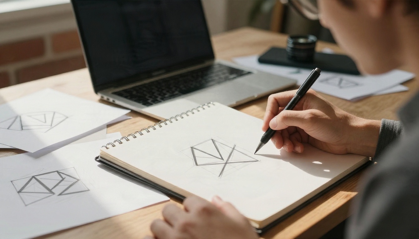
A logo is the smallest and hardest part of the kit. It has to be simple enough to survive a rubber stamp and distinctive enough that nobody confuses it with the shop next door.
Write a Prompt That Works
Vague prompts produce generic marks. The best logo prompts describe a subject, a shape language, a style and a constraint. Compare these two:
- Weak: "logo for my coffee shop"
- Strong: "minimal logo mark for a neighborhood coffee roaster, a single coffee cherry made from two curved shapes, flat solid color, centered on a plain off white background, no gradients, no shadows"
The strong version tells the model what to draw, how simple to keep it and what to leave out. Add the words flat, solid color and plain background almost every time. They keep the result printable.
💡 Ask for a symbol only first, then add the business name in a second pass. Text inside a logo is the part most likely to go wrong, so separate the two jobs.
For marks that include lettering, Ideogram v4 Quality is a strong place to begin because it is built to render readable words inside an image. If you want something faster for early rounds, Ideogram v4 Balanced trades a little detail for speed.
Vector or Raster Output
A raster logo is a grid of pixels. Enlarge it for a banner and the edges blur. A vector logo is built from mathematical shapes and scales to a billboard without losing sharpness. For anything you plan to print, vector matters.
Recraft v4.1 SVG generates scalable vector art directly from text, and Recraft v4.1 Pro SVG is the higher tier for cleaner paths and more detailed marks. Open the result in any vector editor and you can recolor each shape, which is exactly what you need for the one-color versions.
| Format | Best for | Weakness |
|---|
| SVG (vector) | Print, signage, embroidery | Photo style detail is limited |
| PNG (transparent) | Websites, slides, social | Gets soft when enlarged |
| JPG | Quick previews | No transparency |
Pick Colors That Hold Together
Color does more work than the logo in most brand kits. People remember a deep green storefront long before they remember the shape on the sign.
Start From One Anchor Color
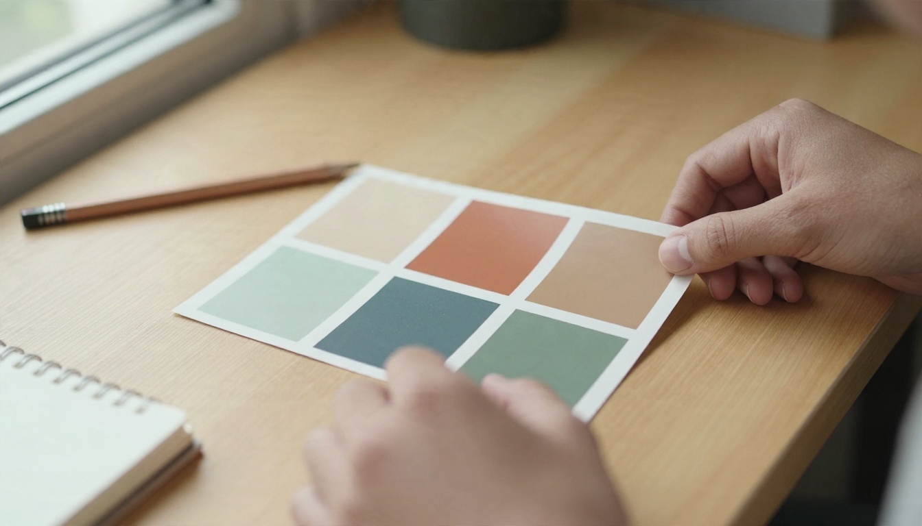
Choose a single color that reflects the feeling you want: warm terracotta for a bakery, deep navy for an accounting firm, soft sage for a wellness studio. Then build around it using a simple formula:
- Anchor: the main brand color, used for the logo and buttons
- Neutral dark: a charcoal or deep brown for text, never pure black
- Neutral light: an ivory or warm white for backgrounds
- Accent: one contrasting color used sparingly
- Support (optional): a soft tint of the anchor for panels and borders
Ask an AI model for palette ideas by describing the mood and the customer instead of naming colors: "calm, earthy palette for a ceramics studio selling to design-minded home cooks". You will get more interesting combinations than if you type "brown and green".
Test Contrast Before Committing
A palette that looks elegant on screen can be unreadable on a menu board. Check that body text against its background reaches at least a 4.5 to 1 contrast ratio, the standard used for accessible web text. Free contrast checkers exist online, and it takes under a minute.
Print is another test. Print your swatches on the actual paper you plan to use. Uncoated stock dulls colors, glossy stock deepens them, and a vivid screen orange can come out brick red.
💡 Keep a one-line note of each hex code beside its job: "#B5563A, buttons and logo". Six months from now you will not remember which terracotta you picked.
Brand Kit Examples You Can Copy
Seeing finished systems makes the abstract checklist concrete. These three examples use different industries, but each follows the same pattern: one simple mark, a short palette, and the same identity repeated on every surface.
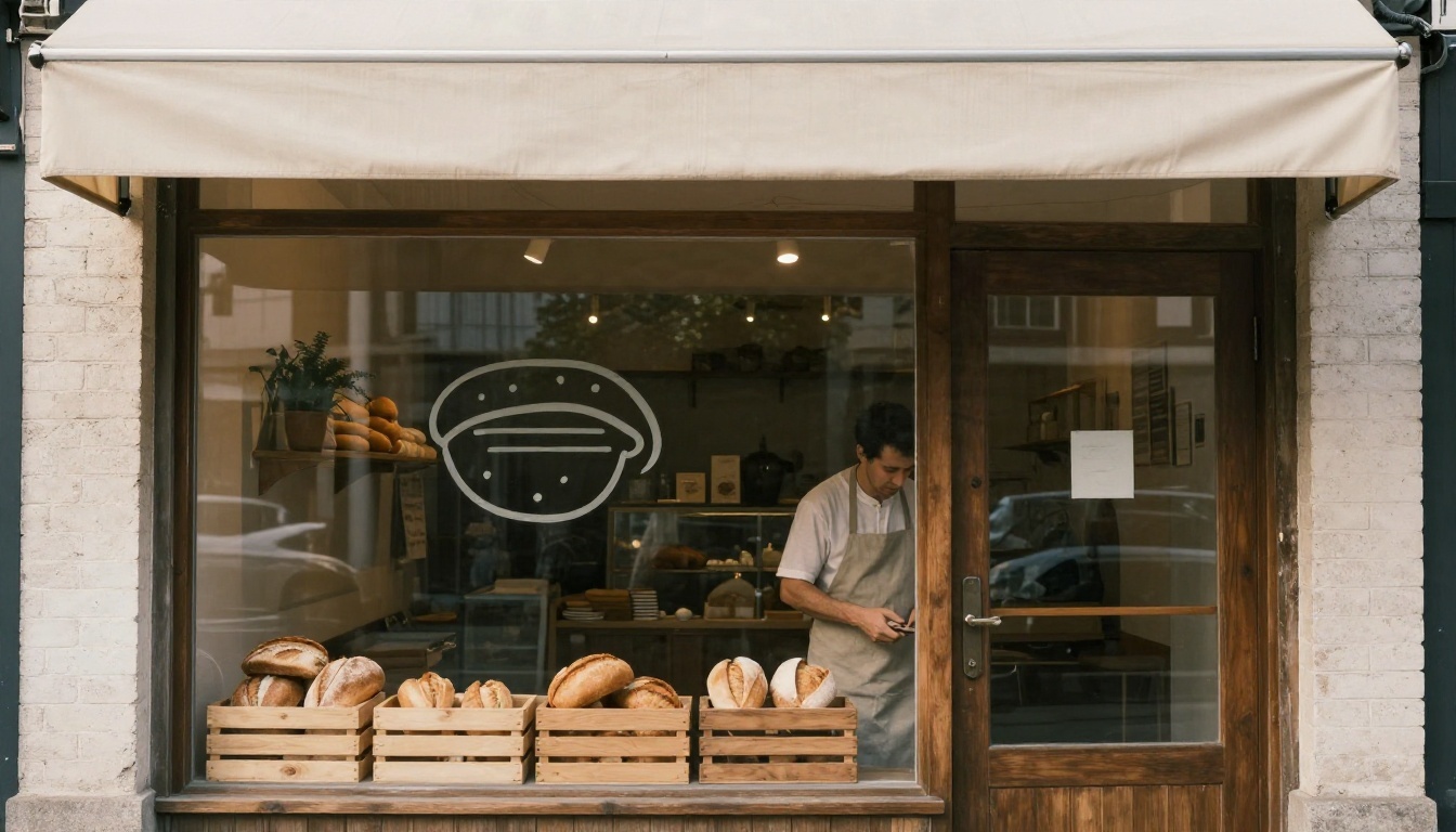
A Neighborhood Bakery
Logo: a wheat stalk reduced to three curved strokes inside a circle.
Palette: warm terracotta, cream, deep brown, with a pale gold accent.
Fonts: a friendly serif for headings, a clean sans for the menu.
Where it shows up: window decal, paper bags, the apron, the chalkboard, the Instagram avatar.
The circle is the secret. It fits a window, a sticker and a round profile picture without cropping.
A Ceramics Shop
Logo: a simple vessel outline drawn with one continuous line.
Palette: sand, forest green, charcoal.
Fonts: a light geometric sans in all capitals.
Where it shows up: a stamp pressed on the underside of each piece, kraft shipping boxes, tissue paper and hangtags.

Packaging is where a small brand feels big. A plain kraft box with a single stamped emblem costs almost nothing and photographs beautifully, which means customers do your marketing for you.
A Freelance Consultant
Logo: the owner's initials in a bold monogram.
Palette: navy, white, and one bright coral accent for links.
Fonts: one serif, used for everything.
Where it shows up: email signature, proposal template, invoice, LinkedIn banner.
A service business does not need packaging. It needs documents that look consistent, because every proposal you send is a tiny brand impression.
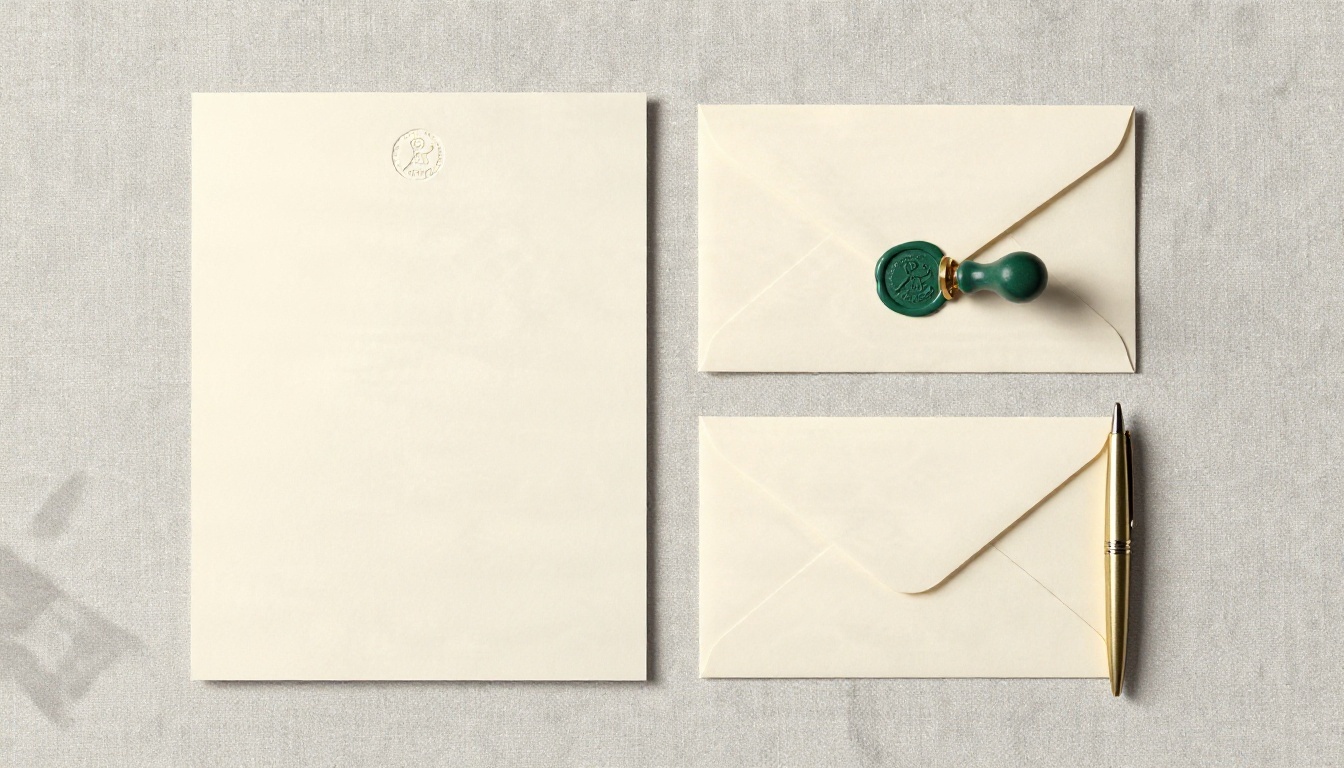
No single generator is the best at everything. A logo model that is good at lettering may not be the best at realistic product photos. The practical approach is a short toolchain where each step feeds the next.

Logos and Vectors
Start with the logo generators above. Generate a batch, pick two favorites, then iterate on those instead of generating endlessly. Every new batch resets your judgment, and the tenth round almost never beats the third.
Cutouts and Mockups
Once the logo exists, a clean transparent version is what lets you place it anywhere. Remove Background handles that, and Recraft Remove Background is a second option if the first leaves a rough edge. For product-style images, Product Cutout isolates an item cleanly so you can place it on a branded backdrop.
When you need lifestyle scenes, such as your mug on a wooden shelf or your tote on a café table, Seedream 4.5 produces photorealistic results, and Nano Banana Pro is handy for editing an existing photo, such as changing the color of a box to match your palette.
💡 Free does not mean unlimited. Most online tools give you a trial or a daily allowance, so decide your two favorite logo directions before you start spending generations.
A Weekend Workflow, Step by Step
Here is a realistic schedule. It assumes zero design experience and about six hours in total.

Saturday Morning: Direction
- Write three adjectives that describe the brand. "Warm, honest, handmade" is better than "premium, modern, innovative".
- Name two businesses whose look you admire, in any industry.
- Describe your customer in one sentence.
- Gather six reference photos into a simple mood board. Print it if you can. Physical boards make decisions faster.
Saturday Afternoon: Logo
- Generate 12 to 20 symbol-only options.
- Cross out anything that looks like a stock icon.
- Pick two and test them at 32 pixels and at 4 inches.
- Add the business name to the winner and generate the vector version.
- Export a black and white variation and a transparent PNG.
Sunday Morning: Colors and Fonts
- Choose your anchor color from the logo itself.
- Build the five-color palette from the formula above.
- Pick two fonts. One serif plus one sans almost never fails.
- Check contrast and print one swatch sheet.
Sunday Afternoon: Mockups and Rules
- Generate mockups of a card, a package, a storefront and a social profile.
- Compare them side by side. Do they look like one family?
- Write a one-page rules sheet: clear space around the logo, minimum size, approved colors, and two examples of misuse.
- Save everything in a single folder named with the date.
Keep the Brand Consistent Everywhere
Consistency is what turns a pretty logo into a recognizable brand. Customers should be able to spot your post in a feed before reading the name.
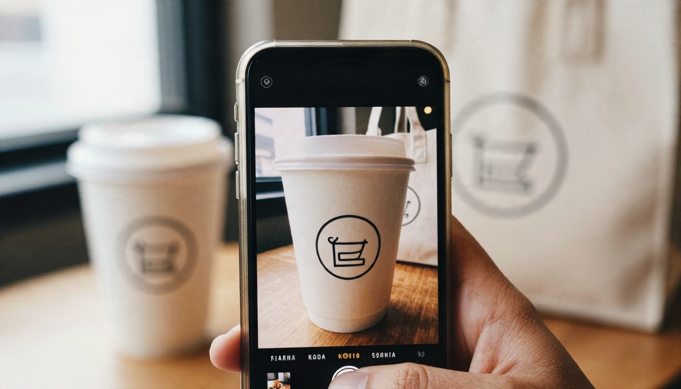
Three habits make this easy:
- Reuse the same prompt skeleton. Save the wording that produced your best mockup and only change the object. "Soft daylight, wooden table, muted earthy tones, 50mm photography" in every prompt gives a shared look.
- Lock the palette. Mention the exact color names in your prompts, then fix small mismatches with an editing model.
- Keep one source folder. Logo files, hex codes and fonts belong together. Pasting a screenshot of a screenshot is how brands quietly degrade.
Common Mistakes That Cost Time
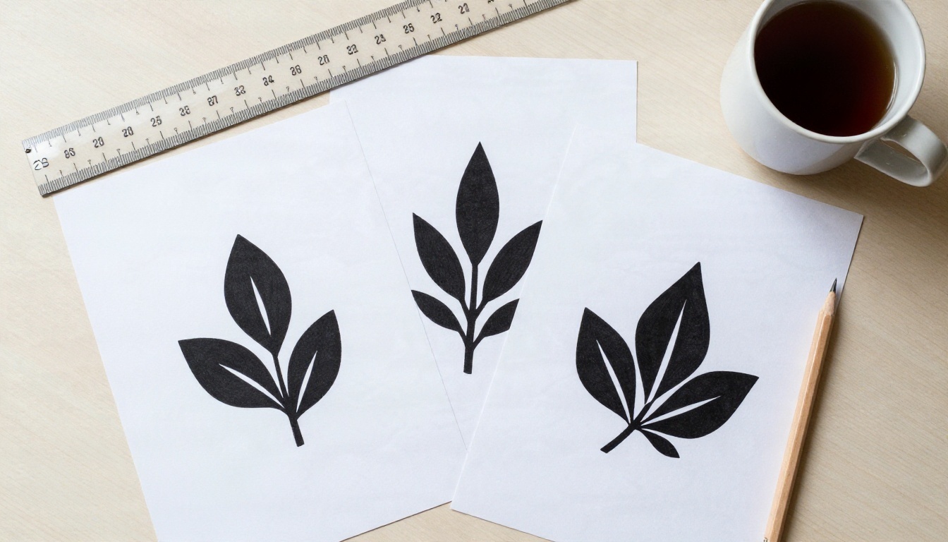
Choosing a Logo Too Detailed to Shrink
If you cannot recognize the mark at the size of a thumbnail, it is too complicated. Fine lines, tiny gradients and thin text vanish on small surfaces. Simplify until it reads at a glance.
Using Too Many Colors
Seven colors is not a palette, it is a box of crayons. Cap it at five and let white space do the rest.
Skipping the One-Color Version
You will need it sooner than you think: for stamps, embroidery, fax-like receipts and a watermark. Make the black version on day one.
Ignoring Trademark Checks
An AI model may produce a shape that looks close to an existing company's mark. Before you print a thousand boxes, run a reverse image search and check the trademark database for your country and industry. Generation tools are not a legal clearance service.
Never Testing in Real Life
Print a card. Hold it. Put the logo on a paper cup. Screen previews flatter everything, and the physical test will tell you in ten seconds what a screen will not.
Start Building Your Brand Today
A brand does not need to be perfect on day one. It needs to be clear, repeatable and honest about who you serve. With a good prompt, a short palette and a disciplined weekend, you can have a logo, colors and a believable set of mockups ready before Monday.
Open Picasso IA and try the toolchain yourself. Generate a symbol with Ideogram v4 Quality or Recraft v4.1 SVG, cut it out with Remove Background, then place it in a realistic scene with Seedream 4.5. Change one variable at a time, keep the versions you like, and compare them side by side.
Want more options? Browse every generator at picassoia.com/en/all-models and build the identity your business deserves.


