You have a date, a venue and a guest list that is still empty. What you do not have is a designer, a budget, or a free weekend to wrestle with layout software. That is exactly the gap an AI flyer for event promotion fills. Type a few sentences, get a poster back in seconds, tweak the wording, and send it to the printer or your group chat before lunch.
This article walks through the whole process in plain language: what a flyer needs to work, a prompt formula you can reuse, 12 prompts for different kinds of events, how free online options compare, and the mistakes that quietly ruin otherwise good posters.
Why Flyers Still Work
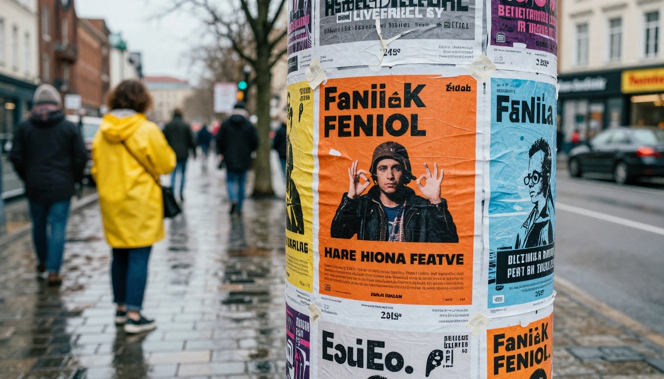
Social posts disappear in a feed within hours. A flyer on a café noticeboard stays for weeks. A flyer in someone's hand gets read while they wait for a coffee. For local events especially, the physical poster and the shareable image work as a pair: one catches people in the neighborhood, the other travels through messaging apps.
Print and Digital Together
The smartest approach is a single design used in two formats. A vertical A4 or Letter layout works for print and wall posting. The same design cropped to a 4:5 or 9:16 frame works for stories and chats. When you generate with AI, you can ask for the format you need from the start, which saves a round of resizing later.
What AI Actually Does
An AI image model does not "know" your event. It turns a written description into a picture: composition, color, lighting, sometimes the lettering itself. Your job is to supply the facts and the mood. The model's job is to arrange them into something that looks designed. Recent models have become much better at rendering short headlines correctly, which was the biggest weakness of early image generators.
💡 Quick rule: let AI handle the visual and the headline. Add small details such as address, ticket link and time in a text editor afterwards, where you control every letter.
What Makes a Good Event Flyer
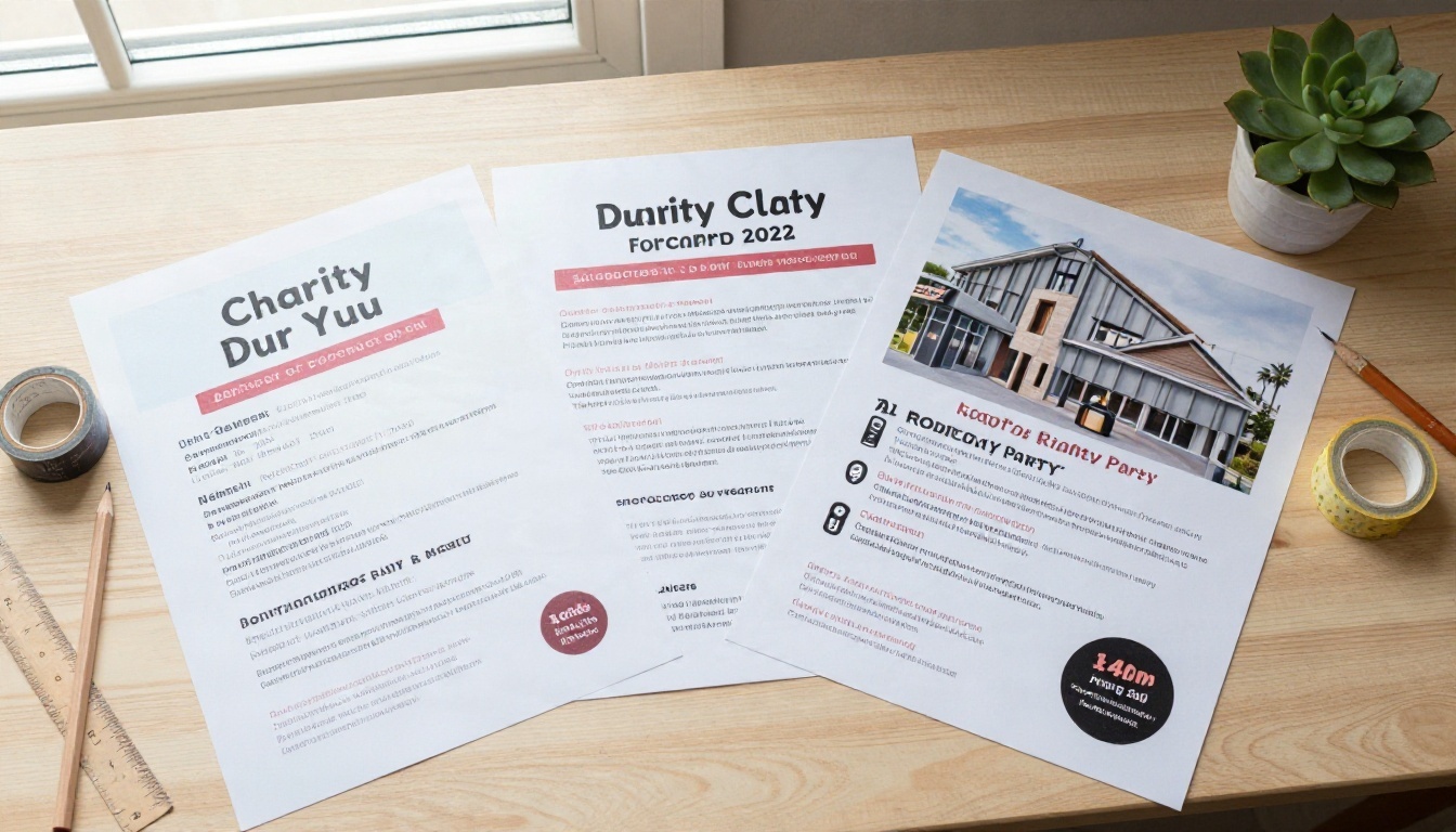
A good flyer answers four questions in about three seconds: what is it, when is it, where is it, and why should I care? Everything else is decoration.
The Five Elements
| Element | Job | Practical tip |
|---|
| Headline | Names the event | 2 to 4 words, large, high contrast |
| Hero image | Sets the mood | One clear subject, not a collage |
| Date and time | Lets people plan | Second largest text on the page |
| Location | Lets people arrive | Venue name plus street or district |
| Call to action | Triggers a decision | "Free entry" or "Book now" is enough |
If your AI result has a great picture but buries the date, fix the date first. A pretty flyer that hides the time is just a pretty picture.
Why Text Rendering Matters
Flyers live and die by lettering. Models differ a lot in how reliably they spell. Ideogram v4 Quality is built with typography in mind and handles headlines cleanly. Recraft v4.1 Pro is aimed at print-ready 2K output, which suits posters. Nano Banana Pro is a strong all-rounder when you want a photographic hero image with a short line of text.
Most weak flyers come from weak prompts like "party flyer". The model has to guess everything, so it gives you the most average result possible. A reliable prompt has six parts.
The Six-Part Formula
- Format: "vertical event flyer, 4:5 poster layout"
- Event type and name: "summer rooftop party called SUNSET SESSIONS"
- Hero subject: "a DJ silhouetted against a warm sky"
- Style and palette: "bold orange and cream, clean modern layout, lots of empty space"
- Text instructions: "headline reads SUNSET SESSIONS in thick sans-serif, small line below reads SAT 14 JUNE"
- Mood and finish: "warm, inviting, printed poster look, high contrast"
Put them in one paragraph. Models read the beginning of a prompt most carefully, so lead with format and event type, not with adjectives.
Words That Help and Words That Hurt
| Helps | Hurts |
|---|
| "large headline", "generous margins" | "lots of text everywhere" |
| "one focal point" | "busy collage of everything" |
| "high contrast text on a calm background" | "text over a detailed photo" |
| "warm natural light" | "make it amazing" |
| "reads exactly: ..." | long paragraphs of body copy |
💡 Tip: keep the text inside the image to a headline and a date. Models spell short strings far more reliably than long ones.
12 Prompt Examples by Event Type
Copy any of these, swap in your own names and dates, and adjust the palette. Each one follows the formula above.
Music and Nightlife
1. Live band night
Vertical event flyer, 4:5 poster. Live music night at a small venue. Photo of a guitarist silhouetted by warm stage light, deep orange and cream palette, huge headline reading "LIVE NIGHT" in thick sans-serif, small line below "FRI 8 PM", generous margins, printed poster look.
2. Rooftop party
Vertical party flyer. Rooftop summer party at sunset, a DJ behind turntables with a warm sky behind, soft golden light, headline "SUNSET SESSIONS" in clean white capitals, small line "SAT 14 JUNE", minimal layout with plenty of empty sky for text.
3. Open mic
Vertical flyer for a coffee shop open mic. Close-up of a vintage microphone on a wooden stage, warm tungsten glow, headline "OPEN MIC" in hand-cut letterpress style, cream paper texture, small text "EVERY THURSDAY".
4. Festival weekend
Vertical poster for an outdoor summer festival. Wide crowd at golden hour with tents and string lights, bold teal and coral color blocks, headline "SUMMER FEST" in heavy condensed type, space at the bottom for a lineup.
Family and Birthday
5. Kids birthday
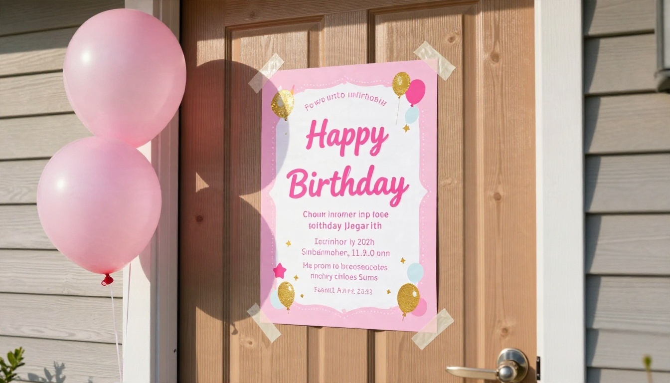
Square invitation flyer for a seventh birthday party. Pink and gold balloons against a soft cream wall, friendly rounded headline "LUNA TURNS 7", small line "SAT 2 PM, BACKYARD", cheerful but uncluttered.
6. Garden party
Vertical flyer for a 50th birthday garden party. Long table with lanterns and flowers at dusk, warm natural light, elegant serif headline "THE BIG 50", soft green and gold palette.
Business and Community
7. Networking evening
Vertical flyer for a professional networking evening. Two people shaking hands in a bright modern lobby, blue and white palette, clear sans-serif headline "CONNECT & GROW", small line "THU 6 PM, FREE ENTRY", clean corporate feel.
8. Charity run
Vertical poster for a 5K charity run. Runners on a park path in early morning light, fresh green and white palette, bold headline "RUN FOR GOOD", empty band at the bottom for sponsor logos.
9. Farmers market
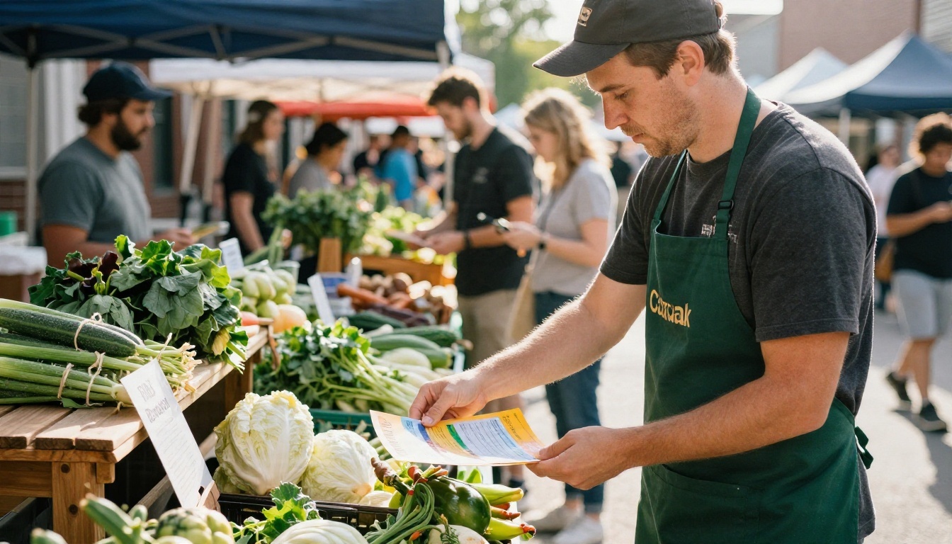
Vertical flyer for a neighborhood farmers market opening day. Wooden stall with crates of vegetables and bunting, bright morning light, friendly hand-lettered headline "MARKET DAY", warm earth tones.
Weddings and Celebrations
10. Wedding open house
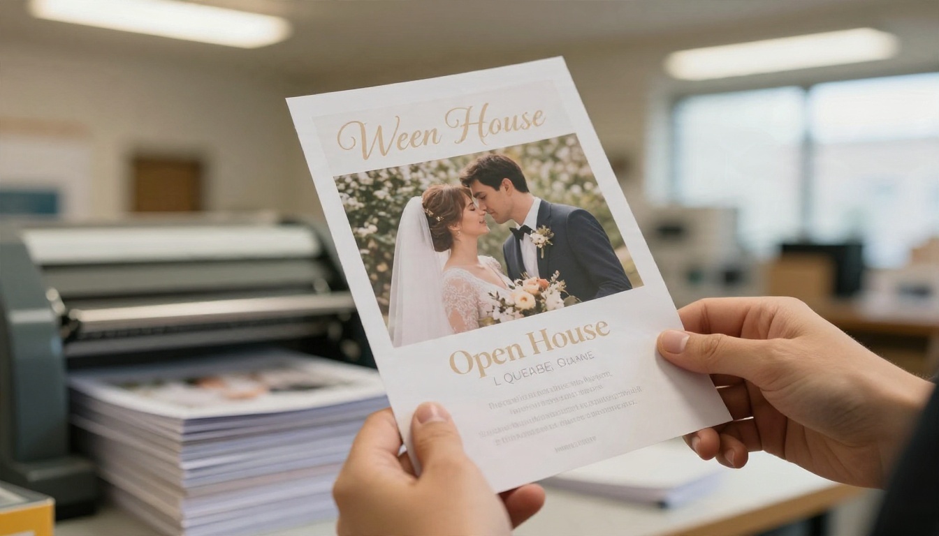
Portrait flyer for a wedding venue open house. Soft floral photography, cream background, elegant thin serif headline "OPEN HOUSE", small line "SUN 11 AM TO 3 PM", plenty of white space.
11. Engagement party
Vertical invitation flyer. Two champagne glasses on a linen tablecloth in natural window light, blush and ivory palette, headline "WE'RE ENGAGED" in script, small line "SAT 7 PM".
12. Baby shower
Vertical flyer for a baby shower. Soft pastel knitted blanket and wooden toys on a bed, morning window light, rounded headline "OH BABY", gentle sage and cream palette.
Free Online Options Compared
"Free" means different things depending on the tool. Some give you a limited number of generations per day, some add a watermark, and some let you generate but charge to download at print resolution.
Where to Make One Free
| Option type | What you get | Typical catch |
|---|
| Template-based design apps (Canva, Adobe Express, Microsoft Designer) | Drag-and-drop layouts with some AI image tools | Best templates and exports can sit behind a paid plan |
| Chat assistants with image generation | Quick drafts from a conversation | Text accuracy varies, limited daily images |
| Text-to-image platforms | Direct control over the visual and prompt | You add small details yourself |
| PicassoIA | Many image models in one place, including several that advertise free generation | Pick the right model for text or photos |
Plans and limits change often, so check each service's current terms before you commit to one for a large print run.
What Free Usually Costs You
Free tools rarely cost money. They cost control. Template apps lock you into someone else's layout. Chat assistants make it hard to repeat a result. A model platform gives you the most control but expects you to write a decent prompt, which you now know how to do.
A sensible workflow: generate the hero visual and headline on a model platform, then place address and ticket details in any free editor. You get a unique poster and exact small print.
How to Use Ideogram v4 Quality on PicassoIA
For text-heavy posters, Ideogram v4 Quality is a strong first pick. If you want faster drafts, try Ideogram v4 Balanced while you refine wording, then switch to the Quality version for the final.
Step by Step
- Open the model page for Ideogram v4 Quality on PicassoIA.
- Paste your prompt. Start with one of the 12 examples above and replace the name, date and palette.
- Set the aspect ratio to a vertical option such as 4:5 or 2:3. Use 16:9 only for banners and event screens.
- Generate and check the headline spelling first, before judging colors.
- Adjust one thing at a time. If the text is right but the photo is dull, change only the hero description. Changing everything makes it impossible to see what helped.
- Save your favorite version and add small details in a text editor.
💡 Settings tip: if a result is nearly perfect but a word is misspelled, regenerate with the exact word repeated in quotes and a shorter headline. Fewer words means fewer chances for errors.
Other Models Worth Trying
Mistakes That Ruin Flyers
Most flyer failures are not about AI at all. They are about the same handful of design errors that humans make too.
Too Much Text
If the flyer needs a paragraph, it is a leaflet. Keep the poster to the five elements above and put the rest on a webpage or ticket link.
Low Contrast Lettering
Pale text on a busy photo looks fine on your monitor and disappears on a wall ten feet away. Ask for "calm background behind the text" or "dark band behind the headline". If the result still struggles, lighten or darken the area in an editor.
Wrong Format for the Place
A horizontal image on a vertical noticeboard wastes space. Decide first where the flyer will live: a door, a pole, a story, a chat. Then pick the ratio.
Skipping the Proof
Print one copy at home first. Check spelling, date, and that the QR code scans. A single typo on 200 copies is an expensive lesson.
Print and Share Your Flyer
Good output deserves good delivery. A bit of care at this stage separates a polished poster from a blurry one.
Print Settings
| Use | Recommended size | Resolution |
|---|
| Noticeboard flyer | A4 or Letter | 300 dpi |
| Handout card | A5 or half Letter | 300 dpi |
| Street poster | A3 or Tabloid | 200 to 300 dpi |
| Banner | Custom | Upscale first, then export |
Many AI outputs come in around 2K to 4K pixels on the long side. That is enough for A4 at good quality, but larger prints need an upscale step. Leave a small margin around the edges so nothing important is trimmed.
Digital Sharing
For chats and stories, export a JPG or PNG and keep the headline in the top two thirds, because apps often overlay buttons at the bottom. Add the booking link in the caption, not just in the image, so people can tap it.
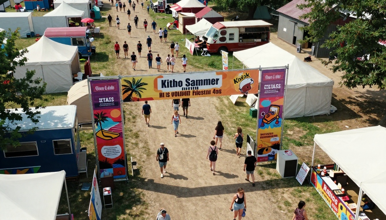
Make Your Own Event Flyer Today
You now have the pieces: five elements every flyer needs, a six-part prompt formula, 12 prompts you can adapt in a minute, and a clear sense of what "free" really means online. The only thing left is to try it.
Pick the event you are planning, paste one of the prompts above into Ideogram v4 Quality or Nano Banana Pro on Picasso IA, and generate three versions. Compare them side by side, keep the strongest, fix the small print, and send it out. Then change the palette and generate another for your social feed.
Want more options? Browse every image model at picassoia.com/en/all-models and find the one that matches your event's style. Your next flyer could be ready before your coffee gets cold.


