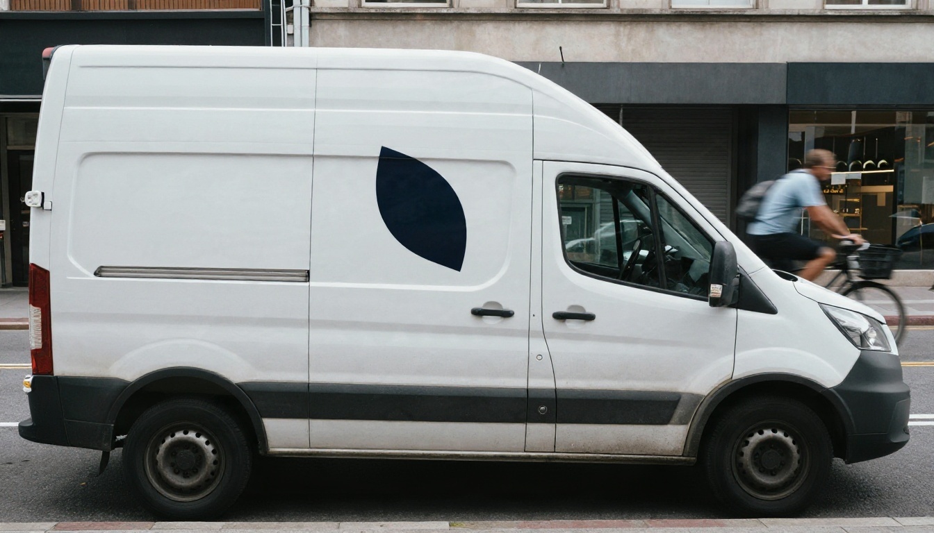
Best AI Logo Generator With Prompt: Free Examples, Vector Export and Online Tools
Looking for the best AI logo generator with prompt control? This article compares vector and raster models, gives you copy-ready logo prompts, shows how to export a clean SVG, and fixes the usual problems like blurry edges, broken lettering and messy backgrounds.
Most people type "make me a logo" into an image generator, get a muddy badge with misspelled letters, and decide AI logo tools are a toy. The problem is rarely the tool. It is the prompt, and it is the file format. A logo has to survive a tiny favicon, a van door and a embroidered cap, and that only works when you pick the right model, write a precise prompt and export something scalable. This article walks through the best AI logo generator options with a prompt box, shows free example prompts you can paste right now, and explains how to get a vector file instead of a blurry PNG.
💡 Quick answer: For a true scalable file, start with Recraft v4.1 SVG. For logos that need readable lettering, try Ideogram v4 Quality. Use a background remover and an upscaler to polish anything that comes out as a raster image.
What Makes a Logo Generator Good
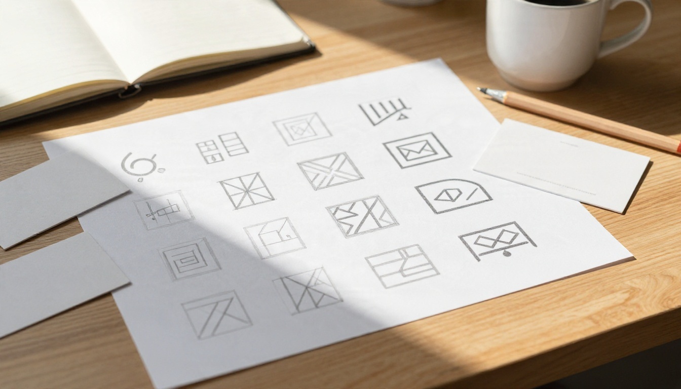
A logo is not an illustration. It is a small, flat, repeatable mark that has to work in one color, on a white wall or a dark hoodie. A generator that makes gorgeous poster art can still be a terrible logo tool.
Vector Export Matters Most
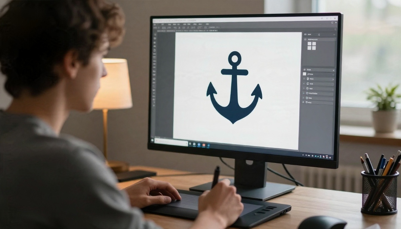
A raster file (PNG, JPG) is a grid of pixels. Enlarge it for a banner and the edges turn soft. A vector file (SVG) stores shapes as math, so the same mark stays razor sharp on a favicon and on a billboard. If a tool cannot give you an SVG, you will need extra steps later, such as manual tracing in a design app.
Lettering You Can Actually Read
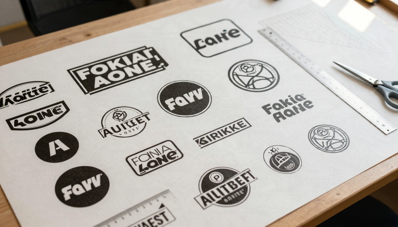
Older image models scramble letters. Newer ones handle short words well, but they still slip on long taglines. Keep brand names short in your prompt, put them in quotes, and avoid more than two or three words.
Flat Shapes, Few Colors
Good logo output has clean edges, limited colors and obvious negative space. If a result has gradients, photographic shadows or tiny details, it will fall apart when printed small.
Clear Usage Rights
Always check the terms of the model you use before putting a generated logo on packaging or a trademark filing. AI marks can look similar to existing brands, so run a quick search for lookalikes before you commit.
Best Logo Generators Compared
PicassoIA hosts several models that suit logo work, each with a different strength. Here is how they stack up for this specific job.
The Recraft SVG family is the natural first stop because the output is a vector, not a picture of a logo. That means you can open the file in a design editor, change colors, and scale it without any loss. Use the standard Recraft v4.1 SVG for quick exploration, then switch to the Pro version when you want a finished candidate. The older Recraft v3 SVG still handles basic icons well.
Ideogram for Wordmarks
When the brand name is the logo, a typographic model earns its place. Ideogram v4 Quality is the one to try for a bold name set in a clean typeface, and Ideogram v4 Balanced gives faster drafts while you test names. The result is a raster image, so plan to vectorize or rebuild it later if you need to print large.
GPT Image and Nano Banana for Iteration
Some of the best logo work comes from a two step loop: generate a concept, then edit it with plain language. GPT Image 2 follows long instructions closely, which helps when your brief has several conditions. Nano Banana Pro is handy when you already have a sketch and want to adjust it: "keep the shape, change the green to deep navy".
Seedream for Brand Mockups
Once the mark exists, Seedream 4.5 is a strong way to see it on a storefront, packaging or a uniform before you spend money on printing.
The Prompt Formula That Works
Vague prompts produce generic results. A strong logo prompt reads like a short design brief. Here is the structure that gives consistent output across almost every model above.
The Five Part Structure
Type of mark: wordmark, lettermark, emblem, mascot or abstract symbol.
Subject: what the logo represents (a bakery, a drone company, a yoga studio).
Style words: minimalist, geometric, hand drawn, vintage badge, modern.
Color limit: "two colors, navy and orange" or "single color black".
Constraints: "flat vector, white background, no gradients, no shadows, centered".
Put them together in one sentence and you are 90 percent of the way there.
💡 Tip: Always end with "flat vector style, plain white background, no gradients, no shadows, no mockup". It removes the most common reason logos look like posters.
Free Logo Prompt Examples
Copy any of these and swap in your own details.
Bakery emblem
Emblem logo for a neighborhood bakery, a single wheat stalk inside a circle, minimalist geometric style, two colors: warm brown and cream, flat vector, plain white background, no gradients, no shadows, centered
Tech wordmark
Wordmark logo with the text "Nimbus" in a clean modern sans serif, lowercase letters, one small cloud shape replacing the dot of the letter i, single color deep blue, flat vector, plain white background
Fitness lettermark
Lettermark logo using the letter "F" formed from two bold diagonal strokes suggesting motion, black and bright red, sharp edges, flat vector, plain white background, high contrast
Coffee roaster badge
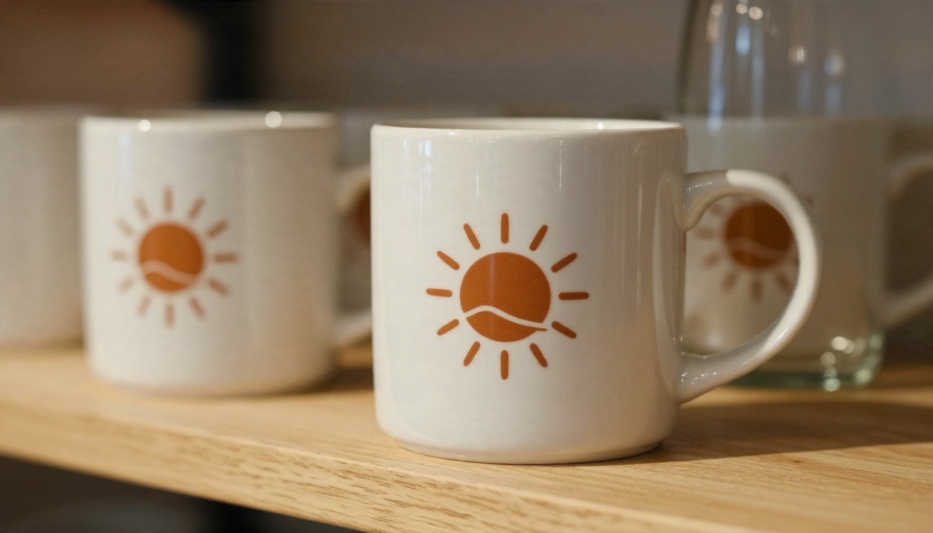
Vintage circular badge logo for a coffee roaster, a coffee bean with a small sun rising behind it, hand drawn line style, dark green and off white, flat vector, no gradients, plain white background
Eco brand symbol
Abstract symbol logo for a sustainable packaging company, a leaf folded like a paper box, simple geometric shapes, single color forest green, flat vector, balanced negative space, plain white background
Kids brand mascot
Friendly fox mascot logo for a children's bookstore, rounded shapes, three colors orange, cream and charcoal, simple flat vector illustration, thick clean outlines, plain white background
Notice what these have in common: a clear subject, a color limit and a flat vector instruction. None of them ask for realism or a scene.
How to Make a Vector Logo on PicassoIA
This is the fastest route to an SVG you can edit. It uses Recraft v4.1 SVG, but the same steps work with the Pro and v3 versions.
Paste your prompt. Use one of the examples above or your own five part brief.
Pick the aspect ratio. Choose a square format. Logos are easiest to place when the artboard is 1:1.
Generate several versions. Run the prompt three to five times. Small wording changes give very different shapes, and you want options.
Download the SVG. Save the file and open it in a vector editor to check the shapes, recolor them and test a black and white version.
Refine with a second pass. If the idea is right but the details are not, adjust the prompt. Change one thing at a time so you know what caused the difference.
Parameter Tips
Setting
Recommendation
Aspect ratio
Square (1:1) for the main mark
Prompt length
25 to 45 words, one idea only
Colors
Name two at most, in plain language
Text
Under three words, wrapped in quotes
Iterations
Generate at least 4 before judging
💡 Tip: If a result is almost right, save the prompt, copy it, and change only the style word. Going from "geometric" to "hand drawn" is a fast way to find a direction without starting over.
Fix Common Logo Problems
Even strong models need a little help. These are the issues that come up most, and how to solve them.
Three Mistakes That Ruin Logos
Too many ideas in one prompt. "A lion, a mountain, a coffee cup and a rocket" gives clutter. Choose one subject.
Asking for a realistic look. Words like "photorealistic" or "cinematic" push the model away from flat shapes.
Long taglines. Keep text to the brand name. Add a tagline later in a layout tool.
Clean Up the Background
A raster logo often arrives on a colored or textured backdrop. Run it through Remove Background to get a transparent PNG, or try Recraft Remove Background for a similar cutout. A transparent file lets you place the mark on photos, packaging and websites without a white box around it.
Sharpen Small Raster Files
If your favorite concept came from a raster model and the file is small, Real ESRGAN can upscale it 4x so the edges stay clean in print. For a mark you plan to use for years, though, a vector rebuild is still the safer choice.
Where Your Logo Will Live
Test the mark in real contexts before you finalize it. A design that looks fine on a screen can fail the moment it meets fabric, ceramic or a curved vehicle panel.
Small Sizes and Favicons
Shrink your logo to 32 pixels wide. If it is still recognizable, it works. If the shape turns into a smudge, simplify it: fewer details, thicker strokes, more space between elements.
Print, Fabric and Signage
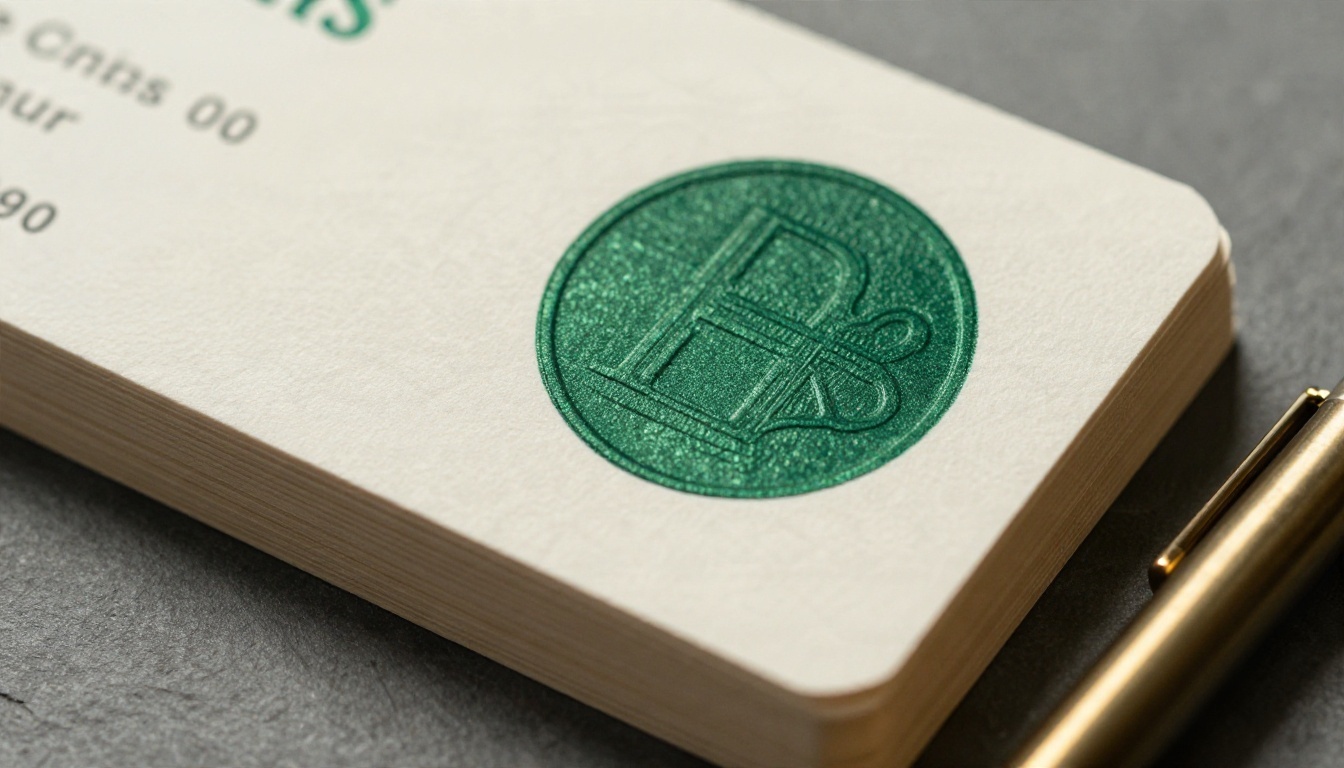
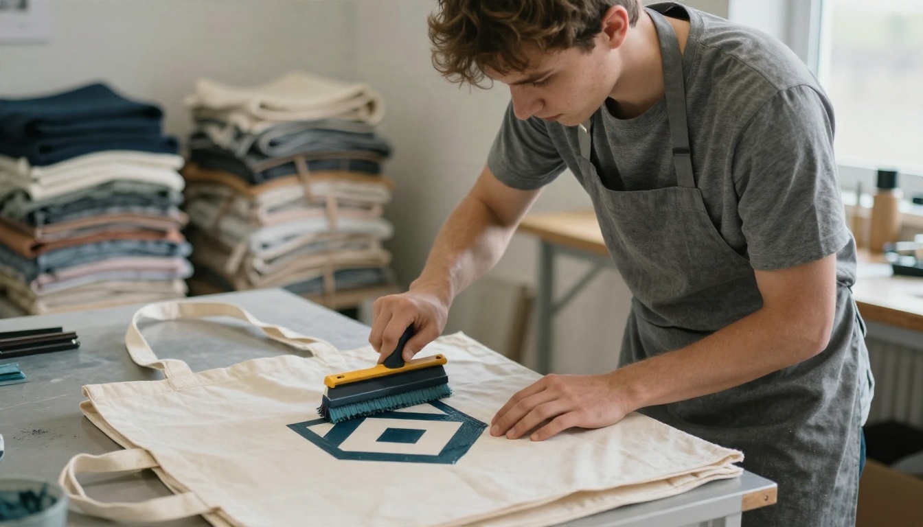
Business cards reward simple marks with plenty of empty space, especially when embossed or foil stamped. Screen printing on tote bags or shirts needs flat shapes and few colors, which is exactly what a clean vector gives you. Signage and vehicle wraps need bold, high contrast shapes that read from a distance.
Mockups Before You Print
Generate a few mockups so you can judge the logo in context. A Seedream 4.5 or Nano Banana scene with your mark on a storefront, a delivery van or a mug will reveal problems that a flat white artboard hides.
Free vs Paid Logo Tools
Free generators are good for exploring ideas. Paid design services are good when you need a finished brand kit. Here is how to decide.
Situation
Best route
Side project or test brand
Free generation, pick a favorite, vectorize
Small business launch
Generate with a vector model, then refine in an editor
Trademark filing
Work with a designer and run a similarity search
Full brand system
Use AI for concepts, a designer for the final system
AI works best as a very fast sketchbook. You can see forty directions in the time it takes to brief a freelancer on one. The final decision, and the legal check, still belong to you.
Pick the strongest shape and test it in black and white.
Remove the background if you ended up with a raster file.
Preview the mark on a mug, a sign and a card.
Save the final SVG and a transparent PNG.
Try Your Own Logo Today
You now have the prompt formula, the example prompts and the right models for each job. The fastest way to see what works is to run a few of them. Open Picasso IA, paste the bakery or wordmark prompt above, swap in your own brand details, and generate five versions in a row. Change one style word each time and watch how the shape shifts. You can also browse every available tool on the full model list to find the one that fits your project. Your first usable logo may be only a few prompts away.