Brand Consistency in AI Generated Campaign Assets: Prompts, Examples, and Free Tools
Your campaign has twelve AI images and they look like they came from twelve different brands. This article shows how to lock palette, lighting, lens and character so every asset matches, with copy-ready prompts, real examples and free tools you can use today.
You generate the hero banner and it looks perfect. Then you generate the Instagram square, the email header and the storefront poster, and suddenly the skin tones shift, the greens turn minty, and the lighting jumps from soft morning to harsh noon. Nothing is technically wrong with any single image. Together, they look like they belong to four different companies.
That is the real problem of brand consistency in AI generated campaign assets: prompts, examples, and free tools all point to the same fix. Consistency does not come from luck or from a magic model. It comes from a repeatable system: a fixed vocabulary for color, light, lens and subject that you paste into every single prompt, plus a reference-based workflow for the moments when words are not enough.
This article builds that system step by step. You will get a prompt template you can copy, a table of what to lock versus what to vary, honest examples of where AI drifts, and a list of free tools on PicassoIA that handle the heavy lifting.
Why AI Images Drift Off Brand
Every generation starts from random noise. Unless you tell the model exactly what to repeat, it fills the gaps with its own averages. Those gaps are where brands quietly leak away.
The Four Drift Zones
After reviewing dozens of campaign sets, the same four things slip first:
Color temperature. Warm cream becomes cool white, terracotta becomes orange.
Light direction. Window light from the left in one asset, overhead softbox in the next.
Lens feel. A flat 24mm look beside a compressed 85mm portrait.
Subject identity. The "same" model with a different face, hairstyle or age.
If you lock these four, you already solve roughly 80% of the visible inconsistency. The rest is polish.
Why Adjectives Fail
Words like "warm", "cozy", "premium" and "clean" mean different things on every run. A prompt that says "warm cozy lighting" gives you a candle glow once and a sunset the next time. Brand systems need measurable, concrete terms: a named film stock, a lens focal length, a light direction, hex-like color names.
💡 Rule of thumb: if a word could describe two very different photographs, it does not belong in your locked brand block.
Build a Brand Prompt Block
The single most useful habit is writing one paragraph, your brand block, and pasting it unchanged at the end of every prompt. The scene changes. The block never does.
The Five Slots
Slot
What it fixes
Example wording
Palette
Color identity
terracotta, warm sand, cream, sage green
Light
Direction and softness
soft daylight from a window on the left
Lens
Perspective and blur
50mm f/2 shallow depth of field
Film look
Grain and tone
Kodak Portra 400 film grain, natural color
Surfaces
Material language
linen, matte ceramic, oak, paper fibers
A Copy-Ready Template
Here is a block you can adapt. Replace the palette and surfaces with your own brand's world:
Photorealistic, raw photography, palette of terracotta, warm sand, cream and sage green, soft natural daylight from a window on the left, 50mm f/2 lens with shallow depth of field, Kodak Portra 400 film grain, matte ceramic, linen and oak textures, calm and quiet mood, no text, no logos
That is it. The scene is the only thing you rewrite.
Keep a Negative List Too
Brand drift also comes from things that sneak in. Keep a short list of exclusions and reuse it: no neon, no oversaturated colors, no plastic skin, no stock-photo smiles, no random text. Models that support negative prompts accept it directly. For models that do not, fold the exclusions into the positive prompt as "natural, unretouched, matte".
Lock Light and Lens First
If you can only fix two things, fix light and lens. Viewers forgive a slightly different shade of green far faster than they forgive a different feeling of space.
Light Direction Is Identity
Pick one main light and name it every time. "Soft daylight from the left" looks like a brand. "Natural light" looks like a coincidence. For campaigns with both indoor and outdoor scenes, define two approved lights, for example window light from the left for interiors and overcast morning light for exteriors, and never improvise a third.
Lens Choices Create Rhythm
A good campaign mixes distances on purpose, but within a fixed set. A simple rule:
35mm for environments and storefronts
50mm for people at work and flat lays
85mm to 100mm for portraits and product close-ups
Writing the focal length into the prompt nudges composition, background blur and facial proportions toward the same family.
Real Examples of a Locked System
Here is what happens when one brand block is reused across different scenes. The brand in these examples is a fictional skincare label with a terracotta, sand and sage world. Each scene prompt was different. The block stayed the same.
Example 1: The Character
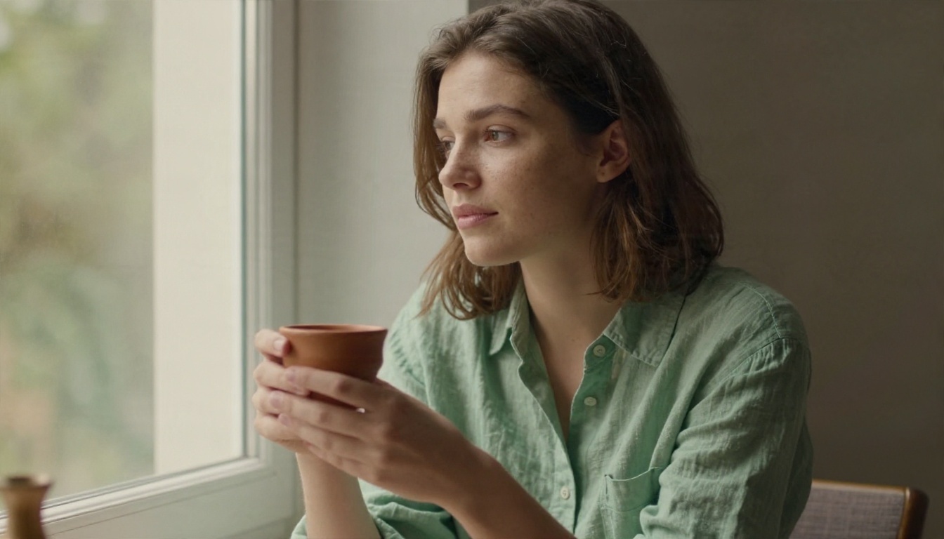
For a campaign person, describe them once in fixed terms and reuse the sentence: "young woman with natural freckles and shoulder-length brown hair, sage green linen shirt". Never swap in "a woman" or "the model". Specific nouns carry identity from one prompt to the next.
Notice how the palette lands on its own. The shirt, the cup and the window light all come from the block, not from the scene description.
Example 2: The Place
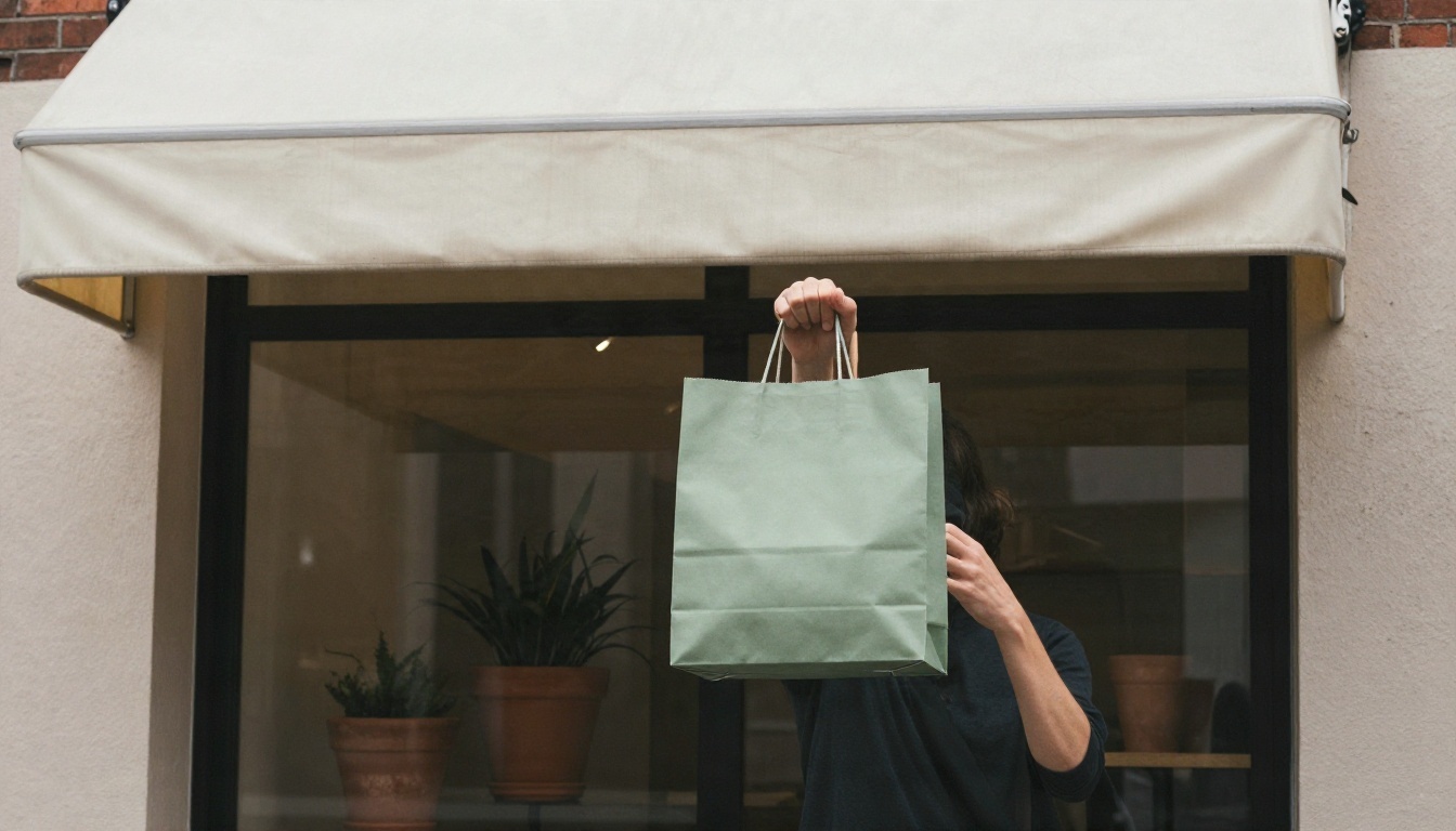
A storefront, a studio and an event space can all feel related if the surfaces and light stay fixed. Here the cream awning and terracotta planters echo the product palette without a single logo.
Example 3: The Flat Lay
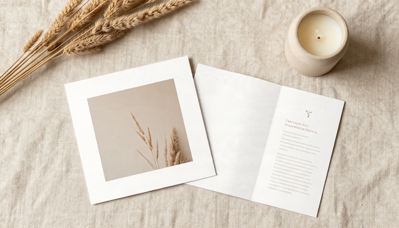
Flat lays are the easiest assets to keep consistent because there are no faces and the lens is fixed overhead. They also work for newsletters, packaging inserts and social carousels.
💡 Tip: generate one anchor image you love, then write the block by describing that image literally: what color, which direction of light, which surface. The block becomes a recipe rather than a wish.
Free Tools That Hold Your Look
Prompts get you most of the way. Reference images and editing tools close the gap. These are the models on PicassoIA worth putting in a brand workflow, and each one has a free way in.
Generate the Anchor Asset
Start with a model that follows long, detailed prompts faithfully:
Nano Banana Pro is strong at multi-element scenes and at keeping details stable when you describe them precisely.
Seedream 4.5 produces high-resolution output with careful color handling, useful for hero banners and print.
Imagen 4 renders natural light and skin texture convincingly, which suits portrait-led campaigns.
Edit Instead of Regenerate
Here is a habit that saves hours: when an image is 90% right, edit it rather than rolling the dice again.
Nano Banana accepts a reference photo and a plain-language instruction, which is perfect for "same scene, different product" requests.
Flux Kontext Fast changes one detail, such as a shirt color or a background object, and leaves the rest untouched.
Depth of Field softens a background after the fact so a set of images shares the same blur character.
Text Removal cleans stray lettering that models sometimes invent on packaging or signs.
Teach a Model Your Brand
When a campaign runs for months, a custom style beats any prompt. Training a small LoRA on 15 to 30 of your approved images bakes the look into the model.
A good system survives a Monday morning with three people and a deadline. Here is the shortest version that still works.
Step 1: Write the Brand Block
Spend an hour on this once. Pull five real photographs you love, describe their palette, light, lens and surfaces in plain words, then condense into five lines. Share it in a document everyone can open.
Step 2: Generate an Anchor Set
Make six anchor images: one hero, one portrait, one product, one environment, one flat lay and one detail. Keep only the ones that feel unmistakably yours. These become your reference set for later edits.
Step 3: Produce by Format
For every channel, change only the format line of your prompt:
Square for feeds
Vertical for stories and shorts
Wide for web headers and email banners
Reusing the same scene idea in different crops is faster and more consistent than inventing new scenes for every channel.
Step 4: Run a Side-by-Side Check
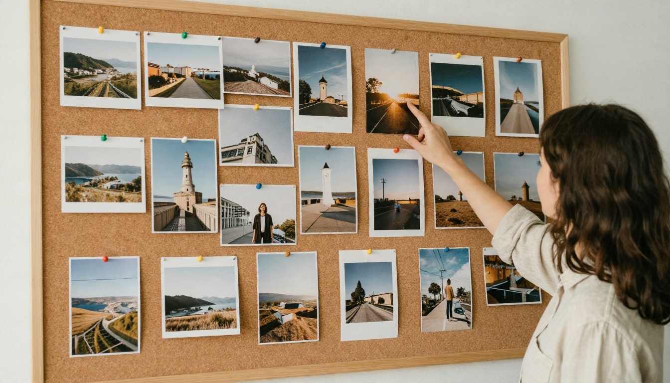
Put every finished asset on one screen, shrink them to thumbnail size and squint. If one image jumps out, something drifted. It is usually white balance or light direction. Fix it with an edit tool rather than regenerating.
💡 Team habit: name each approved asset with the brand block version, for example "block v2". When you update the block, you know exactly which assets need refreshing.
Common Mistakes to Avoid
Most failed campaign sets fail for boring reasons.
Mistake 1: Rewriting the Block Each Time
People paraphrase. "Soft daylight from the left" becomes "gentle natural window light". The model treats those as different instructions. Copy and paste, never retype.
Mistake 2: Mixing Too Many Styles
A campaign with one product shot in studio light, one lifestyle shot in golden hour and one portrait with a dramatic side light is not a campaign. It is a collage. Limit yourself to two approved lighting setups.
Mistake 3: Ignoring Skin and Surface Texture
Overly smooth skin and glossy surfaces are the quickest way to make AI work look generic. Ask for visible pores, fabric weave, paper fiber and film grain. Texture is a brand signal as much as color.
Mistake 4: Letting Text Into the Image
Models invent lettering. Even when it looks readable, small errors hurt credibility. Add "no text, no logos" to your block and place real typography later in your layout software.
Mistake 5: Skipping the Style Reference Page
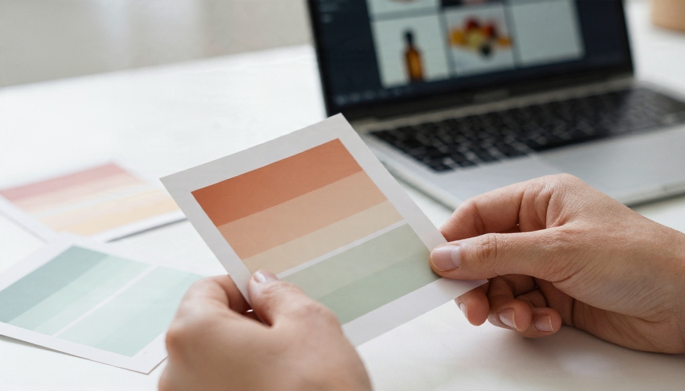
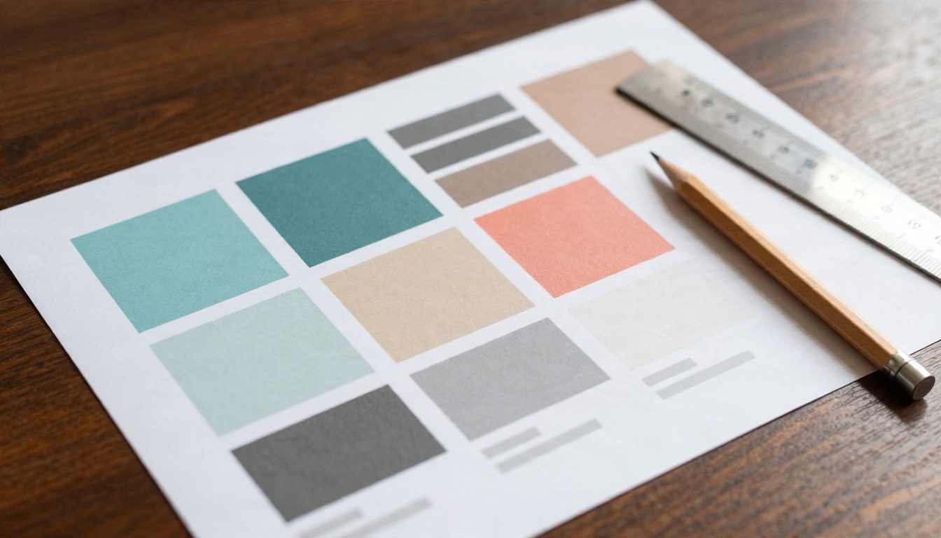
A one-page brand rulebook with swatches, approved photos and the prompt block prevents more drift than any tool. Keep a printed copy near the screen if your team is physically together.
Quick Prompt Library
Use these as starting points. Add your brand block after each one.
Hero banner
"Wide view of a long oak table arranged with matte bottles, a linen tote and folded posters, hands adjusting one print, viewed from a high three-quarter angle."
Portrait
"Young woman with natural freckles and shoulder-length brown hair in a sage green linen shirt, seated on a windowsill holding a small clay cup, calm expression."
Storefront
"Street-level view of a minimalist boutique with a cream awning and terracotta planters, a passerby carrying a paper shopping bag."
Product close-up
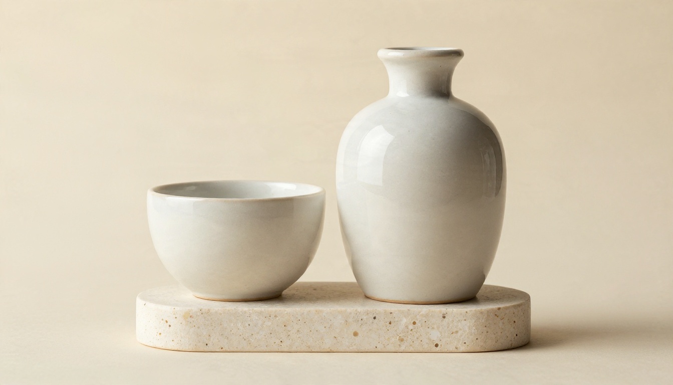
"Low-angle view of a ceramic bottle and jar on a travertine pedestal, crisp glaze reflections, soft shadow falloff."
Team at work
"Two colleagues leaning over a tablet comparing two photographs, one printed and one on screen, shelves of ceramics in the background."
💡 Test it: run the same scene prompt with and without your brand block. The difference in coherence is the best argument for adopting the system across a team.
What Good Consistency Looks Like
A consistent set does not mean identical images. It means a stranger could look at six assets from your campaign, in any order, and say with confidence they come from the same brand. The signals are:
The same color family appears in every frame, even when it is a small accent
Light falls from a predictable direction
Skin and surfaces have real texture
Backgrounds are calm and uncluttered
Faces and clothing repeat when the same person appears
Hit those five and your campaign reads as deliberate, even when it was produced in an afternoon.
Build Your Own Brand Set
You now have a block template, a workflow and a toolkit. The fastest way to see it work is to try it on your own brand, today, with a small test.
Write your five-line brand block. Pick one scene, such as a product on a table. Generate it in Seedream 4.5 or Nano Banana Pro, then change only the scene, a portrait, a storefront, a flat lay, and keep the block untouched. Compare the three results side by side.
When one image is almost right, fix it with Flux Kontext Fast instead of starting over. If your campaign will run for months, train a style with P Image Trainer.
Open Picasso IA, paste your block, and build your first matching set. You can browse every model at picassoia.com/en/all-models and pick the one that fits your brand.