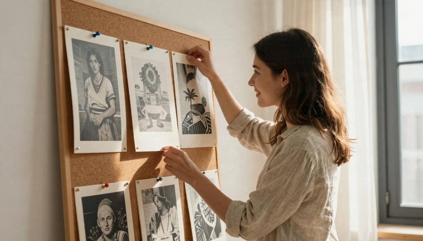
You write a great prompt, get a stunning image, and feel like a genius. Then you change the subject, hit generate again, and the result looks like it came from a different artist. The palette shifts, the lighting flips from soft to harsh, and the lens suddenly feels wider. If you have ever tried to build a series, a brand set, a comic page or a product catalog with AI, you know this pain. Consistent style AI art is the difference between a pile of random pictures and a body of work.
The good news: consistency is not luck. It comes from a handful of repeatable habits: a written style brief, a reusable prompt block, locked settings, reference images and, when you want a signature look, a trained LoRA. This article walks through each one with real prompts, a settings table and a list of tools you can try for free.
Why Style Drifts Between Images
Before fixing drift, it helps to see where it comes from. Image models are built to produce variety. Every generation starts from random noise, and your prompt only nudges that noise toward something recognizable. If your prompt leaves room, the model fills the gap differently each time.
Random seeds do the damage
Each run begins with a seed, a number that decides the starting noise. A new seed means a new composition, new color balance and often a new mood, even with the exact same words. Many tools randomize it by default, which is great for exploring ideas and terrible for a series.
Vague words get guessed differently
Words like "beautiful", "cinematic" or "artistic" mean something different on every run. The model picks one interpretation, then picks another next time. Concrete terms such as "overcast window light from the left, 50mm lens, muted teal shadows" leave far less to chance.
💡 Rule of thumb: if a word could be read three ways by a human photographer, the model will read it three ways too.
Build a Style Brief First
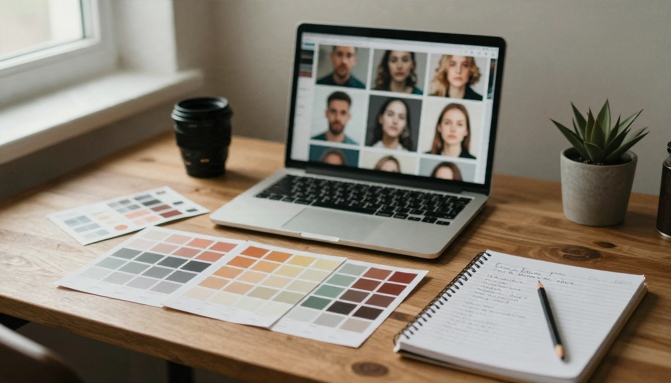
A style brief is a short written document that defines how every image in your project should look. Think of it as the mood board you would hand to a photographer before a shoot. You write it once, then paste parts of it into every prompt.
The five locks
Most visual style comes down to five things. Lock these and the rest tends to follow.
| Lock | What it controls | Example wording |
|---|
| Light | Direction, softness, time of day | "soft window light from the left, late afternoon" |
| Color | Palette and grade | "warm amber highlights, muted teal shadows" |
| Lens | Perspective and depth of field | "50mm f/2.0, shallow depth of field" |
| Texture | Grain, surface detail, finish | "fine film grain, visible skin pores" |
| Mood | Emotional tone | "quiet, intimate, unhurried" |
A reusable style block
Turn the five locks into one paragraph and keep it identical across prompts. Here is a block that produces a warm, film-like look:
"Natural window light from the left, warm amber highlights with soft teal shadows, 50mm lens at f/2.0, shallow depth of field, fine film grain, Kodak Portra 400 color palette, realistic textures, calm and intimate mood."
Save this as a text snippet. Every new prompt becomes [subject and action] + [setting] + [style block]. Only the first two parts change.
Write down what to avoid
A negative list matters just as much. If your look is soft and natural, write down the opposites: harsh flash, oversaturated colors, plastic skin, glowing effects, heavy vignetting. Models that support negative prompts accept this directly. For models that do not, phrase it positively instead: "natural, matte skin texture" rather than "no plastic skin".

Prompts That Hold a Look
With a brief in hand, the prompt itself becomes simple. The trick is structure. When the style part never moves, the model has far less room to wander.
Split subject from style
Keep two separate pieces in your notes. The subject piece changes per image: who, doing what, where. The style piece stays frozen. Putting the style block at the end of every prompt, in the same order and wording, gives remarkably steady results across models.
Sample prompt templates
Here are three templates built on the warm film block above. Swap the subject and keep the rest.
Portrait:
"A woman in her thirties with a copper bob haircut, wearing a linen shirt, sitting on a wooden stool in a bright studio, looking slightly off camera. Natural window light from the left, warm amber highlights, soft teal shadows, 85mm lens at f/1.8, fine film grain, Kodak Portra 400 palette."
Street scene:
"A quiet cobblestone street at golden hour, a cyclist passing a bakery with a striped awning, steam rising from a ventilation grate. Natural light from the left, warm amber highlights, soft teal shadows, 35mm lens at f/2.8, fine film grain, Kodak Portra 400 palette."
Still life:
"A ceramic bowl of ripe peaches on a worn oak table beside a folded linen napkin. Natural window light from the left, warm amber highlights, soft teal shadows, 60mm macro lens at f/2.8, fine film grain, Kodak Portra 400 palette."
Three very different subjects, one visible look.
Words that cause drift
| Risky word | Why it fails | Better replacement |
|---|
| "stunning" | Pure opinion, no visual meaning | Name the light and lens |
| "cinematic" | Can mean letterbox, teal and orange, or anamorphic flare | "anamorphic 40mm, soft contrast" |
| "artistic" | Invites random painterly styles | "documentary photograph" |
| "vibrant" | Pushes saturation unpredictably | "muted earthy palette" |
| "professional" | Triggers stock photo gloss | "editorial, natural, unretouched" |
💡 Tip: reorder nothing. Models weigh early words more heavily, so a prompt whose style block sits in a different position each time will behave differently each time.
Settings That Keep Output Stable
Prompts do most of the work, but settings close the gaps. A photographer keeps the same camera body, same film stock and same exposure between shots in a series. Your generation settings play the same role.
| Setting | What to do | Why it helps |
|---|
| Model and version | Use one model for the whole series | Each model has its own built in look |
| Seed | Fix it while testing, change it deliberately later | Keeps composition and noise pattern steady |
| Aspect ratio | Pick one and stay with it | Framing changes how the model composes light and subject |
| Resolution | Keep it identical across images | Different sizes can shift detail and texture |
| Guidance or prompt strength | Note the value that works and reuse it | Higher values follow wording more literally |
| Steps | Keep constant | Changes the level of finish and sharpness |
Seed and model version
Updating a model mid project is the quiet killer of consistency. A new version can shift skin tone, grain and contrast even with an identical prompt. Pick a model, finish the series with it, and only switch between projects. When a seed is available, fix it for the first few tests so you can see exactly what each prompt change does. Then vary it to get new compositions while the style block holds the look.
Aspect ratio and resolution
Ratio affects more than cropping. A tall 9:16 portrait and a wide 16:9 landscape from the same prompt can feel like different shoots, because the model arranges light and background differently. Choose a master ratio for the series. If you need other sizes later, generate in the master ratio and crop or extend afterward.
Keep a settings log
A plain note works: model, version, ratio, seed range, guidance value and the style block. When you return to a project three weeks later, you can pick up with no guesswork.
Reference Images and LoRAs
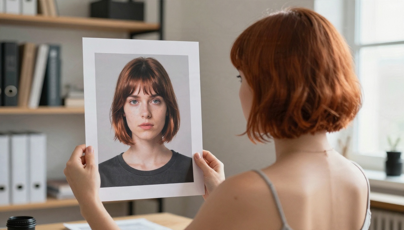
Text alone only goes so far. When you need the same face, outfit or exact color grade across many frames, show the model what you mean.
Reference image editing
Editing style models take an existing image and change it under instruction while keeping the rest intact. Nano Banana and Nano Banana Pro can generate and edit images, which makes them handy for putting the same subject into new scenes. Flux Kontext Fast is built for quick photo edits, such as changing the setting or lighting while preserving the person and overall look.
A reliable routine looks like this:
- Generate one hero image that nails the style.
- Use it as the reference for every following image.
- Describe only what changes: "same woman, same jacket, now standing in a train station at dusk".
- Repeat the style block so the grade stays locked.
Keeping a character recognizable
Faces are the first thing viewers notice when something shifts. Describe fixed traits in the same words every time: "copper bob haircut, freckles across the nose, small gold hoop earrings, olive linen shirt". Treat that line as part of the style block. Pair it with a reference image whenever the model allows it, and the same fictional person will show up across scenes.
Train a LoRA for a signature look
When you want a style that survives any subject, a LoRA is the strongest tool. A LoRA is a small add on trained on a set of your own images, usually 15 to 40, that teaches a model your look. Flux 2 Klein 9B Base LoRA and Flux 2 Klein 4B Base LoRA are made for styled generation with LoRA weights. If you want to train your own, Qwen Image LoRA Trainer Legacy is built for training a custom style.
Good training sets share three traits:
- Variety of subjects, so the model learns the look and not the objects
- One consistent grade and light, so the style is clear
- Clean, sharp images without watermarks or heavy compression
For finer structural control, such as pose or edges, SDXL Multi Controlnet LoRA layers ControlNet guidance on top of style weights.
You do not need a paid stack to test any of this. PicassoIA gathers many image models in one place, and several are listed as free to try. Check each page for current limits, since availability changes.
| Model | Best for | Consistency tip |
|---|
| Seedream 4.5 | Sharp, high resolution photographic scenes | Reuse one style block and one ratio |
| Seedream 5 Pro | Crisp 2K output with clean detail | Lock resolution across the series |
| Nano Banana Pro | 4K images and reference based edits | Feed in your hero image each time |
| Imagen 4 | Natural photorealism | Spell out light and lens in every prompt |
| Qwen Image 3 Pro | Photorealistic portraits and scenes | Keep character traits in identical wording |
| Ideogram v4 Quality | Photorealism with precise prompt following | Short, specific prompts hold up well |
| Flux Kontext Fast | Fast edits that keep the subject | Change one thing per edit |
Pick one model per project
It is tempting to hop between models for each shot. Resist it. Even two excellent models will render skin, grain and contrast differently. Choose one for the series, run the same style block through it, and compare results only between projects.
Test with a three image set
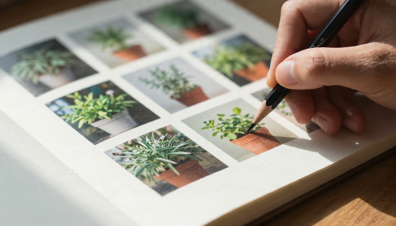
Before committing, generate three images with very different subjects: a portrait, a landscape and an object. Lay them side by side. If they feel like they belong together, your block and model are working. If one looks off, adjust the lock that feels loosest, usually light or color.
Real Examples of One Style
Theory is easy. Here is what one style looks like across different jobs.
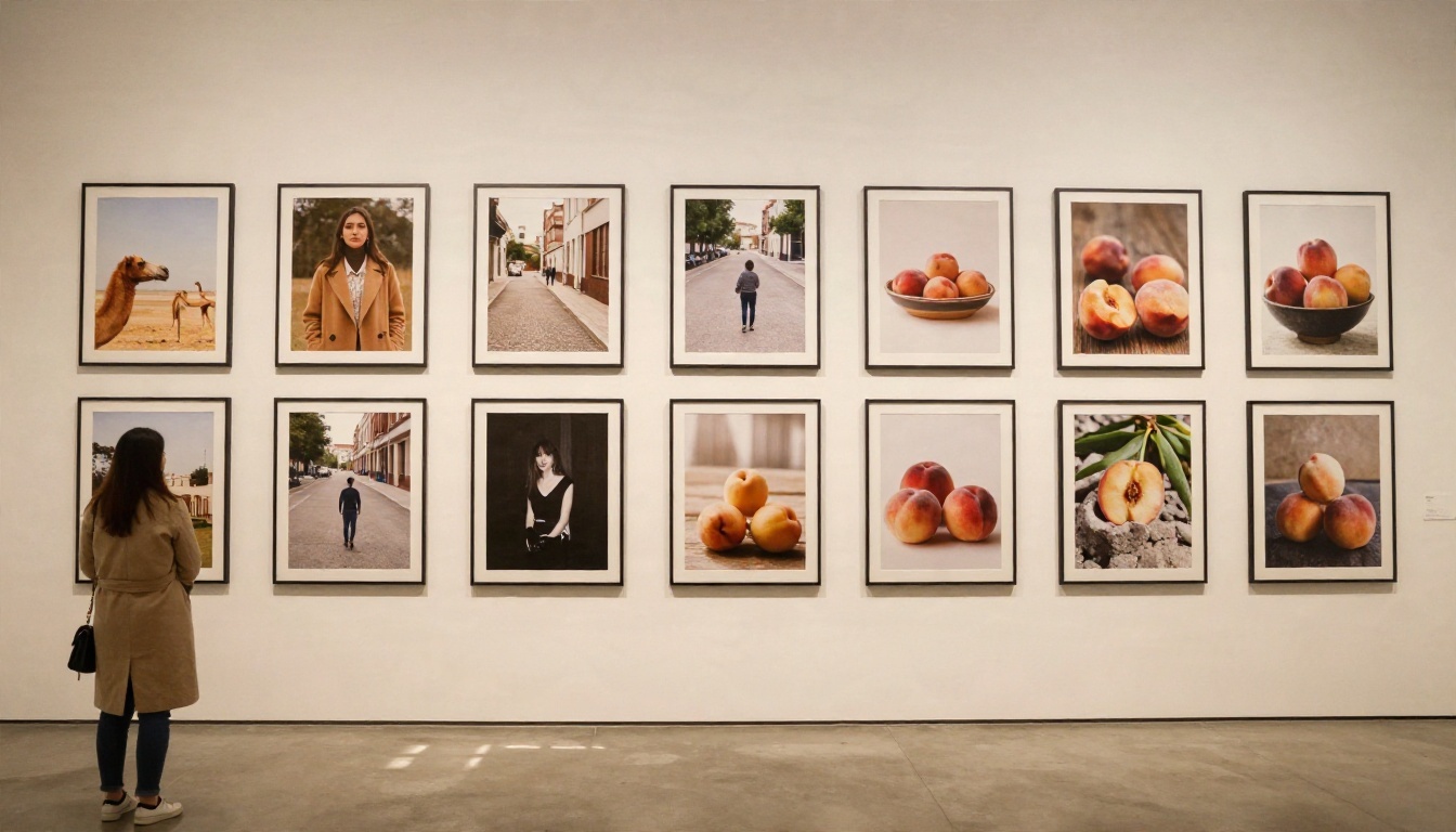
Example: a gallery wall series
Imagine nine photographs for a wall: a woman in a camel coat, an empty street, a bowl of peaches, a staircase, a hand holding a cup, a window with rain, a bicycle, a field, a doorway. Nine unrelated subjects, yet they hang together because each carries the same warm muted grade, the same soft light and the same grain. That is the power of the style block: the subjects vary, the look does not.
Example: a brand image set
A small coffee brand wants ten social images. The brief says: morning light from a window on the left, cream and terracotta palette, 50mm lens, matte textures, calm mood. Each prompt changes only the subject: a pour over kettle, a hand holding a paper cup, a pastry on linen, a corner of the shop. Because light direction and palette never change, the grid on the brand feed looks planned, not scraped together.
Example: a character across scenes
For a short story, you need one heroine in five scenes: a train platform, a kitchen, a rooftop, a market, a library. Generate a hero portrait first. Then use a reference based model and say only what changes. Repeat the fixed trait line, "copper bob haircut, freckles, olive linen shirt", in every prompt. The face, hair and outfit carry from scene to scene while the background changes.
💡 Tip: change one variable at a time. If you change the subject, the location and the lighting in one go, you will never know which one broke the look.
A Repeatable Workflow
Here is a process you can run for any project, from a five image set to a fifty image catalog.
- Write the brief. Fill in the five locks: light, color, lens, texture, mood.
- Create the style block. One paragraph, saved as a snippet.
- Pick one model. Note its name and version.
- Generate a hero image. Try several seeds, choose the best, and save the seed.
- Test three different subjects. Check that they feel like one set.
- Lock the settings. Ratio, resolution, guidance and steps go into your log.
- Produce the series. Change only the subject part of each prompt.
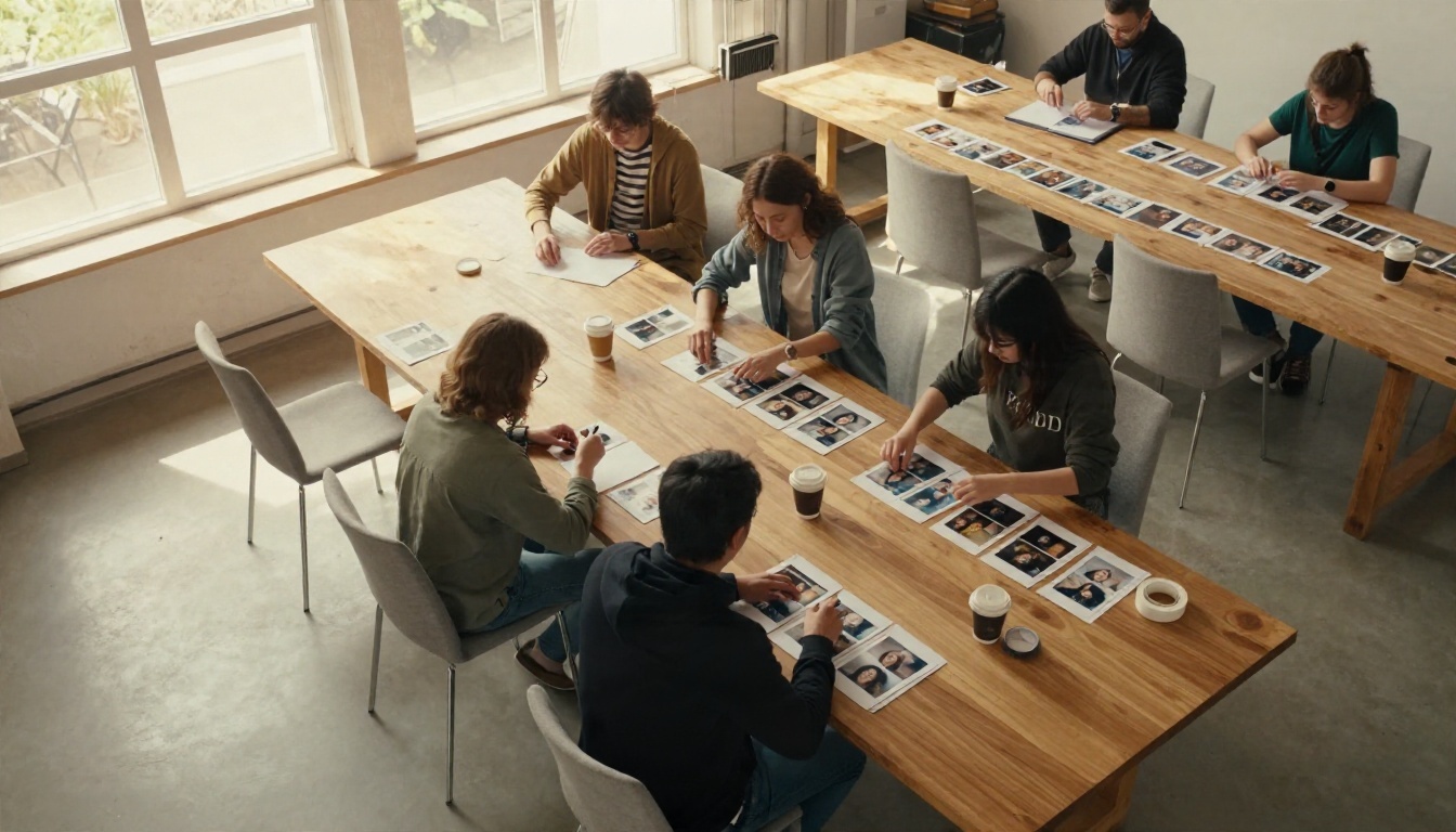
- Review in a grid. Place everything side by side and flag any outlier.
- Fix outliers. Regenerate with the same block or edit the image with a reference.
Quick audit checklist
Before you publish a set, run through these questions:
- Does the light come from the same direction in every image?
- Do the highlights and shadows share the same color cast?
- Is the grain or texture level similar across frames?
- Do the characters keep their hair, face and clothing details?
- Are all images the same ratio and resolution?
- Would a stranger think one person made this set?
If you answer no to any of these, find the lock that slipped and fix that one thing.
Common mistakes to avoid
- Rewriting the style each time. Small wording changes add up to big visual changes.
- Switching models midway. Each model has its own look.
- Leaving the seed random during testing. You cannot compare changes when everything moves.
- Piling on style words. A long list of adjectives often pulls the model in several directions. Five clear locks beat twenty vague words.
- Skipping the grid review. Single images always look fine. Problems only show in a group.
Try Your Own Series
Consistency is a skill you build by repeating a small routine, and the fastest way to see it work is to run it yourself. Pick a look you love, write the five locks, save your style block and generate three images on very different subjects. Put them side by side and judge honestly.
Open Picasso IA and try the same block across a few models, then keep the one that fits your taste. Start with Seedream 4.5 for sharp photographic scenes, or Nano Banana Pro when you want to feed in a reference image. Build your first set of six, review it as a grid, and tweak one lock at a time. Within a few rounds, your images will stop looking like random draws and start looking like your own signature.