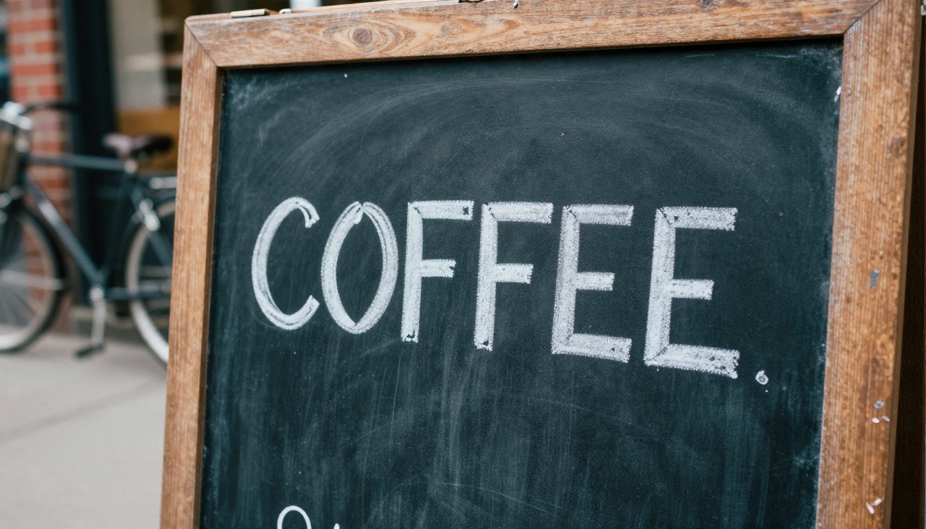
You typed "open" on a poster prompt and got "OPPEN". Or "coffee" came back as "COFEE". Misspelled words are the fastest way to ruin an otherwise perfect AI image, and they are the reason people keep comparing Google's Nano Banana with Ideogram. One is a general image model from Google with strong editing skills. The other was built around typography from day one. This article puts them side by side, shows what the free limits look like in practice, hands you prompts you can paste right now, and lists alternatives that are ready to use today.
What Google Banana Ideogram Really Means
Nobody ships a product called "Google Banana Ideogram". The phrase is a search shortcut. People type it when they want to know which of two tools, Nano Banana (Google's image model, often called "Google Banana") or Ideogram, handles words inside pictures better, and how much they can use for free.
Search intent here is a mix of informational and transactional. Readers want a verdict, but they also want to start generating within five minutes. So the sections below follow that order: the difference, the text test, the limits, the prompts, then the practical steps.
Nano Banana in plain terms
Nano Banana is Google's image generation and editing model. It became popular because it can take an existing photo and change one thing in it while keeping faces, lighting and composition stable. Text rendering is a bonus rather than the headline feature, though newer versions such as Nano Banana Pro and Nano Banana 2 Lite push it much further than the first release did.
Ideogram in plain terms
Ideogram started as a text-first model. Its whole reputation rests on spelling things correctly in logos, posters, packaging and social graphics. The current line includes Ideogram v4 Quality and Ideogram v4 Balanced, plus the faster Ideogram v3 Turbo. If you want an efficient option, P Image Ideogram is worth a look as well.
💡 Quick rule of thumb: If the picture is the star and the text is a detail, start with Nano Banana. If the text is the star, start with Ideogram.
Text in Images: Who Wins
Comparisons published through 2026 broadly agree on one thing: Ideogram is usually rated ahead on clean Latin lettering, while Nano Banana Pro is strong on multilingual text and high resolution output. They disagree on how big the gap is, and that depends heavily on the task. So instead of picking a universal winner, split the test by job.
Short headlines and logos
For one to four words, such as a shop sign, a button label or a logo mark, both models do well, and Ideogram tends to be the more consistent of the two. It rarely swaps letters, and it handles spacing and kerning with a designer's eye. Nano Banana gets there too, but you may need a second try more often.
Posters, packaging, and small print
Here the gap shows. A poster with a headline, a subhead and a date line gives the model three separate text jobs. Ideogram usually keeps all three readable. Nano Banana can nail the headline and then blur the smaller line. The more words you add, the more likely a model is to invent a letter, which is why small print is the real stress test.
Languages beyond English
Nano Banana Pro has the edge when you need non-Latin scripts or a mix of languages in one image, because it draws on Google's broad language training. Ideogram is strongest in English and closely related alphabets. If your campaign runs in Arabic, Hindi or Japanese, test Nano Banana Pro first.
| Task | Better starting point | Why |
|---|
| Logo or single word | Ideogram | Consistent spelling and spacing |
| Poster with 3+ text blocks | Ideogram | Holds small lines readable |
| Photo edit with a sign inside | Nano Banana | Keeps the scene intact |
| Non-Latin scripts | Nano Banana Pro | Broader language coverage |
| Fast drafts and iteration | Nano Banana 2 Lite or Ideogram v3 Turbo | Speed over polish |
| Final print-quality lettering | Ideogram v4 Quality | Highest text fidelity in the family |
Free Limits Without the Guesswork
This is the part of every comparison that goes stale quickly. Free tiers tighten without announcement, and third-party sources contradict each other. One site says you get roughly 100 images a day, another says 2. Treat any exact number you read, including in this article, as a snapshot rather than a promise.
Nano Banana free access
Google publishes usage tiers inside its own apps, and they refresh on a rolling window with a weekly ceiling rather than a clean daily count. The base Nano Banana model has historically been the most generous. The Pro version, which produces sharper text and higher resolution, usually gets a much smaller free allowance. Plan for that: draft with the lighter model, then spend your limited Pro generations on the final version.
Ideogram free access
Ideogram's own free plan is small. Reports range from a handful of images per day to a few slow credits per week, and the plan has changed more than once. It is fine for testing a single logo idea, and not much more. If you plan to iterate on lettering, you will burn through it quickly, because text work almost always needs several attempts.
Why caps keep changing
Image models cost real money to run, and text-heavy images tend to take more retries. Vendors adjust free allowances based on demand, new releases and competitor moves. That is why the practical advice is boring but reliable: check the current limit inside the tool before you plan a project around it, and keep a second tool in reserve.
💡 Budget tip: Write your prompt once, test it on a fast model, and only then run it on a quality model. Every wasted generation on a premium model is a wasted free credit.
Prompts That Spell Words Correctly
Both models respond to the same basic habits. Clean prompts beat clever ones.
The quote rule
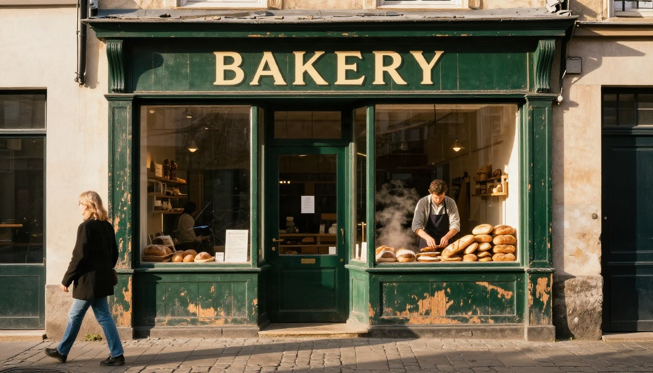
Put the exact words you want inside quotation marks. Without quotes, the model treats your words as a vague idea. With quotes, it treats them as a string to copy. Add the word "text" or "lettering" once so the intent is unmistakable, for example: a wooden shop sign with the lettering "BAKERY".
Layout and font words
Describe where the text sits and what it looks like. Useful phrases include "centered bold sans-serif headline", "small serif subtitle below", "white chalk lettering on black slate" and "embossed on matte paper". Position words matter more than adjectives. "Top left", "centered" and "along the bottom edge" give the model a layout to follow.
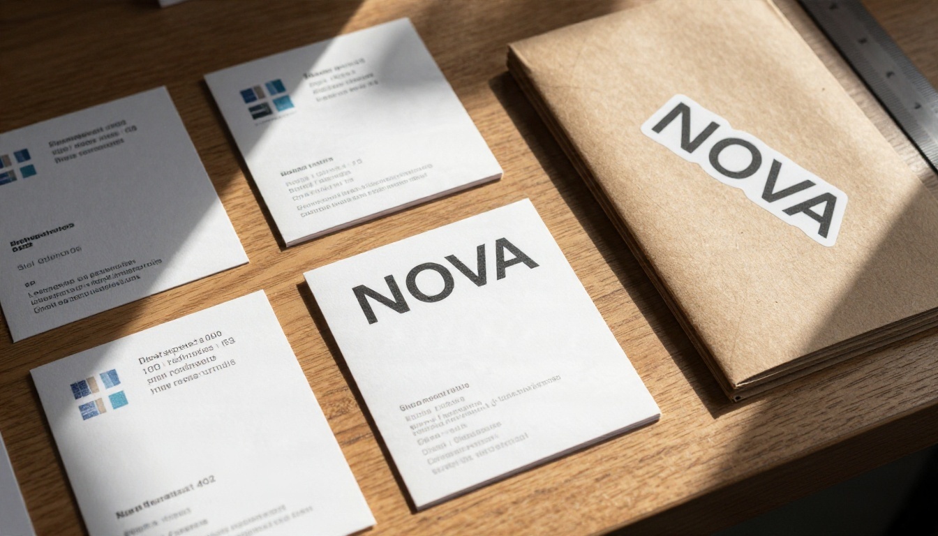
Three prompts to copy
1. Signage (works on both models):
Photograph of a hand-painted wooden shop sign above a bakery door, the lettering "BAKERY" in cream capital letters on dark green, golden hour light, 35mm lens, weathered wood grain.
2. Poster (try Ideogram first):
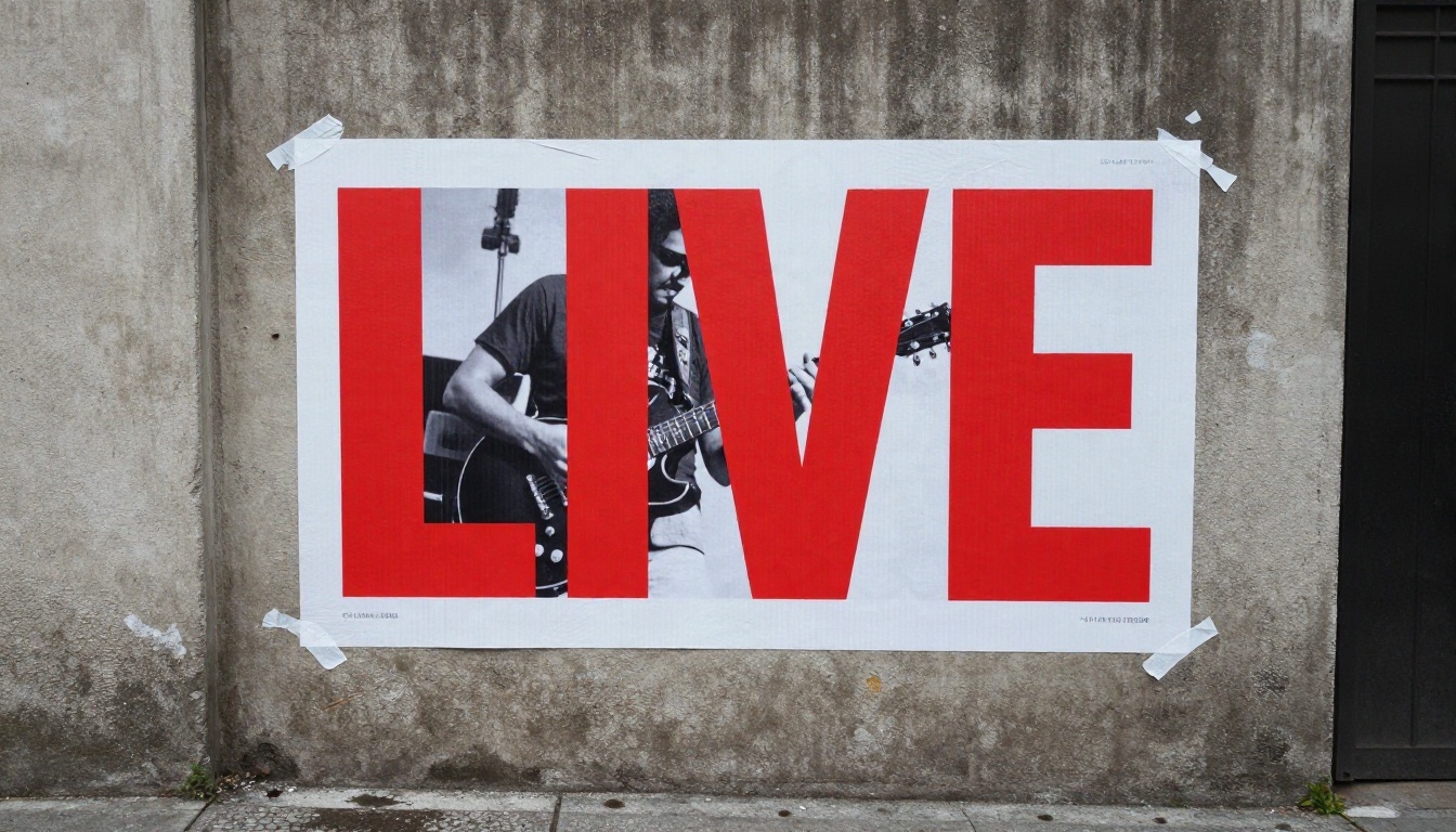
Concert poster on a concrete wall, large headline "LIVE" in bold red condensed letters, black and white photo of a guitarist below, small line "FRIDAY NIGHT" at the bottom, peeling paper edges.
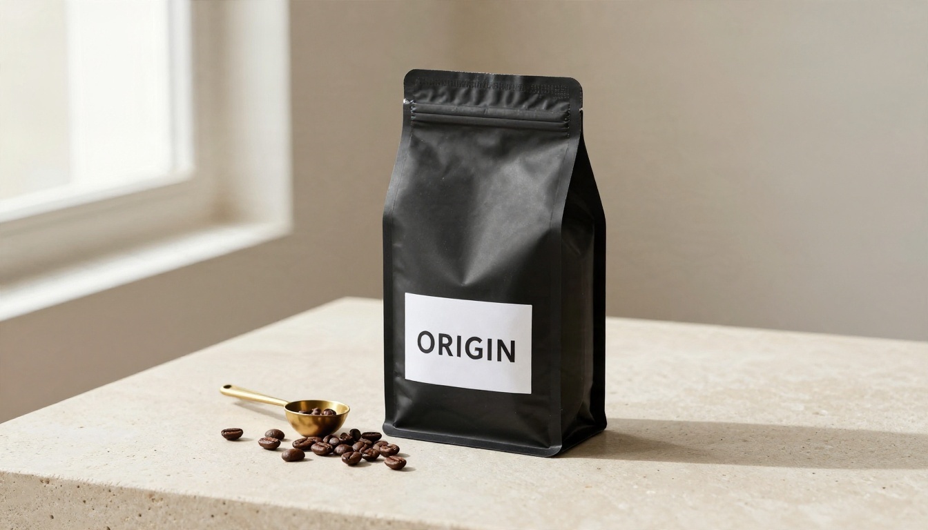
3. Packaging (strong on both):
Matte black coffee bag on a stone countertop, clean white label with the word "ORIGIN" centered, beans scattered in front, soft window light from the left.
💡 Keep it short: Fewer words in the image means fewer chances for a typo. One headline plus one short line usually beats a full paragraph.
How to Use Nano Banana on PicassoIA
Nano Banana is available on PicassoIA, so you can test the Google side of this comparison without juggling separate apps. The same applies to the Ideogram family, which makes side by side testing simple.
Step by step
- Open the Nano Banana page and sign in.
- Paste your prompt into the text box. Put the exact words you want in quotation marks.
- Choose a 16:9 or 1:1 aspect ratio depending on whether you are making a banner or a social post.
- Generate, then zoom in on every letter before you judge the result.
- If one word is wrong, do not start over. Use the model's editing ability: upload the result and ask it to change only that word.
- Run the same prompt on Ideogram v4 Balanced and compare.

Settings worth changing
- Model choice: Use Nano Banana 2 Lite for rapid drafts, then switch to Nano Banana Pro for the final render.
- Aspect ratio: Match the final use. Cropping later can cut through lettering.
- Prompt length: Keep the text part under one sentence, and describe the scene around it separately.
- Iteration: Change one thing per attempt so you know what fixed the problem.
Common Text Mistakes and Fixes
Even good models slip. Most failures fall into a few patterns, and each has a quick fix.
Doubled or swapped letters
Words like "coffee", "letter" and "balloon" tempt models into dropping or adding a letter. Fix it by putting the word in quotes, in capitals, and by spelling it exactly once in the prompt. Repeating it in different forms confuses the model.
Tiny text turning to gibberish
If a line is small in the frame, the model has few pixels to draw it with. Either make the text larger in the layout, or leave small print out and add it later in a design tool. This rule applies to both Nano Banana and Ideogram.
Wrong font mood
If the lettering looks cheerful when you wanted serious, name the style directly: "condensed industrial sans", "elegant high-contrast serif" or "handwritten brush script". One style term is plenty.
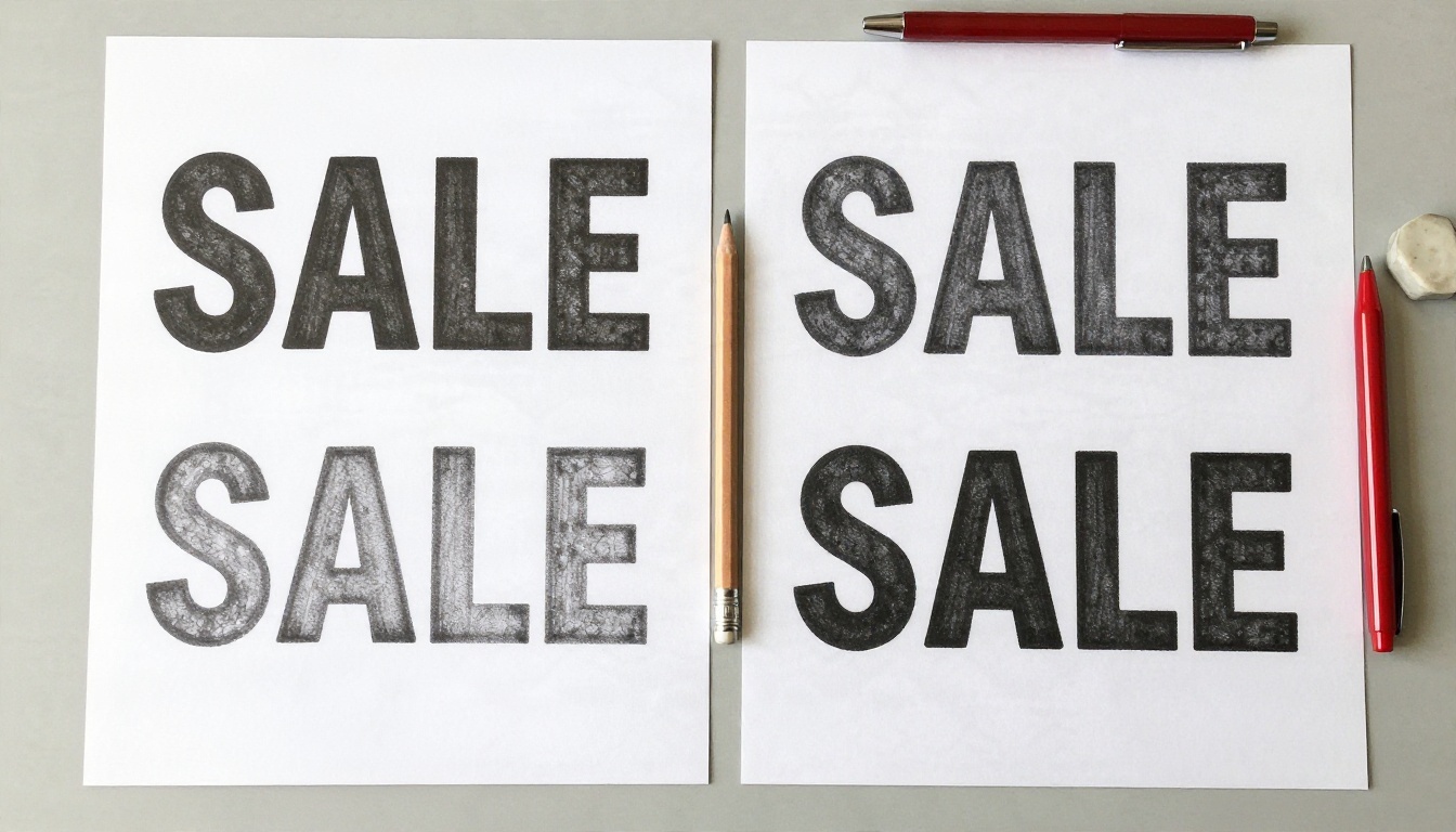
💡 Proof it like a designer: Read the image letter by letter, right to left. Your eye autocorrects words when you read normally and misses errors.
Alternatives Worth Trying
If you hit a free limit, or one model keeps failing on a specific word, switch tools. These are all on PicassoIA and handle text well.
| Model | Best for | Link |
|---|
| Ideogram v4 Quality | Print-grade lettering | Open |
| Ideogram v3 Turbo | Fast text drafts | Open |
| GPT Image 2 | Layouts with several text blocks | Open |
| Seedream 4.5 | Sharp 4K photographic scenes with signage | Open |
| Seedream 5 Pro | Clean 2K images and quick iteration | Open |
GPT Image 2 is a good fallback when your design has a headline, a subhead and a call to action. Seedream 4.5 shines when the text lives inside a realistic photograph, like a sign on a building. And when you want to experiment with styled outputs, Flux 2 Klein 9B Base LoRA gives you another look to compare.
A simple testing routine
Run the same prompt on three models, change nothing else, and keep the best one. This takes about ten minutes and saves hours of guessing. A small team can even split the work: one person tests Ideogram, another tests Nano Banana, and a third tests a fallback, then everyone reviews the outputs together.

Which One Should You Pick
Pick Ideogram when words are the point: logos, posters, menus, book covers and social graphics. Pick Nano Banana when you are editing an existing photo, keeping a character consistent, or working in several languages. Keep a third option from the alternatives table for the day a free allowance runs out in the middle of a deadline.
The honest answer is that most people end up using both. Draft with whichever tool gives you the most free attempts, then finish the final version with the one that spells your words best.
Try It Yourself on PicassoIA
The fastest way to settle this debate is to run your own words through both models. Take one of the prompts above, swap in your brand name or headline, and generate it on Nano Banana, then on Ideogram v4 Balanced. Compare the lettering side by side and keep the winner.
Ready to make your own? Head to PicassoIA, pick a model, paste a prompt with your text in quotes, and see how quickly a clean sign, poster or label comes out. Experiment with a few variations, and you will find your own favorite combination in an afternoon.


