You just registered the business name, printed nothing, posted nothing, and the first question from every supplier, customer and printer is the same: "Do you have a logo?" For a small brand, that question can stall a launch for weeks. A freelance designer quotes a few hundred dollars and two rounds of revisions. A template site hands you the same icon that three other shops down the road already use. This is where a logo sourcing tool earns its place: a free online AI logo maker that lets you generate dozens of directions in minutes, compare them side by side, and pick one with confidence.
This article walks through how that process works in practice, which models on PicassoIA suit which kind of logo, how to write prompts that produce usable marks, and the mistakes that make a homemade logo look cheap.

The word "sourcing" matters. A traditional logo project starts with a designer's blank page. Sourcing flips that: you collect many candidate marks quickly, then select, refine and commit. An AI logo maker is the fastest way to build that candidate pool, because each generation takes seconds and costs nothing on a free tier.
Sourcing versus designing
Designing is slow and personal. Sourcing is closer to shopping: you set criteria, browse a large range of options, and reject most of them. That shift is useful for a small brand because your time is the scarce resource, not your imagination. You already know your product, your customers and your tone. What you lack is a quick way to see those ideas drawn.
Who benefits most
- Side hustles and first-time founders who need something presentable for an Instagram profile and a business card.
- Local shops and food businesses that need a mark readable on a sign, a cup and a paper bag.
- Freelancers who want a monogram or wordmark for invoices and proposals.
- Market sellers whose logo has to work at the size of a small sticker or label.
💡 Tip: If you will print your logo in more than one place (a sign, a label, a stamp), you are sourcing a system, not a picture. Keep that in mind from the very first prompt.
Why Small Brands Start with Free AI
The real cost of a logo
A custom identity from an agency can run into the thousands. Even a modest freelance logo often costs several hundred dollars before you pay for extra file formats. Marketplace contests sound cheap, but you spend hours reading entries and writing feedback. For a business that has not made its first sale, that is a heavy bet on a graphic.
A free online AI logo maker removes the bet. You can generate fifty ideas, throw away forty-eight, and still have spent nothing but an afternoon.
Speed changes the process
When each draft takes ten seconds, you stop treating the first idea as precious. You try a leaf, then a sun, then a monogram, then a stamp-style badge. That freedom to try is the real advantage. It also gives you evidence: you can show five options to friends, regulars or a business partner and watch which one they point at.
| Route | Typical cost | Time to first draft | Options you see |
|---|
| Agency | High | Weeks | 2 to 3 |
| Freelance designer | Medium | Days | 2 to 4 |
| Template site | Low | Minutes | Many, but shared with others |
| AI logo maker | Free to low | Seconds | Unlimited, unique |
What a Good Free Logo Maker Needs
Not every generator is a good logo tool. A pretty illustration is not the same thing as a logo. Check the tool against four requirements before you commit to it.
Clean, simple shapes
A logo has to survive being tiny. If the mark relies on gradients, fine hairlines or a dozen colours, it will turn to mush on a 2 cm sticker. Look for tools that produce flat colours and bold shapes.
Vector output
Vector files (SVG) scale from a favicon to a shop sign without losing sharpness. Raster files (PNG, JPG) blur when enlarged. If your generator can output vector art directly, that saves a trace-and-fix step later. Models such as Recraft v3 SVG and Recraft v4.1 Pro SVG are built for exactly this.
Readable text
A lot of small brands want their name inside the logo. That is where weaker generators fail: letters melt, swap places or invent extra characters. Pick a model with strong text rendering, and keep the name short.
Clear usage rights
Before you print 500 labels, check the terms of any tool you use for commercial use. Keep your prompts and the final files saved, so you can show where the logo came from.
Picking the Right Model on PicassoIA
PicassoIA gives you several models that handle logos well, each with a different strength. Here is a practical comparison.
For vector marks
If your logo is an icon, a badge or a simple symbol, start with a vector model. You get shapes you can recolour and resize in any editor, which matters when your printer asks for an SVG. Recraft v3 is also worth a try when you want a particular style, such as hand-drawn or flat.
For wordmarks and lettering
When the name is the logo, use Ideogram v4 Quality or Ideogram v4 Balanced. Both handle typography far better than general image models. Put the brand name in quotation marks in the prompt, and keep it under three words.
For testing the logo in context
Once you have a mark, you want to see it on a mug, a shop sign or a tote bag. Nano Banana Pro and Seedream 4.5 are strong for realistic scenes, so you can judge a logo in its natural habitat before spending money on print.
A Five Step Logo Workflow
This is the process that tends to work best for small brands. It takes one afternoon, and every step has a clear output.
Step 1: Write a short brand brief
Before you open any tool, answer five questions in a note:
- What do you sell, in one sentence?
- Who buys it?
- Which three adjectives describe the brand (warm, precise, playful)?
- Which two or three colours feel right?
- Where will the logo appear first (sign, label, social profile)?
That brief becomes the raw material for every prompt.
Step 2: Generate wide, not deep
Run at least twelve different directions, not twelve variations of one idea. Mix symbol only, symbol plus name, monogram, badge, and wordmark. Use a vector model for the first three and Ideogram for the last two.
Step 3: Shortlist with a squint test
Print your favourites small or shrink the screen preview, then squint. The marks that still read as a clear shape are your finalists. Delete anything that turns into a smudge. Aim for three finalists.
Step 4: Clean up the finalist
Pick one and refine it. Background removal is often the first job: a cutout tool such as Remove Background or Recraft Remove Background gives you a transparent PNG for stickers and websites. If you only have a raster file and need more pixels for print, run it through Clarity Pro Upscaler or Recraft Crisp Upscale.
Step 5: Save the full file set
Keep a small folder with the following:
- Colour logo on transparent background
- Single colour (black) version
- Single colour (white) version
- Square icon version for social profiles
- The prompt text you used
💡 Tip: Name files clearly, for example brand-logo-black.svg. Six months from now you will be glad you did when a printer asks for "the one colour version."
Prompts That Work for Small Brands
A good logo prompt is short, concrete and tells the model what to leave out. Compare these two:
- Weak: "A beautiful logo for my business."
- Strong: "Minimal flat vector logo of a wheat ear inside a circle, deep green on cream, bold simple shapes, no gradients, no shadows, no background texture."
The strong version names the subject, shape, colour, style and exclusions. That is the formula to repeat.
A reusable prompt formula
[Style] logo of [simple subject] in [shape or layout], [colour palette], [thickness or detail level], no gradients, no shadows, plain background
Examples by business type
| Business | Prompt idea |
|---|
| Bakery | Flat vector logo of a wheat ear inside a circle, deep green on cream, bold lines |
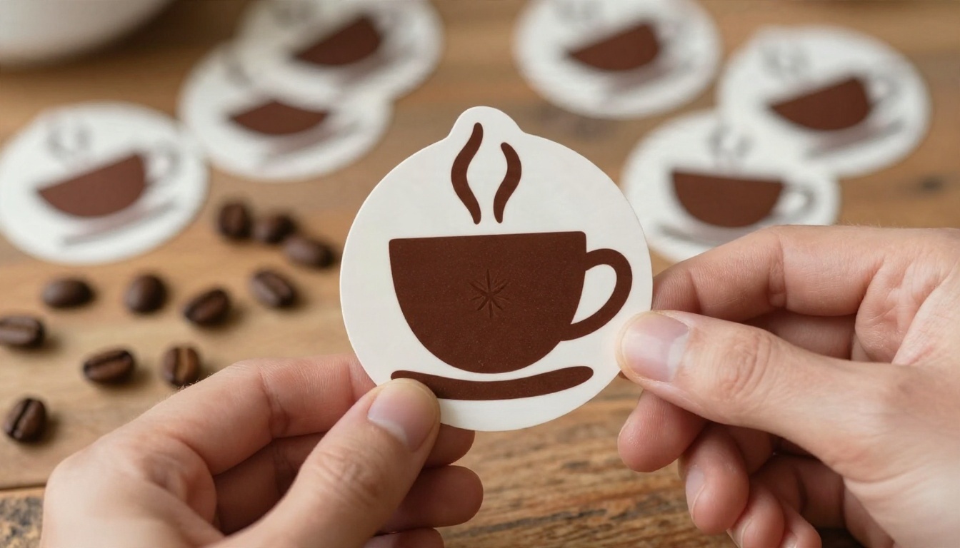
| Coffee roaster | Round badge logo with a coffee bean and a sun rising behind it, two colours, rust and cream |
| Candle maker | Minimal leaf mark above the word "EMBER" in a thin serif, black on white |
| Photographer | Monogram "JM" built from a camera lens ring, navy, geometric, flat |
| Food truck | Friendly sun logo, rounded shapes, cream and rust, readable at sign size |

Words that help, words that hurt
Helpful: minimal, flat, geometric, bold, monoline, badge, emblem, symmetrical.
Harmful: realistic, detailed, 3D, glossy, intricate, cinematic. Those words push the model toward illustration, and illustration rarely shrinks well.
Iterate with one change at a time
When you like a direction, change one thing per generation: the colour, the shape or the typeface. If you change three at once, you will not know which change helped.
Mistakes That Make Logos Look Cheap
Most homemade logos fail for the same handful of reasons. None of them are about artistic talent.
Too much detail
If your logo has more than three elements, remove one. If it still has more than three, remove another. Small brands live on stickers, stamps and thumbnails.
Too many colours
Two colours is a solid limit. Three is the ceiling. Every extra colour raises your printing cost and weakens recognition.
Trendy fonts that age fast
Fonts with exaggerated curves or distressed edges look current for a year and dated after two. A clean sans or a calm serif will still look fine when your shop turns five.
Copying a competitor too closely
When you pass a rival's logo through your prompt and ask for "something similar," you end up with a weak echo. Look at their colour and shape language, then deliberately go in another direction. A bakery in a sea of brown and gold logos can stand out with deep green and cream.
Skipping the real world test
A logo that looks sharp on a laptop can fall apart on kraft paper or a painted wall. Test before you commit.

Test Your Logo in Real Settings
Think of this as the final check before you place any print order. You want to see the mark in the places where customers will meet it.
Packaging and labels
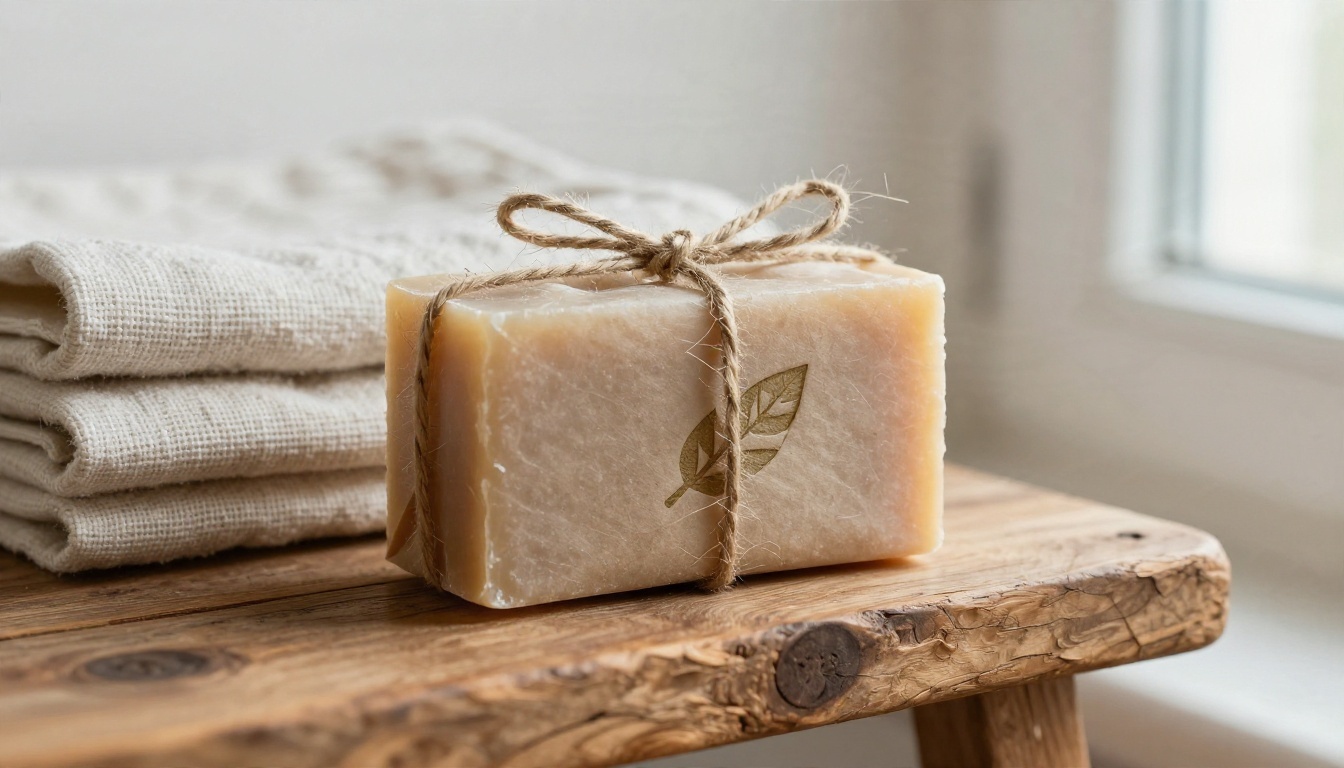
Place the logo on a label mockup at its real size. Check that the text stays readable and that the symbol does not collide with a barcode or an ingredient list. A small stamped mark on kraft paper looks warm and handmade, but only if the lines are bold enough to survive uneven ink.
Stationery and social profiles
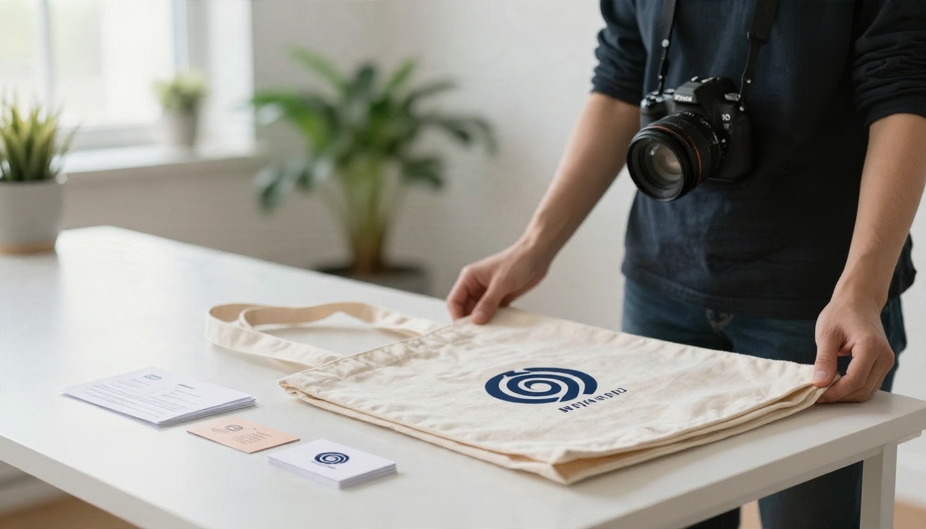
Business cards, invoices and a tote bag are a good set. A logo that works on all of them is probably robust. Also crop it into a circle, because most social platforms display profile pictures that way. If the symbol loses its meaning inside a circle, create a square icon variant.
Signs and vehicles
Outdoor use is the harshest test. Contrast matters most here: cream on rust or navy on white will carry across a street, while pale grey on beige will vanish. Look at your logo from several metres away, or shrink it on screen to a thumbnail, to simulate distance.
A quick checklist
- Does it read at 2 cm wide?
- Does it work in black and white?
- Does it look right inside a circle?
- Is the name spelled correctly, letter by letter?
- Would a stranger guess your industry, or at least not guess the wrong one?
💡 Tip: Show your three finalists to five people for three seconds each, then ask what they remember. The logo people can describe back to you is the one that sticks.
Make Your First Logo Today
You do not need a design degree or a big budget to get a logo that looks considered. You need a short brief, a handful of well written prompts, and the patience to reject most of what you generate. Start with a vector model like Recraft v3 SVG for symbols, switch to Ideogram v4 Quality when the name needs to be part of the mark, and use a realistic scene model to preview the result on a sign or a label.
Open Picasso IA, write your brand brief, and generate your first twelve directions this afternoon. You can browse every image, background removal and upscaling tool on picassoia.com/en/all-models, then test combinations until one mark feels like your business. The sooner you put options on the table, the sooner you can pick one and start printing.


