Most people who try Opus 4.7 for web design make the same mistake on day one: they type "build me a website" and then complain that the result looks generic. The model is not the problem. The brief is. Give it a vague request and you get a vague template. Give it a layout, a palette, a reader and a few hard constraints, and it produces pages that look like a designer spent an afternoon on them.
This article is about doing the second thing. You will find prompts you can paste today, examples of what good output looks like, a straight explanation of usage limits (the part that surprises people most), and the real free options for trying Opus 4.7 without a subscription.
💡 Quick answer: Opus 4.7 is strong at turning a written brief or a screenshot into clean HTML, CSS and responsive layouts. Its limits depend on where you use it, and free access exists mostly through credits and trial routes rather than a permanent free tier.
What Opus 4.7 Does for Web Design
Opus 4.7 is Anthropic's flagship reasoning model of its generation, and it sits behind Claude Design, the research-preview product that turns prompts into visual prototypes, landing pages and slide layouts. You can also reach it through chat and through Claude Opus 4.7 on PicassoIA, where it works as a plain text and vision model.
Where It Shines
The model is good at the boring parts of design that eat hours: spacing systems, type scales, grid structure, hover states, breakpoints and accessible color contrast. It also keeps a long brief in mind. If you tell it in message one that the brand is calm and editorial, message six still respects that.
Three strengths show up again and again:
- Layout logic. It builds sections in a sensible order: hero, proof, features, pricing, call to action.
- Vision input. Upload a screenshot or a photo of a paper sketch and it reads the structure.
- Code hygiene. Semantic HTML, CSS variables and tidy class names instead of tangled inline styles.
Where It Slips
It is not a replacement for a visual designer's taste. Without direction, it drifts toward the same safe blue buttons and rounded cards that every AI-built page uses. It can also invent image paths that do not exist, so plan to swap in real photos. And it does not see the rendered page unless you show it a screenshot, so layout bugs that only appear in the browser need a human to point them out.
Prompts That Produce Good Pages
A strong web design prompt answers six questions: who is the page for, what should they do, what is the mood, what are the sections, what are the technical limits, and what must never appear. Skip any of them and the model fills the gap with a default.
The Six-Part Brief
| Part | What to write | Example |
|---|
| Audience | Who lands on the page | Independent coffee roasters looking for a wholesale supplier |
| Goal | One action only | Request a sample box |
| Mood | Three adjectives and a reference | Warm, tactile, unhurried, like a printed menu |
| Sections | Ordered list | Hero, origin story, three products, testimonials, form |
| Constraints | Tech and size limits | Single HTML file, no frameworks, under 300 lines of CSS |
| Exclusions | What to avoid | No stock gradients, no emoji, no carousel |
Five Prompts to Copy
Paste these as written, then swap the bracketed parts for your own details.
1. Landing page from scratch
Build a single-file HTML and CSS landing page for [product] aimed at [audience]. One goal: [action]. Mood: [three adjectives]. Sections in this order: hero with one headline and one button, three benefits, a short proof section, pricing, final call to action. Use a cream and sage palette, a serif headline font and a clean sans body font. Mobile first, with breakpoints at 640px and 1024px. No carousels, no gradients, no emoji.
2. Portfolio for a creative
Design a portfolio homepage for a [profession] with large editorial typography and generous whitespace. Show six project tiles in an asymmetric grid, a short bio, and a contact link. Keep motion subtle: fade and lift on hover only. Explain your spacing scale in a comment at the top of the CSS.
3. Redesign from a screenshot
Here is a screenshot of my current homepage. Keep the content and the brand colors, but fix the hierarchy. Identify the three biggest layout problems first, then rewrite the page. Do not add new sections.
4. Design system first
Before writing any page, define a design system for [brand]: color tokens with contrast ratios, a type scale, an 8px spacing scale, button and form styles. Output it as CSS variables. I will ask for pages afterward.
5. Accessibility pass
Audit this HTML for accessibility: heading order, color contrast, focus states, alt text, form labels. List each issue with the line and a fix, then return the corrected code.
💡 Tip: Prompt 4 is the one that saves the most time. A design system defined once keeps every later page consistent, and it makes follow-up requests shorter.
Screenshot Prompts Work Better Than You Expect
Because the model reads images, a phone photo of a whiteboard sketch is a valid starting point. Add one sentence about what each box means ("this block is the hero, this strip is logos") and it will map the sketch to real sections. This is also the cheapest way to iterate: show, correct, repeat.
Real Examples Worth Studying
Examples teach faster than rules. Here are three pages of the kind Opus 4.7 builds well, and what made each brief work.
The Editorial Portfolio
A photographer asked for a portfolio with large type, a single accent color and no navigation clutter. The brief named the mood ("quiet gallery wall") and banned sliders. The result used a wide serif headline, a two-column project grid with uneven row heights, and a footer with one email link.
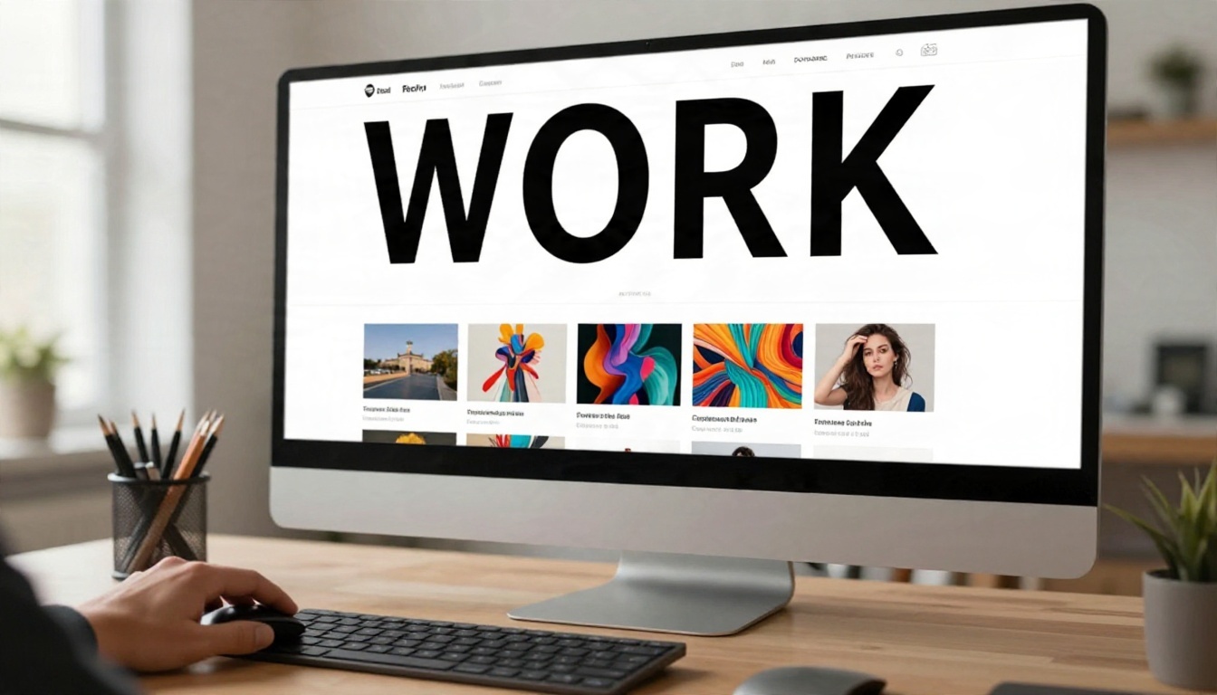
Why it worked: a mood reference plus a ban list. The model had less room to guess.
The Small Shop Homepage
A ceramics seller needed a store front page that felt handmade, not corporate. The prompt gave product categories, a short brand story and one rule: photos first, text second. The model produced a homepage with a full-width image hero, a three-up product row and a short story block.

Why it worked: the content was supplied up front. The model arranged real material instead of inventing filler.
The Responsive Rebuild
A freelancer pasted desktop and mobile screenshots of a client's page and asked for a rebuild with one codebase for both. The model proposed a fluid grid, a collapsing navigation and clamp-based type sizes that scale between phone and desktop.
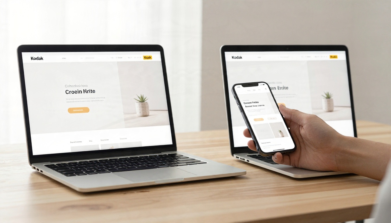
Why it worked: both viewports were shown, so the model designed for both from the start rather than patching mobile at the end.
Usage Limits in Plain Terms
This is the part that catches people. Limits for Opus 4.7 depend on the surface, and the numbers move over time, so treat what follows as a snapshot of what was reported at the time of writing rather than a promise.
Claude Design Has Its Own Allowance
Claude Design, the web design product built on Opus 4.7, was launched as a research preview and was reported as available on paid plans (Pro, Max, Team and Enterprise) rather than the free tier. Reports describe a weekly allowance that is separate from regular chat usage. That means you can run out of design time while chat still works, and the reverse.
Pro Users Run Out Quickly
Anecdotes from reviewers are blunt. Some Pro users say a few large prompts consumed most of their weekly design allowance, and one write-up described losing a big share of tokens within minutes of opening the tool. These are individual reports, not official figures, but the pattern is consistent: design generation is heavy, because every revision regenerates a lot of markup.
Opus Costs More Than Sonnet
Opus is the expensive tier. One comparison put an Opus 4.7 prompt at roughly twice the cost of a Sonnet 4.6 prompt. That gap is why many designers draft with a cheaper model and bring Opus in only when the layout logic gets hard.
| Task | Better fit | Reason |
|---|
| First layout from a blank brief | Opus 4.7 | Needs reasoning about structure |
| Changing a headline or color | Sonnet tier | Small edit, low cost |
| Accessibility audit | Opus 4.7 | Needs careful, multi-step checking |
| Copy tweaks and spacing nudges | Sonnet tier | Repetitive, cheap |
Ways to Stretch Your Allowance
- Batch your edits. Ten changes in one message cost less than ten separate messages.
- Refine in code. Reports say that editing in an IDE does not draw from the design allowance, so export early and finish there.
- Start with a design system. Shorter follow-ups, fewer regenerations.
- Use screenshots sparingly. Images add input tokens. Crop to the problem area.
- Draft cheaper, finish stronger. Use a lighter model for rough passes.
💡 Tip: Before a big prompt, write the whole brief in a notes app first. A clear single request almost always costs less than a vague one followed by five corrections.
Free Options for Trying Opus 4.7
There is no honest way to promise permanent free Opus 4.7. What exists is a handful of ways to try it at no cost for a limited time.
Starter API Credits
Anthropic has offered small starter credits to new API accounts, reported at around five dollars. For web design, that is enough for a handful of pages if you keep prompts tight and set a low output length. Check the current amount, since promotions change.
Cloud Trial Credits
Large cloud providers that host Claude models have offered new-customer credits, with one reported figure of 300 dollars valid for 90 days on Google Cloud. If you are comfortable with a cloud console, that is the most generous route, though it takes setup time and a billing method on file.
Be Careful With "Free" Sites
Many sites advertise unlimited free Opus 4.7. Treat those claims with suspicion. Some are limited daily trials, some are wrappers that route you to a different model, and some collect your prompts. If a page asks for unusual permissions or never names the exact model, close it.
Trying It on PicassoIA
Claude Opus 4.7 on PicassoIA runs in the browser with no installation, no API keys and no configuration, which makes it a quick way to test whether this model suits your design workflow before you commit to a subscription elsewhere.
How to Use Opus 4.7 on PicassoIA
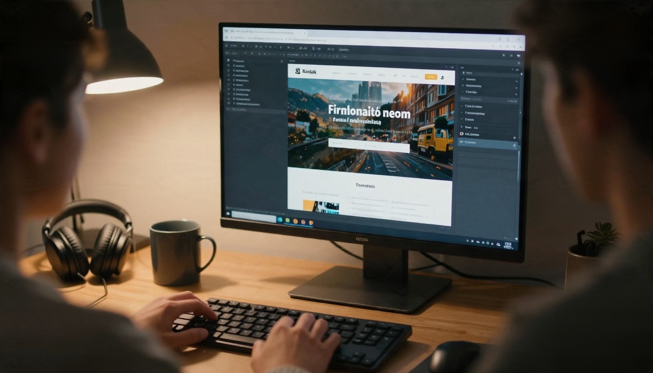
The model page works as a simple chat box with a few controls. Here is a clean workflow for a web page.
Step by Step
- Open the model page. Go to Claude Opus 4.7.
- Set a system prompt. Describe the role once: "You are a senior front-end designer. Output complete single-file HTML and CSS, mobile first, no external libraries."
- Write the six-part brief in the prompt field (audience, goal, mood, sections, constraints, exclusions).
- Upload a reference image if you have a sketch or screenshot. The image field is optional.
- Set the output length. The max tokens control goes up to 8,192, which is enough for a full single-file landing page.
- Run it, copy the code, save it as an HTML file and open it in your browser.
- Iterate with batched edits, pasting back only the section that needs to change.
Parameter Tips
| Setting | Recommended value | Why |
|---|
| Max Tokens | 8192 for full pages, 2048 for edits | Prevents cut-off code on long pages |
| System Prompt | Role plus output format | Keeps style consistent across turns |
| Max Image Resolution | Default is fine for sketches | Lower values save time and cost |
| Prompt length | 150 to 300 words | Enough detail without noise |
💡 Tip: If the code stops mid-file, reply with "continue from the last closing tag" rather than regenerating the whole page.
Pairing It With Other Models
No single model does everything well, and a mixed workflow is often cheaper and faster. If you want to compare outputs or lower your cost on small edits, try these on PicassoIA:

A practical split: draft the structure with Opus 4.7, polish copy with a Sonnet model, and ask a different family such as Gemini for a critique. Different models notice different problems, and that second look is often where a page goes from fine to good.
Common Mistakes to Avoid
Asking for everything at once. A prompt with twelve sections and four color schemes produces a muddled page. Build the hero first, then add sections.
Skipping real content. Lorem ipsum in, lorem ipsum out. Paste your actual headline, product names and prices.
Forgetting the exclusions. Models repeat popular patterns. If you do not want gradients, say so.
Trusting image paths. Placeholder photos will not load. Replace them with your own files before you publish.
Ignoring the browser. Open the page on a real phone. If something looks wrong, screenshot it and send the screenshot back with a one-line note.
Build Your First Page Today
You now have a brief template, five prompts, a sense of where the usage limits bite and a few free ways to test the model. The fastest way to find out whether Opus 4.7 fits your style is to run one real project through it: a portfolio, a small shop page, a landing page for a side project.
Open Claude Opus 4.7 on Picasso IA, paste the six-part brief, and see what comes back. Then compare it against another model from the full model library, and keep whichever gives you the cleanest first draft. Pages are cheap to try, and the second version is always better than the first.


