You type "modern flyer for my event" into an image generator, and what comes back looks a lot like the last five flyers you saw. Same pastel gradient. Same centered headline. Same glossy smile that belongs to nobody. When your AI flyers look the same as everyone else's, the tool is rarely the problem. The brief you hand it usually is.
This article shows where that sameness comes from and how to break it, one step at a time. You'll get prompt changes you can paste in today, layout rules, a color method, and a hands-on workflow with Ideogram v4 Quality on PicassoIA. Every fix is small. Stacked together, they give you a flyer that someone actually stops to read.
💡 Short answer: AI flyers look alike because vague prompts return the average of every flyer the model has seen. Give it a real subject, one clear focal point, a tight palette, and very little text, and the output stops looking generic.
Why AI Flyers All Look Alike
Walk past any notice board and count the near-twins. Soft gradient backgrounds. A rounded sans serif floating dead center. A smiling stock-style person with perfect teeth. A rectangular button that says "Join Us". None of it is wrong, and that is exactly the trouble: none of it is memorable either.
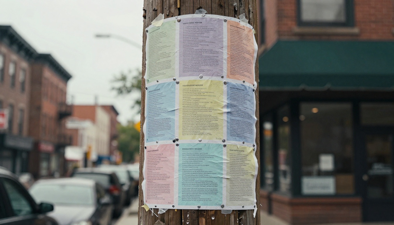
Sameness shows up at three levels. The subject is generic, the layout is symmetrical, and the finish is glossy and over-smoothed. Fix one and the flyer improves a little. Fix all three and it looks like a person with opinions designed it.
The Default Prompt Trap
Most people write a prompt the way they type a search. "Colorful flyer for a summer music festival." That sentence leaves every decision to the model, and the model answers each one with the safest option available: a centered composition, a balanced gradient, a smooth illustrated crowd, a friendly sans serif.
Two people typing nearly the same sentence get nearly the same flyer. That is the whole reason your feed feels repetitive, and why a local business can end up with a poster that looks like it belongs to a national chain it has never heard of.
Models Pull Toward the Average
Image models are trained on millions of examples, and the most common pattern in any pile of flyers is the middle of the pile. A short prompt lets the model settle into that middle. A specific prompt pushes it toward the edges, where the interesting work lives.
| Prompt style | What you wrote | What you tend to get |
|---|
| Vague | "Bright flyer for a bakery sale" | Pastel gradient, centered text, stock-style croissant |
| Specific | "Tight crop of flour-dusted hands holding a sourdough loaf, black and white, tomato red band across the lower third, left-aligned condensed headline" | A flyer with a clear point of view |
| Over-stuffed | Fifteen adjectives, six colors, four fonts | A muddy layout with no focal point |
Specific does not mean long. It means every sentence makes a decision the model would otherwise make for you.
Start With a Real Subject
The fastest way out of the generic look is to replace "a person smiling" with a person doing something particular, in a particular place. Photographs of specific moments carry texture that gradients can't fake, and viewers sense that difference even when they can't name it.
Photograph What You Actually Sell
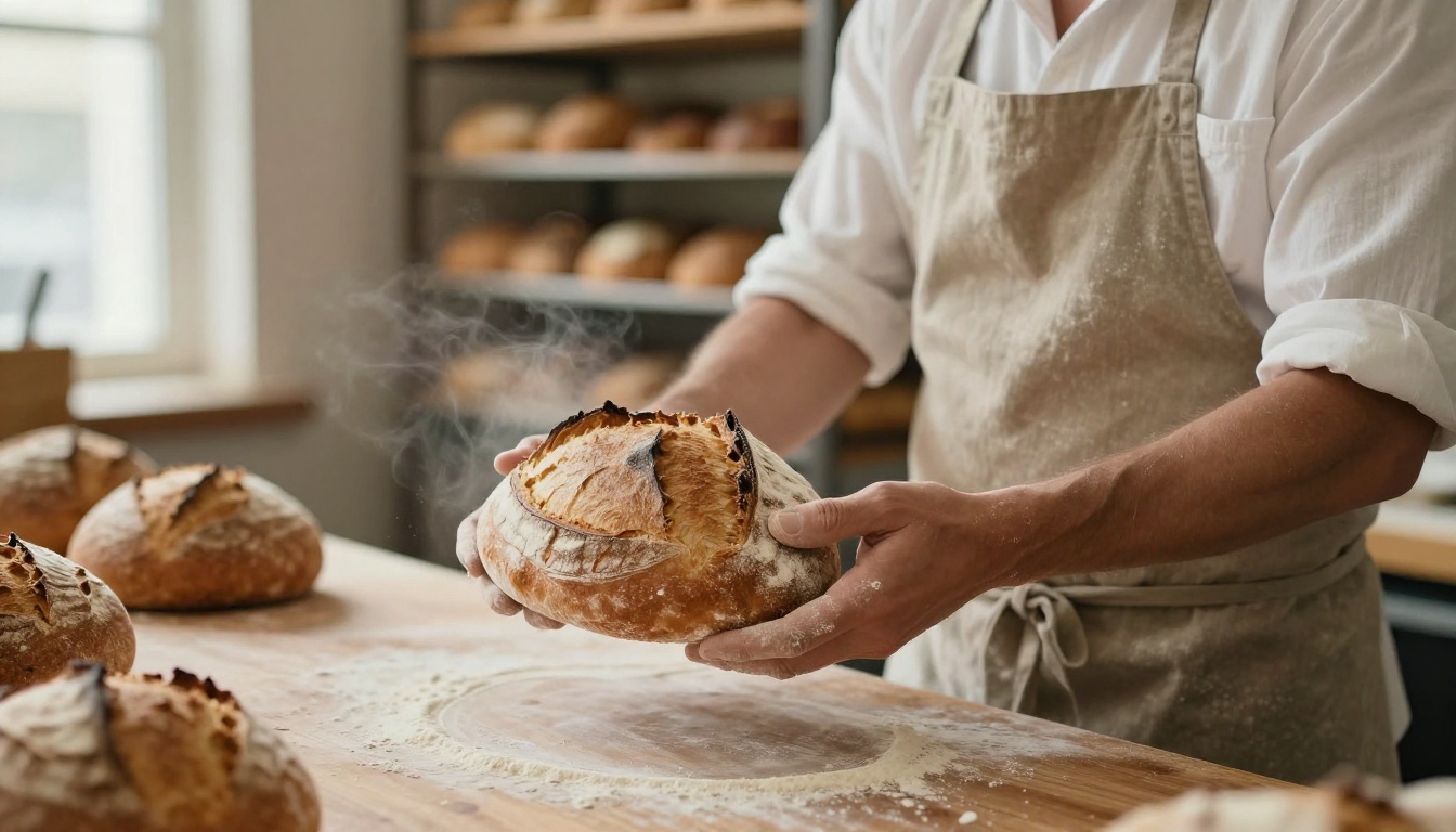
Ask what the viewer will physically get. A loaf, a haircut, a guitar lesson, a table at a farmers market. Make that the hero of the flyer and describe it with concrete detail: materials, hands, light, the small imperfections. A cracked crust photographs better than a perfect one, and a worn wooden counter says more than a white void.
Photorealistic generators such as Flux 2 Pro and Seedream 4.5 are worth testing for this kind of grounded description. Nano Banana Pro is another one to put in the same test, so you can compare how each handles the same subject line.
Describe One Moment, Not a Mood
"Energetic and fun" gives the model nothing to draw. "A drummer mid-hit, sticks blurred, sweat on the forehead, warm stage light from the left" gives it a frame. Pick a single instant and write it like a photographer's shot list.
Use this checklist for the subject line:
- Who or what is in the frame, and what they are doing
- Where it happens, with two or three physical details
- Light direction and quality, such as "low window light from the left"
- Crop, such as tight, off-center, or cut by the edge of the sheet
If a sentence in your prompt could describe any flyer ever made, delete it or sharpen it.
Make Type Do the Heavy Lifting
Type is the second place flyers go generic. AI headlines default to rounded, friendly lettering at medium weight in the middle of the page. Treat typography as the main visual instead of a caption.
Pick a Font Personality
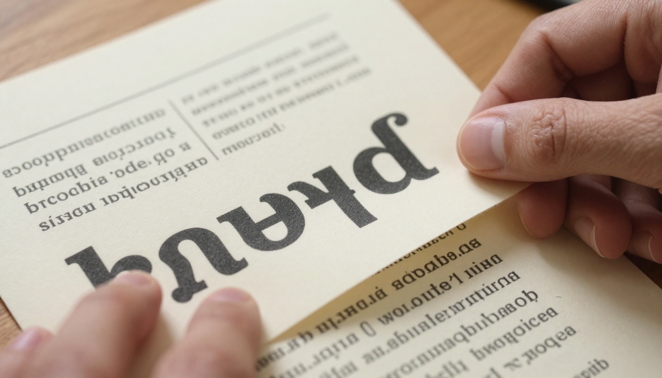
Describe the lettering the way an art director would: "tall condensed grotesque, tightly spaced, set in cream", "heavy slab serif, slightly uneven ink", "hand-cut paper letters". One personality per flyer. Mixing three styles is how you end up back at generic.
When the headline has to live inside the picture, choose a model built with text in mind. Ideogram v4 Quality is the natural first pick, and GPT Image 2 is a sensible second one to compare against it.
Keep Words Short and Few
Use a headline of two to four words and, at most, one supporting line. Dates, addresses, and prices can be added afterward in a layout tool, where fixing a typo takes two seconds. When text is baked into the image, every extra word is another chance for a misspelling.
💡 Tip: Put the headline in quotes inside the prompt, name its position ("bottom left, large"), and keep it under five words.
Give the letters room. Headline size matters less than headline space. A smaller headline surrounded by empty paper beats a huge one crammed against the edges. Ask for "generous margins around the headline" and the result immediately looks more expensive.
Build a Palette That Isn't Pastel
Pastel gradients are the default because they never offend anyone. They also never get noticed. A flyer has about two seconds on a wall, so color has to do real work.
Two Colors and One Loud Accent
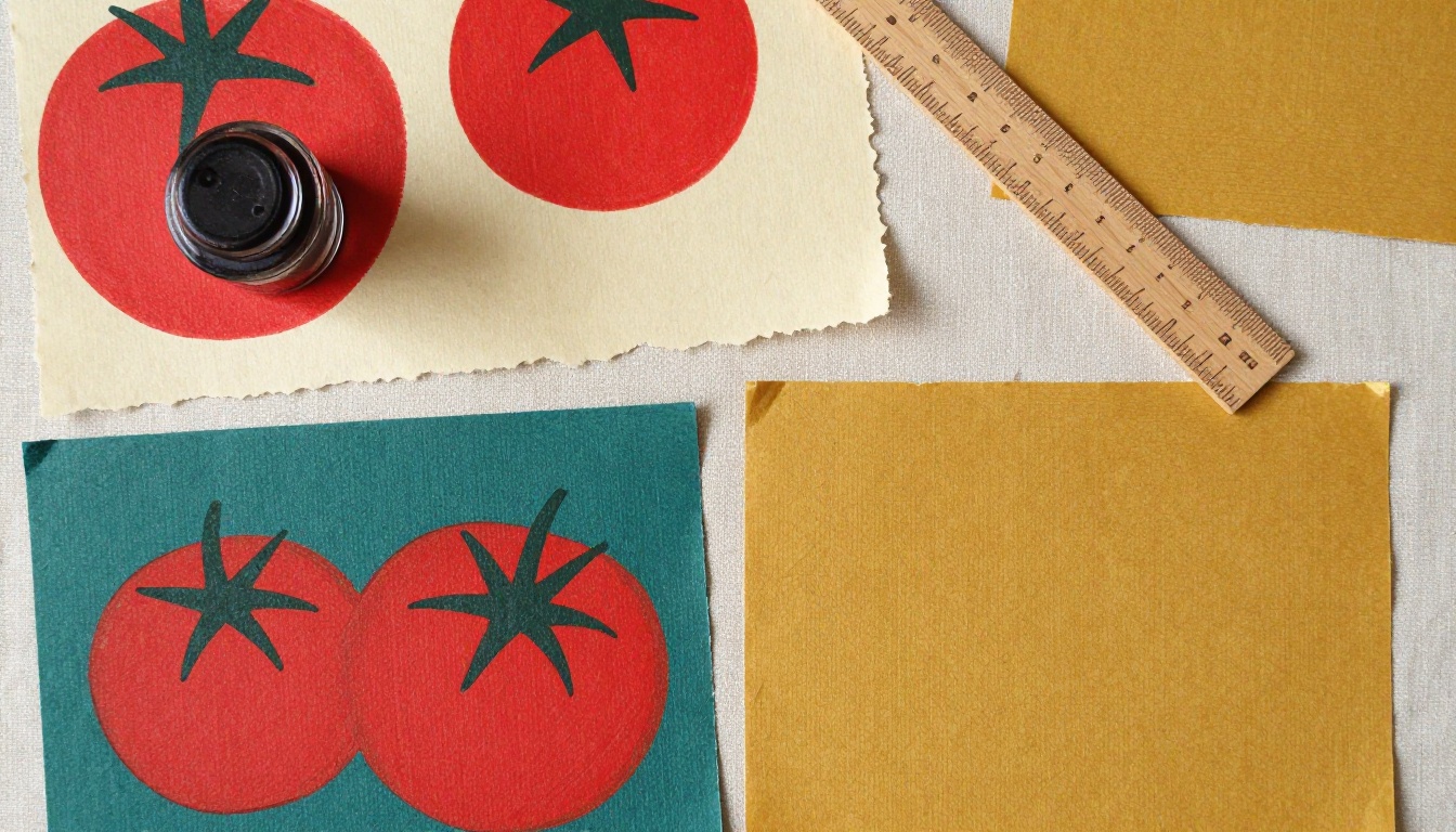
Pick a base, a support color, and one accent that fills no more than a fifth of the sheet. Name them in plain words: "warm cream paper, deep teal ink, one band of tomato red". Color names beat hex codes in text prompts because the model reads them as a description of a scene.
Colors that rarely appear in the default AI look include mustard, oxblood, forest green, tomato red, and charcoal. Pair one of them with plenty of empty paper and the flyer separates from the crowd right away.
Borrow From a Physical Object
When you can't decide, take the palette from something real. A fruit crate label, a painted shopfront, a vintage matchbook, a worn leather jacket. Real objects have colors that already work together, and describing the object gives the model a coherent set without any guesswork on your side.
💡 Tip: Check legibility by squinting at the flyer. If the headline disappears when your eyes blur, the contrast is too low, no matter how pretty the colors are.
Break the Centered Layout
Symmetry is the third giveaway. When everything sits on the vertical center line, the eye has nowhere to travel, and the flyer reads like a template because it basically is one.
Sketch Before You Prompt
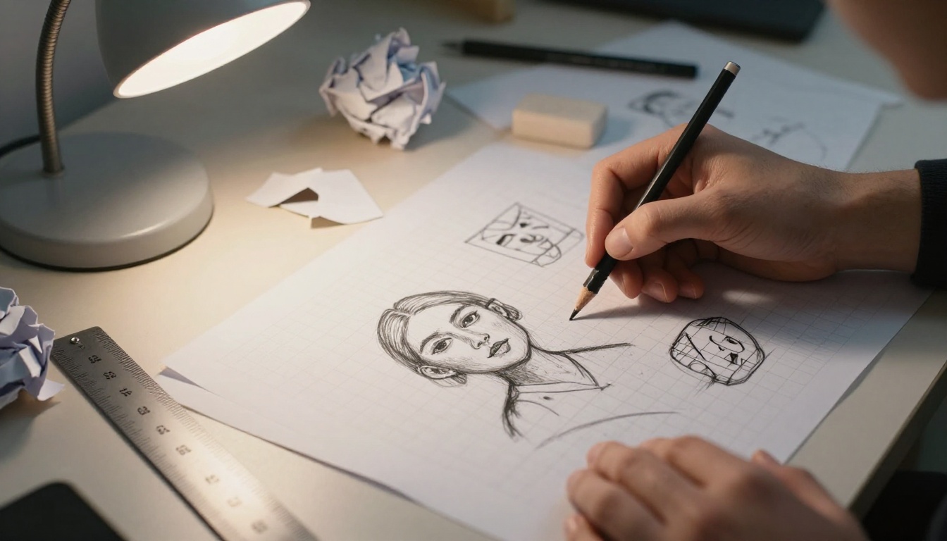
Spend five minutes with a pencil. Draw six small rectangles in a row and put three blocks in each: image, headline, detail. Push one block off-center in every thumbnail. Pick the sketch that feels a little uncomfortable, then put it into words: "headline stacked along the left edge, photo bleeding off the top right, large empty space below".
Use Space and Tension
Empty space is a design choice, not a gap to fill. Ask for "generous negative space", "subject cropped by the right edge", or "headline overlapping the photo by a few centimeters". Add one deliberate flaw too: a visible fold line, a taped corner, uneven ink. Those details tell the viewer a human made this.
| Layout move | Prompt phrase | Effect |
|---|
| Off-center subject | "subject cropped by the right edge" | Pulls the eye across the sheet |
| Big negative space | "two thirds of the sheet left empty" | Gives the headline room to breathe |
| Overlap | "headline overlapping the photo" | Adds depth and rhythm |
| Scale contrast | "tiny detail line beside an oversized headline" | Sets a clear order of reading |
Visual hierarchy is simple: one thing should be biggest, one thing second, and everything else should be small enough to be ignored until the viewer is already interested.
How to Use Ideogram v4 on PicassoIA
Ideogram v4 Quality is a sensible first model for flyers because the headline and the picture can come out in a single pass. Its model page lists over 20 output sizes, an automatic Magic Prompt step that refines your wording, structured JSON prompts for precise control, and output up to 3328x1248 pixels.

Follow these steps:
- Open the model. Go to the Ideogram v4 Quality page on PicassoIA.
- Write the prompt in five parts. Subject, composition, palette, paper and print feel, headline. Here is a working example:
Portrait flyer for a neighborhood bakery open day. Tight off-center photograph of flour-dusted hands holding a sourdough loaf, black and white. One thick tomato red band across the lower third. Large condensed headline "OPEN DAY" in cream, left aligned. Warm uncoated paper texture, slight print grain.
- Choose a resolution. For a portrait flyer pick
1728x2304, a 3:4 shape that sits close to a letter or A4 sheet. Use 2560x1440 for a landscape social post version.
- Pick one prompt type. The plain text prompt switches Magic Prompt on automatically. If you need exact control, use the structured JSON prompt instead, but never both in the same run.
- Turn on copyright detection for commercial work. The model offers an optional post-generation check before you publish.
- Generate, then change one thing. Run it, pick the best result, and change a single variable: the crop, the accent color, or the headline position. Changing five things at once teaches you nothing.
Which Model for Which Job
Different flyer jobs call for different tools. This table is a starting point for your own tests.
Fix These Three Mistakes
- Too many ideas in one prompt. One subject, one accent color, one headline. Cut the rest.
- Asking for "poster style". That phrase pulls the model straight to the most average poster it knows. Describe the paper, the crop, and the light instead.
- Accepting the first result. The first image is a sketch. Generate three or four versions and keep the one with the strongest focal point.
Finish and Test in Print
A flyer lives on paper, so judge it on paper. Screens are generous with contrast and color, and a cheap print will show every weakness your monitor hid.
Upscale Before You Send to Print
A flyer that looks sharp on screen can turn soft on paper. An A4 sheet at 300 dpi needs about 2480 x 3508 pixels, and a US letter sheet needs 2550 x 3300. If your generation is smaller than that, run it through an upscaler first. Clarity Pro Upscaler and Topaz Image Upscale are good places to begin, and Real-ESRGAN is a quick option for a plain 4x enlargement.
Keep important elements well inside the edges, and ask your printer about bleed. Three millimeters is a common request when color or photos run to the border.
Test in the Real World
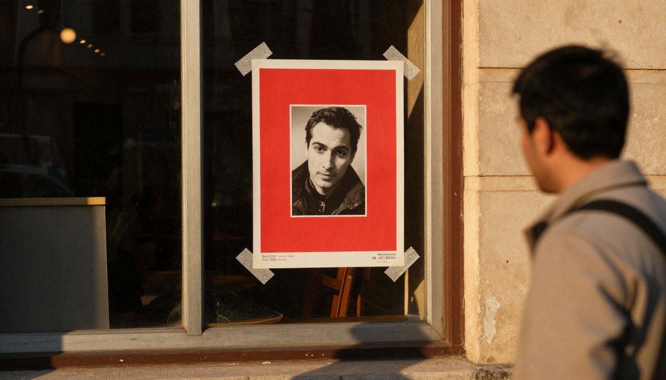
Print one at actual size and tape it to a wall. Step back five meters. Can you tell what it is for within two seconds? If not, the headline is too small or the accent color is too timid. Then put it next to three other flyers from your own niche and check whether yours is the one your eye lands on first.
Checklist Before You Print
| Check | Pass if |
|---|
| Focal point | One element is clearly the biggest |
| Words | The headline is under five words |
| Palette | Two main colors plus one accent |
| Layout | At least one element sits off-center |
| Spelling | Every word is proofed, names and dates twice |
| Sharpness | Image sized for 300 dpi at print size |
Make Your Next Flyer Different
Take the bakery prompt above and swap in your own subject. Keep the structure: a real moment, one loud accent color, a short headline, and a layout that isn't centered. Generate three versions, change one thing at a time, and print the winner at actual size.
Open Picasso IA, choose a model from the table, and write the most specific flyer prompt you have ever written. The first result will still be a sketch, and that is fine. By the third round, you will have something that no template could have given you, and the people walking past your noticeboard will slow down.


