Your channel icon is about the size of a thumbnail on a phone lock screen, and it still has to say who you are in under a second. That is the whole job of a YouTube logo. A good one makes a stranger recognize your videos in a crowded feed, and a bad one makes them scroll past without noticing. The good news: an AI logo generator for a YouTube channel can now give you ten solid directions in the time it takes to drink a coffee, and you do not need a design degree or a budget to get there.
This article gives you the three things people search for most: free prompts you can paste today, the exact banner and icon sizes YouTube expects, and real examples by niche so you can see what works before you generate anything.
💡 Quick answer: Use a model that renders clean shapes and short text, write a prompt that names one symbol, two colors and a flat background, export a square at 800 x 800 pixels for the icon, and build your banner at 2048 x 1152 pixels with the important content inside the 1235 x 338 pixel safe area.
Why Your Channel Needs a Real Logo
Most new creators skip branding and plan to fix it "later". Later usually means after fifty uploads with a blurry default avatar. The logo is the one asset that follows your channel everywhere: the search results, the comments section, the subscription feed, the end screen, the community posts and every collaboration tag.
What Viewers Notice First
Before anyone reads your channel name, their eye lands on shape and color. A simple fox head in orange on a dark background reads faster than a detailed illustration with five colors and a slogan. Viewers do not study your icon. They pattern-match it. When your logo stays consistent, they start to recognize your uploads without reading a single word, and that recognition is what builds the habit of clicking.
Logo, Icon and Banner Are Different Jobs
People mix these up constantly, so here is a clean split:
- Logo: the master design, usually a symbol plus optional wordmark. You create it once and adapt it.
- Channel icon: a square crop of the logo, shown as a circle across YouTube.
- Banner: a wide image at the top of your channel page, which carries the logo, a tagline and sometimes an upload schedule.
If you generate the logo first and treat the other two as adaptations, everything stays consistent.
YouTube Logo and Banner Sizes
Sizes are where most beginners lose time, because a beautiful banner can still get cropped badly on a TV or a phone. These are the numbers to keep nearby.
| Asset | Recommended size | Aspect ratio | Notes |
|---|
| Channel icon | 800 x 800 px | 1:1 | Displayed as a circle, often around 98 x 98 px |
| Banner (full) | 2048 x 1152 px | 16:9 | Minimum 1024 x 576 px, file under 6 MB |
| Banner safe area | 1235 x 338 px | Wide strip | Visible on every device, keep logo and text here |
| Video thumbnail | 1280 x 720 px | 16:9 | Keep a bold subject and little text |
| Video watermark | 150 x 150 px | 1:1 | Shows in the corner of your videos |
Channel Icon Specs
Export your icon as a square PNG or JPG at 800 x 800 pixels, then check it as a circle. Anything near the corners gets cut. A strong rule: the main symbol should fill roughly 60 to 70 percent of the square and sit in the center. If your logo is a wordmark with long text, make a shorter monogram version for the icon instead.
Banner Safe Area
YouTube shows your banner differently on TV, desktop and mobile. The TV shows the whole 2048 x 1152 canvas. Desktop crops the sides. Mobile shows the thinnest center strip, which is the 1235 x 338 pixel safe area. Put your logo, channel name and tagline inside that strip and use the outer zones for texture, a soft background or a photo that can survive being cropped.
Thumbnails and Watermark
Thumbnails are not your logo, but they should carry its colors. If your logo is teal and cream, use those two tones as a recurring frame or accent. Your watermark is the logo reduced to a tiny mark, so a bold, simple symbol works far better than a wordmark.
💡 Tip: Open your finished icon at 48 x 48 pixels. If you cannot tell what it is, simplify it. This one test saves more logos than any design theory.
Free Prompts That Actually Work
The difference between a muddy logo and a clean one almost always comes from the prompt. AI image models tend to add detail when you give them freedom, and logos need the opposite. You want restraint.
The Prompt Formula
Use this structure and fill the brackets:
[Style] logo of [one symbol] for a YouTube channel about [topic], [color 1] and [color 2], flat background, centered, bold simple shapes, [optional text in quotes]
Three rules make it work:
- One symbol only. A fox, a controller, a mountain. Never "a fox holding a controller on a mountain".
- Two colors, maybe three. Name them. "Warm orange and deep charcoal" beats "colorful".
- Ask for a plain background. A flat color or white background makes cutting and resizing painless later.
If you want text in the logo, put it in quotes and keep it short, ideally one or two words. Longer text is where most models still make spelling mistakes.
Gaming Channel Prompts
Gaming logos can be bold and aggressive, but they still need to be readable at small sizes.
Prompt 1: Minimal shield emblem logo with a wolf head silhouette for a gaming YouTube channel, deep red and charcoal grey, flat dark background, centered, sharp clean edges, symmetrical, text "WOLF" below in bold sans serif.
Prompt 2: Mascot logo of a determined owl wearing headphones, teal and cream, thick outlines, flat background, centered, suitable for a round channel icon.
Prompt 3: Monogram logo with the letter "K" built from two angular blades, silver and black, flat background, bold geometric style, centered.
Cooking and Lifestyle Prompts
Food and lifestyle channels usually want warmth. Think hand-made, not corporate.
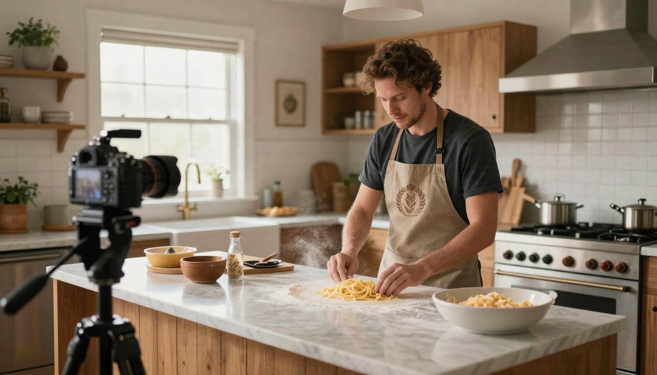
Prompt 4: Rustic emblem logo of a wheat stalk inside a circle for a home cooking YouTube channel, warm mustard yellow and cream, flat paper texture background, centered, hand-stamped look, text "FLOUR" in a friendly serif.
Prompt 5: Simple line logo of a whisk crossed with a wooden spoon, terracotta and off white, flat background, centered, thin consistent line weight.
Tech and Education Prompts
Tech channels benefit from geometry and a calm palette. Education channels can get away with friendlier shapes.
Prompt 6: Minimal geometric logo made of a hexagon with a small circuit-style notch, electric blue and white, flat white background, centered, clean modern sans serif text "BYTE".
Prompt 7: Friendly logo of an open book with a small lightbulb above it, navy and warm yellow, flat background, centered, rounded shapes.
Fitness and Travel Prompts
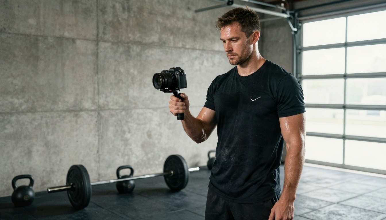
Prompt 8: Bold circular badge logo with a kettlebell silhouette, matte black and signal orange, flat background, centered, strong thick shapes, text "IRON" in condensed bold letters.
Prompt 9: Round patch-style logo of a mountain ridge with a rising sun, forest green and sand, flat background, centered, embroidered look, text "TRAIL" curved along the top.
💡 Tip: Generate at least four variations of each prompt. Pick the one that still reads at a tiny size, then ask for small changes to that one rather than starting over.
How to Use Ideogram v4 Quality on PicassoIA
A logo lives or dies on clean edges and correct lettering, so the model matters. Ideogram v4 Quality is a strong first pick when your logo includes a name, because it handles short text far better than most general image models. If you want a faster, lighter alternative for quick drafts, Ideogram v4 Balanced is on the same platform.
Step by Step
- Open the model page on PicassoIA and choose Ideogram v4 Quality.
- Paste your prompt using the formula above. Keep the logo text inside quotation marks.
- Set a square aspect ratio for the icon version, since you will crop to a circle later. Use a wide ratio when you are generating banner backgrounds.
- Generate several versions. Run the same prompt multiple times and compare the results side by side.
- Pick the clearest one and refine it with a changed prompt: swap a color, simplify the symbol or shorten the text.
- Download the best result and check it at 98 pixels and 48 pixels before you commit.
Settings and Prompt Tips
- Write "flat background" and "centered" every time. These two phrases prevent half the problems.
- Use words like "bold simple shapes", "thick outlines" and "symmetrical" to keep the design tidy.
- Avoid words like "intricate", "detailed" or "realistic" in a logo prompt. They push the model toward scenes, not marks.
- If the text comes out wrong, shorten it to one word and regenerate.
Picking the Right Model
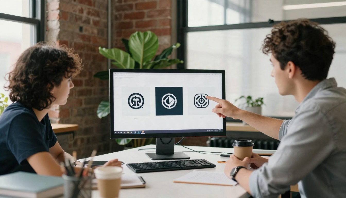
No single model wins every job. Here is how the main options on PicassoIA compare for channel branding.
Vector Output With Recraft
If you plan to put your logo on merch, a stream overlay or a printed poster, vector output is worth the extra step. Recraft v4.1 SVG produces scalable artwork, so the same file works at 48 pixels and at poster size. For a more refined final, try Recraft v4.1 Pro SVG.
Fixing Backgrounds and Resolution
Two small tools finish the job. Use Remove Background to get a transparent version of your logo for overlays and end screens. If the best version of your logo came out small, run it through Real ESRGAN to upscale it 4x before you build the banner.
Real Examples by Niche
Seeing the pattern across niches helps more than any rule. Here is how the same formula changes with the topic.
| Niche | Symbol | Colors | Mood |
|---|
| Gaming | Shield, wolf, blades | Red and charcoal | Aggressive, sharp |
| Cooking | Wheat, whisk, spoon | Mustard and cream | Warm, hand-made |
| Tech | Hexagon, circuit notch | Blue and white | Clean, precise |
| Fitness | Kettlebell, flame | Black and orange | Strong, bold |
| Travel | Mountain, sun, compass | Green and sand | Calm, adventurous |
| Education | Book, lightbulb | Navy and yellow | Friendly, clear |
Notice the repeating logic: one symbol, two colors, a mood word. That is the entire system. When a logo feels off, one of those three is usually wrong. A fitness channel with a soft pastel flower will confuse viewers, and a cooking channel with a harsh black wolf will do the same.
Building the Banner From the Logo
Once the icon is final, build the banner in four moves:
- Create a 16:9 background with a model such as Seedream 4.5 using a calm, low-contrast scene in your brand colors.
- Place the transparent logo in the center of the 1235 x 338 pixel safe area.
- Add a short tagline in the same strip, such as "New videos every Friday".
- Preview the result on a phone-sized crop before uploading.
💡 Tip: If your banner background has a busy subject, keep it on the left or right edge. The center strip is where the logo lives, and it should stay quiet.
Common Mistakes to Avoid
Most weak channel logos fail in predictable ways. Check your draft against this list.
- Too much detail. Fine lines vanish at 98 pixels. Thick shapes survive.
- Too many colors. More than three makes the mark look busy and hard to reuse.
- Long text. A full channel name in tiny letters becomes a gray smear. Use a monogram for the icon.
- Ignoring the circle crop. Corners disappear. Keep the symbol centered.
- Copying a famous logo. Do not prompt for another brand's mark. Aim for something yours, and run a quick search to make sure your symbol is not already identical to a big channel in your niche.
- Changing the logo every month. Consistency is the entire point. Pick one and stay with it for at least a year.
- Forgetting the safe area. A great banner with the channel name cut off on mobile looks careless.
A sixty-second check before upload prevents nearly all of these: view your icon small, view it in a circle, view your banner on a phone crop, and view everything against both light and dark mode backgrounds.
Make Your Own Channel Logo Today
You now have the sizes, the formula and nine prompts to start from. The fastest way to find your logo is to stop planning and start generating. Pick the niche closest to yours, paste a prompt, change the symbol and the two colors, and produce eight versions. Choose the one that still reads clearly at 48 pixels, then build your icon, banner and watermark from it.
Picasso IA puts all of these models in one place, so you can draft a logo with Ideogram v4 Quality, turn it into a vector with Recraft v4.1 SVG, create a matching banner background with Seedream 4.5, and clean it up with a background remover, all in one session. To see every option, browse the full list at picassoia.com/en/all-models, then open a model and run your first prompt. Your channel already has something worth watching. Give it a logo that looks like it.


