You have a photo of a tired room and a search bar full of promises: free, no login, instant redesign. Some of those promises hold up. Many fall apart at the second upload, when a credit counter hits zero or a watermark lands across the best part of the picture. This article separates the real options from the bait, shows how to get a believable redesign from a single phone photo, and sets up a workflow that does not run out of tries halfway through your kitchen.
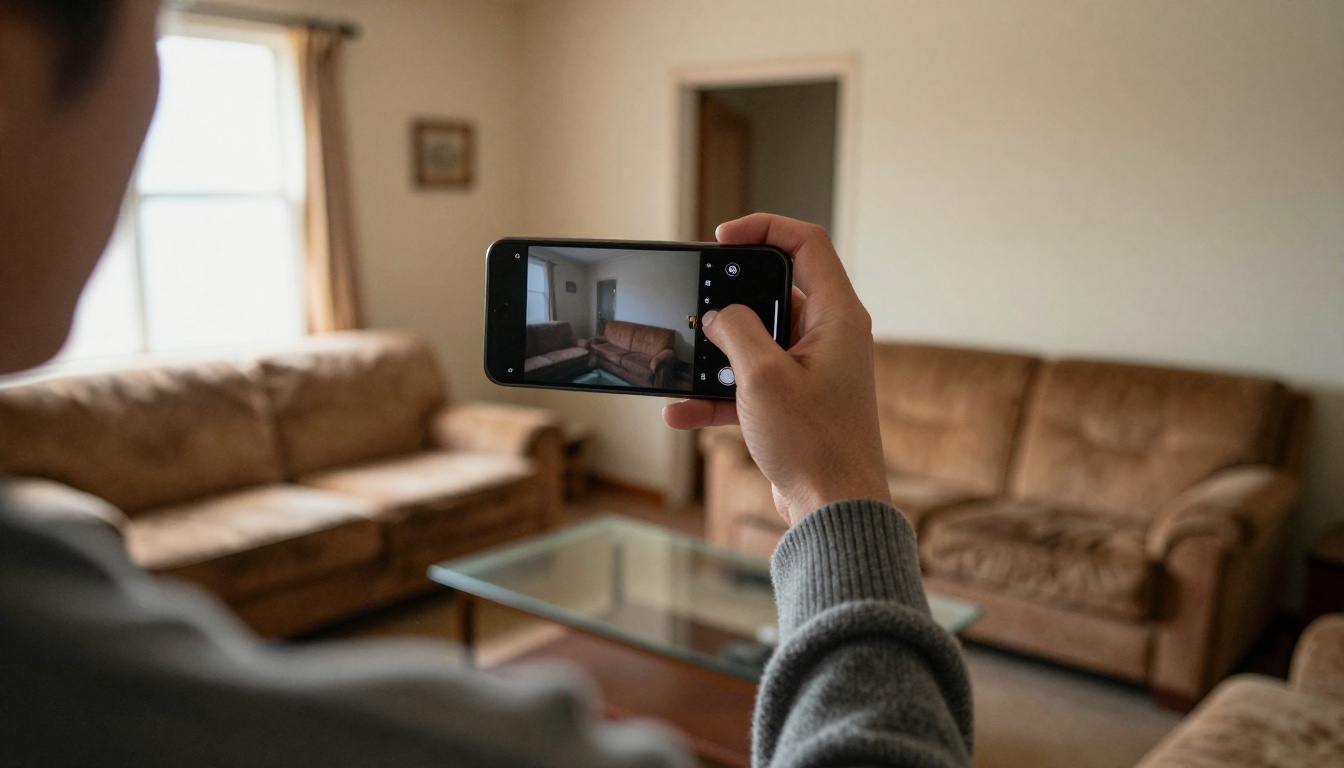
Why Photo-Based Room Design Works
Interior designers have always started with a photo, a tape measure and a pile of samples. AI room design from a photo squeezes that first stage into a few minutes. You upload one picture of the space as it looks today, describe the style you want, and the model returns the same room with new paint, furniture, flooring or lighting. The walls stay where they are. The window stays where it is. What changes is everything you were going to argue about with your partner anyway.
The appeal is simple. A room visualizer built on image-to-image AI lets you test a decision that normally costs real money: a green kitchen, a darker bedroom wall, a different sofa. Seeing it on your geometry, with your window light, is more convincing than any catalog render.
Three things make this approach practical right now:
- Speed: most edits finish in seconds, so you can compare ten options before lunch.
- Low risk: a bad idea costs one generation, not a weekend of repainting.
- Shareable results: a before and after pair settles family debates and gives a contractor something concrete to quote.
The people who get the most from it are not only homeowners. Renters can test removable changes like curtains, rugs and lamps before buying anything. Home buyers can picture an empty apartment with furniture in it. Sellers can use virtual staging to show an empty room as a lived-in space, as long as the listing says the images are digitally staged. Creators and bloggers use the same method to produce before and after content in an afternoon.
Most tools change surfaces and objects: paint colors, flooring, sofas, lamps, curtains, rugs. They rarely grasp structure, which is why the same tool that makes a convincing Japandi bedroom can also invent a door where your radiator lives.
💡 Treat every output as a design sketch, not a blueprint. The AI does not know that a wall is load bearing or that the pipe under the sink cannot move two meters to the left.
What Free and No Login Really Mean
Those words in a search query describe two different things, and plenty of sites blur them on purpose. Free usually means a limited number of generations. No login usually means a demo mode with tighter limits than the signed-in version. Both are fine for one quick test. Neither is built for a whole-house project.
Daily Credits and Hidden Watermarks
Many free room design tools hand out a few credits a day, or a handful for the lifetime of your browser session. The tell is the interface: if the page shows a counter, you are on a credit system. Watermarks are the second trap. A redesign with a large logo across the sofa is fine for a private test and useless for a listing, a client or a social post. Check the output of your very first free run before you invest time in prompts.
Resolution Caps That Hurt
Free tiers often return images around 1024 pixels wide or smaller. That is enough to judge a color scheme and not enough to judge fabric, grout lines or the edge of a table. If you plan to print the result or send it to a contractor, small output makes details look invented.
Where Your Photo Goes
A room photo can reveal more than you expect: a street view through the window, family pictures on a shelf, a house number near the door. Before uploading to any no-login site, crop out personal items and read what the page says about storing images. If it says nothing, assume the photo is kept.
Here is how the main options compare in practice:
| Option | Typical limit | Output quality | Best use |
|---|
| Browser demo, no account | A few runs, often with a watermark | Low to medium resolution | One quick style test |
| Free tier with signup | Daily or monthly credits | Medium resolution, some styles locked | Comparing two or three directions |
| Editing model with no per-edit cap | Limited by your time, not a counter | Full resolution, clean files | Iterating on a real room |
The last row is where the workflow below lives. PicassoIA Image Editor Pro is described on its model page as unlimited, with no per-edit cap and no daily quota. That matters for room redesign because the first result is rarely the one you keep. Edit number four is usually where the good version appears, and it is also where most free tools run dry.
Prepare the Photo Before You Upload
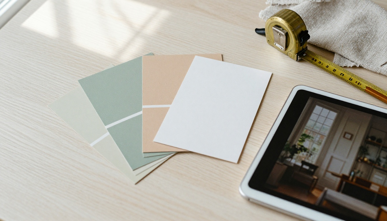
The input photo decides most of the result. A dark, tilted, cluttered picture produces a dark, tilted, cluttered redesign, only with nicer cushions.
Light, Angle, and Clutter
- Shoot from a corner at about chest height so two walls and the floor are visible.
- Use daylight. Warm lamps next to cool windows confuse color decisions.
- Clear the surfaces. Laundry baskets, charger cables and toys get redesigned too, usually into odd objects.
- Keep the camera level. Tilted verticals lead to leaning walls in the output.
- Take two or three angles of the same room so you can test whether a style holds up from each side.
Write Down the Fixed Elements
Before you write a single prompt, list what cannot change: window positions, radiator, door swing, the sofa you bought last month. You will repeat that list in every prompt so the model keeps it. Add rough dimensions too. The AI has no tape measure, so "a two-seat sofa that fits the left wall" gets a better result than "a sofa".
💡 Paint swatches and fabric samples are worth photographing next to a window. A real color reference beats a vague word like "warm".
How to Use PicassoIA Image Editor Pro
PicassoIA Image Editor Pro is the native editing model on Picasso IA. According to its model page it accepts up to three reference images, follows plain-language edits, keeps your input proportions with the match_input_image ratio, and lets you lock a seed to reproduce a result. That feature list fits room work well.
Step by Step
- Open the model page and add your room photo as image 1.
- Optionally add up to two more images, such as a photo of a sofa you like or a color reference. Refer to them as "image 2" and "image 3" inside the prompt.
- Write the edit as one clear instruction: what changes and what stays.
- Leave the aspect ratio on
match_input_image so the room keeps its original framing.
- Set the number of outputs to 2 to get two variations from one run.
- Run it, compare, then change one thing at a time. When a result is close, lock the seed and adjust only the wording.
Prompts That Protect the Layout
A prompt that works for a living room:
Redesign the living room in image 1 in a warm Scandinavian style. Keep the windows, ceiling, door and floor plan exactly the same. Replace the brown sofa with an oatmeal boucle sofa, add a terracotta wool rug and a walnut coffee table. Soft morning light from the left window, photorealistic, natural textures, no text.
Notice the three parts: a style, a list of fixed elements, and the replaced objects. The sentence that starts with "Keep" does most of the work.
| Ingredient | Example wording |
|---|
| Style | warm Scandinavian, Japandi, mid-century, industrial loft |
| Fixed elements | keep the windows, ceiling and door unchanged |
| Replacements | oatmeal boucle sofa, walnut coffee table, linen curtains |
| Light | soft morning light from the left window |
| Realism | photorealistic, natural textures, no text |
A Second Opinion With Flux Kontext Dev
Flux Kontext Dev is built for plain-text edits to a photo you already have, and its model page lists restyling an interior photo to a different decor theme as a use case. It takes one input image, a prompt and a guidance value that defaults to 2.5. A higher value makes the output follow your instruction more strictly, a lower one preserves more of the original. Run the same room through both models and keep the one that respects your layout better.
Room by Room Results
The images below are generated illustrations of the kind of result to aim for. Your own output depends on your photo and your prompt, so treat them as a target, not a promise.
Before you prompt, pick a style and stay with it for the whole run. These four are easy for image models to render convincingly:
| Style | Palette | Materials | Works best in |
|---|
| Scandinavian | Oat, white, soft gray | Pale oak, wool, linen | Living rooms, small flats |
| Japandi | Charcoal, sand, moss green | Bamboo, matte plaster, paper | Bedrooms, offices |
| Mid-century | Walnut, mustard, teal | Teak veneer, leather, brass | Living and dining rooms |
| Industrial loft | Black, rust, concrete gray | Steel, brick, reclaimed wood | Studios, open plans |
Mixed prompts like "Japandi but also industrial" tend to produce a muddy compromise. One style per run gives cleaner results, and you can blend ideas later by hand.
Kitchens
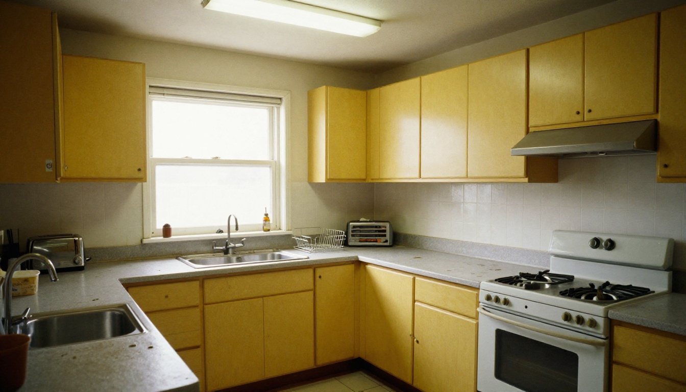
Kitchens show the biggest visible change because cabinets and counters fill most of the frame. Here is a dated 1990s kitchen with yellowed oak, laminate counters and cold fluorescent light.
And here is the same kind of layout after a redesign with sage green shaker cabinets, white quartz, a butcher block island and brushed brass handles.
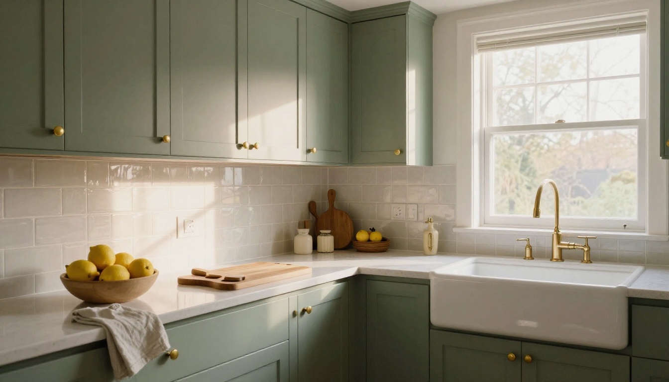
Kitchens need one extra line in the prompt: keep the sink under the window and the cabinet layout, change finishes only. Plumbing and appliance positions are the most common hidden error. An AI will happily place a stove where there is no gas line.
Living Rooms and Evening Light
A living room is where style choices pile up: sofa, rug, lamp, art, curtains. Change them in rounds rather than all at once. First the big pieces, then the textiles, then the accessories.
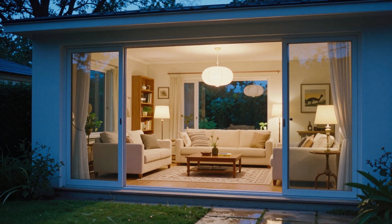
Then ask for an evening version of the same room. A design that only looks good at ten in the morning is a risk, and the dusk test costs one extra generation. Look at how lamps, window glass and wall color behave when daylight fades.
If the room is empty, the same workflow becomes virtual staging. Upload the bare room, state the floor area, and ask for a sofa, a rug and one lamp sized to fit. Keep the furniture count low. Three believable pieces sell a room better than twelve crowded ones, and they leave less room for the AI to make mistakes.
Bedrooms and Home Offices
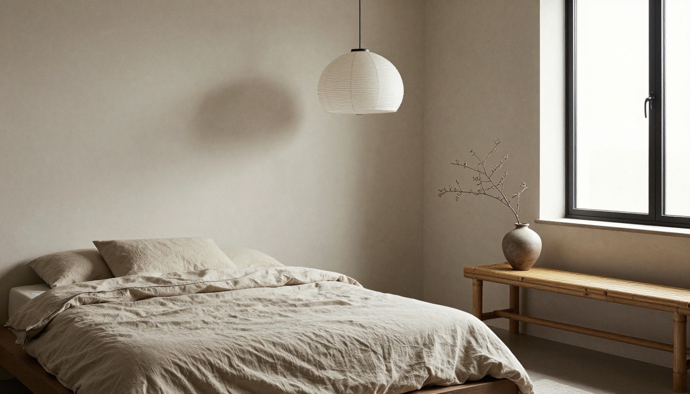
Bedrooms reward restraint. Low furniture, matte walls and layered linen read as calm in a photo, and they are forgiving for AI because there are fewer hard edges to warp.
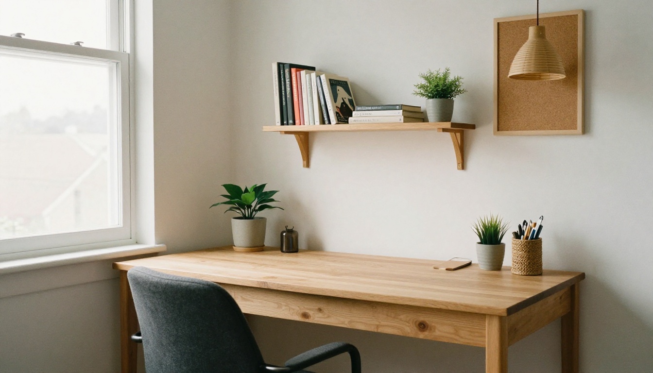
Home offices are the opposite: lots of straight lines, shelves and a desk edge that must stay level. Ask for the desk position to remain fixed and describe the shelf contents loosely, because AI struggles to render readable book spines.
Small Studios
Small spaces need scale. Tell the model the floor area, for example "a 30 square meter studio", and name the furniture that must fit. Without that, the AI fills the room with a full-size sectional that would not clear the door.
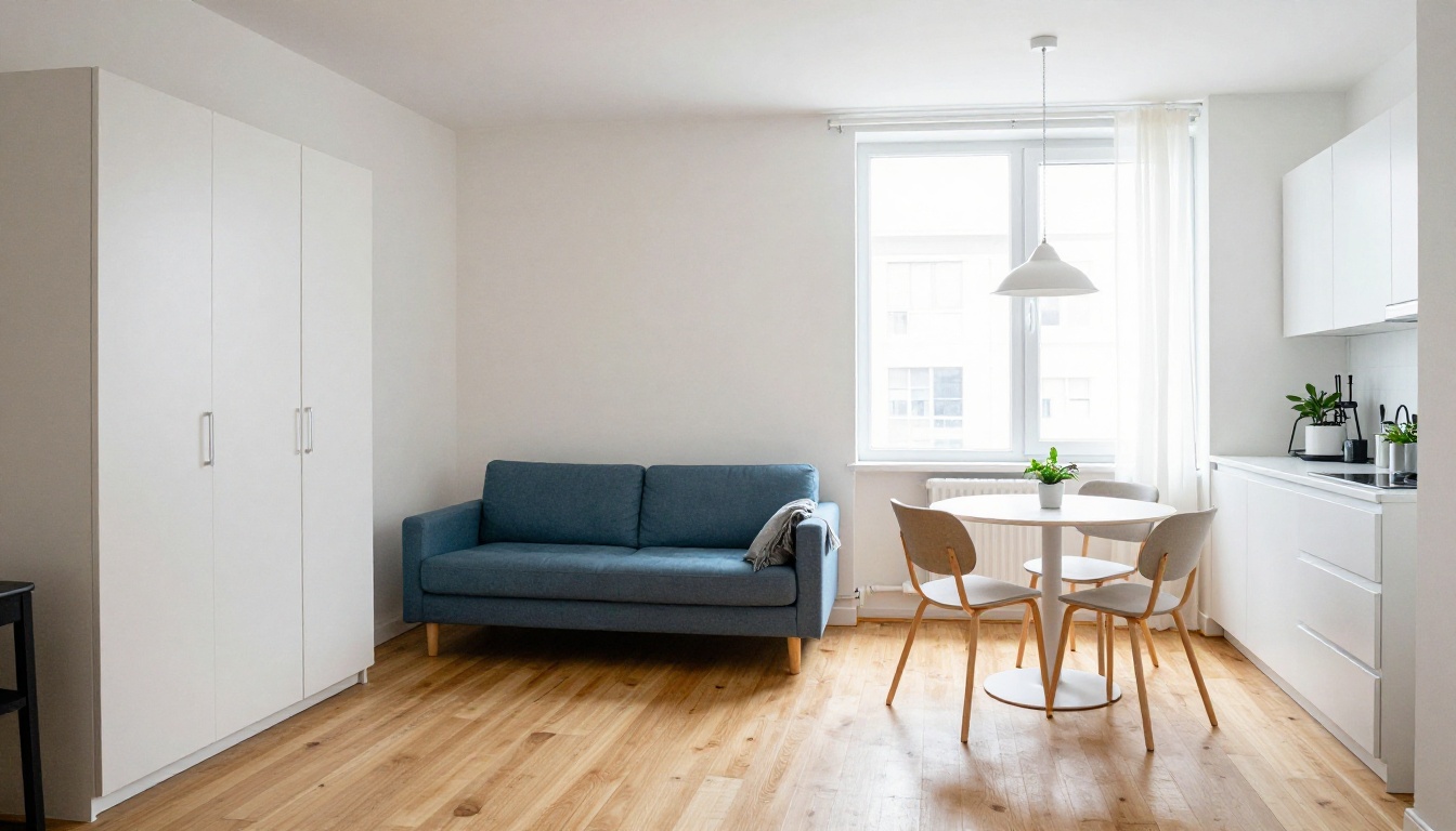
For studios, ask for multi-function pieces: a sofa bed, a drop-leaf table, wall storage. Keep the palette to three colors and let texture do the rest.
Fix What the AI Gets Wrong
Even a strong first result usually has one flaw. The good news is that each flaw has a targeted fix.
Warped Lines and Furniture
When walls lean or a sofa melts into the floor, use a model that respects your photo's structure. Flux Depth Pro works from the depth of the original scene, and Flux Canny Pro works from its edges. Both keep room geometry anchored while the style changes.
Lighting That Does Not Match
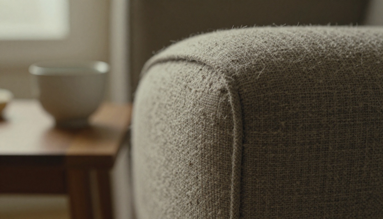
A new sofa lit from the right in a room whose window is on the left looks pasted in. Describe the light direction in the prompt, or run the result through Qwen Image Edit Plus LoRA Relight to adjust it. Texture matters here too. Fabric and wood grain should catch light the way real material does.
Patching and Sharpening
For one bad corner, a mask-based edit beats starting over. Flux Fill Pro repaints only the region you mark, so you can fix a strange lamp without touching the rest. When you have a final version, Clarity Pro Upscaler adds resolution for printing or for sending to a contractor.
Mistakes That Waste Your Free Tries
- Changing five things per prompt. When the result is wrong you will not know which instruction caused it.
- Skipping the fixed elements. Without "keep the windows and door", the model treats everything as negotiable.
- Uploading a dark phone photo. Low light gives muddy colors and invented shapes.
- Ignoring scale. Always name the room size or the furniture dimensions.
- Trusting the first output. Generate two variations, compare, then iterate.
- Mixing styles in one prompt. Pick one direction per run and compare runs side by side.
- Forgetting the floor and ceiling. If you do not name them, the model may swap your oak boards for gray tile.
- Saving a screenshot. Download the original file so you keep full resolution.
Try Your Own Room Today
Pick the room you argue about most. Take one clean corner photo in daylight, write down what cannot move, and describe the style in two sentences. Then open PicassoIA Image Editor Pro on Picasso IA, add your photo as image 1 and run your first redesign. Try a second style on the same photo, then a third. Because the model page advertises no per-edit cap, you can keep experimenting until the room looks like the one you want to live in.
When you want more options, browse all models on Picasso IA and try editing, relighting and upscaling models on the same photo. Your next paint color is one prompt away.


