Professional logo design used to cost money, time, and a back-and-forth with a designer who still did not quite get your vision. Product mockups meant hiring a photographer or wrestling with expensive software that has a six-week learning curve. Those constraints are gone. Nano Banana Pro on PicassoIA accepts a plain text description and returns a 4K-ready visual asset in seconds, with no design background required and no subscription fee to get started.
This is not about replacing professional designers for large campaigns. It is about getting solid, usable brand visuals off the ground fast, whether you are validating a startup concept, building a social media presence, or prototyping packaging before committing to a production run. The model handles logos, product shots, brand kit components, and presentation assets with the same prompt-driven workflow.
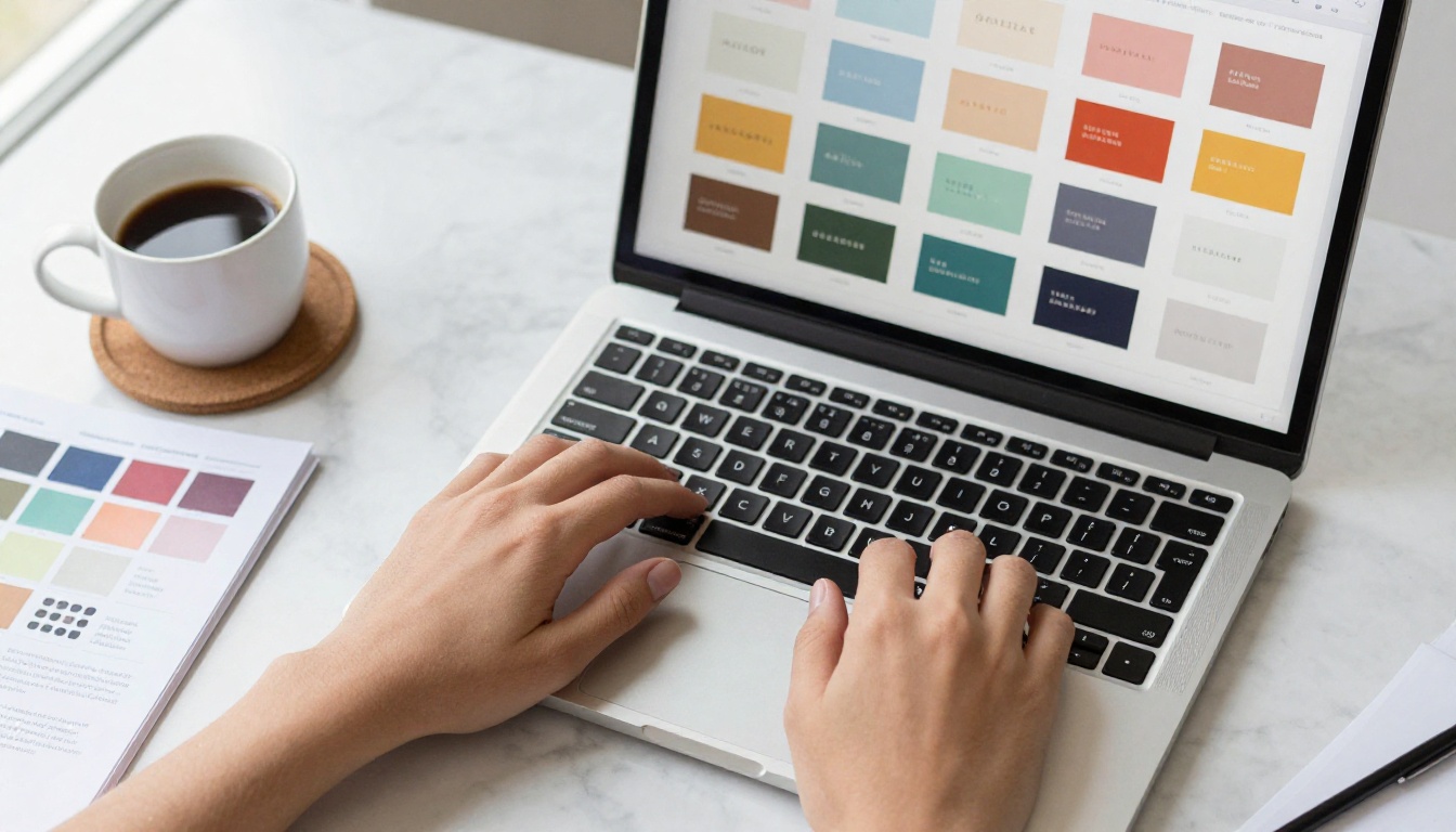
What Nano Banana Pro Can Do for Your Brand
Nano Banana Pro is a text-to-image model built around speed and resolution. You describe what you want, and it renders images at up to 4K resolution in formats that are immediately usable in any design tool or marketing platform. For brand work specifically, this combination matters more than most people realize.
Most AI image generators force you to choose between speed and quality. A fast model gives you something blurry or over-stylized. A quality model takes several minutes and still requires post-processing. Nano Banana Pro skips that trade-off by delivering sharp, print-ready output quickly. No queue, no watermarks, no compromise.
4K Output Without the Wait
Resolution is the first bottleneck most people hit when using AI for brand assets. A logo that looks great at 300px becomes unusable when you need it on a banner, a product label, or a presentation slide at full screen. Nano Banana Pro outputs at 1K, 2K, or 4K, and you choose which one fits the job before you generate anything.
💡 For social media content, 2K is enough. For print materials, packaging, or presentation backgrounds, always select 4K to preserve edge sharpness on text and geometric forms.
The output lands directly as a JPG or PNG with no watermarks, ready for immediate placement in Figma, Canva, Adobe XD, or any other design tool you work with.
Reference Images as Style Direction
One feature that separates Nano Banana Pro from simpler generators is its reference image input: you can feed up to 14 images alongside your text prompt to steer the visual direction. This is not just style transfer. It functions as a visual brief.
If you already have brand colors, an existing logo version, competitor visuals you admire, or a mood board from Pinterest, upload them as references and describe what you want. The model uses that visual context to produce output that feels coherent with the direction you are pointing toward. For brand consistency across multiple mockup variations, this capability is invaluable.
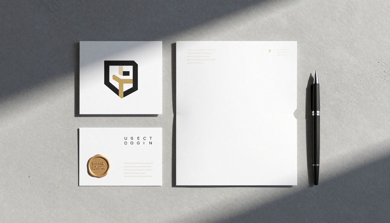
Why Logos Need Specific Prompt Techniques
Logos are different from most image types. You want clarity, simplicity, and reproducibility. A sunset photograph can be vague and still look stunning. A logo that is vague is just visual noise. Prompting for logos requires a different mental model than prompting for editorial or lifestyle images.
Shape and Typography Signals
The model responds well to specific descriptors for both geometric and typographic elements. Instead of writing "a modern logo," describe the exact shapes, letter styles, and color relationships you need. Compare these two approaches:
| Weak Prompt | Strong Prompt |
|---|
| A modern logo for a coffee brand | Minimal circular badge logo, bold sans-serif wordmark, dark espresso brown and cream on white background, centered composition, no gradients |
| A tech startup logo | Geometric triangle mark, thin line style, deep navy blue on white, clean negative space, no shadows, flat design |
| A fashion brand logo | Serif lettermark, tall elegant letterforms, single color black on white, no decoration, editorial style |
The more specific you are about shape type, color relationship, and background, the more usable the output will be on the first generation.
The White Background Rule
If you need a logo that can be placed on any surface or background, always specify a pure white or transparent-equivalent background in your prompt. Writing "on a white background, isolated symbol" tells the model to treat the composition as a production asset rather than an editorial scene. This makes it far easier to use the result in any design tool without extensive masking work.
💡 After generating on white, use PicassoIA's background removal tools to isolate the mark completely if you need full transparency for placement over photos or colored surfaces.
Color Palette Specifics Matter More Than You Think
"Blue and white" produces a result. "Deep navy blue #1a2b4a and clean white on a pure white background" produces a consistent result. When you are building a brand kit with multiple assets, specifying your exact color relationship in every prompt keeps the output palette coherent across generations. Use adjectives that communicate tone: "muted sage green", "warm terracotta", "cool slate gray", rather than generic color names.
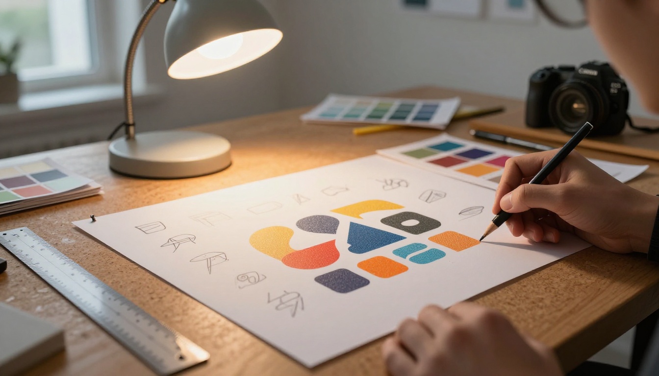
How to Create Logos with Nano Banana Pro on PicassoIA
Here is the exact process for getting a logo from a blank page to a 4K asset.
Step 1 - Open the Model
Go to Nano Banana Pro on PicassoIA. The interface presents you with a prompt box, a reference image upload area, an aspect ratio selector, and a resolution setting. No complex menu, no hidden settings.
Select your resolution before you write a single word. For any brand asset you intend to use professionally, select 4K. You can always downscale a 4K image. You cannot recover detail from a 1K image that you needed at 4K.
Step 2 - Write a Focused Logo Prompt
Your prompt structure should follow this pattern:
[Logo Type] + [Industry or Brand Personality] + [Color Palette] + [Background] + [Style Modifiers]
Three working examples that produce reliable results:
- "Circular badge logo, artisanal bakery brand, warm wheat gold and deep brown palette, white background, hand-drawn feel with clean lines, no gradients, no drop shadows"
- "Geometric monogram logo, two letters interlinked, minimal and modern, black on white, angular sharp forms, flat design, no bevels"
- "Wordmark logo, luxury skincare brand, thin elegant serif typeface, muted rose and ivory tones, white background, premium editorial feel, no decorative elements"
Each prompt specifies what it is (badge, monogram, wordmark), what personality it serves, a clear color relationship, and the background. Nothing ambiguous remains.
Step 3 - Pick the Right Aspect Ratio
Nano Banana Pro supports 11 aspect ratio presets. For logo work:
- 1:1 for social media profile images, app icons, and stacked marks
- 4:3 for general design comps and presentation slides
- 16:9 for banner backgrounds, website headers, and horizontal wordmarks
If you are creating a horizontal wordmark, use 16:9. For a circular or square symbol, use 1:1 to give the mark room to breathe and avoid it getting compressed into a corner.
Step 4 - Iterate with Variations
Run the same prompt two to three times without changing anything. The model produces different compositions each time from the same description. Once you have a direction you like, start modifying the prompt one element at a time: change the color, swap a style modifier, or adjust the composition. This method builds a set of controlled variations rather than random results that share no visual relationship.
💡 Save each variation prompt in a text document as you iterate. When a client asks for "something a bit different," you already have six prompt variations ready to run, each producing a distinct but related direction.
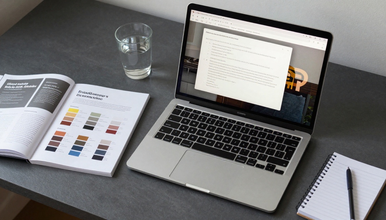
Building Product Mockups That Convert
Product mockups serve a different purpose than logos. The goal is to show a branded item in a realistic context that makes a potential customer believe in it before it is even manufactured. The same model handles this with a different prompting approach.
Product Shot Prompts That Work
For mockups, shift from logo-specific language to product photography language. Think about:
- The product: What material, shape, size, and finish
- The surface: White studio sweep, marble, oak wood, concrete, linen
- The lighting: Softbox left, natural window, directional backlight
- The logo placement: Front-centered, embossed, printed, etched, heat-pressed
- The camera angle: Three-quarter view, straight-on, overhead, low-angle
A working mockup prompt looks like this:
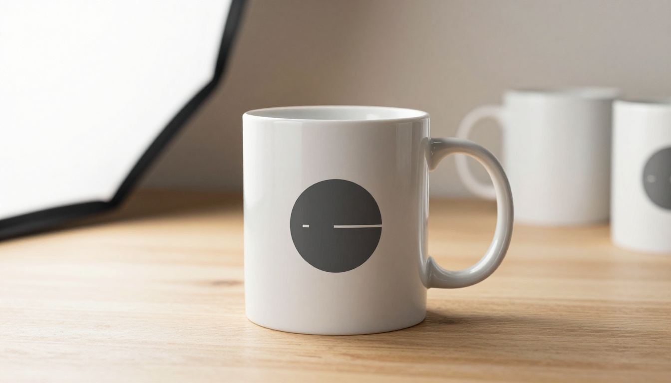
"Matte white ceramic coffee mug, centered on polished light oak surface, minimal circular logo printed in charcoal on the front face, soft natural light from the left window, clean gradient background cream to off-white, three-quarter angle view, photorealistic commercial product photography"
This type of prompt produces images that look like they came from a proper product shoot with a professional photographer.
Reference Images for Brand Consistency
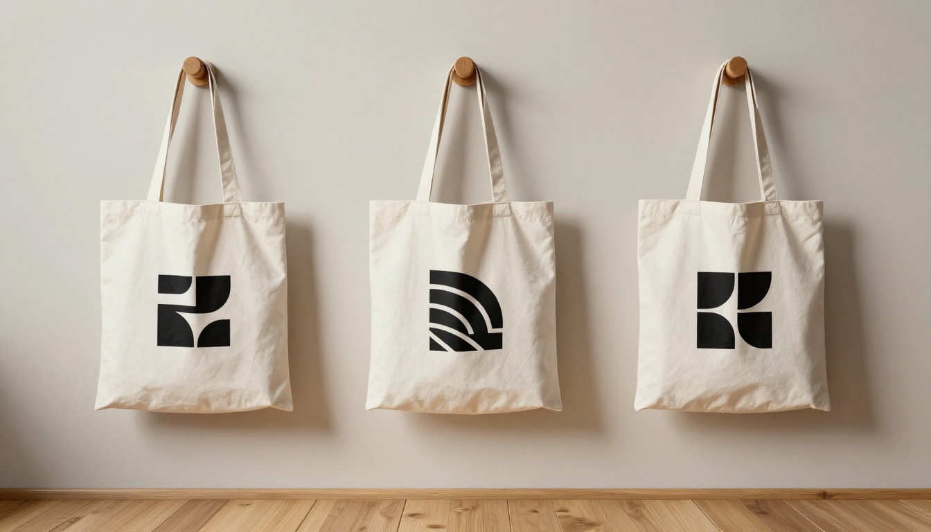
When you are creating multiple mockup types for the same brand, consistency becomes critical. A mug, a tote bag, a business card, and a bottle should all feel like they belong to the same visual family. Feed your established logo or the first mockup you generated as a reference image in subsequent runs. Describe the same color palette and style modifiers in each prompt and let the reference image anchor the visual direction. The result is a coherent brand kit rather than a collection of unrelated assets.
Which Aspect Ratio to Use
| Mockup Type | Recommended Ratio |
|---|
| Product detail shot | 4:3 or 1:1 |
| Lifestyle scene with product | 16:9 |
| Instagram square post | 1:1 |
| Story or Reel cover | 9:16 |
| Website hero with product | 16:9 |
| E-commerce product listing | 4:3 |
Prompt Anatomy for Logos and Mockups
Getting consistently good results from any AI image generator comes down to prompt structure. The difference between a usable output and a vague mess is usually not the model. It is the prompt.
Strong Prompts vs Weak Prompts
The most common failure in logo and mockup prompting is describing a feeling instead of a visual. "Clean and professional" means nothing to the model. "White background, single-color mark, no gradients, geometric forms, sans-serif letterforms" means something specific.
Think about what a graphic designer would write in a creative brief, not what a client says in a first call. Designers talk in visual language: forms, weights, proportions, surfaces, light sources, color relationships. Clients talk in emotional language: "trustworthy," "modern," "premium." Translate the emotional language into visual language before you write your prompt.
3 Mistakes Most People Make
- Skipping the background specification. Every logo and product shot needs an explicit background color or context. Without it, the model makes a choice that may not match your needs, and you waste a generation.
- Stacking contradictory style descriptors. Writing "minimal, luxury, modern, geometric, elegant, editorial, bold, playful" creates contradictions. Pick three coherent descriptors maximum. "Minimal, editorial, single-color" is a coherent brief. "Bold and minimal" is not.
- Ignoring the aspect ratio before writing the prompt. Generating a horizontal wordmark in 1:1 format wastes half the canvas. Match your ratio to your asset type before you type the first word.
💡 Treat each generation as a creative brief response. The more specific your brief, the better the output. Vague briefs produce vague results, from both AI and human designers.
Real Use Cases You Can Copy
Social Media Brand Kits
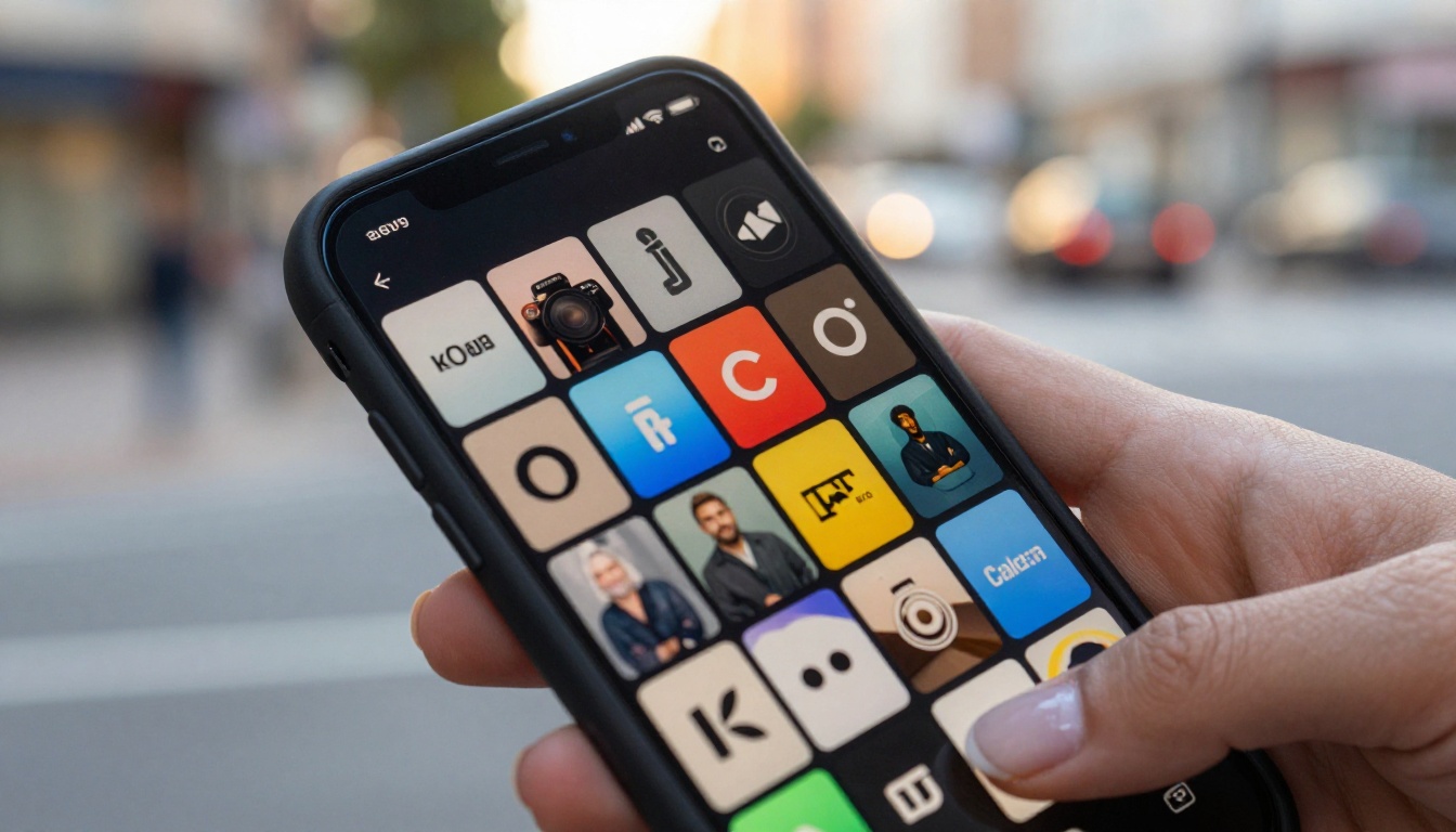
A social media brand kit typically requires five to eight asset types: a profile image, a cover banner, a post template background, a story frame, a highlights icon set, and a watermark. With Nano Banana Pro, you can generate all of these in a single session by adapting the same core prompt across different aspect ratios and surface contexts.
Start with your logo prompt in 1:1 for the profile image. Switch to 16:9 with a background scene for the cover banner. Add a lifestyle context for post backgrounds. Upload your first generated logo as a reference image to keep everything visually linked across the kit. The whole process takes less than an hour.
E-Commerce Product Visualization
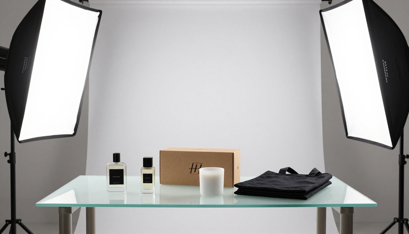
Before committing to a production run of 500 units, most e-commerce brands need to validate the product design with potential customers or investors. AI-generated mockups are the fastest and cheapest way to do this. You can produce a dozen product visualization images in an afternoon using Nano Banana Pro, test them in ads or landing pages, and only move to physical production once the design has proven market interest.
The economics are straightforward: a failed product run after a photo shoot costs thousands. An afternoon of AI-generated mockup testing costs nothing.

Pitch Decks and Presentations
Investors and clients respond to visual credibility. A pitch deck with polished product mockups and clean brand assets reads as more serious than one with placeholders or rough sketches. Using Nano Banana Pro to generate presentation-quality visuals before the product even exists is one of the highest-leverage uses of this technology. You are not faking it. You are showing what it will look like.
Other Models Worth Adding to Your Workflow
Once you have your base logo and mockups from Nano Banana Pro, several other tools on PicassoIA extend what you can do with those assets without starting over from scratch.
PicassoIA Image Editor Pro lets you make targeted edits to generated images: swap a background color, adjust a specific element, or fix a detail without regenerating the entire image. When a mockup is 90% perfect and you need one small change, this is significantly faster than re-prompting and hoping the next generation preserves what already worked.
Flux Redux Dev creates close variations of an existing image while preserving its core composition. If you generate a logo concept you love but want to see it in five different color palettes, Flux Redux Dev handles that without you rewriting the original prompt. It is a controlled variation engine built for exactly this kind of brand asset iteration.
PicassoIA Image serves as a solid alternative generation engine when you want a different visual interpretation of the same prompt. Running identical prompts through two models and comparing outputs is a fast way to find the visual direction that feels right for a brand, without committing to a single visual style from the first generation.
PicassoIA's super resolution tools in the super-resolution category can take any generated asset and upscale it further for large-format print, keeping edge sharpness intact on logos and fine texture detail visible on product surfaces. If you generated at 2K and later need a billboard-quality version, this is the path.
Your Brand Visuals Are One Prompt Away
The barrier between an idea and a professional-looking brand asset is now a well-written sentence. Nano Banana Pro on PicassoIA removes the technical bottleneck that kept brand design expensive and slow. Whether you are creating a logo for a side project, validating a product concept with mockups, or building a social media brand kit from scratch, the process is the same: describe exactly what you see in your head, choose your resolution and ratio, and generate.
The model is free to use, the output is yours immediately, and the only variable between you and a complete visual identity is the quality of your prompt. Start with one logo description. Run it three times. Pick the direction that feels right. Iterate from there.
Open Nano Banana Pro on PicassoIA and write your first brand prompt today.


