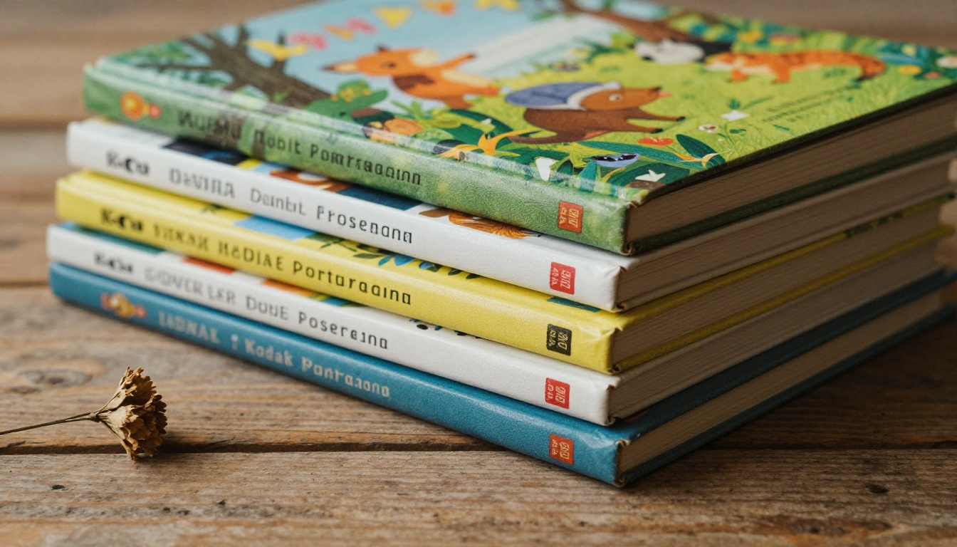
Create Storybook Illustrations with AI: From Blank Page to Beautiful Art
Creating storybook illustrations used to demand years of training or an expensive illustrator. Today, AI tools have changed the equation entirely. This article shows you the exact models, prompt formulas, and step-by-step workflow to produce beautiful children's book art in hours, not months.
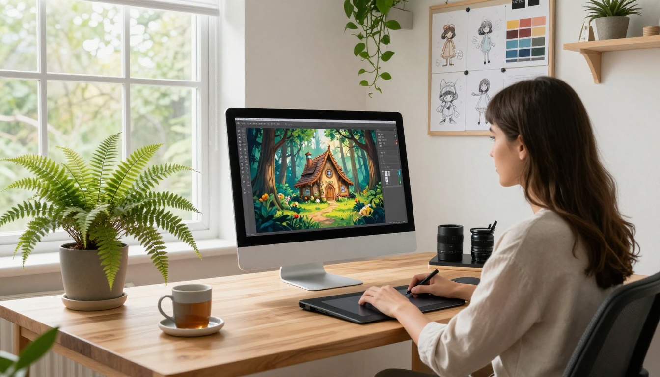
Creating a storybook from scratch used to mean one of two things: you hired a professional illustrator (expensive, often $50 to $150 per spread) or you spent years learning to draw yourself. Neither option worked for the person with a great story, limited budget, and zero art school background. AI image generation has changed that math completely, and if you know which tools to use and how to write prompts specifically for illustrated children's content, you can produce picture-book-quality art in an afternoon.
This is not about generating random pretty pictures and calling it a book. Storybook illustrations have strict visual demands: characters must look consistent from page to page, backgrounds need to support the story without competing with the characters, and the color palette must hold together as a coherent visual world across 20-30 spreads. This article covers all of that, with specific AI models, tested prompt formulas, and a repeatable workflow you can run right now.
What a Storybook Illustration Actually Needs
Most people assume "storybook art" means cute and simple. That's partly true, but what makes a picture book work visually is more precise than that. Before you open any AI tool, it helps to understand the specific visual language you're working in.
Consistent Characters
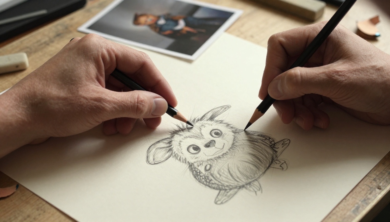
Your fox character needs to look like the same fox on page 3 and page 17. Same proportions, same fur color, same round expressive eyes. Character consistency is the hardest problem in AI-generated storybook art, because each image generation starts fresh without any memory of the previous output. The techniques for solving this are specific and worth spending time on, and we cover them in detail later.
Readable Scenes at Small Sizes
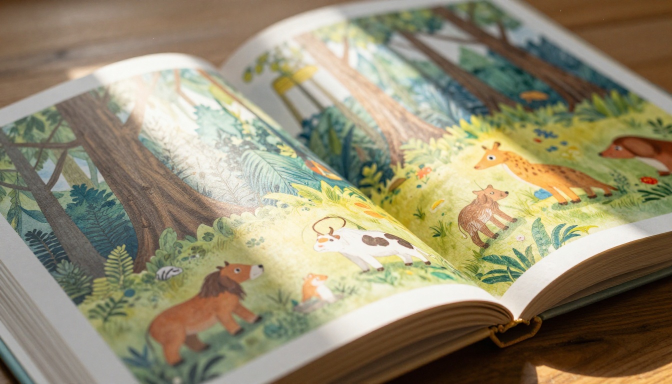
A storybook spread is read at arm's length by a child and an adult sharing a book. That means clear focal points, no visual clutter, strong character silhouettes, and high contrast between the character and background. A busy, photorealistic background competes with the character and makes the scene unreadable. A simple painted meadow or a soft interior setting works far better for the format.
A Coherent Visual Style
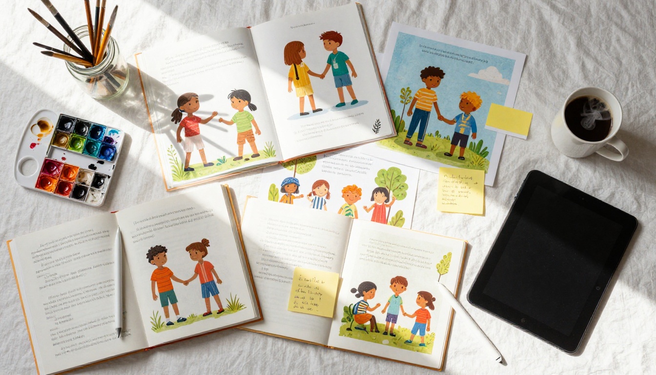
Children's books don't have one single illustration style. They range from bold, flat graphic shapes (classic toddler picture books) to detailed watercolor scenes (middle-grade illustrated chapters) to soft pastel dreamscapes (lullaby and bedtime books). Your AI prompts need to specify this clearly and consistently, or the output will be technically fine but visually incoherent, which is just as broken as a bad illustration.
The Emotional Register
Every spread in a well-illustrated children's book carries a specific emotional weight. The scared scene feels different from the joyful one, not just through character expression but through color temperature, line quality, and background energy. Learning to specify these emotional qualities in your prompts is what separates average AI storybook art from genuinely compelling work.
How AI Handles These Challenges
The limitations of AI image generation from two years ago are real but shrinking fast. Modern text-to-image models address the core storybook challenges in ways that weren't possible even recently.
Style Transfer at Scale
Today's best AI models hold a consistent visual style across an entire generation batch when your prompts are built correctly. Using style anchor phrases, a fixed block of style-defining terms that you paste into every single prompt, creates visual coherence even without any advanced settings or ControlNet tools. This approach is simple, reliable, and works immediately with zero technical setup.
The key insight is that your style description needs to be specific enough to narrow the model's output significantly. Broad terms like "cute" or "artistic" leave too much room for variation. Specific terms like "soft watercolor wash on textured paper, warm limited palette of ochre and sage, flat graphic character design, gentle black ink outlines, no gradients, no photorealism" create a much tighter constraint.
Rapid Iteration Cycles
Traditional illustration requires a full round-trip between sketch, revision, color comp, and final art. That cycle takes 2-4 days per spread for a working illustrator. With AI generation, you run 20 composition variations in the time it once took to finish one rough sketch. This speed changes the economics entirely. You're no longer rationing attempts; you're selecting from abundance.
💡 Pro tip: Generate in batches of 6-8 per scene. You're looking for the one that nails composition, character placement, and emotional tone. Expect to keep 1-2 from every batch.
Prompt-as-Art-Direction
In traditional illustration, you write a brief for your illustrator describing the scene. With AI, your prompt is that brief, delivered directly to the tool. The craft of writing AI storybook prompts is closer to art direction than to creative writing. Specificity, structure, and consistency matter far more than poetic language.
The Best Models for Storybook Art
Not every AI model performs equally on illustrated, stylized, or character-focused content. These are the standouts available on PicassoIA, with notes on where each one excels:
For most storybook projects, the recommended starting point is Flux 1.1 Pro for your main character scenes and spreads, then switching to Flux 1.1 Pro Ultra when you need the final high-resolution version ready for print layout. This two-stage approach balances speed during development with quality at delivery.
Stable Diffusion 3.5 Large is particularly strong when you need to run large batches with tight style control. It responds well to detailed style anchor phrases and tends to stay within the defined aesthetic more reliably across many generations. For a 30-spread book, that consistency under volume matters.
How to Use Flux 1.1 Pro for Storybook Scenes
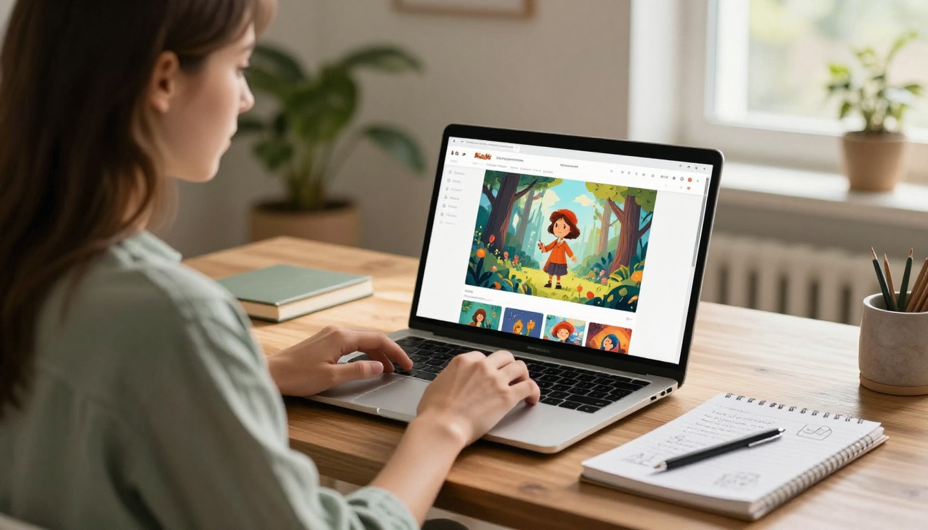
Flux 1.1 Pro is the recommended starting point for most storybook illustration projects. Here's a full step-by-step process that produces consistent, usable results from the first session.
Step 1: Build Your Character Reference First
Before generating a single spread, create your character reference. Open Flux 1.1 Pro and generate 10 variations of your main character using this structure:
"[Character name], [specific physical description: size, color, key features], standing facing forward on a plain white background, children's picture book illustration, soft watercolor style, warm limited palette, gentle ink outlines, full body visible"
From those 10, pick your 3 favorites. These become your visual Bible. Write out the exact physical description from the one you love most, word for word. You'll paste these exact words into every subsequent prompt. Deviating from this description, even slightly, drifts your character away from the reference.
Step 2: Write Scene Descriptions with Physical Anchors
Every spread prompt begins with your exact character description, followed by the scene action and setting:
"[Exact character description from reference], [specific action], [specific location with 2-3 environmental details], children's picture book illustration, [your style anchor block]"
The character description anchors the model toward your established visual. The more precise your physical description, the more consistent your outputs will be across the full book.
Step 3: Lock Style with a Fixed Anchor Block
Your style anchor block should be identical across every single prompt in your project. Write it once, save it in a text file, and paste it without modification into every generation:
soft watercolor style on textured white paper, warm earthy palette of ochre sage and dusty rose,
flat graphic character shapes, gentle black ink outlines, simple readable backgrounds,
no gradients, no photorealism, no digital effects, children's picture book aesthetic
Consistency in this block is what creates a book that looks designed rather than assembled.
Step 4: Test Compositions Before Committing
Generate 6-8 versions of each spread before selecting one. Evaluate each for: character placement (is the fox too centered, too small?), scene readability (can you tell what's happening in 2 seconds?), background simplicity (does the setting support or compete with the character?), and emotional tone (does this feel like the right moment in your story?).
💡 Save the generation seed from any output you love. You can reuse it to generate outputs in the same visual fingerprint, which is invaluable when a spread needs a slight revision without a full regeneration.
Prompt Formulas That Actually Work
These templates are tested specifically for AI children's book illustration content. Copy and adapt them directly for your project.
Character Action Scenes
[Character description with specific physical traits], [action verb + specific action details],
[specific location: 2-3 environmental elements], children's picture book illustration,
soft watercolor style, warm limited palette, gentle black ink outlines, flat design,
simple background, no photorealism
Example: "A small brown rabbit with floppy ears and a blue striped scarf, digging excitedly in a garden with tall sunflowers and a wooden fence behind, children's picture book illustration, soft watercolor style, warm limited palette, gentle black ink outlines, flat design, simple background"
Background Settings
For spreads where the setting is the hero, a marketplace, a forest at dawn, an underwater cave:
[Scene name] background scene for children's picture book, wide establishing shot, no characters,
soft [style] painted aesthetic, [specific environmental elements: 3-4 details], simple sky with [weather condition],
warm color palette, flat design, children's book background art, illustrated style
Emotional Close-Ups
For intimate moments, a character's face when they're frightened, surprised, or overcome with joy:
Close-up portrait of [character description], [specific emotion + physical expression detail],
simple background wash of [color], children's picture book illustration, expressive eyes,
soft watercolor style, warm [light direction] lighting, no photorealism
The emotional close-up format is one of the most powerful in children's book illustration because it creates connection. A child seeing a character cry or laugh in a big close-up format feels that emotion directly. These spreads are worth extra generation time to get right.
Keeping Your Characters Consistent
Character consistency is the primary technical challenge in AI storybook illustration. Here are three methods that work, ranked by reliability:
Method 1: Exact Physical Description Anchoring
Write a single, detailed physical description of your character and copy it word-for-word into every prompt. Even small variations like swapping "big round eyes" for "expressive eyes" produce meaningfully different outputs. This is the simplest method and works well for 10-15 spread projects.
Method 2: Seed Locking
Every AI generation uses a seed number, a random starting point for the generation. When you find a character output you love, save its seed number. Reusing that seed with variations in the action and background tends to produce outputs in the same visual family. Flux 1.1 Pro responds particularly well to this technique.
Method 3: ControlNet Scribble for PosesControlNet Scribble lets you draw a rough stick-figure pose and have the AI generate your character in that exact position. Draw a quick sketch showing your fox jumping, running, or pointing at something, upload it to ControlNet Scribble on PicassoIA, then add your character description and style anchor block. The AI respects your body structure sketch while applying the full visual style on top.
This is the most reliable method for action-heavy scenes where the character needs to be in specific positions that don't appear in your reference batch.
Method
Best For
Consistency Level
Exact Description Anchoring
All scene types
Good
Seed Locking
Similar poses, small variations
Very Good
ControlNet Scribble
Action poses, specific positions
Excellent
5 Mistakes That Undermine Storybook Art
These errors appear constantly in AI-generated children's book projects, even when individual images look technically fine. Avoiding them is what separates a finished book from a collection of pretty pictures.
Mixing too many style descriptors. Prompts that combine "watercolor + anime + oil painting + flat design" produce muddy, inconsistent results. Pick one visual style and own it completely across every spread.
Forgetting the background specification. Prompts focused on the character alone often produce generic white or random gradient backgrounds. Always specify: "simple painted [color] background" or "soft meadow background with blurred wildflowers in distance."
Skipping the print size test. A spread that looks beautiful at full screen can become unreadable when printed at 8x8 inches. Resize your preview image to print dimensions in any image viewer before committing to finals.
Inconsistent light direction. When one spread has light from the left and the next has it from the right with no story reason for the change, it creates visual unease the reader can't quite name. Specify "soft light from upper left, shadows falling to lower right" in every prompt.
Drifting toward photorealism. Over a long generation session, style anchors can weaken and outputs drift toward realistic textures and shadows that read as uncanny rather than illustrated. Check your anchor block every 5-10 spreads and keep it explicit in the prompt.
💡 The 5-second test: Show the spread to someone who hasn't seen your project. If they can describe the scene and emotional tone in 5 seconds without explanation, the illustration is working.
From Digital Files to Printed Pages
Most AI image outputs arrive at 1024x1024 or 1024x768 pixels. For professional print quality at 300 DPI, an 8x8 inch spread needs 2400x2400 pixels minimum. This gap is where AI super-resolution tools earn their place in the workflow.
PicassoIA's super-resolution tools can upscale your generated images 2x to 4x without significant quality loss, preserving the fine linework and watercolor texture detail that makes illustrated book art feel handmade. Run every final spread through upscaling before dropping it into your print layout.
For the cover image specifically, use Flux 1.1 Pro Ultra, which generates at higher native resolution, then run one super-resolution pass on top of that. A strong cover is the single highest-value output in any self-published children's book; the time spent here pays for itself.
For longer projects with 20-30 spreads requiring both pose control and style consistency, SDXL Multi ControlNet LoRA is worth using for your more complex scenes. It gives you structural control over the character pose through ControlNet while applying a custom style via LoRA, which means fewer re-generations when you need a very specific action in a very specific style.
Print-ready checklist:
Minimum 2400px on the short side after upscaling
PNG format for lossless quality retention
RGB color mode (convert to CMYK in layout software before sending to print)
3mm bleed added if sending to a print-on-demand service
Color profile: sRGB for most print-on-demand platforms
Your First Storybook Spread Starts Now
You don't need a portfolio. You don't need a freelance budget or a degree in visual arts. What you need is a clear story, a character description specific enough to repeat reliably, and a style anchor block you commit to for the full project.
Start with one scene: your main character in their opening moment. Run 8 variations with Flux 1.1 Pro, pick the output that feels right, save the seed number, write down the exact physical description word for word, and build from there. Every additional spread becomes faster once your visual language is established, because you're selecting from a palette you already defined.
The craft of illustrated children's books is real, and AI doesn't replace it. What it does is remove the barrier between having a story worth telling and having illustrations worthy of that story. The ideas were never the scarce resource; the execution was. That equation has changed.
The tools are live on PicassoIA. Your story is waiting.
Go run your first storybook prompt right now. Pick your character, write that description, paste your style anchor block, and generate your first batch. The blank page problem is officially solved.