The text problem in AI image generation is real. Most generators smear letters, blend characters together, or produce words that look approximately right but aren't. If you've tried to design posters with readable text using AI and ended up with something that resembles scrambled letterforms, you're not alone. The good news: specific models handle text far better than others, and the way you write your prompt makes an enormous difference.
This article breaks down exactly what works, which models to use, how to structure your prompts, and how to get consistent professional results on your first or second generation.
Why Most AI Posters Fail at Typography
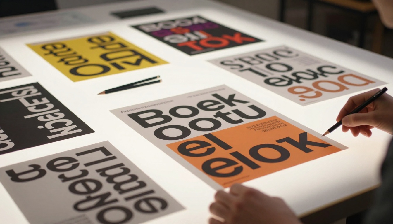
The failure mode is almost always the same. You generate a poster, the image looks great, the layout is solid, but the text is garbled. A headline that should read "Jazz Festival 2025" comes out as "Jozz Fästival 2O25." The model grasped the idea of text but couldn't execute the actual glyphs correctly.
The blurriness problem
Most diffusion-based image models were not specifically trained on text rendering. They learned from billions of images where text was often a secondary element: watermarks, captions, background details. The model learned that text-like patterns exist, but not how to produce them accurately at a pixel level.
The result is text that looks like text from a distance but falls apart when you read it. This is called "hallucinated typography," and it plagues models that weren't explicitly fine-tuned for text accuracy.
What "readable" really means in AI output
Readable text in an AI-generated poster means three things: the correct characters appear in the correct order, letter spacing is consistent without strange gaps or overlapping, and the contrast between text and background is high enough for immediate legibility. Any model that passes all three tests consistently is worth using for poster work.
Contrast is often the easiest to control through your prompt. Character accuracy is entirely model-dependent, which is why model selection matters so much here.
3 Models That Actually Render Text
The text generation landscape among AI models is not equal. After testing across dozens of models, three stand out consistently for poster text accuracy.
Ideogram v3 Quality
Ideogram v3 Quality was built with typography as a first-class feature. Ideogram's architecture explicitly prioritizes text placement, character accuracy, and glyph rendering. When you specify text in the prompt using quotation marks, Ideogram takes it seriously and renders it precisely.
This makes it the strongest choice for any poster where the headline text is critical and must be correct on the first generation. Event posters, announcement graphics, and anything with a specific name or date should go through Ideogram v3 Quality first.
Best for: Headlines, dates, specific names, anything where character accuracy is non-negotiable.
Recraft v3
Recraft v3 approaches text differently. It was designed as a graphic design model, not just an image generator, which means it handles typography within a design context: hierarchy, spacing, the balance between text and negative space. Recraft produces posters that look intentionally designed rather than accidentally generated.
It also supports SVG output through Recraft Vectorize, which means you can convert your poster output into a scalable vector format for printing at any size without quality loss.
Best for: Minimalist posters, logo-adjacent designs, anything where design balance matters as much as text accuracy.
GPT Image 1
GPT Image 1 brings OpenAI's deep language modeling into image generation. Because the model has a strong grasp of semantic meaning, it renders text with high accuracy while also handling the compositional relationship between the text and the surrounding visual elements. The poster layout feels natural, not forced.
GPT Image 2 builds on this with improved photorealism and better prompt adherence, making it ideal for product-style posters where text needs to integrate naturally with photographic elements.
Best for: Complex posters with multiple text elements, photorealistic backgrounds with overlaid text.
How to Write Prompts for Poster Text
The model matters, but your prompt is still the single biggest variable. A weak prompt will underperform even the best model. A precise prompt extracts consistently strong results.
Put text in quotes
Every model that supports text rendering does better when you enclose the exact text in quotation marks within your prompt. Instead of writing "a poster announcing a jazz festival," write: a minimalist event poster with the text "JAZZ FESTIVAL" in bold uppercase sans-serif at the top.
The quotes signal to the model that this is a literal string to be rendered, not a thematic cue to interpret loosely.
Specify contrast explicitly
Don't leave contrast to chance. Tell the model exactly what background color and text color you want. "Bold white sans-serif text on a deep navy background" gives the model zero ambiguity about contrast. "Dark text on a light background" is too vague and leads to inconsistent results.
High-contrast combinations that work reliably across models:
- White text on deep navy or charcoal
- Black text on cream or warm white
- Yellow text on dark charcoal
- White text on forest green
Control layout with position language
Models respond well to explicit positional language. "Large headline centered at the top third of the poster, smaller subtext centered below" gives the model a spatial layout to follow. Without this instruction, text may appear anywhere in the frame, disrupting the visual hierarchy.
Tip: Describe the poster sections as distinct zones: "top third for the headline, middle for the main visual, bottom third for date and location details." This mirrors how professional designers actually structure poster layouts.
Limit the text volume per prompt
The more text you try to pack into a single generation, the more likely you are to get errors. For posters with multiple text elements (headline, subheading, date, location, tagline), consider a layered approach: generate the core visual with just the headline, then use an editing model like Flux Kontext Fast to add secondary text elements in subsequent passes.
This approach dramatically improves accuracy for complex typographic layouts by giving each text element its own generation pass.
How to Use Ideogram v3 Quality on PicassoIA
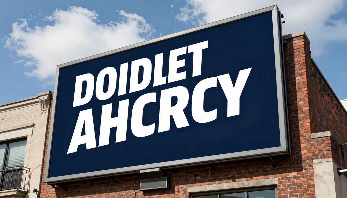
Since Ideogram v3 Quality is the top-performing model for text accuracy, here is a full walkthrough of using it on the platform.
Step 1: Open the model
Go to Ideogram v3 Quality on PicassoIA. The interface loads the model directly with input fields for your prompt and generation parameters.
Step 2: Write a text-first prompt
Structure your prompt to lead with the text element. Example:
A clean minimalist event poster with the bold headline text "SUMMER SOUNDS 2025" in uppercase white letters at the top. Below, a high-contrast image of a crowd at sunset. At the bottom, the supporting text "JULY 18" in smaller white letters. Deep navy background. Professional poster design, print-quality.
Notice: the text is in quotes, positions are specified (top, bottom), and the contrast setup is explicit (white on navy).
Step 3: Set the aspect ratio
For standard vertical posters (A3/A4 format), use 2:3 or 3:4. For social media square posts, use 1:1. For wide-format or banner posters, use 16:9. Ideogram respects ratio settings and adjusts the composition accordingly.
Step 4: Iterate on errors
If any letter is incorrect, don't start over from scratch. Copy the prompt, add a correction note ("ensure the text reads exactly 'SUMMER SOUNDS 2025' with no missing or extra characters"), and regenerate. Ideogram typically converges to accurate output within 2 to 3 generations.
Poster Types That Work Best with AI
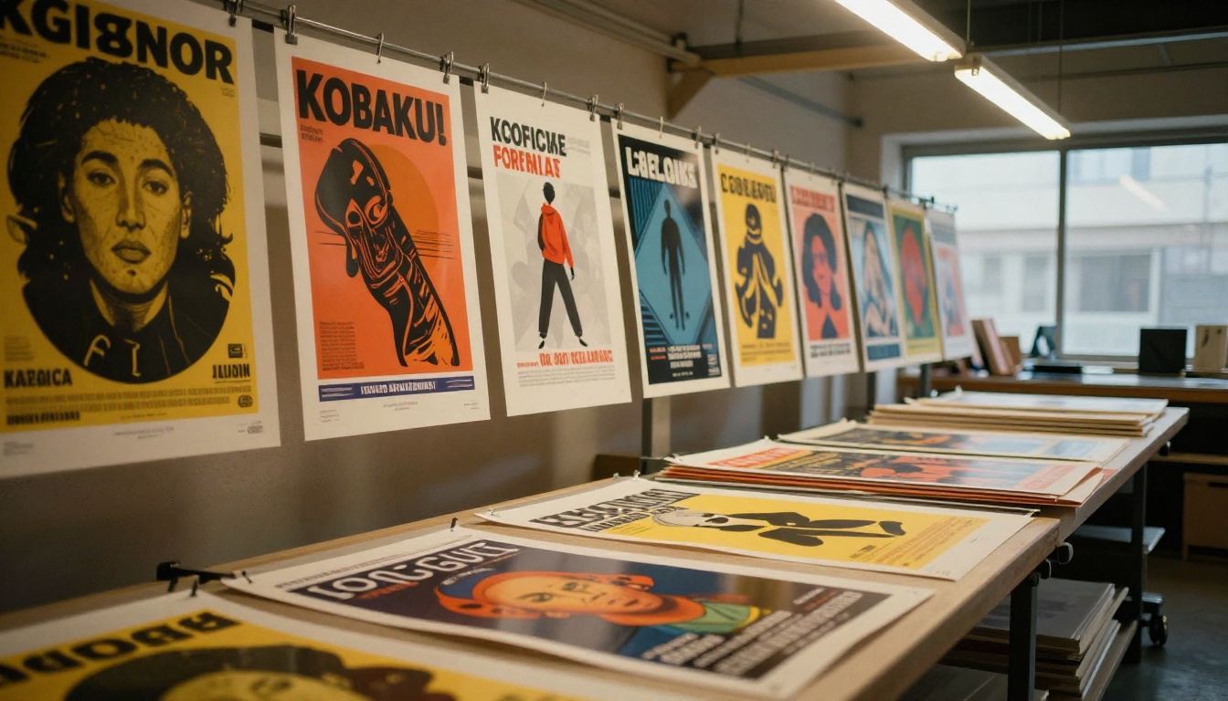
Not every poster type benefits equally from AI generation. Some formats are better suited to the current capabilities of these models.
Event posters
Event posters are the sweet spot. They typically require one strong headline, a date, and a background image. This three-element structure is simple enough for models like Ideogram v3 Quality and GPT Image 1 to handle reliably in a single generation. Concert announcements, community events, product launch parties, and gallery openings all fall here.
Product announcements
Product posters work well when the text is minimal and the visual carries most of the weight. A product name, a single tagline, and a clean background give the model enough room to render both the image and the text correctly. For products where you need to overlay text on a photorealistic image, GPT Image 1 handles the compositional blending most naturally.
Social media graphics
Square and vertical social media posters (Instagram, Pinterest, LinkedIn) work particularly well because the constrained format reduces compositional complexity. Less space means fewer text elements, which directly improves text accuracy. PicassoIA Image handles high volumes of social content quickly for teams producing regular graphics at scale.
What to avoid
Dense informational posters, such as conference schedules or multi-column layouts, are currently not suitable for direct AI generation. The character count alone will produce errors. For these, use AI to generate the visual background, then add text in a design tool like Canva or Figma on top of the AI output.
Common Mistakes and How to Fix Them
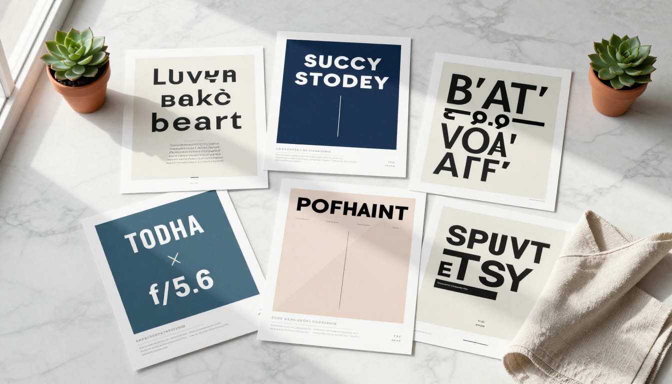
Even with the right model, certain habits consistently produce poor results. Here are the most common ones and what to do instead.
Asking for too much text
The mistake: Prompting for a poster with a headline, subheadline, date, location, ticket price, website, and sponsor logos in a single generation.
The fix: Use the "headline first" approach. Generate the poster with only the primary headline text. Then use an inpainting or text-editing model to add secondary elements in a separate pass. Flux Kontext Fast specializes in localized edits and is ideal for adding text to an existing generated image without disturbing the rest of the composition.
Ignoring background contrast
The mistake: Generating a complex scenic background (forest, crowd, cityscape) and trying to overlay text without specifying a clear contrast zone.
The fix: Add a contrast band to your prompt. "A dark semi-transparent overlay at the top third of the image behind the headline text" gives the model a clear instruction to create visual separation between background and text. This single addition dramatically improves readability.
Tip: Think like a poster designer. Real posters always have a dedicated zone for text that is visually separated from imagery, whether through color blocking, overlay, or simply using a solid-color section of the layout.
Using vague font descriptors
The mistake: Writing "nice font" or "stylish typography" in your prompt.
The fix: Be specific. "Bold condensed sans-serif," "light weight serif," "monospace uppercase," and "rounded modern sans-serif" all give the model actionable instructions. The more specific your font description, the closer the output to your intent.
Not specifying size hierarchy
The mistake: Asking for a "headline and subheadline" without specifying relative sizes.
The fix: Use descriptive size language. "Large bold headline taking up the top 30% of the poster, subheadline at 40% the size of the headline directly below" gives the model a clear size relationship to replicate in the output.
Results You Can Actually Use
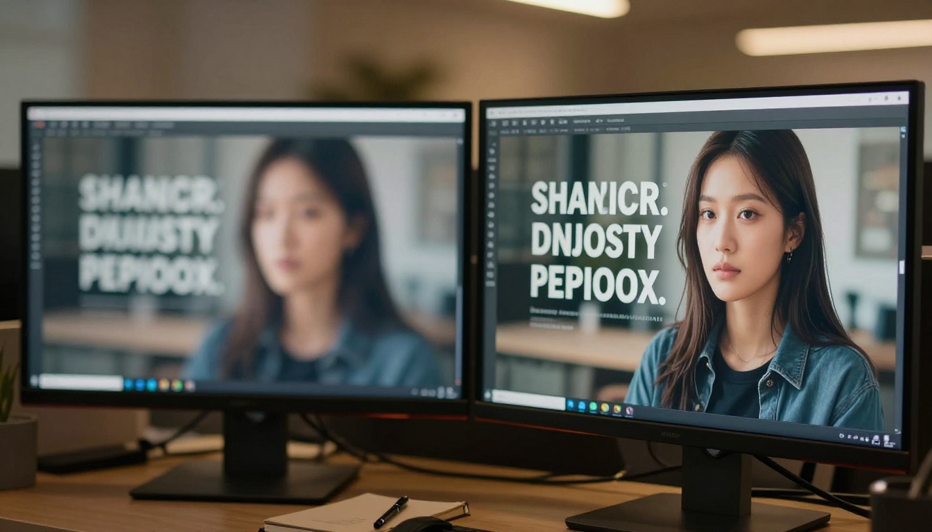
The difference between a usable AI poster and a frustrating one comes down to model selection and prompt precision. With Ideogram v3 Quality for text-critical work, Recraft v3 for design-forward output, and GPT Image 1 for compositionally complex posters, you have everything needed to produce professional results.
The workflow that consistently delivers:
| Step | Action | Tool |
|---|
| 1 | Choose your poster type | Decide before prompting |
| 2 | Write the headline text in quotes | In your prompt |
| 3 | Specify background and text color | In your prompt |
| 4 | Set aspect ratio | Model parameter |
| 5 | Generate with Ideogram v3 or GPT Image 1 | Run generation |
| 6 | Add secondary text if needed | Flux Kontext Fast |
| 7 | Upscale for print | Super Resolution tools |
For print-quality output, consider running your final poster through a super-resolution model after generation. PicassoIA offers several upscaling tools that can take a 1024px output and scale it to print-ready dimensions without introducing artifacts.
Try It Yourself
The only way to get confident with AI poster design is to generate a few. The learning curve is short once you have the model and prompt structure right.
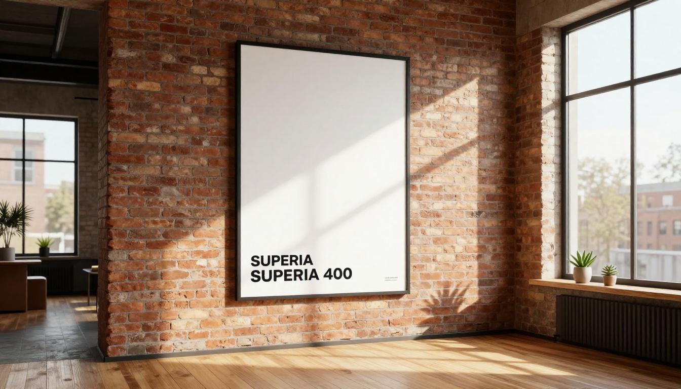
Start with a simple event poster: pick a fictional event name, write a headline in quotes, specify white text on a dark background, and run it through Ideogram v3 Quality on PicassoIA. You will see within two or three generations exactly what is possible and what still needs iteration.
From there, experiment with Recraft v3 for a more design-oriented output, or GPT Image 2 for photorealistic scene integration. Each model has a distinct personality, and you will quickly develop a sense of which to reach for first depending on the brief.
PicassoIA puts all of these models in one place, accessible without switching tools or managing separate accounts. Pick your model, write your prompt, generate, iterate. That is the entire workflow for designing posters with readable text using AI, and it is faster than any traditional design tool once you have it dialed in.


