Your app icon is the first pixel a user sees before they ever open your product. Not the UI, not the onboarding, not the marketing copy. The icon. And for most indie developers and small teams, it is also the last thing that gets real attention, usually thrown together hours before submission. AI changes that equation entirely.
With the right model and a solid prompt, you can generate production-ready app icons in minutes. No designer waiting for your brief. No revision rounds. No licensing headaches. Just a prompt, a generation, and an icon that holds up at every size from 16px favicon to 1024px app store hero.
Why App Icons Still Get Ignored
Most developers treat the icon as an afterthought. The consequences show up in download numbers.
First impressions before the first tap
In an app store, your icon competes in a grid of 20 other apps, all fighting for the same two seconds of attention. Research from mobile analytics firms consistently shows that icon redesigns alone can shift tap-through rates by 5 to 25 percent. The icon is not decorative. It is functional.
A weak icon signals: this product was not built with care. A strong one communicates the opposite before a single word gets read.
Icons and download rates
When someone searches for "expense tracker" or "workout timer," they see a vertical list. What makes them tap one over another? Price matters. Ratings matter. But the icon is the only visual signal in a text-heavy list, and visual processing happens faster than conscious reasoning. Your icon is making a case before your description gets read.
What a Good Icon Actually Needs
Not every icon problem is a design problem. Most are specification problems.
Size, shape, and scalability
App icons live at wildly different sizes at the same time. iOS requires assets from 20x20 to 1024x1024 pixels. Android goes from 48dp to 512x512. A web favicon sits at 16x16. Your icon needs to be recognizable at all of these sizes simultaneously.
This is why vector formats matter so much. A raster PNG that looks sharp at 512px turns muddy at 48px. An SVG scales without quality loss, making it the smarter starting point for any icon that needs to exist across platforms.
Tip: If you want scalable icons right out of the generation pipeline, look for models that output native SVG, not raster images that get traced after the fact.
Color does the heavy lifting
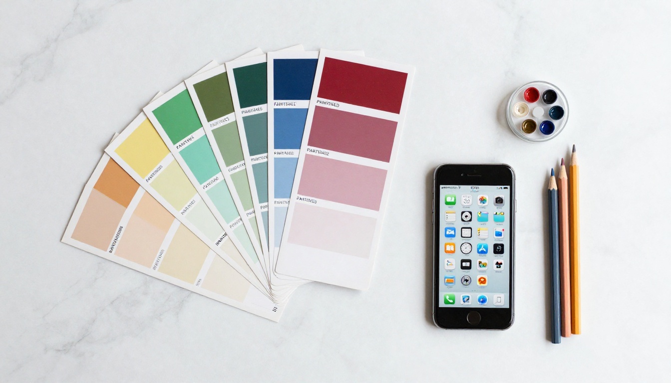
At small sizes, complex shapes collapse into noise. Color is what survives. Strong icon color choices follow a few principles:
- High contrast between the icon mark and the background shape
- One dominant color with one or two supporting tones at most
- Avoid gradients at small sizes: they flatten into grey at 48px
- Test in dark mode: your icons will appear on both light and dark home screens
Tip: Generate your icon in multiple color variants immediately. It costs nothing with AI and saves painful revision cycles later.
The Best AI Models for Icon Creation
Not all text-to-image models handle icons equally. Icons demand precision, clean shapes, and in many cases readable text at small sizes. Here are the ones worth using.
Recraft 20B SVG for clean vectors
Recraft 20B SVG is the most capable model for generating app icons directly as SVG files. It does not render a raster image and trace it afterwards. It generates actual vector paths, which means your output is scalable from 16px to 4K without quality loss.
For icon design, this matters enormously. You skip the conversion step, get cleaner edges, and can open the SVG in any vector editor to adjust colors, paths, or proportions.
You can also pair it with Recraft Vectorize if you already have a raster concept and want to convert it to clean vector paths.
Best for: App icons, favicons, icon packs, UI elements that need to scale across platforms.
Ideogram v2 Turbo for text in icons
Most AI models fail when you need readable text inside an icon, such as a monogram, an abbreviation, or a single letter mark. Ideogram v2 Turbo was built specifically for text rendering in generated images. It is the right choice when your icon concept includes letters.
Apps that use a bold letter as their main mark, a single well-rendered character on a clean background, represent one of the most effective and timeless icon styles. Ideogram handles this without the garbled-character problem that affects other models.
Best for: Monogram icons, letter-based logos, icons with short abbreviations.
GPT Image 1 for detailed icon concepts
GPT Image 1 produces highly detailed, polished images that translate well to icon concepts requiring visual depth. For a gaming app, a photography tool, or anything where the icon should feel layered and premium, GPT Image 1 handles that fidelity well.
It outputs raster images, so you will want to pass results through Recraft Vectorize if vector output is needed. The quality of the initial generation is consistently strong.
Best for: Premium icons, detailed icon concepts, gaming and creative app icons.
Other options worth trying
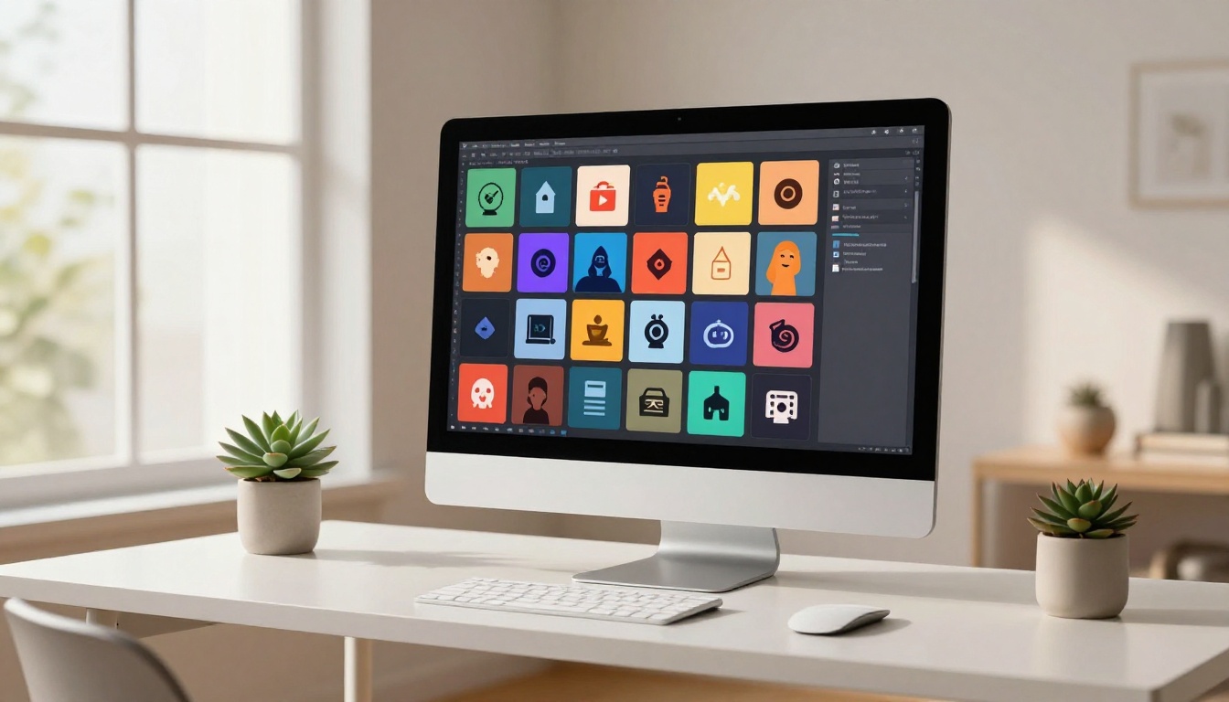
How to Use Recraft 20B SVG
Recraft 20B SVG on PicassoIA is the most direct path from prompt to production-ready vector icon. Here is the full workflow.
Step 1: Open the model
Navigate to Recraft 20B SVG on PicassoIA. No API tokens or local installation required.
Step 2: Set your style
In the style selector, choose the icon style that fits your app:
- Flat icon for productivity, finance, or health apps
- Line icon for minimal or developer tools
- Bold icon for gaming, sports, or entertainment
- Gradient icon for consumer apps where the icon appears large in the store listing
For most app store contexts, flat or bold will perform best at small sizes.
Step 3: Write a focused prompt
Describe only the icon, not a full scene. A good icon prompt answers four things:
- What is the central shape or symbol?
- What is the background color or treatment?
- What is the color of the icon mark?
- What mood or visual weight should it have?
Focused prompt that works: Minimalist flat icon, white lightning bolt centered on a deep blue rounded square background, clean geometric edges, no gradients, app store ready
Vague prompt that fails: A cool modern icon for an energy app with a lightning bolt
The first tells the model exactly what to render. The second hands too much creative judgment to the model and the results show it.
Step 4: Generate and download
Click generate. Recraft 20B SVG produces an SVG file you can download directly. Open it in Figma, Illustrator, or Inkscape to verify paths, swap colors, or adjust proportions.
Step 5: Export all required sizes
From your vector editor, export the icon at:
- 1024x1024 PNG for the App Store
- 512x512 PNG for Google Play
- 192x192 PNG for web and PWA
- 32x32 and 16x16 PNG for favicons
Because you started with a vector source, every export is pixel-perfect regardless of size.
Writing Icon Prompts That Actually Work
The gap between a generic output and a great icon usually lives in the prompt, not the model.
5 prompt templates that deliver results
These structures work across models. Swap in your specifics:
-
Flat minimal: Flat icon, [symbol] centered on [color] rounded square, white [symbol], clean geometric shapes, no gradients, app store format
-
Monogram: Bold letter [X] in [weight] weight, centered on [color] background, minimal, clean edges, scalable icon design
-
Illustrated mark: Simple [animal/object] illustration, flat design, [2-3 colors], rounded square format, thick outlines, approachable tone
-
Abstract shape: Abstract geometric [shape] icon, [color palette], centered composition, minimal detail, bold and readable at small sizes
-
Photography app style: Circular aperture icon, flat design, [primary color], clean and modern, centered on white rounded square background
Mistakes that ruin icon results
Overloading the prompt with details: Icons are small. A prompt describing ten visual elements generates a cluttered result that reads as grey noise at 48px. One central symbol, one background treatment, two colors maximum.
Skipping the background format: Write "rounded square background" to get an app-icon-shaped result. Without this, models generate icons floating on white space without the standard app icon container shape.
Vague color direction: "Blue" is not enough guidance. "Deep navy blue" or "bright coral orange" gives the model enough specificity to produce intentional color choices rather than arbitrary defaults.
Forgetting dark mode: Specify a non-white background unless you specifically want a white icon. Light icons on light home screens disappear completely.
SVG vs PNG for App Icons
Both formats have legitimate places in an icon production workflow. Here is where each one belongs:
| Property | SVG | PNG |
|---|
| Scalability | Infinite, no quality loss | Fixed resolution |
| File size at small sizes | Smaller | Larger |
| App Store submission | Not accepted directly | Required format |
| Design editing | Fully editable paths | Rasterized, destructive edits |
| Favicon support | Modern browsers | Universal support |
| Available on PicassoIA | Recraft 20B SVG | All models |
The practical workflow: generate as SVG for the source file, export to PNG for all submission formats. This preserves an editable master while producing the exact output each platform requires.
Tip: App stores require PNG, but your design source should always be the SVG original. Never overwrite the vector file with a raster export.
3 Real Icon Workflows
Mobile app icon for iOS and Android
- Write a focused prompt around one symbol and one clear background color
- Generate with Recraft 20B SVG to get a vector source file
- Open in Figma or Illustrator, verify the paths and color values
- Export at 1024x1024 PNG for App Store and 512x512 for Google Play
- Test on actual device screenshots placed next to competing apps in the same category
That final step matters. An icon that looks strong in isolation can disappear in a grid of similar-colored competitors. Intentional contrast with the apps around you is a real conversion strategy, not just an aesthetic preference.
Favicon for a web app or site
Favicons live at 16x16 and 32x32 pixels. At those sizes, complexity is the enemy. One shape, two colors maximum.
- Generate with Recraft 20B SVG, specifying a bold, simple central mark with no text
- Export as both SVG (modern browsers) and PNG (legacy support)
- Add to your HTML:
<link rel="icon" type="image/svg+xml" href="/favicon.svg">
For sites that need a polished appearance in browser tabs, bookmarks, and PWA install prompts, this workflow produces professional results in under 20 minutes.
Building a full icon pack with consistency
When your app needs a set of UI icons including navigation icons, action icons, and status indicators, visual consistency matters as much as individual quality.
- Define your base style: stroke weight, corner radius, visual tone
- Write a style prompt you will reuse across every icon:
Flat icon, [style details], white symbol on [brand color] background, 2px rounded corners, consistent visual weight
- Generate each icon using the same base prompt, only swapping the central symbol description
- Use Flux Kontext Fast to edit specific icons that need adjustment without regenerating from scratch
The consistency advantage: once your base prompt is established, every icon in the set shares the same visual DNA. That is something that takes substantial time to produce manually and costs nothing extra with AI.
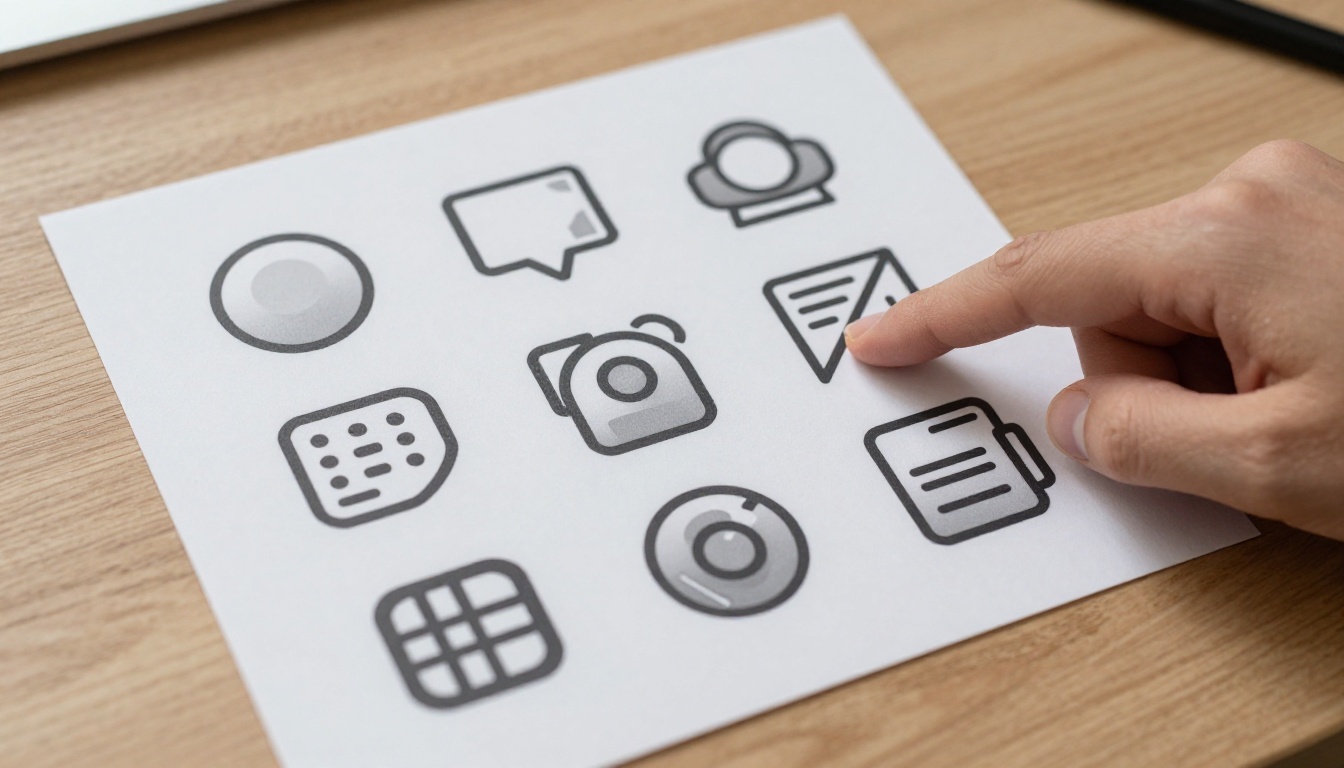
What Models Actually Respond To
AI image models respond to semantic specificity the same way search engines respond to relevance signals. Terms like "rounded square," "app store safe zone," "flat icon style," "monochrome fill," "icon grid format," and "solid background" act as anchors that steer models toward icon-appropriate outputs rather than generic illustrations or scene compositions.
Design-specific language in your prompt consistently outperforms vague style directions. Instead of "modern design," specify "flat design with 8px corner radius and 2px optical margins on all sides." That level of precision produces production-usable results far more often on the first generation, which means fewer retries and faster iteration.
Prompt vocabulary that reliably improves icon output: flat icon, app icon format, rounded square, 2x padding, minimal illustration, icon safe zone, solid fill, transparent background option, scalable mark, no text, centered symbol, iOS icon style, bold icon mark, no gradients, single color background.
The more of these you weave into your prompt alongside the actual concept, the more the model treats it as an icon generation task rather than a general image creation task. That distinction matters in the quality of the result.
Your Next Icon Is One Prompt Away
The app icon you have been putting off for weeks can be done today. The models are available, the workflow is short, and the quality ceiling for AI-generated icons is high enough for production use across the App Store, Google Play, and the web.
Start with Recraft 20B SVG for vector output, use Ideogram v2 Turbo when your icon needs readable text or a letter mark, and reach for GPT Image 1 when you want maximum visual quality on a more detailed concept.
All of these models are available on PicassoIA without local setup or API tokens. Write your first prompt now. Download the SVG. Open it in your editor. Ship your app with an icon that actually represents what you built.