Your wallpaper says something about you. It is the first thing you see when you wake up your screen, the backdrop to every working hour, and the detail most visitors notice when you share your screen. So why is yours a stock photo from 2018 that six million other people also downloaded?
AI image generators changed this equation. You can now describe exactly what you want, down to the lighting angle and film grain, and get a photorealistic wallpaper back in seconds. No design skills. No Photoshop. No subscription to a stock photo library where every image already belongs to someone else's mood board.
This article covers how to generate wallpaper art with AI, which models produce the sharpest results, and the exact prompt structure that separates a mediocre output from something you actually want to stare at for eight hours a day.
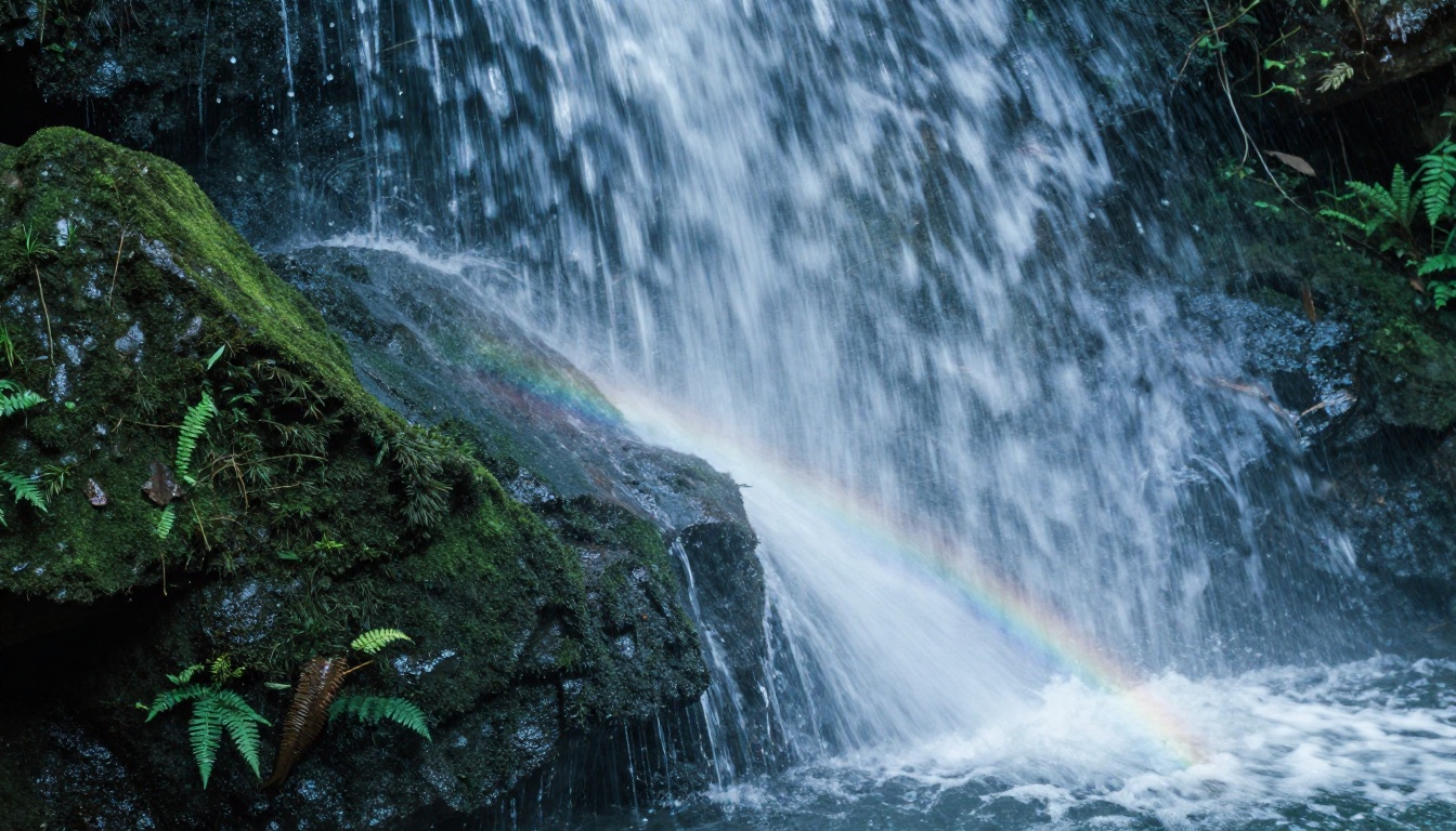
Why Stock Wallpapers No Longer Cut It
The resolution trap
Most stock wallpaper sites offer images in fixed resolutions sized for yesterday's monitors. A 1920x1080 image on a 4K display looks noticeably soft, and almost nothing on those sites is genuinely optimized for ultrawide formats like 3440x1440. AI generators do not have this problem. You specify the output dimensions and the model renders at that resolution from scratch, not by stretching an existing file.
Your aesthetic is not "generic"
The real issue with stock wallpapers is not technical. It is that they were made for everyone, which means they belong to no one. You cannot find a photo that shows exactly the color temperature you want, the composition that fits your dock placement, or the subject that matches your current obsession. With AI, you describe it and it exists. That specificity is the whole point.
The Best AI Models for Wallpaper Art
Not every text-to-image model produces results that hold up at wallpaper scale. These are the ones worth knowing.
Flux Dev: the photorealism standard
Flux Dev is the baseline for serious photorealistic output. It handles fine detail extremely well, including skin texture, fabric weave, foliage microstructure, and architectural surface quality. For landscape wallpapers, it is hard to beat. The model takes longer to run than lighter alternatives but the quality delta is worth it when you want something that looks printed rather than generated.
Best for: landscapes, architecture, portrait work, any scene where photorealism is non-negotiable.
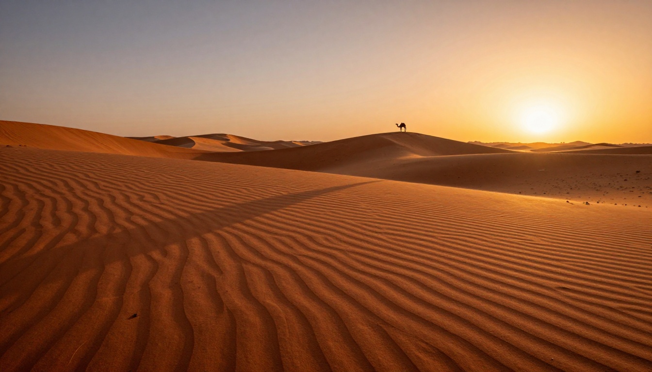
Flux Pro: maximum quality output
Flux Pro sits above Flux Dev in the quality hierarchy. It produces images with noticeably better color accuracy, cleaner edges on complex subjects, and more coherent scene composition overall. If you are generating a wallpaper you plan to use for months, running it through Flux Pro is worth the extra generation time.
Best for: hero wallpapers, dual-monitor setups, prints, any single image you plan to use as a long-term background.
Stable Diffusion 3.5 Large: creative latitude
Stable Diffusion 3.5 Large gives you more stylistic flexibility than the Flux family. While it is capable of photorealism, it also produces interesting results with more painterly or atmospheric prompts. If you want a wallpaper that feels less like a photograph and more like a still from a film, this is a strong choice.
Best for: moody atmospheric scenes, heavily stylized prompts, cinematic color grading.
Flux Kontext Dev: edit and remix photos
Flux Kontext Dev does something different from the other models. Rather than generating from scratch, it lets you take an existing image and edit it with text instructions. This makes it useful when you have a photo you love but want to modify elements, like changing the time of day, replacing the sky, or shifting the color palette entirely.
Best for: remixing your own photos into wallpaper-quality edits, changing environmental conditions.
💡 Tip: If speed matters more than maximum quality, Flux Fast and Flux Kontext Fast generate wallpaper-quality results in a fraction of the time. Great for iterating on prompts before committing to a full-resolution run.
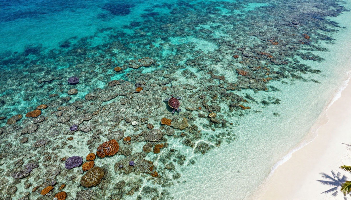
Writing Prompts That Actually Work
The model does most of the work. But the prompt you write determines whether that work goes in the right direction.
The 5 elements every strong prompt needs
| Element | What to Include | Example |
|---|
| Subject | What is in the scene and what it is doing | "A lone lighthouse on a rocky cliff" |
| Environment | Where, when, and what surrounds the subject | "Storm-swept Atlantic coast at dusk" |
| Lighting | Direction, quality, and color of light | "Dramatic side lighting from the west, golden hour" |
| Camera | Lens, aperture, angle, distance | "35mm lens, f/8, low angle, mid-distance" |
| Style Modifiers | Film stock, texture, mood | "Kodak Portra 400, RAW 8K, photorealistic" |
Every element you leave out is a decision the model makes for you. Leave out lighting and it will pick something neutral. Leave out camera angle and it defaults to eye level. The more you specify, the more the output belongs to you.
Prompt by wallpaper type
| Wallpaper Type | Strong Prompt Additions |
|---|
| Nature / Landscape | "wide angle, f/11 deep focus, golden hour, atmospheric haze" |
| Urban / Cityscape | "aerial view, blue hour, light trails, reflections on wet pavement" |
| Portrait | "85mm f/1.4, rim lighting, shallow depth of field, warm bokeh" |
| Macro / Close-up | "100mm macro, f/2.8, water droplets, fine texture detail" |
| Stormy / Dramatic | "cumulonimbus clouds, dramatic side lighting, moody atmosphere" |
3 mistakes that kill your results
1. Overloading the prompt with contradictory styles. Asking for "photorealistic cinematic painterly 3D render" all in one prompt confuses the model. Pick a lane. Photorealism is its own direction.
2. Forgetting the camera spec. Without a lens and aperture, the model will not know whether you want a sweeping panorama or a tight portrait-style crop. "Shot with 24mm f/8" gives it that information.
3. Skipping the lighting. Lighting is responsible for roughly 70% of how professional a photograph looks. "Volumetric morning light from the left" costs nothing to add and changes everything.
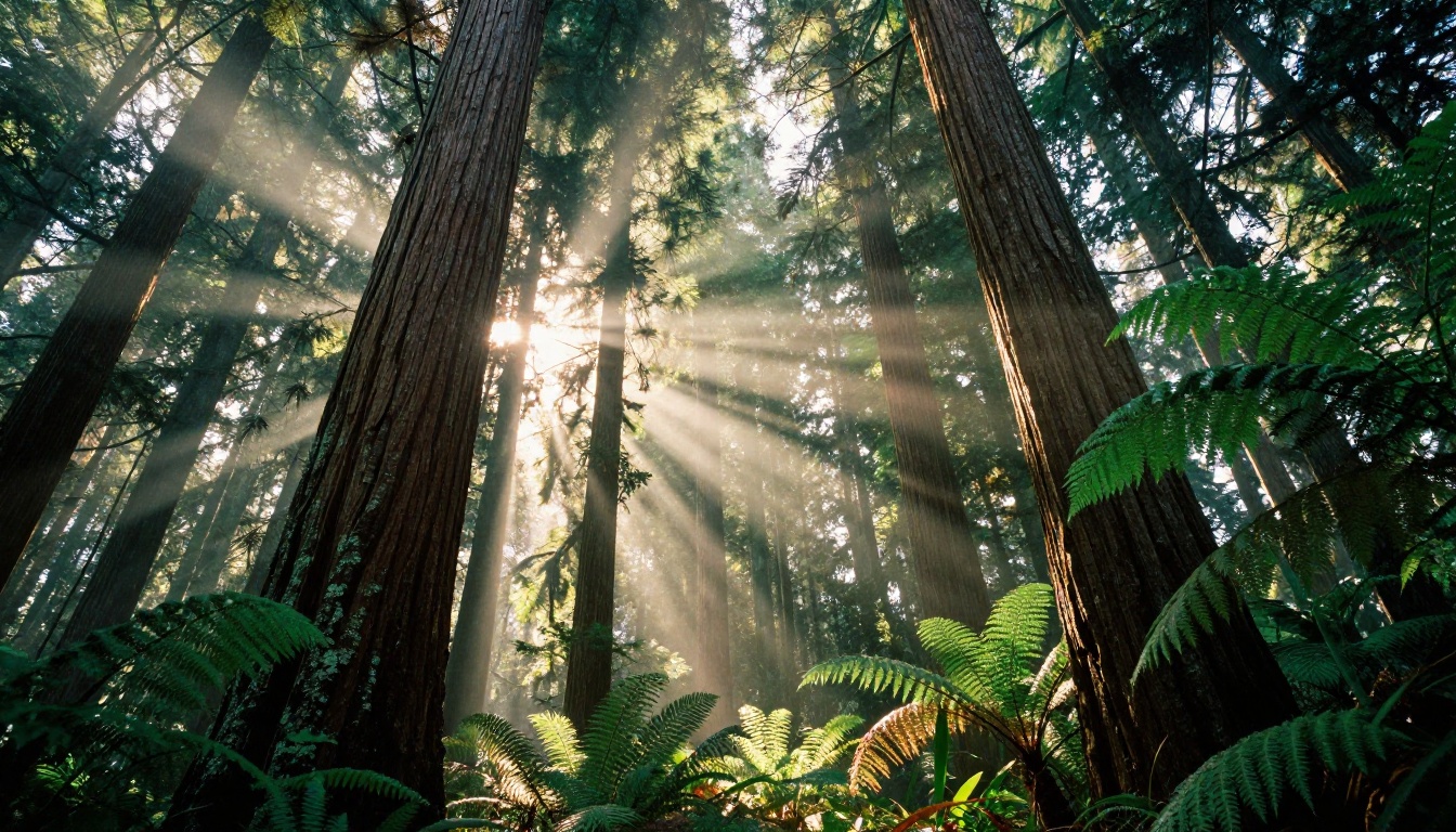
How to Make Your First AI Wallpaper on PicassoIA
This is the practical walkthrough. From zero to download in four steps.
Step 1: Pick your model
Head to PicassoIA and open the text-to-image collection. For a first wallpaper, start with Flux Dev. It handles a wide range of subjects well and the quality is immediately noticeable.
If you want to iterate quickly without waiting for each generation, use Flux Fast to dial in your prompt, then switch to Flux Pro for the final high-quality output.
Step 2: Write your prompt using the 5-element structure
Start with your subject and environment, then layer in lighting, camera, and style modifiers. Here is a complete example prompt for a mountain landscape wallpaper:
"Aerial cinematic photograph of a snow-capped mountain range at sunrise, low cloud layer filling the valley below, golden light breaking over the eastern peaks, shot with 24mm wide-angle lens at f/8, RAW 8K, Kodak Portra 400 film grain, photorealistic, National Geographic quality"
That is 48 words. Every one of them is doing a job.
Step 3: Set the right dimensions
Before generating, check the aspect ratio setting. For desktop wallpapers, 16:9 covers most monitors. For ultrawide (3440x1440), you will need a wider crop or to use the custom dimension option. For phone wallpapers, switch to 9:16.
💡 Tip: If you have a specific pixel count in mind, like 3840x2160 for 4K, use the custom width and height inputs if the model supports them.
Step 4: Download and check quality
Once generated, zoom in to the full image before downloading. Check the detail in the areas that matter most. Grass should have individual blades visible. Skin should show pores and texture. Water should have readable surface movement. If any area looks smeared or incoherent, regenerate with a slightly adjusted prompt.
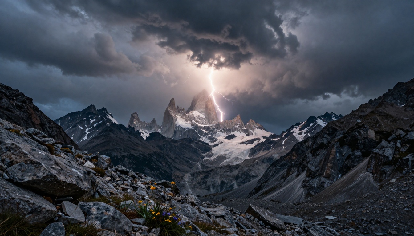
Styles That Produce the Best Wallpapers
Some subjects photograph better than others, and the same logic applies to AI-generated wallpaper art. These three categories consistently produce results people actually want to use.
Nature and landscape
This is the strongest category for AI wallpapers. Models like Flux Dev and Flux 2 Pro have absorbed enormous amounts of landscape photography during training. Mountain ranges, coastlines, forests, and deserts all render with exceptional detail. The key is specifying a specific time of day, a specific atmospheric condition, and a specific camera lens.
Prompt formula for landscapes: [Subject] + [Location type] + [Time of day] + [Weather/Atmosphere] + [Camera lens] + [Film stock]
Urban and architecture
Cities at blue hour, rain-slicked cobblestone streets, brutalist building facades at low angle: these all produce stunning wallpapers. The trick with urban scenes is to specify the vertical element. A skyline at 70mm telephoto looks completely different from the same skyline at 24mm wide angle.
For urban wallpapers, Flux Schnell LoRA produces stylized cityscapes quickly, while Stable Diffusion 3.5 Large adds a more cinematic, film-like quality to the same scenes.
Portrait and figure
A well-lit portrait works beautifully as a wallpaper, especially when composed with the subject off-center so that desktop icons or a phone clock do not obscure the face. Use shallow depth of field (f/1.4 to f/2.8) to create separation between the subject and background. Golden hour rim lighting adds depth that flat front-lighting cannot match.
💡 Tip: When using portrait-style wallpapers, specify the subject placement deliberately. "Subject positioned in left third of frame" leaves the right two-thirds clean for desktop elements.
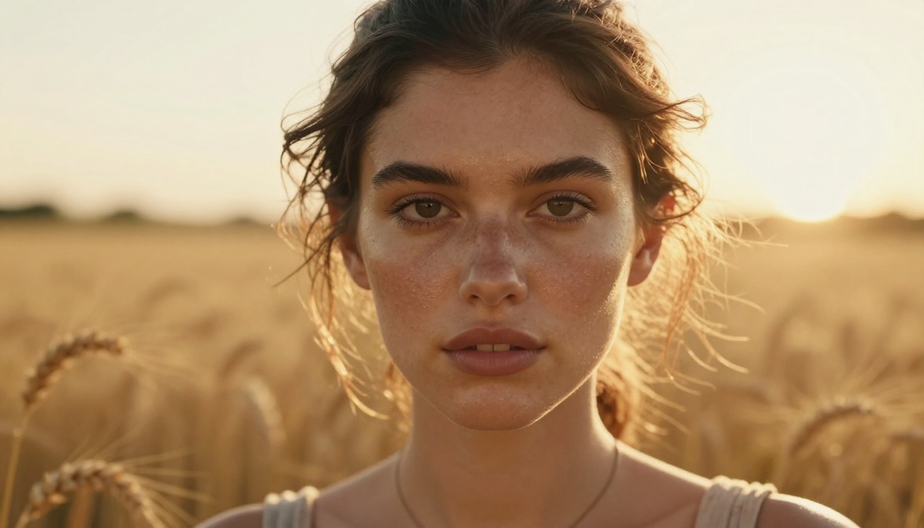
Phone vs Desktop: Ratio Breakdown
This is the detail most people skip and then wonder why their wallpaper looks wrong.
Aspect ratios by device
| Device | Aspect Ratio | Common Resolution | Notes |
|---|
| Standard desktop | 16:9 | 1920x1080, 2560x1440 | Most common monitor format |
| 4K desktop | 16:9 | 3840x2160 | Same ratio, higher pixel count |
| Ultrawide monitor | 21:9 | 3440x1440, 2560x1080 | Use custom dimensions or crop |
| MacBook Liquid Retina | 16:10 | 2560x1600 | Close enough to 16:9 with slight crop |
| iPhone (recent models) | 19.5:9 | 2796x1290 | Use 9:16 as closest match |
| Android (standard) | 20:9 | 2400x1080 | Use 9:16 ratio |
How to get the right resolution
The model generates at its native resolution for the chosen ratio. For most purposes, the output is already wallpaper-ready. If you need to match an exact pixel count, the super-resolution features available on PicassoIA upscale a 16:9 output to full 4K without losing detail.
For ultrawide monitors (21:9), the most reliable approach is generating at 16:9 and then using an outpainting tool to expand the canvas on both sides. The result fills the ultrawide without distorting the central composition.
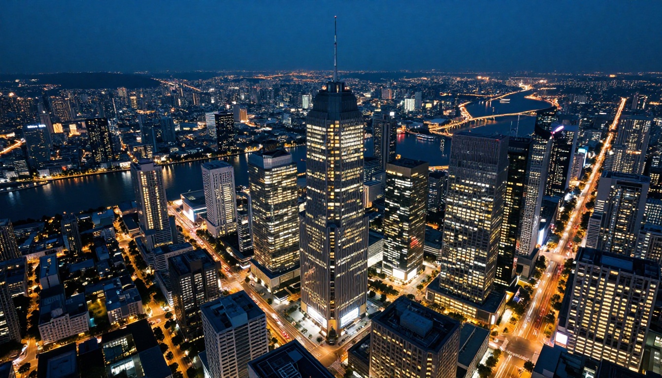
What Makes a Wallpaper Actually Hold Up
There is a difference between an image that looks good in a preview and one that holds up after six months as your daily background. A few things separate the two.
Complexity without chaos: The best wallpapers have enough visual interest to reward attention without being so busy that they become exhausting. A single strong subject with a detailed background works better than an image with equal visual weight everywhere.
Comfortable negative space: If you use your desktop actively, you need space for icons or a dock. A wallpaper that is detailed across every square centimeter leaves nowhere for those elements to sit legibly. Build negative space into your prompt: "sky occupying upper half of frame" or "foreground subject in left third" gives you breathing room.
Color palette coherence: AI sometimes produces images with color combinations that look striking in isolation but clash with your system UI colors. Before committing to a generation, think about whether the dominant colors work with your operating system's accent colors and window chrome.
Aspect ratio correctness: A 16:9 image force-stretched to 21:9 looks wrong immediately. Generate for your actual screen ratio from the start rather than rescaling after the fact.
💡 Tip: Generate three to five variations of the same prompt before picking one. The same prompt produces different compositions across runs. What looks like a small difference in the thumbnail often looks dramatically different at full scale on your monitor.
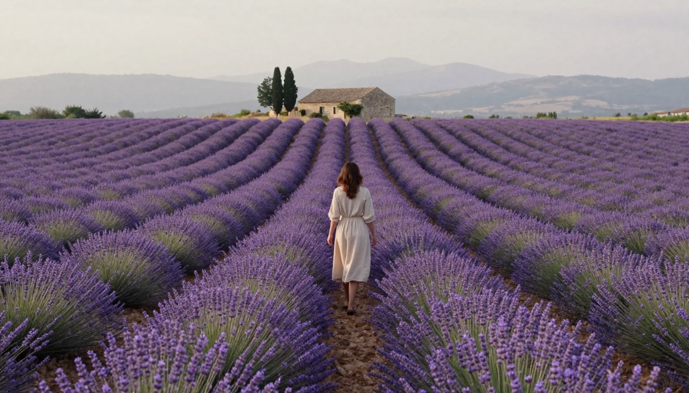
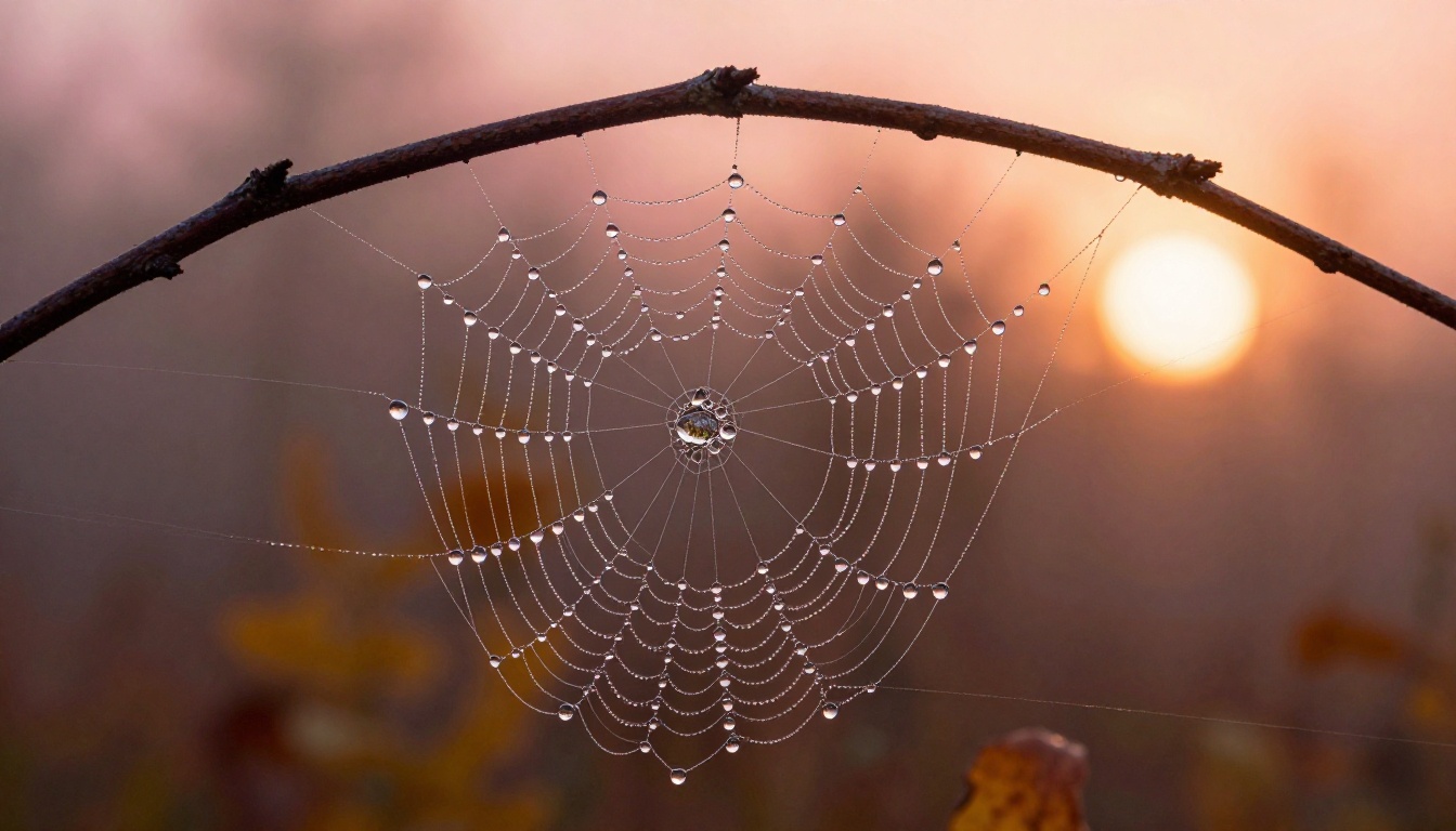
Try It Yourself Right Now
The fastest way to see what AI wallpaper generation can do is to run a single prompt. Pick a subject you actually care about, add lighting and camera specs, include "RAW 8K photorealistic" at the end, and run it through Flux Dev on PicassoIA.
The first result will probably not be perfect. That is fine. Refine the lighting direction, adjust the camera distance, swap the time of day. Three iterations is usually enough to land on something genuinely good.
If you want maximum quality for a long-term wallpaper, take your refined prompt to Flux Pro or Flux 2 Pro for the final generation. For phone wallpapers in portrait orientation, switch to the 9:16 ratio and let the same prompt reconfigure for vertical composition.
Every wallpaper on your devices from here forward can be one you actually designed. Open PicassoIA, write your first prompt, and see what comes back.


