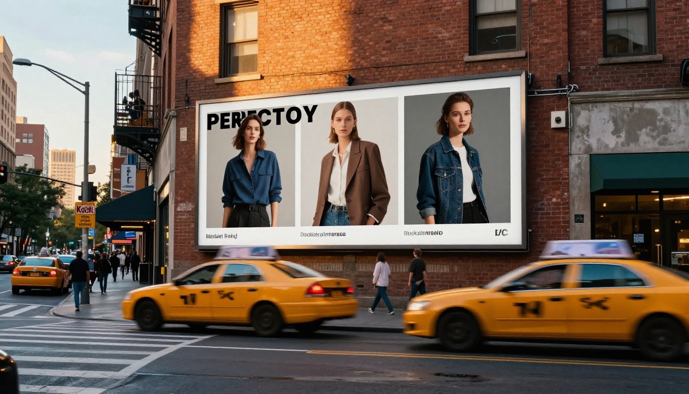
For years, AI image generators had one glaring weakness that designers, marketers, and content creators learned to work around: they could not render readable text. Every logo turned into a swirl of pseudo-letters. Every sign in a generated storefront looked like it belonged in a half-remembered dream. Billboards, packaging, menus, and social media mockups all suffered the same fate — the moment you needed real words inside a synthetic image, the output fell apart.
GPT Image 2.0, built into OpenAI's GPT-4o suite, takes a structurally different approach to this problem. The results are not perfect, but they are meaningfully better than anything the diffusion model era produced.

Why Text Always Broke in AI Images
The root cause was architectural. Traditional diffusion models like Stable Diffusion, SDXL, and early Midjourney were trained on image-caption pairs where the model learned visual patterns statistically. Text characters, from the model's perspective, were just another visual texture — no different from fur, bark, or fabric weave.
The model never actually "knew" that an "A" was an "A." It knew that pixels arranged in a certain triangular formation tend to appear next to pixels that look like a crossbar. This statistical mimicry worked well enough for decorative purposes but collapsed the moment legibility was required.
The three failure modes were consistent across almost every generator:
- Character garbling: Letters merged, split, or were replaced by plausible-looking shapes that were not actual characters.
- Spelling drift: Even when individual characters looked right, words accumulated errors across their length — "COFFEE" became "COFFE3" or "COFFFE."
- Inconsistent baseline: Letters floated at different heights, creating text that looked handmade in the worst possible way.
💡 This was not a training data problem. It was a representational one. The models had no internal concept of "a word" as a discrete unit.
What GPT Image 2.0 Changed
GPT Image 2.0 does not operate purely as a diffusion model. It is integrated with the language understanding capabilities of GPT-4o, which means the system that generates the image has an explicit, token-level understanding of the text it is trying to render.
When you prompt it with "a coffee shop sign that reads OPEN," the language model component parses "OPEN" as four specific characters in a specific sequence, then instructs the image synthesis process to produce those characters in that order. The visual generation is constrained by the linguistic specification in a way that earlier pipelines never attempted.
This is sometimes described as a hybrid architecture — part language model, part image synthesizer, with the language model playing a directive role rather than just being used at the prompt-encoding stage.
What this enables:
| Capability | Earlier Models | GPT Image 2.0 |
|---|
| Single short words | Occasional success | Consistent |
| Multi-word phrases | Rare | Reliable |
| Brand names and logos | Almost never | Frequently accurate |
| Long sentences | Failed | Partial success |
| Numbers and symbols | Inconsistent | Mostly correct |
| Mixed languages | Poor | Improving |
How It Actually Reads Characters
The mechanism behind GPT Image 2.0's text rendering involves the model treating text as a semantic intention rather than a visual pattern. Here is what that means in practice:
When the system processes a prompt requesting visible text, it:
- Identifies the text string as a discrete element with specific character composition.
- Plans the typographic layout — font weight, size relative to image, positioning, and baseline alignment — as a spatial specification.
- Guides the image synthesis to produce pixels that satisfy both the visual aesthetic of the scene and the character accuracy requirements.
- Performs implicit checking during generation to reduce character drift across longer sequences.
This is meaningfully different from asking a diffusion model to "predict what text looks like" and hoping the statistical average of millions of training images produces something legible.
💡 Think of it this way: earlier models dreamed text. GPT Image 2.0 writes it and then draws the result.
The model also benefits from its instruction-following capabilities. It can respond to prompts like "use bold sans-serif font" or "the text should be white on a dark background" and actually honor those stylistic instructions with reasonable accuracy.
The Character Limit Problem
Accuracy degrades with length. This is one of the clearest patterns in GPT Image 2.0's text rendering behavior.
Short strings — 1 to 6 characters — are rendered with high fidelity in most cases. A product name like "NOVA" or a label like "SALE" will appear correctly in the vast majority of generations.
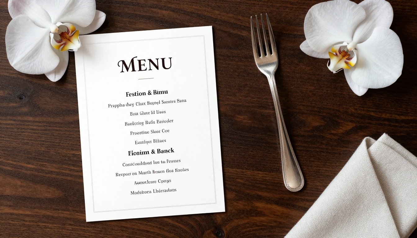
Medium strings — 7 to 15 characters — succeed frequently but with occasional letter substitutions or spacing irregularities. "FRAGILE" and "HAND MADE" work well. "SATISFACTION" sometimes loses a letter.
Long strings — more than 20 characters — are where things get unpredictable. Full sentences in an image tend to accumulate errors as the generation process proceeds. The beginning of a sentence is usually accurate; the end may drift.
Practical rules for working with the model:
- Keep in-image text to short, high-impact words when precision matters.
- For longer text, consider generating the image without text and adding it in post using a design tool.
- Use the model for medium-length text in mockups where pixel-perfect accuracy is not the final deliverable.
Where It Still Falls Apart
Knowing the failure cases is as useful as knowing the strengths. GPT Image 2.0's text rendering is impressive relative to what came before, but it has consistent weak points:
Script and handwriting fonts: The model struggles with cursive and calligraphic styles. The interconnected letterforms create ambiguity about where one character ends and another begins, and the model's character-by-character approach does not handle ligatures gracefully.
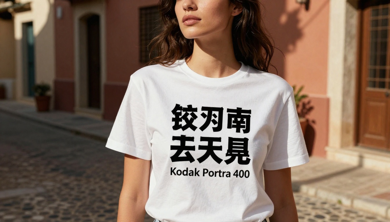
Non-Latin scripts: Arabic, Chinese, Japanese, Korean, and other complex writing systems are significantly harder. The model can produce text that looks plausible from a visual distance but contains character errors that would be immediately obvious to a native reader.
Extreme stylization: Text that is heavily distorted, at unusual angles, or integrated into complex patterns becomes harder to render accurately. The model's character guidance appears to weaken when the visual complexity of the surrounding image is high.
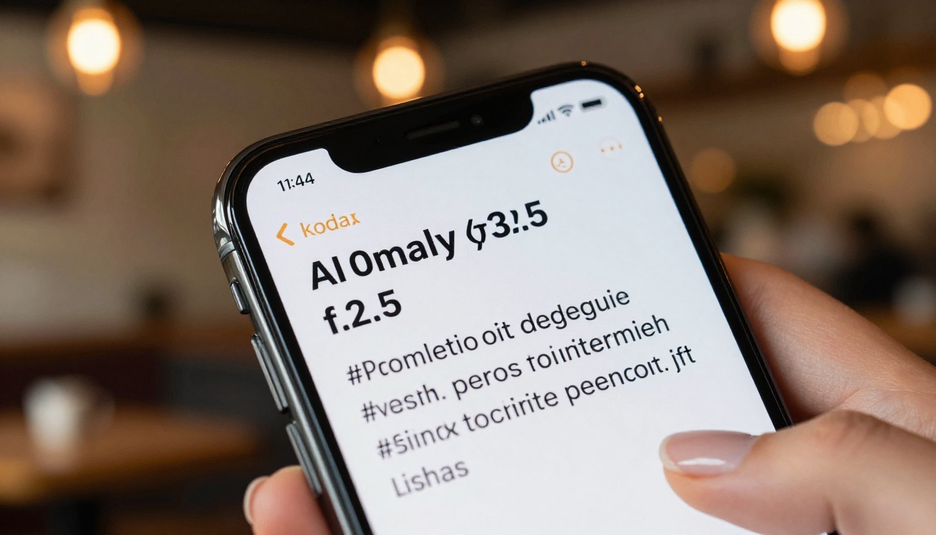
Tiny text: Text that occupies a small portion of the image — like fine print on a label — often degrades into noise at normal resolution.
💡 For professional work, treat GPT Image 2.0 as your first pass, not your final output. It gets you 80% of the way there faster than any previous tool could.
Real Use Cases That Work Now
The practical applications that have become reliable are worth naming specifically, because this is where GPT Image 2.0 actually changes workflows:
Marketing mockups: Generating placeholder advertisement images with readable headline text for client presentations. Previously this required a designer to composite the text in Photoshop after generation. Now the first draft often comes out presentation-ready.
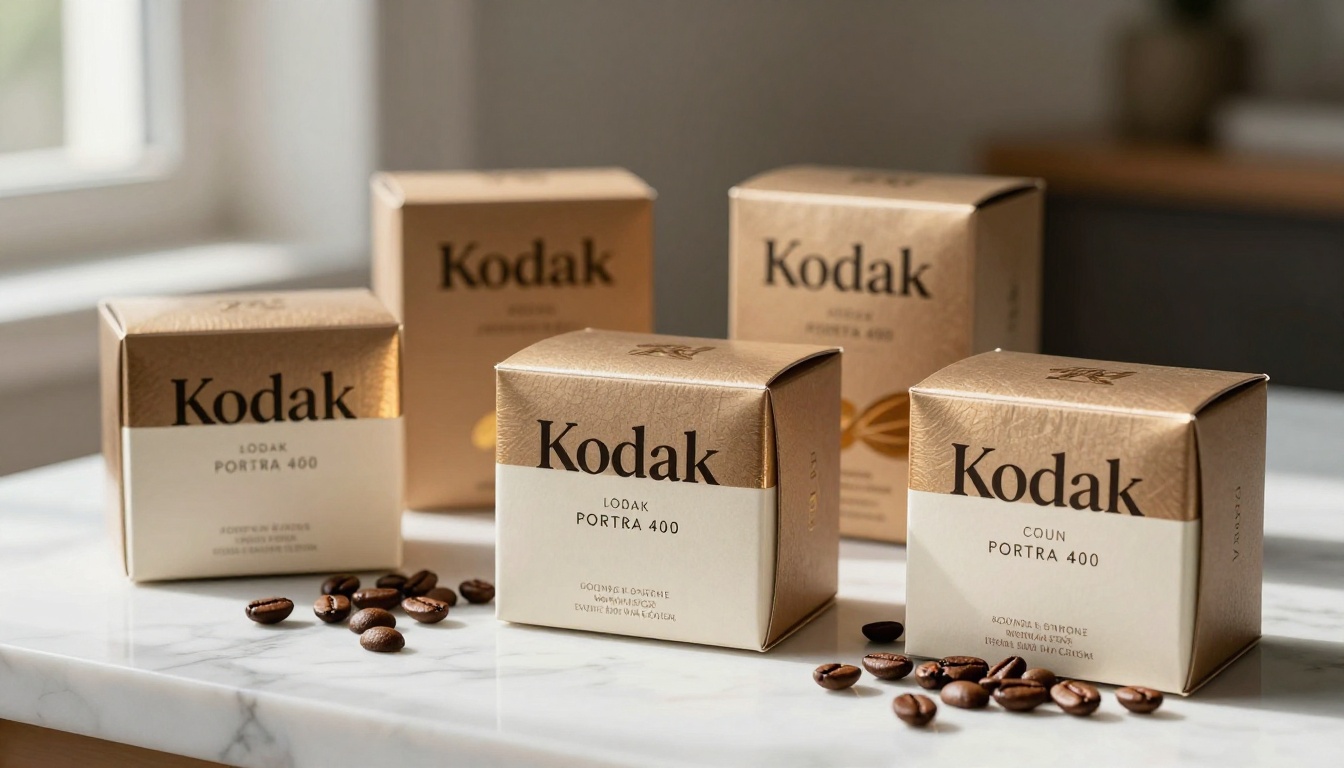
Product packaging concepts: Short brand names and weight or volume labels on packaging images render with enough accuracy to communicate the concept clearly in early-stage design reviews.
Social media content: Post mockups with 3 to 5 word text overlays, hashtags, or short captions are highly reliable. Content teams can produce dozens of visual variants quickly.
Signage and wayfinding: Generating realistic interior or exterior scenes with labeled signage — "EXIT," "RECEPTION," "LEVEL 2" — works consistently for architectural visualization and presentation.
Book and magazine covers: Titles of 1 to 4 words placed prominently on a generated image now come out correctly in most generations, making this a genuine shortcut for designers producing cover concepts.
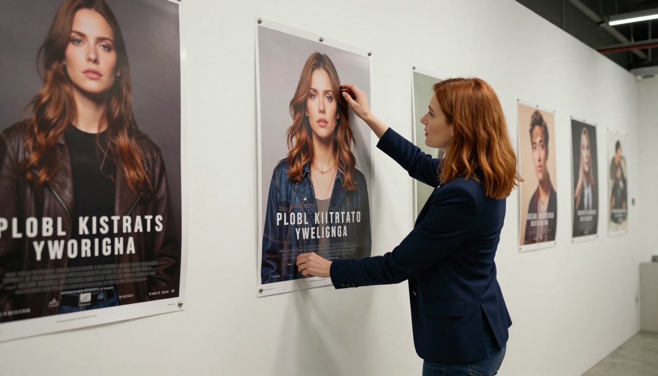
Event materials: Flyers and posters with event names, dates, and locations have become viable starting points when the text is kept concise.
How to Prompt for Accurate Text
The way you write the prompt has a direct impact on how accurately text is rendered. These strategies work consistently:
Put the text in quotes in your prompt. This signals to the model that the string inside is intended as literal visual text. "A storefront with a sign that reads "BARISTA"" performs better than "a storefront with a BARISTA sign."
Specify the typographic context. Describe font weight, color, and placement. "Bold uppercase white letters" gives the model more constraints to work with and tends to produce cleaner output.
Separate image description from text content. Prompts that clearly distinguish "what the scene looks like" from "what text appears in the scene" tend to produce fewer errors than prompts where text is mixed into the visual description.
Request fewer words per text element. If you need a poster with multiple text blocks, it is often better to generate separate images for different sections and composite them, rather than asking for a complex multi-line layout in a single generation.
Iterate with seeds. Once you find a generation where the text is mostly right, use the same seed to regenerate at higher quality or with minor prompt adjustments. You are more likely to preserve the text accuracy if the random seed is held constant.
💡 Think of text prompting as giving a typesetting instruction, not a visual description. Specificity produces accuracy.
GPT Image 2.0 vs. Other Text-Capable Generators
The competitive landscape for text rendering in AI images has changed rapidly. Here is how GPT Image 2.0 sits relative to other tools people commonly use:
| Model | Short Text | Long Text | Non-Latin | Style Control |
|---|
| GPT Image 2.0 | Excellent | Moderate | Partial | Good |
| Midjourney v6 | Good | Weak | Poor | Good |
| Adobe Firefly | Good | Moderate | Limited | Excellent |
| FLUX.1 Dev | Moderate | Weak | Poor | Good |
| Ideogram 2.0 | Excellent | Good | Moderate | Moderate |
Ideogram built its reputation specifically on text accuracy and remains a strong alternative for use cases requiring consistent long-form text rendering. Adobe Firefly offers the most reliable integration with professional design tools. GPT Image 2.0's advantage is its combination of text accuracy with instruction-following for complex, richly described scenes.
How to Use PicassoIA for Text-Rich Image Generation
PicassoIA gives you access to powerful text-to-image models that you can use right now to experiment with text rendering in your own projects. The PicassoIA Image generator is built for exactly this kind of creative work, and the P Image Trainer lets you go further by training custom styles on top of the base model.
Step 1: Open the PicassoIA Image model and start with a clear scene description.
Step 2: Add your text specification in quotes within the prompt. For example: "A product label for a skincare brand that reads "LUMINA", minimalist white packaging, soft studio lighting, photorealistic."
Step 3: Set the aspect ratio to 16:9 for advertising mockups, or 1:1 for social media content.
Step 4: Generate 4 to 8 variations and select the one with the most accurate text rendering.
Step 5: For style-consistent variations of your best result, try Flux Redux Dev on PicassoIA. It builds on existing visual references while maintaining compositional coherence, which is useful when you need text in a scene that matches an established visual identity.
What This Means for Designers and Content Teams
The practical implication of GPT Image 2.0's text capabilities is not that designers are no longer needed. It is that the first-draft phase of visual content creation has changed fundamentally.
Generating a set of 20 marketing mockup variants for a client presentation used to mean hours of work — creating scenes, sourcing stock images, compositing text in post. With reliable text rendering in AI generation, that first draft phase compresses dramatically.
The new workflow looks like this:
- Use AI image generation with text prompts to produce 15 to 20 rough concept variants in under an hour.
- Select the 3 to 5 strongest concepts based on composition, tone, and text accuracy.
- Refine in a design tool — correcting any text errors, adjusting typography, adding brand-specific fonts if needed.
- Present polished versions that were built on AI-generated foundations.
This is not about replacing the design step. It is about compressing the exploration phase so creative teams spend more time refining strong ideas and less time producing initial variations from scratch.
The accuracy improvements in GPT Image 2.0 make that compressed first phase genuinely useful rather than just visually approximate. When the text in your mockup actually reads correctly, you can show it to a stakeholder without a caveat.
Try It Yourself on PicassoIA
If you want to experience this firsthand, PicassoIA gives you direct access to the tools that make it possible. Start with the PicassoIA Image model and write a prompt that includes a specific word or phrase you want to appear in the image. Use the quote technique described above. Generate a few variations and see how the text comes out.
For more experimental or stylized output, the Flux Redux Dev model lets you build on existing visual references while maintaining compositional coherence — useful when you need text in a scene that matches an established visual identity.
The technology is moving fast. What required hours of post-production work two years ago now comes out of a single prompt in seconds. The tools available on PicassoIA today give you access to the leading edge of that shift without needing to set up API access, manage credits, or install anything locally.
Open a browser, write a prompt, and see what comes out. The text might just be readable.


