Getting text right inside an AI-generated image is one of those problems that sounds simple and turns out to be genuinely hard. Most image models smear letters, blend characters together, or produce strings of convincing-looking nonsense that falls apart under any real scrutiny. Nano Banana Pro from Google changes that in a way that is both practical and surprisingly consistent. This article breaks down exactly how it handles text, why it works when other models fail, and what you can actually do with it on PicassoIA.
Why Text Breaks in Most AI Images
Ask almost any AI image model to render a sign, a label, or a banner with specific words on it, and the result is usually some variation of the same problem: letters that look almost right but are not. The model captures the visual shape of text without actually knowing what text is.
The Core Problem with Diffusion Models
Standard diffusion models treat every pixel as part of a continuous visual distribution. They have absorbed billions of images and learned what text looks like statistically. That is a fundamentally different thing from knowing how to place specific characters in specific positions. When you prompt for a billboard that reads "OPEN 24 HOURS," the model generates something that resembles that phrase visually, but the character-level precision is almost always off.
The failure modes are consistent across most text-to-image systems:
- Character blending: Two letters merge into a single ambiguous glyph
- Letter substitution: The model swaps similar-looking characters (0 for O, l for 1)
- Spacing errors: Kerning and tracking are inconsistent across the word
- Word boundary collapse: Multiple words run together without clear separation
- Phantom characters: Extra letters appear that were not in the prompt at all
These are not bugs in a specific model. They reflect how diffusion models encode and decode visual information at a fundamental level. The text rendering problem is structural, not incidental.
What "Hallucinated Letters" Actually Look Like
The term "hallucinated letters" refers to characters the model invents based on visual plausibility rather than prompt fidelity. A model might generate a product label that looks absolutely correct at thumbnail size and falls apart completely at full resolution. The letters resemble a specific language without actually forming real words.
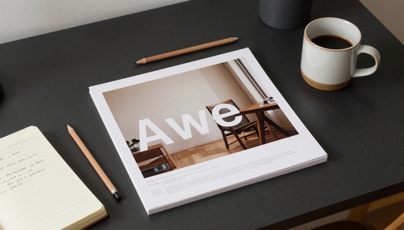
This is particularly painful for commercial use cases. A mock-up for a brand campaign, a product shot with pricing text, or a social media creative with a specific headline all become unusable the moment the text is not legible. For years, the standard workaround was to generate the image without text and add typography in post using Photoshop or Canva. Nano Banana Pro makes that workaround optional for a wide range of use cases.
What Nano Banana Pro Does Differently
The architectural difference between Nano Banana Pro and earlier text-to-image approaches comes down to how it handles the relationship between tokens in the text prompt and spatial regions in the output image.
Character-Level Spatial Attention
Where conventional diffusion models process text prompts as semantic signals that influence the overall image distribution, Nano Banana Pro applies a finer-grained attention mechanism specifically for character placement. When the prompt specifies text content, the model does not just "know" that text should appear somewhere in the image. It allocates dedicated spatial attention to specific character sequences and their positions within the rendered scene.
This is what allows the model to render words like "SALE" or "OPEN" on a storefront sign with the correct number of characters, spaced appropriately, in a font style that matches the surrounding scene aesthetics. The model does not guess that text-like shapes should appear. It places specific glyphs in specific locations.
💡 The more specific your prompt is about text placement, the better the result. Instead of "a sign that says HELLO," try "a rectangular wooden sign mounted on a brick wall with the word HELLO in white painted block letters, centered."
Token Alignment vs. Visual Guessing
Earlier models like SDXL attempted text rendering through visual pattern matching alone. The model had seen enough text in training data to generate something that looked like text, but the connection between a specific string in the prompt and a specific glyph sequence in the output was probabilistic at best.
Nano Banana Pro uses token-level alignment, meaning the model maintains a direct correspondence between each character in the requested text and a visual region in the output. This is why short, specific text strings render much more reliably than long paragraphs, and why prompt phrasing that clearly specifies the exact string to render produces better outputs than vague references to "some text."
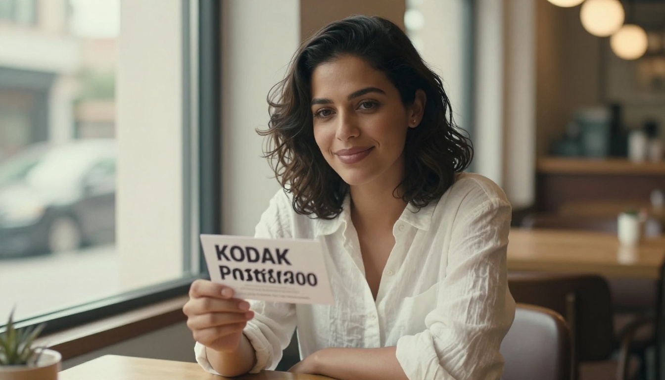
The practical result: if you ask for three words, you get three words. Not two merged into one and a phantom fourth character hovering at the edge of the sign.
How Scene Context Affects Text Rendering
One underappreciated aspect of Nano Banana Pro's text handling is how strongly the surrounding scene context influences the typographic output. The model adjusts font style, weight, and color contrast to match the aesthetic of the environment it is generating. A handmade wooden sign will get a slightly rougher, painted-letter treatment. A modern storefront will get a clean sans-serif. A vintage label will get serif letterforms with appropriate distressing.
This contextual adaptation means that text rendered by Nano Banana Pro does not look like it was pasted onto the scene after the fact. It looks integrated, because the model places it as part of the scene from the start.
Where It Actually Shines
Understanding where Nano Banana Pro performs best helps you plan your prompts and set accurate expectations.
Signs, Labels, and Banners
This is the core use case and the one where the model is most reliable. Physical text in a scene, such as a storefront sign, a traffic warning, a menu board, or a protest banner, renders with high fidelity when the requested text is short and positioned naturally within the scene context.
| Text Length | Reliability | Notes |
|---|
| 1-4 characters | Very high | Near-perfect in most cases |
| 5-8 characters | High | Occasional kerning variance |
| 9-15 characters | Moderate | Word breaks help significantly |
| 16+ characters | Variable | Best split across multiple visual elements |
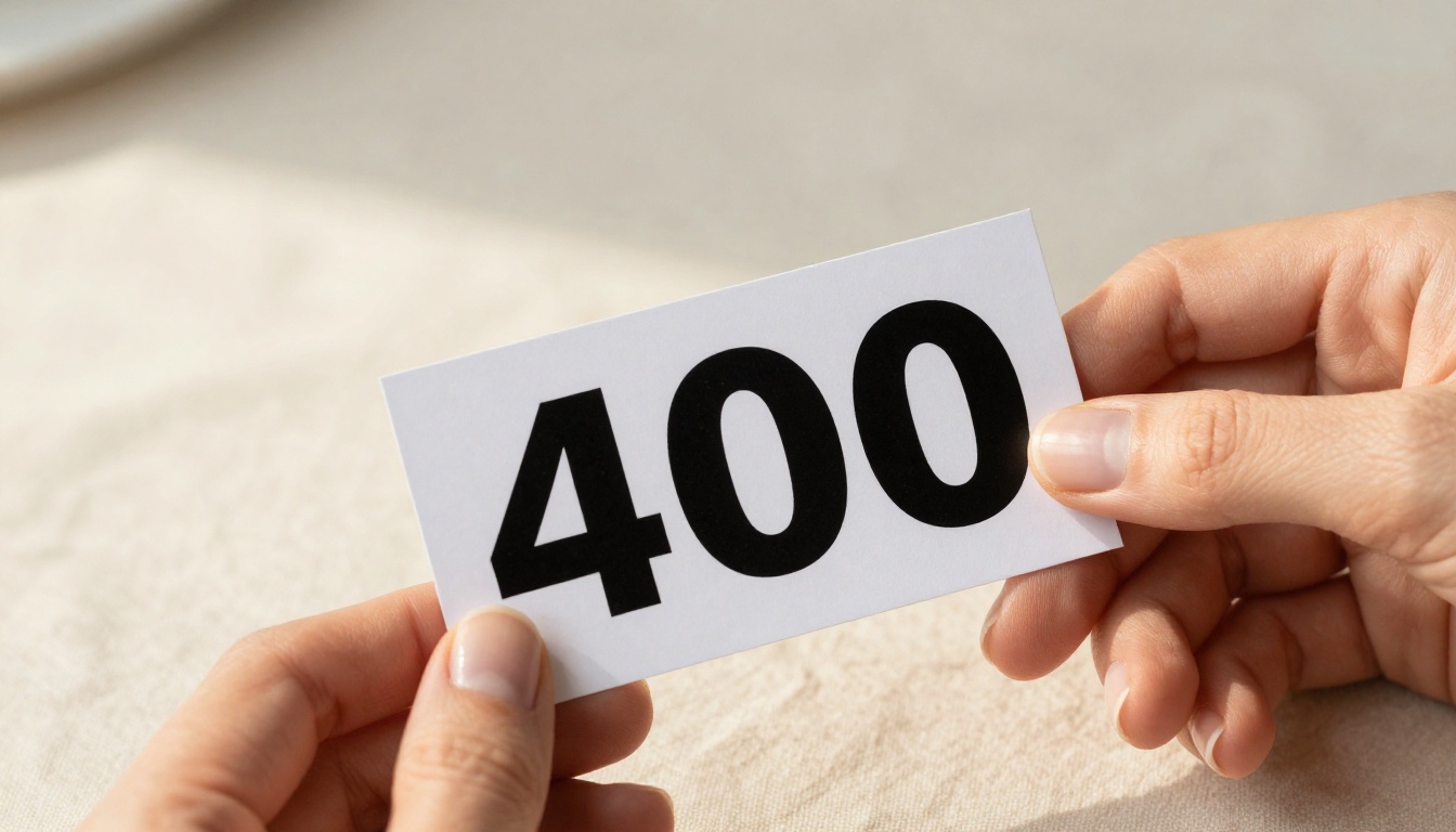
The model handles uppercase Latin characters most reliably, followed by mixed case, then numerals, then special characters. Numbers in isolation (a price tag showing "12", a door number showing "4B") render very accurately.
Product Packaging and Mockups
Brand mockups are one of the highest-value commercial applications for this capability. A product shot showing a bottle with a brand name, a box with a product title, or a bag with a logo text all become achievable without post-production text work.
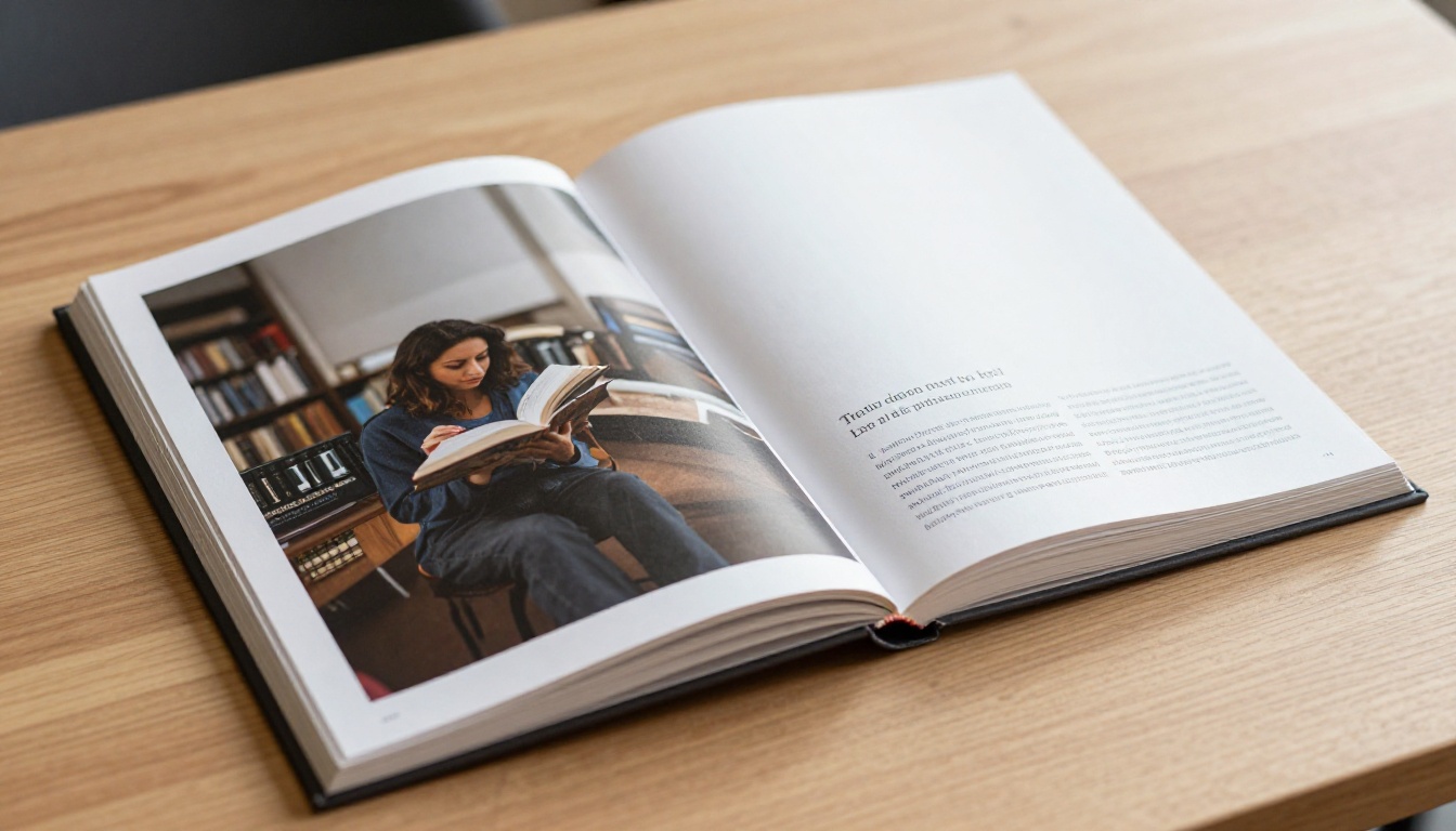
Nano Banana Pro handles curved text on product labels with reasonable accuracy, which is particularly difficult for other models. The model adapts letter positioning to follow the curvature of the surface it is placed on, producing results that look like real printed packaging rather than a flat overlay.
Social Media and Ad Creatives
For social content that requires a short headline, a price callout, or a CTA phrase embedded directly in the image, Nano Banana Pro removes the need for a design layer on top of the generated output. A promotional banner with "50% OFF" rendered directly into the scene is achievable in a single generation pass.
💡 For social creatives, specify the font style in the prompt. "Bold condensed sans-serif in white with a slight drop shadow" will produce more consistent results than leaving font style unspecified.
How to Use Nano Banana Pro on PicassoIA
Nano Banana Pro is available directly on PicassoIA. The setup is straightforward and requires no special technical configuration.
Setting Up Your First Text Prompt
Navigate to the Nano Banana Pro model page on PicassoIA. The prompt field accepts standard natural language with no special syntax required for text rendering. The most effective prompt structure follows this pattern:
- Scene description first: Describe the overall image before mentioning text
- Text element second: Specify what surface the text appears on
- Text content third: Enclose the exact text in quotation marks within your prompt
- Style details last: Font weight, color, size relative to the scene
Example prompt:
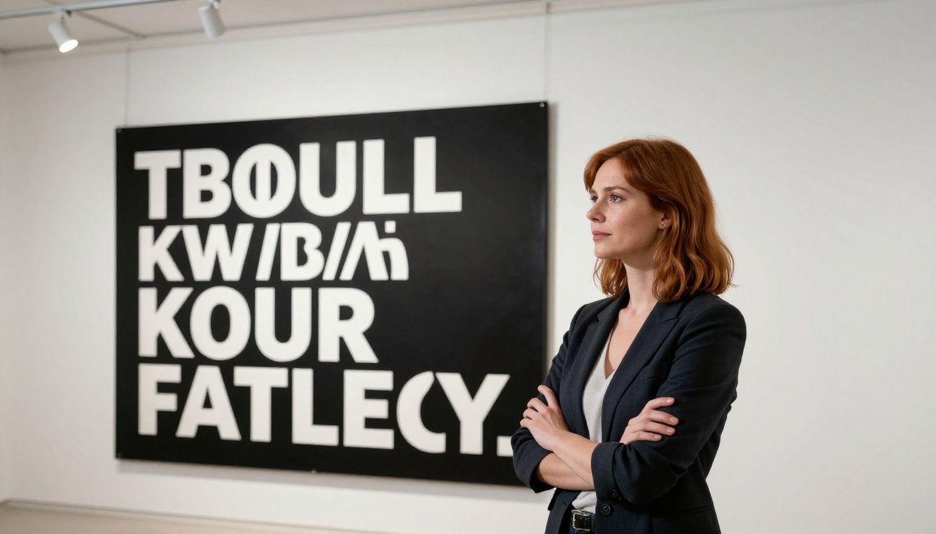
"A worn wooden door on a brick building exterior, a hand-painted sign mounted at eye level reading "CLOSED", weathered white paint on dark wood, midday sunlight from above, photorealistic"
Parameters That Affect Text Quality
When using Nano Banana Pro on PicassoIA, these settings have direct impact on text rendering quality:
- Steps: Higher step counts (30-50) produce sharper letterforms. Fast generations at lower steps tend to smear text edges and blur character boundaries.
- CFG Scale: A higher guidance scale (7-10) increases prompt adherence, which helps the model stick to the specific text content you specified. Values below 5 often drift from the requested string.
- Seed: If you find a generation where the text is nearly correct, note the seed and regenerate with minor prompt adjustments. Spatial attention patterns are partially seed-dependent, so a near-correct seed is a strong starting point.
Tips for Cleaner Results
These practical observations make the biggest difference in day-to-day use:
- Use all-caps for single words. The model renders uppercase with higher fidelity than mixed case for short words.
- Place text on high-contrast surfaces. White text on dark backgrounds and dark text on light surfaces both render cleanly. Avoid mid-tonal backgrounds where letterforms can blend in.
- Avoid requesting italics unless the overall image style specifically calls for it. Angled characters are harder for the model to render with clean edges.
- For numbers, keep numeric strings very short (1-3 digits) or write them out as words when possible.
- Request the text as physically embedded in the scene, not floating. "Text painted on the wall" renders better than an abstract request for "text appearing in the image."
Text Accuracy Across Different Prompt Styles
Not all text requests are equal. The type of text, its length, and how it is described in the prompt all affect output quality from Nano Banana Pro.
Short Words vs. Long Phrases
The model's token-level spatial attention works best when it has a limited number of characters to place. Single words and two-word phrases produce the most reliable results. Beyond that, the model begins to introduce more variance in character spacing and occasionally drops or merges letters.
For longer text requirements, the best approach is to break the content into multiple shorter text elements within the same scene. A storefront with three separate signs, each carrying two to three words, will render more accurately than a single sign trying to carry nine words at once.
💡 Think of text in your scene the way a set designer would: multiple smaller text elements placed naturally in context, not a single large block of copy.
Serif vs. Sans-Serif Typography
Sans-serif fonts render with higher accuracy across all character lengths. The clean geometric forms of sans-serif letterforms align more closely with the high-frequency training data in the model. Serif fonts are achievable, particularly for headings and short labels, but they introduce more variability in the rendering of serifs at smaller visual sizes within the scene.

Script and handwritten styles fall on the lower end of accuracy for specific text content. They can look beautiful and stylistically appropriate, but the model treats script as more of a visual style than a character-accurate rendering task. If exact legibility matters, stick to sans-serif or simple serif styles.
Pairing with Other PicassoIA Models
Nano Banana Pro does not have to work alone. PicassoIA's model collection gives you multiple options for refining and extending the output.
Editing and Fixing Text with Inpainting
When a generation almost gets the text right but one character is off, inpainting is the most efficient fix. PicassoIA's image editing capabilities let you mask the specific text region and regenerate just that portion with a refined prompt targeting the specific error. This is significantly faster than full regeneration and preserves the rest of the image you have already approved.
The combination of Nano Banana Pro for initial generation and targeted inpainting for precise text correction produces consistent, production-ready results in two passes rather than ten.
Upscaling Text Clarity with Super Resolution
Text rendered at standard output resolution can look sharp at web sizes but show edge artifacts when printed or used at large display scales. PicassoIA's super-resolution models can upscale the final image while sharpening letterforms and preserving the photorealistic quality of the surrounding scene.
This is particularly relevant for print mockups, large-format advertising materials, and any use case where the image will be viewed at higher than screen resolution. The character edges that look acceptable at 1080p can reveal softness at poster sizes, and a super-resolution pass tightens them significantly.
Comparing with Other Text-Capable Models
PicassoIA hosts several models that attempt text rendering with varying results. Flux Pro and Flux 1.1 Pro have meaningfully improved text handling compared to older diffusion baselines, and GPT Image 2 approaches text from a multimodal perspective that yields strong results for certain use cases.
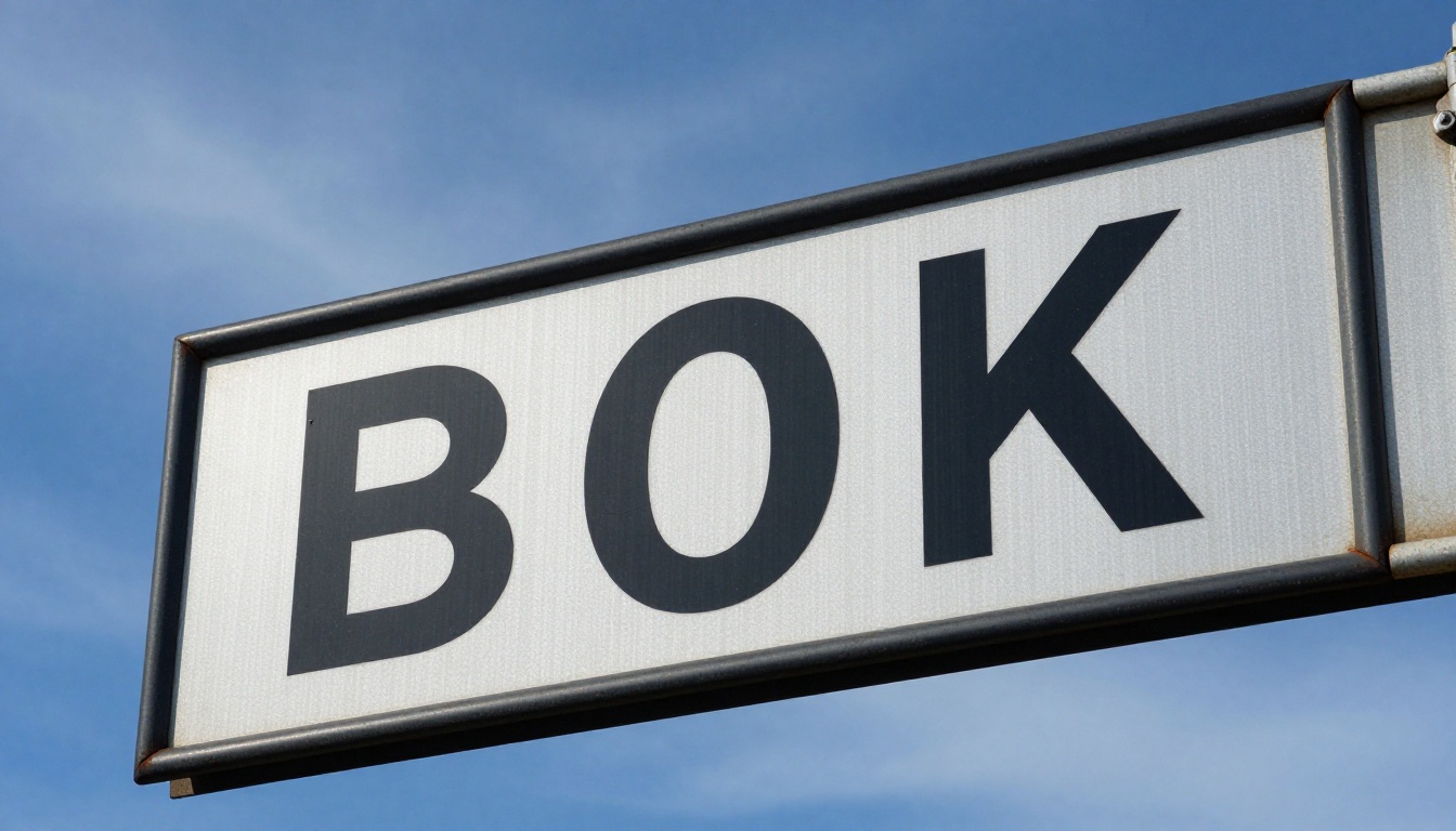
Nano Banana Pro holds the top position specifically for character accuracy in short text strings within photorealistic scenes. For artistic or stylized text where exact accuracy matters less, other models in the collection may produce more aesthetically interesting results. The right choice depends on whether you need the text to actually say what you intend.
Try It on PicassoIA

The single best way to see what Nano Banana Pro can do is to run a few prompts yourself. Start with something concrete: a storefront sign with a one-word label, a product mockup with a short brand name, or a vintage poster with a three-word headline. Keep the text short, use all-caps, and place it on a high-contrast surface. Then compare the output against what you would get from a standard model on the same prompt.
Most users find that with two or three prompt iterations, they can produce text-in-image results that are genuinely usable without any post-production work. The character accuracy is not always perfect at first, but it is close enough that small prompt adjustments or a targeted inpainting pass brings it to a finished state.
The broader PicassoIA collection gives you options to go further. Generate with Nano Banana Pro, refine specific text regions with inpainting, and upscale for print. That three-step workflow produces output that would have required a graphic designer a few years ago.
You can also try Nano Banana and Nano Banana 2 to compare generation speed against accuracy for your specific requirements. Each variant in the family has a slightly different balance between speed, image quality, and text fidelity, and the right one depends on your workflow.
Text in AI images is no longer the problem it was. Go make something with actual words in it.


