How to Make 3D Logos with AI: Fast, Pro Results in Minutes
Want professional 3D logos without hiring a designer? AI image generators now produce photorealistic dimensional brand marks from a single text prompt. This article covers the best models, prompting strategies, material descriptors, and a hands-on walkthrough using PicassoIA to get results in minutes.
Making a 3D logo used to mean hiring a 3D artist, purchasing Cinema 4D or Blender licenses, and waiting days for revisions. Today, a well-constructed text prompt and the right AI image model produces professional-grade dimensional brand marks in under two minutes. The results are not approximate or "close enough." When you know what you are doing, they are genuinely indistinguishable from studio-crafted work.
This article breaks down exactly how that works: which AI models perform best for 3D logo work, how to write prompts that produce real depth and material quality, a step-by-step walkthrough on PicassoIA, and the most common mistakes that prevent people from getting results worth using.
What Makes a 3D Logo Look Real
The difference between a flat result and a convincing 3D logo comes down to three physical properties: material, depth, and light behavior.
A logo that reads as three-dimensional does not simply have a drop shadow. It has:
Visible side faces on letterforms or shapes, showing physical depth
Specular highlights that behave according to the material (chrome reflects sharp and white, brushed metal reflects in directional streaks, matte reflects nothing)
Cast shadows that fall at a consistent angle and soften realistically with distance
Ambient occlusion in corners and recessed areas, adding the contact darkness that grounds objects to surfaces
When you write an AI prompt without specifying these elements, the model has to guess. It usually defaults to something flat with a stylized shadow. Specifying these four properties explicitly is the single biggest improvement you can make to your prompts.
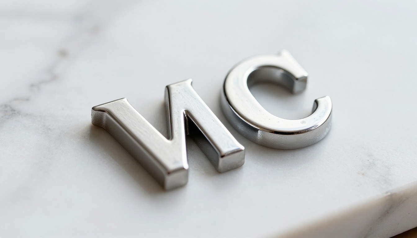
💡 Tip: Describe your logo as a physical object. "A heavy chrome letter A sitting on a marble surface" gives the model far more to work with than "a metallic 3D letter A."
AI Models Built for This
Not every text-to-image model handles dimensional objects equally well. Some excel at texture and material fidelity. Others handle spatial depth and perspective better. Here is how the top options on PicassoIA compare for 3D logo work.
FLUX 2 Pro for Crisp Detail
FLUX 2 Pro is currently the top-performing model for detailed product and object photography. Its training on high-resolution commercial imagery means it carries strong expectations for how metallic objects behave under studio lighting. For chrome, gold, and brushed steel logos, the specular highlights it produces are noticeably more accurate than competing models.
It also handles typography better than most. Letters stay sharp, proportions remain consistent, and the model does not hallucinate additional letterforms as frequently as older architectures.
Best for: Chrome, gold, metallic finishes, studio product aesthetic
FLUX 1.1 Pro Ultra for Photorealism
FLUX 1.1 Pro Ultra pushes the realism ceiling further. Where FLUX 2 Pro produces sharp commercial imagery, Ultra adds film-like depth, more natural light falloff, and finer micro-texture detail. If your goal is a logo that looks photographed rather than rendered, this is the model to use.
The tradeoff is slightly longer generation time, but for final-quality outputs the difference in believability is significant.
Best for: Embossed textures, paper and physical material logos, photographic realism
Stable Diffusion 3.5 for Style Range
Stable Diffusion 3.5 Large offers more stylistic flexibility. While it does not match FLUX for pure material fidelity, it handles a broader range of visual styles without fighting the prompt. For logos that need a specific aesthetic, dark and moody, warm and crafted, minimal and architectural, SD 3.5 responds to stylistic direction more reliably.
Best for: Styled brand marks, emblem designs, varied aesthetic directions
Realistic Vision for Texture Close-ups
Realistic Vision v5.1 is built specifically around photographic material and surface quality. For extreme close-up logo shots that need to show physical texture in detail, it produces grain, surface imperfection, and material variation that feels genuinely tactile.
Best for: Close-up embossed work, paper textures, leather, stone, concrete material logos
Model
Best Material
Realism Level
Speed
FLUX 2 Pro
Chrome, gold
Very High
Fast
FLUX 1.1 Pro Ultra
Embossed, photographic
Highest
Medium
Stable Diffusion 3.5
Styled aesthetics
High
Fast
Realistic Vision v5.1
Texture close-ups
Very High
Fast
Writing Prompts That Actually Work
Most people write prompts that describe what they want to see. The better approach is to describe the physical scene that would produce the image you want to see.
The Core Formula
A strong 3D logo prompt has four required components:
The object: What physical thing is this? A letter? An emblem? A wordmark?
The material: Chrome, brushed gold, matte black, carved marble?
The surface and environment: What is it sitting on or mounted to?
The light: Where is it coming from, how hard or soft, what color temperature?
Weak prompt:3D metallic logo, professional
Strong prompt:A heavy chrome letter A standing on polished black granite, directional studio softbox from upper left, visible side faces with deep cast shadow, anisotropic metal highlights, 85mm f/2 product photography, Kodak Portra 400 film grain
The difference is specificity. The second prompt leaves almost nothing to chance.
Material Descriptions That Work
The words you use to describe material directly determine what the model generates. These tested material descriptors produce reliable results:
"brushed 24k gold, warm yellow tone, directional grain highlight, soft specular along brush direction, subtle oxidation in recessed areas"
Matte Black:
"matte black powder coat, no specular highlights, slight sheen only at extreme edge, absorbs surrounding ambient light"
Embossed Paper:
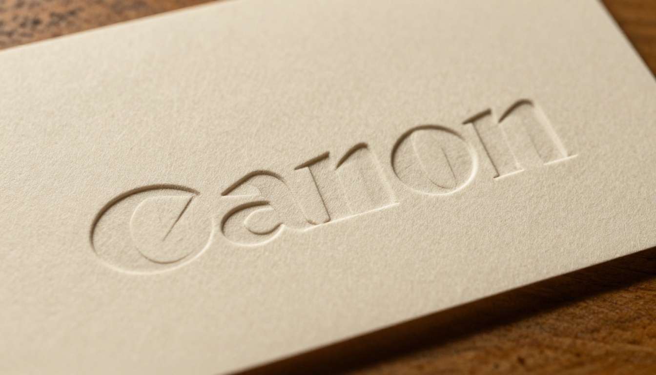
"cream cotton paper, deep emboss letterforms, raking sidelight creating crisp shadows inside the relief, fine paper fiber texture visible"
Carved Marble:
"Calacatta marble with grey veining, carved inset lettering, shadow inside the carved channels, polished marble surface around the carving"
Lighting That Creates Depth
Lighting is what makes or breaks the three-dimensional illusion. Specify:
Direction: "directional light from upper left at 45 degrees"
Quality: "hard single source" (sharp shadows) or "large soft box" (soft gradients)
Color temperature: "warm tungsten" or "cool daylight" or "neutral studio"
Secondary fill: "weak fill light from opposite side at 20% intensity"
Without a lighting specification, the model defaults to flat ambient lighting, which removes the shadow and highlight contrast that creates the sense of depth.
💡 Tip: Add "ambient occlusion in corners and recessed areas" to your prompts. This phrase reliably produces the contact shadow darkening that makes 3D objects read as solid and grounded.
How to Use FLUX on PicassoIA
PicassoIA gives you direct access to FLUX 2 Pro and the full suite of models above, from a browser with no local installation or GPU requirement. Here is the exact workflow for producing a 3D logo.
Step 1: Open the Model
Go to the FLUX 2 Pro model page on PicassoIA. The interface presents a prompt field, aspect ratio selector, and optional generation parameters.
Set aspect ratio to 1:1 for logo work. Square format gives the model equal space in all directions and prevents the compositional bias that horizontal ratios introduce when generating centered objects.
Step 2: Write Your Prompt
Start with this template and customize the material and environment for your brand:
A [shape/letter/wordmark] made of [material], resting on [surface],
[lighting description], visible depth on side faces,
cast shadow on surface below, [camera: 85mm f/2],
product photography, Kodak Portra 400
Example for a chrome letter initial:
"A heavy polished chrome letter B resting on white marble, single softbox from upper left, visible side faces with depth, anisotropic metal highlights, sharp cast shadow on marble, 85mm f/2 studio photography, Kodak Portra 400 film grain, photorealistic"
Step 3: Iterate on the Result
The first generation rarely needs to be the final result. Look at what came back and identify one thing to improve. Is the material not metallic enough? Add "mirror chrome, high reflectivity." Are the shadows too soft? Add "hard single-source lighting, sharp shadow edges."
Make one change at a time. Changing three things at once makes it impossible to know which adjustment produced the improvement.
Parameter tips for FLUX 2 Pro on PicassoIA:
Set guidance scale between 3.5 and 4.5 for product photography. Lower values give more creative variation; higher values stay closer to the prompt.
Set steps to at least 28 for final quality. Quick iterations at 20 steps are fine, but final outputs benefit from extra refinement.
If the result has the right composition but wrong material, use seed locking to preserve the layout while changing only the material description in the prompt.
Prompt Templates by Style
Copy these and fill in your brand's specific letter, shape, or wordmark:
Corporate Chrome Wordmark:
"Three-dimensional chrome wordmark letters standing on polished concrete, directional warm studio main light from upper right, visible letter depth, sharp anisotropic highlights, cast shadows on concrete, 50mm f/4 product photography, natural film grain, clean background"
Luxury Gold Emblem:
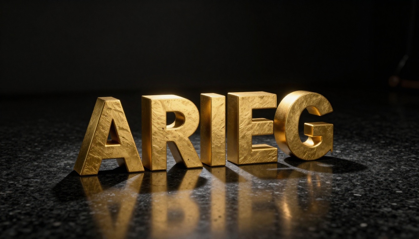
"A circular brand emblem with a central icon, cast in 24k brushed gold, raised above a deep black velvet surface, single overhead spotlight, directional brush highlight across the gold face, soft ambient occlusion where emblem meets velvet, 90mm macro lens, photorealistic"
Architectural Concrete Logo:
"Brand initials cast into raw concrete surface, carved inset with depth, single raking light from the far left creating crisp shadow inside the recessed letterforms, fine concrete aggregate texture visible, industrial cold-tone ambient, flat depth of field across the surface, 100mm tilt-shift lens"
Vintage Embossed Seal:
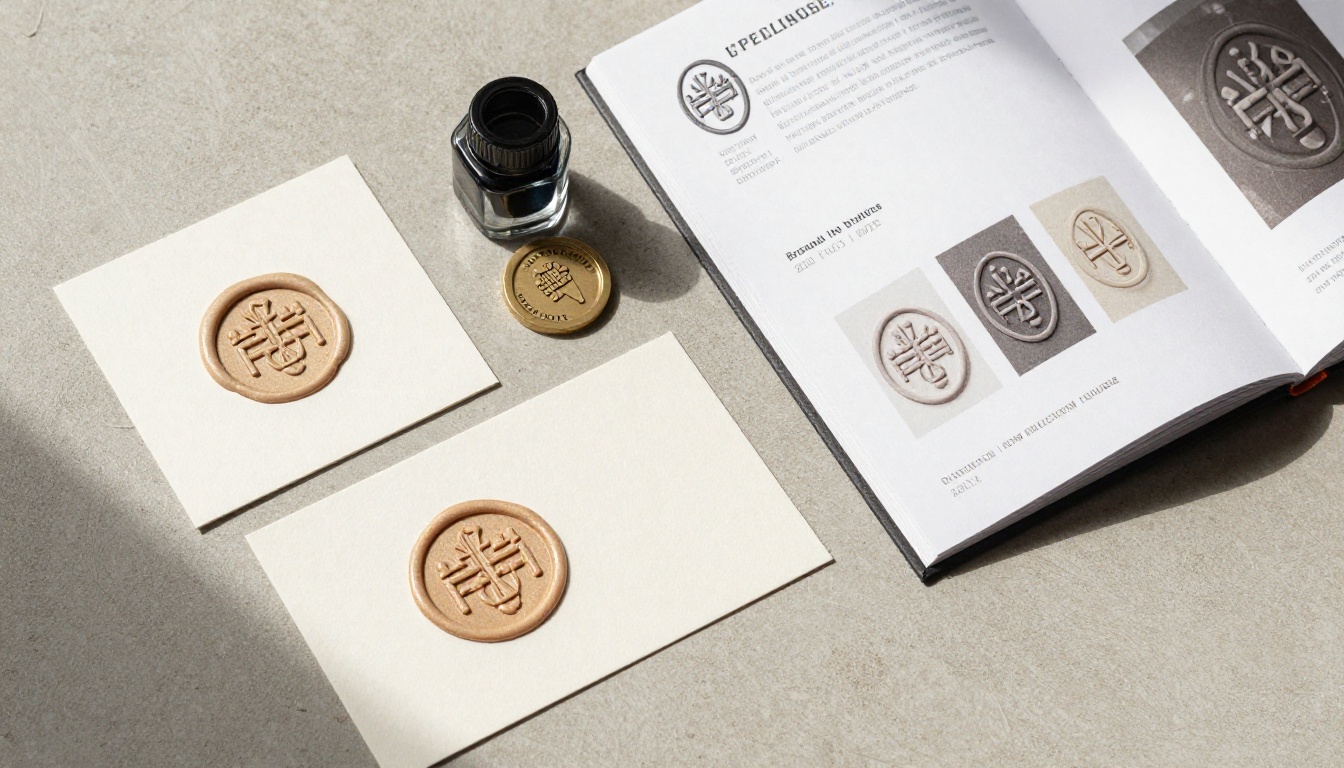
"A circular wax seal with an embossed brand crest, deep crimson wax, candlelight from upper right creating warm directional light, embossed elements catching light sharply, recesses in deep shadow, resting on aged parchment paper, close-up product photography, Kodak Portra 400"
5 Mistakes That Kill Your Results
1. Asking for Too Much at Once
"A chrome 3D logo with my brand name, multiple color variations, on a marble background with plants, in both light and dark versions" is not a prompt, it is a brief. Models cannot resolve competing instructions at this level of complexity. One concept, one material, one environment per generation.
2. Skipping the Surface
Logos floating in empty space almost never look physically real. A surface grounds the object, creates the cast shadow, and gives the light somewhere to bounce. Specifying "on white marble," "on polished concrete," or "on black velvet" immediately gives the result physical credibility.
3. Using Abstract Quality Words
"Professional," "high quality," "premium" are invisible instructions to an AI model. They carry no visual information. Replace every abstract quality word with a physical description. "Photorealistic chrome with sharp specular highlights" outperforms "professional metallic look" in every test.
4. Not Specifying Camera Distance
Without a camera specification, the model picks composition arbitrarily. Adding "85mm f/2 medium close-up" or "100mm macro extreme close-up" controls framing directly. The compression that telephoto lenses produce also flattens the background and increases focus on the object, which is almost always what logo photography needs.
5. Ignoring the First Iteration
Most people run one prompt, decide it did not work, and write a completely different prompt. The first result usually has something useful in it: the right depth structure, a good material response, an interesting compositional choice. Study what came back before scrapping it. Targeted refinement reaches the goal faster than starting over.
Taking Your Logo Further
A single 3D logo image is a starting point. Once you have a result you are happy with, there are several directions to take it.
Super Resolution: Use the super resolution tools on PicassoIA to upscale your logo to 4x the original resolution. This is essential for print use or large-format applications where pixel density matters.
Background Removal: The background removal tools on PicassoIA cleanly isolate your logo element from any generated background, giving you a transparent PNG ready for placement on any surface or material.
Variations via Inpainting: Once you have a base image you like, use inpainting to change just the material or color without rebuilding the entire composition. Select the logo area and reprompt with a different material descriptor.
Brand Identity Spread: Generate the logo, then use it as a reference point for a broader brand identity, mocking up business cards, letterheads, and packaging with the same dimensional aesthetic running through every application.
💡 Tip: When you find a seed value that produces a composition you like, save it. Using the same seed with varied prompts lets you iterate on material and lighting while keeping the spatial layout consistent.
Pick your material. Describe the surface and the light. Run the generation. The prompts in this article are tested starting points, not rigid formulas. Take one, swap in your brand's specific requirements, and iterate from there. Within three or four generations, you will have a result that would have taken a 3D artist hours to produce.
The tools are ready. Your brand identity is one prompt away.