Creating infographics used to mean hours in Illustrator or waiting days for a designer. With today's AI image models, you can produce polished, data-rich visuals in minutes. This article covers practical workflows, the best models to use, prompt strategies, and step-by-step tips for getting professional results fast without any design background.
Most infographics look bad. Not because the data is wrong, but because the visuals are rushed, generic, or built from the same five templates everyone else is using. AI changes this completely. With the right models and the right prompts, you can create infographic-quality images in minutes, without a design degree, without Adobe, and without hiring a freelancer. This is how it works.
Why Infographics Still Win in 2027
The attention problem nobody talks about
Humans process visuals 60,000 times faster than text. That is not a metaphor — it is a measured cognitive difference. When someone lands on a page with a wall of paragraphs, they scan. When they land on a page with a well-structured visual, they stop. That stopping moment is the entire value proposition of an infographic: force the eye to pause, then deliver information while attention is held.
But the format only works when the visual is good. A weak infographic is worse than no infographic, because it signals low effort and breaks trust instantly. Readers make quality judgments about your content in under 50 milliseconds. That first impression is almost entirely visual.
What separates a good infographic from a forgettable one
Three things separate infographics that get shared from ones that get ignored:
Visual hierarchy — the reader's eye should travel a clear path from the headline to supporting data to the takeaway.
Contrast — the most important number or fact must stand out visually. Color weight and size do this work.
Credibility signals — charts, icons, and imagery that look polished and intentional. Pixelated visuals or mismatched styles destroy credibility regardless of how good the data is.
AI addresses all three when you prompt it correctly.
AI vs. Traditional Infographic Design
The old process was slow by design
Before AI, creating a professional infographic meant briefing a designer, waiting 48 to 72 hours for a draft, going through two or three revision rounds, and spending between $200 and $800 for a single piece. Or spending four to six hours in Illustrator yourself, which most people do not have time for.
The result was that strong infographics were reserved for big campaigns or well-funded content teams. Everyone else used screenshots and stock photos that looked exactly like everyone else's screenshots and stock photos.
What AI does in seconds
AI image generation collapses this workflow into something anyone can run:
Old Process
AI-Powered Process
48 to 72 hour turnaround
Under 60 seconds per image
$200 to $800 per infographic
Near-zero cost
Requires design software skills
Plain text prompt only
2 to 3 revision rounds
Instant variations
One final output
Multiple options per prompt
Dependent on freelancer availability
Available at any hour
You describe the visual you want in plain language. The AI renders it. No waiting, no briefing, no invoice.
The real shift here: instead of relying on a designer to interpret your idea, you become the creative director and the AI handles production. That role change is worth sitting with for a moment. Creative direction is something anyone can do. Production used to be the bottleneck. It no longer is.
The Best AI Models for Infographic Visuals
Not all models produce the same results. For infographic-style imagery, you need models that handle clean compositions, sharp structural clarity, and consistent visual tone. Here are the strongest performers available on PicassoIA.
Flux 1.1 Pro for rich, detailed scenes
Flux 1.1 Pro is the current top choice for photorealistic, detailed imagery. When your infographic needs a strong visual anchor, such as a person working, a product shot, or an environment that sets context for the data, Flux 1.1 Pro delivers the lighting fidelity and detail that makes visuals feel premium and editorial.
💡 Best for: Hero imagery, section openers in infographics, and any visual that needs to feel like professional photography.
Strengths:
Exceptional lighting physics and shadow accuracy
Fine texture reproduction across fabric, skin, paper, and metal
Strong spatial coherence in complex multi-element scenes
Limitations:
Slower than Schnell variants
More detail than necessary for simple abstract visuals
For even higher fidelity in print-resolution infographics, Flux 1.1 Pro Ultra pushes output resolution further while maintaining the same quality ceiling.
Imagen 4 for clean, layout-friendly visuals
Imagen 4 from Google produces some of the cleanest, most structured compositions in AI image generation today. Its outputs lean toward high contrast, flat-friendly color palettes that pair naturally with infographic layouts. The model also handles negative space better than most, which is critical when you need images that will coexist with overlaid text or chart elements without visual competition.
💡 Best for: Background visuals, section imagery in text-heavy infographics, and any scene where the image needs to sit behind data without fighting it.
For fast drafting at slightly lower fidelity, Imagen 4 Fast is the right call during the concept phase. Run fast first, switch to the full model for finals.
SDXL for rapid iteration
SDXL has been the industry workhorse for a reason. It is fast, produces consistent results across batches, and responds well to stylistic prompts. For rapid prototyping of infographic visual styles, conceptual comparisons, or generating multiple visual options before committing to a final direction, SDXL is one of the most productive tools in the stack.
Its companion model SDXL Lightning 4-Step cuts generation time even further while preserving structural quality, making it particularly useful for high-volume infographic projects where you need 20 or 30 variations fast.
Stable Diffusion 3.5 for tight compositional control
Stable Diffusion 3.5 Large offers strong prompt adherence and handles complex multi-element prompts better than earlier SD versions. When you need to describe a scene with multiple data points, multiple people, and a specific environment all in one image, SD 3.5 follows that complexity more reliably than many alternatives.
Stable Diffusion 3.5 Medium is a practical middle-ground option when speed matters but you still want tight prompt adherence.
How to Prompt for Infographic-Style Images
Generating a strong infographic visual is 80% about the prompt. The model is capable, but it needs specific instruction to reach its potential.
The anatomy of a strong prompt
Every effective prompt for an infographic visual has five components:
Subject — what is the main focus? A person, an object, a workspace, a screen?
Context — where is it set? A desk, an office, a clean white background, an outdoor setting?
Lighting — the single most impactful variable for photorealism. Specify the source, direction, and quality (golden hour, overcast diffused, studio softbox, monitor glow).
Camera specs — angle, focal length, aperture. These create the depth, scale, and perspective that separate professional photography from snapshot aesthetics.
Style flags — photorealistic, film grain, specific film stock, and always: no illustration, no CGI, no glow effects.
A weak prompt: "a woman working on infographics"
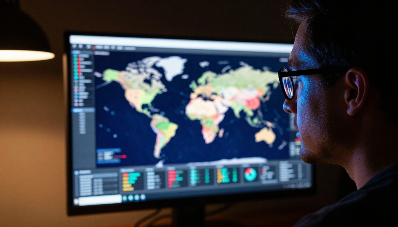
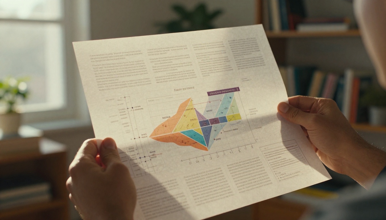
A strong prompt: "Close-up of a young woman reviewing a printed infographic at a bright oak desk, soft diffused morning light from the left window, Canon 85mm f/1.8, shallow depth of field, film grain Kodak Portra 400, photorealistic, no digital art"
The second prompt gives the model camera physics, lighting physics, and style constraints. The model stops guessing and starts executing.
3 prompt templates you can use today
Template 1: Person working with data visuals
[Subject description and action] at [environment], [lighting condition] from [direction],
[camera lens] [aperture], [film stock], photorealistic photography, no CGI, no illustration
Template 2: Flat lay overhead shot
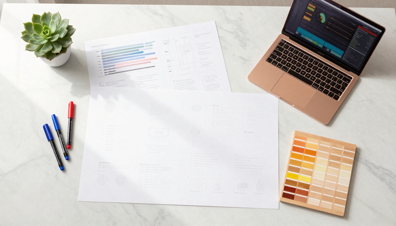
Aerial top-down flat lay of [objects on surface], [surface material] with [texture detail],
soft diffused light from [direction], Canon 35mm f/8, every object sharp,
photorealistic flat-lay photography, film grain [stock]
Template 3: Screen or monitor close-up
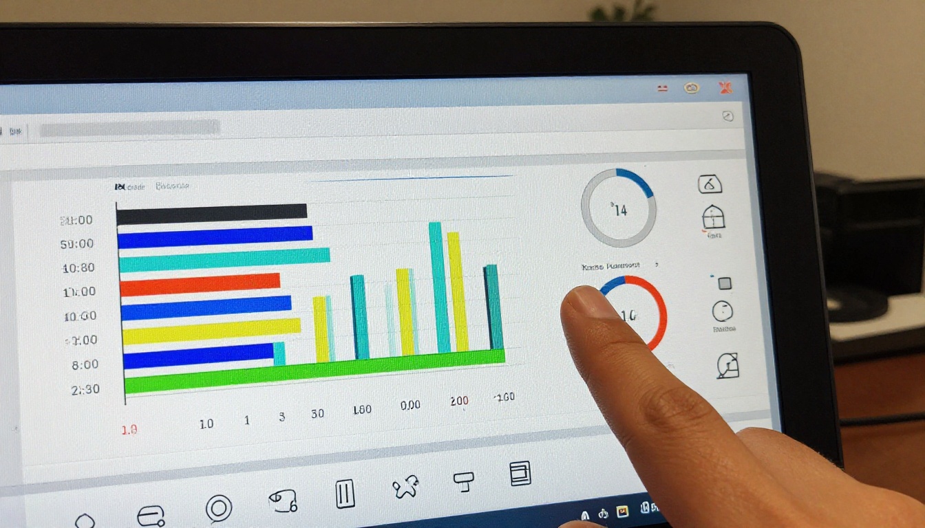
Close-up of [screen content] on a [monitor or tablet], [ambient light source] casting [color] glow,
[macro lens specs], film grain [stock], photorealistic product photography, no glow effects
Mistakes that kill your results
Vague subjects destroy specificity. "A data visualization" gives the model almost nothing. "A bar chart showing monthly statistics on a large 4K monitor" gives it structure and composition guidance.
Missing lighting direction forces the model to default to flat, even lighting that looks artificial and unconvincing. Always specify where light comes from: "morning light from the left," "warm lamp glow from below," "monitor light casting blue on the face."
Style contradictions break the output. Do not combine "photorealistic" with "vibrant neon glow" or "digital illustration style." Pick a single visual lane and stay in it across your entire prompt.
No negative constraints allow the model to fill gaps with its training defaults, which are often illustration-adjacent. Always close your photorealistic prompts with "no CGI, no illustration, no glow effects, no digital art."
Step-by-Step: Build Infographic Visuals on PicassoIA
Here is a practical workflow for creating a full set of infographic visuals on PicassoIA from scratch.
Step 1: Define your infographic structure first
Before opening any AI tool, sketch or write out what sections your infographic needs to communicate. Each section that benefits from a visual should get its own image generation request. A typical infographic needs:
1 hero image (full-width, high emotional impact, sets the tone)
2 to 3 section context images (mid-width, support specific data points)
Background fills or section divider imagery
Defining this upfront prevents the common mistake of generating random images and trying to force them into a layout retroactively.
Use the templates above for each image. The critical detail for infographic imagery: specify negative space. If you want the image to sit to the left of a text column, add "subject positioned on left third of frame with clean empty negative space on the right side." This prevents the AI from centering everything and leaving no room for data overlays.
Step 4: Generate, assess, and iterate one variable at a time
Run each prompt and immediately assess three things:
Does the composition work within your intended layout?
Is there clean space for text overlay where you need it?
Does the visual style match your other infographic images?
If a generated image is off, adjust one variable at a time. Change the lighting first, then the camera angle, then the subject description. Changing everything simultaneously makes it impossible to identify what fixed or broke the output.
Step 5: Upscale for print quality
If your infographics are destined for print, high-DPI displays, or large-format sharing, run your finals through PicassoIA's Super Resolution models. These upscale images 2x to 4x while sharpening fine detail, which is essential for print at A3 size or above. The difference at 300dpi is significant enough to matter.
Pairing AI Visuals with Layout Tools
AI image generation handles the hard part: creating original, non-stock visuals that match your infographic's tone and style. The layout work, where text, data labels, and structural elements come together, belongs in a dedicated tool.
Canva for non-designers
Canva is the fastest path from "AI image" to "finished infographic." Its drag-and-drop grid system works perfectly with 16:9 AI images as section backgrounds or hero panels. Upload your PicassoIA-generated images directly, then build your text and chart layers on top.
Canva workflow in 4 steps:
Create a new infographic document (1920x1080 for digital, A4 for print)
Upload your AI images from PicassoIA to the Canva media library
Set each image as a section background or panel fill
Add text layers, statistics, data labels, and icons on top
The entire process takes under 20 minutes once your images are ready.
Figma for full control
For teams building infographics as part of a repeatable design system, Figma offers more precision. You can set up frames with defined grid layouts, create reusable components for chart elements, and collaborate in real time with teammates.
AI images from PicassoIA work as fills inside Figma frames, giving you pixel-precise positioning. Combine with a clip mask to trim images exactly to your layout shape with no jagged edges.
💡 Tip: When exporting AI images for use in layout tools, always use the original source URL from PicassoIA before any compression step. Infographics are frequently shared at 2x retina resolution or printed large. Starting from the highest available source quality protects you downstream.
Which Infographic Types Benefit Most from AI
Not every infographic format benefits equally from AI-generated visuals. These types get the highest return:
💡 Note on text within images: Current AI image models struggle with rendering accurate readable text inside generated images. Do not rely on AI to produce legible statistics, labels, or headlines within the image itself. Generate clean visuals and add all text content in your layout tool afterward.
Scaling Your Infographic Output
Once the individual workflow is solid, the next question is volume. How do you produce infographics consistently without every single one taking 30 minutes to build?
Build a prompt library
Save every prompt that produces a result you are happy with. Organize them by type (flat lay, portrait, monitor, overhead) and by lighting condition. When you need a new visual, start from a proven base prompt and adjust the specific subject rather than writing from scratch every time.
A prompt library of 20 to 30 tested prompts eliminates most of the trial-and-error from your production workflow.
Create a visual style brief
Decide once: which film stocks? Which camera lenses? Which lighting styles? Write these decisions into a one-page brief and apply them consistently across all your infographic imagery. Consistency across images is what makes an infographic feel professionally produced rather than assembled from random outputs.
Example style brief entry:
Film stock: Kodak Portra 400
Primary lenses: 85mm f/1.4 for portraits, 35mm f/8 for flat lays, 100mm macro for close-ups
Lighting: Soft diffused natural daylight from the left or warm amber afternoon window light
Forbidden: Neon, CGI, illustration, glow effects, dark studio backgrounds
Batch generate at the start of each project
Before writing a single word of your infographic content, generate your full image set. Having the visuals in hand before writing prevents the common mismatch where the text describes something the images do not show.
Common Questions About AI Infographics
Can AI generate the actual chart layouts and data graphics?
Not reliably. Current text-to-image models are not purpose-built for diagrammatic data visualization. They produce photography-style imagery and artistic visuals. For charts, graphs, and structured data layouts, use a dedicated tool like Canva, Datawrapper, or Flourish. AI handles the atmospheric and contextual imagery; the data visualization tools handle the actual data display.
How do I keep visual consistency across multiple AI images?
Use a fixed seed value in your prompts when generating variations of similar content, and keep your camera, lighting, and film stock parameters identical across all prompts in a set. Consistency at the prompt level produces consistency in the output.
What resolution should I generate at for infographic use?
For digital infographics shared on social or embedded in web content, 16:9 at standard output resolution is sufficient. For print or high-DPI retina displays, run your outputs through the Super Resolution upscaler on PicassoIA before exporting. Always work from the highest source quality you can get before bringing images into Canva or Figma.
Do AI images work for branded infographics?
Yes, with one caveat: AI models do not generate logos or specific brand marks. Use AI to produce the photographic and atmospheric imagery, then add brand colors, typography, and logos as layers in your layout tool. This separation of AI and brand elements actually speeds up the workflow because you are not fighting the model to reproduce precise brand assets.
Start Creating Your Own Infographics Today
The barrier to high-quality infographics has dropped permanently. You do not need a design agency, a stock photo subscription, or six hours in Illustrator. You need a clear idea of what information you want to communicate, a well-structured prompt, and a model matched to your output type.
PicassoIA gives you access to every model covered in this article, from Flux 1.1 Pro to Imagen 4 to SDXL and beyond, all in one place, without juggling multiple platforms or API keys.
Start with the prompt templates from this article. Pick one infographic format. Generate your first batch of visuals. Then bring them into Canva or Figma and see how fast the workflow moves when creative production is handled by AI.
The data is yours. The story is yours. The AI handles the pixels.