Cinematic color grading separates average photos from images that stop you mid-scroll. That specific warmth in skin tones, those rich teal shadows, the way highlights bleed slightly into ivory: it is a visual signature you have seen in every major film of the last two decades. Achieving it used to require expensive software, hours of manual work, and a solid grasp of color theory. AI collapses that entire process into a single well-crafted prompt.
Why Color Grade Changes Everything
Color grading is not just an edit. It is the emotional layer sitting on top of the photograph. The same scene shot in flat, ungraded footage feels like surveillance camera footage. Apply a warm orange-teal grade and suddenly it reads as a Hollywood production. The difference lives entirely in how the color channels are shifted and the tonality is balanced across shadows, midtones, and highlights.
What Your Eyes Actually React To
Human vision is wired to respond to specific color contrasts. Warm skin tones against cool backgrounds create instant visual hierarchy. This is why the teal and orange grade became ubiquitous in cinema. Teal recedes visually, orange advances, and human skin tones fall perfectly in the orange range. The contrast between the two creates depth, drama, and polish in a single move.
The Science Behind Film Tones
Film stocks like Kodak Portra 400 and Fuji Velvia introduced characteristic color responses that digital cameras cannot naturally replicate. Portra pushes reds and skin tones warm, lifts the shadows slightly rather than crushing them to pure black, and rolls off the highlights softly. These qualities make subjects look healthier, more present, more alive. AI models trained on millions of cinematically graded images have absorbed these characteristics as part of their visual vocabulary.
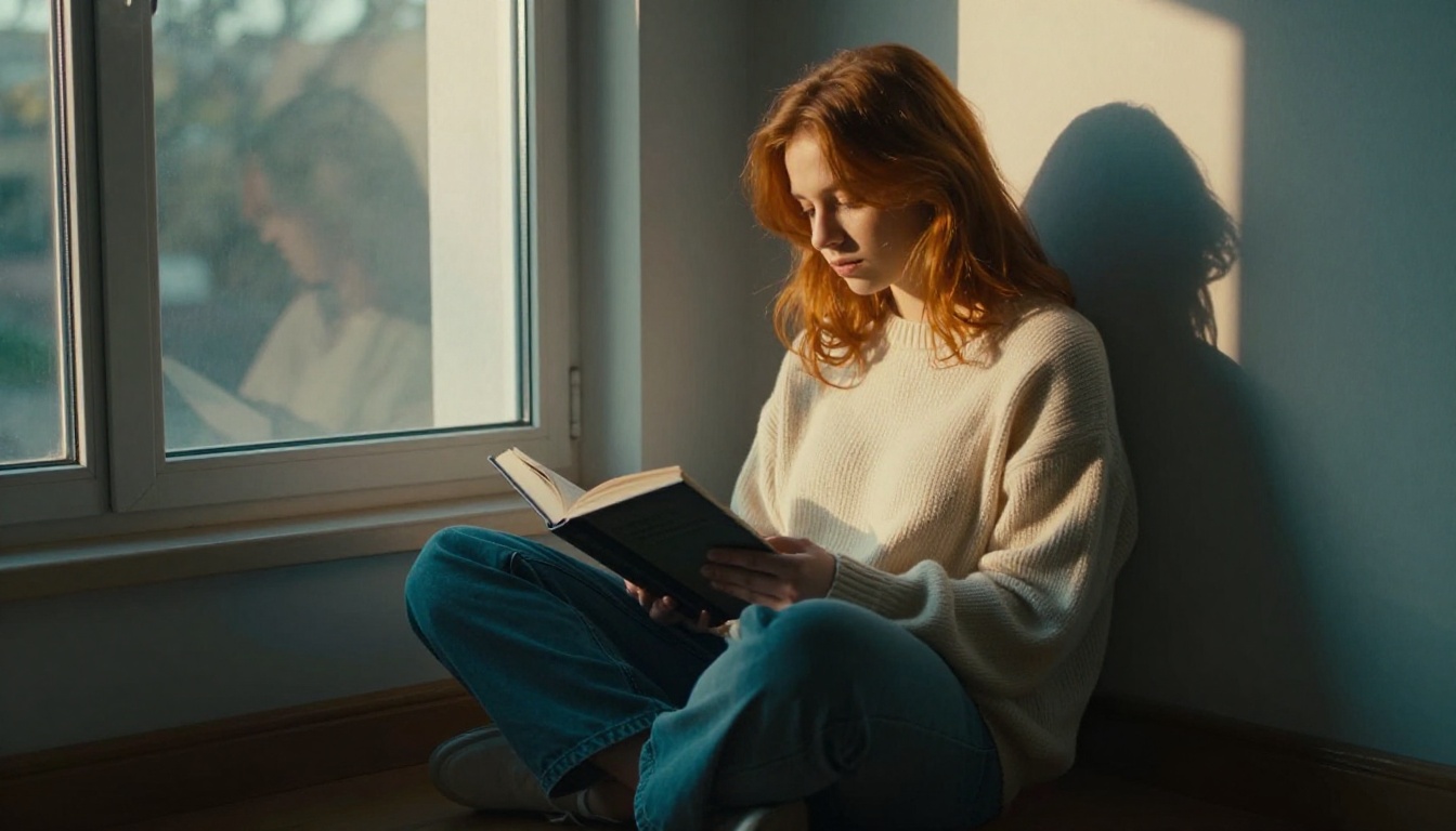
The 5 Cinematic Color Looks
Not all cinematic grades are the same. The five most common looks each carry a distinct emotional signature. Knowing them helps you specify exactly what you want in a prompt.
| Look | Shadows | Midtones | Highlights | Mood |
|---|
| Teal and Orange | Deep teal | Warm amber | Bleached ivory | Drama, action |
| Bleach Bypass | Cool silver | Desaturated | High contrast | Gritty, noir |
| Golden Hour | Warm brown | Rich amber | Soft gold | Romantic, nostalgic |
| Blue Hour | Cool blue | Neutral gray | Pale white | Moody, introspective |
| Matte Faded | Lifted blacks | Desaturated | Faded | Indie, editorial |
Teal and Orange
The most imitated grade in cinema history. Used in everything from Mad Max: Fury Road to Transformers to countless Instagram feeds. It works because orange skin tones and teal environments create the maximum contrast between subject and background. In your prompts: "teal shadows, warm amber midtones, bleached highlights, Kodak Portra look."
Bleach Bypass
Originally a darkroom chemical process that skips the bleaching step during film development. The result: desaturated, high-contrast images with retained silver tones. Think Se7en, Saving Private Ryan, Minority Report. In your prompts: "bleach bypass film process, desaturated midtones, silver tones, pushed contrast, muted colors."
Golden Hour and Blue Hour
Golden hour brings warmth, softness, and that impossibly flattering quality of late afternoon sun. Blue hour, the 20 minutes after sunset, delivers the opposite: cool, dreamy, melancholic. Both are highly specific lighting conditions that AI models replicate accurately when described with precision. Use "volumetric afternoon light, golden hour glow, warm amber highlights" or "blue hour, cool blue tones, post-sunset ambient light."
Matte and Faded
The lifted black look popularized by indie films of the early 2010s, made famous by tools like VSCO. Blacks are pulled off pure black, saturation is reduced, and the overall feel becomes soft and editorial. In prompts: "lifted blacks, matte grade, faded colors, editorial film look, desaturated shadows."
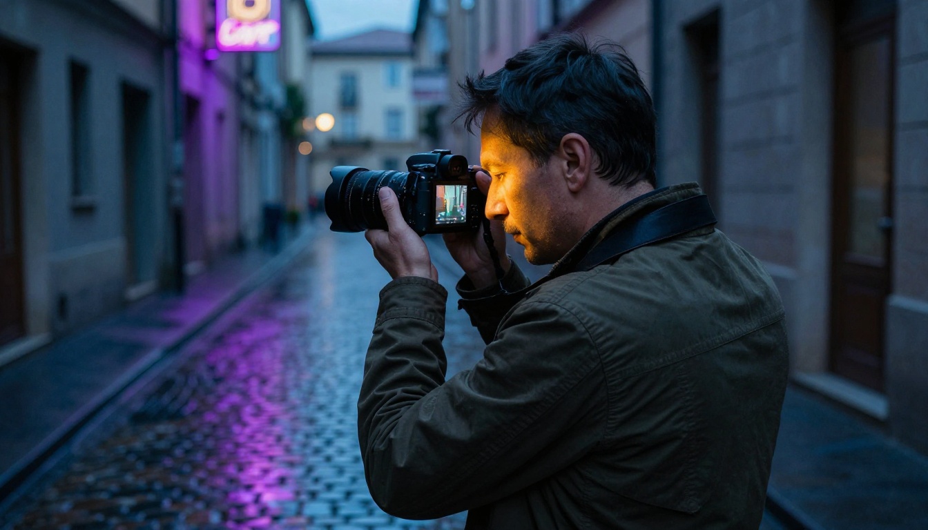
How AI Reads Color Instructions
When you describe a color grade in a text prompt, you are giving the AI a set of tonal and chromatic instructions. The model has been trained on enough cinematically graded images to associate phrases like "Kodak Portra 400 film scan" or "teal and orange grade" with specific RGB channel adjustments, contrast curves, and saturation maps.
What Prompts Actually Trigger
The most effective cinematic prompts work at three levels simultaneously:
Film Stock References
Referencing actual film stocks gives the AI a precise starting point. "Kodak Portra 400" signals warm, soft skin tones and lifted shadows. "Fuji Velvia 50" triggers saturated greens and rich blues. "Ilford HP5" activates high-contrast black and white with film grain.
Color Channel Language
Direct channel descriptions override general style references. "Shadows pushed to teal, midtones warm amber, highlights bleached to ivory" tells the model exactly where each tonal range should land chromatically.
Lighting Descriptors
Lighting and color grade are inseparable. "Volumetric morning light from the left" plus "Kodak Portra aesthetic" gives the AI both the light source direction and the color processing to apply to it.
💡 Tip: The more specific your color language, the more precise the output. "Cinematic colors" is too vague. "Shadows crushed to teal with warm amber midtones and ivory highlights" is actionable.
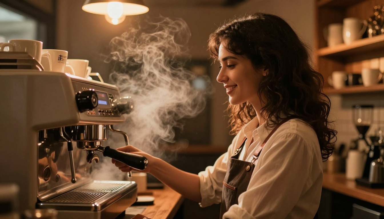
After testing across dozens of models and styles, a reliable formula for cinematic color grades follows this structure:
💡 Prompt Formula: [Subject + Pose/Action] + [Environment] + [Lighting Direction + Quality] + [Color Grade Specification] + [Camera + Lens] + [Film Stock Reference] + --ar 16:9 --style raw
For Teal and Orange:
"A woman in a linen dress standing in a sunlit doorway, late afternoon sidelight from the right, warm amber skin tones with deep teal cast in the shadows, cinematic teal and orange color grade, shot on 85mm f/1.4, Kodak Portra 400 film scan quality, photorealistic 8K --ar 16:9 --style raw"
For Bleach Bypass:
"A man in a dark coat walking through a rainy city street at dusk, cool desaturated tones, high contrast, silver shadows retained, bleach bypass film process, 35mm f/2.0, overcast natural light, Ilford HP5 aesthetic, photorealistic 8K --ar 16:9 --style raw"
For Golden Hour:
"A couple at a wooden table on a farmhouse porch, rich golden afternoon backlight creating warmth in their hair, amber midtones, soft ivory highlights, Kodak Portra 400 look, 50mm f/1.8, shallow depth of field, photorealistic 8K --ar 16:9 --style raw"
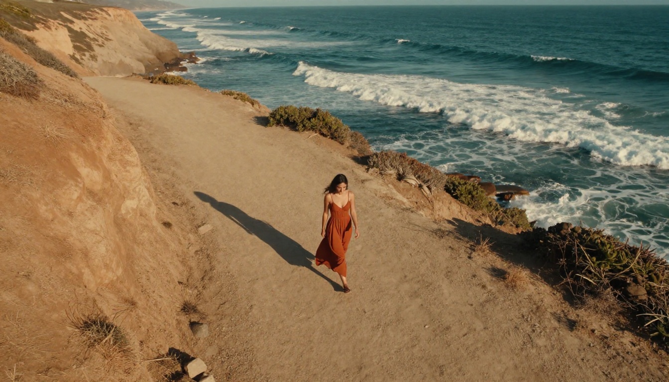
Which PicassoIA Models Nail Cinematic Grades
Not every AI model handles cinematic color with the same fidelity. Some are optimized for vivid, punchy output; others lean into photorealistic subtlety. For color-sensitive work, these are the models worth your attention.
Flux Dev by Black Forest Labs produces some of the most photorealistic output available. Its handling of skin tones is exceptional, making it the strongest option for portrait-led cinematic images. It responds well to direct color grade language and renders film grain naturally rather than artificially. Use it when the subject is a person and accuracy in skin tone reproduction matters most.
Flux 1.1 Pro Ultra extends the base Flux capabilities with significantly higher resolution output and improved prompt adherence. For large-format cinematic images where you need every shadow detail and highlight roll-off to be precise, this is the first choice. Its handling of tonal contrast in complex lighting scenarios is noticeably more refined than earlier versions.
Google Imagen 4 brings exceptional prompt-to-image accuracy. When you write a specific color description, Imagen 4 tends to follow it more literally than other models. This makes it ideal for testing color grade variations, since changes in prompt wording translate directly into visible changes in the output.
Recraft v4 is particularly strong for editorial and fashion photography aesthetics. Its color reproduction has a slightly elevated, styled quality that aligns well with bleach bypass and matte grade work. When the goal is an image that reads as high-end editorial rather than documentary, Recraft delivers consistent results.
Ideogram v3 Quality offers strong compositional control alongside reliable color handling. Its output has a clean, commercial quality that works well for golden hour and warm grade work where the goal is polished rather than gritty.
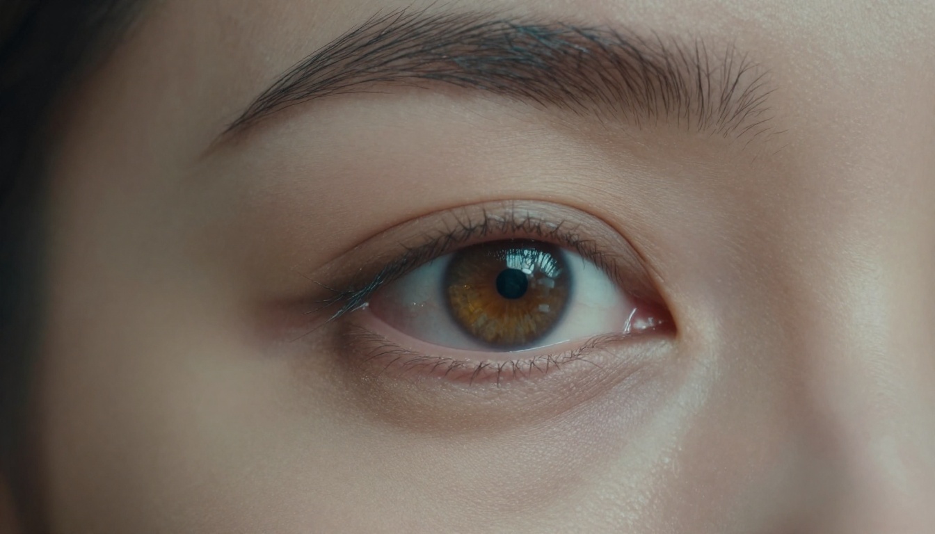
Model Comparison at a Glance
| Model | Skin Tone | Shadow Depth | Film Grain | Best For |
|---|
| Flux Dev | Excellent | Deep, natural | Realistic | Portraits, close-ups |
| Flux 1.1 Pro Ultra | Excellent | Detailed | Realistic | Wide scenes, landscapes |
| Google Imagen 4 | Very Good | Accurate | Subtle | Testing grade variations |
| Recraft v4 | Good | Stylized | Minimal | Editorial, fashion |
| Ideogram v3 | Good | Clean | Subtle | Commercial work |
How to Use Flux Dev on PicassoIA
Since Flux Dev is the strongest model for cinematic color work, here is the step-by-step process for generating your first properly graded image.
Step 1: Open the Model
Navigate to Flux Dev on PicassoIA and click Generate.
Step 2: Build Your Prompt
Use the formula: Subject plus Environment plus Lighting plus Color Grade plus Camera plus Film Stock. Be specific about which grade you want. "Teal and orange cinematic grade" and "bleach bypass grade" produce very different results.
Step 3: Set Aspect Ratio to 16:9
This ratio immediately gives the image a film-still quality that 1:1 or portrait ratios cannot match. For cinematic output, always use 16:9.
Step 4: Add Quality Modifiers
End every cinematic prompt with: "photorealistic, 8K, film grain, RAW photography, --style raw." These modifiers push the model away from artificial, digital-clean looks and toward the film aesthetic.
Step 5: Iterate on the Grade
If the first output has the right composition but the grade is off, adjust only the color-related portion of the prompt. Change "teal shadows" to "blue shadows" or "warm amber" to "golden honey" and regenerate. Compositional elements stay consistent while the tonal character shifts.
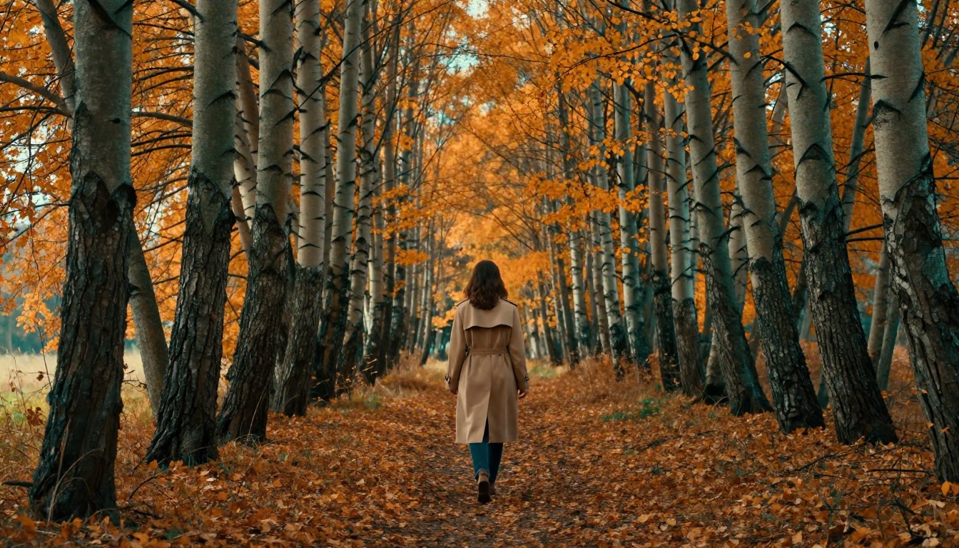
Lighting Setups That Carry the Grade
Color grading and lighting are co-dependent. The same grade looks completely different on a scene lit with soft overcast light versus hard directional sun.
Hard Directional Light Plus Teal and Orange
Hard sun from a low angle, early morning or late afternoon, creates strong shadows. Those shadows are where the teal grade lives. The more pronounced the shadows, the more dramatic the teal-orange contrast. Use: "hard sidelight from the right, long shadows, late afternoon low sun, teal and orange cinematic grade."
Overcast Light Plus Bleach Bypass
Flat, diffuse overcast light has no strong highlights and even shadows. Combined with a bleach bypass grade, it creates a cold, oppressive atmosphere with no warmth. Use: "overcast diffuse light, flat natural lighting, bleach bypass film process, desaturated midtones, cold color palette."
Candlelight and Tungsten Plus Warm Grade
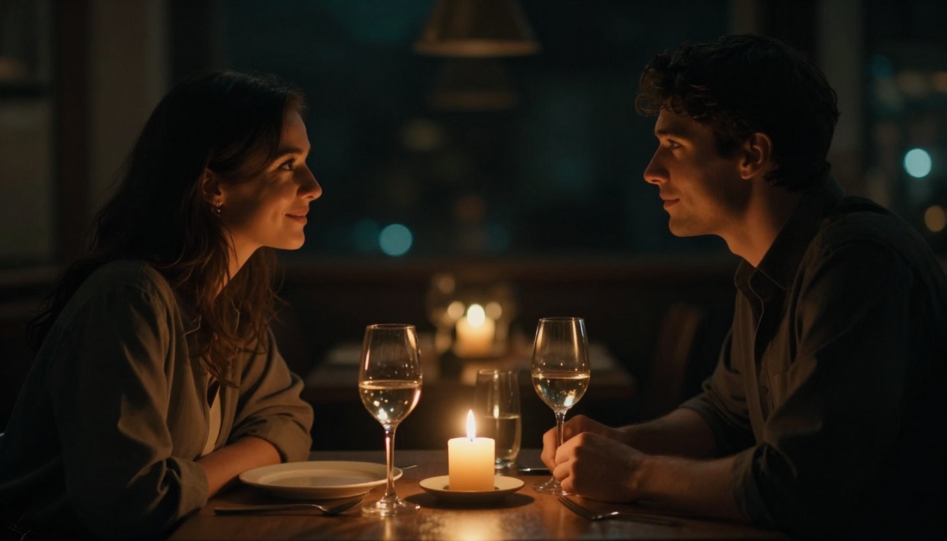
Tungsten and candlelight are already pushing orange. Combined with a warm cinematic grade, the result is deeply warm, intimate, and atmospheric. Use: "tungsten interior lighting, warm amber candlelight, orange skin tones, warm shadows, Kodak Portra 400 aesthetic."
Upscaling for Maximum Quality
After generating a cinematic image, upscaling extracts every detail from the output. PicassoIA offers dedicated super-resolution models built for this.
Clarity Pro Upscaler is designed for photorealistic upscaling. It adds texture and micro-detail rather than simply enlarging pixels, which matters for cinematic work where skin texture and film grain need to hold at large sizes.
Topaz Image Upscale by Topaz Labs upscales up to 6x and is particularly effective at retaining film grain structure, making it ideal for images with a strong analog aesthetic. Upscaling a cinematically graded image at 4x-6x with grain retention gives you the closest analog to a high-resolution film scan available through AI.
💡 Tip: Upscale after finalizing the grade, not before. Upscaling amplifies both the strong and the weak details in an image.
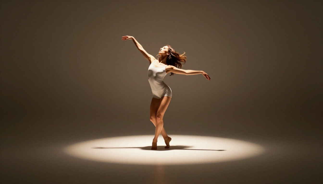
3 Mistakes That Break Cinematic Prompts
Most failed attempts at cinematic grades share one of these three errors.
1. Generic Style Words Without Tonal Specifics
Writing "cinematic look" without specifying shadow color, midtone temperature, and highlight behavior gives the model too much freedom. Always specify tonal zones explicitly: shadow hue, midtone warmth, highlight roll-off.
2. Conflicting Lighting and Grade
A bleach bypass grade on a warm golden hour scene creates visual confusion. The grade fights the light rather than amplifying it. Match the grade to the lighting condition: warm grades for warm light, cool grades for cool or overcast light.
3. Over-Specifying the Subject, Under-Specifying the Color
Detailed subject descriptions are valuable, but if the color grade section is just "cinematic colors," the model defaults to whatever "cinematic" it encountered most during training. Give the same attention to the color description as to the subject description.
Your First Cinematic Shot
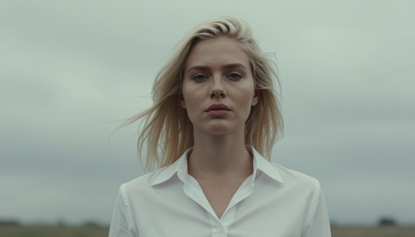
Every image in this article was generated on PicassoIA using the exact prompt formulas described above. No Lightroom. No DaVinci Resolve. No manual color correction. The models on the platform have absorbed enough cinematographic knowledge to execute these grades consistently when the prompts are written with precision.
Start with the teal and orange grade since it is the most forgiving and immediately readable as cinematic. Open Flux Dev on PicassoIA, use the formula, and run your first generation. Once you see the shadows shift to teal and the skin tones push warm, the process makes sense in a way that reading about it cannot fully convey.
After your first image, try the same prompt on Recraft v4 and Google Imagen 4 to see how each model interprets identical color instructions. The differences will immediately tell you which model matches your aesthetic most closely.
Then run the result through Clarity Pro Upscaler and see the final image at full resolution. Prompt, generate, upscale: that is the full pipeline for cinematic AI photography on PicassoIA.


