Your brand looks different on Instagram than on your website. The lighting is off. The colors don't quite match. One post feels warm and editorial, the next looks cold and corporate. Customers notice this, even if they can't name it. And when they notice it, they trust you a little less. The good news: AI image generation has changed this equation completely, and you don't need a photography budget or a design agency to fix it.
Why Most Brand Visuals Fail
It's not about money
Small brands often blame inconsistency on budget. "We can't afford a professional photographer for every campaign." But plenty of well-funded brands look just as inconsistent. The problem isn't money. It's process.
When your social team pulls stock photos, your marketing manager uses a different app for product shots, and your website designer uses something else entirely, you end up with three visual languages competing for attention under one brand name. The result is a feed that feels assembled, not designed.
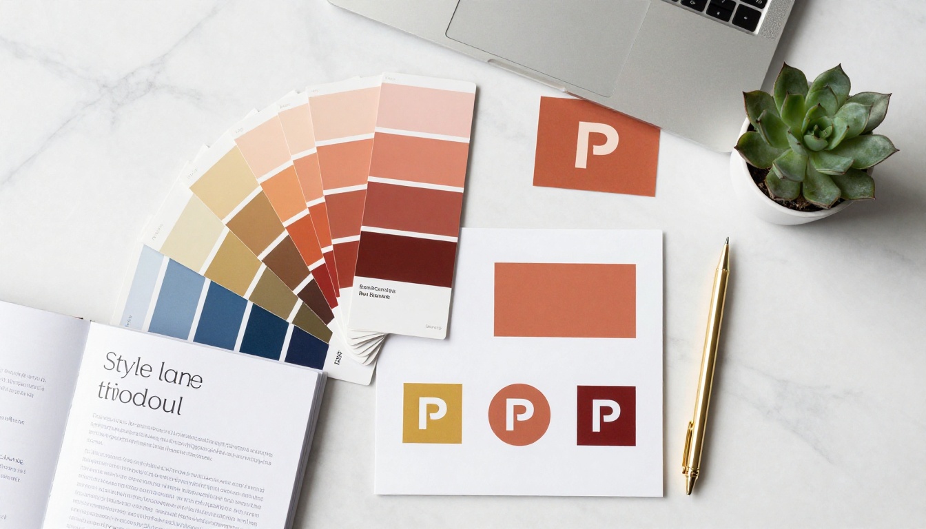
What inconsistency actually costs
Visual consistency isn't just aesthetic. It's functional. Studies on brand recognition show that consistent visual presentation increases revenue by up to 23%. More practically: when someone sees your content in a crowded feed, they should recognize it as yours before they read a single word.
That recognition is built on three pillars: color temperature, lighting style, and compositional rhythm. Change any one of those without discipline, and your brand becomes forgettable.
What "Visual Consistency" Actually Means
Color, light, and composition
Consistency doesn't mean every image looks the same. It means they feel like they belong to the same world.
Think about how a luxury fashion brand shoots their campaigns. The images are different: one is a close-up, one is a wide street shot, one is a product detail. But the lighting direction, the color grade, and the subject framing follow strict internal rules. A warm, slightly desaturated tone. Natural window light. Negative space on the left. Those rules form the visual DNA.
AI models can be trained and prompted to respect that DNA every single time.
The 3-second recognition test
Here's a practical benchmark: if you strip your logo from an image and someone still knows it's from your brand within 3 seconds, you have visual consistency. If they'd need to check the username, you don't.
Run this test on your last 9 posts. Count how many pass. That number tells you exactly how much work AI can do for you right now.
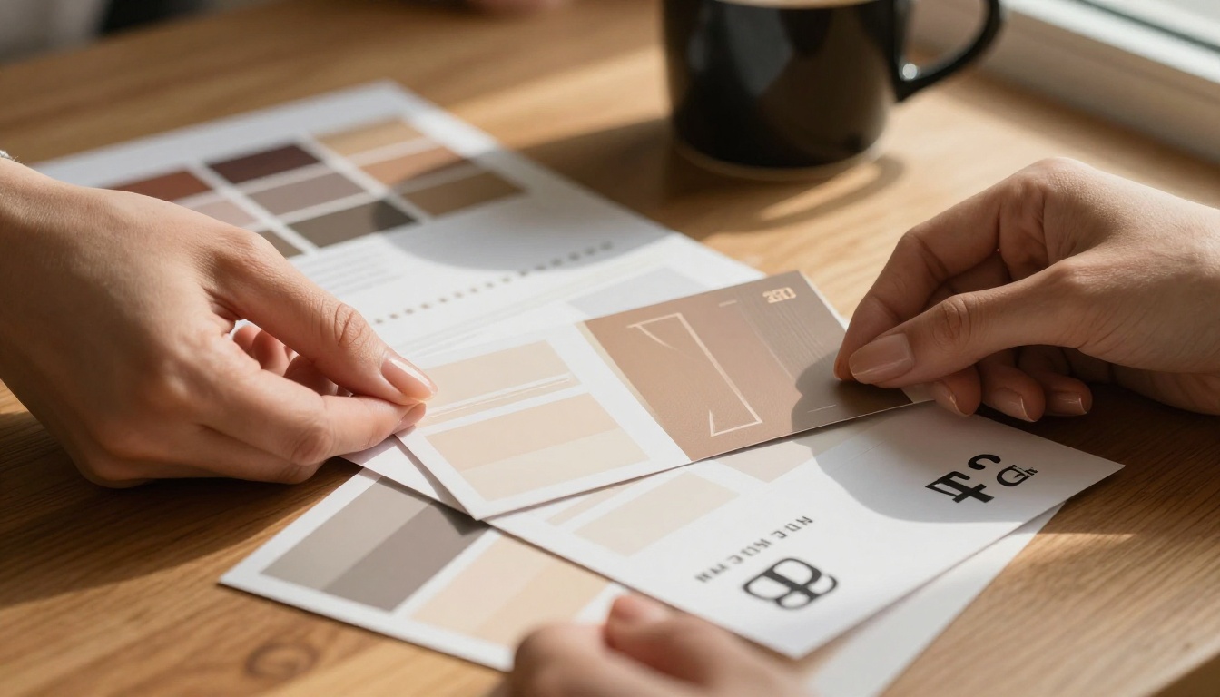
AI Models That Lock In Your Brand Style
Flux Kontext Pro for reference-based generation
The most powerful tool for brand visual consistency is reference-based image generation. Instead of describing your brand style in words (which is imprecise), you feed the model an existing on-brand image and tell it to maintain that style.
Flux Kontext Pro is built exactly for this. You provide a reference image, write a prompt describing the new scene, and the model preserves the lighting style, color temperature, and compositional feel of your reference. The output isn't a copy. It's a new image that belongs to the same visual family.
This is what professional photographers call "matching the look." With Flux Kontext Pro, you can do it at scale, on demand, without a photographer.
For even more power, Flux Kontext Max handles more complex reference scenarios and produces higher-fidelity results when your brand visuals involve intricate textures or detailed environments.
Working with multiple brand references
One of the biggest challenges in brand photography is producing a series where every image belongs together. A 9-image Instagram grid, a landing page hero sequence, a product catalog. Each image needs to feel like it was shot in the same session.
Flux Kontext Apps: Multi-Image Kontext Pro solves this directly. You can provide multiple reference images and generate new content that synthesizes the style from all of them. The result: a batch of outputs with shared visual language, ready to deploy across any channel.
For portrait-heavy brands (beauty, lifestyle, coaching, fashion), Flux Kontext Apps: Portrait Series generates subject portraits with consistent lighting, skin tone rendering, and framing across every shot.
Training your own style with LoRA
If you want the deepest possible level of brand lock-in, train a custom LoRA on your existing brand photography. A LoRA (Low-Rank Adaptation) is a compact model fine-tune that teaches an AI to reproduce a very specific visual style.
P Image Trainer on PicassoIA lets you upload 10 to 20 of your best on-brand images and train a custom LoRA in minutes. Once trained, every generation through that LoRA inherits your brand's specific lighting ratios, color cast, and compositional habits.
This is the professional approach. Agencies use custom LoRAs to maintain brand style across thousands of generated assets. You can now do the same.
Once your LoRA is trained, use P Image Edit LoRA to apply your brand style to existing photos, not just new generations. Upload a generic product image, apply your LoRA, and it comes out looking like it was shot in your studio.

How to Use Flux Kontext Pro on PicassoIA
This is a step-by-step walkthrough for generating your first batch of consistent brand visuals using Flux Kontext Pro on PicassoIA.
Step 1: Prepare your brand reference
Select one photograph that represents your brand at its best. This is your visual anchor. It should be:
- Shot with the lighting style you want to replicate (natural, studio, golden hour, etc.)
- Featuring your typical color palette prominently
- At the composition style you want (tight portrait, environmental wide shot, product detail, etc.)
This image becomes your style reference in Flux Kontext Pro.
Step 2: Write a style-preserving prompt
The prompt for reference-based generation follows a specific structure:
[New scene description] + [explicit style instructions] + [quality modifiers]
Example for a skincare brand:
"A glass serum bottle resting on a marble bathroom shelf, morning light streaming from left window, same warm golden color grade as reference image, identical lighting ratio, soft shadows, editorial product photography, 8K RAW, photorealistic"
That phrase, "same [lighting/color grade/atmosphere] as reference image," is the most critical part. It tells the model to borrow those qualities, not invent new ones.
Tip: Be explicit about what you want preserved. "Same color temperature," "same lighting direction," "same tonal range" all give the model specific instructions rather than vague style cues.

Step 3: Lock your seed number
Seed numbers are one of the most underused tools for visual consistency. When you find a generation you love, note the seed number. Using the same seed with slight prompt variations produces outputs with a shared underlying structure.
This isn't guaranteed consistency (prompts still drive significant variation), but it's a powerful anchor, especially when generating product variations or character series.
Step 4: Generate in batches and curate
Generate 4 to 6 variations of each scene. Select the two or three that best match your brand reference. Delete the rest. This curation step is where your brand identity gets reinforced: you're sharpening your own eye as much as you're directing the AI.
Step 5: Build your prompt library
Save every prompt that produced a successful on-brand result. Over time, you'll accumulate a prompt library specific to your brand, your subject matter, and your preferred models. This library is as valuable as the images themselves.
Building Your Brand Prompt System
Define your visual DNA in words
Before you generate a single image, write your brand's visual DNA as a prompt fragment. This is a 20 to 40 word block that you prepend to every generation prompt. Example:
"Warm golden natural light from left, soft shadows, earth tones (terracotta, ivory, deep navy), 85mm lens shallow depth of field, Kodak Portra 400 film grain, photorealistic RAW 8K"
This fragment becomes your brand's visual fingerprint in text form. Every image that includes it will share the same core qualities.
The 5-element prompt formula
For maximum consistency, structure every brand image prompt with these five elements:
| Element | Example |
|---|
| Subject | "A woman in her 30s holding a white ceramic mug" |
| Environment | "Seated at a sun-drenched kitchen counter with marble surfaces" |
| Lighting | "Soft volumetric morning light from left window, gentle fill from right" |
| Camera | "85mm f/1.4, shallow depth of field, slight film grain" |
| Style lock | "Warm terracotta color grade, Kodak Portra 400, photorealistic 8K RAW" |
Combine all five and you have a prompt specific enough to produce on-brand results consistently.
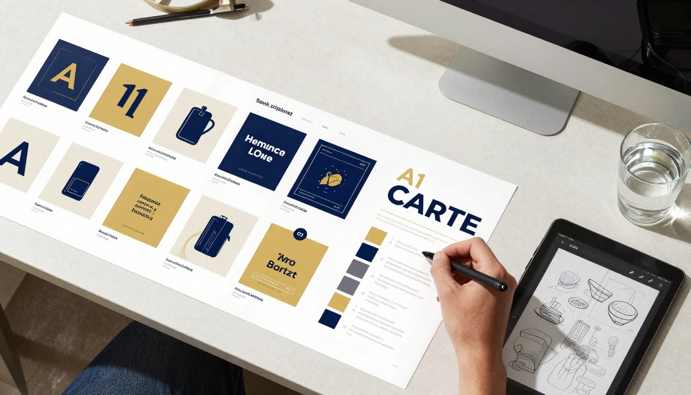
When to use GPT Image 2
For brands that need image editing rather than pure generation, swapping product colors, changing backgrounds while keeping subjects consistent, or adding brand elements to existing photos, GPT Image 2 offers instruction-based editing with strong prompt fidelity.
This is particularly useful when you have existing product photography that needs to be adapted for different color variants or seasonal campaigns while preserving the original's lighting and composition.
Real Results Across Channels
Social media: the grid problem
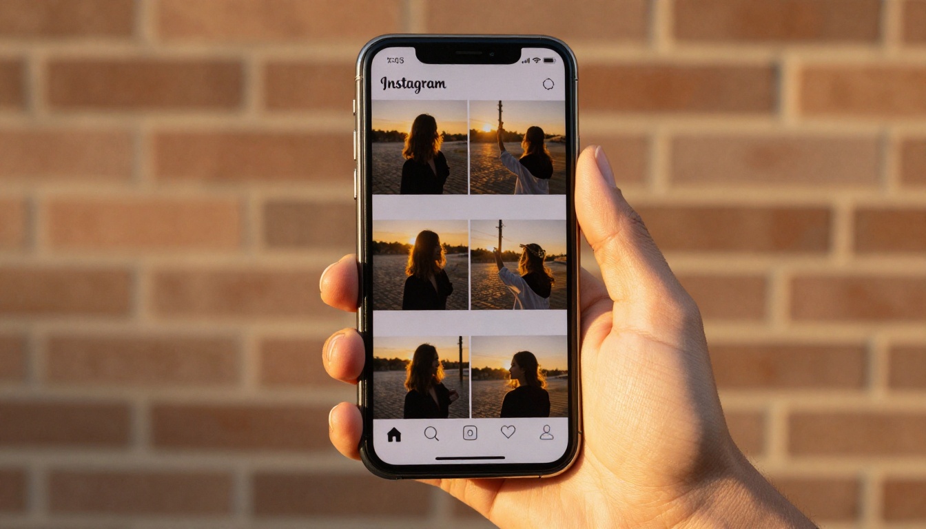
The Instagram grid is the highest-stakes visual consistency challenge for most brands. Nine images, viewed simultaneously, need to form a coherent visual narrative. With traditional photography, achieving this requires shooting everything in the same session, with the same photographer, under the same conditions.
With AI, you can produce an entire grid in an afternoon. Use Flux Redux Dev to generate controlled style variations of a single reference image, producing a set of outputs that are visually related but compositionally distinct. The result: a grid that looks professionally art-directed.
Tip: Generate 2 to 3 "anchor" images first (your strongest brand expressions), then use those as references for the remaining 6 to 7 grid images.
Product photography: every SKU, same look
Product photography is where visual inconsistency does the most commercial damage. When different products on your site look like they were photographed in different studios, customers lose confidence.
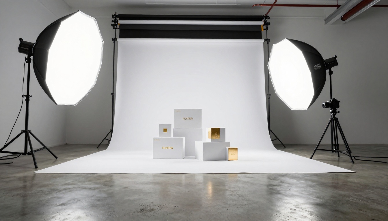
AI product photography solves this by generating every SKU under identical virtual lighting conditions. Set up your scene prompt once (white infinity backdrop, two-point studio lighting at 45-degree angles, 50mm lens, slight product shadow), then drop in each product variant. Every image will match because they share the same prompt architecture.
For brands needing ultra-high-fidelity product imagery, PicassoIA Image produces photorealistic outputs with precise control over surface materials, lighting, and background conditions.
Campaign imagery: cohesive across every format
A campaign needs to work as a billboard, a social post, a web banner, and an email header. Each format has different dimensions, but the visual identity must be immediately recognizable across all of them.
Build your campaign visual in 16:9 format first, then regenerate for other ratios using the same prompt and a fixed seed. Variations will feel like they were art-directed together rather than adapted separately.
Tip: Create a "campaign anchor" image, your best, most on-brand hero visual, and include it as a reference in every subsequent campaign generation. The model will carry its energy into new compositions.
What This Changes for Your Brand
Before AI, building visual consistency required: a dedicated photographer on retainer, a strict art direction brief enforced across every shoot, a consistent post-production color grade applied by the same editor, and significant per-image cost.
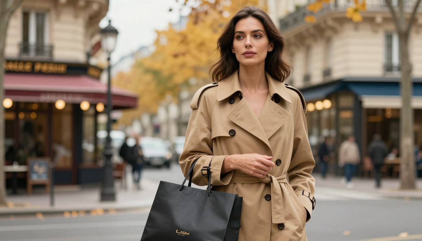
With AI, the constraint shifts from budget to craft. You need to be good at writing brand-specific prompts and curating outputs against a clear visual standard. The cost per image drops to near zero. The speed goes from weeks to minutes. The quality, when prompted correctly, is indistinguishable from professional photography.
That's not hyperbole. It's already happening across marketing teams in fashion, beauty, food, and consumer goods. Brands are replacing costly quarterly photo shoots with AI sessions that produce more material, faster, and at a fraction of the cost.
The only remaining question is whether you're building that capability now or waiting until your competitors already have it.

Create Your First Consistent Brand Set
The best way to internalize this workflow is to build one brand set from scratch. Pick a product or service, write your visual DNA fragment, choose Flux Kontext Pro or PicassoIA Image as your base model, and generate a set of 9 images using the 5-element prompt formula.
Curate down to 5 that feel like they belong together. That's your first AI brand set.
From there, every new campaign, every new product launch, every new social series becomes a variation on that established visual language. You're not starting from scratch each time. You're executing a system.
PicassoIA has over 91 text-to-image models available, including specialist tools for portraits, products, lifestyle photography, and custom style training with P Image Trainer. The visual identity you want to build exists in that toolkit. All you need to do is define it precisely enough to generate it.
Start building your brand visuals on PicassoIA and see how fast a consistent brand identity comes together when the right models are doing the heavy lifting.


