Sci-fi UI overlays are everywhere: blockbuster films, video game cinematics, YouTube thumbnails, social media content. That layered, technical interface aesthetic with targeting reticles, hexagonal grids, and data readout panels used to require a team of motion graphic designers and thousands in software licenses. Now you can generate production-ready sci-fi HUD elements with a single text prompt.
The shift happened fast. AI image generators have reached a quality threshold where they can produce isolated interface elements, transparent overlay compositions, and full HUD systems from natural language descriptions. The results are detailed enough for film storyboards, game concept art, and social content production.
Here is what this covers: how to write prompts that produce clean, usable sci-fi UI overlays, how to structure a full HUD asset set, and a step-by-step workflow using PicassoIA Image to generate your own assets from scratch.
Why Designers Are Switching to AI for UI Assets
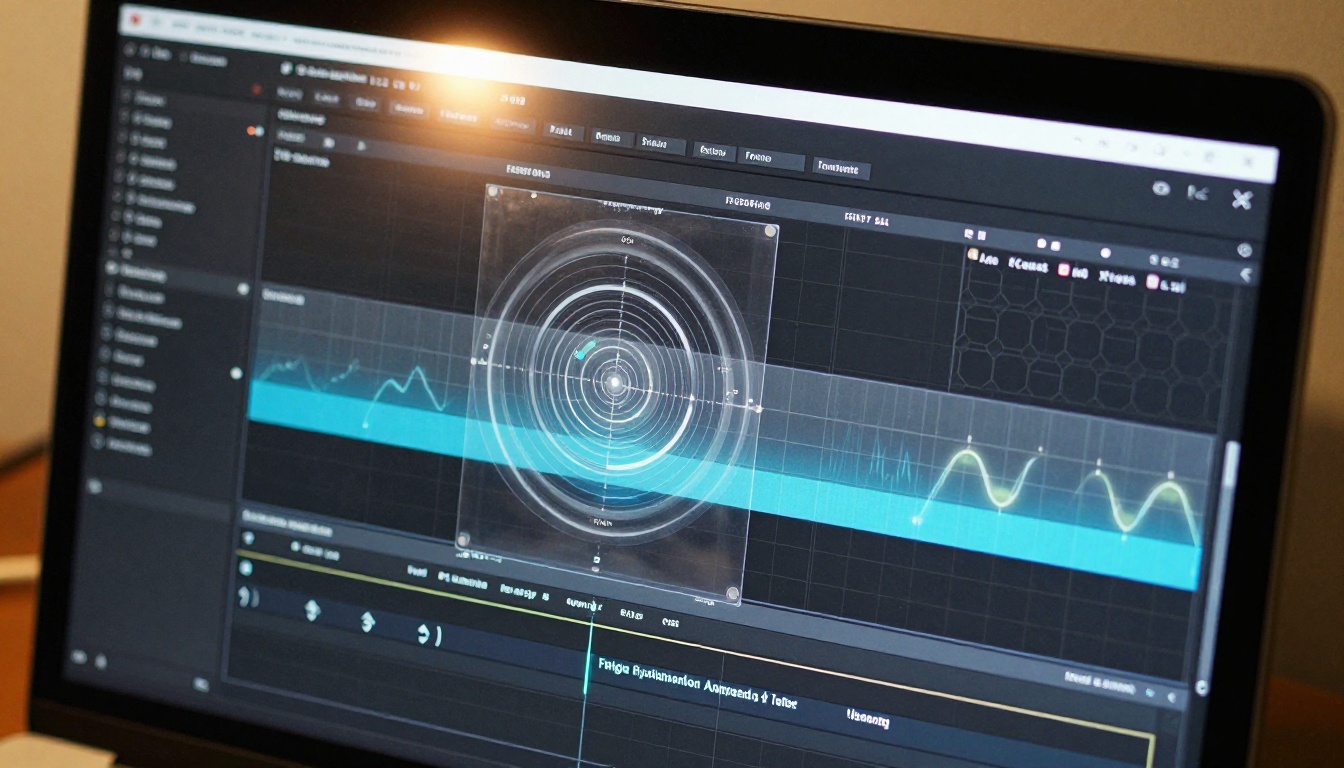
Traditionally, creating a sci-fi interface overlay set meant vector illustration software, specialized motion graphics templates, or purchasing pre-made asset packs. Each option carried trade-offs: custom vector work took days, templates looked generic, and purchased packs limited your creative control while every competitor used the same assets.
AI generation changes the calculus entirely. You describe what you want with specificity, the model renders it, and you iterate in seconds rather than hours. The result is assets tuned to your exact project rather than borrowed from someone else's vision.
Where sci-fi UI overlays actually get used:
- Film and TV pre-visualization storyboards
- Video game concept art and interface mockups
- YouTube video overlays and channel graphics
- Social media content with a technical, data-driven aesthetic
- Presentation decks and pitch materials for tech companies
- Personal art projects, digital prints, and themed photography
The diversity of use cases matters because skills you build generating one type of sci-fi interface translate directly to every other application. The prompt architecture for a targeting reticle is the same architecture you use for a full cockpit HUD, a data visualization panel, or an AR scanning interface.
💡 The most in-demand overlays are ones that look like they could plausibly function. Interfaces with readable structure, logical data zones, and consistent visual language always outperform purely decorative ones in both professional and commercial contexts.
What Actually Makes a Sci-Fi Overlay Work
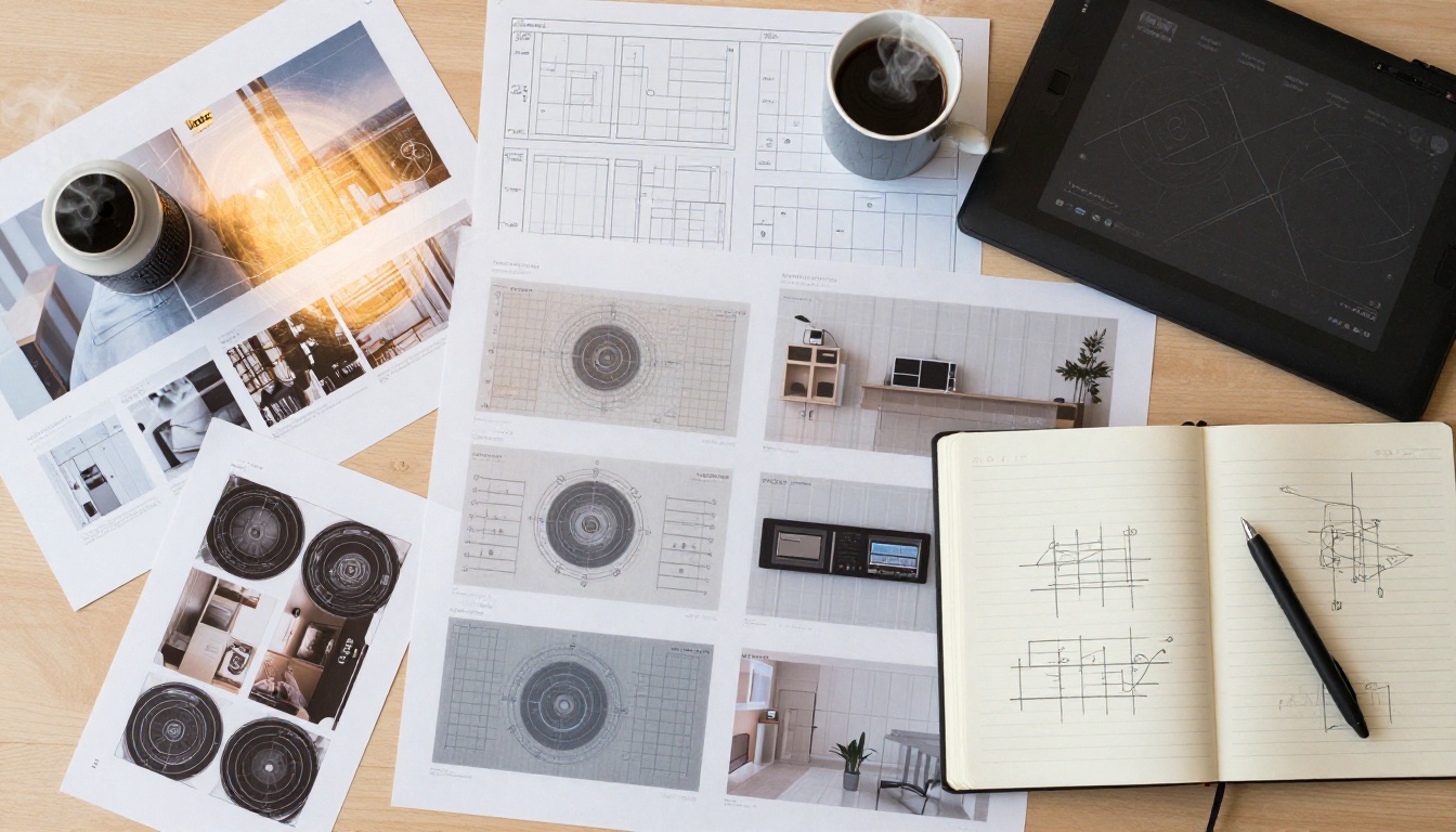
Not all sci-fi UI aesthetics are equal. The difference between a polished, professional-looking overlay and a generic one comes down to three things: structure, density, and restraint.
Structure drives believability
Real interface design, even fictional interfaces in films, follows a logic. Information zones are separated. Navigation elements have consistent placement. Data panels cluster around functional areas. When your prompt describes this logic, the AI renders interfaces that look purposeful rather than arbitrary. The result reads as a real system to viewers even though it never functioned as one.
Density signals sophistication
Sparse overlays look like placeholders. Dense ones with multiple information layers, grid subdivisions, annotation lines, and hierarchical data zones look designed. The key is distributing that density across the frame without crowding any single area. Think in zones: center, corners, edges, and midpoints all get their own visual territory.
Restraint in decorative elements
Every additional decorative element that does not serve a structural purpose dilutes the overall quality. The best sci-fi UI overlays look like they had a single art director making consistent decisions about what stays and what gets removed. Describe the functional elements you need, not the decorative ones you might want.
| Element | Generic Version | Production Version |
|---|
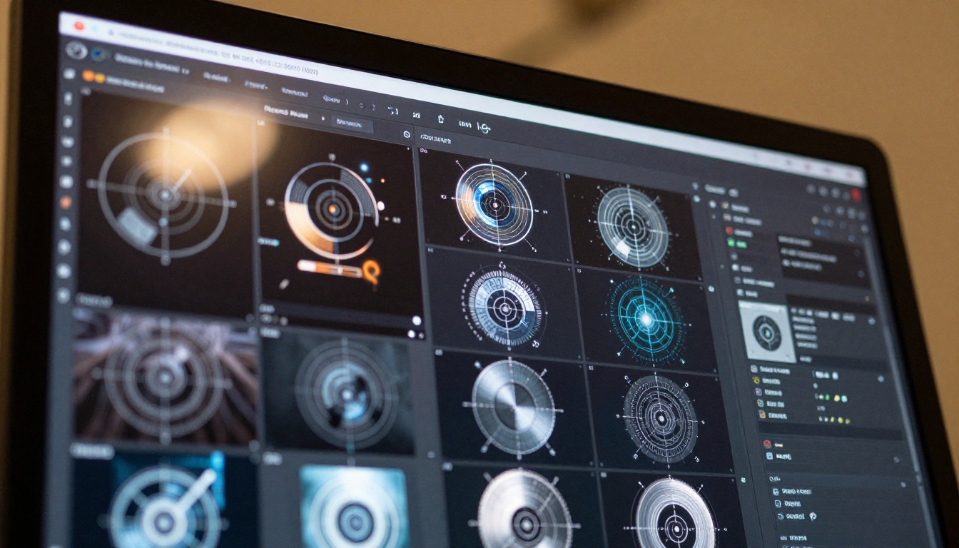
| Targeting reticle | Simple circle | Multi-ring with tick marks and annotation arms |
| Data panel | Random numbers | Structured label-value pairs with clear hierarchy |
| Grid overlay | Uniform spacing | Variable density with defined focal zones |
| Typography | Decorative display fonts | Monospace, system-style, readable at small sizes |
| Borders | Solid rectangle | Segmented corners with gap breaks at intervals |
Writing Prompts That Actually Produce Clean Overlays
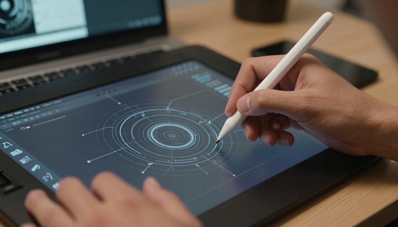
The gap between a mediocre sci-fi UI prompt and an effective one is specificity. Vague prompts produce generic results. Structured prompts with detailed element descriptions produce assets you can actually use in a production pipeline.
The anatomy of a strong overlay prompt
A reliable sci-fi UI prompt follows this five-part structure:
- Element type: "circular targeting reticle", "rectangular data panel", "hexagonal grid overlay", "scanning sweep arc with progress indicator"
- Visual treatment: "transparent, minimal stroke weight, monochromatic", "high contrast dark background with light interface lines"
- Structural detail: "outer ring with 360-degree tick marks, inner crosshair, four cardinal annotation arms extending outward"
- Output context: "isolated on pure black background for compositing", "flat graphic design render, no perspective distortion"
- Quality modifier: "clean vector-style line work", "slight film grain texture for realism", "technical diagram quality, no decorative fills"
Prompts that work in practice
Targeting reticle:
"Circular targeting reticle interface element, multi-ring design with outer ring tick marks at 15-degree intervals and degree annotations, four cardinal indicator arms with small arrow tips, central crosshair with small square indicator, isolated on pure black background, clean monochromatic white line work, no fills, technical diagram quality, flat graphic render"
Data readout panel:
"Rectangular sci-fi data readout panel, structured label-value pairs in monospace font layout, horizontal separator lines between four data sections, status bar at top with three indicator dots, system identifier text at bottom, isolated dark background, flat graphic with consistent stroke weight, technical schematic quality"
Hexagonal grid overlay:
"Hexagonal grid overlay pattern for sci-fi interface, variable opacity cells with brighter center cluster fading to edges, data annotation points at three intersections with small label boxes, flat projection no perspective, isolated on black background, light monochromatic line color, minimal clean technical quality, consistent cell geometry"
💡 Always include "isolated on pure black background for compositing" or equivalent isolation instruction in every overlay prompt. Assets without explicit isolation instructions often have subtle gradients or environmental context baked in that composite poorly over footage.
LSI keywords to weave into prompts
For richer, more specific generation results, include terms from this list where relevant: heads-up display, HUD element, targeting system, data visualization panel, scanning arc, status indicator, tactical display, system readout, interface schematic, compass overlay, altitude indicator, diagnostic panel.
How to Use PicassoIA Image: Step by Step

PicassoIA Image is built for exactly this kind of asset generation. Here is the full workflow from opening the tool to having a compositable overlay asset:
Step 1: Open the model
Go to PicassoIA Image and open the generation interface. No account setup required for basic use.
Step 2: Set generation parameters
For sci-fi UI overlay elements, the following parameter setup produces the most usable results:
- Aspect ratio: 1:1 square for isolated elements like reticles and panels; 16:9 widescreen for full-screen overlays
- Negative prompt: Add "blur, soft focus, gradient background, bokeh, photographic, camera" to reinforce the flat graphic output
- Seed: Note successful seeds for regenerating similar results later
Step 3: Write your structured prompt
Use the five-part prompt architecture from the previous section. Being specific about element type, visual treatment, structural details, and output context eliminates most of the guesswork in iteration.
Full example prompt for a HUD reticle:
"Sci-fi targeting reticle interface element, three concentric rings with outer ring having tick marks every 10 degrees and cardinal degree labels at 0 90 180 270 positions, four directional arms extending beyond outer ring with annotation lines and small end caps, central crosshair with small square center indicator, flat clean technical render, isolated on pure black background, monochromatic white line work, no fills, no decorative elements, vector graphic quality"
Step 4: Generate and evaluate
Generate 4 variations per prompt and evaluate each against three criteria:
- Clean line work without blur or anti-aliasing artifacts at element edges
- Consistent stroke weight throughout the design
- Logical element placement that follows a readable visual hierarchy
Step 5: Iterate with precision
If the first batch misses the mark, identify the specific element that failed and add a targeted correction. Examples: "no text overlapping structural lines", "no asymmetric distortion", "no filled areas, line art only". Targeted corrections produce faster improvement than rewriting the whole prompt.
Step 6: Build variations with Flux Redux Dev
Once you have a base element that works, use Flux Redux Dev to generate visual variations that maintain the established style while changing specific structural aspects. This is the key to building a coherent HUD system where every element looks like it belongs to the same interface family. Feed your base reticle image as a reference and prompt for the next element in your set.
Building a Full HUD Asset Set
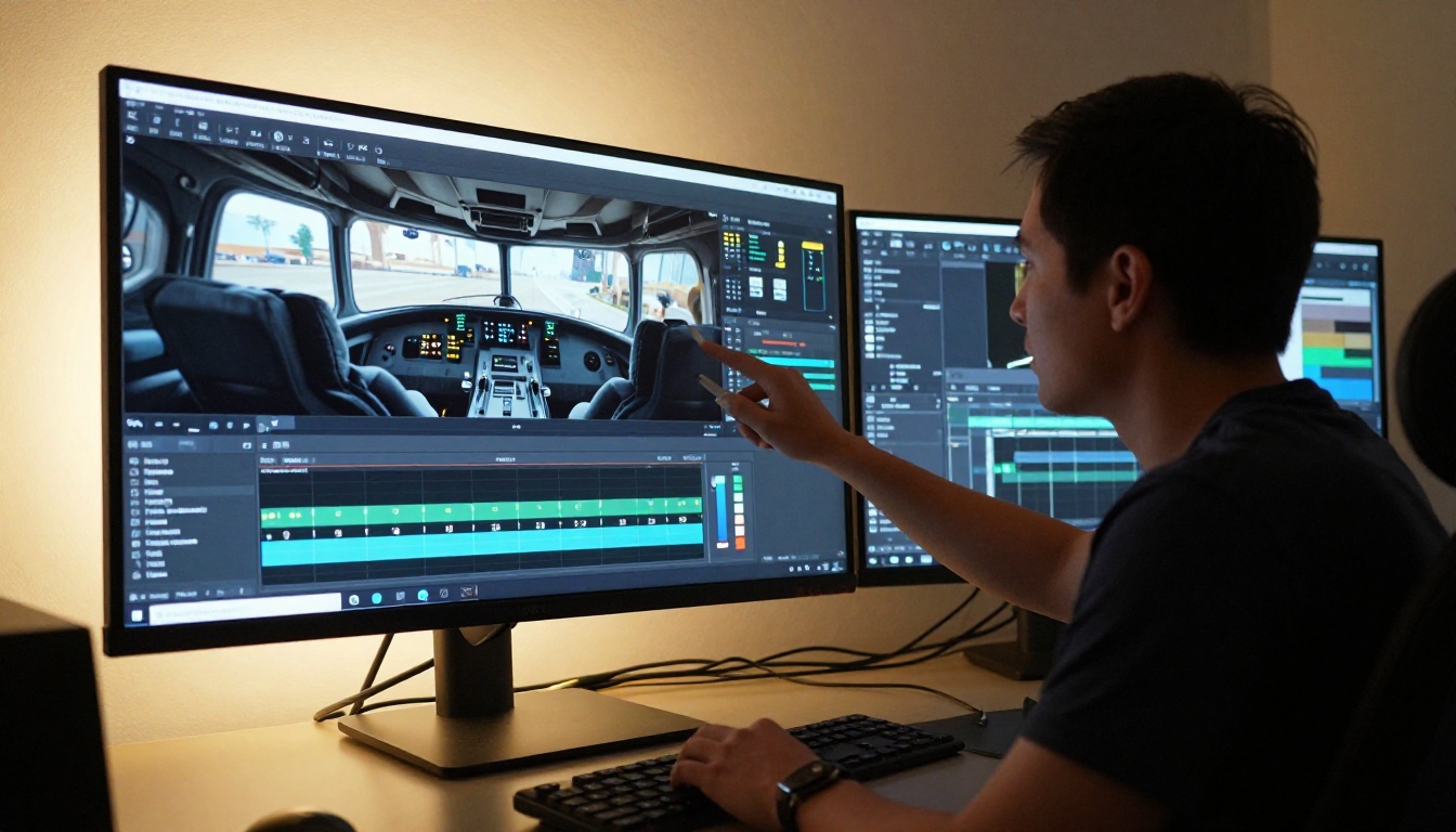
A single overlay element is a starting point. A full HUD system is what makes a project look production-ready. The workflow for building a complete set requires planning before you generate a single image.
Define the visual language before generating
Before opening any AI tool, define three parameters for your HUD system and write them down:
- Color palette: Cool blue-white, warm amber, neutral white, or a single accent color
- Geometry type: Circular (organic, targeting), hexagonal (structural, industrial), rectangular (data-driven), or mixed with one dominant type
- Density level: Minimal (3-5 elements total), standard (8-12 elements), or dense (15+ elements across multiple layers)
These three decisions should stay consistent across every element you generate. Consistency is what separates a designed HUD from a random collection of sci-fi graphics.
The tiered element structure
Tier 1: Primary elements (generate first)
- Main targeting reticle in 1-2 design variations
- Corner frame brackets for all four corners in matching style
- Primary data panel in left-side and right-side layout variants
- Status bar strip for top and bottom screen placement
Tier 2: Supporting elements (after visual language is set)
- Secondary tracking circles at smaller scales
- Compass or directional heading indicator
- Progress arc or loading indicator
- Scan line effect strip for atmospheric layering
Tier 3: Background texture (final layer)
- Subtle dot matrix or grid pattern at very low opacity
- Faint technical diagram or blueprint background
- Film grain or noise layer for photographic integration
💡 Generate your entire Tier 1 set before moving to Tier 2. If your corner brackets use a specific line weight and 45-degree cut angles, carry that exact treatment into every subsequent element. One inconsistent element in a set is immediately noticeable.
Naming and organizing your assets
Use a consistent naming convention from the start. A format like [project]-[element-type]-[variant]-[version] keeps large sets navigable. Example: hud-reticle-primary-v2, hud-panel-left-data-v1, hud-corner-br-v1. The investment in organization pays off during the compositing stage when you need to swap individual elements quickly.
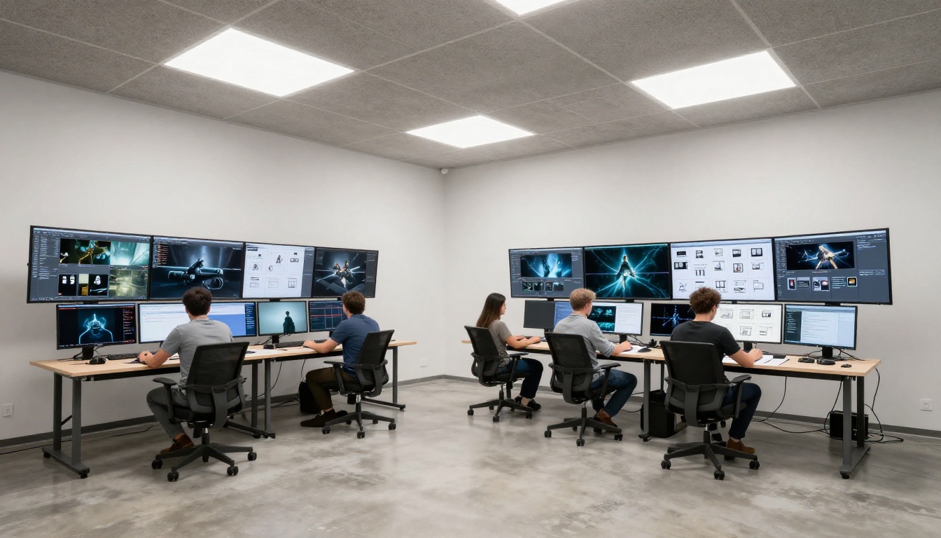
Generated assets need to be composited over source footage or backgrounds to function as actual overlays. The pipeline is straightforward whether you are working in Photoshop, After Effects, DaVinci Resolve, or any other compositing application.
Blend modes for dark-background assets
Assets generated on black backgrounds composite best using Screen blend mode. Screen mode mathematically removes pure black while preserving lighter colors and line work. The result is a clean composite without any manual masking or background removal required.
For finer control over opacity:
- Screen at 100% for maximum intensity elements like main reticles
- Screen at 60-80% for supporting data panels and frames
- Screen at 15-35% for background texture and grid layers
Layer order for a complete HUD composition
- Base footage or background (bottom layer)
- Background texture, grid, or dot pattern (Screen, 15-25%)
- Frame elements, corner brackets, status bars (Screen, 60-70%)
- Data panels and information zones (Screen, 70-80%)
- Primary targeting reticle and main navigation (Screen, 85-100%)
- Top-level status indicators and alerts (Screen, 100%)
Adjusting for light backgrounds
If your source background is bright or predominantly light-colored, the Screen mode approach will not work. The two solutions are: invert your overlay elements to dark-on-light and use Multiply blend mode instead, or use Flux Redux Dev to regenerate elements explicitly designed for light background compositing by specifying a white background in your generation prompt.
Scaling strategy
Always generate at the highest resolution your tool supports and scale down rather than up. Sci-fi UI line work degrades poorly when scaled up because the thin lines break apart. Generated at high resolution and scaled to your output size, line work stays crisp at any composition dimension.
3 Mistakes That Ruin HUD Sets
1. No system plan before generating
The most common mistake is generating individual overlay elements without a defined visual language. The result is a set with inconsistent line weights, mixed geometry types, and clashing color temperatures that cannot be used together. Fix this by writing a brief style guide for your HUD system before generating anything: color, geometry type, dominant line weight, and complexity level.
2. Overloading a single composition
Dense overlays work when information distributes across zones. When everything clusters in the center of the composition, the result reads as cluttered rather than sophisticated. Use a mental grid model when compositing: thirds, corners, and edges each hold their own zone with clear visual separation between them.
3. Skipping the training phase with Flux Redux Dev
Flux Redux Dev gives you a significant workflow advantage when building full HUD sets. Using it to generate variations from an approved base element ensures visual consistency across the set without manually re-specifying every stylistic detail in each new prompt. Skipping this step and re-prompting from scratch for every element is the slow path.
Start Creating Your Own Sci-Fi Interface

The workflow for generating professional sci-fi UI overlays with AI is genuinely accessible right now. You do not need a design background, vector illustration skills, or expensive software subscriptions. You need a clear description of what you want and an iterative approach to refining it.
PicassoIA Image handles the technical rendering. Your job is to describe the visual language with enough specificity that the model knows what interface system you are building. That description skill, writing precise, structured prompts, is the real creative work here, and it develops quickly with practice.
A practical starting point:
- Open PicassoIA Image
- Pick one element: a targeting reticle is the best starting point
- Write a prompt using the five-part structure from this article
- Generate 4 variations, pick the closest, refine once
- From that base, generate your corner brackets using Flux Redux Dev for visual consistency
- Build the full set one tier at a time
The best sci-fi UI overlays are not the most complex ones. They are the ones with the clearest internal logic, the most consistent visual language, and the most purposeful placement within the composition. Those qualities are decisions you make before you generate a single image, which means the creative control is entirely yours.
If you want to take the visual language further and train a custom style that persists across every asset you generate, P Image Trainer lets you build a LoRA on your approved base elements, giving every subsequent generation the same signature style automatically.
Open PicassoIA Image and build your first sci-fi interface set.


