That scratch on the back of a napkin. The rough character sheet you doodled during a meeting. The floor plan you drew with a ruler and pencil because the idea was moving faster than any software could keep up with. For most of design history, those sketches sat in a drawer until someone with expensive 3D software found the time to rebuild them from scratch. AI has changed that completely.
Today you can take a rough pencil drawing and get back a photorealistic, depth-accurate image in under a minute, without installing Blender, Cinema 4D, or any production pipeline. What used to require a full studio workflow now runs in a browser tab. The question is no longer whether it's possible, it's which tool to use and how to set it up correctly.
This article breaks down exactly how to turn sketches into 3D with AI, which models work best for which drawing types, and a practical step-by-step process for getting results that look like they came out of a professional render suite.
Why Sketches Beat Text Prompts
What Text Prompts Get Wrong
When you type "a red leather armchair with wooden legs in a studio," the AI fills in every decision you didn't make. The exact curvature of the armrest, the angle of the legs, the proportion between seat depth and back height. Those decisions come from the model's training data, not your vision. The result might be beautiful, but it's not yours.
The problem compounds fast with complex shapes. Describe a character from a video game concept, an unusual architectural form, or a product with a specific ergonomic grip, and the text prompt breaks down. You end up in an iterative loop, refining words to describe spatial information, and words are a poor encoding for spatial information. Three sentences about a chair's silhouette will never communicate what a five-second sketch does.
The Information Inside a Sketch
A sketch carries structural data that words cannot replicate. The proportional relationships between parts, the implied silhouette, construction lines showing perspective and foreshortening, and the spatial hierarchy of near and far elements. Even a loose rough scribble encodes a spatial intent that would take several paragraphs to approximate in text.
When you give that sketch to an AI model built to read structural input, like the ControlNet-based models below, you're handing it the geometry first and letting it fill in texture, lighting, and material second. That order of operations produces outputs that feel like your design interpreted realistically, not a generic image that happens to contain a similar object.
💡 Use text prompts when you want to explore ideas freely. Use sketch-to-image when you know the form and need it to look real.
The Tech Behind the Magic
How ControlNet Reads Your Lines
ControlNet is a neural network conditioning layer that sits on top of standard diffusion models. Its job is to take structural input, whether that is an edge map, a depth map, a pose skeleton, or a freehand scribble, and use it to constrain the image generation process. Instead of letting the model roam freely through visual probability space, ControlNet pins down the geometry and lets the model explore material, color, and lighting within those boundaries.
The practical result is generation that respects your spatial intent while still producing photorealistic outputs. Your sketch becomes a scaffold, not a reference image. The model uses it to decide where things are, then applies its full photorealism capability to decide what they look like in terms of texture, shadow, reflectance, and atmospheric detail.
This is what separates a ControlNet-processed sketch from simply uploading a photo of your drawing and asking the model to "make it realistic." In the second approach, the model tries to preserve the visual appearance of your pencil lines. In the ControlNet approach, it reads the structural information and generates fresh, photorealistic pixels that follow the same structure.
Scribble vs. Canny: Pick the Right One
Two input types dominate sketch-to-3D workflows. Choosing between them determines whether your rough lines become an asset or a liability.
| Input Type | Best For | Tolerance for Rough Lines |
|---|
| Scribble | Concept sketches, loose drawings | High, built for imprecision |
| Canny Edge | Technical drawings, clean ink work | Low, reads every mark as a boundary |
| Depth Map | Adding 3D depth to existing images | N/A, operates on existing photos |
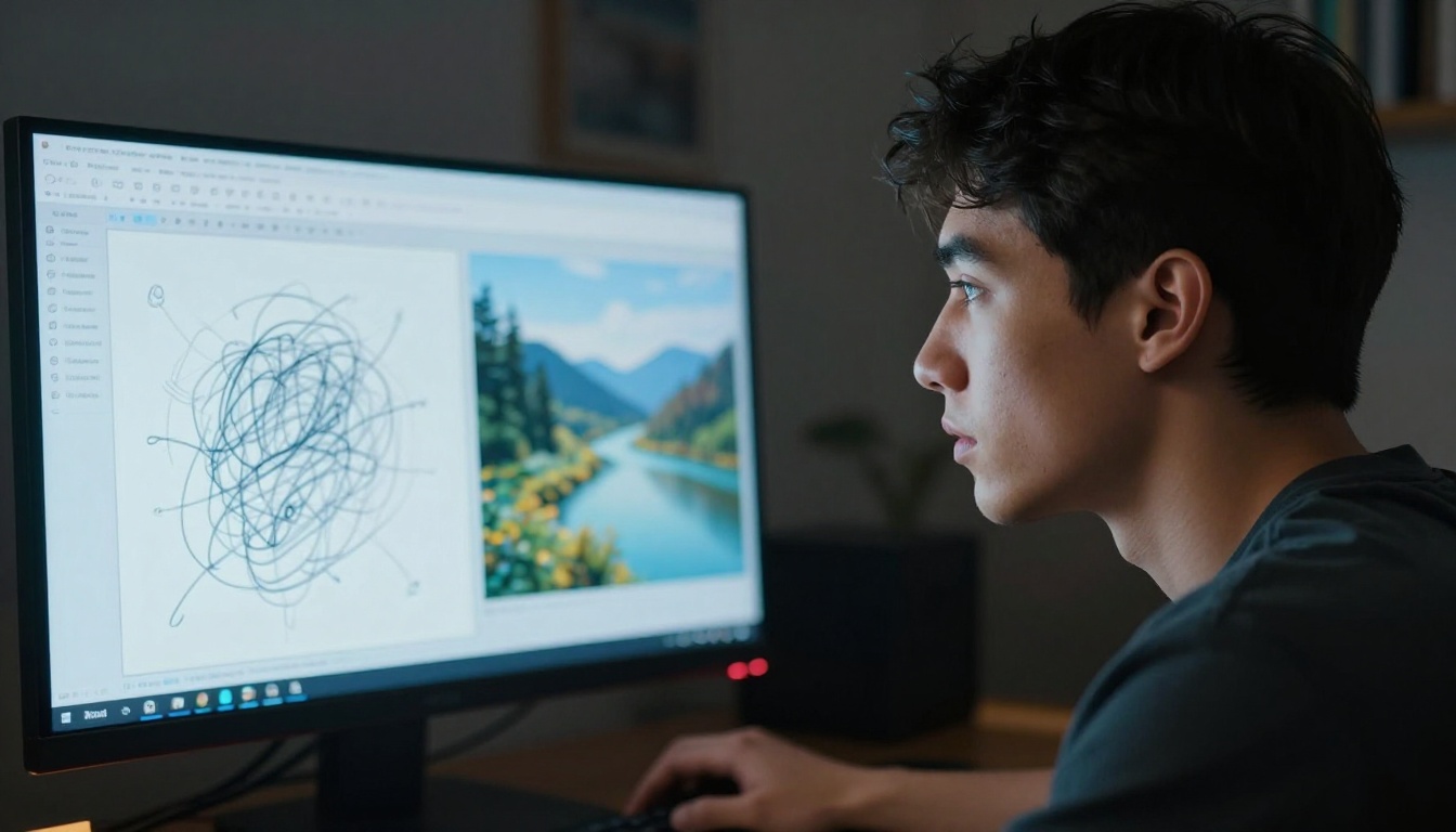
Controlnet Scribble is built specifically for freehand drawings. It extracts the structural intent from messy lines without treating every stray pencil mark as a hard spatial constraint. For quick concept work or anything drawn by hand, it is the fastest path from sketch to photorealistic output.
Flux Canny Pro and Flux Canny Dev work better when your sketch is clean, architectural, or deliberately precise. Canny edge detection reads every line as a boundary, which is a weakness for rough concept drawings but a strength for technical product sketches and architectural elevations with clean penwork.
How to Use Controlnet Scribble on PicassoIA
Controlnet Scribble is the most accessible entry point for turning pencil drawings into photorealistic 3D images. It accepts drawings that would produce confused results in any other model and returns outputs with genuine depth and material presence, provided you follow a few practical steps.
Step 1 - Prepare Your Drawing
The sketch should be on a white or near-white background with dark, confident lines. Phone photos of paper sketches work fine provided the lighting is even and the paper lies flat. If your drawing is on tinted paper, desaturate it and increase the contrast before uploading. The model reads line weight and density as structural signals, so eraser marks and faint construction lines will be de-emphasized naturally relative to your main outlines.
What to avoid before uploading:
- Dark, patterned, or colored backgrounds
- Fine cross-hatching or shading that might read as surface texture instead of form
- Multiple overlapping objects with no visible separation between silhouettes
- Motion blur or strong shadow from angled lighting when photographing paper
Step 2 - Upload and Set Your Prompt
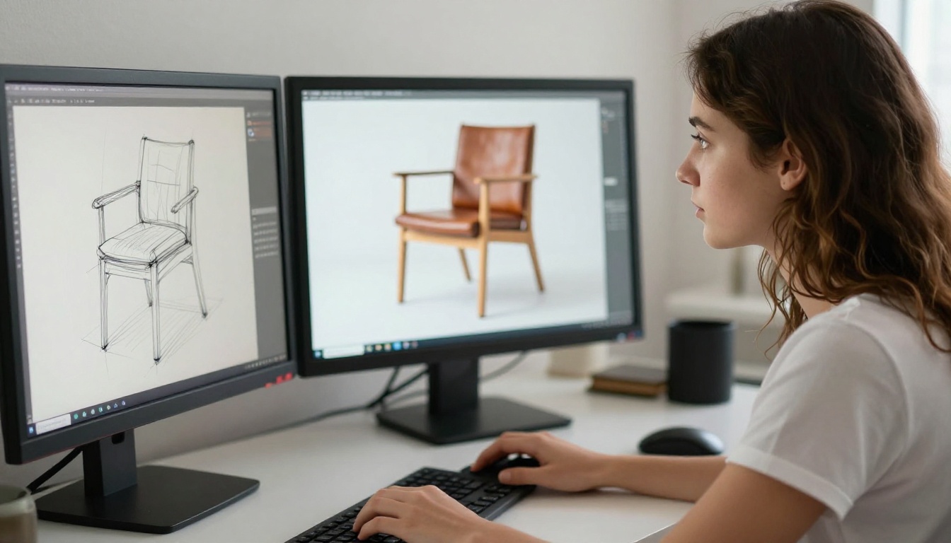
Upload your sketch as the control image. In your text prompt, describe material, lighting, and setting. Do not describe the shape. The shape is already in the sketch. If your sketch shows a chair, do not write "a chair with four legs and a backrest." Write "warm oak wood grain, soft studio lighting from above, photorealistic, shallow depth of field, 8K."
The prompt should finish what the sketch started. Duplicating spatial information that is already in the drawing adds noise and pulls the model's attention away from material quality.
💡 Prompt addition that consistently improves 3D feel: Add "volumetric shadows, photorealistic surface texture, depth of field" to any sketch conversion prompt. These three phrases push the model toward treating the output as a three-dimensional object rather than a flat rendering.
Step 3 - Adjust the Control Strength
Control strength determines how strictly the model follows your sketch versus how much creative interpretation it applies. A value between 0.55 and 0.70 works for most rough concept sketches. Below 0.4 and the sketch becomes a loose inspiration rather than structural guidance. Above 0.85 and the model over-commits to messy lines, producing stiff, literal outputs.
For architectural drawings with deliberate precision, push control strength toward 0.80. For character sketches or loose product concepts, staying in the 0.60 range lets the model interpret proportions with more natural flow while still respecting the overall form.
Two minutes of control strength adjustment changes the output character more than hours of prompt editing. It is the first variable to adjust when results look either too rigid or too loose.
Flux Depth Pro: Adding Real 3D Feel
Flux Depth Pro and Flux Depth Dev approach sketch-to-3D from a different angle than ControlNet. Rather than reading your lines as edge boundaries, they estimate depth information from the input image and use that depth map as a conditioning layer during generation. The result is outputs where foreground objects appear physically closer, background recedes naturally, and atmospheric depth cues read as genuine spatial distance.
Depth Maps vs. Flat Renders
The difference between an image that reads as "3D" and one that reads as flat usually comes down to depth variation in how each region was generated. A flat image treats every pixel as equally far from the camera. A depth-conditioned generation applies scale falloff, focus gradients, and atmospheric haze that the human visual system interprets as real spatial distance.
Flux Depth models compute a depth map from your input, assigning near-to-far values across the image plane, then use that depth map as a second control signal during generation. The output isn't just lit to look three-dimensional. It was generated with spatial information baked into every region.
For architects, interior designers, and product developers, this distinction matters. The difference between a render that looks "generated" and one that a client accepts as a real visualization is often this depth encoding.
When Depth Models Beat Canny
Use Flux Depth Pro when your sketch has clear foreground and background layers, when you are working on interior concepts where spatial recession matters, or when converting a photo of a physical model into a polished photorealistic render.
Use Flux Canny Pro when edge accuracy matters more than depth, particularly for product sketches with complex silhouettes where the exact profile shape needs to survive the conversion intact.
The two models are complementary. Many professional workflows run Canny first to nail the structure, then run the output through a depth model to add spatial dimension to the already-accurate form.
Getting Photorealistic Textures
Prompt Words That Add Volume
The difference between an output that looks generated and one that reads as a photograph of a physical object often lives in specific prompt descriptors. Certain phrases directly activate the model's training on material physics and light interaction.
Surface descriptors with the highest photorealism impact:
- Subsurface scattering (skin, wax, translucent plastics)
- Specular highlights on [surface type] (metals, glass, polished ceramics)
- Volumetric morning light from the left (creates directional shadow and depth)
- Visible micro-texture, pore structure (for organic surfaces and skin)
- Matte finish with ambient occlusion in recesses (for matte objects and product renders)
- Kodak Portra 400, film grain, 8K RAW (anchors the output to photographic realism rather than render aesthetics)
Pair any of these with a sketch input through Controlnet Scribble and the output quality shifts noticeably from "AI-generated image" toward "photograph of the actual object."
After Generation: Upscaling for Production Use
Sketch conversion outputs typically come out at standard generation resolution. For presentations, mockups, or client deliverables, you need more. PicassoIA's Super Resolution models upscale outputs 2x to 4x without the blurring artifacts that standard bicubic upscaling produces, preserving the texture detail that makes the 3D effect convincing at large sizes.
Running a sketch conversion output through super resolution before finalizing is a habit that separates polished deliverables from rough previews. The texture fidelity difference at 4x scale is the same as the difference between a concept render and a production-ready visualization asset.
5 Sketch Types That Convert Best
Not all drawings benefit equally from AI conversion. These five categories consistently produce the strongest photorealistic results.
Architecture Concepts
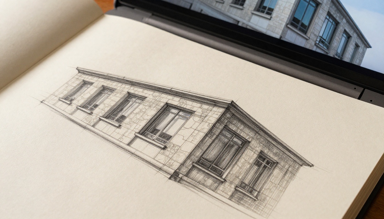
Architectural sketches have the clearest line intention and the most predictable structural logic. Perspective lines, wall intersections, and window proportions read cleanly through Flux Canny Pro. A rough elevation drawing becomes a photorealistic facade render in two or three iterations. Paired with Flux Depth Pro, the output gets proper atmospheric recession that makes the building read as a real three-dimensional structure rather than a flat elevation.
Character and Fashion Design
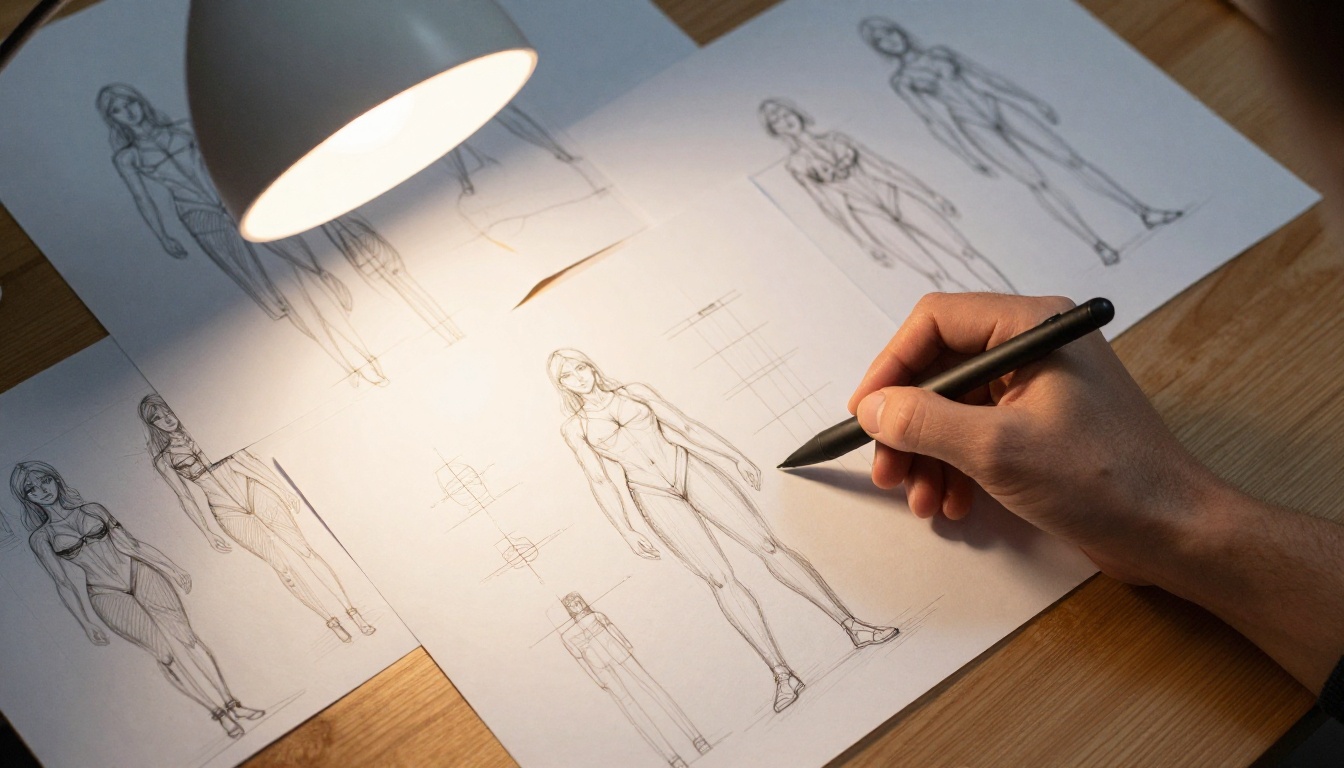
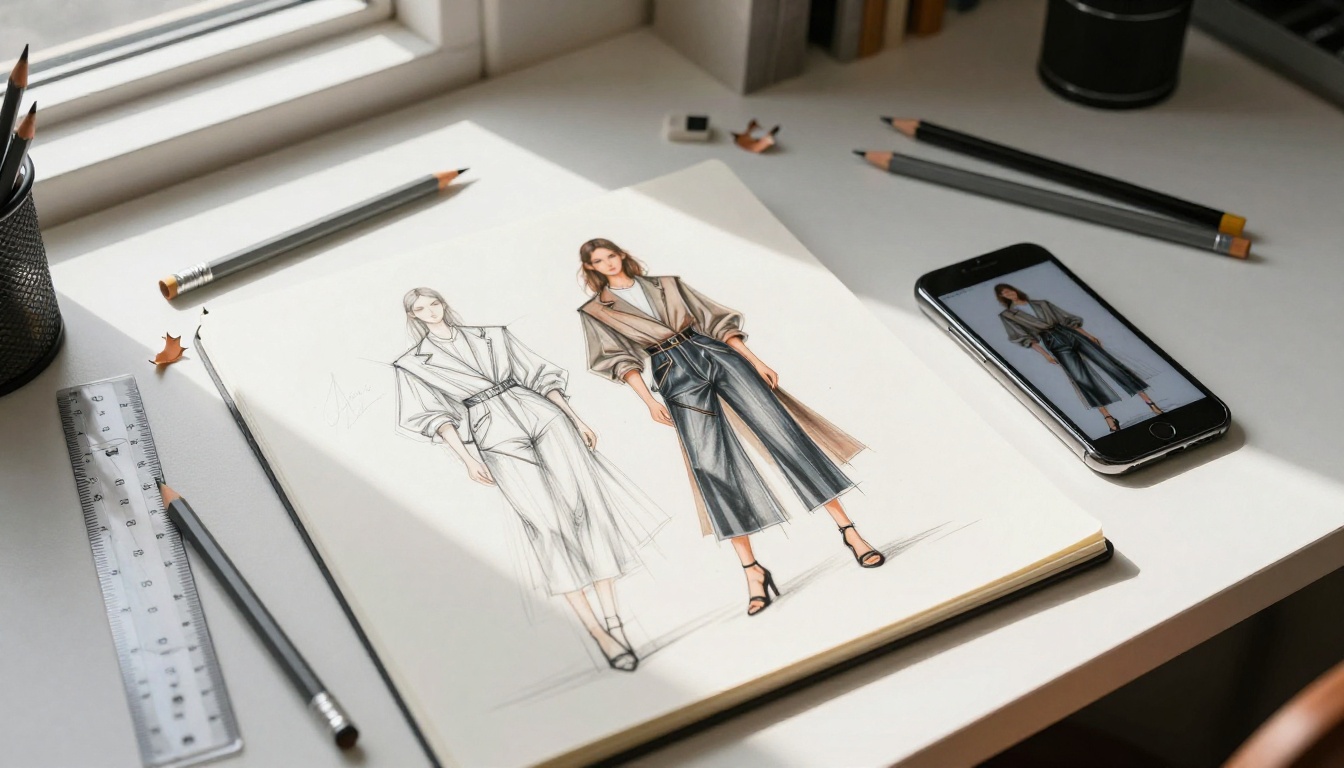
Character sheets with clear silhouettes work best through Controlnet Scribble. Fashion illustration sketches with clean body outlines translate directly to photorealistic clothing renders. Keeping poses simple in the first pass and adding complexity after establishing the base form reduces the chance of anatomical artifacts in the output.
Product Prototypes
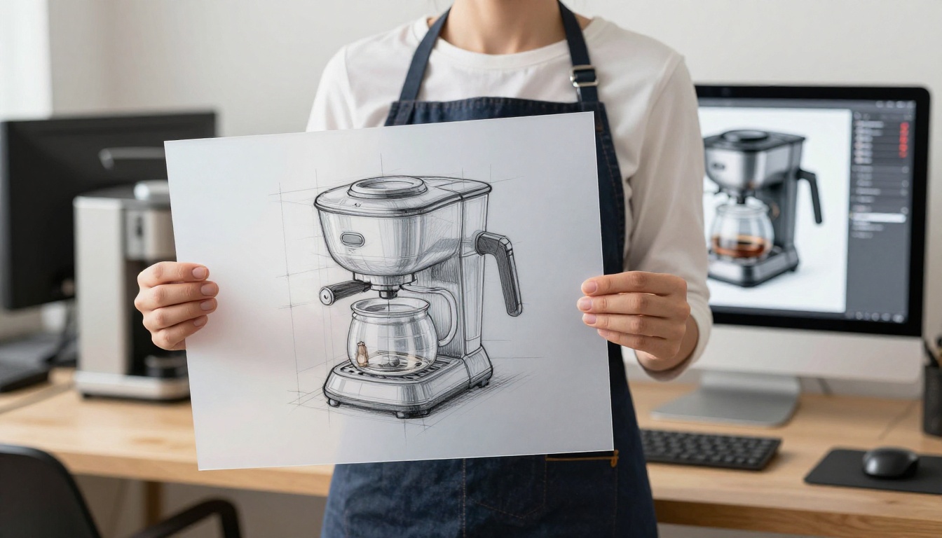
Industrial product sketches, especially those drawn in clean isometric or three-quarter views, convert exceptionally well. SDXL Multi Controlnet LoRA allows layering multiple control signals simultaneously, which means you can control structure with your sketch while controlling surface material appearance with a reference image in the same generation pass. For consumer products where material quality is part of the evaluation, this dual control capability is difficult to replicate with simpler models.
Interior Layouts
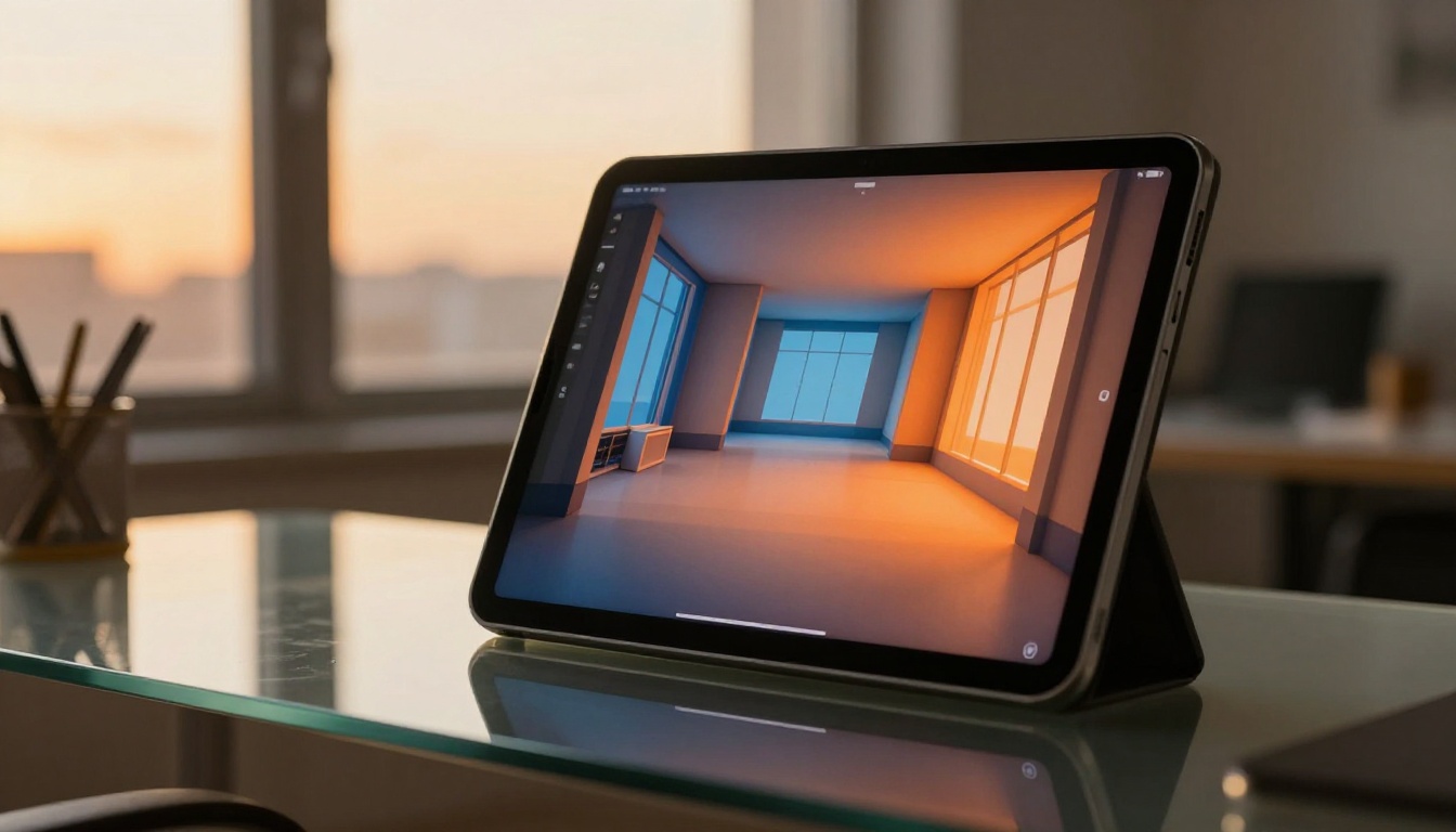
Perspective interior sketches convert well with Flux Depth Dev because interior spaces have natural depth recession built into the perspective. A rough room sketch becomes a staged interior render with proper vanishing points, spatial layering, and atmospheric lighting. Adding furniture descriptions in the prompt while keeping the spatial layout from the sketch gives you the best of both worlds.
Landscape Thumbnails
Quick landscape thumbnails, the kind used in animation and game art pre-production, respond well to scribble input. The looseness of thumbnail sketches matches exactly what Controlnet Scribble is designed to handle, and atmospheric mood prompts handle lighting intent separately from the structural sketch. A rough three-value thumbnail with a clear horizon line becomes a detailed photorealistic environment in one generation pass.
Mistakes That Ruin the Conversion
Too Much Detail in the Sketch
Counterintuitively, adding too much detail to your sketch often degrades output quality. ControlNet-based models work by interpreting structural intent, and a sketch packed with fine cross-hatching, tonal shading, and internal rendering marks presents competing instructions. The model tries to represent every pencil stroke as a physical edge and the output becomes cluttered and visually noisy.
The best sketches for AI conversion are clean, confident outlines with minimal internal detail. Think of it as sending a silhouette blueprint, not a finished illustration. The more you trust the AI to handle surface quality, the more it can focus its capability on photorealism rather than trying to interpret your rendering style.
Wrong Control Strength Settings
Control strength is the single most impactful parameter that most people never adjust. Default interface settings often sit at 1.0, which is too high for rough sketches. At maximum control strength, the model treats every line as a hard constraint and produces stiff, over-literal results that look nothing like a photorealistic render.
Start at 0.60. Run the generation. Then decide: if you want more structural fidelity, push toward 0.80. If you want more photorealistic creative interpretation, drop toward 0.40.
💡 Quick calibration test: Generate the same sketch at 0.40, 0.60, and 0.80 control strength. The output variation across three generations shows you more about the parameter than any written description, and it takes about 90 seconds.
Skipping the Right Model for Final Output
For any sketch where photorealism is the primary goal, finishing with RealVisXL v3 Multi Controlnet LoRA sits at the top of the quality ceiling. It combines structural control from ControlNet with RealVisXL's photorealistic skin, material, and lighting output. The results read as photographs of physical objects, not AI renders. The trade-off is generation time. Use Flux Schnell for rapid iteration to establish composition and control strength, then run the final output through RealVisXL once you have everything dialed in.
Model Selection at a Glance
Start with Your Next Sketch
The barrier between a pencil drawing and a photorealistic 3D image is now nothing more than the time it takes to upload a file and write a material description. The models on PicassoIA span every sketch type and quality tier, from Controlnet Scribble for loose concepts to Flux Depth Pro for depth-accurate architectural renders to RealVisXL v3 Multi Controlnet LoRA for production-ready photorealism.
Pick any drawing in your sketchbook right now. Upload it. Describe the material and lighting, not the shape. Set control strength to 0.65. Run it once.
That is the entire workflow. The ideas you have been deferring because rebuilding them in 3D software felt too heavy? They are one sketch upload away from looking exactly as you imagined them.


