Most free AI image generators can produce something. The question is whether what they produce is worth using. The gap between a forgettable output and a genuinely stunning photorealistic image comes down to six things: how you write your prompt, which model you choose, what aspect ratio you set, how you describe lighting, whether you iterate, and whether you upscale the result. None of these require a paid subscription. All of them work on PicassoIA today.
This is not theory. These are the exact adjustments that separate images people share from images people delete.
Why Most Free AI Images Look Generic
The average person types five words into a generator and expects magazine-quality output. That is not how it works. AI image models are trained on billions of image-text pairs, which means they respond to descriptive specificity. A vague prompt returns a vague image. A precise, layered prompt returns something that looks deliberate.
The Prompt Is Usually the Problem
"A beautiful woman in nature" tells the model almost nothing. Where in nature? What time of day? What is she wearing? Where is the camera positioned? What is the mood? Every unanswered question gets filled in with statistical average results, which is why so many AI images look alike.
The fix is not longer prompts for the sake of length. It is more specific prompts that target the exact visual variables the model responds to.
The Wrong Model for the Task
Not every model produces the same kind of image. Some excel at hyper-realistic portraits. Others are built for speed at lower fidelity. Using Flux Schnell for a detailed landscape where fine texture detail matters will give you decent but not exceptional results. Using Flux 1.1 Pro for quick iteration when testing prompt variations is overkill. Matching the model to the task is one of the fastest ways to improve output quality without changing anything else.
Tip 1: Write Prompts Like a Film Director
Film directors do not say "shoot something nice in the forest." They specify the lens, the camera angle, the time of day, the actor's position relative to the light, and the emotional tone of the scene. That level of specificity is exactly what AI models respond to. Most people skip these details entirely and then wonder why their outputs look generic.
Subject, Action, and Environment
A strong prompt has three foundational layers: who or what is in the image, what they are doing or how they are positioned, and where they are. Once those three elements are clear, every additional detail you add sharpens the result.
Bad: "A cat in a garden."
Better: "A tabby cat resting on a weathered stone wall in an overgrown English garden at midday."
Best: "A tabby cat resting on a moss-covered stone wall in an English cottage garden, afternoon sun cutting across from the left at 45 degrees, wildflowers slightly blurred in the background, shallow depth of field, photorealistic, 85mm f/1.8 lens, Kodak Portra 400 film grain, RAW 8K photography."
The jump from bad to best is not about using more words. It is about removing ambiguity so the model has less room to fill in generic defaults.
Camera and Lens Specifications
AI models trained on photography data respond to camera terminology. Including lens specs, aperture values, and camera angles gives the model a concrete reference for how the image should look. This alone is one of the highest-leverage prompt additions most people never try.
💡 Prompt tip: Add terms like "85mm f/1.4", "35mm f/2.8 wide angle", "100mm macro", or "24mm wide angle" to your prompts. These shift the composition and perspective in predictable, controllable ways every time.
Film stock references work consistently too. "Kodak Portra 400 film grain" or "Fuji Velvia color saturation" nudge outputs toward more organic, less synthetic-looking results. The model has seen these terms associated with real photographic aesthetics and applies them accordingly.
Tip 2: Pick the Right Model for the Job
On PicassoIA, there are over 90 text-to-image models available. That is not a problem. That is a significant advantage once you understand what each category of model does well. The mistake most people make is defaulting to one model for everything.
Photorealism vs Stylized Output
For photorealistic images, P Image and Flux 1.1 Pro consistently deliver high-quality results with natural textures and accurate lighting. For more stylized but still realistic work, Flux Krea Dev produces images that avoid the typical synthetic AI look that makes outputs feel obviously machine-made.
For text accuracy in images, Ideogram v3 Quality handles readable text inside generated images better than most alternatives. For quick iteration when testing prompt structures, Flux Schnell and Flux Fast generate in seconds.
Speed vs Quality Tradeoff
The real workflow most productive AI image creators use is: start fast, finish slow. Use Flux Schnell or Flux Fast to test your prompt and composition. Once the framing is right, switch to Flux 1.1 Pro or P Image for the final output at full quality. This saves time and produces better results than going straight to the highest-fidelity model from the start.
Tip 3: Set the Right Aspect Ratio
Aspect ratio affects more than just image shape. It changes how the model allocates its attention across the canvas, which directly impacts composition, subject framing, and background rendering quality.
When 16:9 Works Best
16:9 is ideal for landscapes, cityscapes, wide establishing shots, and anything where horizontal space matters. It gives the model room to build out an environment, which results in more context-rich backgrounds and a stronger sense of depth and scale. Wide scenes breathe in 16:9 in a way they cannot in square format.
Use 16:9 for:
- Landscapes and nature scenes
- Interior rooms and architectural spaces
- Wide product photography with environmental context
- Cinematic scene compositions
Portrait Needs 9:16
For any image centered on a person, face, or vertical subject, 9:16 gives the model vertical room to place the subject naturally without squashing proportions or forcing awkward cropping. 1:1 works well for social media content or product thumbnails where a clean square composition is needed.
💡 Aspect ratio rule: Before generating, ask yourself what direction the dominant subject points. People and tall objects need 9:16. Wide scenes and objects need 16:9. Ambiguous or social content works in 1:1.
Tip 4: Describe Your Lighting
Lighting is what separates a flat AI image from one that looks like it was actually photographed. Most people ignore it entirely in their prompts, which is one of the main reasons most AI images look flat and unconvincing.
Natural Light and Time of Day
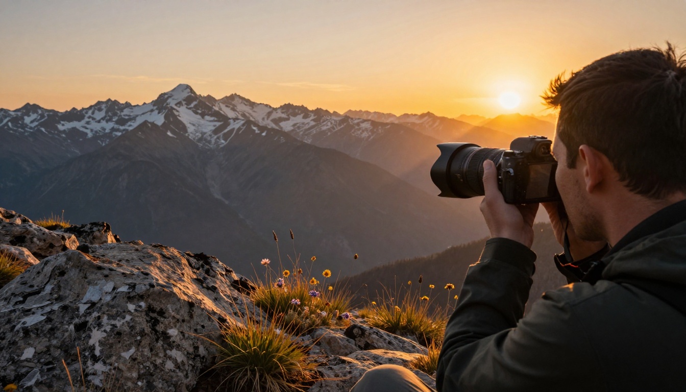
The quality of natural light changes dramatically by time of day, and AI models trained on real photography data respond precisely to these terms. "Golden hour" tells the model to produce warm, angled, long-shadow light. "Blue hour" produces cool tones with soft transitions. "Midday" produces harsh overhead lighting. "Overcast" produces even, shadowless diffusion.
Each creates a completely different mood and texture feel:
- Golden hour: Warm, cinematic, long shadows, orange tones
- Blue hour: Cool, moody, soft transitions, blue-purple cast
- Midday sun: High contrast, sharp shadows, saturated colors
- Overcast: Even exposure, no harsh shadows, muted tones, documentary feel
- Sunrise: Soft pink-orange tones, low angle, delicate shadows
Studio and Directional Light
For product images, portraits, and any controlled environment, directional lighting instructions give you precise control over where shadows fall and how textures appear.
Specify:
- "Volumetric light from upper left" for dramatic side lighting
- "Soft diffused fill light from front" for even face illumination
- "Rim light from behind" for a glowing edge on subjects
- "Window light from the right" for natural indoor portrait setups
- "Overhead fluorescent, slightly warm" for realistic indoor scenes
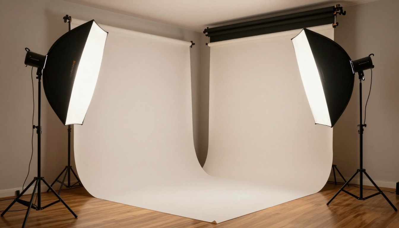
These terms activate trained lighting patterns in the model that produce consistent, professional-looking results without requiring any post-processing or manual editing.
Tip 5: Iterate with Seeds and Negatives
Getting a great AI image on the first try is luck. Getting great images consistently is process. Two tools that make iteration systematic: seed control and negative prompts. Together, they let you refine outputs in a controlled, repeatable way rather than regenerating blindly and hoping.
How Seed Control Works
Every AI image generation uses a random seed number to initialize the noise that the model denoises into a final image. If you like the composition from a generation but want to adjust the lighting direction or time of day, keeping the same seed while changing only those specific prompt elements gives you a comparable result with just those variables changed.
This is how you refine without losing what was working. Most models on PicassoIA expose the seed value in the generation output, so you can copy it and reuse it.
💡 Seed strategy: Find a seed that produces a composition you like. Then iterate on the prompt while keeping the seed fixed. Change only one variable at a time: lighting first, then color temperature, then background detail. This turns random luck into controlled iteration.
Negative Prompts That Actually Help
Negative prompts tell the model what to exclude from the output. The most useful negatives for photorealistic work are:
- "blurry, out of focus" prevents soft, unfocused results
- "cartoon, illustration, painting, drawing" keeps outputs photographic
- "watermark, text, signature" removes unwanted overlays
- "oversaturated, unrealistic colors" keeps color grading natural
- "low quality, jpeg artifacts, pixelated" pushes toward higher fidelity
- "extra limbs, distorted hands, malformed fingers" fixes anatomical issues in portraits
Do not add everything to negative prompts. Target the specific problems you are seeing in your current outputs. A bloated negative prompt can constrain the model so heavily that outputs become generic and uninspired.
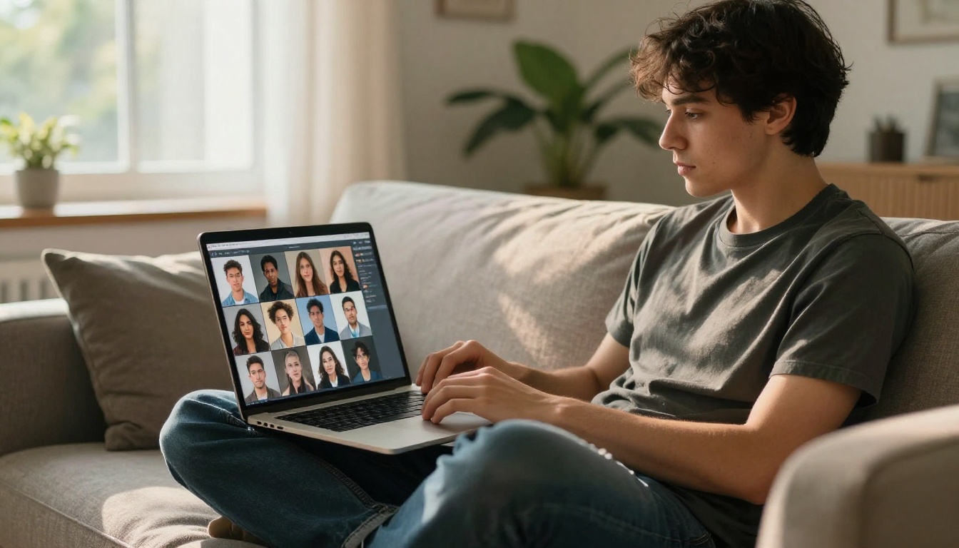
Tip 6: Upscale Every Final Image
No matter how strong your prompt is, the base resolution from most free AI image generators hits a ceiling that starts showing at large display sizes. Upscaling solves this completely and costs nothing extra on PicassoIA.
Free Upscaling Models on PicassoIA
PicassoIA has nine dedicated upscaling models covering everything from fast 1-second results to 6x print-ready enlargement. The most reliable options for photorealistic images:
- Clarity Pro Upscaler: Adds sharp photorealistic detail, best for portraits and nature photography
- P Image Upscale: Fast 1-second upscaling for quick results without quality loss
- Google Upscaler: Enlarges any photo 4x without visible detail loss
- Topaz Image Upscale: Enlarges up to 6x, ideal for print-ready or presentation output
- Real ESRGAN: Reliable free 4x upscaling with strong performance on most image types
- Crystal Upscaler: Specializes in portrait upscaling up to 4x with natural skin texture preservation
- Recraft Crisp Upscale: Excellent for product and object images where edge sharpness matters
- Bria Increase Resolution: Consistent general-purpose 4x upscaling across a wide range of image types
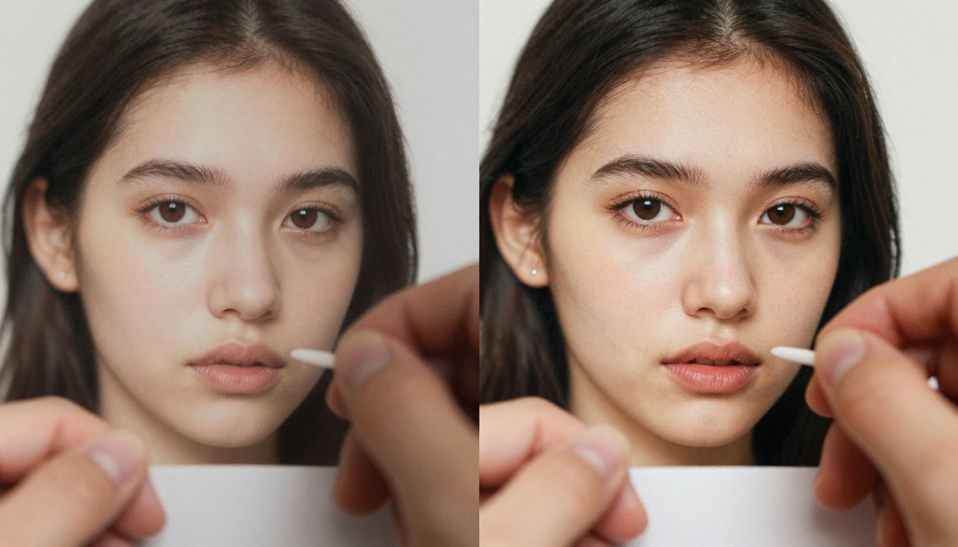
When to Use 2x vs 4x
For web and social media, 2x upscaling is usually sufficient and preserves more of the original image character. For print, presentation decks, or large display use, 4x gives you room to zoom in without quality degradation. For anything going to print at A3 or larger, Topaz Image Upscale at 6x is the best option available for free.
💡 Upscaling rule: Always upscale after you are satisfied with the composition and content. Upscaling cannot fix a bad composition or incorrect subject. It only sharpens and enlarges what is already there.
Using PicassoIA for Free Images
PicassoIA brings all the models above under one interface with no software to install. Here is the exact workflow from blank page to final image:
Step 1: Select a model. Visit picassoia.com/en/all-models and filter by "text-to-image." Start with P Image or Flux Schnell for your first test run.
Step 2: Write a layered prompt. Follow the director framework from Tip 1: subject plus action plus environment plus lighting plus camera specs. Do not rush this step. The prompt does most of the work.
Step 3: Set your aspect ratio. Choose 16:9 for landscapes and wide scenes, 9:16 for portraits, 1:1 for social content.
Step 4: Generate and evaluate. Run 2-3 variations. Look at composition, lighting accuracy, and subject detail. Note what is working before making any changes.
Step 5: Iterate with seed control. Copy the seed from your best result. Adjust one prompt variable at a time: lighting first, then background, then color temperature. Do this until the output matches your vision.
Step 6: Upscale the winner. Take your final image into Clarity Pro Upscaler or Topaz Image Upscale for a high-resolution final version.
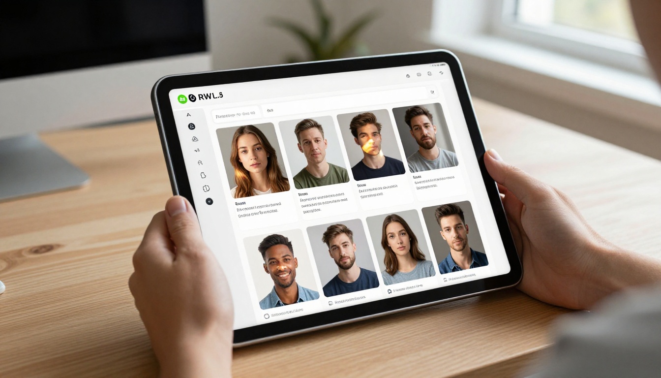
This six-step workflow consistently produces better results than any single tip alone because the tips are not independent. They stack.
Edit What Is Not Working
Once you have a strong base image, Flux Fill Pro lets you paint over and regenerate specific sections without touching the rest of the image. Background wrong? Fix it. Subject detail missing? Fill it in without starting over.
Flux Redux Dev creates variations of your best image, letting you try different interpretations around a composition you already like. This is far more efficient than regenerating from scratch when you are close but not quite there.
For editing existing photos or adding elements to real images, Flux Kontext Fast edits from a text description, giving you a powerful photorealistic adjustment tool that works on real photographs as well as AI-generated outputs.
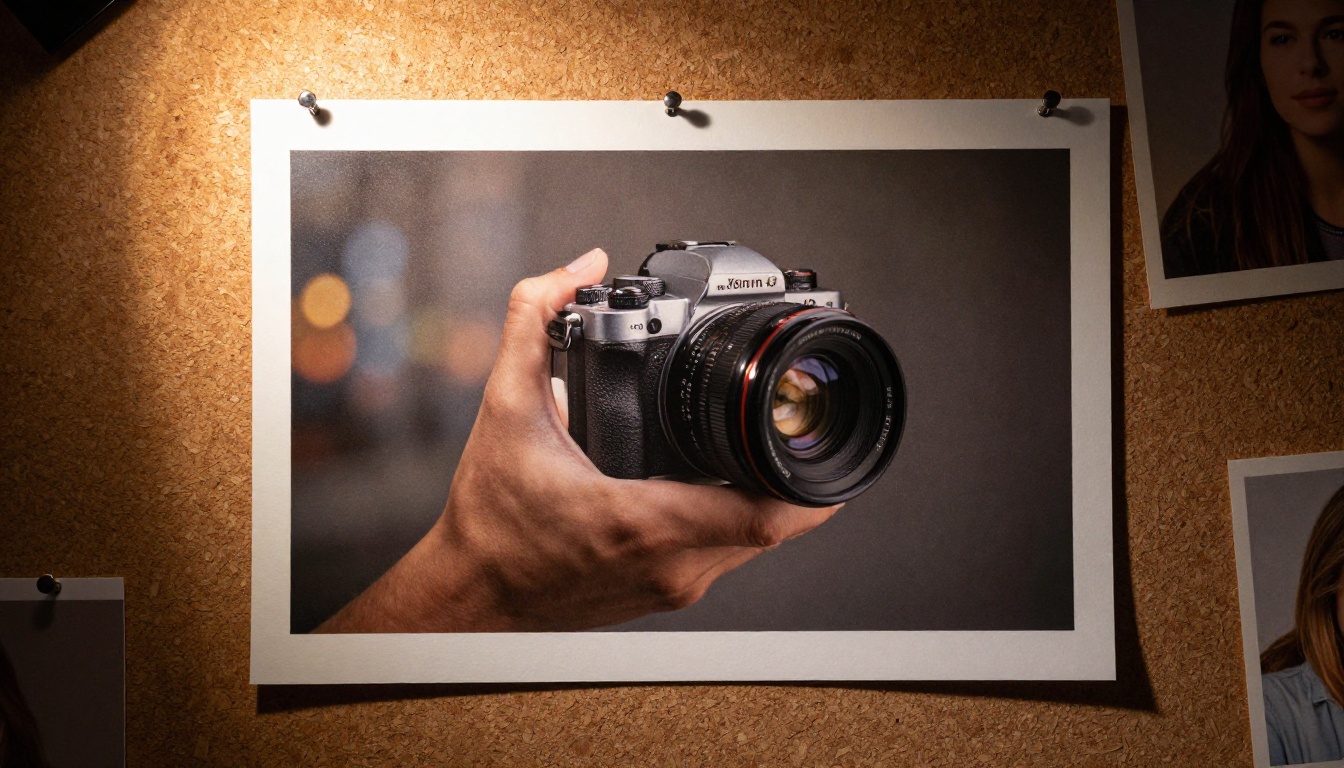
The Six Tips Together
The real power is in combination. Each tip alone improves results. All six together is what produces consistently professional-looking free AI-generated images.
- Detailed, specific prompts using the director framework
- The right model matched to your output type and iteration stage
- Correct aspect ratio set before generating, not after
- Lighting instructions that remove flatness and add depth
- Seeds and negatives to iterate without losing progress
- Upscaling every final image before it is used anywhere
💡 Most people stop after getting one image they kind of like. The people getting exceptional results run 10-15 variations of a single prompt, iterate on what works, and refine until the output matches exactly what they pictured. The process matters as much as the prompt.
What makes free AI-generated images look cheap is not the tools. It is the absence of process. The tools on PicassoIA are genuinely capable of producing results that would pass for professional photography in most contexts. The difference between that and a generic forgettable output is almost entirely in these six areas.
Create Your First Image Right Now
You do not need a budget. You do not need design experience. You need a specific idea and the willingness to describe it with enough detail that the model can reconstruct it.
Start at picassoia.com/en/all-models. Pick P Image or Flux Schnell. Write a prompt using the director framework. Generate. Iterate with seeds. Upscale the winner.
The gap between what you have been getting and what is actually possible with free AI image generation is not a tool problem. It is a process problem. Now you have the process.