A real watercolor asks you to wait. You lay down a wash, hold your breath, and hope the pigment blooms where you wanted it to. An AI watercolor generator skips the waiting and gives you the soft edges, the pooled color and the speckled paper grain in about ten seconds. You can type a sentence, upload a photo, or do both, and walk away with something that looks like it came off a cold-press block.
The catch is that the results vary wildly. Some tools produce muddy photo filters with a paper texture slapped on top. Others produce paintings that fool people standing a meter away. This article shows you how to land on the good side: which free options are worth your time, how to convert a photo, the prompt formula that works, and what to do when the output looks too digital.
What an AI Watercolor Generator Does
At its core, a watercolor generator is an image model that has seen millions of paintings and photographs of paintings. It has absorbed what wet pigment does on paper: how color spreads into damp areas, how edges stay hard on dry areas, how light shows through thin layers because the white of the paper acts as the highlight.
When you give it a prompt, it does not paint stroke by stroke like a human. It predicts an image that statistically looks like watercolor. That is why prompts that mention paper, water and pigment behavior give far better results than a bare "watercolor style."
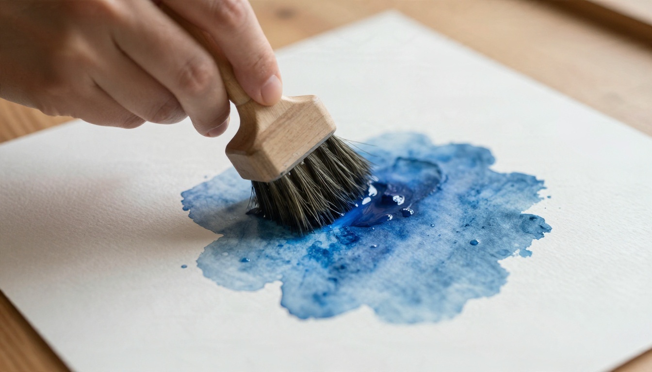
Text to watercolor
You describe a scene and the model invents it from scratch. This is the best route when you need an original illustration for a blog post, a nursery print, a greeting card or a book cover mockup. You control subject, palette and mood entirely through words.
Image to watercolor
You upload a photo and the tool repaints it. This is the route for portraits, pets, wedding venues, travel snapshots and house sketches. The photo supplies composition and likeness, and the model supplies brushwork. Results depend on how well the tool keeps the original structure while loosening the details.
💡 Quick rule: Choose text to watercolor when you want something new. Choose image to watercolor when the subject already exists and has to stay recognizable.
Free Options That Actually Work
"Free" covers a lot of ground, and most of it is disappointing. Before you sign up for anything, know the four forms free usually takes.
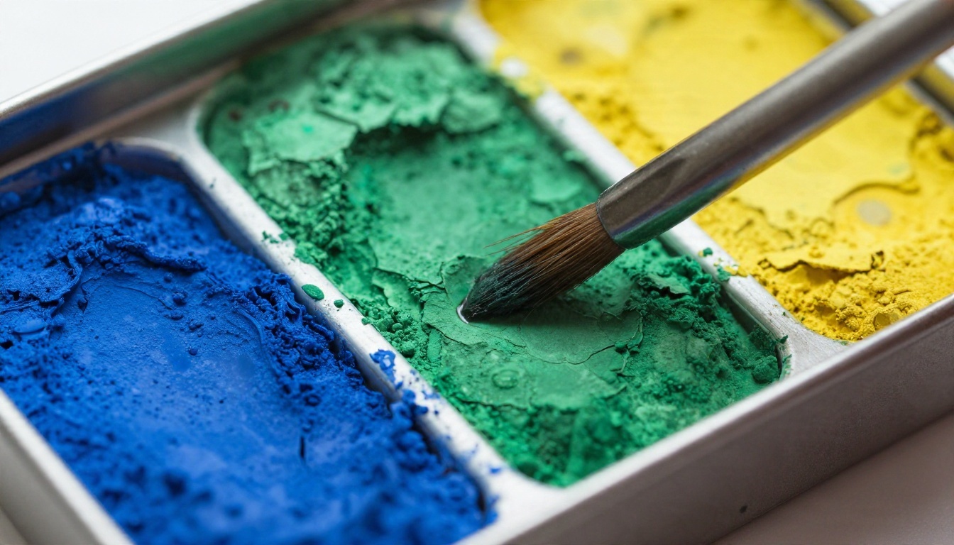
What "free" usually means
| Type of free | What you get | Typical limit |
|---|
| Daily credits | A handful of generations each day | Resets every 24 hours, slow queues |
| Trial credits | One lump sum when you sign up | Runs out in an afternoon |
| Free with watermark | Unlimited low-resolution output | Small files, visible mark |
| Open source models | Full control if you run them yourself | Needs a capable graphics card and patience |
If you only need a few watercolors a week, daily credits are the sweet spot. If you plan to produce dozens for a project, a platform with generous or unlimited generation saves a lot of frustration.
Free routes on Picasso IA
Picasso IA lists many image models in one place, so you can test the same watercolor prompt across several of them and keep the winner. Models worth trying for watercolor work:
- Seedream 4.5 handles soft gradients and paper texture well and renders up to 4K.
- Nano Banana is quick and friendly for both generating and editing, which suits the photo conversion route.
- Qwen Image 3 follows long descriptive prompts closely, useful when you specify paper, palette and composition in one go.
- Imagen 4 Ultra picks up fine detail like granulation and dry brush edges.
- Stable Diffusion 3.5 Large is a solid generalist with a strong grasp of artistic styles.
💡 Tip: Run the same prompt on three models before you commit. Each one has a different idea of what "loose" means, and the difference is often larger than any prompt tweak.
Turn a Photo Into Watercolor
This is the most searched use case, and the one where small choices decide whether you get art or a filter.
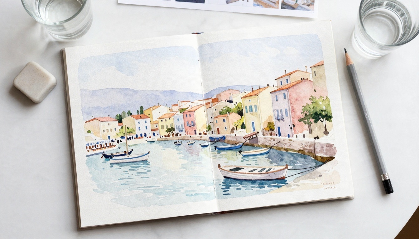
Pick the right source photo
The generator works best when the photo already has the qualities of a good watercolor. Look for:
- Soft or directional light, not harsh midday glare.
- Clear shapes with a readable silhouette, such as a face, a boat, a building.
- Simple backgrounds. A cluttered background turns into mud when painted.
- Moderate resolution. A sharp 2 to 4 megapixel image is plenty. Giant files do not improve the result.
A step by step workflow
- Crop first. Remove distractions at the edges. Watercolor likes a clear focal point and breathing room.
- Upload to an image editing model. Flux Kontext Fast and PicassoIA Image Editor Pro both accept a photo plus an instruction.
- Write an instruction that names the medium. For example: "Repaint this photo as a loose watercolor on cold-press paper, soft color bleeds, visible paper grain, white paper left bare for highlights."
- Generate three versions. Never settle for the first. Pick the one where the eyes or main shapes stay recognizable.
- Refine with a second pass. Ask for "less detail in the background, stronger wash in the sky" and run it again.
- Upscale if you plan to print. A super resolution model brings small outputs up to a size that holds on paper.
Settings that matter
| Setting | Recommended | Why |
|---|
| Aspect ratio | Match your original | Avoids stretching faces and horizons |
| Style strength | Medium | Too low looks like a filter, too high loses likeness |
| Detail request | "Loose" or "suggested" | Real watercolor leaves information out |
| Seed | Fix it while testing | Lets you compare prompt changes fairly |
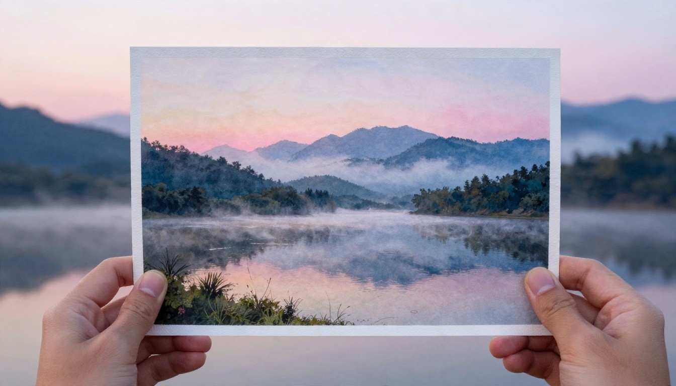
💡 Landscape trick: For scenery, add "atmospheric perspective, distant hills lighter and bluer." It mimics what painters do on purpose and gives instant depth.
Watercolor Prompts That Work
A good prompt reads like a short art direction note. Vague prompts get a generic, over-smooth image. Specific prompts get texture.
The five part prompt formula
Subject + Palette + Paper + Water behavior + Light
- Subject: what is in the picture and how it is composed.
- Palette: two to four named colors, such as "cobalt blue, burnt sienna, warm gray."
- Paper: "cold-press cotton paper," "rough paper with visible tooth," "deckle edge."
- Water behavior: "wet on wet blooms," "soft bleeding edges," "granulating pigment," "dry brush highlights."
- Light: "soft morning light, white paper glowing through thin washes."
Ready prompts by subject
Pet portrait
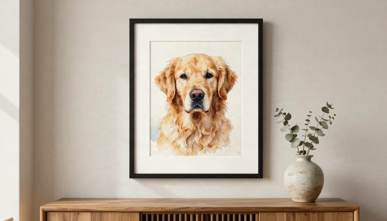
"Watercolor portrait of a golden retriever looking left, warm ochre and burnt sienna fur, loose wet on wet background in pale blue, visible cold-press paper texture, white paper left bare around the muzzle, soft natural light."
Botanical
"Single peony in full bloom, alizarin crimson fading to blush pink, sap green leaves with granulation, white background, fine pencil outline visible beneath the wash, cotton paper grain."
Travel scene
"Narrow Mediterranean alley with terracotta rooftops, loose ink-free watercolor, warm yellow ochre walls, cool violet shadows, splattered pigment at the edges, deckle paper border."
Moody landscape
"Misty mountain lake at dawn, ultramarine and payne's gray washes bleeding into each other, pale pink sky left unpainted, atmospheric perspective, rough watercolor paper."
Words that hurt your results
- "Ultra detailed" and "hyperrealistic." Both fight the medium.
- "Digital painting." You will get a smooth, airbrushed look.
- Too many colors. Past four, the palette turns muddy.
- Long strings of artist names. They muddy the style instead of sharpening it.
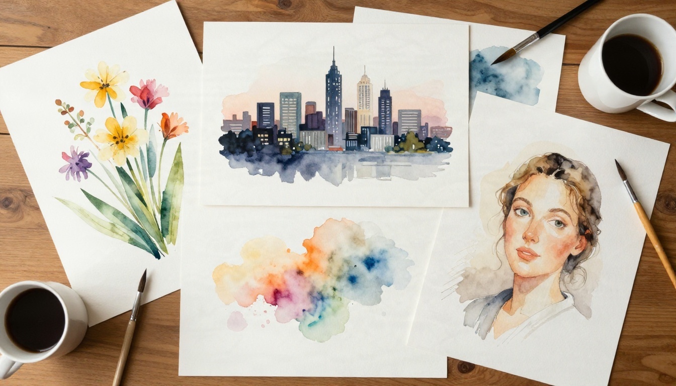
Style vocabulary you can borrow
| Look you want | Phrases to add |
|---|
| Loose and airy | "wet on wet," "soft blooms," "unfinished edges" |
| Crisp illustration | "pen and wash," "clean pencil lines," "flat washes" |
| Moody and rich | "layered glazes," "deep indigo shadows," "granulation" |
| Delicate botanical | "white background," "fine detail," "transparent washes" |
| Rustic sketchbook | "splatter," "visible pencil," "toned paper" |
If your favorite model struggles with a few words of lettering in the painting, Ideogram v4 Quality is one of the better choices for short text, which helps with greeting cards and invitations.
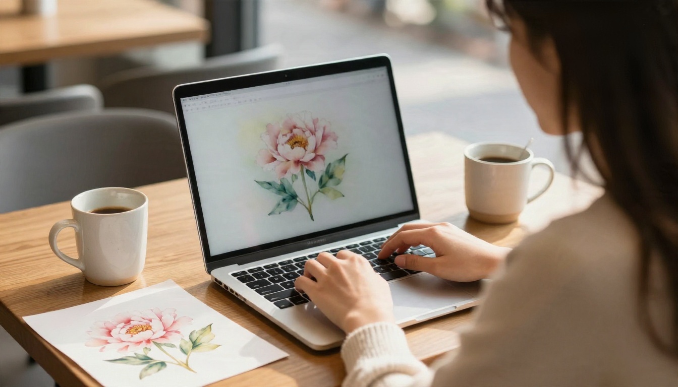
You do not need to install anything. Browser based generators now cover every scenario, and most differences come down to speed, control and how much the output looks like paper rather than a screen.
Which model for which job
What to check before you pick one
- Does it keep faces recognizable? Test with a portrait you know well.
- Does the paper texture look physical? Zoom to 100 percent and look for grain, not a repeating pattern.
- Can you set a seed or reuse a reference? It makes series work consistent.
- What are the usage rights? Read the terms if you plan to sell prints or use the art commercially.
Fix Common Watercolor Problems
Even good prompts occasionally miss. Here are the usual problems and how to repair them without starting over.
It looks like a photo filter
The model kept too much of the original structure. Raise the style strength, or rewrite the instruction to say "simplify shapes, remove fine detail, let color bleed past outlines." Adding "unfinished edges" also helps.
The colors are too saturated
Real watercolor rarely sits at full saturation. Add "muted, natural pigment, slightly desaturated" and name earth tones such as raw sienna, sap green and Payne's gray.
Edges look too clean and digital
Ask for "soft bleeding edges, pooled pigment at the borders, slight blooms." If it is still too tidy, request a deckle edge paper border to break the rectangle.
Faces lose their likeness
Crop tighter on the face and keep the instruction short. Lengthy style lists pull attention away from the identity. A second pass with "keep facial features accurate" often restores it.
The image is too small to print
Run the final pick through a super resolution model and print on textured paper. The grain of cotton stock actually hides small upscale artifacts.
💡 Fast diagnostic: If three generations in a row feel wrong, the problem is the prompt, not the model. Rewrite from the five part formula and try again.
Print and Use Your Art
An AI watercolor is only half finished until it lives somewhere. These are the uses that tend to work best.
Print at home
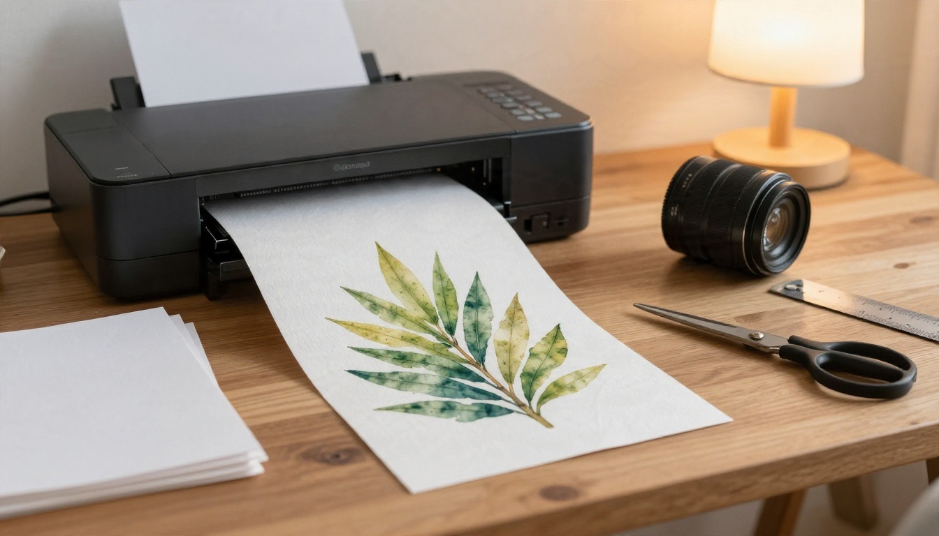
Use matte or cotton rag paper rather than glossy photo stock. The tooth of the sheet is what makes a print read as painted. Set the printer to its highest quality mode and let the sheet dry flat for a few minutes before handling it.
Where watercolor art sells and shines
- Wall art and gallery sets in groups of three, tied together by one shared palette.
- Greeting cards and invitations with a small ink wash border.
- Children's book spreads where soft color suits the mood.
- Blog headers and social posts that need a calm, hand made feel.
- Pet and home portraits as personal gifts.
Add a human finish
Many artists generate a base and then paint over it. Print on watercolor paper, add a few real dry brush strokes, splatter or a pencil line, and the piece becomes truly yours. It also solves the "does it look machine made" worry in one move.
Start Painting With Picasso IA
You now have the pieces: a way to pick the right route, a prompt formula, a photo workflow and fixes for the usual problems. The fastest way to learn what works for your style is to make something right now.
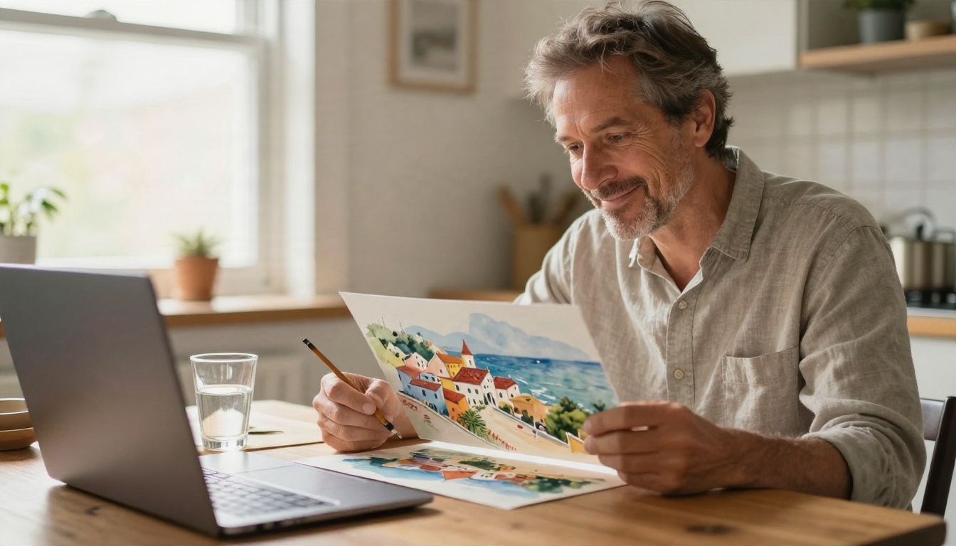
Open Picasso IA, pick one of the models above, and paste in the peony or mountain lake prompt from this article. Then swap one variable at a time: change the palette, switch the paper, or upload your own photo to PicassoIA Image Editor Pro and ask for a loose watercolor repaint. Three attempts in, you will know which model matches your eye.
Browse every available model at picassoia.com/en/all-models, keep a folder of your best prompts, and build a small series. A dozen cohesive pieces are worth more than a hundred random ones.


