A browsing reader gives a book about three seconds. In that window the front image has to signal genre, mood and quality without a single sentence of help. Plenty of well-written novels stall because their artwork whispered the wrong thing. The good news is that a free AI generator can now produce photographic, genre-accurate book art in minutes, and you do not need a design degree or a four-figure budget to use one well.
This article walks through the full process: how to judge a free generator, how to write prompts that produce usable art, where the title text belongs, and how to check the result at thumbnail size before you export for print. Every step uses tools you can open in a browser today.
💡 Quick answer: Generate the artwork with no lettering, choose a portrait ratio such as 2:3, test it at thumbnail size, and only then add the title and author name in a layout tool. That order avoids the three most common failures: garbled text, wrong proportions and unreadable thumbnails.
Why Book Art Decides Sales
Readers do not browse the way authors imagine. They scroll a grid of tiny images, pause on the few that feel right, and ignore the rest. The blurb, the reviews and your carefully edited first chapter only get a chance if the front image earns that pause.
Self-published authors feel a second pressure: budget. A custom illustrated jacket from a freelancer can cost hundreds of dollars, and a series multiplies that bill. A free generator will not replace a skilled designer on every project, but it lets you test concepts, build mockups and make confident decisions before you spend anything.
The Three-Second Browse
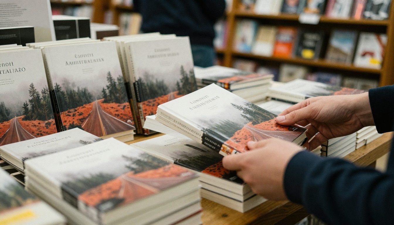
In a store, the table does the selling. A shopper's eye lands on color first, then on the dominant shape, then on the mood. Only after that does anyone read a title. Online the sequence is identical, just smaller: a thumbnail the size of a postage stamp has to communicate everything at once. That is why one strong focal point beats a busy collage almost every time.
What Readers Read at a Glance
Every genre has a visual dialect, and readers fluent in it spot a mismatch instantly. A cozy mystery wearing the heavy palette of a horror novel gets skipped by both audiences.
| Visual signal | What the reader infers |
|---|
| Warm light, soft focus, open space | Romance, cozy fiction, memoir |
| Deep shadow, narrow framing, cold tones | Thriller, mystery, horror |
| Vast landscape with one small figure | Fantasy, epic adventure, literary fiction |
| Clean background, single bold object | Nonfiction, self-help, business |
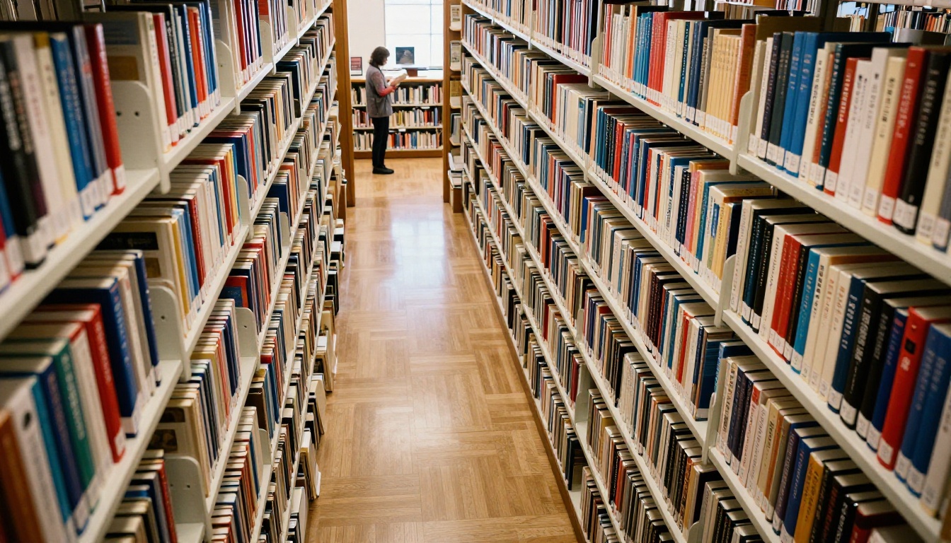
Walk any library aisle and the pattern shows itself: colors cluster by genre. Fit in enough to be recognized, stand out enough to be remembered. That sentence is the whole brief for your artwork.
What a Free Generator Must Deliver
"Free" only helps if the output survives contact with a printer. Before you spend an evening on any tool, check three things.
Resolution and Aspect Ratio
A book front is a tall rectangle, usually 2:3 or close to it. Many generators default to square or landscape, which forces you to crop away half the picture. Pick a tool that offers portrait ratios natively and exports at roughly 2K on the long edge, so you have room to crop and scale. Soft, low-resolution files look muddy on paper, and sharpening cannot rescue them.
Commercial Use Rights
Some free tiers limit outputs to personal use, stamp a watermark or demand attribution. If you plan to sell the book, read the terms before you generate a single image. A watermark-free file with clear commercial rights saves you from redoing the whole design later.
Text Rendering Limits
Even strong models occasionally misspell words, swap letters or invent characters that look like writing but are not. Treat any lettering inside a generated image as a rough sketch, never as final type. The workflow for handling that comes a few sections down.
Picasso IA hosts several text-to-image models, and each suits a different job:
| Model | Good for | Watch out for |
|---|
| GPT Image 2 | Scenes that follow detailed instructions closely | Review any lettering it adds |
| Ideogram v4 Quality | Photorealistic art and title treatment sketches | Keep final type in a layout tool |
| Recraft v4.1 Pro | Print-ready 2K output | Settle the idea in drafts first |
| Seedream 5 Pro | Sharp 2K images with rich detail | Prompt for one focal point, not a crowd |
| Imagen 4 Ultra | High-detail photographic scenes | Skip fine print inside the scene |
| P Image | Fast drafts to test ideas | Use a stronger model for final art |
How to Use Picasso IA for Jackets
Text-to-image models exist for exactly this job, so the workflow below is repeatable for any genre. It takes about twenty minutes for a first concept.
Pick a Model for Your Genre
Start with P Image to test five or six concepts quickly, since fast drafts cost you almost no patience. When one idea wins, rebuild it in Seedream 5 Pro or Recraft v4.1 Pro for the sharp, print-friendly version.
Write a Prompt With Five Parts
Vague prompts produce stock-photo mush. Build each prompt from five pieces:
- Subject: one clear focal point, such as a lone lighthouse or a single red door.
- Setting: where it sits, with two or three concrete details.
- Light: direction and time of day, for example low golden sun from the left.
- Lens: a camera and aperture hint like 85mm f/1.8 for depth.
- Mood and palette: three or four color words that match your genre.
Close every prompt with no text, no lettering, no logos. Here is a working example:
A lone lighthouse on a misty cliff at dawn, wet grass in the foreground, pale gold sun breaking from the left, 50mm lens, shallow haze, muted teal and cream palette, calm and lonely mood, photographic, no text, no lettering
Set Portrait Ratio and Seeds
Choose a portrait ratio such as 2:3 or 3:4 before you generate. Then run four to six variations of the same prompt. If the model offers a seed setting, note the seed of your favorite, because reusing it with small prompt edits lets you adjust one detail at a time without losing the composition.
The short version as steps:
- Open the text-to-image collection on Picasso IA and choose a model.
- Paste your five-part prompt.
- Set a portrait ratio.
- Generate four to six drafts.
- Pick the strongest and rerun it in a higher-quality model.
- Download the file at full resolution.
Prompts That Work by Genre
Each genre rewards a different recipe. Use these as starting points and swap in your own story details.
Thriller, Mystery and Horror
Lean on negative space and a single unsettling object: a rain-streaked taxi window, a half-open door, an empty swing in fog. Keep the palette narrow, with two dominant colors at most. Low light and a cold tint do most of the work.
Starter: "Rain-streaked taxi window at night, blurred city lights, one lit cigarette glow, 35mm lens, cold blue and sodium amber, tense mood, photographic, no text."
Fantasy, Romance and Nonfiction Art
Fantasy wants scale: a tiny human against a huge castle, forest or sky. Romance wants warmth and closeness: soft light, two figures turned slightly away, a meadow or a window seat. Both benefit from a clear empty zone where the title can sit later.
Starter: "Sunlit meadow at golden hour, a lone figure walking toward a stone farmhouse, long shadows, 85mm lens, honey and sage palette, hopeful mood, photographic, no text."
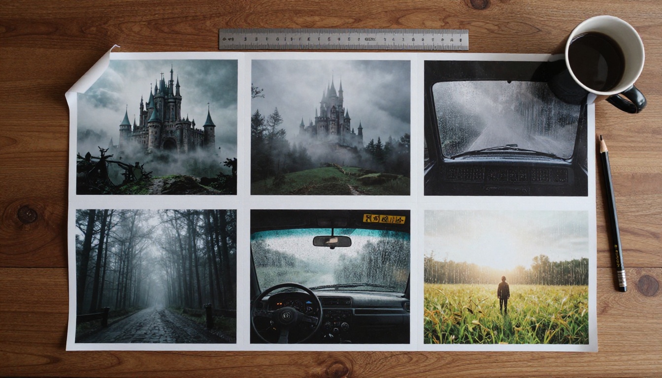
Lay three proofs side by side, as in the photo above, and the genre differences become obvious. If your draft could swap places with a neighbor's book on the shelf, it is not distinct enough yet.
Nonfiction and self-help follow a simpler rule: one bold object on a clean background, with enough contrast that the subject reads from across the room. A single worn notebook, a mountain trail marker or a steaming mug can anchor a whole topic.
Keep a Series Consistent
Readers who finish book one should recognize book two from across a room. Reuse the same lens language, the same palette and the same composition rhythm, and change only the subject. If book one shows a lone figure at the bottom right under a wide sky, keep that structure and swap the landscape. Save your winning prompt as a template with blanks for subject and setting, and the whole series ends up looking like a family instead of a coincidence.
Add Title Text the Right Way
The prettiest artwork fails if the title is hard to read. This is where most first-time designs fall apart.
Why AI Lettering Breaks
Image models predict pixels, not spelling. Long titles, unusual names and small subtitles get distorted, and you may only notice the flaw after printing. A single swapped letter in an author name is an expensive mistake. So generate the picture alone, and set the words yourself.
A Clean Layout Workflow
- Import the artwork into any layout tool you like, whether a free browser editor or desktop software.
- Place the title where the image has calm space, usually the top third or bottom third.
- Pick one display font for the title and one plain font for the author name. Two fonts is plenty.
- Check contrast. If the title fights the background, add a soft gradient behind it or shift the artwork.
- Make the author name large enough to read in a thumbnail, especially if you have a following.
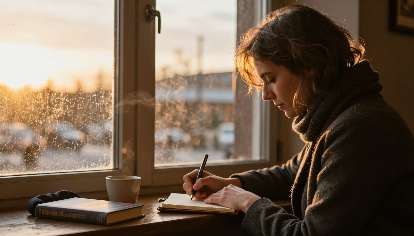
💡 Tip: Ask for empty space in the prompt itself: "large calm sky in the upper third" or "dark foggy area at the bottom". Models follow that kind of instruction well, and you will not need to fight the composition later.
Print Specs and Thumbnail Tests
A design that looks stunning on a monitor can still fail at the printer or at stamp size. Check both before you publish.
Ebook and Paperback Sizes
Dimensions depend on the retailer and the printer, so always confirm against their current template. These numbers are common starting points:
| Format | Typical target |
|---|
| Ebook front image | 2560 x 1600 pixels, tall orientation, ratio around 1.6 to 1 |
| 6 x 9 inch paperback front | 1800 x 2700 pixels at 300 DPI |
| Full wrap (back, spine, front) | Add spine width for your page count, plus about 0.125 inch bleed on each outer edge |
If your generated image is smaller than the target, run it through a super resolution model before layout rather than stretching it in the editor. Stretching creates blur. Upscaling rebuilds detail.
The Thumbnail Test
Shrink the finished design to roughly the size it will appear in a store grid, then step back from the screen. Ask three questions:
- Can you still read the title?
- Can you name the genre in one second?
- Does it stand apart from the three books beside it?
Run the same check in grayscale. If the focal point vanishes once color is removed, the design leans on hue alone, and readers on e-ink devices will miss it entirely.
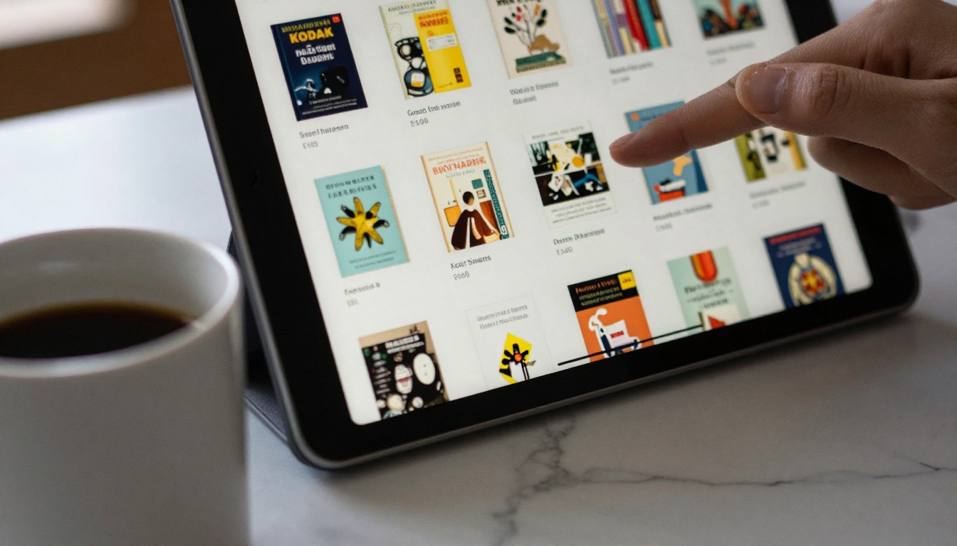
If any answer is no, simplify. Remove a secondary object, boost contrast or enlarge the title. Most designs improve when you cut things, not when you add them.
Once a physical proof arrives, check the paper too. Matte and gloss finishes change how color and detail look, and the only way to know is to hold the book.
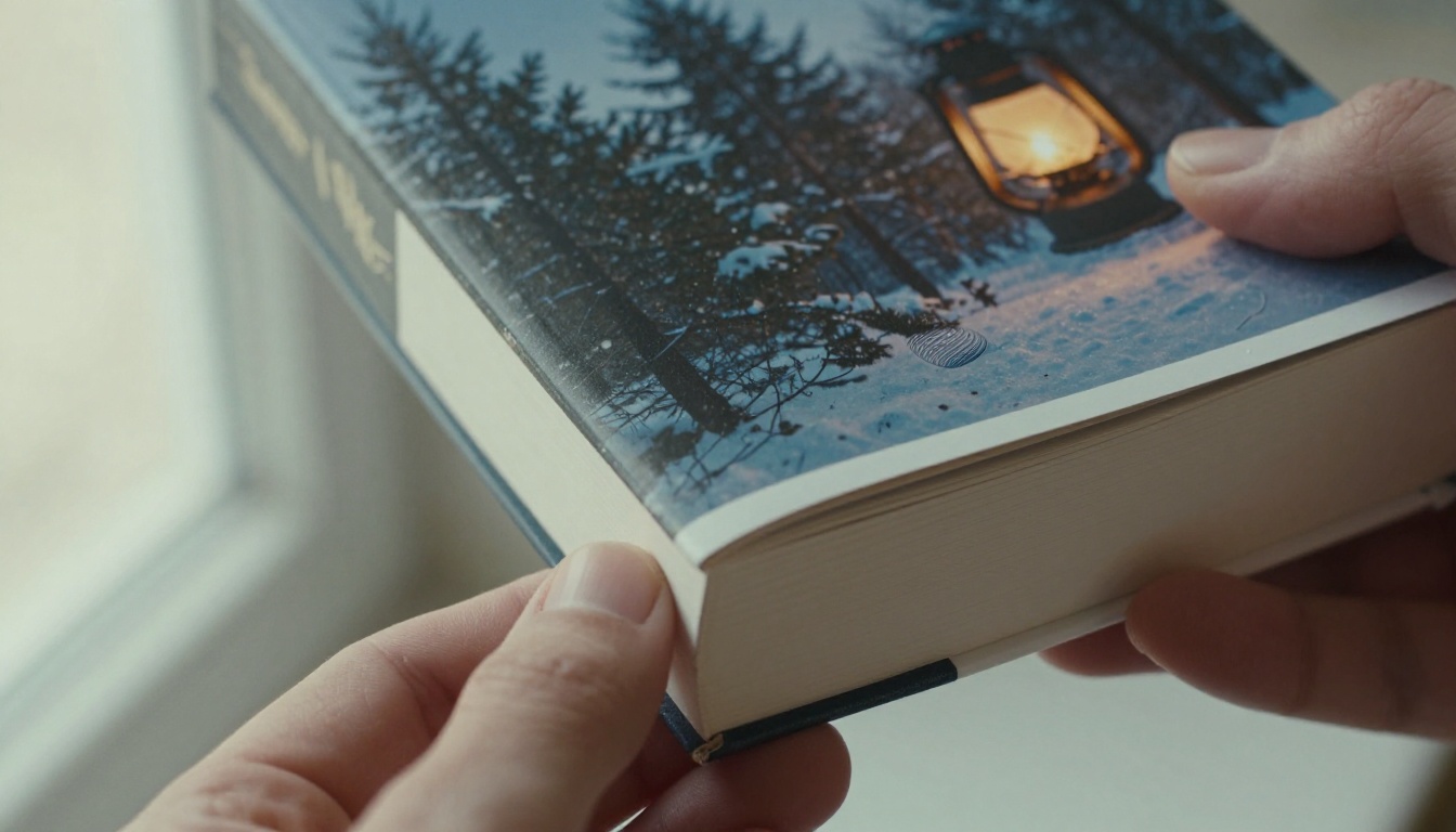
Order a single proof copy before a full run. Print shops know that colors shift from screen to paper, and a proof costs far less than a pallet of books with muddy shadows.
3 Common Mistakes to Avoid
1. Cramming in every idea. A book with a dragon, a castle, a sword and a storm looks like four books fighting. Choose the one image that best represents the promise of the story.
2. Ignoring genre signals. Originality matters, but readers shop by pattern recognition. Break the rules on purpose, one at a time, never by accident.
3. Skipping the proof. Screens glow and paper does not. Dark, moody designs suffer most, because shadow detail can turn to black on the page. Lighten the shadows slightly before you export for print.
Two smaller habits also pay off. Save every prompt that worked, so your next book in the series matches the first. And keep a folder of rejected drafts, because a discarded idea for one book often fits the next.
Make Your First Jacket Today
You now have the whole workflow: a genre recipe, a five-part prompt, a portrait ratio, a clean layout and a thumbnail check. The only step left is to try it.
Open Picasso IA, pick a text-to-image model such as GPT Image 2 or Seedream 5 Pro, paste the lighthouse prompt from above, and change one detail so it belongs to your story. Generate six variations, pick the one that stops your own eye for a moment, and run it through the thumbnail test. If you want to compare more options, browse the full list at picassoia.com/en/all-models.
Your book already holds the story. Give it a front image that gets it picked up, and see how far a single evening of experiments can take it.


