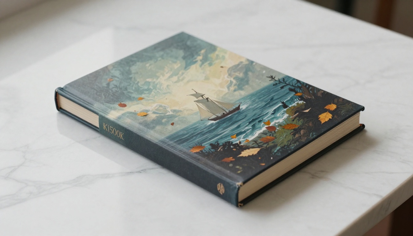
Getting a professional book cover used to mean hiring a designer for $500 to $2,000 and waiting two weeks. Flux 2 Max changes that equation entirely. This model produces artwork at a level of detail that competes directly with commissioned illustration work, and the speed difference is measured in seconds rather than days. For self-publishers, indie authors, and small press editors, that shift is not incremental. It is structural.
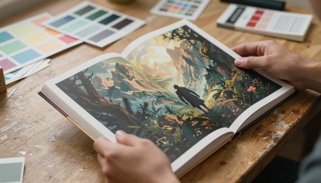
What Flux 2 Max Actually Does
Most AI image models generate plausible-looking images. Flux 2 Max generates believable ones. The distinction matters enormously in publishing, where a book cover needs to hold up at full print resolution, survive thumbnail scaling on Amazon, and communicate genre instantly without looking like it was assembled from stock photo clipart.
The architecture behind Flux 2 Max is built around a diffusion transformer that processes image tokens at significantly higher fidelity than earlier Flux variants. The result is sharper character edges, more coherent scene depth, and surface textures that survive close inspection. When you zoom into a Flux 2 Max output at 300 DPI, the fabric in a character's cloak has visible fiber. The sky carries atmospheric haze gradients. The light sources cast shadows that follow physics rather than approximating them.
Detail Fidelity at Maximum Output
Flux 2 Max outputs at resolutions suitable for full-bleed print production. A standard paperback at 6x9 inches and 300 DPI requires roughly 1,800 x 2,700 pixels. Flux 2 Max handles this comfortably, and with PicassoIA's super resolution tools you can push output to 3,600 x 5,400 or higher for hardcover or large-format work.
The model is particularly strong with:
- Character faces: Proportional, expressive, and consistent without the uncanny distortions that plagued earlier models
- Environmental depth: Layered backgrounds with proper atmospheric perspective
- Material surfaces: Leather, stone, water, fabric, and metal all render with physical plausibility
- Lighting coherence: A single light source casts shadows and specular highlights that follow real-world behavior
Typography and Text in the Scene
Typography in AI-generated images has been the weakest link in every model until recently. Flux 2 Max handles in-scene text with significantly higher accuracy than its predecessors. You can prompt for a title to appear as if carved into stone, etched in gold foil, or written in aged ink, and the output is legible rather than a garbled approximation of letters.
This does not replace a professional layout pass in design software. For final print, you will still add your title, author name, and ISBN in a dedicated tool after generation. What changes is that the compositional space for text, which Flux 2 Max reserves with greater accuracy than earlier models, saves you from awkward post-generation cropping.

Book Cover Results by Genre
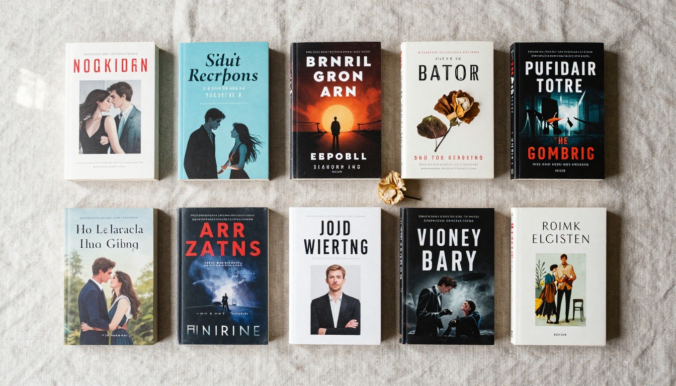
Different genres have wildly different visual vocabularies. A thriller cover is not a fantasy cover with different text. They use different color palettes, different compositional grammar, and different signals that readers recognize in 0.3 seconds while scrolling. Flux 2 Max handles this spectrum because its prompt sensitivity is high enough that genre-specific instructions translate accurately into visual output.
Fantasy and Epic Fiction
Fantasy covers require dramatic scale, which Flux 2 Max delivers reliably. Prompting for a lone warrior against a castle silhouette at sunset, a dragon rising above storm clouds, or a forest of silver-barked trees shrouded in atmospheric fog produces results with the visual weight the genre demands.
The model respects classic fantasy cover conventions: low viewpoints that make subjects feel towering, wide-angle perspectives that emphasize environmental scale, and lighting that favors dramatic shadows with single strong light sources. For epic fantasy, the deep jewel-tone palette (crimson, midnight blue, dark gold) translates well from prompt to output without requiring heavy post-processing.
💡 Prompt tip: Add "seen from below, upward angle, subject towers against dramatic sky" to immediately communicate the scale conventions of the fantasy genre.
Romance Novel Artwork
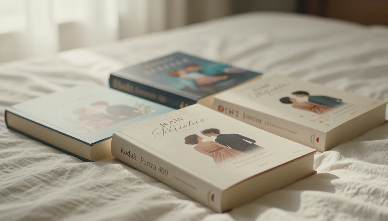
Romance covers have strict conventions and a readership that reads them as fluent signals of subgenre. A contemporary romance differs from a historical romance in pose, costume, and lighting language. Flux 2 Max is sensitive enough to these specifics that "Regency England couple in a formal garden, soft warm light, painterly tones" produces a meaningfully different output from "contemporary small-town romance, flannel shirt, autumn orchard background."
The model's character generation is strong enough that the emotional register between two figures in a scene reads authentically rather than robotically, which is the real bar this genre sets.
Children's Books and YA
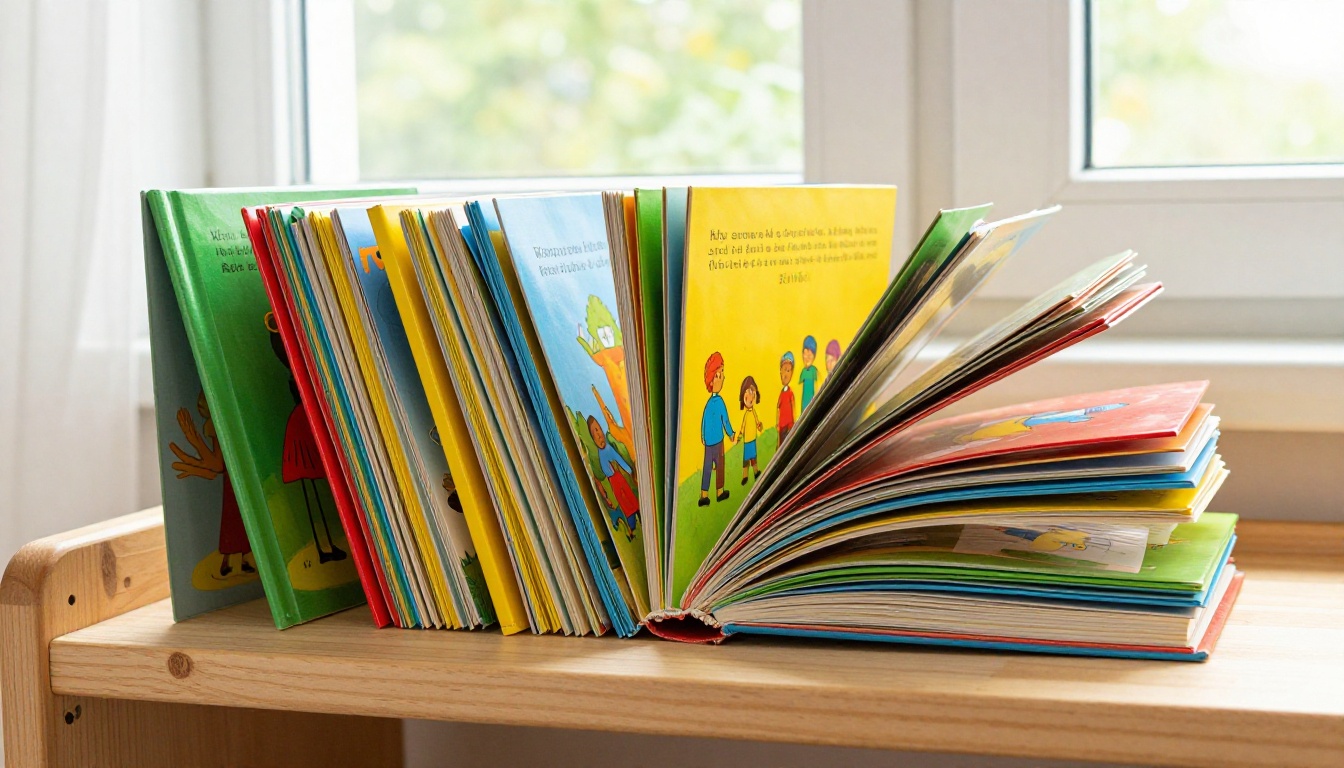
Children's illustration is where Flux 2 Max requires the most prompt specificity. The model defaults toward photorealism, which is not always the right register for picture books. To shift toward a more illustrative aesthetic, include terms like "painterly watercolor style, flat color areas, rounded character forms, bright primary palette" in your prompt.
YA covers are easier because the genre already blends photorealistic and stylized aesthetics. A YA cover with a stylized character against a moody night sky plays directly to Flux 2 Max's strengths without requiring as many style override terms.
Non-Fiction and Business Books
Non-fiction covers often rely more on bold typography and conceptual imagery than on detailed character illustration. Flux 2 Max excels at generating conceptual backgrounds, product-adjacent scenes, and editorial-style photography that functions as a strong design base.
A business book about decision-making might use a tight shot of hands moving chess pieces across a board. A personal development book might use an open road at sunrise with long shadows. A science book might use an extreme close-up of natural geometric patterns. Flux 2 Max handles all three with photographic plausibility, without requiring you to source or license stock photography.
How to Use Flux on PicassoIA
PicassoIA runs the Flux model family through a clean web interface with no local installation, no API configuration, and no model weight downloads required. You write a prompt, set a few parameters, and results arrive in seconds. For book cover work, the relevant starting points are Flux 1.1 Pro for quality-first generation and Flux Schnell for fast concept iteration.
Your First Prompt Setup
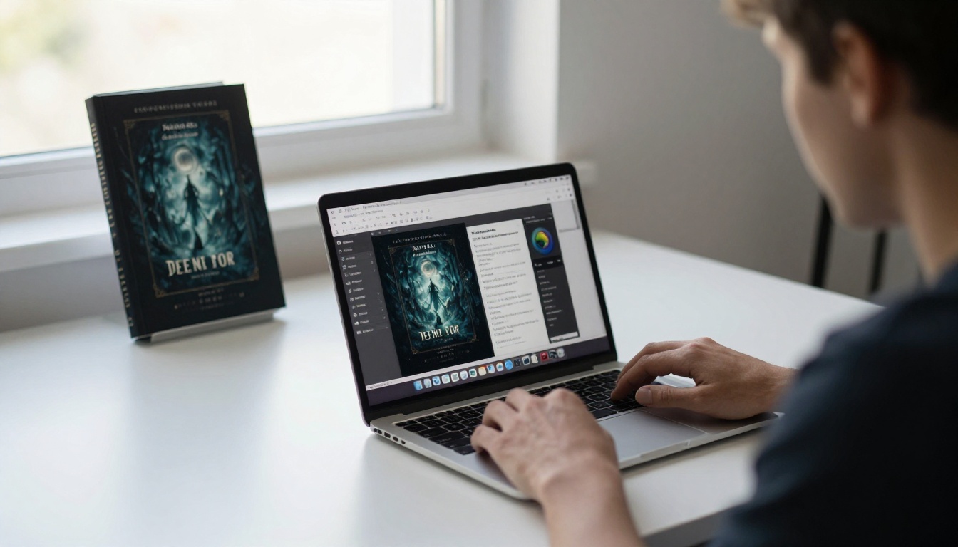
When you open Flux 1.1 Pro on PicassoIA, you find a prompt field, an aspect ratio selector, and a quality setting. For book cover work:
- Set aspect ratio to 2:3 (portrait format matching standard book dimensions)
- Set quality to maximum
- Write your prompt starting with genre signal, then mood, then subject, then environment, then lighting
The model reads prompts with slightly more weight on early terms, so lead with what matters most. "Dark fantasy, atmospheric, lone female knight in fog, Gothic castle behind, moonlight from the left, dramatic shadows" will consistently outperform "moonlit female knight in front of a Gothic castle, dark and atmospheric, fantasy." Same information. Different results.
Getting the Right Dimensions
Book covers are portrait format, not square. PicassoIA's custom dimension controls let you specify exact pixel dimensions for any output size. For standard publishing formats:
| Format | Dimensions at 300 DPI | Notes |
|---|
| Paperback 5x8 | 1500x2400px | Most common trade paperback |
| Paperback 6x9 | 1800x2700px | Standard indie publishing |
| Hardcover 6x9 | 1800x2700px | Same base, add bleed for print |
| Large format 8.5x11 | 2550x3300px | Needs upscaling post-generation |
Generate the front first, then use PicassoIA's outpainting capability to extend canvas for spine and back artwork if you want a seamless full-wrap design.
Iterating Toward a Final Result
One prompt rarely produces a final output. The practical workflow looks like this:
| Pass | Purpose | Tool |
|---|
| Pass 1 to 5 | Establish composition and color palette | Flux Schnell (fast) |
| Pass 6 to 12 | Refine character, scene, and lighting | Flux 1.1 Pro |
| Pass 13 to 15 | Finalize candidate, upscale | Super Resolution |
| Final step | Add title, author name, ISBN | Canva or Affinity |
Using Flux Schnell for early concept testing costs fewer credits and produces results in under 5 seconds, which makes rapid iteration practical rather than expensive.
Prompt Anatomy for Book Covers
Writing prompts for book covers is different from writing prompts for general AI art. A book cover has specific functional requirements: it must communicate genre, suggest tone, leave space for typography, and hold up at both thumbnail and full-resolution sizes simultaneously.
What Your Prompt Needs
A strong book cover prompt has six layers:
- Genre signal ("dark fantasy," "contemporary romance," "literary thriller")
- Mood and atmosphere ("melancholy dread," "triumphant joy," "claustrophobic tension")
- Primary subject ("hooded woman standing at cliff edge," "couple in formal period costume")
- Environment ("fog-covered mountain valley at dusk," "Victorian ballroom with candlelight")
- Lighting specification ("single cold moonlight from upper right, deep shadows filling left third")
- Style anchors ("painterly realism," "cinematic photography," "muted jewel tones, film grain")
Each layer adds specificity that steers the model away from generic output and toward something that reads as a deliberate design decision rather than an attractive image that happens to be portrait-format.
Three Mistakes to Stop Making
Using vague style descriptors. Telling the model "epic" or "beautiful" adds nothing. Replace them with specific visual instructions. "Deep shadow areas covering 60% of the frame" is actionable. "Epic" is not, and the model effectively ignores terms it cannot translate into pixel-level decisions.
Fighting the aspect ratio. Square prompts produce square art that gets awkwardly cropped to portrait. If your prompt describes a wide mountain panorama, you will get that panorama and then lose most of it in the crop. Describe portrait-native scenes from the start. A cliff face viewed from below, a figure walking toward a vertical tower, a character standing in a doorway: these are inherently portrait compositions.
Neglecting typography space. Your title needs physical room on the image. Prompt for that room explicitly: "upper third of image is overcast sky with minimal surface detail, leaving clear space for title text." A composition where artwork bleeds to every edge is a problem you will spend hours fixing in layout software later.
From AI Art to Print-Ready File
Generating a stunning image and getting it onto a printed book are two different problems. The gap between them is mostly about resolution and color space.
Resolution and DPI Requirements
IngramSpark requires a minimum of 300 DPI. Amazon KDP recommends 300 DPI. Flux 2 Max generates at resolutions that meet this requirement for most standard book sizes directly, but large-format books (8.5x11 or coffee table sizes) will need upscaling after generation.
For color, Flux 2 Max outputs in RGB. Most print services use CMYK internally. The conversion creates slight color shifts, particularly in saturated blues and oranges. To minimize this:
- Work in the widest color space available during generation
- Preview your output converted to CMYK before submitting to print
- Adjust saturation slightly upward in RGB before converting, since CMYK conversion typically reduces apparent vibrancy by 10 to 15 percent
Upscaling with Super Resolution
PicassoIA's super resolution tools can double or quadruple your image resolution while preserving fine detail. This is not traditional upsampling. The AI adds plausible detail at the higher resolution rather than simply interpolating pixels, so the result holds up at full print resolution even when the base generation was at web resolution.
This matters specifically for facial detail in character-based artwork, for fabric and material textures, and for any atmospheric effects like fog or smoke that would pixelate badly with simple bicubic upscaling.
The Flux Models Worth Using on PicassoIA
Not every generation task calls for the same tool. Here is how the Flux family on PicassoIA maps to specific book cover workflows:
Flux 1.1 Pro is the primary workhorse for final production generation. It delivers the highest-detail output in the family, handles complex multi-element scenes reliably, and is the right choice when you have your concept established and want print-quality results. Use it for your final passes, not your early ones.
Flux Schnell generates in under 5 seconds. For composition blocking, palette testing, and concept branching, this speed advantage is significant. You can run 10 concept variations in under a minute, identify the strongest compositional direction, then move to Flux 1.1 Pro for the quality-focused refinement passes.
Flux Dev LoRA supports custom LoRA weights, which means you can train the model on a specific character, visual style, or art direction and maintain consistency across a book series. For authors publishing multiple books in the same fictional universe, visual consistency across all releases is a meaningful brand asset. Flux Dev LoRA makes that consistency achievable without committing to a single illustrator contract for the entire series run.
Flux Kontext Pro lets you make targeted edits to generated images using text prompts rather than regenerating from scratch. Generated a strong composition but the character's expression is wrong? Prompt for that specific change and keep everything else intact. For final refinement, this tool is enormously useful for fixing small issues without losing everything that works in the overall image.
💡 Workflow note: Start with Flux Schnell for direction, move to Flux 1.1 Pro for quality, then use Flux Kontext Pro to fix specific details in your chosen candidate before upscaling.
5 Practical Tips for Self-Publishers
These come from real production workflows, not theoretical considerations:
1. Generate at least 20 variations before committing. The first image that works is rarely the best one. Volume of concept testing directly predicts quality of the final output. Twenty variations in Flux Schnell takes less than two minutes and costs a fraction of what a single revision round with a human designer would.
2. Use seed numbers for coherent refinement. When you find a generation with the right compositional direction, note the seed value. You can then make targeted prompt adjustments while keeping the same compositional base by fixing the seed, which prevents the model from drifting into a completely different interpretation on each generation.
3. Test at thumbnail size before celebrating. Your result will appear at roughly 160x240 pixels on most retail pages. Check it at that size before finalizing. Images that look stunning at full resolution often lose all their detail and emotional register at thumbnail scale, which is what most potential readers will actually see first.
4. Match your artwork to your book's actual tone. Readers who buy based on the cover develop expectations. A dark, grim sword-and-sorcery cover attached to a whimsical comedic fantasy generates mismatched expectations that cost you reviews, not just return rates. The cover is a promise. Make sure your book delivers on it.
5. Do not skip the typography step. AI-generated artwork needs a design pass in real layout software. Title font selection, kerning, author name placement, and spine text are design decisions that a prompt cannot fully resolve. Budget 30 minutes in Canva, Affinity Publisher, or Adobe InDesign at the end of your generation workflow. The artwork is not finished when the image looks right. It is finished when the type looks right too.

Start Designing on PicassoIA
The distance between "I need a book cover" and "I have a professional book cover" is now measured in hours, not weeks or thousands of dollars. Flux 2 Max on PicassoIA closes the production gap that used to require either a significant design budget or months of learning specialized illustration software.
Your next cover is a prompt away. Open Flux 1.1 Pro on PicassoIA, set your aspect ratio to 2:3, and start with your genre signal. Iterate with Flux Schnell to find your direction fast, refine with Flux 1.1 Pro for print-quality results, and use Flux Kontext Pro to fix specific details without starting over.
If you want visual consistency across a series, Flux Dev LoRA gives you the custom training capability to make every release in your catalog feel like it belongs to the same world.
The tools are there. What you produce with them is limited by the specificity of your prompts and the time you invest in iteration, not by the capability of the model.