Self-publishing used to mean one thing when it came to cover art: hire a designer, spend $300 to $1,500, wait two weeks, and hope the result actually fit your genre. FLUX.3 Max from Black Forest Labs changes that equation completely. The model generates 4-megapixel photorealistic illustrations with the compositional intelligence that used to require a human with a decade of publishing experience. For authors working in fantasy, thriller, children's books, romance, or non-fiction, the output quality is no longer the question. The question is knowing how to use it well.
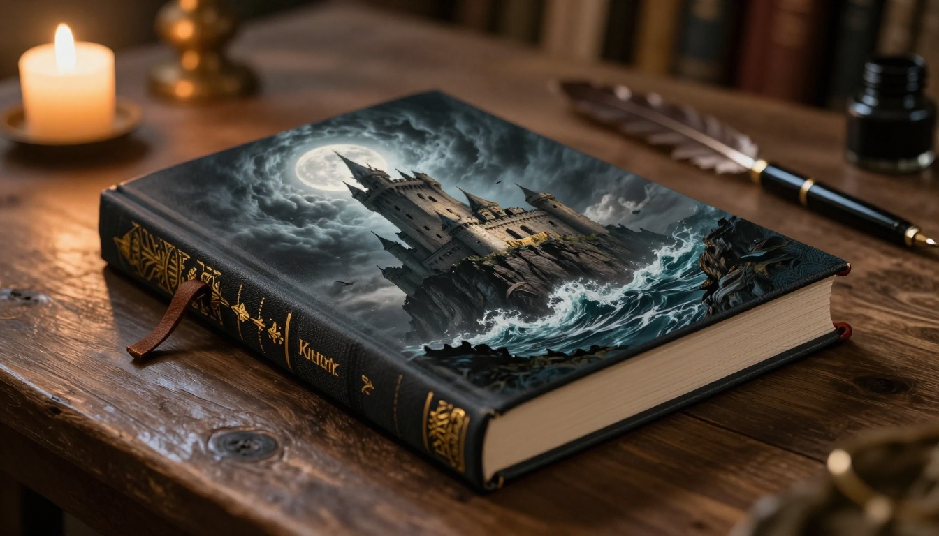
Why Book Cover Quality Actually Sells Books
The data on this is not subtle. In multiple reader behavior studies, cover design is the single largest factor in whether a browser clicks on a book listing. A weak cover signals a weak book, regardless of what's inside. This matters most in three situations: Amazon KDP listings where thumbnail quality drives click-through rates, BookFunnel and newsletter swaps where readers compare covers side by side, and print-on-demand where the cover has to hold up at full 6x9 physical size.
The Three-Second Rule
A cover has approximately three seconds to communicate genre, tone, and quality to a potential reader. Genre readers in particular are ruthless about this. A fantasy reader who sees a cover with murky atmosphere and inconsistent lighting skips it. A thriller reader who sees flat color gradients instead of real photographic depth skips it. FLUX.3 Max solves this at the generation stage. The model produces images with dramatic, directional light and genuine compositional weight, which is the visual language that genre readers recognize instantly as professional work.
What Covers Cost Without AI
| Approach | Cost | Turnaround | Print-Ready at 300 DPI |
|---|
| Freelance designer | $300–$1,500 | 1–3 weeks | Yes |
| Stock art plus Canva | $0–$50 | 1–2 days | Sometimes |
| Premade cover sites | $50–$200 | Immediate | Usually |
| FLUX.3 Max via AI platform | $0.01–$0.10 per image | 30–90 seconds | Yes at 4MP |
The cost difference is not the main argument. The main argument is that FLUX.3 Max at 4MP output gives you raw material that a designer can finalize for typography in Canva or Adobe InDesign at a fraction of traditional cost.
FLUX.3 Max: The Specifics That Matter for Publishing
FLUX.3 Max is the flagship model in Black Forest Labs' third-generation FLUX architecture. It operates at 4 megapixels of output resolution, which translates to approximately 2048 x 2048 pixels. That is adequate for a standard paperback cover at 300 DPI when sized correctly. The model's core advantage over earlier FLUX versions is in three areas that matter directly to publishing work.
Resolution That Actually Prints
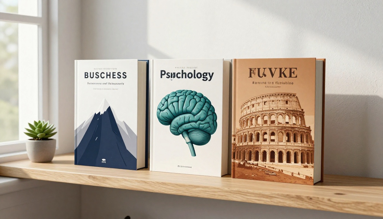
Earlier FLUX models like Flux Dev produced excellent 1MP to 2MP outputs. Functional for digital use, but borderline for 6x9 print without upscaling. FLUX.3 Max produces genuine 4MP images where the fine detail is present in the raw output, not interpolated. Cloth binding texture, hair strand definition in portrait covers, and foliage grain in landscape illustrations all hold up under zoom without visible pixelation at print sizes.
Color Accuracy for Genre Expectations
Every genre has a visual color language that readers recognize unconsciously. Fantasy covers lean toward cold blues, forest greens, and dramatic gold-hour warmth. Thrillers anchor in near-black urban tones with cold blue-white accent light. Romance sits in warm amber, soft pink, and golden hour. Children's illustrations use high chroma, pure primaries with soft edge definition. FLUX.3 Max has absorbed enough of the professional book art corpus to produce genre-accurate color temperature by default when you describe the scene correctly in your prompt.
Where It Outperforms Earlier FLUX Versions
💡 The biggest jump from FLUX.1 to FLUX.3 Max is atmospheric consistency. Older models sometimes produced light sources that did not match across the frame. FLUX.3 Max handles volumetric light, rim lighting, and shadow directionality with much greater coherence, which is exactly what genre publishing requires.
You can compare it against Flux 2 Max and Flux 2 Pro for your own workflow. Both are available on PicassoIA and represent strong alternatives depending on your specific output needs.
FLUX Model Comparison for Book Art
| Model | Best for | Output resolution | Speed |
|---|
| FLUX.3 Max | Final print-ready output | 4MP | Moderate |
| Flux 2 Max | High-res iteration and testing | 4MP | Moderate |
| Flux 2 Pro | Concept exploration, batch prompting | 2MP | Fast |
| Flux Dev | Rapid prototyping, style testing | 1MP | Very fast |
| Flux Kontext Fast | Editing existing covers, targeted changes | Variable | Fast |
Fantasy and Sci-Fi Covers: Where It Shines
Fantasy and science fiction are where FLUX.3 Max earns its reputation. Both genres demand large-scale environmental compositions with atmospheric depth: mountain ranges, space vistas, ancient ruins, storm-lit skies. These require the model to maintain spatial coherence across a wide field, something earlier diffusion models often failed at with fog consistency or inconsistent scale relationships between foreground and background elements.
Epic Landscapes and Atmospheric Lighting
The trick for fantasy covers is describing the atmosphere before the subject. Start your prompt with the sky, then work down: storm cloud structure, how light breaks through, what it illuminates, how far that light falls. A solid formula:
[Weather/sky conditions] + [Light break direction and quality] + [What the light falls on] + [Foreground in shadow] + [Camera angle and lens]
Example: "Towering storm clouds breaking over a granite cliff face, silver moonlight cutting through at 30 degrees from upper right, illuminating white marble fortress towers, dense black pine forest in shadow in the foreground, low-angle shot, 35mm lens, 8K RAW photography."
This structure gives the model a coherent light scenario to work from rather than leaving it to guess, which is what separates a professional-looking output from a generic one.
Character Portraits at Print Resolution
Character-centered covers work differently. Shift to portrait-style framing and use face-specific detail instructions. Describe skin texture, light direction on the face (Rembrandt, split, or butterfly lighting), eye color catching specific light, and clothing material texture. FLUX.3 Max handles fine facial detail reliably at 4MP, which means the portrait holds up as the dominant visual when the book thumbnail is shown at small sizes on Amazon.
💡 For character covers: Always specify where the light source is relative to the face. Without this, the model defaults to flat frontal lighting, which reads as amateur at small thumbnail sizes.
Children's Books: Illustration Quality at Scale
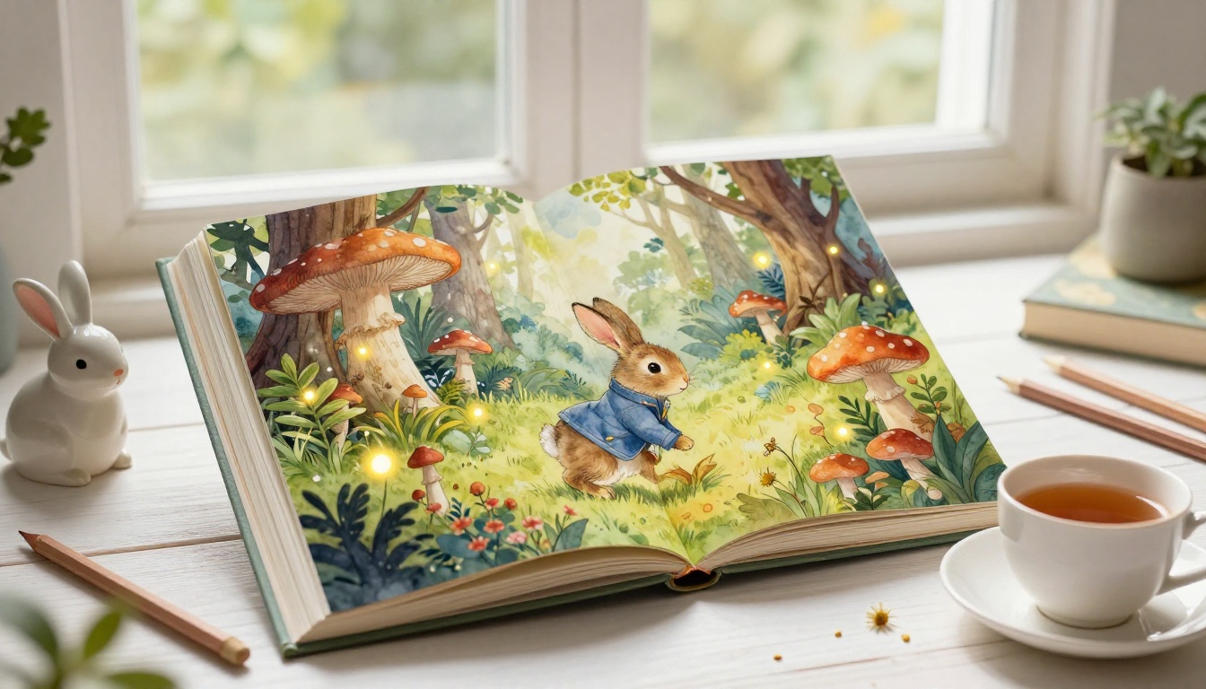
Children's illustration is a different challenge entirely. The target aesthetic is storybook warmth: soft edges, pure saturated colors, a sense of handcrafted texture under the surface. FLUX.3 Max can produce this when prompted away from its default photorealistic mode.
Watercolor and Storybook Aesthetic
The phrase to include in children's illustration prompts is the texture reference: "watercolor wash textures on soft matte paper surface, visible paper grain, gouache-style paint opacity, warm color saturation, storybook illustration quality." This pulls the model toward the correct aesthetic without forcing an obviously digital look.
For interior page illustrations, specify the framing: "full-bleed illustration suitable for a 7x7 inch children's book spread, centered composition with natural whitespace at bottom for text overlay." This gives you output that is immediately usable in InDesign or Canva without heavy cropping.
Character Consistency Across Spreads
One limitation of any single-image generator is character consistency across multiple illustrations. There are two practical approaches: use Flux Kontext Dev with reference images to maintain character appearance across generations, or establish a highly specific written character description that you paste verbatim into every prompt. The second approach is simpler but requires careful description writing. Describe everything: hair color, exact curl pattern, eye color, skin tone, clothing colors, and any distinctive accessories the character carries in every scene.
Thriller and Mystery: Dark Precision
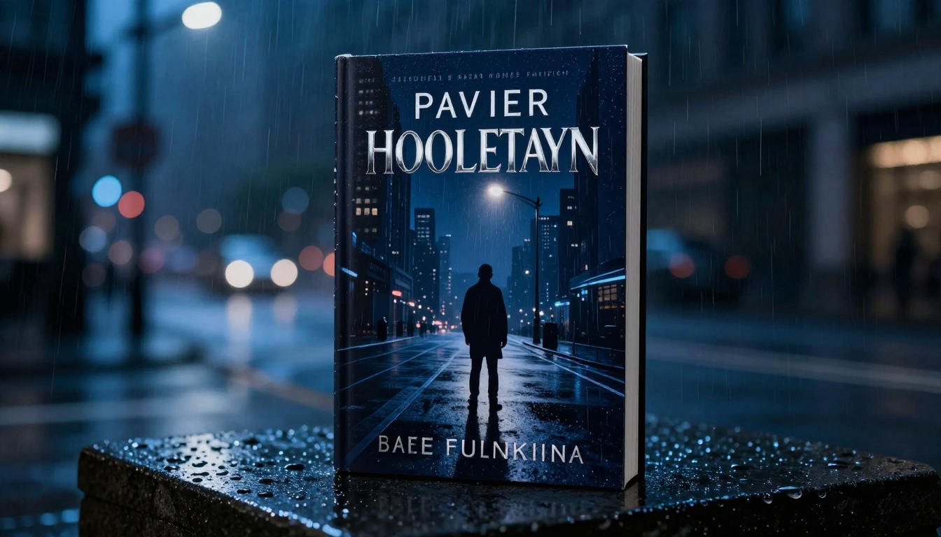
Thriller covers have very specific visual requirements. High contrast. Urban settings. Directional single-source light. Negative space for typography. A sense of scale that makes the viewer feel watched rather than safe.
Urban Nightscapes and Moody Setups
Nighttime urban environments are FLUX.3 Max's strongest thriller asset. The model handles wet pavement reflections, sodium vapor lamp color (warm amber-orange), and the deep blue of ambient urban night sky with natural quality. To produce a cover-worthy nightscape: specify the light source explicitly (streetlamp, neon sign, car headlights), describe the wet vs. dry state of surfaces, and include "rain-slicked" or "fog-diffused" for atmospheric depth. Single-source cold blue-white light against very dark surroundings reads as thriller instantly.
Typography-Ready Negative Space
Every professional thriller cover needs room for the title, author name, and often a tagline. Build negative space into your prompt deliberately: "dark sky occupying upper third of frame with no obstructions, clean dark area suitable for overlaid title text." Without this instruction, the model fills the frame edge-to-edge and you are cropping in Canva against useful visual information.
💡 Practical tip: Generate the illustration at 16:9 ratio, then crop to 2:3 (standard book cover ratio) in your design software. This gives you more visual material to work with when repositioning compositional elements.
Sci-Fi and Historical Fiction
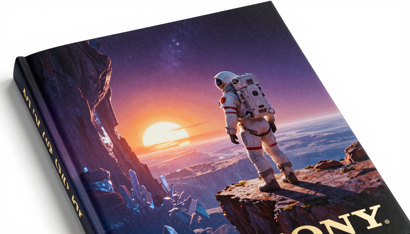
Science fiction benefits from the same epic-scale composition approach as fantasy, but the color palette shifts dramatically. Deep purples and violets, unnatural atmospheric colors, extreme contrast between illuminated and shadow regions. Historical fiction operates in a different register: warm sepia-adjacent tones, period-accurate architectural detail, soft diffused natural light consistent with pre-electric illumination.
For historical fiction covers, prompt for: "warm golden late-afternoon light consistent with 19th century natural lighting, no artificial light sources, period clothing and setting details, architectural accuracy." FLUX.3 Max produces strong period-accurate environments when the historical framing is explicitly stated in the prompt.
What differs between sci-fi and fantasy in prompting:
- Sci-fi: Emphasize alien color palettes (non-earth sky colors), extreme scale (planetary landscapes), material accuracy (spacesuit fabric, metallic hull surfaces), hard shadow edges from a single sun
- Fantasy: Emphasize atmospheric believability (consistent fog layers, organic lighting), period-accurate materials (stone, cloth, wood), weather system coherence with soft gradients
How to Use Flux 2 Max on PicassoIA for Book Art
PicassoIA makes the flagship FLUX models accessible without API setup or a developer environment. The workflow takes about five minutes from prompt to download-ready image.
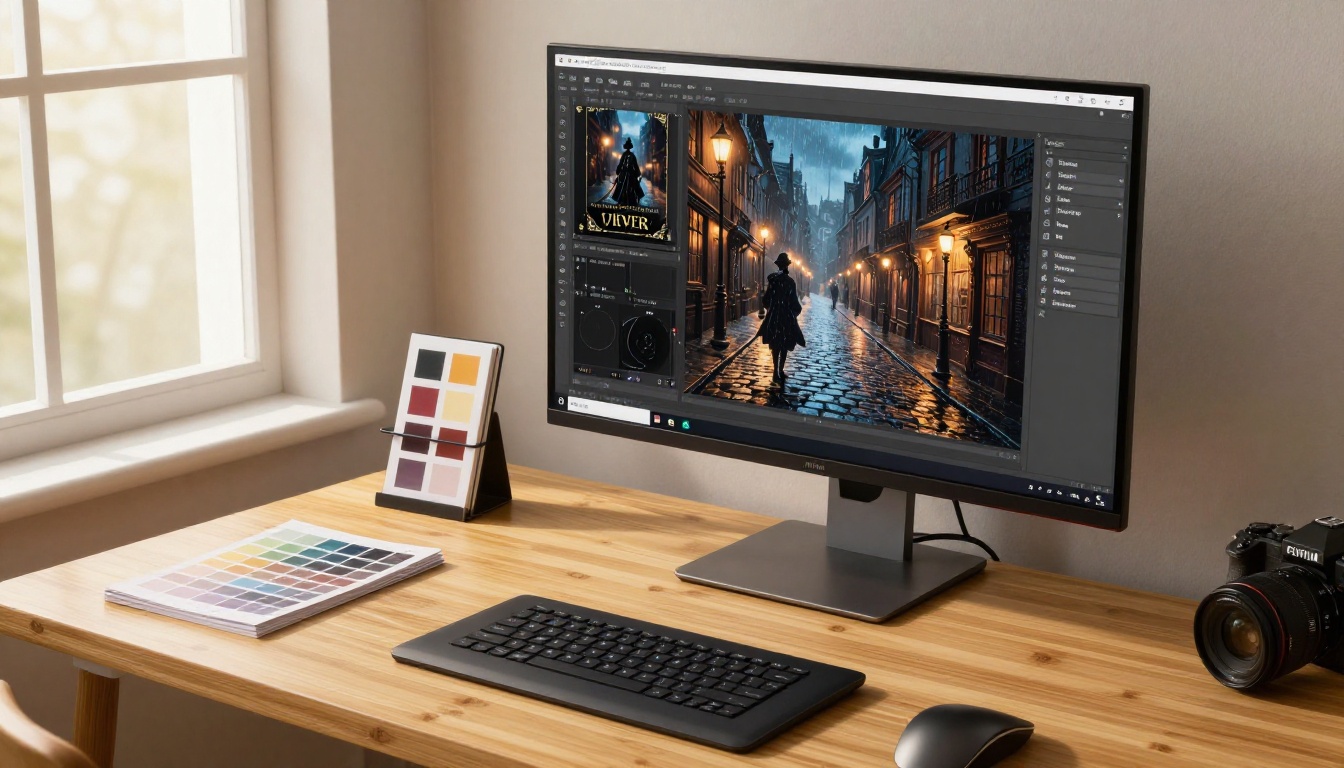
Step-by-Step for a Thriller Cover
Step 1. Go to Flux 2 Max on PicassoIA.
Step 2. Set aspect ratio to 2:3 if available, or generate at 16:9 and plan to crop. Use maximum available resolution.
Step 3. Write your prompt in three blocks: environment description, lighting description, camera and technical specs. Keep each block specific. "Rain-slicked cobblestone alley at 2am" beats "dark street at night."
Step 4. Generate and evaluate. If the light direction is off, add a correction: "single streetlamp at upper left, all other light sources removed." If there is too much visual noise in the negative space area, add: "minimal elements in upper third of frame, clean dark sky."
Step 5. Download the full-resolution output and open in Canva, Affinity Publisher, or InDesign for typography overlay.
Prompt Structures for Each Genre
| Genre | Prompt elements | Recommended light direction |
|---|
| Fantasy epic | Storm sky, mountain fortress, atmospheric fog | Cold silver moonlight from upper left |
| Thriller | Wet urban night, lone figure, negative space upper third | Warm sodium lamp from below-left |
| Children's | Woodland scene, animal character, watercolor textures | Soft diffused morning light |
| Romance | Golden hour landscape, couple silhouette, warm amber saturation | Warm late afternoon from right |
| Sci-fi | Alien horizon, twin suns, crystalline terrain, spacesuit detail | Hard high-contrast from one sun |
| Historical | Period architecture, muted warm palette | Diffused afternoon, pre-electric era |
You can also use Flux 2 Pro for batch iteration across multiple concepts, or Flux Kontext Fast when you need to make targeted edits to a near-final cover composition without regenerating the entire image from scratch.
Romance, Botanical, and Non-Fiction Illustration
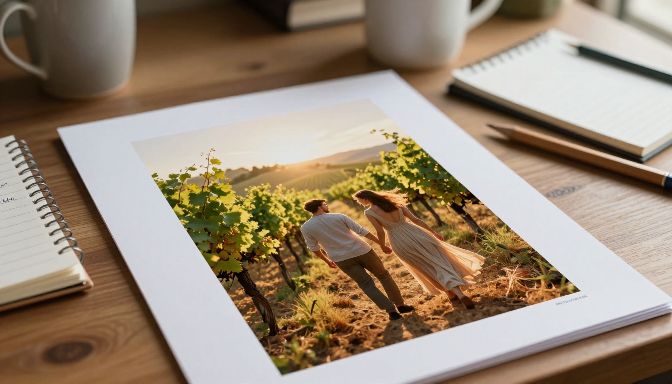
Romance covers follow specific visual conventions that genre readers have sharp pattern recognition for. Warm lighting. Intimate composition. Frequently featuring landscapes or close character details rather than full faces, which can trigger uncanny valley reactions at low resolutions. The Tuscan vineyard, the coastal cliffside, the rain-slicked London street. FLUX.3 Max handles all of these with natural cinematic warmth when you prompt it toward golden-hour color temperature and specify the emotional atmosphere alongside the physical scene.
Non-fiction covers work better with editorial illustration: clean geometric compositions, single dominant visual metaphor, strong contrast between the illustration and clean background areas where the title and subtitle sit. Recraft v4.1 Pro is worth comparing here for business and design non-fiction, as it handles precise geometric illustration with different strengths than FLUX for that category specifically.
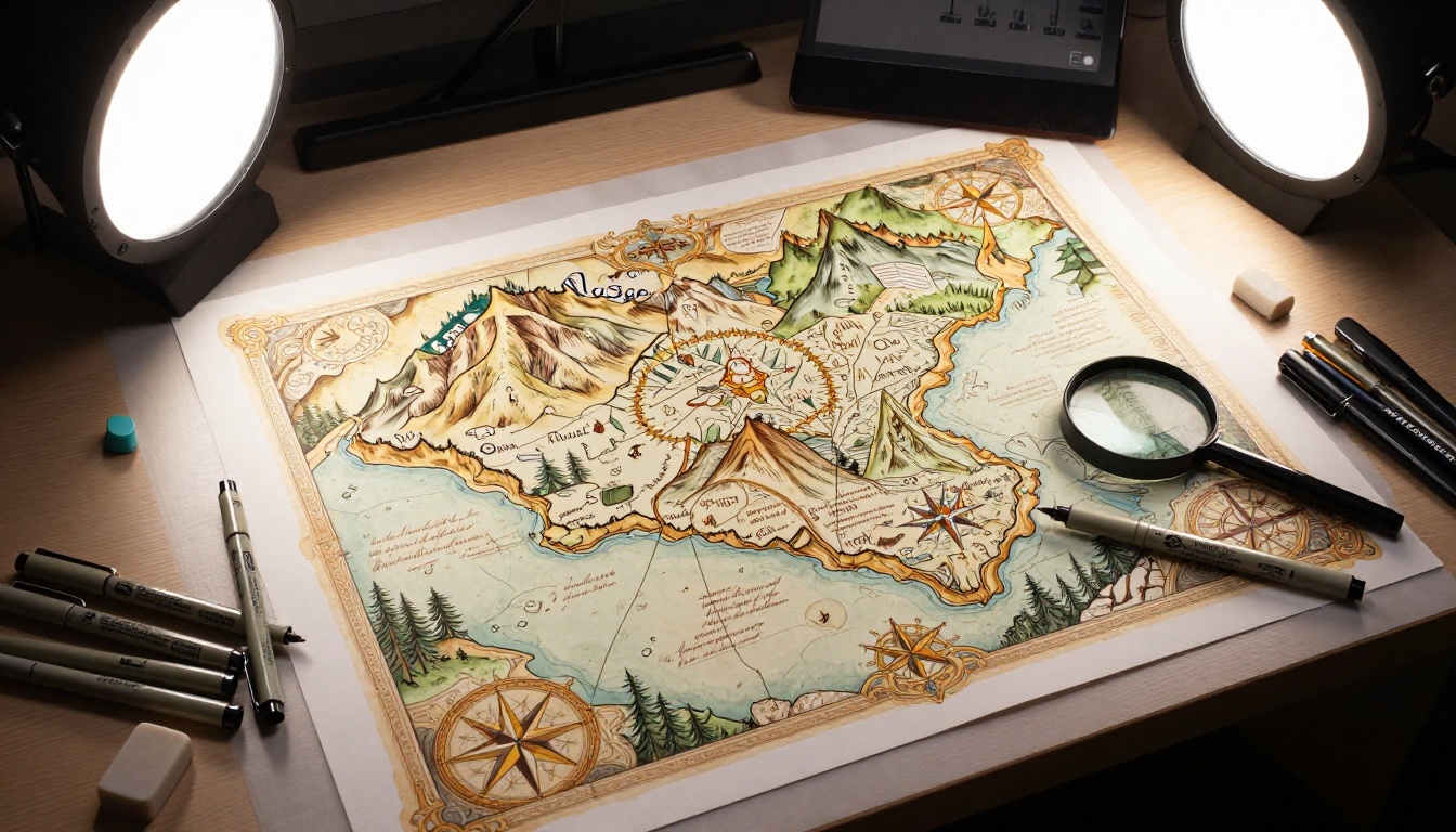
For illustrated non-fiction (field guides, travel books, history titles), the fantasy map approach produces strong results. A detailed illustrated map as a cover generates better click interest than a stock photograph because it signals to the reader that this book is specialized and hand-crafted. Prompt for: "detailed hand-illustrated map with ornate cartographic details, compass rose, mountain range glyphs, calligraphy place names, warm parchment color palette, period-accurate cartography style." This prompt reliably produces covers that stand out in a category dominated by stock photography.
What FLUX.3 Max Cannot Do (and What to Use Instead)
FLUX.3 Max is not a typography tool. It generates text within images poorly and inconsistently. Never attempt to embed your actual book title in the image generation prompt. Generate the artwork first, then overlay your title, subtitle, and author name in your design software using proper typography.
It also does not guarantee character consistency across separate generation runs. For series covers where you need the same protagonist appearing across five or more books, Flux Kontext Dev with reference images or Flux Fill Pro for targeted inpainting gives you better control over maintaining visual continuity across a series.
For interior spot illustrations in children's books or non-fiction, consider iterating with Flux 2 Dev for variation-heavy iteration at lower cost per generation, then finalizing with FLUX.3 Max for print-ready resolution on the pieces you choose to use.
Three limitations and their solutions:
- Text in image: Generate without text, add typography in Canva or InDesign after
- Character consistency: Use Flux Kontext Dev with a reference image for series work
- Aspect ratio: Generate at 16:9, crop to 2:3 (standard book cover ratio) in design software
Start Creating Your Own Book Art Today
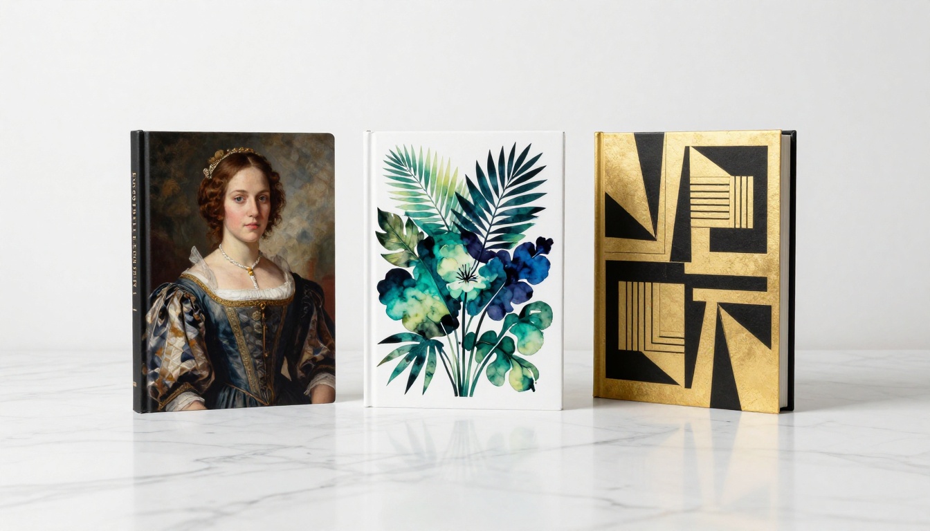
The barrier between having a manuscript and having a professional-looking published book used to be a $1,000 design invoice and two weeks of waiting. That barrier is gone. Every model discussed in this article is available on PicassoIA right now: Flux 2 Max, Flux 2 Pro, Flux Kontext Fast, Flux Dev, Flux Kontext Dev, and Flux Fill Pro for editing and inpainting. Start with your genre. Write a prompt that describes the scene, the light direction, and the camera angle. Generate, iterate, and download. You have 91 image generation models available on the platform to work with. Browse all of them at picassoia.com/en/all-models to find the exact aesthetic your book art needs.


