GPT Image 1.5 showed up quietly in early 2025, but the children's book community noticed fast. Authors who had been paying professional illustrators $3,000 to $15,000 per project started generating full spreads in seconds. The results were not always perfect, but they were often startling: warm, coherent scenes with the kind of soft color relationships you associate with award-winning picture books.
This article breaks down what GPT Image 1.5 actually does well for storybook illustration, where it frustrates you, and how platforms like PicassoIA give you access to multiple specialized models to fill in the gaps.
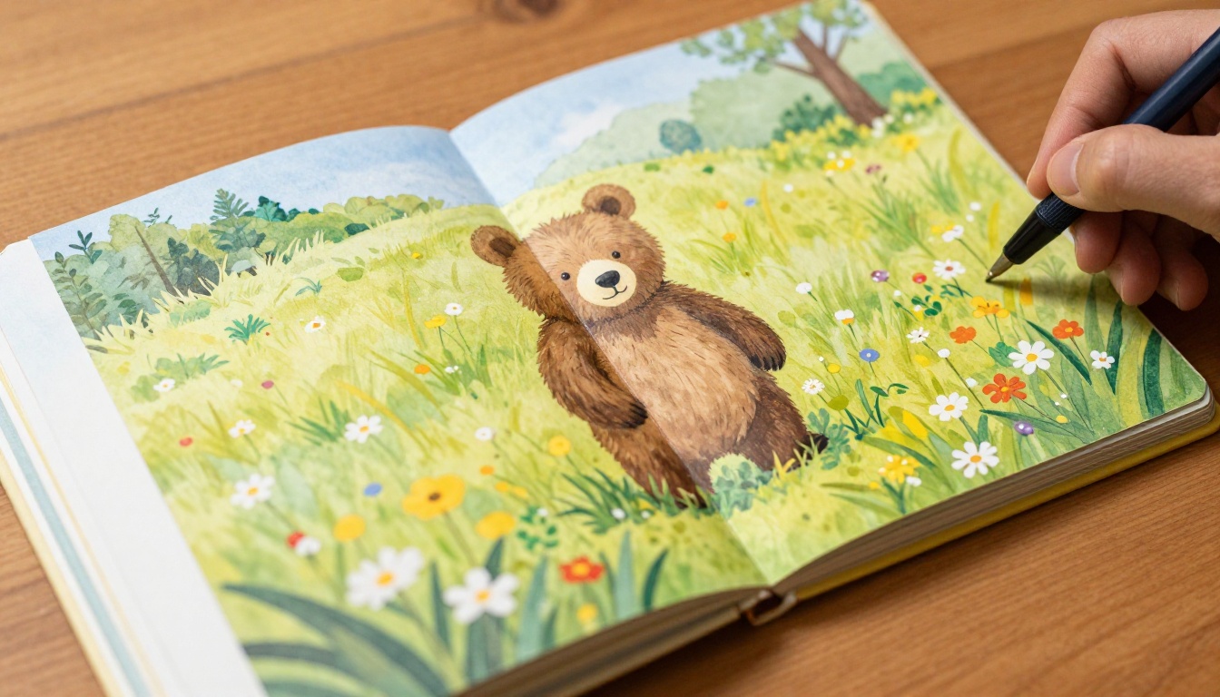
What GPT Image 1.5 Actually Does
GPT Image 1.5 is OpenAI's second-generation multimodal image model, released as part of the GPT-4o ecosystem. Unlike DALL-E 3, which was bolted onto ChatGPT as a separate pipeline, GPT Image 1.5 is natively integrated into the model's vision and language processing. That matters for illustrated content because you can describe a scene in detail and the model actually reads the whole description rather than summarizing it into simpler visual instructions.
How It Differs from Earlier AI Image Tools
The biggest functional difference between GPT Image 1.5 and models like DALL-E 2 or early Stable Diffusion versions is semantic coherence. Older models produced visually impressive images that often failed at relational logic: a fox "carrying" a basket would sometimes be standing near a basket, or the basket would be floating. GPT Image 1.5 handles spatial relationships, scale, and object interaction far more reliably.
For children's books, this is not a minor improvement. A spread where a small mouse hands a wrapped gift to a larger owl needs both animals to be the right size relative to each other, in the right position, with the gift clearly being passed between them. That kind of scene used to take multiple regenerations and heavy prompt engineering. GPT Image 1.5 gets it right on the first or second try most of the time.
💡 Pro tip: When writing prompts for GPT Image 1.5, describe spatial relationships explicitly. Instead of "a rabbit near a tree," write "a rabbit standing at the base of a tall oak tree, looking up at a nest in the branches above."
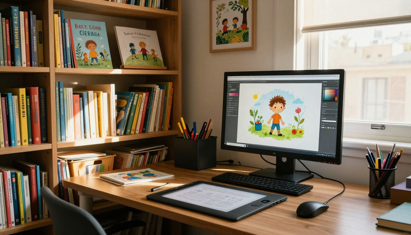
The Native Editing and Consistency Features
GPT Image 1.5 introduced a proper edit mode that lets you upload an existing image and modify specific regions via text. For children's books, this is useful for changing background elements between spreads while keeping character appearance consistent. You can describe a scene, generate it, then use edit mode to shift the setting from "forest" to "beach" without regenerating the character from scratch.
This is not perfect, but it is meaningfully better than anything the previous generation of tools offered for iterative book creation.
Why Children's Books Are a Perfect Test Case
Picture books sit at the intersection of the most demanding visual requirements. They need:
- Consistent characters across 10 to 30 pages
- Controlled color palettes that feel deliberate and cohesive
- Simple, readable compositions that work at small print sizes
- Emotional expressiveness in character faces
- Scene variety without breaking visual continuity
Most AI image models fail on at least two of these. What makes GPT Image 1.5 interesting is that it handles emotional expressiveness and scene composition reliably, which were the hardest problems for older models.
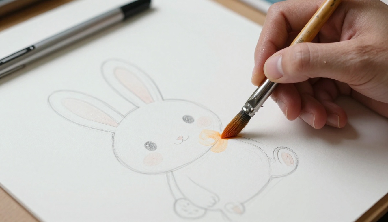
The Specific Demands of Picture Book Art
A typical 32-page picture book might show the same fox character in 20 different scenes: at home, in a forest, at a market, in a storm. The fox needs to look like the same fox on every page. Its fur color, eye shape, body proportions, and clothing (if it wears any) must stay locked across images generated at different times with different scene descriptions.
GPT Image 1.5 improves on this with its reference image input. You can generate a character sheet showing multiple poses of the same character, then reference that sheet in subsequent generation prompts. The consistency is not pixel-perfect, but it is close enough for most self-publishing workflows where a human artist does final cleanup.
Color Palette and Mood Consistency
GPT Image 1.5 responds unusually well to color direction. Phrases like "muted earth tones: sage green, burnt sienna, warm cream" or "pastel palette: soft lavender, blush pink, sky blue" produce results that actually match the description. This is more reliable than most competing models, which treat color instructions as suggestions rather than constraints.
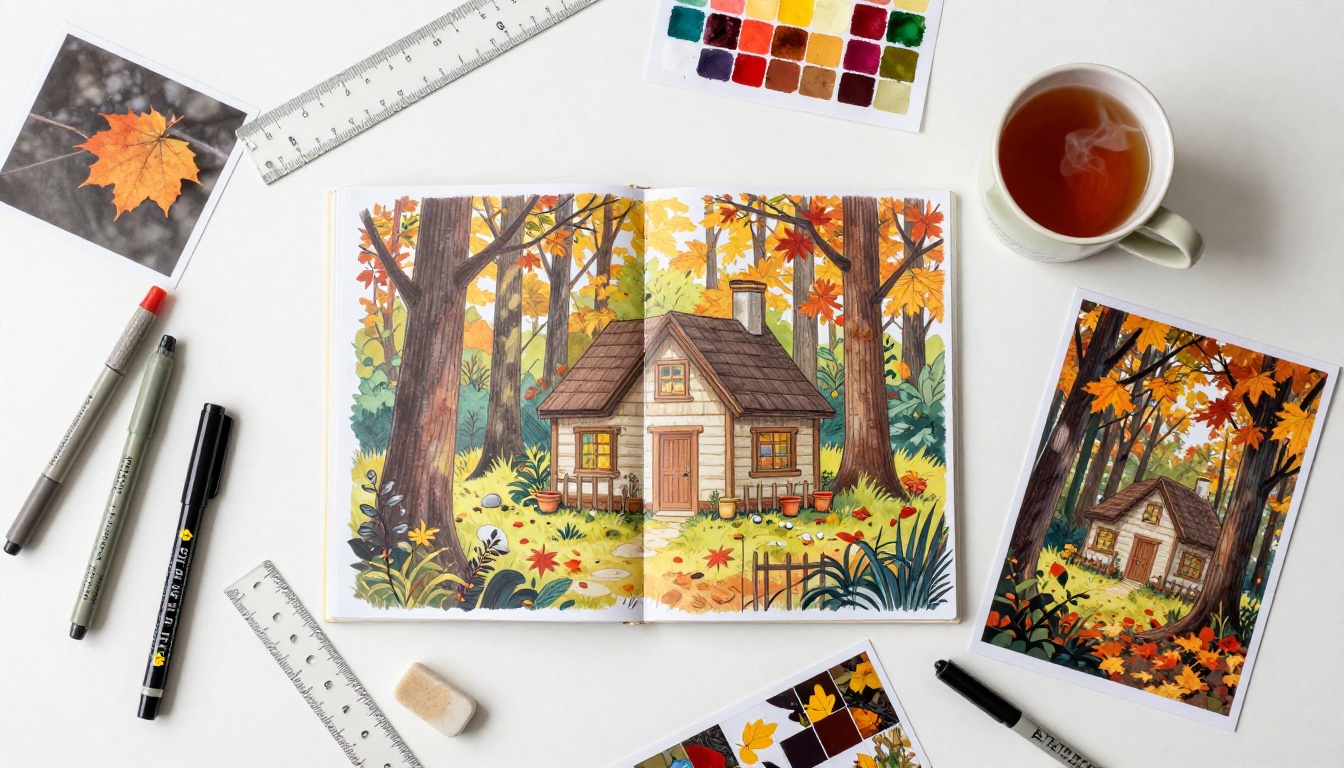
Illustration Styles GPT Image 1.5 Handles Well
Watercolor and Soft Pastel Looks
The watercolor aesthetic is arguably where GPT Image 1.5 performs best for children's books. It reliably produces soft edges, visible paper texture, gentle color bleeding, and the organic unevenness that makes watercolor feel handmade. A prompt like "watercolor illustration of a small hedgehog sheltering under a mushroom cap in light rain, soft sage green and warm amber tones, visible paper grain, loose brushwork" typically produces results that look publishable without further processing.
Specifying the paper texture and the brushwork quality explicitly is what separates a generic result from something that feels printed. Without those cues, the model may produce a cleaner digital look that lacks the warmth children's books require.
Flat Design and Bold Outlines
Flat design for children's books, think bold outlines, solid fills, and simplified shapes, is another strength. This style aligns with how the model was trained on a vast range of published illustration, much of which includes Scandinavian picture book aesthetics and contemporary board book design.
💡 Useful prompt structure: "Flat vector-style illustration [subject], [setting], bold black outline 3pt weight, [color palette], minimal shadow, clean fill, [mood/atmosphere]"
Detailed Scene Compositions
GPT Image 1.5 handles complex scenes with multiple characters and environmental elements better than most models. A spread showing a busy village market with six different animal characters, each doing something distinct, produces coherent results where older models would produce visual chaos.
The practical limit is roughly four to five distinct character actions in a single frame. Beyond that, the model starts to blur activities and misplace characters.
Where GPT Image 1.5 Falls Short
Character Consistency Across Pages
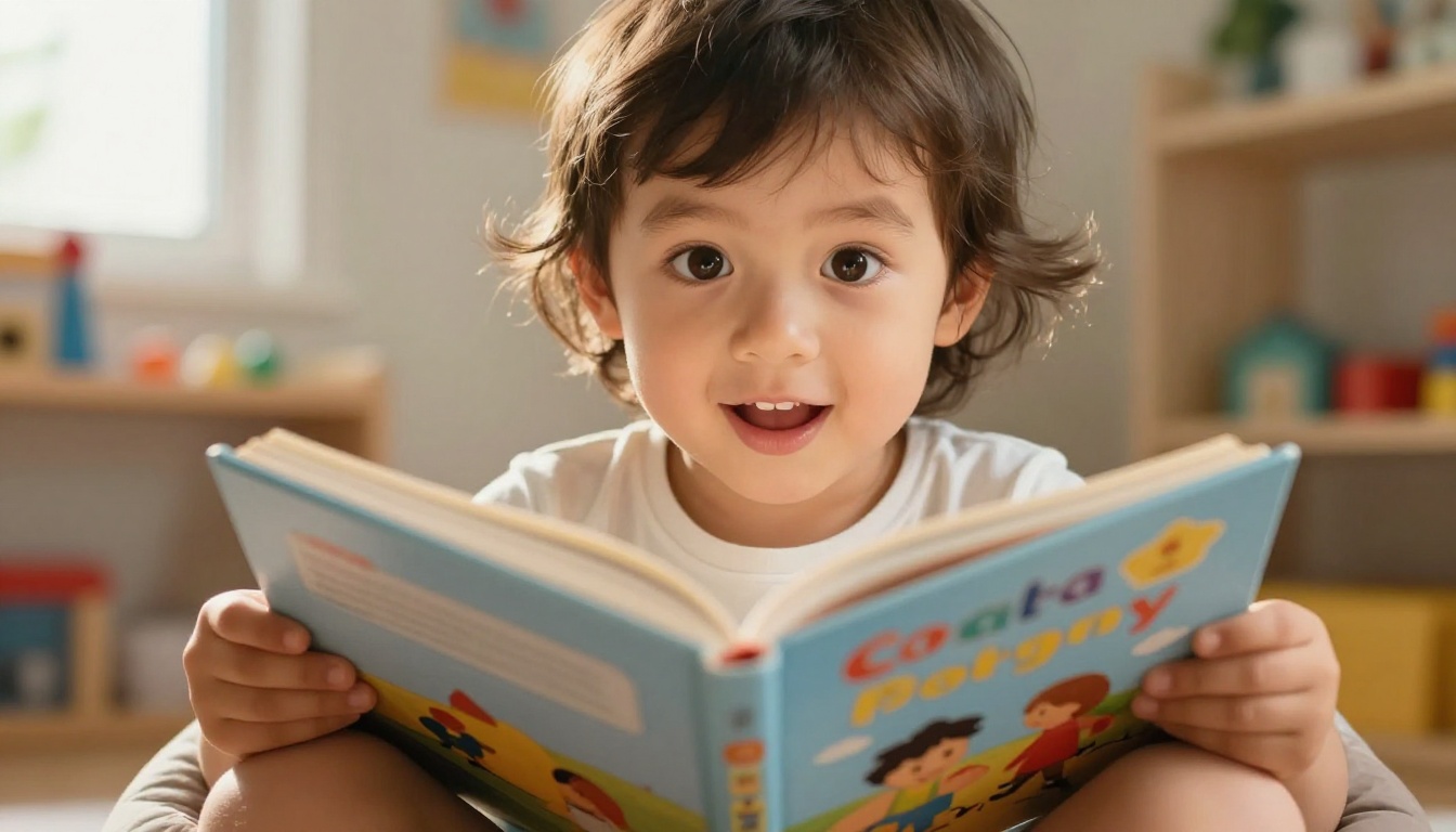
This remains the hardest problem in any AI illustration workflow. Even with reference images, GPT Image 1.5 will drift on character details across a full book. The fox's ear shape might shift subtly. The owl's eye color might change between spreads. These inconsistencies are tolerable in a rough draft but require artist correction before publication.
The practical workflow most self-publishers follow:
- Generate 20 to 30 candidate images
- Select the best 15 to 20
- Pass them to a human illustrator or use edit tools to normalize inconsistencies
- Apply super-resolution upscaling before print
For that last step, tools like Clarity Pro Upscaler and Image Upscale by Topaz Labs on PicassoIA produce sharp, high-resolution output without the artifacts that degrade print quality.
Text Rendering in Illustrations
This is a known weakness. GPT Image 1.5 is significantly better at text than DALL-E 3 was, but it still struggles with text longer than a few words embedded inside an illustration. If your storybook design places story text inside the illustration rather than on separate white areas, you will get garbled letters, merged characters, and inconsistent fonts.
The solution is to generate text-free illustrations and typeset the story copy in design software like Canva, Adobe InDesign, or Affinity Publisher after the fact.
Style Lock-in and Variation Limits
GPT Image 1.5 tends to converge on a particular visual interpretation of a style and resist deviating from it significantly within a single project. If your first 10 images all look like a certain kind of digital watercolor, the model is likely to keep producing that look even when you adjust the prompt. This is often useful for consistency, but it can be frustrating if you realize mid-project that you want a slightly different feel.
Breaking out of a style lock requires regenerating from a fresh session with substantially different prompt language.
How to Use P-Image on PicassoIA for Children's Book Art
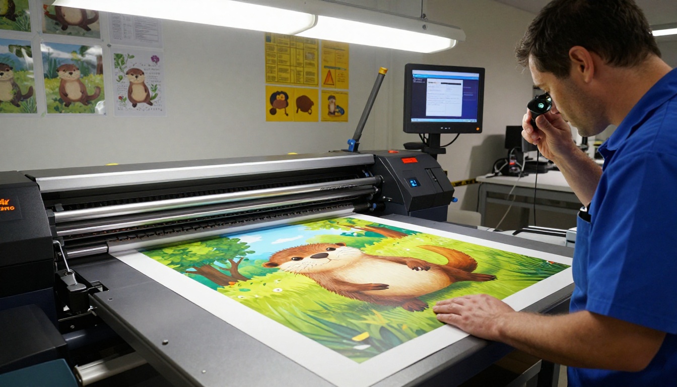
P-Image is one of the fastest text-to-image models on PicassoIA, generating a finished image in under one second with no generation limits. For children's book workflows, that speed matters: you can iterate through dozens of scene variations in the time it would take most models to produce three or four.
Setting Up Your First Storybook Prompt
P-Image responds well to structured prompts that front-load the most important visual information:
Prompt structure that works:
[Character description with specific traits] + [Action and emotion] + [Setting with light source] + [Style and palette] + [Technical specs]
Example:
"A small brown rabbit with oversized floppy ears and a red knitted sweater, sitting cross-legged on a mossy rock, reading a tiny open book with a focused expression. Dappled morning light through autumn oak leaves above. Warm amber and burnt orange palette. Children's book watercolor style, soft edges, visible brush texture. 16:9."
Getting Consistent Characters Across Scenes
The most reliable consistency method on PicassoIA involves using P-Image's seed parameter. Set a seed value for your first successful character image and record it. When generating subsequent scenes, the seed does not guarantee an identical character, but combined with a detailed character description in the prompt, it significantly narrows the variation range.
For critical consistency, such as the title page and frontispiece, use Seedream 5 Pro's multi-reference input. Upload two or three of your best P-Image results showing the same character, then prompt Seedream 5 Pro to generate a new scene using those as references. The model blends across the references to maintain visual coherence.
Upscaling and Finishing with Super Resolution
Children's books require high-resolution files for print, typically 300 DPI at the final printed size. An AI-generated image at standard output resolution will not meet print spec without upscaling. PicassoIA's super-resolution tools solve this cleanly:
Flux Dev and Seedream 5 Pro for Storybook Styles
When to Use Flux Dev
Flux Dev is a 12-billion parameter model with excellent prompt adherence, making it reliable for scenes that need precise compositional control. For children's books, Flux Dev excels at:
- Flat design aesthetics with clean fills and bold shapes
- Architectural environments: houses, castles, tree homes
- Crowd scenes where multiple characters must be spatially organized
- Title page illustrations where compositional precision matters above all
Its img2img mode is particularly useful for refinement: generate a rough version with P-Image, then feed it into Flux Dev to tighten the composition while keeping the general layout intact.
Why Seedream 5 Pro Excels at Color
Seedream 5 Pro produces 2K resolution images with exceptional color saturation and tonal range. For children's books where color is a primary storytelling tool, the difference is visible immediately. Seedream's multi-reference input (up to 10 images) also makes it the strongest option for character consistency workflows.
Its long prompt support, up to 4,000 characters, means you can write detailed lighting and mood descriptions without the model truncating your instructions midway.
💡 When to pick which model:
Prompt Writing for Children's Book Art
The Formula That Works
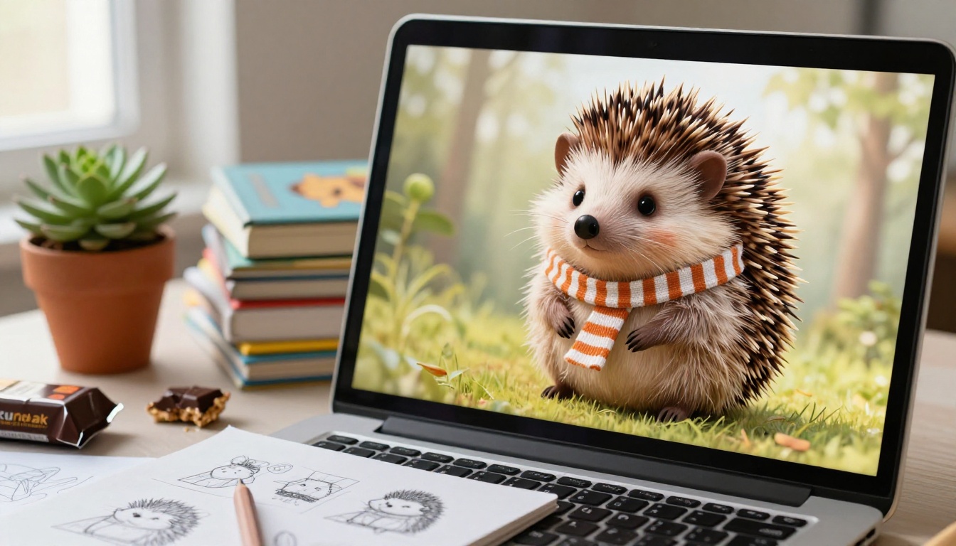
After testing hundreds of prompts across GPT Image 1.5 and PicassoIA models, the following structure produces the most consistent results for picture book illustration:
Part 1 - Character anchor (always lead with this):
"[Animal/character type] with [3-4 specific physical traits], [clothing if any], [emotional expression]"
Part 2 - Action and setting:
"[Verb phrase describing what character is doing] in/at [setting with one or two environmental details]"
Part 3 - Light and atmosphere:
"[Light source direction and quality], [time of day], [weather if relevant], [mood word]"
Part 4 - Style specifications:
"[Illustration style], [palette], [texture notes], [aspect ratio]"
Keep Part 1 identical across every spread in your book. This repetition of character descriptors is the most reliable substitute for a true character-locking mechanism.
Common Mistakes and How to Fix Them
| Mistake | What Happens | Fix |
|---|
| Vague character description | Different-looking character each time | Add 4+ specific physical traits |
| Style mixed with action | Incoherent visual result | Separate style and content in prompt |
| Skipping light direction | Flat, lifeless images | Always specify light source position |
| No palette constraint | Colors shift across spreads | Name 3-4 specific colors per prompt |
| Requesting 5+ activities | Characters blur together | Cap at 3 actions per scene |
Your Storybook Starts Here
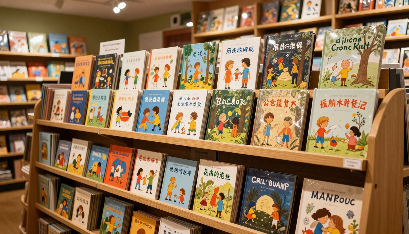
GPT Image 1.5 lowered the barrier for picture book creation in a way that matters. A first-time author can now generate a full set of draft illustrations in an afternoon, test three different visual styles before committing, and arrive at editorial meetings with something that looks like a real book.
But no single model does everything a children's book needs. The practical workflow is a combination: fast iteration with P-Image, color and resolution work with Seedream 5 Pro, compositional precision with Flux Dev, and print-ready files via Clarity Pro Upscaler or Topaz Image Upscale.
PicassoIA puts all of these tools in one place. Whether you are drafting your first picture book or producing a series, you can try each model directly and build the workflow that fits your project. Start with your character concept, write your first prompt, and see what comes back. The tools are ready when you are at picassoia.com/en/all-models.


