Small text inside an AI-generated image has been a known problem since the first diffusion models shipped. Ask any model to put six words of fine print at the bottom of a poster, and you get cursive-looking soup that no one can read. But Nano Banana Pro changed that. Google built this model to handle typography at every scale, from headline-sized display text down to the kind of fine-detail captions that most models simply smear into noise. This article breaks down exactly why it works, how to use it inside PicassoIA, and where it beats competing models for text-critical generation tasks.
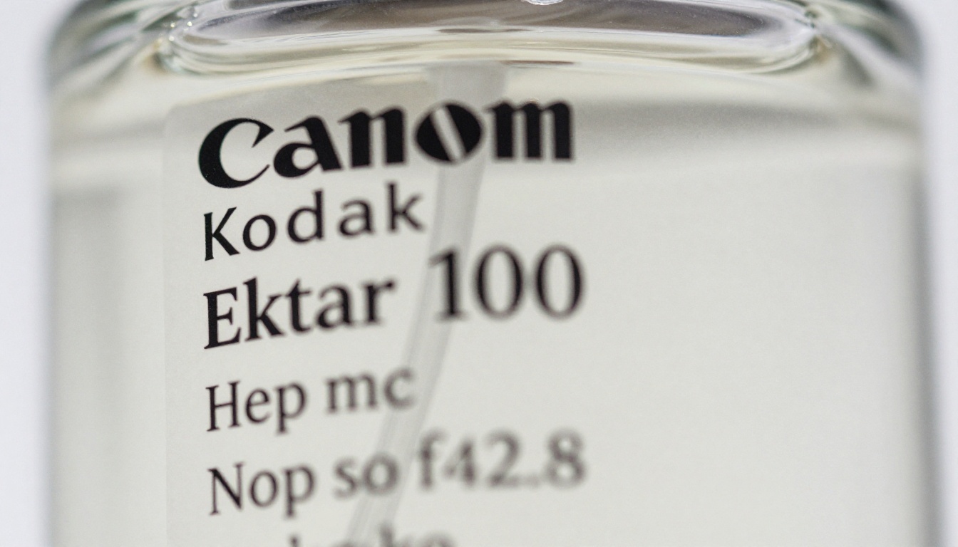
The Text Problem Nobody Solved Until Now
Why AI Models Mangle Letters
Most image generation models work by progressively denoising a grid of pixels. That process is excellent at absorbing the statistical patterns of natural images: the way light falls, the roughness of skin, the bokeh behind a shallow-depth-of-field portrait. It is genuinely terrible at absorbing discrete, rule-based systems like written language.
Typography requires something diffusion alone cannot give you: every character must match an exact template. An "a" is not approximately an "a". It either matches the glyph or it does not. Diffusion models see text in training images as a visual texture, not as a structured symbol system. The result is that most models reproduce the visual impression of text without reproducing the actual characters. Letters bleed into each other. Curves close in the wrong direction. Words become legible from a distance and total gibberish up close.
This issue gets worse as the text gets smaller. At large display sizes, the model has more pixels per character to work with, so glyphs can be closer to correct even when rendered with noise. At 8-point captions in a 1024-pixel-wide image, each character occupies perhaps 12 pixels of width. There is almost no room to absorb the randomness that diffusion adds, and the text collapses into abstract marks.
What Changes When the Text Is Small
The pixel-budget problem is only half the story. The other half is training signal density. During training, small text appears in many images, but it appears at low resolution inside those images. The training signal for small glyphs is sparse, low-contrast, and frequently compressed by JPEG artifacts in the training data. The model never gets a clean, high-resolution example of fine print to draw from.
The result is a compounding failure: low pixel budget at generation time plus weak training signal means small text is effectively invisible to the quality-control mechanisms inside most models.
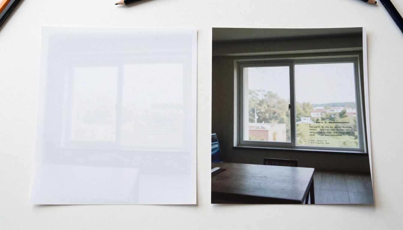
Nano Banana Pro's Approach
How It Handles Characters at Small Scale
Nano Banana Pro is built on Google's architecture, which approaches the text rendering challenge differently from pure diffusion models. Rather than relying solely on the pixel-denoising pipeline to produce correct characters, it incorporates a structured token representation that keeps glyphs consistent across the generation process.
In practical terms: the model knows that when you write "Use by 2026" in your prompt, those specific characters should appear in the output. It does not simply try to reproduce the visual texture of text and hope the right letters emerge. It has a representation layer that enforces character identity before the final rendering pass smooths the result into the surrounding image.
This is why Nano Banana Pro handles small text reliably while many other models fail at it. The character identity constraint holds even when the allocated pixel space is tight. A six-character ingredient line on a product label in the lower third of a 4K image is still readable because the model never abandoned the structured glyph representation.
💡 Prompt tip: Put the exact text you want in quotes inside your prompt. Write the bottle label reads "Lavender Extract 30ml" rather than just describing a labeled bottle. This signals to the model that specific characters matter, not just the general visual impression of text.
The 4K Advantage
The "Pro" in Nano Banana Pro refers primarily to its native 4K output resolution. This matters a lot for small text. At 4K (roughly 3840 x 2160 pixels), a six-word caption at what would be an 8-point equivalent occupies roughly 50 pixels of width instead of 12. That is four times more pixel real estate per character, and the model's character identity constraint has four times more room to work with.
The practical outcome is that you can generate images with fine print at 4K and the text remains legible at 100% zoom. If you then downscale the image to 1920 x 1080, the small text is still crisp at the displayed size because you started with high native resolution rather than upscaling a blurry result.
For context, Nano Banana 2 and Nano Banana 2 Lite are faster options in the same family. They generate at lower resolutions and are better suited to images where text is not the primary concern. When precise small-scale typography is the requirement, Pro is the right choice.
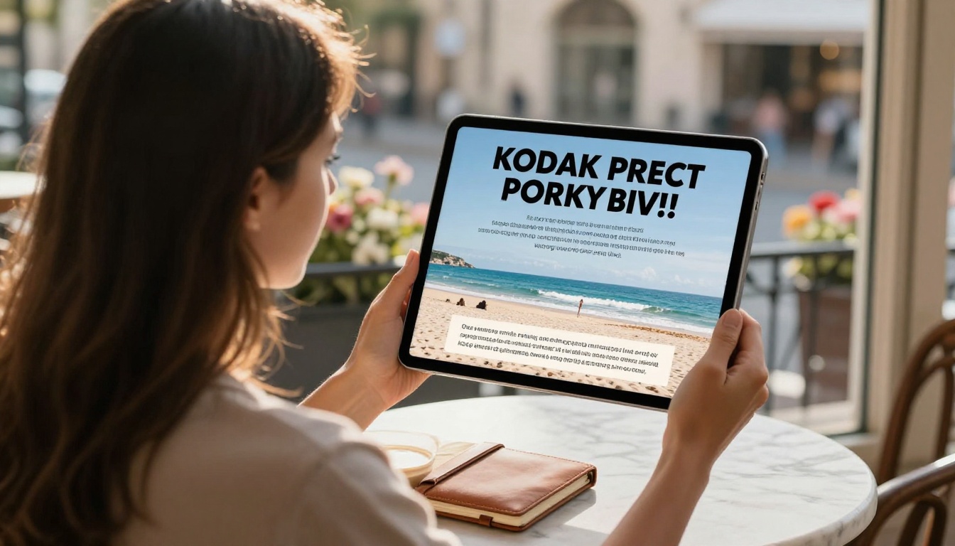
Where It Works Best
Product Labels and Packaging
Packaging photography with AI is one of the most demanding text rendering tasks in commercial content production. A label needs a product name, variant descriptor, volume, ingredients panel, legal copy, and often a certification mark. Every element at a different size, with the smallest elements being critical for compliance in some industries.
With traditional models, the approach was to generate the photography and composite the text in post using Photoshop or Figma. That works, but it adds a production step and the typography never integrates perfectly with the photographic lighting.
Nano Banana Pro generates packaging photography where the text reads as physically part of the label, responding to the same lighting as the surrounding surface. Curved label text follows the glass correctly. Embossed lettering catches highlights the same way the surrounding texture does. This is because the text is rendered into the image during generation, not composited afterward.
💡 For packaging prompts: Describe the label surface material as well as the text content. Writing matte white label with "Organic Oat Milk" in bold, "500ml" in smaller text below gives the model enough to work with. Add volumetric morning light from the left, 90mm macro lens to nail the photography style.
Social Media Graphics
Social media images with text overlays are a daily production need for brand designers. The challenge is that the text has to be readable, but it also cannot visually overwhelm the photography. Small, well-placed supporting copy at the bottom or corners of an image is where most models break down.
With Nano Banana Pro, you can generate a lifestyle photo of a coffee shop interior and ask for a two-line caption at the bottom reading "Opening October 2026" and "Reserve your table now" in small weight text, and both lines come through readable without degrading the rest of the image.
This is especially useful for batch content creation. When you need 30 variations of a promotional image, each with slightly different copy, you can generate all of them directly rather than generating 30 base images and then spending time in Figma adding text to each one.
Infographics with Fine Data Labels
Data visualization often requires thin text labels near chart elements. A bar chart showing statistics has axis labels, bar labels, and a legend, all of which tend to be small. Most AI image models are useless for generating actual infographic content because the numbers come out wrong.
Nano Banana Pro is not a data visualization tool and cannot reliably render complex charts with correct numerical data. But for conceptual infographic imagery, where the visual structure and rough text sizes matter more than the exact data values, it produces far more convincing results than other text-to-image models. The text at least looks like text.
How to Use It on PicassoIA
Writing the Right Prompt
The biggest leverage point for better text rendering in Nano Banana Pro is how you structure your prompt. The model responds well to explicit character-level instructions.
Effective prompt patterns:
- Put exact text in quotation marks:
the label says "Organic Oat Milk"
- Describe the font style and size relative to the image:
in small italic serif text, bold sans-serif headline
- Reference placement explicitly:
fine print at the bottom of the image, caption in the lower left corner
- Describe the contrast:
white text on dark background, black text on a cream label
Patterns to avoid:
- Vague text references:
with some product information written on it
- Unrealistic character counts: asking for a full paragraph of body copy at small size is more than any model handles reliably
- Conflicting type instructions: specifying both
handwritten and printed style for the same text element
Parameters Worth Adjusting
When working with Nano Banana Pro on PicassoIA, the most impactful parameter beyond the prompt is the aspect ratio. For images where text appears in specific zones (header or footer copy), a 16:9 ratio gives the model the width to spread text horizontally, which tends to produce better character separation than taller formats.
If you are generating a portrait-format image with text, the 9:16 ratio can work but you should expect to use an upscaler afterward for fine-print sections. Text elements at the narrow edges of a 9:16 portrait are the most challenging for any model.
💡 Seed control: Once you get a generation with text that reads correctly, note the seed value and use it as a starting point for variations. Character accuracy tends to stay consistent within seed-adjacent generations.
When to Run an Upscaler After
Even with Nano Banana Pro's 4K native output, some small-text use cases benefit from a dedicated upscaling pass. If you need the image at 6K or higher for large-format printing, or if a specific text element is still slightly soft at the final size, pairing with Clarity Pro Upscaler adds sharpness without introducing new rendering artifacts.
Topaz Image Upscale is the other strong option, scaling up to 6x and preserving edge detail well in text strokes. For general upscaling where text is not the primary concern, P Image Upscale is faster and covers most cases.
The sequence that works reliably: generate at 4K with Nano Banana Pro, verify text legibility at 100% zoom, then upscale if the delivery format requires it. Do not skip the 100% zoom check before upscaling, because upscaling a text failure does not fix the characters.
Model Comparison: Text Accuracy
How does Nano Banana Pro stack up against other models on PicassoIA for text rendering?
The table makes the trade-offs clear. Ideogram v4 Quality is the strongest competitor for typographic work, particularly at medium display sizes, and it is a better choice for poster-style images where type is the hero element at 18-point and above. Nano Banana Pro pulls ahead specifically when the text is small, which is the most common source of failure across the board.
Other PicassoIA Models That Work Alongside It
Ideogram for Type-Heavy Images
When your project is a typographic composition rather than photography with embedded text, Ideogram v4 Quality is worth using in parallel with Nano Banana Pro. Its headline and display text rendering is among the best available. A workflow that works well for many designers: use Ideogram for the type-dominant compositions in a campaign and Nano Banana Pro for the photography-dominant ones where text is secondary but still needs to read correctly.
Ideogram v4 Balanced covers the middle ground faster when you are doing high-volume draft generation before committing to final quality runs.
Recraft for Design System Assets
Recraft v4.1 Pro has a distinct advantage in its SVG output capability. For logos, icons, or design assets that need to be scalable rather than raster-based, Recraft handles text as vector paths rather than pixels. The small-text problem does not exist in the same way for SVG because scaling happens in the vector domain after generation. If your project requires scalable assets with text, Recraft is the tool. If your project requires high-resolution photographic images with embedded readable text, Nano Banana Pro is the better fit.
The Nano Banana Family for Speed
Not every task needs the Pro tier. Nano Banana 2 Lite generates images significantly faster and is more than adequate for medium-sized text in casual social content. Nano Banana 2 sits between Lite and Pro, offering editing and image fusion features that the Pro variant does not have. The original Nano Banana remains available for edit-and-generate workflows where you want to start from an existing image.
Think of the family as a tiered system: Lite for speed, 2 for editing flexibility, Pro for output quality and fine-text precision.
Make Your First Precision-Text Image Today
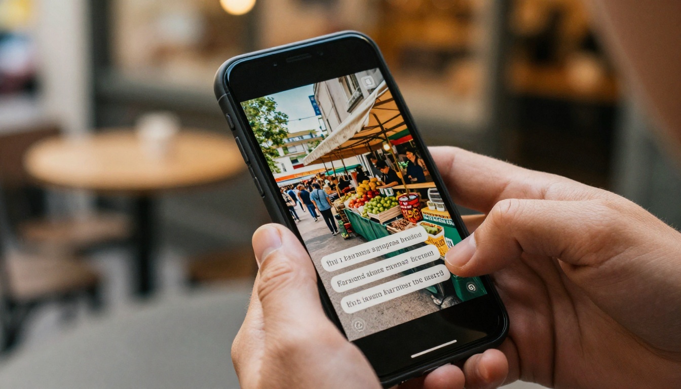
The problem of small text in AI images is not fully solved across the board, but Nano Banana Pro is the clearest improvement available right now for photographers and designers who need it. The combination of structured character representation and native 4K output means fine print stays readable without post-production compositing.
If you have been working around the text problem by adding type in design software after generation, try running the same prompt in Nano Banana Pro with the text in quotation marks first. The results are often good enough to cut that step out of your workflow entirely.
PicassoIA has the full Nano Banana family available alongside Ideogram v4 Quality, Recraft v4.1 Pro, and a growing range of upscalers including Clarity Pro Upscaler and Topaz Image Upscale for when the output needs to go to print.
Head over to picassoia.com/en/all-models to see the full catalog. Pick Nano Banana Pro, put your text in quotes, and see what it does at 4K.


