Text in AI images has been a known problem for years. Ask any diffusion model to write the word "GRAND OPENING" on a storefront sign, and you're likely to get a carnival of garbled shapes that vaguely resemble letters. Seedream 5 Pro, developed by ByteDance, is one of the few models that takes typography seriously at the architecture level. This article breaks down exactly how it handles text inside images, what it gets right, and what still trips it up.
The Text Problem Most Models Still Haven't Solved
Why Diffusion Models Struggle with Letters
Standard diffusion models learn by predicting what pixels should look like based on a prompt. They're trained on billions of natural images, most of which contain text only incidentally: a road sign in the background, a label on a shelf, a poster barely visible in a crowd. The model learns the shape of textual elements but not the underlying system of letterforms.
The result is images that look like text at arm's length but dissolve into nonsense on closer inspection. Letters merge. Characters invent themselves. Words that should read "CAFÉ DU MONDE" instead become a confident-looking string of meaningless symbols that fool the eye for exactly half a second.
This is a structural consequence of training on unstructured image data where text is incidental noise, not a primary learning signal.
The Gap Between "Looks Like Text" and "Is Text"
There is a meaningful difference between a model that produces visual noise that resembles text and one that actually renders readable, typographically correct letterforms. The first approach works at low resolution, in thumbnails, in blurred previews. The second is what print designers, content creators, and brand teams actually need.
This gap defines the battlefield where Seedream 5 Pro competes, and it is where most models quietly fail.

What Seedream 5 Pro Does Differently
Seedream 5 Pro is a 2K native-resolution model trained by ByteDance on a dataset that includes extensive typographic material in both Latin scripts and CJK (Chinese, Japanese, Korean) characters. This is where its text handling begins to diverge from the competition.
Bilingual Training at Scale
ByteDance's training pipeline exposed Seedream 5 Pro to an enormous volume of real-world text in images: product packaging, editorial layouts, digital advertising, UI screenshots, signage photography, and print designs. Crucially, CJK character rendering demands precise pixel-level accuracy in a way Latin script often forgives. A missed stroke in a Chinese character changes its meaning entirely. This rigorous requirement propagates back into how the model handles all text, including English.
The discipline required for accurate CJK rendering raises the quality bar for Latin typography as a secondary effect.
Dedicated Typography Attention Layers
Where generic image diffusion models treat text regions the same as clouds or grass, Seedream 5 Pro applies higher attention to regions the model identifies as containing structured glyphs. This does not mean it has a separate OCR engine bolted on. Rather, its internal attention mechanisms have been trained to recognize that letterforms deserve a different quality of spatial precision than organic textures.
The practical effect: when you prompt Seedream 5 Pro to include a word on a poster, the output allocates more rendering effort to that region, producing crisper edges and fewer hallucinated strokes.
Native 2K Resolution Advantage
Most models generate at 512 or 1024 pixels and then upscale. Seedream 5 Pro generates natively at 2K resolution, which matters enormously for text. At 512 pixels, a single letter might be 8 to 12 pixels wide. At that resolution, there simply are not enough pixels to represent the fine details of a serif terminal or a lowercase "g" descender. At 2K, a headline letter can be 50 to 80 pixels wide, and the model has the spatial room to render it properly.
Resolution is not the only factor, but it is a prerequisite.
Where Seedream 5 Pro's Text Shines
Posters and Event Graphics
Poster headline text is Seedream 5 Pro's strongest domain. Single-word or short-phrase headlines in bold sans-serif or slab-serif fonts render with reliable sharpness. If you prompt for a movie poster with a title like "ECLIPSE" in white block letters against a dark sky, the model delivers the kind of output that would require only minor post-processing in Photoshop, if any.
The model handles:
- All-caps headlines in bold and ultra-bold weights
- Center-aligned text blocks with consistent baseline spacing
- Single-color text on contrasting solid or gradient backgrounds
💡 Tip: Shorter text produces better results. Three words reliably render better than eight. Treat the headline as a single design element, not a sentence.

Product Labels and Packaging
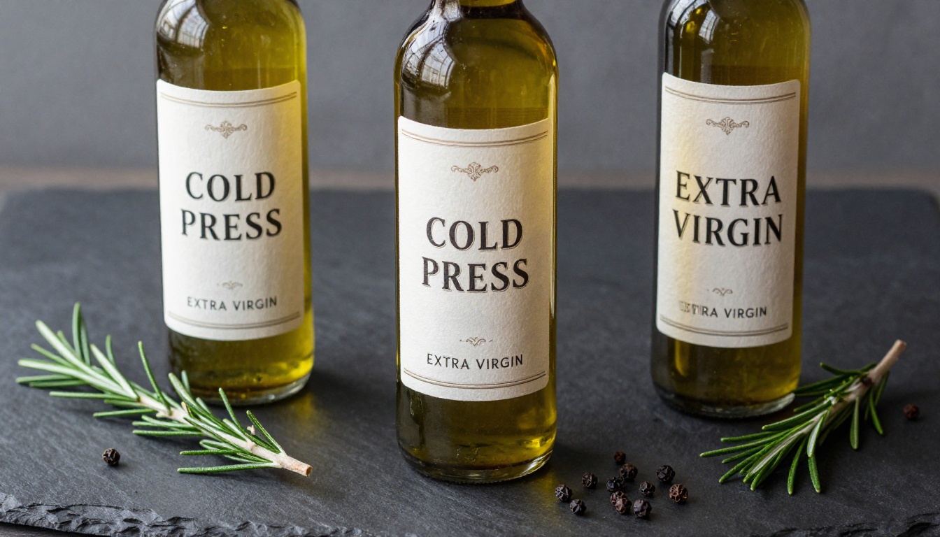
Brand name rendering on packaging is a high-stakes use case. Seedream 5 Pro handles short product names and category descriptors on labels with impressive consistency, especially when the background has sufficient contrast. Words like "COLD PRESS," "ARTISAN ROAST," or "EXTRA VIRGIN" on a product bottle render cleanly when you use the quote syntax in your prompt.
💡 Prompting tip: Put the text you want in quotes inside your prompt. Write: label reading "COLD PRESS" in an elegant serif font rather than just describing the label style. The model treats quoted text as a literal instruction.
Social Media and Thumbnail Art
Social media graphics demand text that reads at small sizes and in compressed thumbnail previews. Seedream 5 Pro produces the kind of high-contrast, bold typography that survives the thumbnail compression of YouTube or the small preview cards of Instagram Stories. The model's native 2K output means there is genuine resolution to spare when you export at 1080p.
This makes it a strong choice for content creators who need branded graphics without a dedicated design team.
Real Use Cases That Show the Difference
Billboard and Outdoor Advertising Mockups
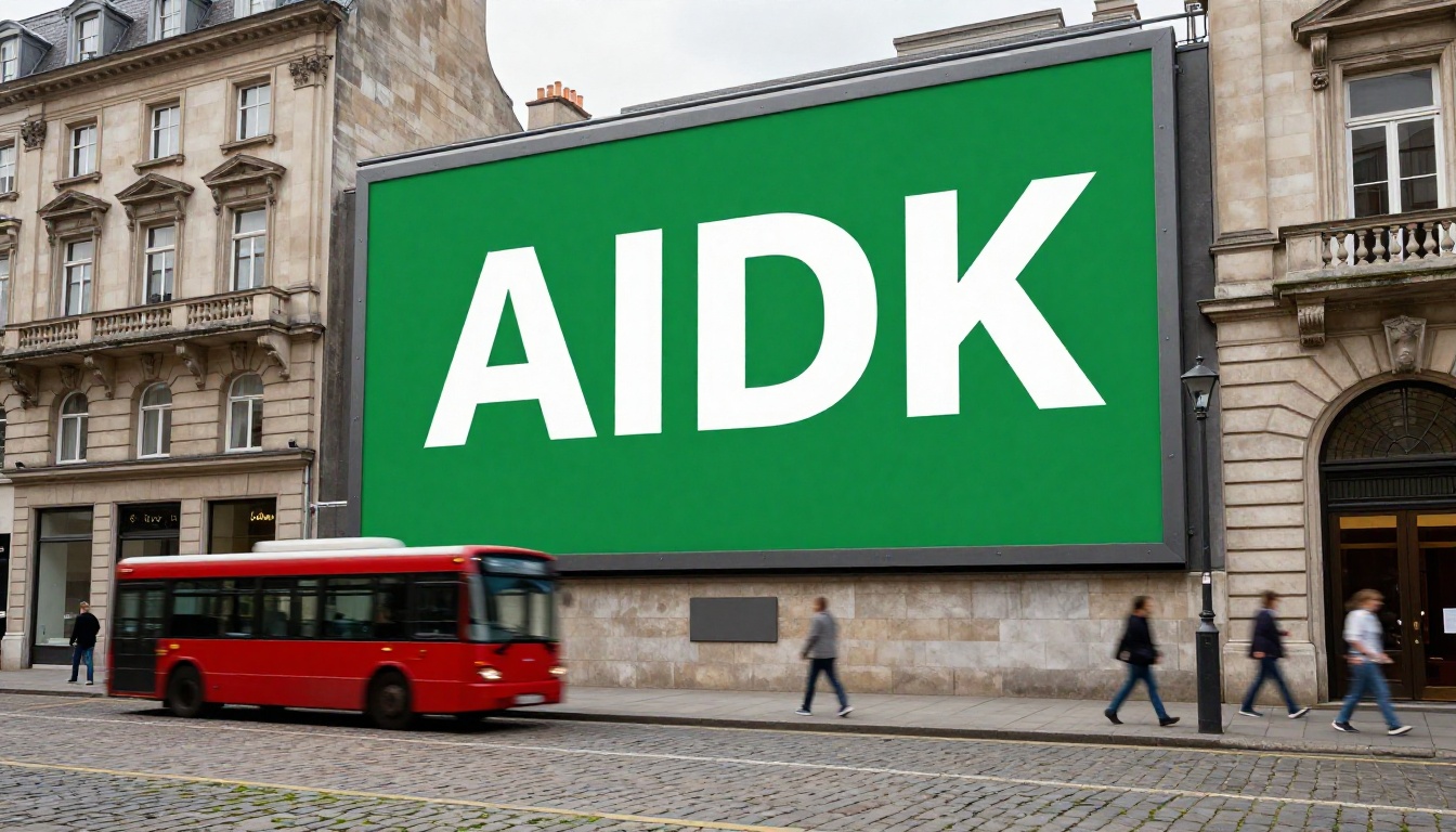
Outdoor advertising mockups are a practical test because the text has to read clearly on a physically distorted, perspective-corrected surface. Seedream 5 Pro handles billboard faces with headline text remarkably well, maintaining letter sharpness even when the billboard is photographed at an oblique angle from street level.
The model does not get confused by the perspective foreshortening the way weaker models do. The text stays legible even when the underlying plane is tilted away from the viewer.
Published Books and Editorial Design
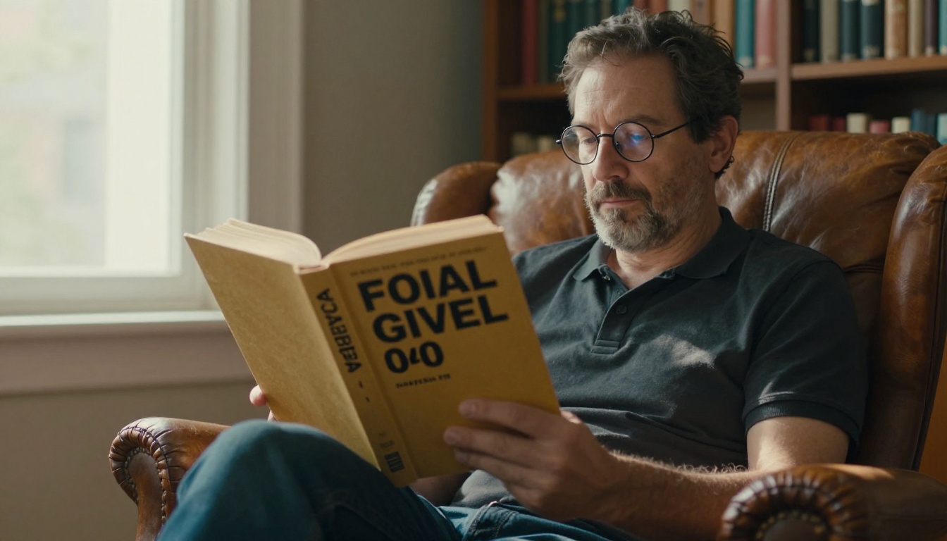
Book jacket generation is a premium use case where title typography often defines whether an image works. Seedream 5 Pro can produce images where the title sits naturally within the composition, rather than looking like a text layer pasted over a background. The integration of the typographic element into the scene is noticeably better than older models.
Short titles of one to four words perform best. Multi-line title blocks with subtitle text below are riskier but often viable when the background has strong contrast zones and the supporting type is small enough to avoid competing with the headline.
Restaurant Menus and Signage
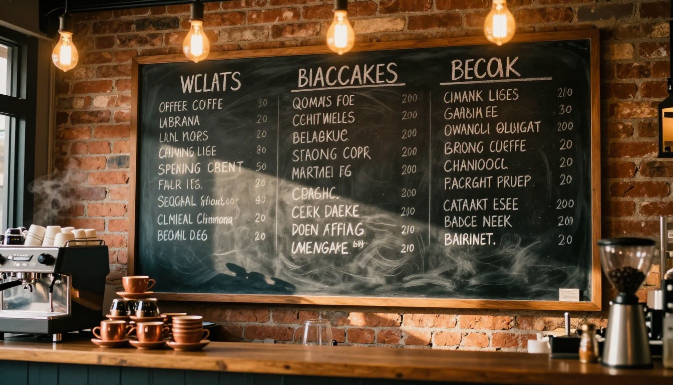
Chalkboard-style menu text in an organic, brush-script style is one of the more demanding tests because it requires the model to produce intentionally imperfect letterforms while keeping them readable. Seedream 5 Pro handles this type of atmospheric text well. The output reads as "handwritten" without dissolving into meaningless strokes, which is exactly the target for the aesthetic.
How to Use Seedream 5 Pro on PicassoIA
Seedream 5 Pro is available directly on PicassoIA. No software installation needed, no API configuration required. Here is how to get reliable text output from it.
Open the Model on PicassoIA
Go to the Seedream 5 Pro page on PicassoIA. The model runs entirely in the browser and accepts plain text prompts immediately.
Write Prompts That Produce Clean Text
Use these prompt patterns for reliable text rendering results:
- Quote the text explicitly: Include the exact text you want in quotation marks within the prompt. Example:
a poster with the words "OPEN DAILY" in bold white serif font on a black background
- Specify font style: Describe the font type (serif, sans-serif, script, condensed, bold) rather than a specific commercial font name
- Set clear contrast: Describe the relationship between text color and background. High contrast (white on dark, black on light) reliably produces cleaner results than complex color combinations
- Limit text length: Aim for one to five words of in-image text per prompt. Longer strings increase the risk of character hallucination significantly
Adjust Parameters for Best Output
| Parameter | Recommended Setting | Why |
|---|
| Aspect Ratio | 16:9 or 1:1 | Avoids awkward text cropping at unusual ratios |
| Resolution | Native 2K | Maximizes pixel budget for letterform detail |
| Prompt Upsampling | Off when text is present | Upsampler may paraphrase your quoted text, breaking the literal instruction |
💡 Avoid turning on prompt upsampling when your prompt contains quoted text. The upsampler may rewrite your intended text content, which destroys the literal instruction to the model and produces unpredictable letter output.
Comparing Seedream 5 Pro to Other Text-Capable Models
Seedream 5 Pro vs Ideogram v4
Ideogram v4 Quality and Ideogram v4 Balanced were explicitly built with text rendering as a core feature. Ideogram's text accuracy in straight typographic compositions, such as posters and cards, is marginally stronger on very long text strings and multi-line body copy. However, Seedream 5 Pro produces richer, more photorealistic image quality in the surrounding scene, making it the better choice when the image composition matters as much as the text itself.
Choose Ideogram v4 Quality when: you need long body copy in the image or precise multi-line text blocks.
Choose Seedream 5 Pro when: you need the text integrated into a photorealistic scene with depth, lighting, and atmosphere.
You can also try P Image Ideogram, a fine-tuned pipeline that blends Ideogram's text accuracy with a faster generation workflow.
| Feature | Seedream 5 Pro | Ideogram v4 Quality |
|---|
| Short headline text | Excellent | Excellent |
| Long body copy | Good | Very Good |
| Photorealistic scenes | Very Good | Good |
| Stylistic range | Wide | Moderate |
| Speed | Fast | Moderate |
Seedream 5 Pro vs Reve 2.1
Reve 2.1 is another strong text-capable model, particularly for editing existing images with text overlays. Reve excels at precise instruction-following for image modification tasks. Seedream 5 Pro has the edge in pure generative quality for new image creation with embedded text, especially in high-complexity photorealistic scenes.
When to Use Layerize Instead
Layerize is a specialized model for extracting text layers from existing graphics, not for generating new ones. If you have a logo or design asset and need to separate the typographic elements from the background, Layerize is the right tool. It is not a competitor to Seedream 5 Pro; it is a complement for post-generation workflows.
When the Text Still Breaks
Seedream 5 Pro is not a typesetting engine. There are conditions where even its strong text handling gives way to hallucination or degraded letterforms.
Long Strings of Body Copy
Multi-sentence text inside an image is genuinely hard for any diffusion model. If you prompt for an image that includes a full paragraph of readable copy, Seedream 5 Pro will produce something that has the texture of a paragraph without the content. The first sentence might be intact; by the third sentence, letters start to drift and invent themselves.
Limit in-image text to slogans, headlines, and short labels. Use design software to composite longer copy onto the image after generation.
Script and Decorative Fonts in Complex Compositions
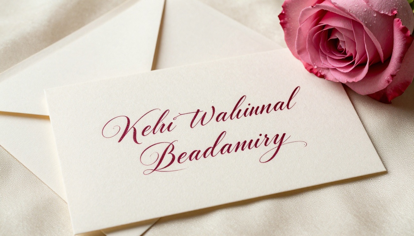
Calligraphic and decorative fonts demand more from the model's letterform representation. Wedding-invitation-style script on a plain background renders well. The same script on a busy floral pattern with soft bokeh and complex overlapping elements is a harder problem, and results become less predictable with each added layer of visual complexity.
💡 Workaround: Generate the typographic element separately against a neutral background, then composite it into the complex scene in post-production. Seedream 5 Pro's high native resolution makes clean masking significantly easier than with lower-resolution models.
Non-Latin Scripts Beyond CJK
While Seedream 5 Pro handles Chinese, Japanese, and Korean with strong reliability due to its training data, scripts outside its core training domain, such as Arabic, Devanagari, Cyrillic, and Hebrew, are less consistent. Results vary significantly by script, text length, and compositional complexity. For multilingual text rendering in non-CJK scripts, test carefully before committing to a production workflow.
Try It Yourself on PicassoIA
If you have been working around bad text rendering in AI images, using placeholder graphics or compositing text manually in post-production, Seedream 5 Pro is worth testing as a direct alternative.
Write a prompt with your text in quotes, keep the string short, set high contrast between text and background, and generate your first image. If the first result is not what you wanted, adjust the font description and contrast, then run it again. The model responds well to direct iteration.
For comparison, PicassoIA also has Seedream 4.5 available alongside the Pro version, letting you quickly benchmark both versions against each other on your specific use case without changing tools. The Pro version consistently outperforms 4.5 on text sharpness, especially at shorter text lengths where the 2K native resolution advantage is most pronounced.
For all available AI models across image generation, video, audio, and more, browse the full catalog at picassoia.com/en/all-models.


