The problem with most AI-generated images is not the subject. It is the surface. Too clean, too symmetric, too impossibly lit. Your brain registers it in about 0.3 seconds: something is off. That "off" feeling has a name, and more importantly, it has a fix.
This article walks through every layer of what makes AI art look artificial and how to push past it. From prompts to post-processing to choosing the right tools, these are practical methods that actually work.
What Actually Makes AI Art Look Fake
Before fixing anything, you need to know exactly what you are looking at when you see AI art that does not pass for real.
The Uncanny Valley in Images
The uncanny valley originally described robots that looked almost human but not quite. The same phenomenon happens with AI images. When an image is 80% realistic but missing the random, chaotic imperfections of reality, your visual system flags it as wrong. The issue is not that AI art looks bad. It is that AI art often looks too good in the wrong ways.
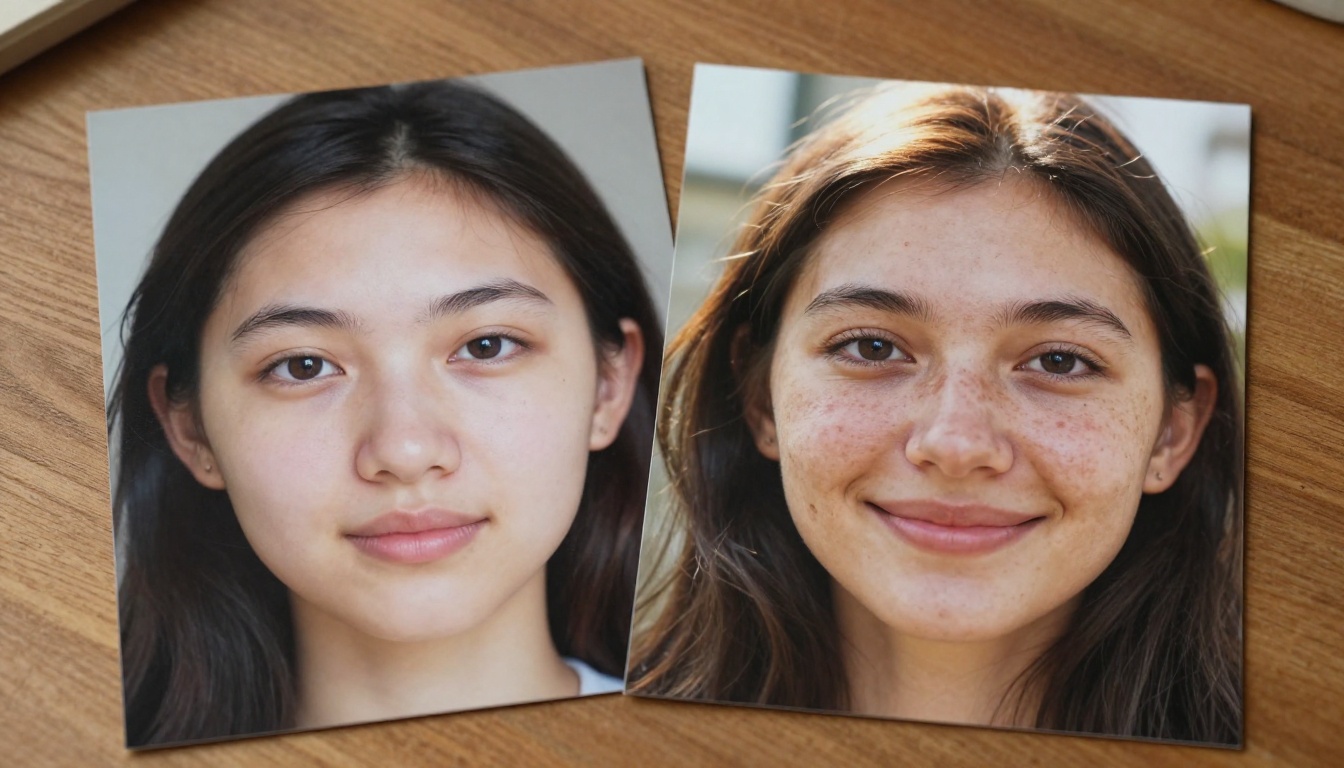
Real photographs contain:
- Sensor noise from the camera's ISO setting
- Chromatic aberration at the edges of high-contrast areas
- Depth-of-field falloff that is physically consistent
- Motion blur on moving subjects or from camera shake
- Environmental imperfections like dust, slight overexposure, or compression artifacts
AI models trained on "good" images learn to remove all of these. The result is technically superior and visually suspicious.
Perfect Skin, Perfect Lighting, Perfect Lie
The number one giveaway in AI portraits is skin. Real human skin has pores, asymmetry, variation in color between the nose and cheeks, individual hairs, and tiny blemishes. AI models default to porcelain smoothness because that is what dominated the training data tagged as "high quality."
Lighting is the second giveaway. AI tends to generate soft, even, flattering light with no hard shadows. Real photographers often work with harsh side lighting, mixed color temperatures, and accidental reflections. The absence of these "mistakes" is itself a mistake.
💡 The rule: Anything too perfect is immediately suspicious. Your goal is strategic imperfection, not random noise.
Your Prompt Is the Problem
Most users generate AI images with prompts like "beautiful woman, studio lighting, 8K, photorealistic." Every single one of those words pushes the model toward the over-polished aesthetic you are trying to avoid.
Words That Create Plastic Results
Certain prompt keywords trigger very specific model behaviors. Words like "beautiful," "perfect," "clean," and "smooth" are optimization targets. The model has learned that images labeled with these words look a certain way, and it will reproduce that look.
Avoid in prompts:
| Avoid | Why |
|---|
| "beautiful" | Triggers idealized, symmetrical features |
| "perfect lighting" | Generates flat, professional studio light |
| "smooth skin" | Produces porcelain, pore-free results |
| "ultra sharp" | Removes natural softness and grain |
| "studio" | Creates sterile, controlled environments |
Prompts That Force Realism
The fix is replacing vague quality descriptors with specific photographic references. Think like a photographer giving a technical brief.
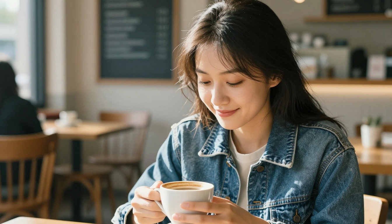
Use instead:
- "Kodak Portra 400 film grain" instead of "photorealistic"
- "85mm f/1.8 shallow depth of field" instead of "bokeh"
- "volumetric afternoon light from upper left" instead of "natural lighting"
- "visible pores, slight skin texture, asymmetric features" instead of "realistic portrait"
- "slight motion blur on hair, environmental out-of-focus" instead of "detailed"
The specificity tells the model you want documentary photography, not commercial photography. These two aesthetics are completely different to a trained model.
💡 Prompt tip: Add "candid, unposed, documentary photography" to any portrait prompt. It shifts the output away from commercial advertising imagery toward something that feels lived-in.
Add Imperfections on Purpose
This is where most people feel uncomfortable. Adding flaws feels counterintuitive. But imperfections are what make images believable.
Grain, Noise, and Film Simulation
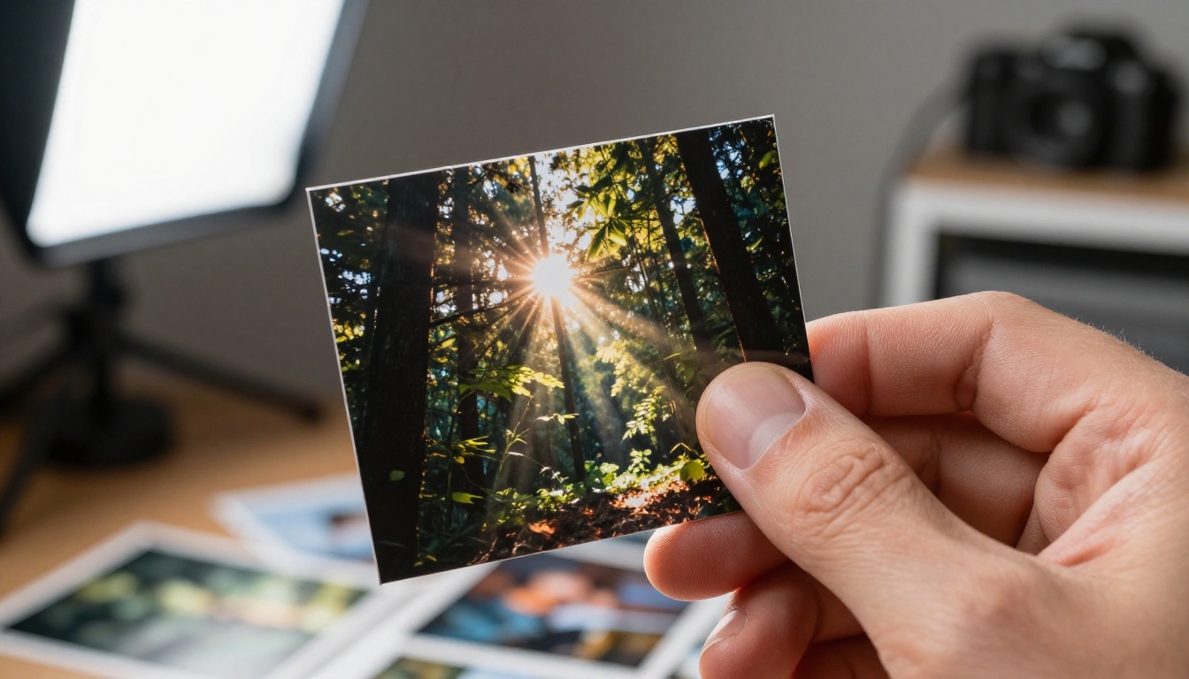
Film grain is the fastest way to make an AI image look analog. In your prompt, reference specific film stocks:
- Kodak Portra 400: Warm tones, fine grain, slight color cast in shadows
- Fujifilm Superia 400: Cooler tones, slightly green shadows
- Kodak Tri-X 400: Black and white, heavy grain, high contrast
- Ilford HP5: Softer grain than Tri-X, more latitude in shadows
Each film stock has a different character that models have been trained on. Referencing them generates very specific grain structures rather than a generic "noise filter" effect.
Asymmetry Is Your Friend
Human faces are asymmetric. Buildings have wear patterns. Trees do not grow in perfect fractals. When you describe subjects, include asymmetry explicitly:
- "slight asymmetric smile"
- "one eye marginally more open than the other"
- "uneven stubble growth"
- "hair strand falling across forehead"
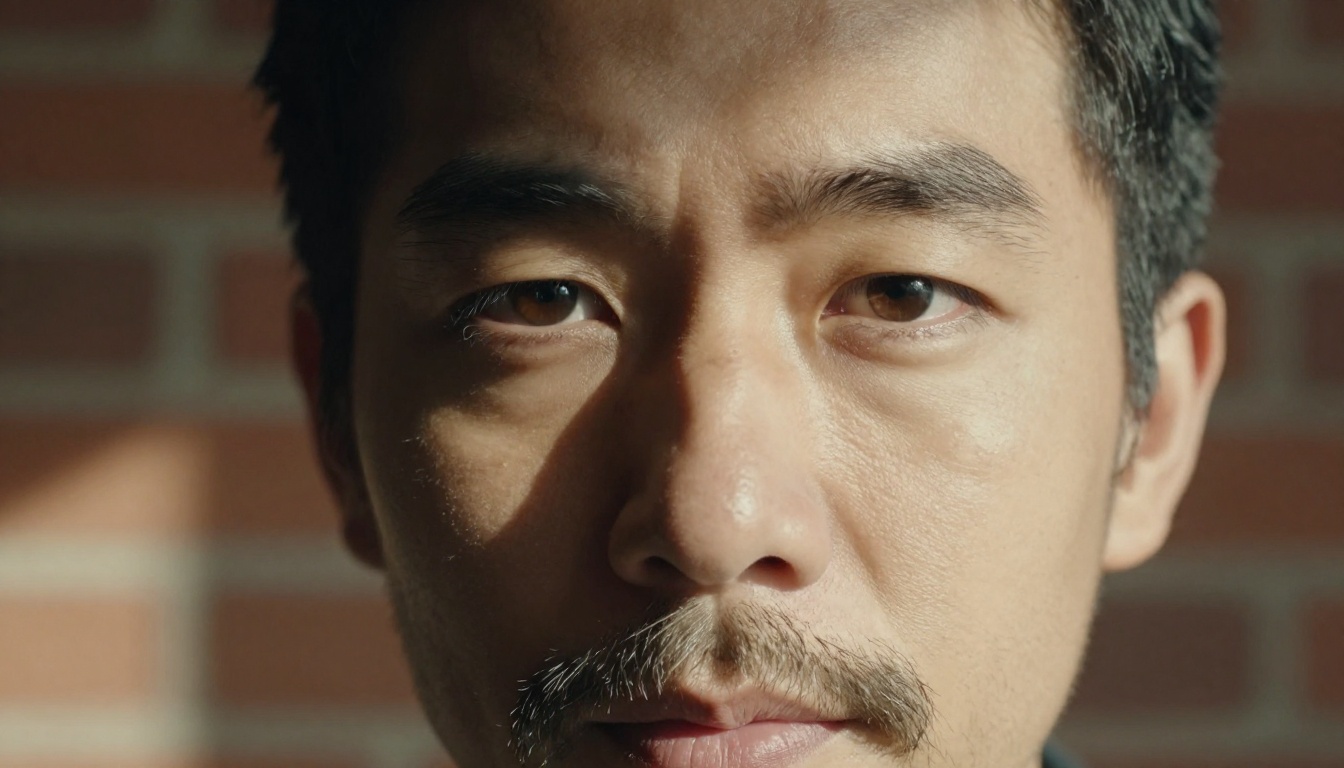
These micro-details push the model's output away from the averaged, idealized face and toward something specific. Specific is believable.
Lighting That Does Not Lie
Lighting is the most controllable variable in photography and the most misused variable in AI prompting.
Directional Light With Hard Shadows
Professional AI images default to soft diffused light because it is the most flattering and easiest to generate convincingly. But real-world photography uses directional light constantly.
Lighting references that add realism:
- "single key light from upper left at 45 degrees"
- "late afternoon golden hour backlight creating rim lighting"
- "practical tungsten bulb to the right, no fill light"
- "overcast outdoor light with soft shadows"
- "Rembrandt lighting with shadow triangle on right cheek"
Each of these creates specific shadow behavior that grounds the image in a physical reality.
Color Temperature Inconsistency
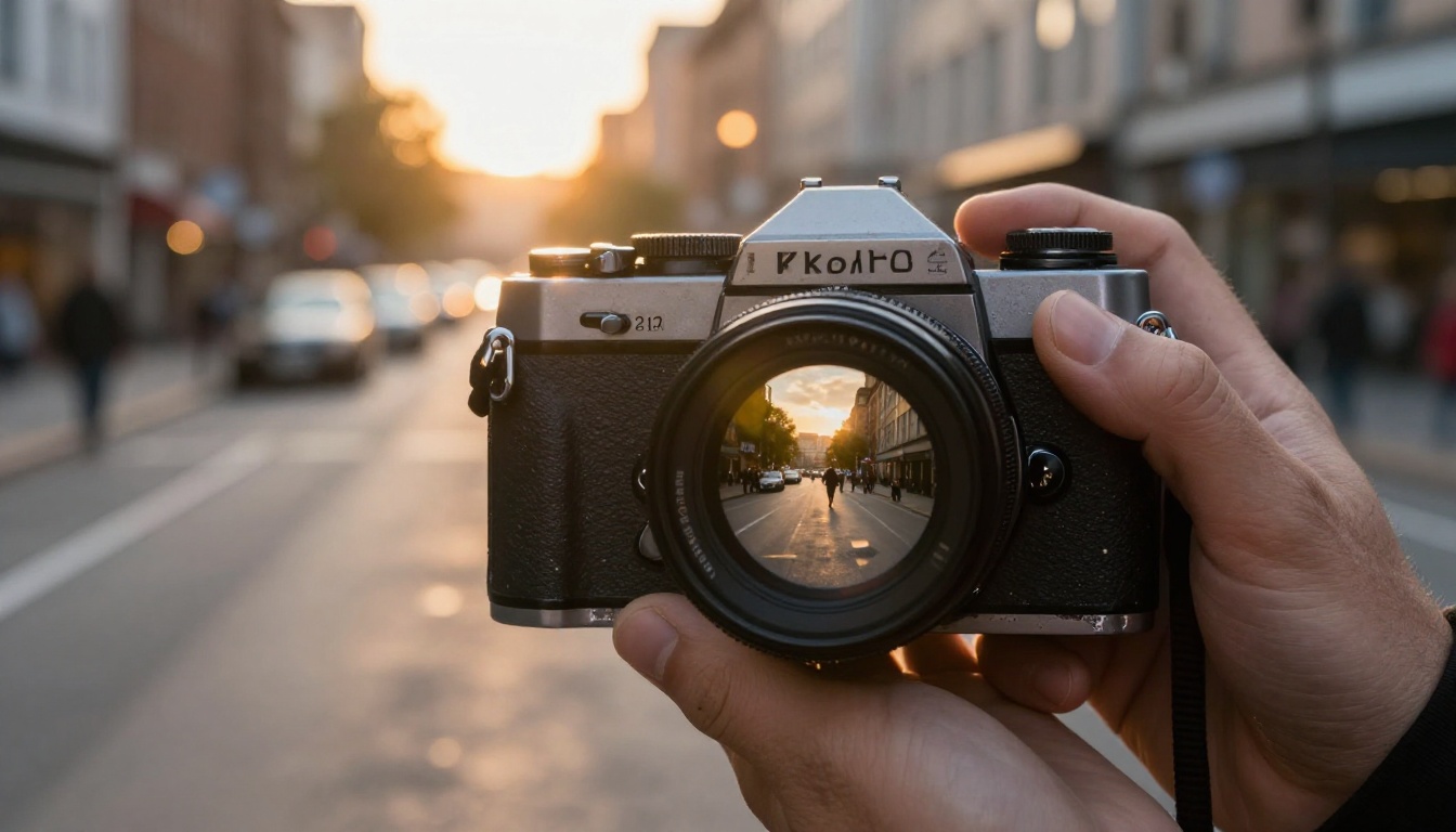
Real environments have mixed color temperatures. A room lit by a window (5600K daylight) and a table lamp (2700K tungsten) will have visible color differences across the scene. AI tends to normalize everything to one consistent color temperature.
In your prompt, describe competing light sources: "warm tungsten lamp to the right, cool daylight from window to the left, slight color mismatch between lit and shadow areas."
💡 Lighting truth: The most photographically authentic images have at least two light sources of different temperatures competing in the frame.
Post-Processing for Authenticity
Prompt engineering gets you 70% of the way there. Post-processing closes the gap.
Noise Overlays and Halation
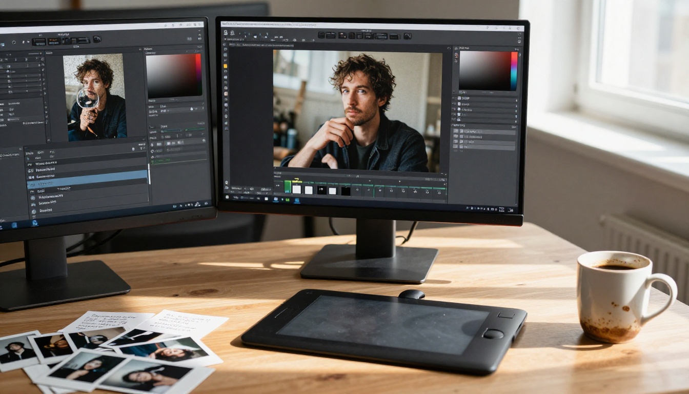
After generating your image, apply a noise overlay at 5-15% opacity in your editing software. This adds organic grain that sits on top of the AI's native texture, preventing the "painted on noise" look.
Halation is the bloom effect you see in film photography where highlights bleed slightly into shadows at high-contrast edges. Adding subtle halation in post makes highlights look chemically real rather than digitally clipped.
Lens Distortion and Chromatic Aberration
All real camera lenses have some degree of barrel distortion (the image bows outward) or pincushion distortion (it bows inward). They also create chromatic aberration, the colored fringing you see at high-contrast edges in photos shot with cheaper lenses.
Adding minimal chromatic aberration (1-2 pixels of color channel offset at the edges) and slight barrel distortion in post creates the signature fingerprint of real camera glass. AI models rarely generate these artifacts naturally unless you specifically request them.
Prompt additions for lens artifacts:
- "slight barrel distortion, 24mm wide angle"
- "chromatic aberration at high contrast edges"
- "slight vignetting toward corners"
- "lens flare from direct light source"
How PicassoIA Makes This Easier
Getting all of this right in a single prompt is difficult. PicassoIA gives you tools at each stage of the process that make authentic results significantly more achievable.
Models Built for Photorealism
The platform's text-to-image collection includes models specifically trained on real photographic datasets, which respond differently to the realism prompts described above compared to general-purpose generators. Visit picassoia.com/en/all-models to see the full catalog.
For prompt ideation and refinement, using a large language model on the platform helps you build the detailed, specific prompts that generate realistic output. Models like Claude Sonnet 4.6 or GPT 5 can take a simple idea and expand it into a 75-word technical photography brief with specific lens choices, lighting angles, and film stock references. This removes a major barrier for users who know what they want visually but struggle to translate it into prompt language.
Using Super Resolution the Right Way
One of the most effective tricks for making AI art look less artificial is strategic upscaling. When you take an AI image and upscale it with a photorealistic super-resolution model, the upscaler adds micro-detail, texture, and grain that was not in the original. The result often looks significantly more like a real photograph than the source image.
Clarity Pro Upscaler adds photorealistic detail during upscaling, including skin texture and surface grain. For portraits specifically, Crystal Upscaler is designed to enhance faces with authentic skin texture that the original AI image may have smoothed over. Real ESRGAN offers free 4x upscaling with strong sharpening that creates the crisp-but-natural look of a real scanned photograph.
The key is to not use maximum settings. Over-sharpening with super-resolution creates a different kind of artificial look. A conservative upscale at moderate settings adds texture without pushing the image back into the uncanny valley.
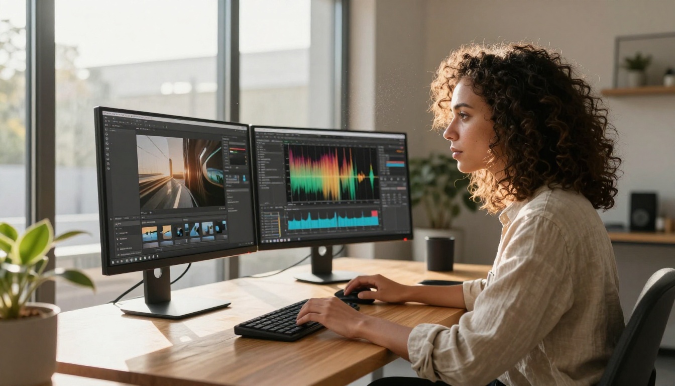
💡 Upscaling workflow: Generate at standard resolution, then upscale at 2x with Clarity Pro Upscaler for detail injection. The two-step process consistently produces more natural results than prompting for "high detail" alone.
3 Common Mistakes That Give It Away
Even with good prompts and post-processing, these three errors keep showing up in AI art that fails the authenticity test.
Too-Perfect Symmetry
Human faces are not symmetric. Faces in AI images often are. The left eye is the same size as the right eye. The corners of the mouth are equidistant from the nose. The hair parts perfectly. All of this reads as artificial.
Fix: Explicitly request asymmetry in every portrait prompt. "Slightly asymmetric face, one shoulder higher than the other, hair parted imperfectly" are not subtle additions. They are load-bearing prompt elements.
Generic Studio Lighting
The second mistake is defaulting to soft, even, three-point studio lighting. This is technically correct photography and visually unmemorable. More importantly, it does not match the lighting of any real environment a person would actually be in.
Real people are lit by car windows, office fluorescents, laptop screens, single lamps, open doorways, and midday sun from above. Describe the specific, imperfect light source relevant to the scene.
No Story in the Background
AI images often have backgrounds that are either blurred into abstraction or perfectly arranged. Real photographs have backgrounds that tell a story: a dirty coffee cup, a coat thrown over a chair, books stacked imperfectly, a window showing weather.
Describing a specific, slightly chaotic background instantly adds documentary credibility. The viewer subconsciously reads environmental context as evidence that the scene is real.
| Mistake | What It Signals | Fix |
|---|
| Symmetric face | Computer average | Request asymmetric features explicitly |
| Soft studio light | Commercial photography | Use single practical light source |
| Clean background | Generated environment | Add specific, imperfect background details |
| No grain or noise | Digital render | Reference film stock in prompt |
| Perfect skin | AI smoothing | Request visible pores, texture, blemishes |
Start Creating Images That Actually Look Real
The gap between AI art that reads as fake and AI art that passes for real comes down to one principle: specificity beats generality. Every vague quality descriptor you remove and replace with a specific photographic reference moves the output closer to something that could have been captured with a camera.
Start with a prompt that reads like a photography brief. Add film grain by referencing a specific stock. Describe your light source with direction, color temperature, and quality. Request imperfections explicitly. Then upscale with a tool like Clarity Pro Upscaler or Crystal Upscaler to inject the micro-detail that separates an AI render from a real photograph.
PicassoIA brings all of these tools together in one place. Text-to-image generation, LLM-powered prompt writing with models like GPT 5 and Claude Sonnet 4.6, and super-resolution upscaling are all available without switching platforms. Try the prompting methods from this article on your next generation and compare the result side by side with your previous default output. The difference is immediately visible.


