If you have ever briefed a creative agency for a logo and received something that felt half-finished three weeks later, Recraft V4.1 Pro is a fundamentally different experience. It does not attempt to be a general-purpose image generator that happens to work for logos. It is built for precision: geometrically accurate shapes, real text rendering, native SVG output, and style consistency across multiple generations. The result is that a founder, designer, or marketer can build a production-ready logo in under an hour, with format variations and a clear path to a full brand identity system that a professional studio would charge thousands for.
This article walks through the full workflow: from setting your brand parameters before you write a single prompt, through the refinement rounds that produce something you actually want to use, to exporting SVG files that open cleanly in Illustrator or Figma and building the asset suite a real brand deployment requires.
What Recraft V4.1 Pro Actually Does
Most people discover that general-purpose image models fail at logos in the same predictable ways. Letters get corrupted or invented mid-word. Simple geometric shapes come out slightly off-axis or uneven. Colors drift from what you specified. The second generation looks nothing like the first. Tiny details that make a mark feel deliberate get lost in the noise of photorealistic training data.
Recraft V4.1 Pro was built to fix those specific failures. Three capabilities separate it from other models when the job is logo creation.
Text Rendering That Works First Time
Text accuracy has historically been the hardest problem in AI image generation. Most models treat letter shapes as visual texture rather than precise typographic characters. Recraft V4.1 Pro approaches brand text with typographic awareness: short strings like initials, brand names, and one-line taglines render legibly without postprocessing cleanup. Kerning holds across the full word. Individual characters do not blend or morph into adjacent ones. For wordmark logos, where every letter needs to be exactly right, this is the capability that matters most.
Native SVG Output
Recraft V4.1 Pro SVG is a dedicated model variant that outputs true scalable vector graphics rather than rasterized JPG or PNG files. The difference matters in production:
- SVGs scale to any size with zero quality loss
- A billboard and a favicon share the same source file without degradation
- Vector paths import directly into Illustrator, Figma, or Inkscape for editing
- Colors are stored as exact hex values inside the file
- File sizes are smaller than PNG equivalents for web use
This means you go from AI generation to a print-ready, editable brand asset without running the result through an auto-tracer and cleaning up the mess afterward.
Style Consistency Across Generations
Brand identity work requires more than one good image. You need a primary mark, an icon version, a reversed version, and a monochrome version, at minimum. When a model cannot maintain visual consistency across generations, you end up with a set of assets that look like they came from different brands and different tools.
Recraft V4.1 Pro locks its visual output when you anchor the style in your prompt. A second generation using the same core descriptors produces something that belongs in the same brand system as the first. This consistency is what makes it useful for building a brand, not just generating a single lucky asset.
How Recraft V4.1 Pro Compares to Other Models
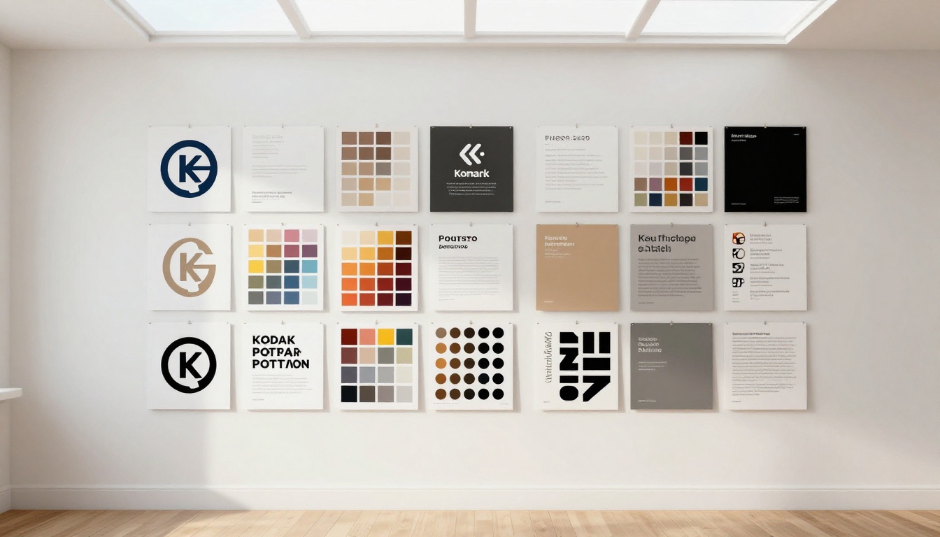
The right question is not which model generates the most beautiful images in general. It is which model does the specific job of producing a usable brand mark. Here is the comparison that matters for logo work:
| Feature | Recraft V4.1 Pro | General Image Models |
|---|
| SVG vector output | Native | Requires auto-tracing |
| Text rendering accuracy | High | Inconsistent |
| Style lock across generations | Strong | Variable |
| Logo-specific presets | Yes | No |
| Color precision | Hex-aware | Approximate |
| Commercial use rights | Included | Varies by model |
| Transparent background support | Direct via prompt | Unreliable |
Recraft AI has released several model generations that each add precision. The current lineup on PicassoIA includes:
💡 Tip: Use Recraft V4.1 for rapid concept rounds when direction is still open. Switch to Recraft V4.1 Pro when you are ready to produce the final output.
Preparing Before You Write a Single Prompt
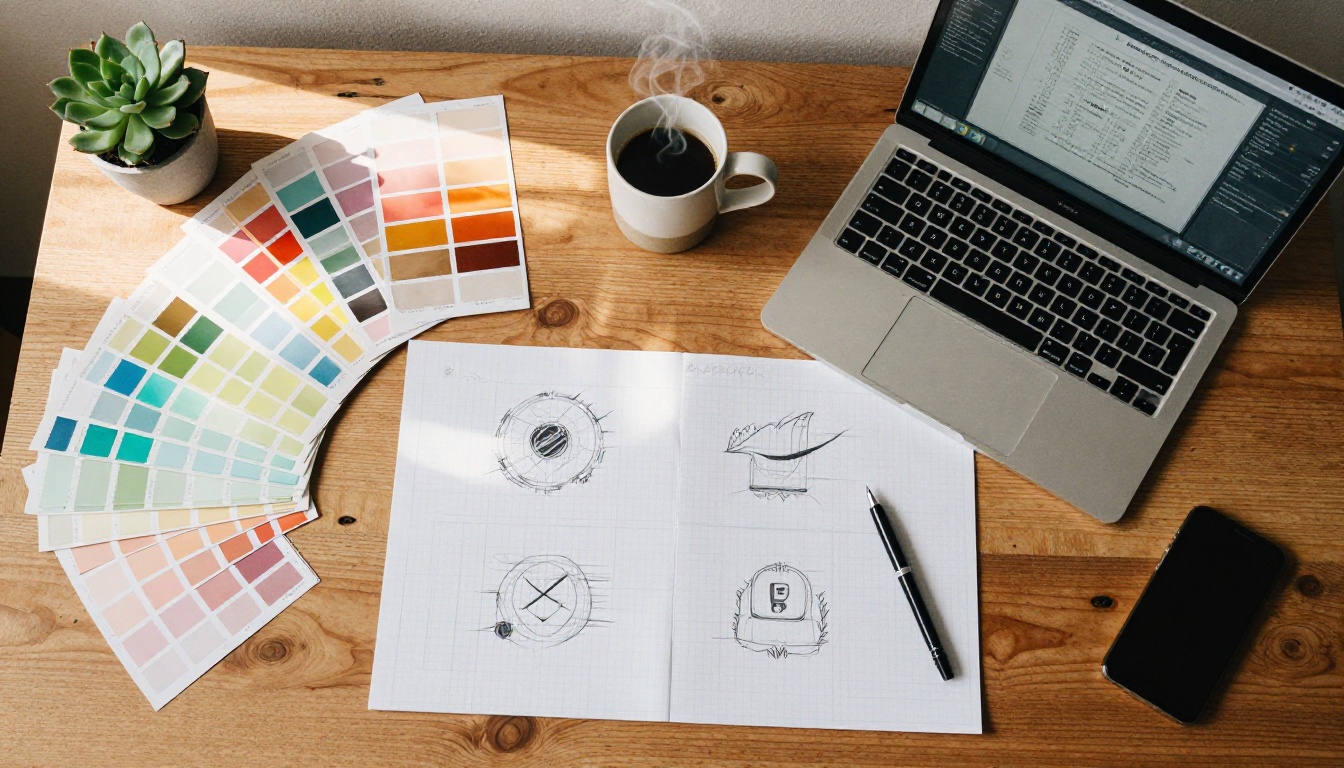
The single most effective thing you can do before opening the model is define your brand parameters in plain language. This takes five minutes and dramatically reduces the number of iteration rounds you will need. Designers call this a creative brief. For AI logo work, it is your prompt architecture.
The Six Parameters That Shape Logo Output
Write these down before you generate anything:
1. Brand name or initials — exactly as they should appear in the mark, if text is part of the logo design. Include capitalization.
2. Industry and audience — a fintech startup and an artisan bakery require completely different visual language. Being specific here changes the output more than almost any other single variable.
3. Tone — pick two or three from: serious, playful, minimal, bold, premium, approachable, technical, organic, institutional, rebellious. These are design-language terms, not marketing terms.
4. Color direction — use exact hex codes if you have them. If not, describe the color mood and pair it with a concrete reference ("deep forest green, similar to environmental organizations," or "warm terracotta with ivory").
5. Logo type — wordmark (text only), lettermark or monogram (initials), icon mark (symbol only), combination mark (icon plus text), or emblem (enclosed shape). Each type has different prompt requirements and prompt failure modes.
6. Avoid list — what the logo must not look like, and which styles or references to exclude. This is as useful as what you want to include, because it prevents the model from defaulting to generic patterns in its training data.
Choosing the Right Model Variant
- Recraft V4.1 Pro: Rasterized PNG output, detailed marks, complex compositions, photorealistic mockups of how the logo looks applied to products
- Recraft V4.1 Pro SVG: When you need an editable vector file immediately, for print production, or for passing to a developer or print shop
- Recraft V4.1: Fast concept generation when you have not settled on a visual direction yet
Writing Prompts That Produce Real Logos
Logo prompting in Recraft V4.1 Pro is a different discipline from photography or illustration prompting. The model responds well to design language: typographic terms, composition vocabulary, specific color values, and explicit exclusion instructions. Vague creative language produces vague outputs.
The Prompt Formula
Structure every logo prompt using this sequence:
[Logo type] + [brand name or initials in quotes] + [style descriptors] + [exact color values] + [explicit exclusions] + [output format instructions]
Full example in practice:
"Minimalist geometric logomark for a fintech brand, abstract interlocking hexagons forming a shield shape, deep navy #1B2A4A and gold #C9A84C, no text, no gradients, no drop shadows, isolated on white background, clean high-contrast edges, SVG-ready professional output"
Five Prompt Templates by Logo Type
| Logo Type | Prompt Template |
|---|
| Wordmark | Wordmark logo "BRAND" in custom geometric sans-serif, [exact colors], minimal, isolated white background, no icons, no gradients |
| Icon mark | Abstract [shape] icon logo for [industry], [exact hex colors], geometric, no text, isolated transparent background, SVG ready |
| Monogram | Monogram lettermark "AB", interlocked letters, [style], [exact colors], isolated white background, optical balance |
| Combination mark | Combination mark: [icon description] with wordmark "BRAND" to the right, [exact colors], professional, isolated white background |
| Emblem | Circular emblem logo, [central symbol], [border style], [text if any], [exact colors], isolated, no drop shadows |
What to Include Versus What to Skip
Include in every prompt: exact hex codes, specific geometric vocabulary (hexagon rather than "geometric shape"), typographic style (geometric sans-serif rather than "modern font"), and explicit background instruction.
Skip these entirely: abstract mood words with no visual equivalent like "innovative" or "trustworthy," requests for more than three distinct visual elements in a single mark, and gradients unless they are deliberate to your brand system.
💡 The single highest-impact addition to any logo prompt: "isolated on white background" or "isolated on transparent background." Without it, the model generates a compositional scene rather than a clean brand asset.
The Step-by-Step Workflow
This is the exact workflow that produces production-ready logos in one session. Follow it in order.
Step 1: First-Round Generation
Open Recraft V4.1 Pro on PicassoIA and run your prepared prompt. Generate four variations in the first pass without editing between them. Resist the urge to adjust the prompt immediately. You want to see what the model interprets from your direction before you modify anything.
Evaluate the four outputs by asking three questions: Which has the strongest silhouette when shrunk to a small thumbnail? Which feels closest to the brand tone you defined in your brief? Where did the text render correctly, and where did it break?
Pick the strongest one variation. That becomes your anchor for round two.
Step 2: Targeted Refinement

Take your chosen variation's prompt and make specific changes based on what you observed. The second round of prompts should be precise, not exploratory. If round one was too complex, simplify. If the style was directionally right but not precise, add one specific design term. If the color drifted from your target, insert the exact hex code.
Common second-round refinements that improve output:
- Replace "geometric" with "single-weight stroke, optical balance"
- Add "no drop shadows" and "no gradients" explicitly if they appeared
- Add or remove text from the mark based on what you actually want
- Specify "centered composition" or "left-aligned" if the layout defaulted wrong
- Add "simplified, fewer anchor points" to reduce complexity in SVG output
Generate three to four more variations. Most logo projects land in round two or three with this method.
Step 3: Export the Vector
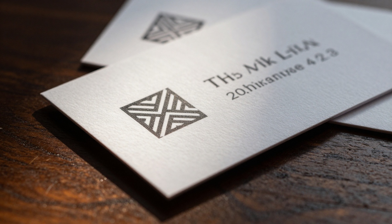
Once you have a logo worth keeping, switch to Recraft V4.1 Pro SVG and re-run the same finalized prompt. The SVG output opens cleanly in Illustrator or Figma. You get editable paths, a source file that works at any scale from favicon to billboard, and color values stored as exact hex codes inside the document.
Open the SVG and run two quality checks: verify the color values match your brand hex codes exactly (do a global color swap if they drifted even slightly), and run a path simplification pass in your design tool to remove unnecessary anchor points that would create weight in print output.
Step 4: Build Your Format Set
From the base SVG, create the minimum set that every brand deployment requires:
- Full color (primary version on white or light background)
- Single color black (for dark backgrounds and single-color printing)
- Reversed white (for use on brand-color or dark backgrounds)
- Icon only (the mark without the wordmark, for app icons and small applications)
- Favicon (simplified 32x32 version where complex marks need reduction)
This set applies to every standard brand surface from website header to business card to social profile to print collateral.
Step 5: Apply and Document the Color System
With the SVG in your design tool, do a global color swap to lock in exact brand hex values. This ensures that even if Recraft's output drifted slightly from your target, the final file contains the correct values for every production use. Create a minimal brand reference document that records these hex codes, the source prompts you used, and the spacing rules around the logo. Anyone on your team who needs to generate a matching asset in the future can work from that document without guessing.
Mistakes That Ruin Logo Output
Most failed AI logo attempts share the same root causes. All of them are fixable before generation.
Cramming too much into one mark. A logo does not need to say everything about your brand. It needs to be recognizable. Three visual elements maximum, usually two. If you are describing four or five distinct components in your prompt, your brief is too complex for a single mark.
Using vague style language. "Modern and clean" describes almost every logo designed in the last 20 years. Replace vague terms with specific design vocabulary. "Single-weight geometric stroke, Bauhaus structure, no serifs, symmetric" gives the model something precise to work from instead of defaulting to the median of its training data.
Omitting the background instruction. Without a transparent or white background instruction, you get a composition image rather than a logo asset. The background becomes part of the file, and the logo cannot be placed on colored surfaces without extensive masking and cleanup.
Not testing at small sizes. A logo that only reads well at 500px wide will fail on a business card, email signature, or mobile favicon. After generating, shrink your output to a 40x40px preview and check whether it still reads clearly. If it does not, the mark is too complex and needs a simplified icon variant.
Not saving successful prompts. Good logo prompts are as valuable as the outputs they produce. Document every prompt that produced a result worth using. Re-generating from a half-remembered version of a prompt almost never reproduces the same quality.
From Logo to Full Brand Identity
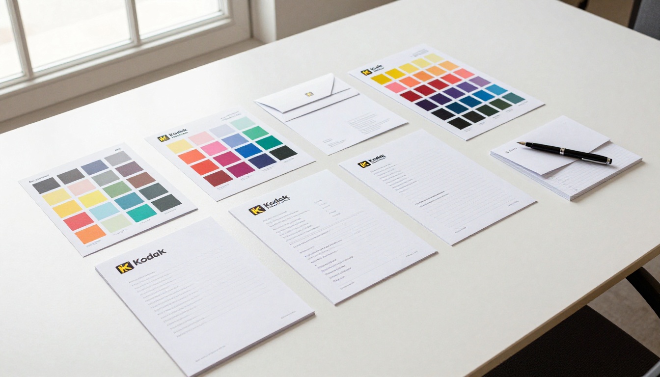
With your logo locked in, Recraft V4.1 Pro can continue the brand work across the full identity system. The same model maintains visual consistency when you carry the core style descriptors forward into new prompts.
Brand Assets You Can Generate Next
Icon sets — "flat icon for [concept], same geometric style as [your logo descriptors], [exact colors], isolated" produces interface and marketing icons that belong in the same brand system.
Pattern fills — extract your primary shape and generate it as a repeating motif for packaging backgrounds, presentation templates, and brand materials. Geometric logos are especially well-suited for this.
Applied mockups — generate photorealistic scenarios showing the logo on products, signage, and screens. These work as pitch-ready presentation assets without a photo shoot. Use Flux Pro on PicassoIA for photorealistic brand photography that matches the logo's visual direction.
Social media templates — carry the color system and typographic style into social-format compositions to maintain brand consistency across digital touchpoints.
💡 On PicassoIA, the Super Resolution tool upscales any raster export to 4x print quality, and Background Removal isolates marks cleanly when SVG output is not available. All of this happens inside one workspace, without switching between different platforms or tools.
Keeping the Brand Consistent Across a Team
Once your core assets exist, create a minimal brand reference document that includes: the primary logo SVG as a linked file (not embedded), all exact hex codes, typography specifications, and the source prompts for regenerating matched assets. Anyone who needs to extend the brand later can use that document without guessing or drifting from the established system.
This is the same deliverable professional brand agencies produce. The prompts function as the equivalent of editable source files.
Start Building Your Brand on PicassoIA
You do not need a design background to get a professional logo out of Recraft V4.1 Pro. You need clear brand parameters, a prompt that follows the formula above, and two or three rounds of targeted iteration. Most projects produce a production-ready mark in under an hour.
Recraft V4.1 Pro is available on PicassoIA alongside Recraft V4.1 Pro SVG, Recraft V4.1, and over 91 other text-to-image models in a single workspace. Define your brand parameters, run the prompt formula, and evaluate the first four variations. Refine from there. The gap between an AI draft and a real brand asset is shorter with Recraft V4.1 Pro than it has ever been, and the workflow above is what closes it.


