Recraft V4.1 Pro arrived with a specific claim: it understands brand logic, not just visual style. Most AI image models can produce a clean illustration when you give them the right prompt. What they cannot do is hold a consistent visual identity across dozens of assets, recognizing when a secondary icon needs to echo the weight and curve radius of the primary logo mark. Recraft V4.1 Pro was built to close that gap, and for anyone producing brand illustration systems at scale, the difference is measurable from the first session.

What Recraft V4.1 Pro Actually Does
The V4.1 Pro label is not a marketing increment. The model ships with structural improvements over Recraft V4 that directly target brand design workflows. It processes prompt instructions with significantly higher fidelity, which matters when your prompts carry specific style constraints like "flat geometric, 2px stroke, warm terracotta fill, no gradients, rounded terminals." Earlier versions would approximate this. V4.1 Pro tends to execute it precisely.
The most meaningful addition is Style Anchoring. When you set a reference style in the model interface, subsequent generations within that session inherit the visual properties of the first approved output without requiring a full style description rewrite each time. For brand work, where you might need 40 to 60 icons all looking like they came from the same hand, this is not a convenience feature. It is the functional foundation of the whole workflow.
The Style Consistency Problem
Before V4.1 Pro, producing a 20-icon set with consistent AI output meant one of two things: either you used a ControlNet pipeline with heavy post-processing, or you accepted that some icons would look slightly different from others and hoped the client would not notice. Neither is a workable solution at professional scale.
The core issue is that style in AI image generation has always been probabilistic. You describe a style in words, the model interprets those words, and each generation samples slightly differently from its distribution. Stroke weights shift by a fraction. Color saturation drifts toward warmer or cooler tones. Proportions vary subtly across assets. Over 20 icons, those small shifts accumulate into a set that looks hand-assembled from different sources rather than designed as a coherent system.
How V4.1 Pro Solves It
V4.1 Pro addresses style drift at the model architecture level rather than through prompt engineering workarounds. The Style Anchoring mechanism lets the model hold a set of visual parameters, derived from an initial approved output, and apply them as a conditioning signal to every subsequent generation. The output is not identical across assets, which would be monotonous, but it is consistent in the way that professional brand illustration should be: varied in subject, unified in treatment and visual weight.
For brand designers, this means you can describe the style once, approve an initial output, and then work from that approved output as a reliable template for the entire set.
Brand Illustration Types It Handles Best
Not all brand illustration formats benefit equally from V4.1 Pro. The model has genuine strengths and clear limitations depending on what you need to produce.
Logo Mark Systems
V4.1 Pro handles geometric logomarks, wordmark explorations, and abstract brand symbols with notable accuracy. Its prompt fidelity means you can specify construction grid logic, "based on a 5x5 grid with circular terminal strokes," and get outputs that reflect that constraint. For initial mark exploration, it compresses what used to be a multi-day manual sketching process into a focused two-hour review cycle.
Where the model still has limits is fine-detail letterform work. For custom typeface design or highly refined wordmark optical spacing, outputs need professional refinement in a vector tool. The right mental model: use V4.1 Pro as a rapid ideation engine, not a final delivery instrument.
Icon Sets and UI Illustrations
This is the strongest use case for V4.1 Pro. Icon sets with consistent stroke weight, terminal treatment, and visual style across dozens of assets are exactly what Style Anchoring was built to support. A 30-icon UI library that might take a junior designer three weeks to produce can be prototyped in an afternoon session, reviewed with a client, and then refined by a human illustrator who is now working from approved visual directions rather than an open brief.
💡 Tip: For UI icon sets, generate your first approved icon with maximum detail in the prompt. Set it as your visual anchor. Then prompt each subsequent icon with the subject description only, stripping the style instructions. The model carries the style forward.
Marketing and Campaign Visuals
Hero illustrations, editorial spots, and campaign characters are strong use cases for V4.1 Pro. The model renders complex scenes with multiple visual elements in accurate proportion, a consistent color palette, and coherent spatial relationships. For a brand running quarterly campaigns, this means turning brief updates into polished illustration concepts in hours rather than weeks.
Recraft V4.1 Pro vs. the Previous Version
The upgrade from Recraft V4 to V4.1 Pro is not about adding new output styles. It is about executing existing instructions with more precision and holding that precision reliably across multiple generations in a single session.
| Feature | Recraft V4 | Recraft V4.1 Pro |
|---|
| Style Anchoring | Not available | Full session-level anchoring |
| Prompt fidelity | Good | Significantly improved |
| Text rendering accuracy | Accurate | Improved kerning and spacing |
| Stroke weight consistency | Variable | Stable across a full icon set |
| Brand color adherence | Close approximation | Precise from perceptual description |
| Generation speed | Fast | Comparable to V4 |
| Complex scene spatial logic | Solid | Improved proportional accuracy |
| Multi-asset set coherence | Inconsistent | Strong with anchoring active |
The performance gap between V4 and V4.1 Pro is most visible at scale. A single image output from both models may look similar. A 40-icon set from both models will show a clear difference in set-level visual coherence.
Prompting for Brand Consistency
The model is only as accurate as the instructions it receives. Prompting for brand illustration work is different from prompting for lifestyle photography or editorial images, and the difference matters significantly when you are building a cohesive identity system.
Build a Style Anchor
Your first prompt should be your most detailed. This output is the style anchor for everything that follows. Include every constraint that defines your brand's visual language:
- Illustration style: flat geometric, minimal line art, hand-drawn organic, editorial ink, etc.
- Stroke weight: "2px uniform stroke" or "shape-only, no visible stroke"
- Color palette: descriptive perceptual terms ("warm brick red, off-white cream, deep forest green")
- Shape construction logic: "rounded terminals, circular arcs, optical centering on baseline grid"
- Explicit exclusions: "no gradients, no drop shadows, no texture fills, no perspective distortion"
Once you have an output that executes all of these precisely, that image becomes your visual reference for the project. Every subsequent icon or illustration prompt can then be written as subject-only, just a few words describing what the new asset depicts. The anchor handles the visual language.
Color and Typography Signals
For color accuracy, describe colors in terms of perceptual properties rather than technical codes alone. "A muted, slightly dusty terracotta, not orange, closer to clay or fired earth" gives the model more useful signal than just naming a color family. For typography-adjacent elements like wordmark forms, badge layouts, or label treatments, specify weight relationally: "similar in weight to Helvetica Medium" or "condensed slab serif with slightly rounded corners and open apertures."
💡 Tip: If the model drifts on color saturation across a long generation set, append a short negative signal to each subject prompt: "no cool tones, no blue shift, warm clay palette only." This corrects drift without disrupting the established style anchor.

How to Use Recraft V4 on PicassoIA
Recraft V4 is available on PicassoIA with no subscription required, giving you direct access to the model's brand illustration capabilities. Here is how to run a brand illustration workflow on the platform:
Step 1: Open the Recraft V4 Model
Navigate to PicassoIA and open the Recraft V4 model page. The interface presents the prompt field and aspect ratio selector in a clean, minimal layout.
Step 2: Write Your Full Anchor Prompt
Write a complete style description for your first illustration. Include all visual parameters: illustration style, stroke weight, color palette, shape construction logic, and exclusions. A well-structured anchor prompt for a brand icon set might be: "Flat geometric icon of a mountain peak, 2px uniform stroke in deep forest green, warm off-white fill, rounded terminals, based on circular arc construction, no gradient, no shadow, no texture, centered on square canvas."
Step 3: Select the Right Aspect Ratio
For standalone icons, choose 1:1. For hero illustrations and website banners, select 16:9 or 3:2. For social media cards, use 4:5 or 1:1. The model supports 14 aspect ratio presets, covering every standard platform format.
Step 4: Generate and Evaluate
Run your first generation. If the output accurately reflects your style constraints, save it as your visual reference document for the rest of the project. If not, adjust the most specific constraint that was missed and regenerate. The model responds well to targeted, specific corrections.
Step 5: Iterate With Subject-Only Prompts
Once your style anchor is approved, write each subsequent prompt with subject-only language: "Flat geometric icon of a leaf." "Flat geometric icon of a water droplet." The model carries the established visual language through each new subject without requiring the full style description each time.
Step 6: Download Clean Files
Download your outputs with no watermarks. Bring them into Illustrator, Figma, or your preferred vector tool for any final optical alignment refinements, path cleanup, or color adjustments before client delivery.
You can also use Recraft V3 on PicassoIA for its distinctive range of output styles, including pixel art, engraving, hand-drawn, and grain modes. Each has its own visual character and suits specific brand personalities and creative directions.
What the Results Actually Look Like
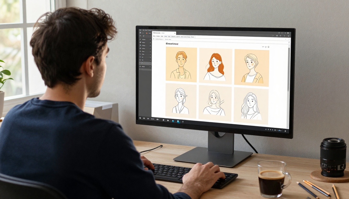
Understanding the workflow is useful. Seeing what a production brand illustration project produces with V4.1 Pro gives a more concrete picture of where the model fits in a real design process.
For Startups
A pre-revenue startup with no dedicated design budget can use V4.1 Pro to produce a functional brand illustration system in a single working session. A realistic scope: one logomark exploration, four to six secondary brand marks, a 12-icon functional set, two hero illustrations for the landing page, and a repeating pattern tile for packaging or marketing materials. This scope takes a senior freelance illustrator two to three weeks and costs between $3,000 and $8,000. With V4.1 Pro, the same ideation scope takes a few hours and produces outputs ready for early-stage pitches, product marketing, and initial web design.
The output is not production-final without human review and cleanup. But it is directionally complete enough to make decisions and move forward, which is exactly what early-stage companies need.
For Agencies
For brand agencies, the value is concentrated in the speed of visual ideation. Instead of waiting for a junior designer to produce three distinct brand illustration directions over two weeks, a senior strategist can generate a dozen visual directions in a single morning, curate the strongest three, and present them to the client in the same week. The human illustrator then takes the approved direction into production, working from a validated visual brief rather than open-ended exploration. The quality of the final output stays high. The time to client approval compresses significantly.
The Real Cost Comparison
Choosing how to produce brand illustrations involves trade-offs across time, cost, and output consistency. Here is how the common approaches compare:
| Approach | Timeline | Estimated Cost | Set Consistency |
|---|
| Experienced Freelance Illustrator | 2 to 3 weeks | $3,000 to $8,000 | High, if well-briefed |
| Junior In-House Designer | 3 to 4 weeks | Salary-based | Variable, depends on experience |
| Stock Illustration Libraries | 1 to 2 days | $500 to $2,000 per year | Low (generic, off-brand) |
| Recraft V4.1 Pro (ideation phase) | 2 to 4 hours | Low per-generation cost | High with style anchoring |
| Recraft V4 on PicassoIA | 2 to 4 hours | Pay per use, no subscription | High with disciplined prompting |
This table is not an argument that AI replaces illustrators. It shows where AI creates real leverage. Recraft V4.1 Pro compresses the ideation and visual direction-setting phase dramatically. Human illustrators add the final layer of craft and precision that separates a functional brand from a genuinely memorable one. The best brand illustration workflows use both in sequence.
Four Prompting Mistakes That Break Brand Sets
Most visual consistency failures in AI-generated brand illustration sets come from the same handful of prompting errors. Knowing them upfront prevents the most common sources of style drift.
1. Describing mood instead of construction
"Warm and approachable" is a mood description. "Rounded corners, 2px stroke, light fill, no sharp angles" is a construction description. The model responds to construction logic, not emotional tone, when building consistent visual sets.
2. Using different style names across prompts
Calling the style "flat illustration" in one prompt and "minimal graphic" in the next introduces ambiguity. Pick one accurate style term and use it consistently throughout the session, even if you eventually drop it once the anchor is firmly set.
3. Leaving color underspecified
"Blue" can mean 40 different things to the model. "A desaturated slate blue, closer to grey than navy, similar to faded denim on a cloudy day" is a specific perceptual description the model can target. The more specific your color language, the less saturation and hue drift you see across a long generation set.
4. Adding too many subjects in one prompt
Each icon prompt should have exactly one subject. "A leaf and a water droplet combined into one mark" asks the model to make compositional decisions that you should be making as the designer. Prompt for single subjects and compose multi-element assets manually in your design tool.
Presenting Brand Illustration Work to Stakeholders
Sharing brand illustration work with clients or internal stakeholders benefits from a structured presentation format. Whether you are presenting a startup's identity system or an agency's creative pitch, the way you arrange AI-generated outputs affects how decision-makers evaluate them.
Place your style anchor image first, presented as the tone-setting visual reference. Follow it with three to four subject variations showing how the style holds across different icon types, proving the system is not a one-off output. Then show the full icon set as a compact grid. Finally, show the icons in context on product mockups or marketing material templates. This progression helps non-designers understand what "style consistency" means in practice, rather than asking them to infer it.
Recraft V4 on PicassoIA produces outputs at resolutions sufficient for these client presentations without any upscaling required, and you can download clean files immediately after generation.

Build Your Brand's Visual System
If your brand is still using generic stock icons or mismatched illustrations pulled from different libraries, that is the most direct problem to address. Brand visual consistency is not aesthetic perfectionism. It is how recognition compounds over time. Every touchpoint where a customer sees your consistent illustration style reinforces the visual memory of your brand.
Recraft V4 on PicassoIA is available now with no subscription required. Write your first anchor prompt, generate a starting point, and see what a consistent brand illustration system actually looks like before committing weeks to production. If the output gives you something to work with, the rest of the workflow moves quickly.
Recraft V3 is also on the platform for brands that need more stylistic range, from pixel art to hand-drawn and engraving modes. Both models are worth testing against your brand's visual personality before committing to a production style.
Open PicassoIA today, run your first brand illustration prompt, and see what your brand's visual language looks like when it finally holds together.