Recraft V4.1 Pro is one of the few AI models that genuinely outputs true scalable vector graphics instead of a rasterized image dressed up as SVG. That distinction matters more than it sounds. If you work in brand design, icon creation, or any field where files need to scale infinitely without quality loss, you need to know exactly what this model delivers and where it stops short. This article breaks down the actual output, the difference between the free and Pro tiers, how to use Recraft V4.1 Pro SVG on PicassoIA, and which use cases it genuinely handles well versus where you should reach for something else entirely.
What Recraft V4.1 Pro Actually Does
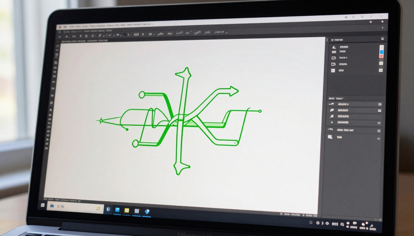
Most AI image generators produce JPEG or PNG files. Even when they export something labeled as SVG, the file often contains an embedded raster image wrapped in XML tags. That is not vector art — that is a workaround. Recraft V4.1 Pro is different: it generates path-based SVG code where individual shapes, curves, and fills are defined mathematically as bezier paths. This means you can open the output in Illustrator or Inkscape and actually edit the nodes, change colors, adjust path weights, and export the file at any size without quality loss.
This matters because the file you get is structurally different from anything a standard diffusion model produces. The SVG is not just a container — it is the actual design, built from mathematical descriptions of shape rather than a grid of colored pixels.
True SVG, Not Raster in Disguise
The model uses a diffusion process trained specifically on vector data, producing output that is genuinely editable at the path level. When you generate a logo or icon with Recraft V4.1 Pro SVG, what you get is a file with discrete shapes you can select, recolor, reshape, and export cleanly across any production workflow.
Contrast this with standard raster-based models like Flux 1.1 Pro, which produce stunning photorealistic images but have no concept of vector paths. Neither approach is better in absolute terms. They solve different problems.
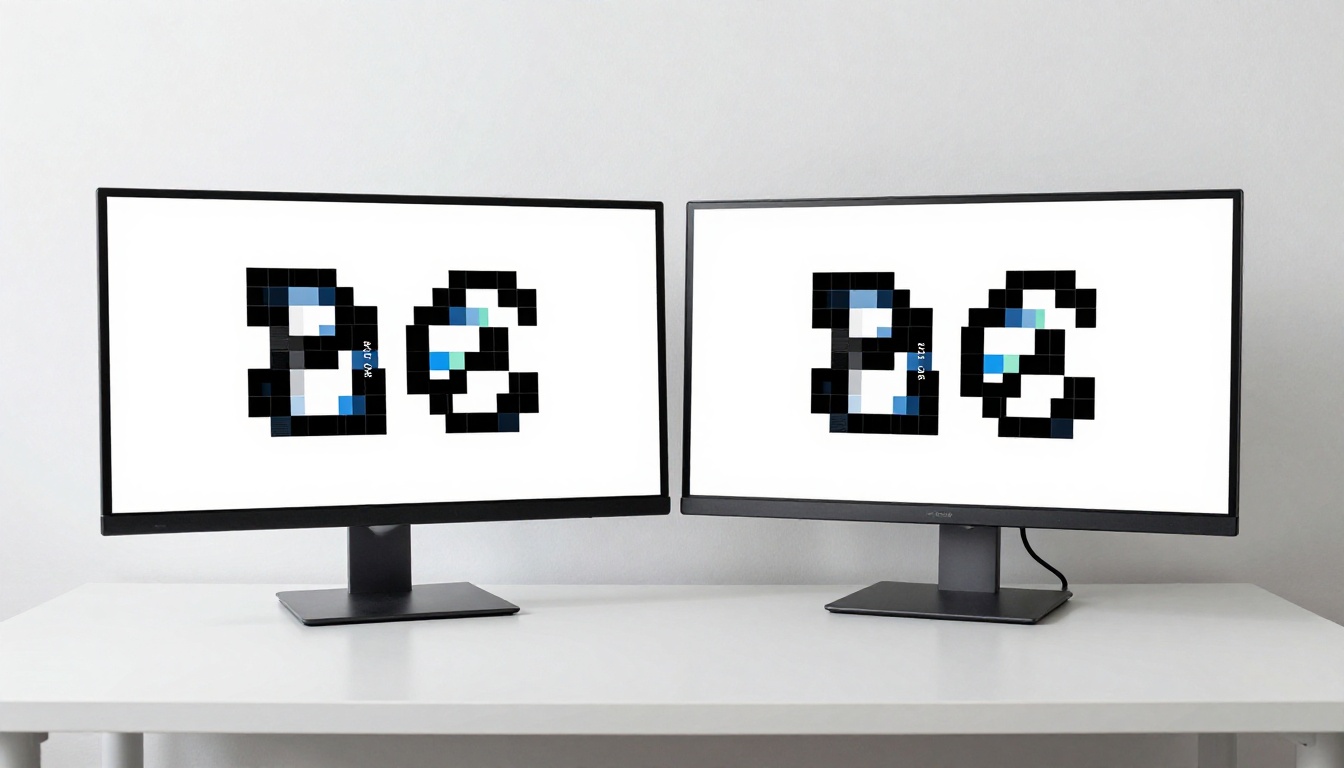
💡 What matters: If you are building a brand identity, presenting logos to print shops, or creating icons for mobile apps, you need SVG. If you are making editorial images, social media photography, or cinematic content, stick with raster.
The Pro Tier vs. Free
Recraft V4.1 (free) and Recraft V4.1 Pro look similar on paper, but the Pro tier includes meaningful differences that become visible in production:
- Higher resolution output: The SVG viewBox is larger, meaning more path precision on complex shapes and finer detail at small print sizes
- Better handling of overlapping paths: Gradients, layered shapes, and intricate geometry produce cleaner results with fewer path conflicts
- More reliable prompt adherence: Brand-specific requirements like exact color matching and composition constraints follow through more consistently
- Priority processing: Noticeably faster generation under load, which matters when you are iterating through 15 logo concepts in a single session
The free version works well for simple shapes and quick icon prototypes. The Pro version is where output starts holding up in professional print and production environments without requiring significant manual cleanup.
The Output Quality
Recraft V4.1 Pro SVG is genuinely impressive in a focused range of tasks, and genuinely frustrating in others. Here is what the real output looks like across the use cases that matter most.
Where the Results Impress
Geometric and abstract logos are where this model shines most clearly. Clean shapes, balanced symmetry, and bold icon-style marks come out well-structured and editable with minimal path cleanup needed. Prompts like "minimal circular logo with interconnected rings, flat design, two-color, no gradients" produce SVG output that moves into a professional workflow without format conversion or manual retracing.
Icon design is another strong area. Single-color icon sets with consistent visual weight generate cleanly. When you are producing sets of icons for a single interface, Recraft V4.1 Utility Pro also handles this category with a different stylistic emphasis. The Recraft family gives you real options to match different design aesthetics.
Monogram-style symbols and abstract marks work well, especially when you avoid asking the model to render specific readable text. AI-generated legible letterforms in SVG remain unreliable across all tools in this category. Symbols and abstract marks are the stronger use case.
Where Things Get Tricky
Complex multi-element scenes fall apart fast. Asking Recraft V4.1 Pro for a detailed illustration with multiple figures, backgrounds, and environmental elements produces messy SVG output with hundreds of tiny overlapping paths that are nearly impossible to edit by hand. This is not the right model for editorial illustration or any design requiring scene complexity.
Photorealistic effects are also outside its scope by design. Shadows that mimic volumetric lighting, gradients that simulate surface texture, and realistic color transitions that work in raster formats do not translate into clean vector form the same way. The SVG output handles flat gradients and solid fills well. Anything needing realistic shading requires post-processing in a raster editor.
Prompt specificity requirements are significantly higher than with raster models. Vague prompts produce unpredictable output. Colors, shape count, style references, and composition instructions all need to be explicit in the prompt for the model to produce consistent results.

Recraft V4.1 Pro vs. V4.1 Free
Here is a direct comparison of what you get across the tiers available on PicassoIA:
| Feature | Recraft V4.1 Free | Recraft V4.1 Pro | Recraft V4.1 Pro SVG |
|---|
| Output Format | Raster (PNG/JPG) | Raster with vector options | True SVG paths |
| Path Editability | No | Partial | Full |
| Detail in Complex Shapes | Moderate | High | High |
| Generation Speed | Standard | Priority | Priority |
| Best For | Concepts, mockups | Quality raster output | Production SVGs |
When Pro Is Worth It
The Pro tier pays off immediately if you are:
- Preparing files for print production where vector scalability is non-negotiable
- Building icon systems for web or mobile UI that need consistent path weights across an entire library
- Creating brand assets that will be used at sizes from a 16px favicon to a 3-meter trade show banner
- Working with clients or developers who need editable source files to implement independently
If you are generating visual concepts to present in a slide deck or an early-stage mockup, the free tier handles the job. The Pro output earns its place when the files go to production.
Using Recraft V4.1 Pro on PicassoIA
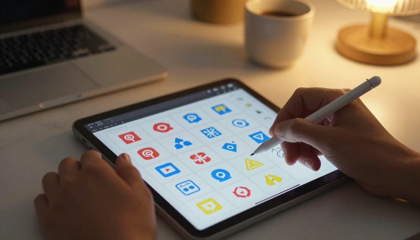
PicassoIA gives you direct access to the full Recraft V4.1 Pro family without needing a separate Recraft account or subscription. Here is how to get results worth using.
Step 1: Find the Model
Navigate to Recraft V4.1 Pro SVG on PicassoIA. If your project needs general-purpose raster output with vector-quality detail rather than actual SVG files, Recraft V4.1 Pro is the sibling model worth considering. Both are available in the text-to-image collection.
For illustration-style output specifically, Recraft V4.1 Utility Pro handles a slightly different aesthetic range with a more illustrative character, and Recraft V4.1 Utility offers the same in a lighter version. Test a few models side by side when your brief sits between categories.
Step 2: Write Your Prompt
Strong Recraft prompts share a common structure that works across every model in the family:
- Subject: What the icon or logo represents
- Style: Flat, minimal, outlined, filled, two-color, or monochrome
- Composition: Single shape, icon in a circle, mark with supporting geometry
- Color specification: Hex codes work well alongside specific color names
- Exclusions: No text, no shadows, no gradients unless you specifically want them
Example prompt: "A minimal vector icon of a mountain peak inside a thin circle, flat design, single color dark navy, no text, no gradients, clean geometric style, icon set aesthetic"
Avoid words like "realistic," "photographic," or "detailed texture" since these push the model toward raster-style output that works against the vector generation process. The more the prompt sounds like a design brief, the better the output follows it.
Step 3: Refine and Export
Once you have output you like, download the SVG and open it in Illustrator, Figma, or Inkscape. The first thing to check: are the paths actually discrete shapes, or is the file a rasterized embedding? With Recraft V4.1 Pro SVG, you should see editable anchor points throughout the design when you select elements.
If paths are too numerous or complex for clean editing, use Illustrator's "Simplify Path" function or Inkscape's equivalent. Most logo-quality outputs need 20 to 50 percent node reduction before they are clean enough for professional handoff. This is a normal part of the AI-to-production workflow, not a failure of the model.
Other Recraft Models Worth Knowing
The Recraft family on PicassoIA covers more ground than just the Pro SVG version. Knowing which model fits which task saves time and prevents the frustration of using the wrong tool for a specific brief.
Recraft V4.1 SVG vs. Pro SVG
Recraft V4.1 SVG is the free-tier SVG option. It generates true vector output but at lower resolution and with less precision when shapes overlap or the design requires finer geometric detail. For personal projects, blog graphics, and quick icon prototypes that will not go to print production, it is entirely adequate.
Recraft V4.1 Pro SVG is the production-ready version. Path counts are better optimized, and the model handles nuanced prompts with more consistent results when you are iterating through multiple concepts.
Both sit above Recraft V3 SVG and Recraft V3 in terms of output precision, but V3 has defenders for a specific aesthetic reason.
Recraft V3 Still Has a Role
The older generation is not obsolete. Recraft V3 produces output with a distinctive character that V4.1 has moved away from. If you are building assets for a brand with an artisanal or hand-crafted aesthetic, the V3 generation sometimes produces more appropriate results than the cleaner, more geometrically precise V4.1.
Think of it this way: V3 is the design equivalent of a typeface with visible calligraphic influence. V4.1 Pro is the modern geometric sans. Both are valid. Both serve different briefs. Having access to both on PicassoIA means you can match the right model to the brand character you are working with.

The Real Use Cases
Vector art is not a universal requirement. But for specific production scenarios, it is the only format that works without compromise.
Logo and Brand Identity
Brand assets need to survive across every medium: a business card at 3.5 inches, a trade show banner at 8 feet, a website favicon at 16 pixels, and an embroidered patch with thread-count constraints. Raster files break down at scale. SVG does not. For startup branding, product logos, and corporate identity work where you need a single master file that holds up everywhere, the Pro SVG output is the right starting point.
The generation process lets you iterate on 15 to 20 logo concepts in the time it would take to sketch three by hand. Not every output is usable — expect a 30 to 50 percent usability rate on complex briefs. But the successful outputs drop directly into a design workflow without format conversion or manual retracing.

Icon Sets and UI Assets
Designing 30 to 50 icons for an app takes weeks by hand. Using Recraft V4.1 Pro SVG alongside Recraft V4.1 Utility Pro cuts that process significantly. You prompt for families of icons with consistent visual weight, download the SVGs, and refine them in your vector editor of choice.
The consistency challenge is real: AI-generated icon sets often drift in style and stroke weight between individual icons. The practical solution is to batch-generate icons with tightly controlled prompts and then normalize line weights in Figma or Illustrator after the fact. The starting point quality from Recraft V4.1 Pro justifies the extra refinement step.
Practical prompt template for icon sets:
"A single vector icon of [description]. Thin outline style, 2px stroke weight, rounded line caps, 24x24 grid, single color, no fill, minimal detail, icon set aesthetic"
Generate each icon separately using this template for the most consistent results across a full set. Changing only the description while keeping everything else identical gives the model the best signal for visual consistency.
When Flux or Ideogram Makes More Sense
Not every design brief needs vector output. If your project requires photorealistic imagery, editorial visuals, or marketing photography, Flux 1.1 Pro and Flux Schnell produce results that Recraft cannot match. These are fundamentally different tools built for fundamentally different outputs, and using the right one for the task is the difference between a two-minute workflow and a two-hour cleanup.
Ideogram V4 Quality also deserves a mention here. If your design includes text that needs to be readable and accurate inside the image, Ideogram has historically been the strongest option in this category. Recraft's text rendering in SVG form is unreliable for actual legible letterforms. For posters, thumbnails, and any design where accurate type is part of the image itself, Ideogram is the better pick.
💡 Quick decision framework:

Try It on PicassoIA
The Recraft V4.1 Pro family is live on PicassoIA right now, alongside every other model mentioned in this article. You do not need a separate Recraft subscription or account. Recraft V4.1 Pro SVG, Recraft V4.1 Utility Pro, Recraft V4.1 SVG, and the rest of the lineup are accessible from a single platform alongside 91 other text-to-image models covering every other use case from photorealism to illustration.
If you work in brand design, UI, or any creative field where vector files are a production requirement, the case for running a test with Recraft V4.1 Pro SVG is straightforward: the output quality at its best saves hours of manual vector tracing, and PicassoIA makes it accessible without managing another subscription or navigating another platform's pricing tiers.
Start with a simple logo or icon brief. Push the prompt to be specific about colors, style, and what to exclude. Download the SVG and check the paths in your editor. You will know in three generations whether it fits your workflow — and if the brief calls for something different, the rest of the model library is one click away.
Browse the full model collection at picassoia.com/en/all-models and start testing what Recraft V4.1 Pro actually delivers for your specific work.


