Recraft V4.1 Pro has quietly become the tool that serious brand designers reach for when they need results that don't look AI-generated. Not because it hides what it is, but because it thinks in systems the way a good designer does: color relationships, typographic hierarchy, logo variation logic, and consistent spatial rules that hold across every surface a brand touches.
This piece breaks down how it performs on brand identity work specifically, where the output needs to hold up on a business card, a building facade, a digital product, and a thirty-slide presentation deck all at once. The requirements are different from casual image generation, and the tool's architecture reflects that difference in ways that matter.
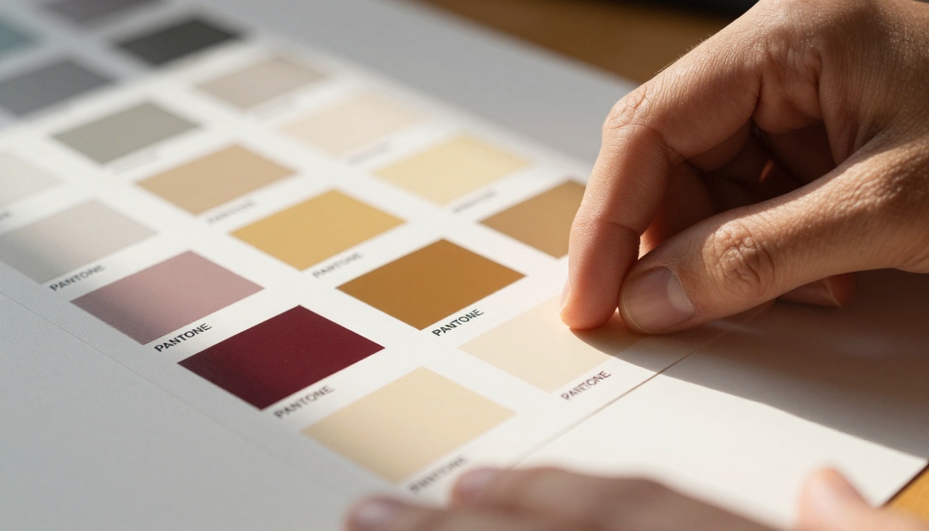
What Recraft V4.1 Pro Actually Does
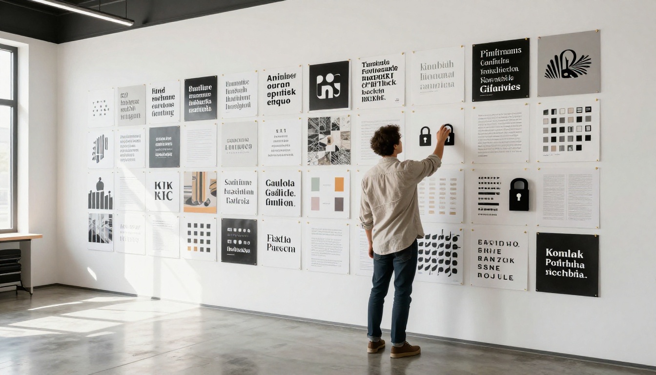
Most AI image tools generate individual assets. Recraft V4.1 Pro is built around the concept of a style token, a locked configuration that maintains visual consistency across every output in a session. That distinction matters enormously for brand work, where consistency isn't a preference but a requirement.
When you create a style in Recraft V4.1 Pro, it locks in:
- Color temperature and palette balance
- Line weight and geometric preferences
- Texture and finish behavior (matte vs. glossy, flat vs. dimensional)
- Typographic character (geometric, humanist, slab, or transitional)
Every asset you generate after that inherits those parameters automatically. A logo variation, a brand pattern, an icon set, a header illustration: they all read as coming from the same visual system. That's the actual hard problem in brand identity design, and Recraft V4.1 Pro solves it structurally rather than by accident.
The Core Brand System
Recraft V4.1 Pro operates with a layered output model. You start with a brand direction prompt, it returns a visual specification, and every subsequent generation refers back to that specification. Think of it as a living style guide that enforces itself during creation rather than after the fact.
The system handles both vector-native and rasterized outputs. For logos and marks that need to scale from a favicon to a billboard, vector-native outputs are essential. Recraft V4.1 Pro generates SVG-compatible paths rather than bitmapped approximations, which means a logo exported from a session is production-ready without additional cleanup in Illustrator or another vector editor.
Style Locking That Works
Style lock is the defining feature for multi-asset brand projects. Here's what it prevents in practice:
- Color drift between assets (the navy on the letterhead matching the navy on the app icon)
- Inconsistent stroke weights across icon sets
- Typographic weight mismatches when mixing headline and body copy variants
- Composition logic breaking when switching between horizontal and vertical logo lockups
Without style locking, every AI-generated asset is an independent creation that happens to share a prompt. With it, you're running a governed design system. That shift changes what's possible in a single work session and how much post-processing the outputs require before they're usable.
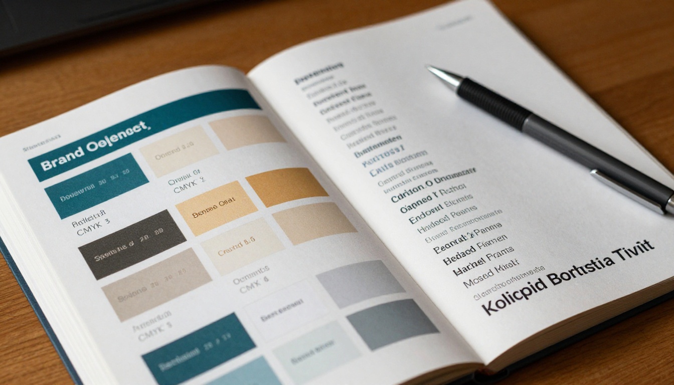
Color Palette Work
Color is where most AI brand tools fail. They generate attractive combinations that don't function as brand systems because they're optimized for visual appeal rather than application logic. A beautiful color palette that fails WCAG contrast standards or shifts unpredictably between screen and print isn't a brand palette, it's a design problem.
Building Palette Logic
When you define a primary color in Recraft V4.1 Pro, it doesn't just suggest complements. It builds a functional palette architecture:
| Role | Purpose | Typical Count |
|---|
| Primary | Brand recognition, CTA buttons | 1-2 |
| Secondary | Supporting elements, accents | 2-3 |
| Neutral | Backgrounds, text, dividers | 3-5 |
| Semantic | Success, warning, error states | 3 |
This palette logic applies across print specifications (CMYK, Pantone matching), digital formats (HEX, RGB, HSL), and accessibility standards (WCAG contrast ratios). The system auto-checks contrast ratios and flags any combination that fails AA standards before you commit to it, catching the kind of issue that usually surfaces during development QA.
CMYK and Hex Accuracy
One persistent weakness with AI-generated brand palettes is the gap between the screen color and the print result. Recraft V4.1 Pro builds palettes against ICC color profiles from the start. When you export a brand color specification, you receive exact Pantone equivalents alongside CMYK breakdowns, not approximate conversions that shift on press.
💡 Pro tip: Always specify your target print profile in the prompt (for example, "Pantone coated for offset lithography"). It reduces gamut approximation errors significantly and prevents expensive reprints.
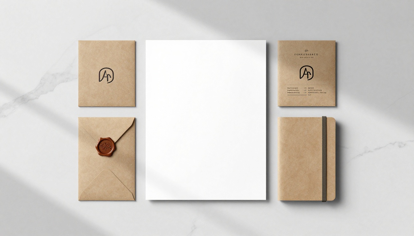
Logo Generation at Scale
The logo generation capability in Recraft V4.1 Pro is different from general-purpose image generators because it's optimized for symbol-plus-wordmark systems rather than decorative imagery. The output model understands that a logo is a scalable system, not a single picture.
From Input to Vector
The input model accepts both text prompts and rough reference sketches. In brand identity practice, most logo projects start with hand-drawn thumbnail directions: a general shape language, a rough letterform idea, a compositional direction. Recraft V4.1 Pro accepts those as context images and generates refined vector interpretations from them.
The generation pipeline produces:
- Primary mark (the icon or symbol alone)
- Full lockup (symbol plus wordmark, horizontal orientation)
- Stacked lockup (symbol above wordmark, vertical)
- Wordmark-only (for contexts where the symbol won't read at size)
- Favicon and app icon (optimized for small-scale legibility at 16px and 32px)
All five outputs are generated with consistent geometry, spacing ratios, and weight relationships. In traditional design work, producing all five variations from a single approved direction takes multiple days of dedicated designer time. In Recraft V4.1 Pro, it happens within the session.
On PicassoIA, you can immediately run those logo outputs through Recraft Crisp Upscale to produce print-resolution versions, or through Recraft Creative Upscale when you need more textural depth added to accompanying brand imagery.
Iterations Without Fatigue
The real advantage of AI in logo work isn't the first output. It's the fifteenth iteration, the one that gets you to the form a client actually responds to without burning the design team out on the process of getting there.
Recraft V4.1 Pro maintains session memory across iterations. When you refine a direction ("make the primary mark heavier, less decorative"), the system applies that adjustment within the locked style parameters. The change propagates coherently across all generated assets rather than abandoning the established visual language when you nudge a single variable.
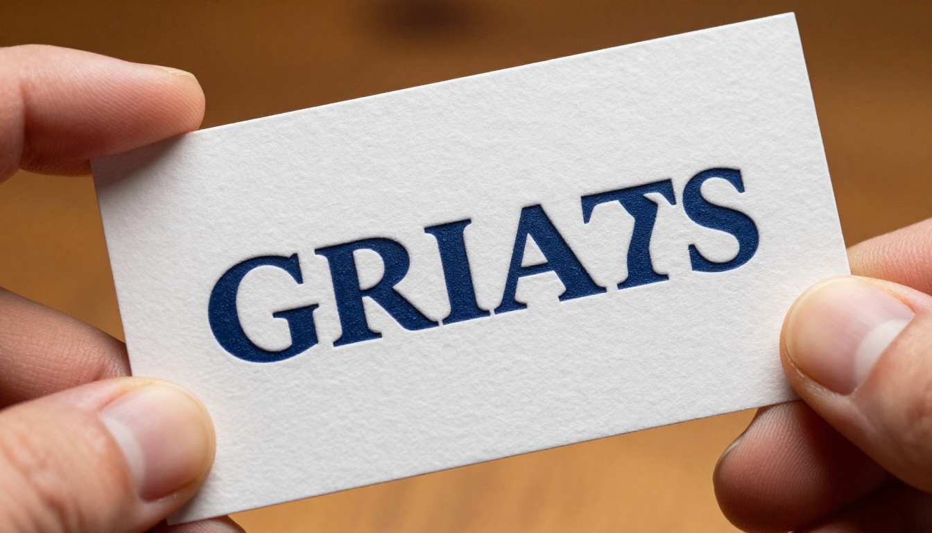
Typography That Fits the Brand
Typography is the element of brand identity that most AI tools handle poorly. Generating decorative letterforms is technically straightforward. Building a functional type system that performs at multiple scales, in multiple weights, across multiple applications is a genuinely different problem that requires understanding hierarchy, not just aesthetics.
Pairing Logic
Recraft V4.1 Pro's typographic engine evaluates font pairings against several criteria simultaneously:
- Optical size relationships (does the headline feel proportionally correct against body copy at actual reading size?)
- Personality alignment (are both faces drawn from compatible historical traditions?)
- Contrast balance (is there enough differentiation between heading and body without feeling disconnected?)
- Functional range (does each face have enough weights to cover display, text, caption, and label use cases?)
The output isn't a single font pair. It's a type specification with:
- Display size: headline face, weight, tracking, and leading
- Body size: text face, weight, and line-height ratios
- Caption and label: reduced-size specifications for supporting text
- Code and data: monospace specification for any technical content if relevant
This type specification becomes part of the style token, so every subsequent text element generated in the session inherits these specifications automatically without manual re-application.
Hierarchy in Practice
The practical test for a type system is whether someone can read it without thinking about the reading experience. When type hierarchy is working, attention flows from headline to subhead to body naturally. When it isn't, readers stall or skim past content that should hold them.
Recraft V4.1 Pro outputs type system specifications with built-in hierarchy ratios. In practice that means proportional scaling relationships are enforced across the system: headline at one scale, subhead at a mathematically derived reduction, body at the readable base, caption at a further reduction. Those ratios are preserved whether the system is applied to a website, a printed brochure, or a conference presentation deck.
How to Use Recraft V4.1 Pro on PicassoIA
PicassoIA gives you access to the Recraft ecosystem alongside complementary upscaling and background-removal tools, all in a single platform. Here's how to run a complete brand identity session from brief to production assets.
Step-by-Step Setup
Step 1. Write a specific brand brief. One paragraph describing the industry, target customer, emotional register, and two reference points. "A luxury organic skincare brand targeting women 30-45, Scandinavian minimal design, warm but not rustic, trustworthy but not clinical" produces far better outputs than "modern logo for a beauty company" because specificity constrains the output space toward your actual goal.
Step 2. Generate the visual direction first. Before the logo, generate a mood piece: a scene, an object, a texture that embodies the brand's feeling. This locks the visual temperature of the project and prevents palette drift once you move into mark-making.
Step 3. Lock the style parameters. Document the exact colors, weight preferences, and finish behavior from your direction image. Recraft V4.1 Pro's style token applies these automatically within a session, but documenting them lets you resume across sessions consistently.
Step 4. Generate logo variations. Run your logo prompt within the established style parameters. Generate the full set: primary mark, both lockup orientations, wordmark-only, and favicon version. Plan for four to six variations per direction rather than one, because the variation you commit to is rarely the first one.
Step 5. Upscale for production. Run final logo assets through Recraft Crisp Upscale for print-quality resolution. For brand photography or hero imagery, use Clarity Pro Upscaler to add photorealistic micro-detail to supporting visuals.
Step 6. Clean the assets. For logos requiring transparent backgrounds, run them through Remove Background. This isolates the mark cleanly, giving you a production-ready PNG without manual masking work.
Pro Tips for Brand Projects
- Specificity scales better than length: "geometric wordmark, condensed grotesque, tight tracking, black on white" outperforms a two-paragraph prompt that lacks concrete direction.
- Palette before mark: Establish the color direction first. Generating the logo within an established color context produces more coherent results than retrofitting color after the fact.
- Test at real size: Drop the logo into an actual business card template at actual print size before approving any direction. Small-scale legibility issues are invisible at 100% screen zoom.
- Upscale after approval: Don't spend credits upscaling every iteration. Finalize the direction first, then upscale only the approved output.
Real-World Brand Applications
Recraft V4.1 Pro's performance varies across project types. Here's where it delivers strongly and where its limits show up clearly.
Startups and Small Business Logos
This is the strongest use case. A startup needs a complete brand identity fast, within a tight budget, with enough quality to hold up professionally against well-resourced competitors. Recraft V4.1 Pro delivers all of that without requiring an in-house design team or a lengthy agency engagement.
In a focused session, a startup can produce:
- Primary logo and all standard variations (horizontal, vertical, wordmark-only, favicon)
- Color system with print and digital specifications including CMYK and Pantone equivalents
- Type system with proportional sizing ratios across display, body, and caption
- Brand pattern and texture assets for backgrounds and physical materials
- Icon set at standard sizes (16px, 24px, 32px) with consistent geometry
The output is raw production material, not a concept deck requiring additional interpretation. Brand guidelines can be structured around these assets immediately, without a second round of design work.
Enterprise Identity Systems
For enterprise projects, Recraft V4.1 Pro works better as a rapid concepting tool than a final production engine. The value is in compressing the exploration phase: generating twenty direction variations in a day rather than spending three weeks on preliminary sketches that serve the same exploratory purpose.
At enterprise scale, the outputs typically need refinement by senior designers who understand trademark clearance requirements, multi-jurisdictional print production complexity, and internal stakeholder approval processes. Recraft V4.1 Pro shortens the path to that refinement phase significantly without claiming to replace it.

The AI branding tool landscape has several competing approaches worth positioning against clearly.
Speed and Output
| Tool Type | Primary Use | Style Consistency | Vector Output |
|---|
| Recraft V4.1 Pro | Brand identity systems | Strong (style token) | Yes (SVG-native) |
| General text-to-image | Diverse visual content | Weak (per-prompt) | No |
| Template-based logo generators | Simple quick logos | Moderate (template-based) | Partial |
| Creative suite AI features | Concepting and editing | Moderate (style reference) | Workflow-dependent |
The vector-native output and style token system are the genuine differentiators. Everything else generates imagery. Recraft V4.1 Pro generates brand assets that function as the starting point for a production system, not images that need to be manually rebuilt for production use.
What It Still Can't Do
Being precise about limits matters. Recraft V4.1 Pro doesn't:
- Evaluate trademark conflicts: Legal review is required before any identity is finalized for commercial use. AI-generated marks can inadvertently resemble existing registered logos.
- Account for cultural context: Color symbolism and iconographic meaning vary significantly across markets. That judgment requires human input with specific market knowledge.
- Produce motion-ready assets: Brand motion design and animation identity are separate production steps not covered by static generation.
- Replace brand strategy: What a brand stands for, how it positions against competitors, what it says and to whom: those are human-led decisions that the visual system expresses but cannot originate.
These aren't weaknesses specific to Recraft V4.1 Pro. They're the boundary between what AI visual production does and what brand strategy requires.
Your Brand, Built Right Now
If you've been waiting on a proper visual identity because the cost and timeline of traditional design work didn't fit where your project is right now, Recraft V4.1 Pro removes those barriers without removing quality from the output.
PicassoIA gives you direct access to the Recraft toolset alongside upscalers like Recraft Creative Upscale, P Image Upscale, and Google Upscaler, plus background removal tools that complete the production workflow without switching platforms.
Write a specific brand brief. Generate the visual direction. Build the palette. Create the logo variations. Upscale for print. Prepare clean transparent assets.
A complete brand identity in a session, not a quarter. Start at picassoia.com/en/all-models and build something real today.


