If you've spent more than an afternoon trying to get an AI image that actually looks like a book cover rather than a generic fantasy render, you already know the frustration. The right mood, genre-specific lighting, a scene that tells a story at a glance - these are harder to produce than they appear. Seedream 5.5 on PicassoIA is one of the few models that approaches this challenge with enough spatial and compositional intelligence to make a real difference for authors, illustrators, and independent publishers. This article breaks down what it does well, where it excels by genre, and how to get the most out of it for your projects.
Why Book Covers Are Harder Than They Look
A book cover has to do something very specific: communicate a genre, set a tone, and stop a reader's scroll in about two seconds. That is a tighter brief than most design projects. It is also why generic AI output fails so often. A beautiful landscape is not a fantasy cover. A romantic sunset is not a romance novel cover. The difference is in how compositional elements are arranged, what the lighting communicates emotionally, and whether the scene has a specific focal energy that matches the genre's visual expectations.
The Three Things Readers Judge Instantly
Publishers and book marketing research consistently point to three visual cues readers process before they consciously register anything else:
- Focal point clarity: Is there one clear subject, or does the eye wander without settling?
- Lighting mood: Does the light feel dangerous, warm, epic, or intimate?
- Genre signals: Colors, composition angles, and stylistic choices that read "thriller" vs. "cozy mystery" vs. "epic fantasy" before a single word is processed.
Most AI image generators handle "make a scene that looks cool" well enough. Making a scene that communicates a specific genre signal is another matter entirely.
Where Most AI Models Fall Short
Earlier generation models tend to produce scenes that are visually impressive but genre-ambiguous. A dark forest could be fantasy, horror, or literary fiction - the model does not know which you need. They also struggle with compositional control: foreground-background relationships, where the light originates relative to the subject, and whether the image's visual weight sits at the center, left, or right for cover layout purposes. Seedream 5.5 improves on all of these points in ways that translate directly into usable output for publishing workflows.

What Seedream 5.5 Actually Does Differently
Seedream 5.5 is a substantial architectural revision from ByteDance that improves on its predecessors in three specific areas that matter most for book and illustration work.
Scene Control and Composition Precision
The model has markedly better spatial reasoning than earlier versions. When you describe a low-angle view of a figure on a cliff with fog below, it delivers that composition - not an eye-level shot with fog vaguely present somewhere. This precision matters enormously for cover design, where the camera angle determines whether the image communicates power (low angle looking up), vulnerability (high angle looking down), or intimacy (eye-level, close). You are not just describing a subject - you are directing a shot, and the model responds to that level of instruction.
💡 Prompt tip: Always specify camera angle and distance explicitly. "Low-angle shot looking up at a hooded figure" produces a dramatically different result than "a hooded figure on a cliff." Seedream 5.5 responds to this level of directorial control reliably and consistently across generations.
Lighting That Tells a Story
Every genre has a lighting language. Epic fantasy uses volumetric light cutting through atmospheric haze. Romance uses golden hour warmth with soft rim light on figures. Thriller uses hard shadows and single-point light sources. Seedream 5.5 interprets lighting descriptions with enough fidelity that specifying "volumetric morning light from the left, cold blue tones in shadow" translates into the image with real accuracy. This is the difference between an atmospheric scene and a flat, undirected one that could belong to any genre.
No Text Hallucination
One of the most persistent headaches with AI image generation for publishing work is unwanted text appearing in the scene - random letters, invented symbols, illegible script burned into backgrounds. Seedream 5.5 handles this cleanly. When you specify "no text visible," it produces clean scenes consistently. This matters because cover typography (title, author name, series branding) is always added separately in design software after the image is finalized. A text-free scene is what you actually need from the image generator.

Seedream 5.5 by Genre
The real test for any text-to-image model in publishing contexts is how it performs across genres with distinct visual vocabularies. Here is what to expect from each.
Fantasy and Sci-Fi Art
Fantasy is the genre where atmospheric composition matters most. Readers expect scale, majesty, and a sense that something larger than everyday life is at stake. Seedream 5.5 handles this exceptionally well. Epic landscape compositions with small human figures, dragon silhouettes against stormy skies, ancient citadels with atmospheric haze - the model produces these with the cinematic weight that makes them feel like they belong on a hardcover. For sci-fi, its handling of clean industrial environments, alien terrain with specific geological textures, and spacecraft in realistic lighting contexts makes it competitive with purpose-built concept art tools.
What works: Atmospheric depth, epic scale, figure-to-environment relationships, dramatic rim lighting, and alien landscapes with convincing geological detail.
What to watch: Overly complex mechanical details in sci-fi settings can lose coherence at high detail levels. Simplify machine elements in your prompt and add fine detail during the upscaling pass.

Romance Novel Art
Romance covers live on warmth, emotional connection between figures, and lighting that feels like a memory. Golden hour is the genre's workhorse. Seedream 5.5 produces these with natural-looking light that avoids the flat, over-saturated look common to many AI generators. The model handles figure relationships well: two figures at various distances, with the emotional charge between them reading clearly through posture and light placement. Silhouette compositions, a reliable romance convention, render cleanly with consistent edge lighting that keeps figures readable against detailed backgrounds.
💡 Genre tip: For romance, always specify warm color temperature explicitly ("golden hour, amber tones, warm 5000K light"). The model defaults to neutral if you do not direct it, and neutral reads as clinical rather than intimate in this genre.

Children's Books and Illustrations
Children's book illustration requires the visual world to feel safe, warm, and full of wonder without tipping into condescension or visual clutter. Seedream 5.5 handles this well when you specify the right parameters. The approach is to anchor scenes in warm natural light (afternoon sun through cottage windows is a reliable anchor), soft organic textures, and compositions that invite young readers in rather than keeping them at visual distance.
For chapter book interiors, the model produces detailed illustration-adjacent scenes with good negative space for text integration when you prompt for it. Map illustrations, scene headers, and character vignettes all fall within what it handles confidently. The model also avoids the "too slick" quality that makes some AI illustration feel corporate rather than storybook-like when you keep the lighting grounded and organic.

Thriller and Mystery Art
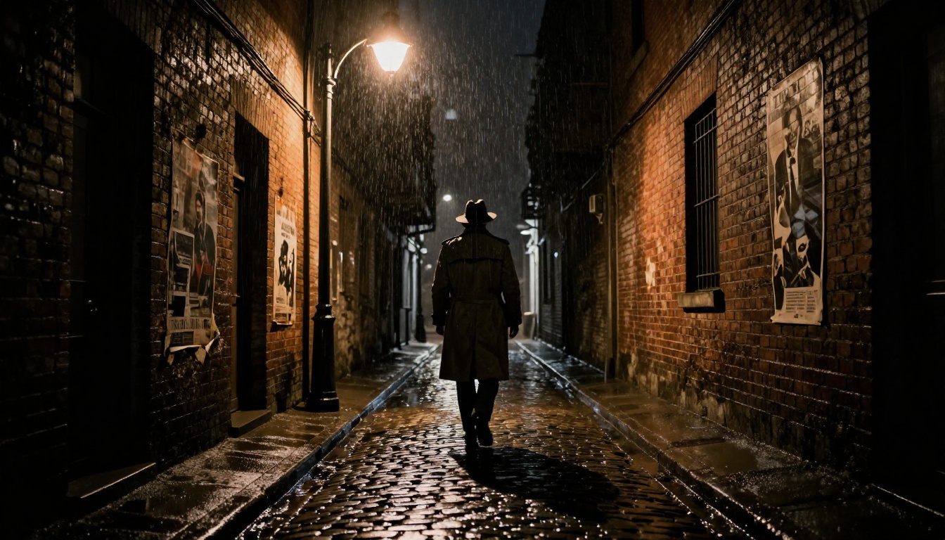
The noir aesthetic - hard shadows, single-point light sources, urban geometry - is one of the cleaner briefs for AI image generation because the constraints are tight and specific. Seedream 5.5 delivers consistently strong results here. High-contrast chiaroscuro, rain-wet surfaces reflecting streetlight, figures in silhouette against lit windows - these prompt reliably and consistently. For mystery specifically, the model handles environmental storytelling well: an abandoned room with specific details that imply a narrative, the atmospheric visual signal that "something is wrong here" without requiring explicit dramatic content.
| Genre | Lighting Style | Prompt Elements | Best Ratio |
|---|
| Fantasy | Volumetric, atmospheric | Scale, epic vista, mist | 16:9 |
| Romance | Golden hour, rim light | Warmth, figure silhouette | 2:3 |
| Children's | Soft, warm, natural | Cozy, bright, organic texture | 4:3 |
| Thriller | Hard shadow, single source | Contrast, urban, wet streets | 2:3 |
| Sci-Fi | Cold, directional, dramatic | Scale, industrial, alien terrain | 16:9 |
How to Use Seedream 5.5 on PicassoIA
Getting consistent, professional results from Seedream 5.5 requires structured prompts. The model rewards specificity and punishes vagueness.
Writing Prompts That Work
Structure your prompts in five layers:
- Subject and action: Who or what is in the scene, doing what, in what position or pose.
- Environment: Where, with what specific details in the background and foreground.
- Lighting: Direction, color temperature, quality (hard vs. soft), atmospheric conditions like mist or rain.
- Camera: Angle (low, aerial, eye-level), distance (extreme close-up, medium, wide), lens specification (e.g., "85mm f/1.4").
- Style anchor: "RAW 8K photography, photorealistic, Kodak Portra 400 film grain" consistently steers the model toward the photorealistic quality that works for book publishing rather than illustration or CGI styles.
A prompt covering all five layers will consistently outperform one that covers only one or two. The gap in output quality is immediately visible when you compare.
Aspect Ratio and Resolution Settings
Different publishing formats require different output ratios:
- Standard paperback or hardcover: 2:3 (portrait). The most common book format by a wide margin.
- Wide scenes and interior illustrations: 16:9. Best for illustrated spreads and marketing assets.
- Square thumbnails: 1:1. For social media, digital storefronts, and promotional graphics.
Set your aspect ratio before generating on PicassoIA. Cropping after the fact always costs you composition quality, particularly around figure placement and the image's natural focal center.
Upscaling for Print Quality
AI-generated images are ready for digital display but need upscaling for print production. A 1024px output at 300 DPI covers a small physical area. For a standard 6"x9" paperback at 300 DPI, you need at least 1800x2700 pixels. Before sending files to a printer, run your output through Clarity Pro Upscaler or Topaz Image Upscale, both available on PicassoIA. These models add genuine detail during the upscale pass rather than simply interpolating pixels, which keeps photorealistic quality intact at larger print sizes.
For portraits and character close-ups, Crystal Upscaler is specifically trained on face and skin texture detail and produces noticeably better results than general-purpose upscalers on those specific subjects.
Image generation is step one. A complete publishing workflow involves several other capabilities that PicassoIA handles within the same platform.
Super-Resolution for Print Files
The super-resolution models on PicassoIA turn web-resolution AI output into print-ready files:
- Clarity Pro Upscaler: Best for landscape scenes and atmospheric images. 4x upscale with sharp detail preservation throughout.
- Real ESRGAN: Fast and reliable 4x upscaling. Particularly strong on textures and environmental backgrounds.
- Google Upscaler: Excellent overall quality across both portrait and landscape content, with consistent results.
- Topaz Image Upscale: Up to 6x upscaling for very large format print requirements, such as posters or trade show displays.
For a standard book cover at print resolution, a 4x upscale from a 512-768px source output is generally enough. Run two sequential passes (4x, then 2x) if you need larger sizes without visible softening.
Writing Back-Cover Text with LLMs
Once your cover image is finalized, PicassoIA's large language model collection handles the rest of your book's copy. GPT 5, Claude Sonnet 5, and Gemini 3.1 Pro are all available for drafting back-cover copy, series descriptions, and marketing blurbs that match your cover's visual tone. This makes PicassoIA a single-platform workflow for self-publishing authors rather than a tool you drop in and out of.
💡 Workflow tip: Generate your cover image first, then describe it to the LLM and ask it to write copy "in the visual tone of" that scene. This creates marketing language that coheres with your cover rather than existing separately from it - a difference readers feel even when they cannot articulate why.

What Works and What Needs Iteration
Being honest about capability gaps saves production time. Seedream 5.5 is among the stronger text-to-image models for publishing work right now, but no model is without constraints.
What It Handles Confidently
- Atmospheric scene composition with clear, single focal points
- Genre-specific lighting and color palette interpretation from written prompts
- Photorealistic natural environments: forests, cliff edges, urban settings, interiors, bodies of water
- Figure silhouettes and mid-to-distant character placement in scenes
- Interior environments with specific textures, props, and atmospheric detail
- Fantasy and historical architecture at mid-range and wide shooting distances
- Botanical, map, and prop illustration with strong detail fidelity
Where Iteration Is Required
- Close-up character faces: Better than older models but facial consistency still benefits from multiple generations. Budget for selecting from several outputs rather than engineering a single perfect result on the first try.
- Complex hand positions: Hands remain difficult for any text-to-image model at current capability levels. Use composition and crop choices to minimize hand visibility when the specific gesture is not critical to the scene.
- Rendered text in images: The model handles "no text" instructions well but struggles to render specific readable text accurately within a scene. Add title and author text in design software after generation - always.
- Highly specific character designs: If your protagonist has a very specific defining feature that needs to appear consistently, budget time for iteration or use PicassoIA's inpainting tools to refine particular areas of an otherwise strong output rather than regenerating from scratch.
Your Turn on PicassoIA
The barrier to professional-quality book illustration has dropped significantly with Seedream 5.5 on PicassoIA. What previously required hiring a cover artist or weeks of software training is now achievable in an afternoon of focused prompt work. The model rewards specificity, responds to compositional direction, and handles genre visual language with more precision than most alternatives at any price point.
Whether you are working on your first novel's debut edition, maintaining a consistent visual identity across a multi-book series, or building illustration plates for a children's book, the workflow is the same: generate with Seedream 5.5, upscale with Clarity Pro Upscaler, and finalize your typography in your design tool of choice.
PicassoIA has over 91 text-to-image models available at picassoia.com/en/all-models, ranging from Seedream 5.5 to tools for animation, video enhancement, audio generation, and AI-assisted writing. If Seedream 5.5 is your starting point for visual publishing work, the breadth of what is available makes it straightforward to expand that workflow as your projects grow in scope and ambition.


