Seedream 5 Pro for Infographics and Data Graphics: The 2K Visual Standard
Seedream 5 Pro delivers 2K-resolution precision for data-heavy visuals. This article breaks down how to use it for infographics, chart layouts, and professional data graphics, with prompt strategies, model comparisons, and real workflow tips that save time and produce sharper results.
When data needs to tell a story, the visual carrying that story determines whether anyone actually reads it. Infographics and data graphics sit at the intersection of function and form, where accuracy in bar proportions matters as much as color choice, and where a blurred label destroys the credibility of an entire report. That is why Seedream 5 Pro for infographics and data graphics deserves serious attention from anyone producing charts, dashboards, presentations, or visual reports at a professional level. Developed by ByteDance and available on PicassoIA, this model generates images at a native 2K resolution with structural precision that most AI image models simply do not achieve. This article breaks down exactly what it delivers, how to use it, and where it fits against the alternatives.
What Seedream 5 Pro Actually Is
Seedream 5 Pro is a text-to-image AI model by ByteDance that prioritizes structural accuracy, fine typographic rendering, and 2K output quality. It is not a general-purpose creative model optimized for painterly effects or stylized art. It is built for content that needs precision: product photography, text-heavy layouts, technical diagrams, and data-dense visual compositions.
For the specific problem of infographic and data graphic generation, this focus makes it the strongest model in its class currently available on PicassoIA.
The Technical Difference at 2K
The native 2K output of Seedream 5 Pro is not just a resolution number. At 2K, the model preserves:
Geometric precision: Bar widths, pie segment proportions, and gridlines maintain accurate spatial relationships
Typographic sharpness: Numbers, labels, and category names remain legible without post-processing
Color boundary clarity: Adjacent color regions in charts maintain hard, clean edges rather than bleeding into each other
Structural coherence: Multi-element layouts hold their intended visual hierarchy at full resolution
This is the set of properties that separates a usable data graphic from one that only looks like a chart but cannot actually be read.
Why Most Models Struggle with Data Charts
Standard AI image models are trained heavily on photographic and artistic content. When asked to render a bar chart, they apply learned patterns from that training, producing results that visually approximate a chart without achieving the geometric and typographic accuracy a real chart requires.
Seedream 5 Pro's training reflects a different set of priorities: structured layouts, precise text rendering, and accuracy in geometric composition. These priorities make it distinctly more capable for statistical visualization and data-driven visual work.
Why Resolution Defines Data Graphic Quality
Resolution matters differently for data visuals than it does for other content. A portrait photograph at 1K still communicates clearly. A bar chart at 1K may be completely unusable in a professional context.
Three Ways Low Resolution Breaks Charts
Label degradation: At lower resolutions, text labels on data visualizations often blur to the point of unreadability. A chart with unreadable labels communicates nothing and cannot be published or presented.
Proportion distortion: When resolution is insufficient to render precise bar boundaries, the model approximates proportions visually. A bar representing 37% can look identical to one representing 45% when the boundaries blur together.
Context failure: Data graphics appear in contexts that demand resolution resilience. Printed reports, large conference screens, high-DPI devices, and PDF exports all stress low-resolution outputs in ways that reveal every flaw. A 1K output that looks acceptable on a small screen falls apart in every professional deployment context.
The 2K Standard in Practice
Context
Minimum Resolution
Seedream 5 Pro Output
Web presentation
1080p
Exceeds requirement
Printed A4 report
1500px wide
Meets at 2K
Conference screen (4K display)
3840px wide
Meets with super-res
Social media sharing
1200px wide
Exceeds requirement
PDF export
300 DPI equivalent
Meets at 2K
For most professional data graphic needs, 2K output covers the requirement directly. For large-format print, PicassoIA's super-resolution models extend the output further without quality loss.
How to Generate Infographics on PicassoIA
Using Seedream 5 Pro for data graphic generation follows a specific workflow that produces better results than standard creative image prompting.
Access the Model
Navigate to the PicassoIA text-to-image collection and select Seedream 5 Pro. The model is available without special configuration, and 2K output is the default generation setting. No additional parameters are required to activate the high-resolution output.
Structure Your Data Graphic Prompt
The prompt structure for data graphics differs significantly from creative image prompting. Where creative prompts benefit from evocative language, data graphic prompts require specificity.
Vertical bar chart with six bars, quarterly business revenue comparison across four years, deep navy and amber color scheme, white background, labeled axes with percentage values above each bar, clean sans-serif typography, professional presentation style, 2K photorealistic, sharp gridlines, precise geometric layout
Example for an infographic layout:
Three-panel horizontal infographic layout, global logistics statistics, top section with large bold statistics in coral on white, middle section with world heatmap in blue gradient, bottom section with icon-and-number row, clean minimal typography, professional business presentation quality, 2K photorealistic
Iterate with Precision
The first Seedream 5 Pro output is a draft. These refinements produce the most reliable improvements:
If proportions are off: add "mathematically precise bar proportions, equal-width bars"
If text is unclear: add "ultra-sharp legible text labels, large font size"
If colors blend together: add "high contrast color differentiation, distinct color per category"
If the layout is cluttered: add "minimal layout, generous white space, clear visual hierarchy"
💡 Tip: Specify the exact number of data elements in every prompt. "Exactly five pie segments," "precisely four bars," or "exactly three trend lines" gives the model a concrete constraint and dramatically improves structural accuracy.
Chart Types That Produce the Best Results
Different data visualization formats respond differently to AI generation. Here is how Seedream 5 Pro performs across the most common types.
Bar Charts and Column Charts
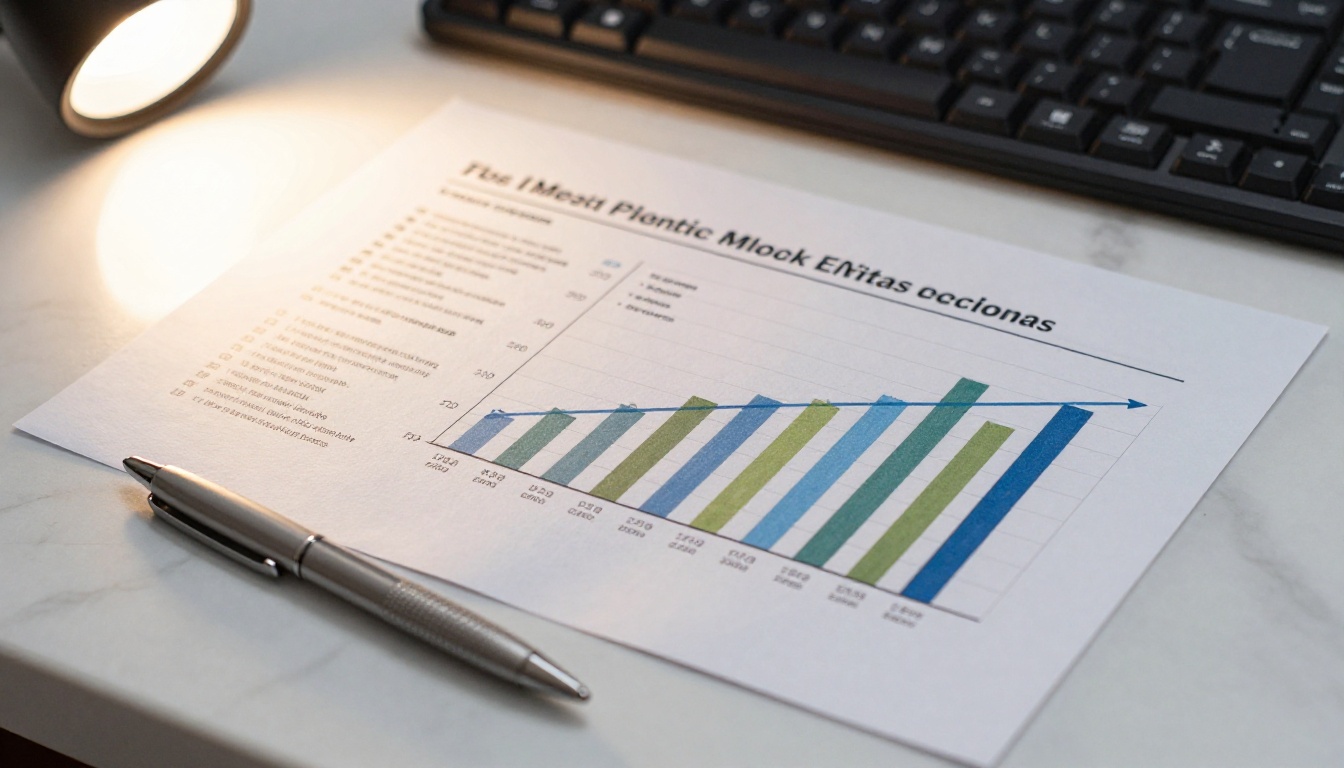
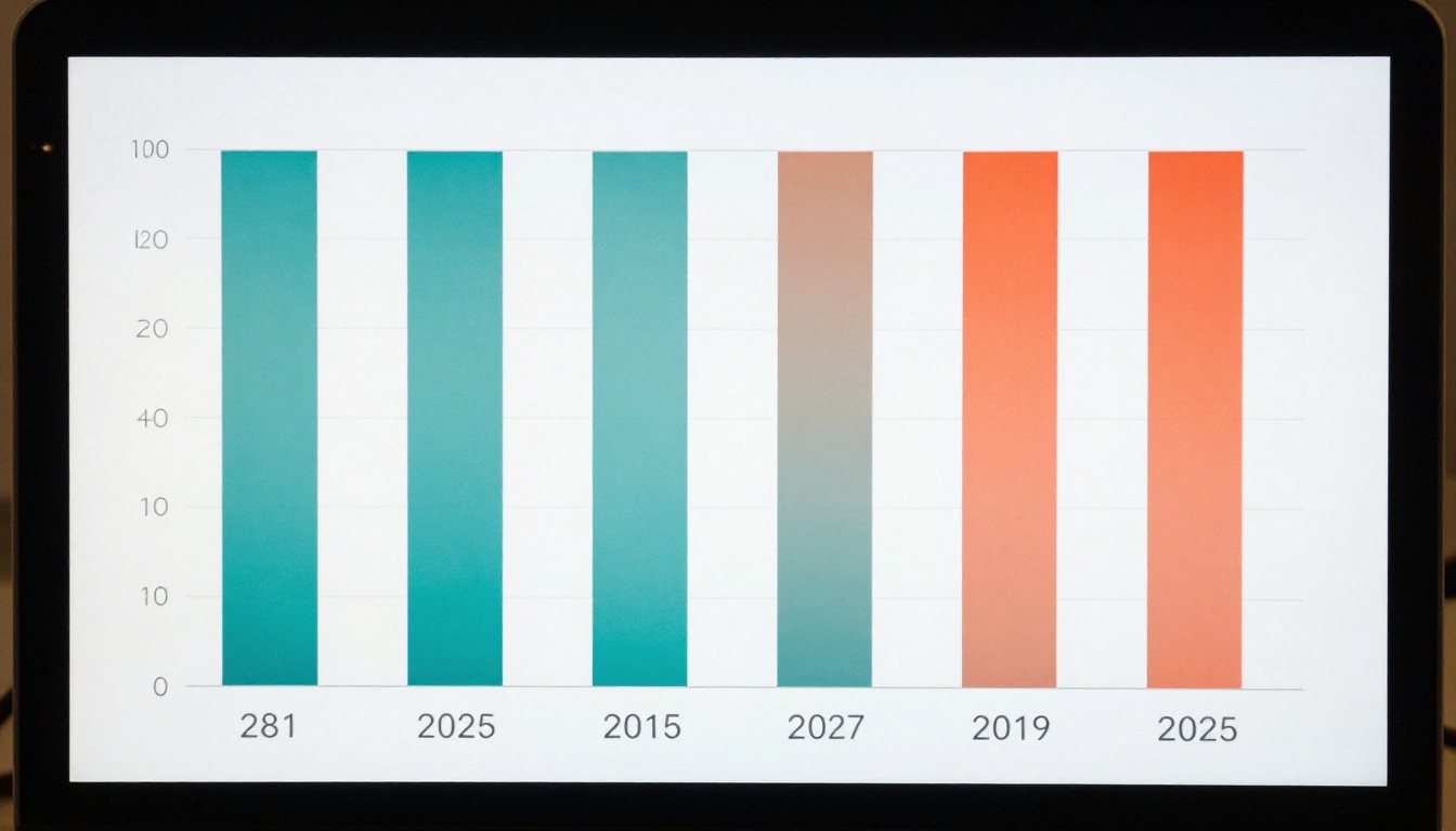
Bar and column charts are the strongest performing format for Seedream 5 Pro. The model renders distinct bar boundaries, accurate proportional heights, and readable axis labels with high consistency. Specifying the exact number of bars and a high-contrast color pair (navy and coral, teal and orange) produces the most reliable results.
Best practice: Use a white or very light gray background. Dark backgrounds with light bars work but require explicit color specification for every element, including axis lines and label text.
Pie Charts and Donut Charts
Pie charts perform well with Seedream 5 Pro when the number of segments is specified precisely. Three to five segments produce the most accurate proportional rendering. Beyond six segments, the model begins to approximate segment sizes less accurately. For complex multi-variable distributions, a stacked bar chart is a more reliable format to generate at this stage.
Line Graphs and Trend Charts
Line graphs require additional prompt specificity around the trend direction. Specify "ascending trend from left to right," "three crossing trend lines," or "sharp peaks at Q2 and Q4" to get directionally accurate outputs. The model renders individual data point markers, axis labels, and grid lines at 2K with strong precision.
Mixed-Element Infographic Layouts
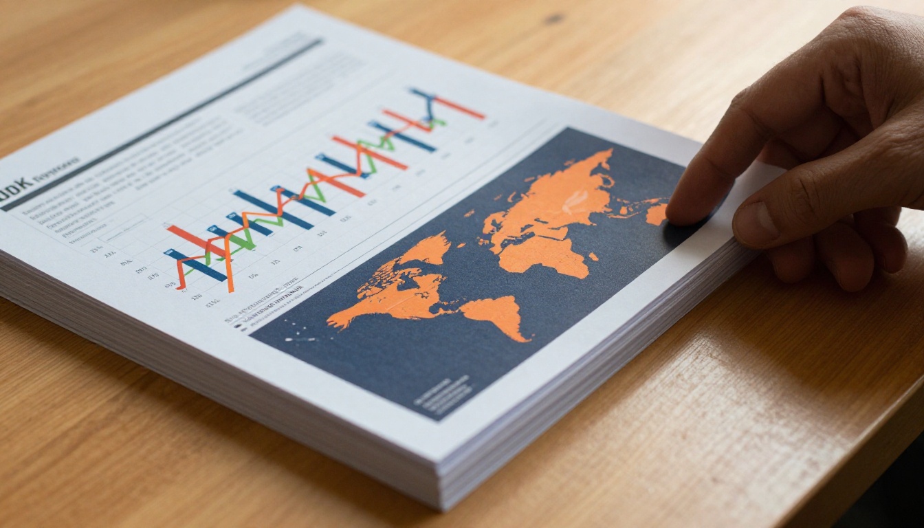
Multi-section infographic layouts benefit from explicit section count and layout direction. "Three horizontal panels stacked vertically" gives the model a clear structural framework. Mixing chart types within a single infographic (a bar chart in one section, a pie chart in another, statistics callouts in a third) works well with Seedream 5 Pro when each element is described separately in the prompt.
Seedream 5 Pro vs. Other Models
PicassoIA offers over 90 text-to-image models. Knowing where Seedream 5 Pro fits relative to similar options informs smarter model selection for each project.
vs. Reve 2.1
Reve 2.1 is PicassoIA's strongest model for iterative editing and creative composition. It excels at images that require editorial flexibility and creative interpretation. For data graphics, Reve 2.1 produces visually attractive outputs but applies more artistic interpolation to chart elements, which can compromise the geometric accuracy data visuals require.
Choose Seedream 5 Pro when data accuracy and structural fidelity are the priority.
Choose Reve 2.1 when creative campaigns require aesthetic flexibility alongside data elements.
vs. P Image Ideogram
P Image Ideogram is optimized for images with embedded text, making it competitive for text-heavy infographics and typographic compositions. For infographics that are primarily statistical callouts, quotes, and headline numbers, Ideogram renders typography extremely cleanly.
For infographics that contain actual chart data — bars, lines, pie segments, proportional relationships — Seedream 5 Pro renders the data elements with greater structural accuracy.
Feature
Seedream 5 Pro
Reve 2.1
P Image Ideogram
Data chart precision
Excellent
Good
Good
Typography rendering
Very good
Good
Excellent
Resolution output
2K
Variable
Standard
Creative flexibility
Moderate
Excellent
Good
Best use case
Data graphics
Creative campaigns
Text infographics
Real Workflow for Data-Heavy Projects
Business Reports and Quarterly Reviews
For structured business documents, generate each chart element individually rather than as a composite layout. A single, focused prompt for a revenue bar chart produces a more accurate result than a prompt asking for an entire report page. Assemble individual chart generations in your presentation software or document editor for precise layout control.
💡 Tip: When generating charts for business reports, specify brand colors in descriptive terms ("deep navy blue," "bright coral red," "clean white background"). Consistent color description across multiple chart generations helps maintain visual cohesion across a full report.
The workflow for a typical business report section looks like this:
Identify the data story: What single insight does each chart communicate?
Write the prompt around that insight: Rather than describing a generic bar chart, describe a chart showing a specific narrative (Q3 revenue significantly outperforming Q1 and Q2)
Generate at 2K and export: The 2K output from Seedream 5 Pro holds quality through export to PDF without additional upscaling
Apply super-resolution if needed: For poster-scale or billboard data graphics, PicassoIA's super-resolution models push the output further without introducing blur
Marketing Infographics for Sharing
Marketing data graphics require a balance between data accuracy and visual impact. The prompting approach shifts toward visual appeal:
Add "bold, high-impact design" to the quality modifiers
Specify the intended format: "square format for Instagram," "vertical for Pinterest," "horizontal for LinkedIn"
Request "prominent statistics callouts" for shareable infographic formats that prioritize at-a-glance readability
Presentation Slides and Pitch Decks
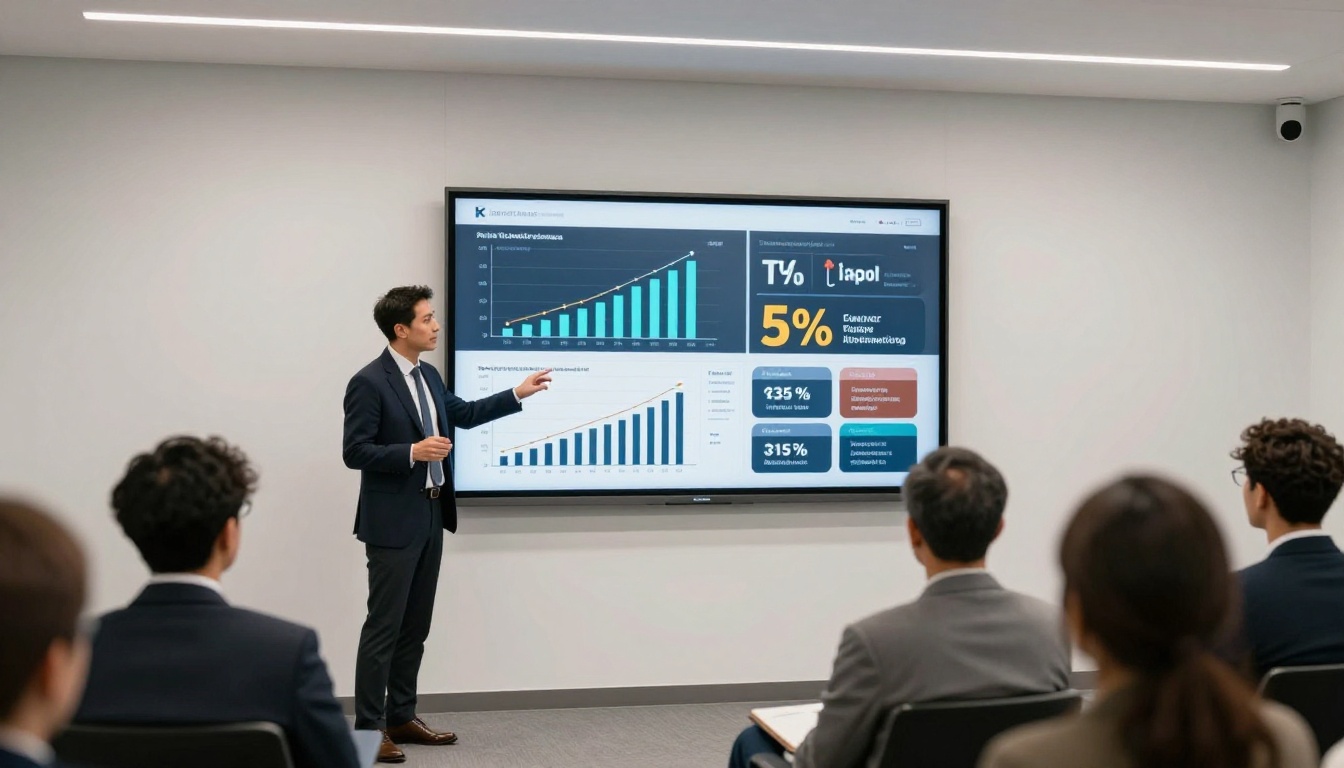
Presentation data graphics need to read clearly at projection distances. Prompt specifically for large, bold elements: "oversized bar labels," "high-contrast color pairs," "minimal data density per chart." Single-message data points per slide outperform multi-variable complex charts in projection contexts.
Extend Outputs with PicassoIA Tools
Seedream 5 Pro handles the generation side. PicassoIA offers additional tools that extend what you can do with those outputs.
Super Resolution: Available in PicassoIA's model collection, super-resolution tools can upscale a 2K Seedream 5 Pro output to poster or billboard scale without quality degradation. This is the path from screen-quality to large-format print.
Background Removal: Seedream 5 Pro's clean geometric outputs work exceptionally well with PicassoIA's background removal tools, making individual chart elements easy to isolate for compositing into custom layouts or brand-specific templates.
AI Image Restoration: For infographic assets that have been compressed, edited, or re-exported multiple times, PicassoIA's restoration models recover sharpness and reduce compression artifacts without affecting the underlying data visual structure.
3 Mistakes That Cost Generations
Prompting for Too Much at Once
Asking the model to render a 12-bar chart with individual values, axis labels, a legend, a title, and a subtitle all in one generation is too many elements for a single prompt to handle precisely. Results become cluttered and structurally inaccurate. Break complex infographics into components: generate charts individually, then assemble in post.
Ignoring the Background
The background color of a data graphic fundamentally affects how the chart data reads. A dark background requires high-contrast light colors for the data elements. A white background handles both dark and medium tones well. Always specify the background explicitly. "White background," "light gray background," or "dark navy background with white labels" are all valid and produce significantly better results than leaving it unspecified.
Treating the First Output as Final
The first generation from any prompt is a draft. Seedream 5 Pro improves significantly with targeted iteration. If bars are slightly the wrong proportion, add "precisely equal-width bars" to the next prompt. If labels are too small, add "large prominent text labels." If colors are too similar, add "highly distinct colors with clear separation." A targeted second generation typically produces a production-ready result.
Start Building Your Data Visuals
The practical case for Seedream 5 Pro in data graphic work comes down to one thing: 2K native resolution with structural fidelity that most AI image models do not achieve at any resolution. For infographics, business charts, data presentations, and statistical visualizations, that precision is the difference between a graphic that functions and one that only approximates.
Start with a single chart. Write a specific prompt. Specify the chart type, the number of elements, the color scheme, and the background. Generate, iterate once with targeted corrections, and produce the output your project actually needs.
PicassoIA gives you Seedream 5 Pro alongside the full suite of tools that extend it: super-resolution for large-format output, background removal for compositing, and restoration for existing assets. It is a full data graphic workflow in one platform.