Your thumbnail text is a conversion lever, and most creators are wasting it. When a viewer scrolls YouTube at speed, your thumbnail has roughly 0.4 seconds to register. If your text looks blurry, soft, or pixelated, the brain dismisses it before the viewer consciously decides. That is not a design problem. That is a resolution problem. And it is one that Nano Banana Pro's 4K text output solves at the source, producing pixel-precise letterforms that survive YouTube's compression pipeline and stay readable on every screen size from a 75-inch smart TV down to a 5-inch phone.
This article breaks down exactly what 4K text quality does for thumbnails, which AI upscaling models on PicassoIA sharpen your existing designs fastest, and what technical mistakes are quietly degrading the text quality on thumbnails you have already spent time building.
Why Thumbnail Text Quality Kills Your CTR
Every click starts with recognition. Before a viewer reads your title in the metadata, they read your thumbnail. The text on that thumbnail either registers in under half a second or it does not register at all. Low-sharpness text is not just aesthetically weak. It is functionally invisible.
The Small Screen Problem
The majority of YouTube views now happen on mobile. On a phone held at arm's length, a standard 1280x720 thumbnail rendered at roughly 100x56 pixels on screen is competing with dozens of other thumbnails on the same page. At that scale, soft text with anti-aliasing artifacts or compressed edges becomes a gray smear. Bold text with pixel-precise 4K rendering stays readable.
💡 Quick test: Pull up your own channel on your phone's YouTube app. If you cannot read your thumbnail text at a glance, neither can your audience.
This is why resolution matters more than design skill at small sizes. A mediocre design with sharp 4K text will always out-perform a beautiful design with blurry, low-resolution text on a mobile feed.
When Text Becomes Noise
Standard 72 DPI thumbnail text exported without proper resolution settings generates a specific kind of degradation: edge aliasing. The letters have soft, jagged edges that blend into the background. Add YouTube's own compression pass on upload, and you lose another 10 to 20 percent of apparent sharpness. By the time the viewer sees it, the text is fighting the background instead of sitting cleanly above it.
The solution is not bigger fonts. The solution is sharper pixels at the source.
What 4K Text Resolution Actually Means
The term "4K" in the context of thumbnail text is not about the final upload resolution. YouTube displays thumbnails at a maximum of 1280x720. The advantage of 4K source resolution is in the downscaling math: when you start from a 3840x2160 canvas and let the platform resize it, the text edges land on pixel boundaries cleanly. The result is visually sharper text at the displayed size compared to text designed natively at 1280x720.
Pixels Per Inch on Real Screens
Modern phone screens run between 400 and 460 PPI. When YouTube renders a thumbnail at the small preview size, it uses actual device pixels to fill that space. A source image with more resolution data gives the scaling algorithm more information to work with. More information equals sharper output. This is the mechanical reason 4K source text looks noticeably crisper on high-DPI screens.
| Source Resolution | Displayed Sharpness on Mobile | Compression Resilience |
|---|
| 720p native | Moderate | Low |
| 1080p upscaled | Good | Moderate |
| 4K source | Very sharp | High |
| 4K AI upscaled | Best | Highest |
The Sharpness Gap Between Standard and 4K
The difference becomes most visible on specific letter shapes: O, S, C, G, Q. These round characters have curves that require more edge data to render smoothly. At low resolution, they show staircase aliasing. At 4K, they are smooth. On a thumbnail where your title might include any of these common letters, that smoothness directly affects how professional the design reads at every size.
Nano Banana Pro's Approach to 4K Text
Nano Banana Pro addresses thumbnail text sharpness at the generation level. Rather than generating a thumbnail at standard resolution and upscaling after, it produces 4K-native text rendering from the start. The text edges are computed at full 4K precision, which means no interpolation artifacts, no anti-aliasing softness, and no compression-induced blurring of the letterform edges.
How It Handles Text Rendering
The critical difference in Nano Banana Pro's pipeline is how it treats typography. Standard AI image generators treat text like any other visual element, subjecting it to the same diffusion process that softens and blurs hard edges. Nano Banana Pro's 4K text output treats letterforms as precision objects with hard boundaries, preserving edge definition that survives YouTube's compression pipeline intact.
This matters most on:
- Short, bold words: Single words in all-caps with tight tracking
- High-contrast overlays: White text on dark backgrounds or vice versa
- Thumbnail titles under five words: Where each letter needs to carry individual weight
4K Output for Standard Uploads
A 4K source file for a YouTube thumbnail is not about file size or storage. It is about having a resolution reservoir to draw from. When YouTube processes your upload and generates the thumbnail, it pulls from your source data. More source data means a cleaner final output at every displayed size, from the full 1280x720 search result thumbnail down to the tiny 68x38 related video chip in the sidebar.
💡 Worth noting: Design your thumbnails at 4K, export at maximum quality, and let YouTube's resize algorithm work with the full resolution data. The small thumbnail previews will look dramatically sharper across every device.
Best PicassoIA Upscalers for Thumbnail Sharpness
If your existing thumbnails were created at standard resolution, PicassoIA's super-resolution models can recover and sharpen that quality without starting over. These are the models that consistently perform best on thumbnail text specifically.
Clarity Pro Upscaler
Clarity Pro Upscaler is purpose-built for photorealistic detail sharpening. It produces crisp results without introducing the artificial over-processed look that cheaper upscalers create. For thumbnails with photographic backgrounds and overlaid text, it preserves the natural image while bringing hard text edges into precise definition.
Best for: Thumbnails with real photo backgrounds and heavy text overlays.
Recraft Crisp Upscale
Recraft Crisp Upscale does exactly what the name says. It prioritizes edge crispness above all else. For thumbnails where text is the primary visual element and the background is a flat color or gradient, this model produces the most visible improvement in text readability.
Best for: Simple design thumbnails where text carries the visual weight.
Image Upscale by Topaz Labs
Image Upscale by Topaz Labs supports up to 6x magnification, making it the right choice when you need to push a 720p thumbnail all the way to 4K output. Topaz's algorithm is trained specifically on photographic content, which means it understands the difference between text edges and photographic gradients and treats them accordingly.
Best for: Maximum upscale factor when starting from the smallest source files.
Real-ESRGAN for Fast Results
Real-ESRGAN is the fastest free option in the lineup. It produces solid 4x upscaling with reliable text edge preservation. For creators who need to process a large backlog of old thumbnails, Real-ESRGAN offers the best balance of speed and output quality.
Best for: Batch processing older thumbnail archives quickly.
P Image Upscale
P Image Upscale delivers sharp results in under one second. For creators working inside a fast iteration loop where you are testing six thumbnail variations and need sharp previews for each one quickly, P Image Upscale removes the wait from the workflow entirely.
Best for: Rapid iteration and thumbnail A/B testing workflows.
How to Use PicassoIA for Sharp Thumbnails
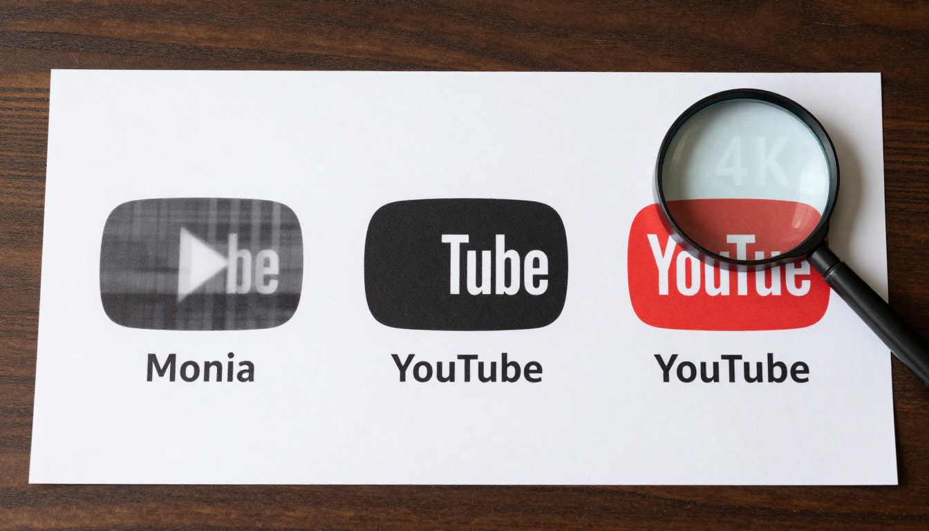
The process is straightforward. You do not need to know anything about resolution theory or compression algorithms. PicassoIA handles that at the model level.
Step 1: Start With Your Thumbnail Design
Build or export your thumbnail at the highest resolution your design tool allows. If you use Canva, Photoshop, or Figma, export at the largest available size. The PicassoIA upscaler will take it from there. There is no minimum resolution requirement, though better source quality always produces better upscale output.
Step 2: Upload and Select Your Model
Go to picassoia.com/en/all-models and filter by Super Resolution. Upload your thumbnail file, select the model that matches your use case from the comparisons above, and run the sharpening process.
For thumbnails with:
Step 3: Export and Upload to YouTube
Download the upscaled result. When you upload to YouTube Studio, use the 4K output file as your thumbnail source. YouTube will generate its own resized versions from that file. You will see the difference immediately in the thumbnail preview before the video even goes live.
💡 Pro move: After uploading, open the video on your phone and check the thumbnail at the small sidebar chip size. If the text is still legible at that size, your upscale worked. If not, run it again through Crystal Upscaler with a higher scale factor.
4 Mistakes That Blur Your Thumbnail Text
Most blurry thumbnails are not a design failure. They are an output failure. These are the four most common technical mistakes that degrade text quality after the design is finished.
Wrong Export Resolution
Exporting your thumbnail at 1280x720 JPG with 80% quality before upscaling is backwards. You are compressing the data before the upscaler has a chance to work with it. Always export at maximum resolution and maximum quality first, then upscale, then compress for final delivery. The order matters more than most creators realize.
Compression After Upload
Some creators export the upscaled thumbnail as a low-quality JPG to reduce file size before uploading to YouTube. This adds a second compression pass on top of YouTube's own. The platform recommends PNG or high-quality JPG for thumbnails. Trust the platform's compression process and deliver the highest quality source file you can.
Font Choices That Do Not Scale
Not all fonts survive small sizes. Thin-weight fonts, script fonts, and decorative fonts with thin strokes turn into illegible smears below a certain pixel count. For thumbnails, stick to:
- Weight: Bold or Extra Bold minimum
- Letterform: Clean, geometric shapes without thin strokes
- Contrast: At least 4:1 ratio between text color and background
Ignoring Small Screen Preview
Most creators design and preview on a desktop monitor at full resolution. The thumbnail looks sharp there. The mistake is not checking it at actual mobile display size. Set your browser to 50% zoom, reload your channel page, and see what your thumbnail actually looks like at viewing distance. If the text is still readable, you are in good shape. If not, apply PicassoIA's super-resolution before the next upload.
Comparing Results Across Upscalers
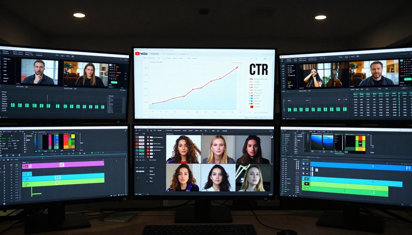
Not all upscalers treat text the same way. Here is a practical breakdown of what to expect from each model on PicassoIA:
The sweet spot for most thumbnail workflows is Recraft Crisp Upscale or Clarity Pro Upscaler depending on how image-heavy your design is. Run both on a test thumbnail and compare at 50% browser zoom. The winner for your specific design style will be immediately obvious.
Text Sharpness Is a Competitive Advantage
Most creators in any niche are still uploading thumbnails with soft, compressed text. They are not doing it intentionally. They just have not looked at their thumbnails at actual mobile display size and run the comparison. When you use 4K text quality through Nano Banana Pro or run your existing thumbnails through PicassoIA's super-resolution models, you are not just making your thumbnails look better. You are making them functionally more readable than the competition's at the exact scale where clicks actually happen.
Readability at small sizes ties directly to CTR. CTR ties directly to how aggressively YouTube's algorithm distributes your content. Sharper text is not a cosmetic change. It is a distribution lever.
Every thumbnail in your backlog is a candidate for this improvement. Pull your lowest-performing videos, check the thumbnails at mobile size, and run the ones with blurry text through Image Upscale by Topaz Labs or Clarity Pro Upscaler on PicassoIA. Swap the thumbnails and watch the impression-to-click ratio over the following week.
The thumbnails are already published. The audience is already there. The only thing between you and more clicks is sharper pixels.
If you want to start fresh with 4K-native thumbnails using Nano Banana Pro's precision text output, or run any of PicassoIA's full collection of image generation and super-resolution models, everything is at picassoia.com/en/all-models. Generate, upscale, and export in one workflow without switching tools.


