AI Infographic Generator Free: From Text to Infographic
Paste your text, get a finished infographic. This article shows which free AI image models handle headlines and short labels, how to write a prompt that builds the layout, and how to catch misspelled words and invented numbers before you publish.
You have a block of text, a spreadsheet of numbers or a list of steps, and a clean visual is due by the end of the day. An AI infographic generator promises to handle the layout for you: paste the words, get a finished graphic. Some of those promises hold up. Others fall apart the moment a headline is misspelled or a chart shows numbers nobody supplied.
This article separates the two. You will see what text to infographic tools actually do, which free options deserve a test, how to write prompts that produce a usable layout, and how to fix the mistakes that appear most often. One rule runs through all of it: let the AI draw, and let a person check every word and every number.
💡 Short version: Write a structured prompt, generate three variations in a text-friendly image model, pick the best layout, and proofread every word before anything goes public.
What an AI Infographic Generator Does
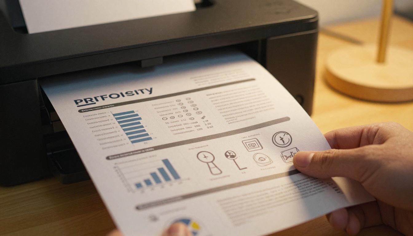
A generator takes plain language and returns a picture that looks like an infographic: a headline, a few sections, icons, simple charts and a controlled color palette. Two very different engines sit behind that result.
Image models paint the whole graphic as pixels. You describe the layout, the style and the words, and the model draws everything at once. It is fast and flexible, but the model is drawing letters rather than typing them, so a misspelled word is always possible.
Template editors keep your text as real, editable text and drop it into a fixed layout. Apps such as Canva, Piktochart and Venngage are built around this approach. Your words stay exact, though the design is limited to the templates on offer.
Image model
Template editor
Speed to first draft
Seconds
A few minutes
Text accuracy
Needs a proofread
Exact
Layout freedom
Very high
Limited to templates
Editing after export
Regenerate or retouch
Edit directly
Best fit
Posters, thumbnails, social posts
Data-heavy reports
Who gets the most from it
Anyone who has to explain something quickly benefits, but four groups see the biggest gain:
Bloggers and marketers who want the main points of a long post as a shareable graphic.
Teachers who need a poster for tomorrow's lesson, not next week's.
Small shop owners who want a process chart or a how-it-works display on the wall.
Students who condense a chapter into one page of timelines and short labels.
For all four, the draft is the hard part. The generator removes the blank page, and you supply the facts.
The workflow is the same whatever the audience. Start with the source text and cut it to one claim per section. Turn each claim into a label of three words or fewer. Decide on one headline. Then hand the model only those short pieces, never the full article. Pasting 1,200 words into a prompt does not produce a better infographic; it produces a crowded one. The editing you do before generating is where most of the quality comes from.
Free Options That Actually Work
"Free" is a slippery word in this category. Most free plans trade something away, so check the current terms of any tool before you build a routine around it. These are the limits to look for:
Limit
What it means for you
Workaround
Watermark
Not usable for client work
Check the plan before you start
Credit cap
A few drafts per day or month
Plan prompts on paper first
Resolution cap
Soft text when printed
Upscale the final pick
Export format
Only PNG or JPG
Use an SVG model for vectors
Planning your prompt before you press generate matters more on a free plan than anywhere else, because every retry spends something. On PicassoIA, the Nano Banana Pro page is titled around free 4K generation, which makes it a low-risk place to run a first test.
Models worth testing first
The table below is a testing plan, not a ranking. Results change with every prompt, so run the same brief through two or three models and judge the output yourself.
Write one prompt and keep it identical across every run.
Send it to three models.
Score each result on four points: spelling, hierarchy (can you spot the headline in two seconds?), contrast between text and background, and white space.
Keep the winner and change only one thing per retry.
💡 Changing a single variable at a time is the fastest way to see what a model responds to. If you rewrite everything between runs, you never find out which edit helped.
Write a Prompt That Builds Layout
Structure beats adjectives
"Beautiful colorful infographic about coffee" gives the model almost nothing to organize. Layout words do the real work: vertical, three sections, icon above each label, headline at the top, single column. The more of the structure you name, the less the model has to guess.
A prompt formula you can copy
Build every prompt from the same seven parts, in this order:
Format: orientation and ratio, such as vertical 2:3.
Headline: the exact words, in quotation marks.
Sections: how many, and the exact label for each.
Icons or charts: one simple icon per section, or one chart type.
Style: flat vector, hand-drawn, paper cutout, or clean corporate.
Palette: three colors at most.
Limits: no paragraphs, no logos, generous white space.
Here is the formula applied to a real brief:
Vertical infographic poster, 2:3 ratio, flat vector style, off-white background.
Headline at the top in bold sans-serif: "5 Steps to Better Coffee".
Five numbered sections in a single column, each with one simple line icon
and a label of three words or fewer: "Grind Fresh", "Measure Water",
"Heat Water", "Pour Slowly", "Serve Now".
Palette: deep brown, cream and one orange accent.
Generous white space, no paragraphs of text, no logos.
Notice what the example leaves out. There are no adjectives like stunning or professional, no long sentences, and no vague instructions. Every line either fixes the layout or fixes the words. For a timeline, swap the sections line for "a horizontal line with six dated points, each with a one word label above it". For a comparison, ask for two columns with three rows each. Once a structure works, save the prompt and change only the content next time.
Keep the words short
Text is where image models slip. Short strings survive; long ones break. Follow three limits:
Headline: six words or fewer.
Section labels: three words or fewer.
Body copy: none inside the image. Add it later in an editor.
💡 If you need a paragraph under each section, generate the graphic with empty space for it and type the paragraphs yourself. You get exact text and a clean design.
How to Use Ideogram V4 on PicassoIA
Ideogram V4 Quality is a sensible first pick when the graphic carries a headline and short labels. If you want to compare, its sibling Ideogram V4 Balanced sits right next to it in the catalog.
Paste your structured prompt, with the headline inside quotation marks.
Pick a vertical ratio such as 2:3 for posters, or square for social posts, if the model offers the option.
Generate three variations and compare spelling first, layout second.
Re-run the best one with a small edit: shorten a label, swap the accent color, drop a decorative element.
Sharpen the final file with Recraft Crisp Upscale before you print or publish at a large size.
Settings worth changing:
Aspect ratio: choose it before the first run. Cropping afterward cuts off your headline.
Seed: where the model page exposes one, reuse it when you only change a single word. The layout stays stable.
Number of variations: three is the sweet spot. Fewer hides the better option, more wastes credits.
Match the Layout to the Job
The same content needs a different shape on each platform. Pick the ratio first, then write the prompt around it.
Use
Ratio
Layout tip
Instagram carousel slide
4:5
One idea per slide, large headline
Pinterest pin
2:3
Headline on top, five sections at most
Slide deck
16:9
Three blocks side by side
Printed poster
Portrait, close to 2:3
Upscale before printing
Long blog graphic
Tall vertical
One section per screen of scrolling
If a model does not offer an exact ratio, choose the nearest one and crop the edges later.
Social media carousels
A carousel works because each slide carries one idea. Generate a style reference first, then reuse the same palette and icon style words in every following prompt so the slides look related. Keep the headline on each slide under five words.
Classroom posters
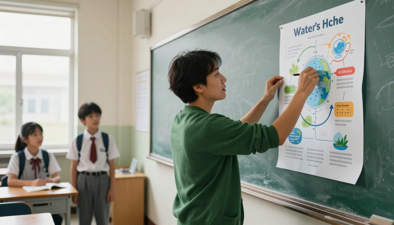
Posters for a wall need big type and few labels, because students read them from across the room. Ask for a single process, such as the water cycle or the stages of a plant, with one arrow path and five labels at most. Print large, and upscale first.
Business reports and decks
For reports, use the image model for the visual frame: the header band, the icons, the background. Then place real charts from your spreadsheet on top. A team that reviews a printed draft together catches wording problems that a screen hides.
Small shop displays
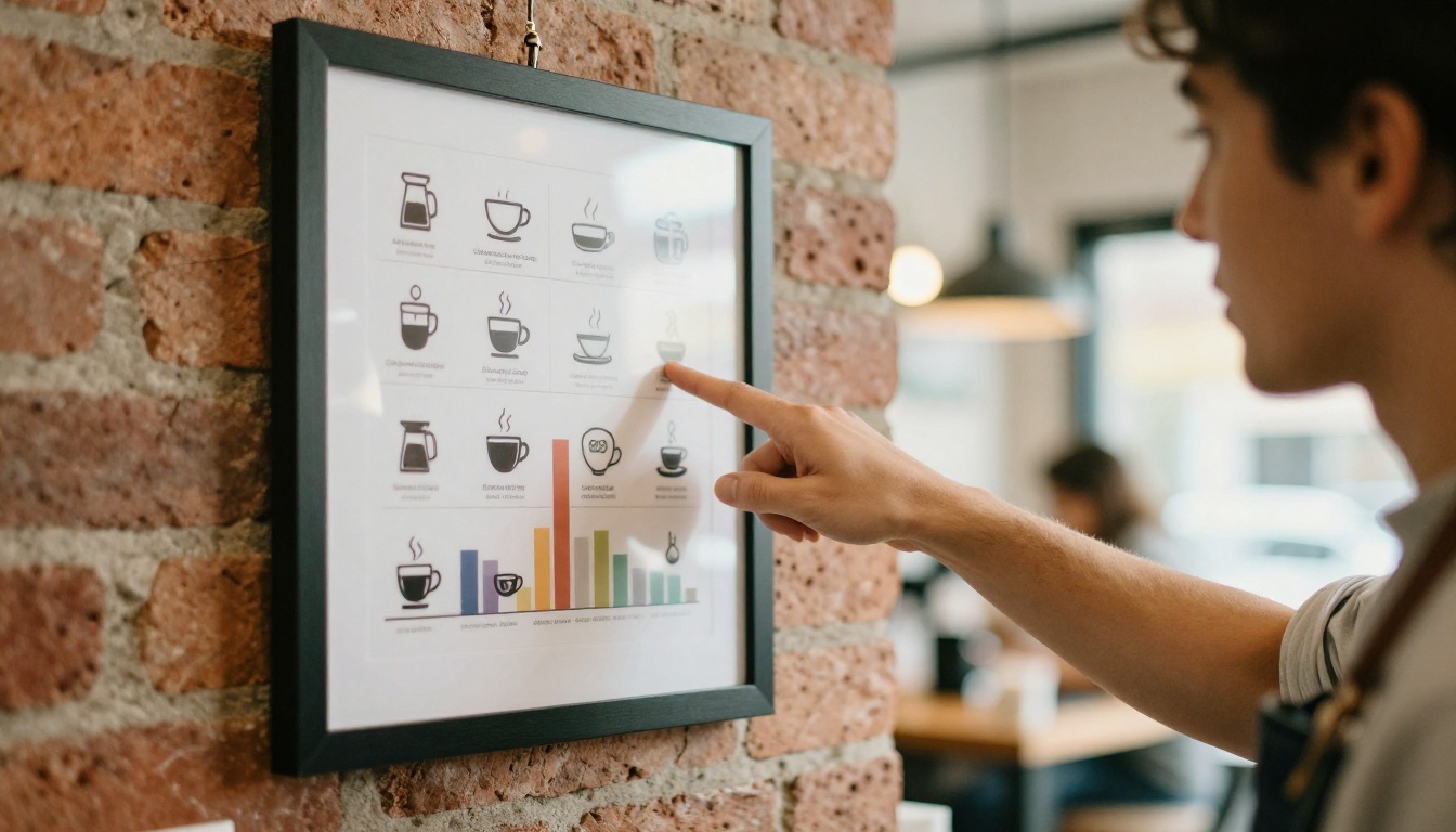
A framed infographic on a shop wall answers the questions customers keep asking: how it is made, what goes in it, how to order. Keep it warm, readable from two meters away, and consistent with the colors of the shop itself.
Fix the Usual Mistakes
Garbled or misspelled text
This is the most common failure. Shorten the string, put it in quotation marks, and say where it sits ("headline at the top, centered"). If one word keeps breaking, regenerate with the same seed and a simpler synonym. If it still fails, leave that area blank and type the word yourself.
Invented numbers
A generator that draws a bar chart is illustrating, not calculating. Bars, percentages and axis labels can look convincing and still be wrong. If the numbers matter, build the chart in a spreadsheet and place it in the layout by hand. Treat any figure the model produced on its own as decoration.
Crowded layouts and clashing colors
If the result feels busy, the prompt asked for too much. Cut sections down to five, drop secondary icons, and add "generous white space" to the limits line. One idea per graphic beats seven ideas squeezed together.
For color, name your palette. Three colors handle almost every case: a dark tone for text, a light tone for the background, and one accent for emphasis. Vague color words such as "vibrant" invite a rainbow.
If you are producing a series, such as ten slides or a weekly poster, save the winning prompt as a template. Keep the format, style, palette and limits lines exactly as they are and swap only the headline and labels. That one habit keeps a whole set looking like it came from the same designer, and it makes proofreading faster because the layout never surprises you.
Before anything goes live, run this checklist:
Check
Pass condition
Spelling
Every word read aloud, letter by letter
Numbers
Each figure matches your source
Contrast
Text readable on a phone screen
Resolution
Sharp at the final display size
Sources
Facts come from you, not from the model
When Vector Output Makes Sense
Raster versus SVG
Most image models return pixels. A few return SVG, a vector format made of shapes and lines. Recraft V4.1 Pro SVG and Arrow 1.1 Max are two vector options on PicassoIA.
Raster (PNG, JPG)
Vector (SVG)
Scaling
Softens when enlarged
Stays sharp at any size
Editing
Retouch pixels
Move shapes and recolor
Look
Rich textures and shading
Clean, flat, graphic
Best for
Posters and social posts
Icons, diagrams, logos
A hybrid workflow that works
The most reliable route combines both. Generate the artwork with an image model: background, icons, decorative shapes. Then set the headline, labels and numbers as real text in a layout editor. You keep the speed of AI and the accuracy of typed words. For a crisp final export, a model like Recraft V4.1 Pro SVG gives you icons you can recolor to match any palette.
Make Your First Infographic Today
Pick one article, report or lesson you already have. Boil it down to a headline and five short labels. Paste them into the prompt formula above and run it on Picasso IA with Ideogram V4 Quality. Generate three variations, read every word, then sharpen the winner with Recraft Crisp Upscale.
If the first result is close but not right, change one thing and run it again. A second try usually fixes spelling and spacing, and a third often lands on a layout you would be happy to publish. When you want to compare more options, open the full catalog at picassoia.com/en/all-models and test a few models on the same brief.
Experiment freely. Every retry teaches you which words the model respects, and your next infographic starts from a better prompt than the last.