You have a bake sale on Saturday, a gig on Friday and a product drop next week. Hiring a designer for each one is not realistic, and a blurry template with the wrong crop makes your brand look careless. An AI poster generator for Instagram fixes this in minutes: you type a sentence, pick the right proportions, and get a finished visual that fits the feed without awkward cropping.
This article gives you three things. First, the exact pixel sizes Instagram expects right now. Second, copy-ready prompts for the most common poster jobs. Third, real social media examples from small businesses, so you can see how a prompt turns into something that earns taps. Everything here works with text-to-image models you can try on PicassoIA, and several of them are listed as free to try.
What an AI Poster Generator Actually Does
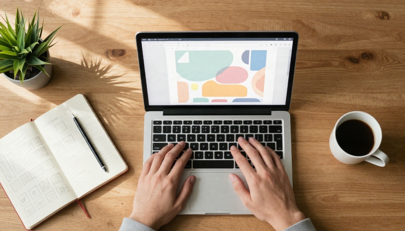
A poster for Instagram is simply a vertical image with a clear message, a strong focal point and enough breathing room for the eye to rest. Traditional design tools ask you to build that from layers, fonts and stock photos. An AI image model builds it from a description.
From Prompt to Poster
You describe the subject, the mood, the colors and the format. The model returns several candidates. You pick the best one, adjust the wording, and generate again until the composition feels right. Most people land on something usable in three to six attempts.
Modern models are also much better at rendering short pieces of text inside the image. That matters because a poster without a headline is just a picture. Models such as Ideogram v4 Quality and GPT Image 2 were built with typography in mind, so a one or two word headline usually comes out spelled correctly.
Why Instagram Needs Its Own Format
A poster designed for print is usually landscape or A-series portrait. Instagram is a phone-first platform, and a phone is held vertically. If you generate a wide image and crop it later, you lose the subject. If you generate in the right ratio from the start, the model composes around the frame you actually need.
💡 Tip: Always set the aspect ratio before you write the prompt. A model that knows the canvas is tall will place the subject, the headline and the empty space differently from one that thinks the canvas is wide.
Instagram Poster Sizes That Work
Sizes on the platform have shifted over the past two years. The profile grid now previews posts in a taller 3:4 rectangle, which changed what a safe design looks like. Here is the current picture, based on what the main size references agree on.
| Format | Ratio | Pixels | Best use |
|---|
| Portrait feed post | 4:5 | 1080 x 1350 | Default choice for posters |
| Tall feed post | 3:4 | 1080 x 1440 | Matches the profile grid preview |
| Square post | 1:1 | 1080 x 1080 | Quotes, product shots, carousels |
| Story or Reel | 9:16 | 1080 x 1920 | Full screen announcements |
| Landscape post | 1.91:1 | 1080 x 566 | Rarely worth it for posters |
Feed: 4:5 or 3:4
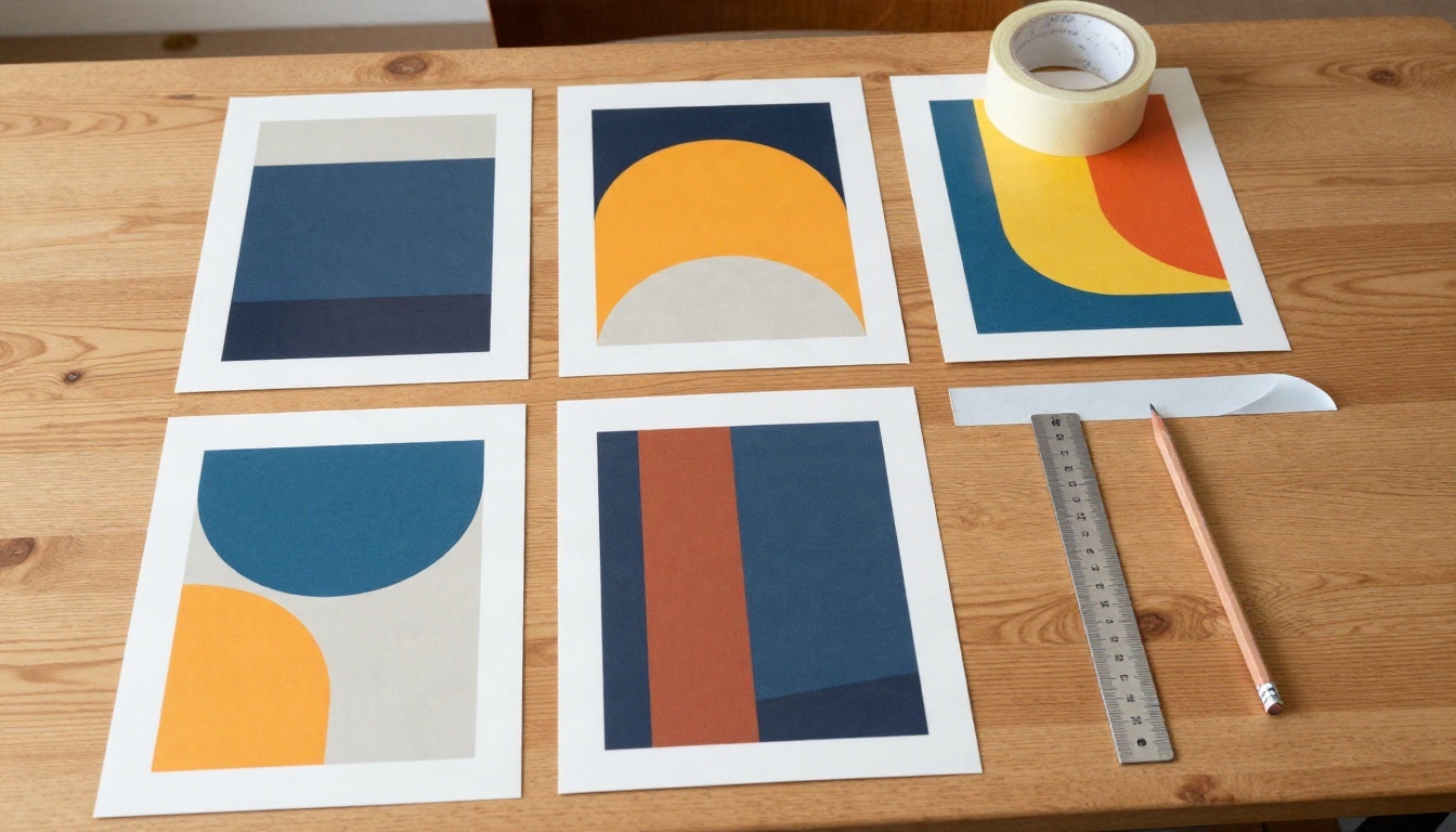
Both ratios work. A 4:5 poster at 1080 x 1350 fills most of the phone screen in the feed and is the safe default. A 3:4 poster at 1080 x 1440 matches the grid preview, so nothing gets trimmed when someone visits your profile.
If you care about how your grid looks, generate in 3:4 and keep the headline inside the central 4:5 area. That way the poster looks right in both places. A thin strip at the top and bottom is the only thing that can be lost.
Stories and Reels
Stories and Reels use 9:16 at 1080 x 1920. Posters for these placements need extra margin, because the app draws its own interface on top: the profile name at the top, the reply bar at the bottom. Keep your headline away from the outer 250 pixels or so on each edge.
Reel covers have an extra wrinkle. They get previewed on the grid, so keep the important subject in the middle 1080 x 1440 zone.
Square and Landscape
Square still has a place. Quotes, price lists and product close-ups often look cleaner at 1080 x 1080, and square images are easy to reuse inside carousels. Landscape at 1.91:1 is the weakest option for a poster. It shrinks your design into a thin band in a feed full of tall images.
💡 Tip: Generate larger than you need. A 2K or 4K output lets you crop to 4:5 or 3:4 later without softness. If a result looks slightly small, run it through a super resolution model before posting.
Free Models Worth Trying
Not every image model is good at posters. You want three qualities: clean text, strong composition and photographic realism when the poster features a person or a product. These are the options I would test first.
| Model | Strength for posters | Good for |
|---|
| Ideogram v4 Quality | Reliable headline text | Event and sale posters |
| GPT Image 2 | Follows long, detailed instructions | Layout heavy prompts |
| Seedream 4.5 | Sharp 4K photographic detail | Lifestyle and product visuals |
| Nano Banana Pro | Fast 4K results and edits | Quick iterations |
| Recraft v4.1 Pro | Print-ready 2K output | Posters you also want on paper |
| Imagen 4 | Natural, photorealistic scenes | People and food photography |
Picking by Job
If the poster is mostly words, such as a sale announcement, start with Ideogram v4 Quality. If it is mostly a photo with a short line of text, Seedream 4.5 or Imagen 4 give you more believable textures. If you plan to edit an existing image, for example swapping a background or changing a color, Nano Banana handles edits well.
For a flat vector look with logos and icons, Recraft v4.1 SVG produces scalable files. Those work best for brand elements rather than photo posters.
How to Use Ideogram v4 Quality on PicassoIA
This is the workflow I use when a poster needs a readable headline. The steps are the same for the other text-to-image models, so you can swap in a different one afterward.

Step by Step
- Open the model page. Go to Ideogram v4 Quality on PicassoIA and sign in.
- Choose the aspect ratio first. Pick the portrait option closest to 4:5 or 3:4 for feed posts, or 9:16 for Stories. Use the closest ratio the model offers, then crop precisely afterward if needed.
- Write the prompt in this order: subject, setting, lighting, style, then the exact headline in quotation marks.
- Keep the headline short. One to three words is the sweet spot. Put it in quotes so the model treats it as literal text.
- Generate a batch. Look at composition before you judge details. If the layout is right, refine the wording. If the layout is wrong, change the prompt rather than regenerating the same one.
- Download and check on a phone. View it at actual size. If you cannot read the headline from arm's length, make it larger or shorter.
Parameter Tips
- Seed: If a result is nearly perfect, reuse its seed with a slightly changed prompt to keep the composition.
- Negative space: Ask for "empty space in the upper third" if you plan to add text in another app.
- Realism: Add lens and light details such as "85mm lens, soft window light" to push results toward photography rather than illustration.
- Consistency: For a series, copy the same style sentence into every prompt so your grid looks unified.
💡 Tip: Save your best style sentence in a notes app. Reusing it across posters is the fastest way to build a recognizable look.
Prompts You Can Copy Today
A good poster prompt has four parts: the subject, the scene, the light and the text. Replace the words in brackets with your own details.
Sale or Promotion
Vertical 4:5 poster, a smiling shop owner holding a tote bag in a sunlit boutique, warm natural light from a large window, shallow depth of field, photorealistic, empty space in the upper third, bold headline "SALE" in clean sans-serif lettering.
This works because the headline is a single word and the empty space protects the layout. Swap the boutique for a bakery, a gym or a salon and the structure still holds.
Event or Gig
Vertical 3:4 poster, a guitarist silhouetted against a brick wall at dusk, warm streetlamp light, film grain, photorealistic, headline "LIVE" at the top in bold condensed lettering, small empty band at the bottom for details.
Leave the date, venue and ticket link for the caption or for a text editor. Tiny text is where AI models still stumble.
Product Launch
Square 1:1 poster, a ceramic mug on a pale oak table, morning light from the left, soft shadows, minimal styling, photorealistic, headline "NEW" in elegant serif lettering, lots of calm empty space.
Quote or Announcement
Vertical 9:16 Story poster, a person walking on a quiet beach at sunrise, wide framing, soft haze, photorealistic, short headline "HELLO" in the center, margin on all sides.
Prompt Formula
| Part | Example | Why it matters |
|---|
| Format | Vertical 4:5 poster | Sets the composition |
| Subject | Baker holding a loaf | Gives the eye a focus |
| Light | Warm morning window light | Controls the mood |
| Style | Photorealistic, 50mm lens | Avoids a fake look |
| Text | Headline "FRESH" | Keeps text short and exact |
| Space | Empty upper third | Leaves room for layout |
Social Media Poster Examples
Here is how real situations translate into prompts. Each example below follows the formula above, with a headline of one word or none.
Bakery Window
A neighborhood bakery wants to announce a weekend special. The poster shows the owner taping a loaf poster to the window, with morning light behind the glass. The scene feels honest, and the golden crust tells the story without extra words.
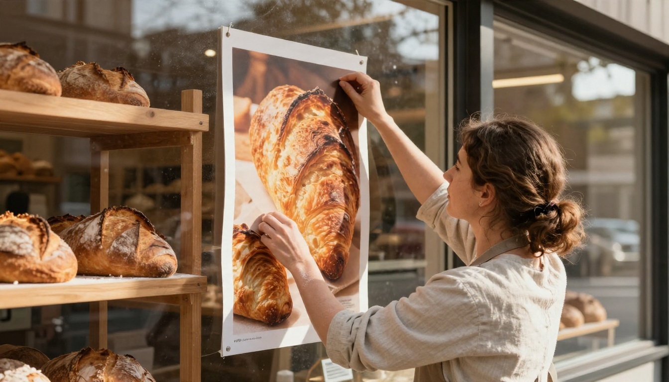
Prompt idea: Vertical 4:5 poster, a baker in a linen apron at a shop window, golden sourdough loaves on wooden shelves, backlit morning sun, flour on forearms, photorealistic, headline "FRESH" at the top.
Fitness Studio
A boutique gym wants a motivational visual for Monday. A person looking at a large framed print of a runner at sunrise sends a quiet message about effort without shouting. The white brick wall and soft light make the post feel premium.
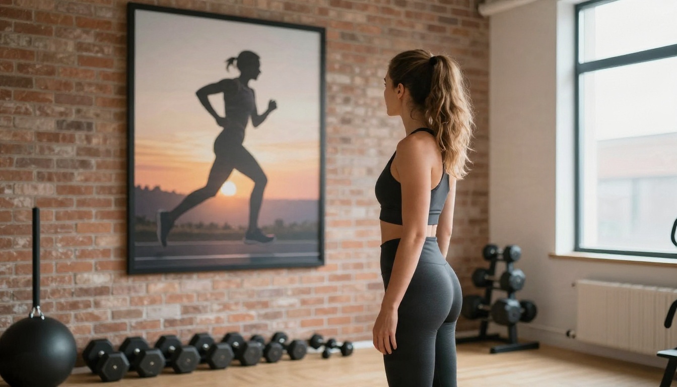
Prompt idea: Vertical 3:4 poster, a woman in athletic wear in a bright studio looking at a framed sunrise running photo, white brick wall, soft right side window light, 70mm lens, photorealistic, headline "MONDAY".
Music Night
Gig posters have a long tradition of layered paper on city walls, and that texture is easy for a photographic model to reproduce. A guitarist passing a wall of peeling flyers at dusk gives you atmosphere, motion and a clear subject.
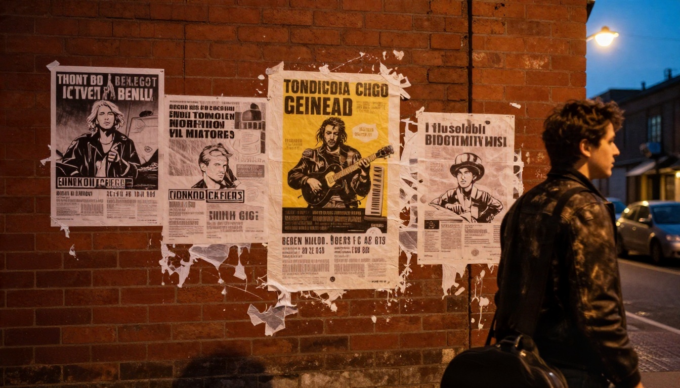
Prompt idea: Vertical 4:5 poster, a young guitarist in a leather jacket walking past a red brick wall covered in torn paper flyers, dusk, warm streetlamp glow, film grain, photorealistic, headline "LIVE".
Weekend Market
Makers and ceramic artists often sell in person and promote online. A candid portrait of the seller beside her stand builds trust faster than a polished studio shot. The dappled light under the canvas awning does the styling for you.
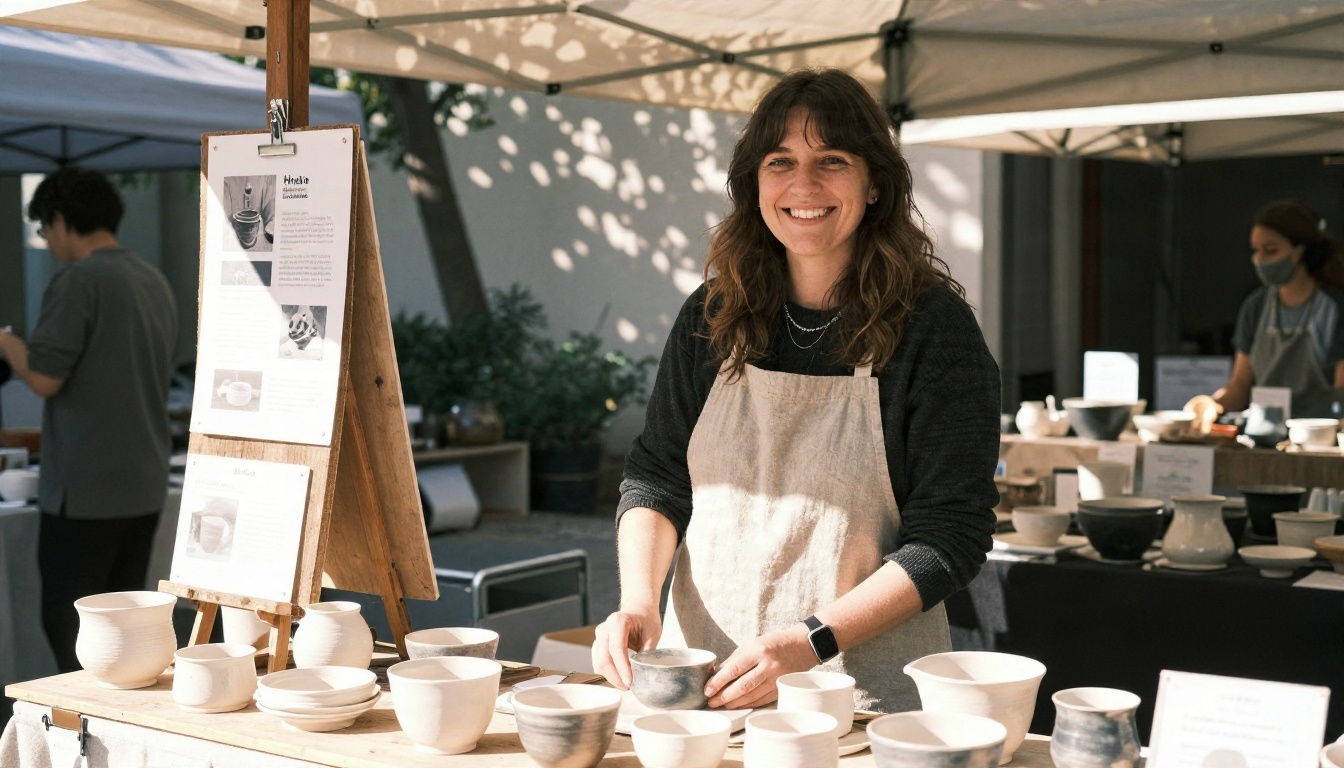
Prompt idea: Square 1:1 poster, a smiling potter at an outdoor market stall, handmade ceramics on a wooden table, dappled afternoon light, 50mm lens, photorealistic, headline "SATURDAY".
Summer Event
Seasonal events benefit from a sense of place. A woman in a white sundress looking at an event flyer on a wooden pillar at a beach bar tells viewers where the party is and what the weather feels like, in one frame.
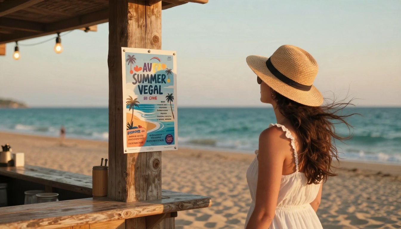
Prompt idea: Vertical 9:16 Story poster, a woman in a white sundress and straw hat at a beach bar terrace, string lights, turquoise sea, golden hour, 35mm lens, photorealistic, headline "SUMMER".
Mistakes That Ruin AI Posters
Most poor results trace back to a handful of habits. Fixing them takes seconds.
Too Much Text
Models handle a word or three reliably. A full paragraph, a phone number and a date in the same image invite misspellings. Generate the visual with a headline, then place the details in the caption or in a simple editor.
Wrong Ratio
Generating a square and stretching it to 4:5 distorts faces and logos. Always choose the target ratio at generation time.
Style Drift
If every poster in your grid has a different mood, followers cannot tell who made them. Reuse the same lighting and color sentences. A consistent style sentence beats a clever one-off prompt.
Ignoring the Phone Preview
A poster that looks great on a monitor can be unreadable on a six inch screen. Check it at actual size before posting. Contrast between headline and background matters more than font choice.
Skipping the Safe Zone
Stories and Reels place interface elements on the edges. Headlines that sit too close get hidden by the profile bar or the reply field. Keep margins generous.
💡 Quick checklist: correct ratio, headline under four words, subject in the center, margin on every edge, readable on a phone, same style sentence as the last post.
Make Your First Poster Today
You do not need a design degree to publish a poster people stop for. You need the right ratio, one clear subject, a short headline and a prompt that describes light as carefully as it describes content.
Open Ideogram v4 Quality, choose a 4:5 portrait, paste one of the prompts above and change three words to match your business. Then try the same idea in Seedream 4.5 and compare the two. If you want to see the rest of the catalog, browse all models on Picasso IA and test whichever style fits your brand.
Generate five variations tonight, pick the strongest, and schedule it for tomorrow morning. The next poster will take half the time, and the one after that will look like it came from a design team.


