Your LinkedIn photo is the smallest image on your profile and the one people judge fastest. A recruiter scrolling through fifty candidates gives each thumbnail about a second. In that second, a cluttered kitchen, a parking lot or a half-cropped wedding guest registers before your job title does. The fix is not a new camera or a studio booking. It is the background, and you can change it for free with AI in a few minutes.
This article walks through exactly how to do that: which colors actually work on LinkedIn, how to cut yourself out cleanly, how to generate a new backdrop that matches your lighting, and which mistakes make an edited headshot look fake. Every example below is built around one idea: the background should support your face, never compete with it.
Why Your Background Matters
What Recruiters Notice First
Eye-tracking studies on resumes and profile pages keep showing the same pattern. People look at the face, then the immediate surroundings, then the text. If the surroundings are noisy, the brain spends effort decoding them instead of reading you as competent and approachable.
A clean backdrop does three jobs at once:
- Separates you from the scene so your face is the clear focal point.
- Signals care. A tidy frame suggests you pay attention to detail.
- Survives the shrink. LinkedIn displays your photo as a small circle in feeds and comments, so busy patterns turn into mush.
💡 Quick test: shrink your current photo to roughly the size of a thumbnail on your phone. If you cannot tell where your shoulders end and the room begins, the background is too busy.
Size and Crop Rules
Before you touch any colors, get the frame right. LinkedIn crops profile photos into a circle, so anything near the corners disappears anyway.
| Setting | Recommended value |
|---|
| Minimum upload size | 400 x 400 px |
| Safe upload size | 800 x 800 px or larger |
| File type | JPG or PNG |
| Face size | Roughly 60 percent of the frame |
| Framing | Head and upper chest, eyes in the top third |
A tightly cropped face on a plain background beats a wide shot of you in a beautiful room. The circle crop rewards simplicity.
Best LinkedIn Background Colors
Color is not decoration here. It changes how your skin, hair and clothing read at a small size. These are the options that hold up best, with the reasoning behind each one.
Soft Light Gray
If you only remember one choice, make it this one. Light gray is neutral, so it never fights with skin tone, hair color or clothing. It works for almost every industry, from finance to design, and it hides small cutout imperfections better than white does.
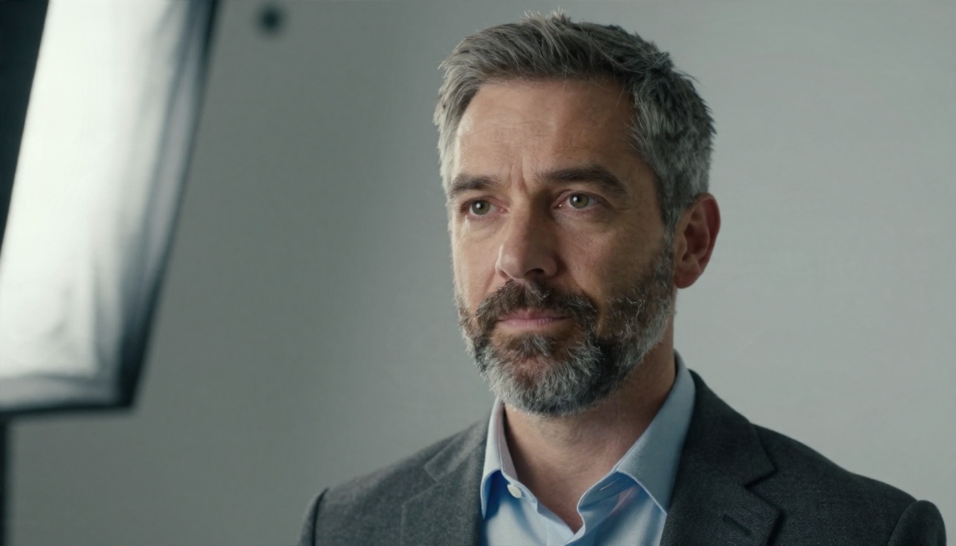
Notice how the subtle shadow falloff on the backdrop gives the image depth. A perfectly flat gray can look pasted on. A gentle gradient looks like paper in a real studio.
Deep Navy Blue
Navy projects authority and calm. It pairs well with darker blazers if there is enough separation, and it makes lighter skin tones and warm hair colors stand out. The trick is a rim light on the hair and shoulders so the dark clothing does not melt into the dark wall.
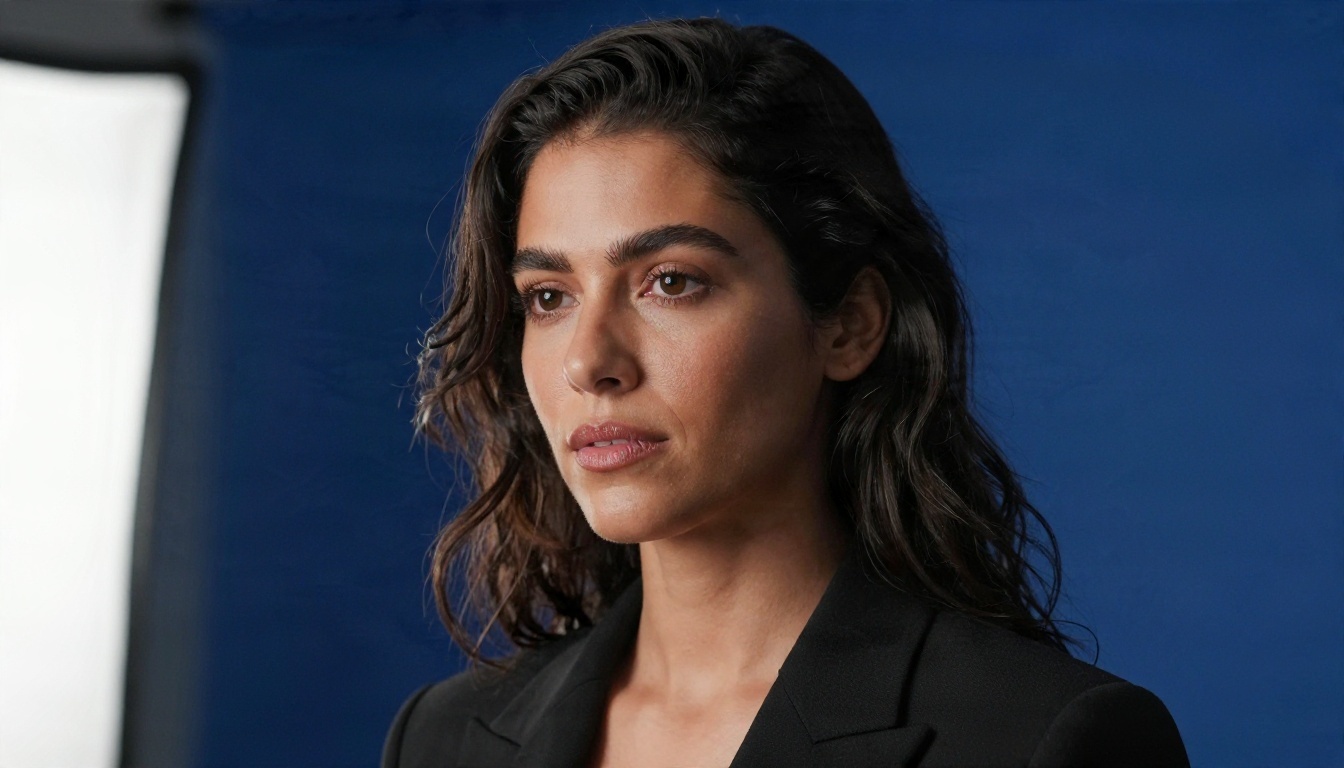
Navy is a strong pick for law, consulting, banking, healthcare leadership and executive roles. It is less friendly for creative fields, where it can feel a bit formal.
Sage Green
Muted green has become one of the most popular choices for people in wellness, sustainability, education and early-stage startups. It feels fresh without being loud. Keep the saturation low. A bright lime green will vibrate against skin at thumbnail size.
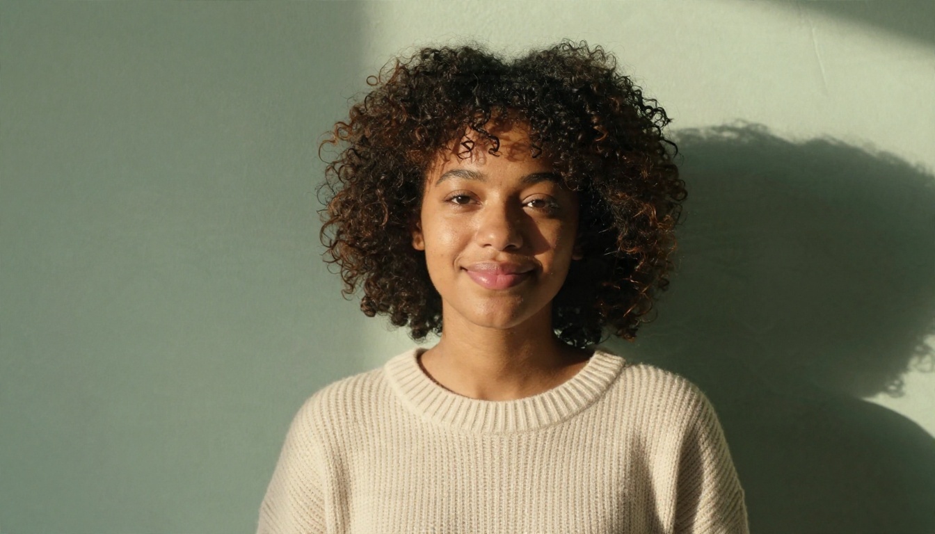
Cream, white and soft earth tones in clothing sit well against sage. Avoid olive or forest green shirts, which blend into the wall.
Warm Beige and Terracotta
Warm neutrals add friendliness. Beige is a gentler cousin of gray, and terracotta brings more personality for people in marketing, hospitality, product and design.

Warm walls reflect a soft glow back onto the face, which flatters most skin tones. Dark greens, navy and charcoal clothing give the best contrast.
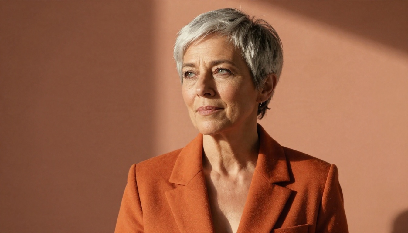
One caution: terracotta and orange clothing clash. If your wall is rust, wear a tone from a different family, or choose a close, deliberate match like the example above where the blazer and wall belong to the same palette.
Blurred Office or Co-working Space
Sometimes a solid color feels too sterile, especially for sales, real estate or community roles where warmth sells. A softly blurred workspace tells viewers you are in a real professional environment without handing them details to study.

The rule is that the blur must look optical, not digital. Real lenses blur gradually: things farther from you blur more. A uniform smear around your outline is a giveaway.
What to Avoid
- Pure white with a harsh cutout edge. It makes every stray hair glow.
- Bright saturated colors like red, electric blue or yellow. They bleed onto skin and shrink badly.
- Busy patterns such as bookshelves, brick or foliage.
- Obvious fake scenes like beaches, skylines or galaxies. They signal the opposite of trust.
- Gradients with visible banding from low quality exports.
Change It Free in Minutes
Now the practical part. The workflow has two stages: first remove the old background, then place a new one. You can do both on PicassoIA without paying for a studio session.
How to Use Remove Background on PicassoIA
The Remove Background model on PicassoIA cuts your subject out of the photo and returns a clean, transparent cutout. Here is the process:
- Open the model page and upload your photo. A sharp, well lit, front-facing picture gives the cleanest edges.
- Run the cutout. The model isolates you from the scene, including hair strands and shoulders.
- Check the edges by zooming in on hair, ears and the shoulder line. Soft hair edges are normal. Hard, jagged outlines are not.
- Download the PNG with the transparent background. Keep this file. You will reuse it for every color test.
💡 Tip for better cutouts: stand at least one meter in front of the wall. Photos taken while leaning on a wall have shadows that confuse any cutout tool, human or AI.
Pick Your New Background
With the transparent PNG in hand, you have two paths:
| Path | Best for | Effort |
|---|
| Solid color or gradient | Fast, safe, universal | Low |
| AI generated backdrop | Matching a specific mood or industry | Medium |
For a solid color, drop your cutout on a light gray (#E6E8EB works well) or soft navy canvas in any basic editor. Add a very subtle gradient or vignette so it does not look flat. Export at 800 x 800 px.
For a generated scene, keep reading.
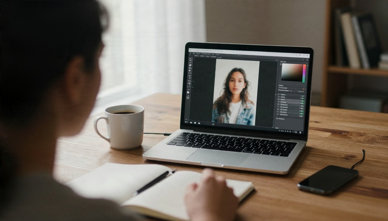
Generate a New Background With AI
A cutout dropped on a random image often looks wrong because the light direction does not match. Generating the background with your lighting in mind solves that problem, and it is where text to image and editing models earn their place.
Editing the Photo Directly
PicassoIA Image Editor Pro lets you upload your headshot and describe the change in plain language. Because it edits the existing photo rather than rebuilding it, your face stays yours. It also offers unlimited generations, so you can test five colors without watching a counter.
Nano Banana is another strong option for image editing from a text instruction, especially when you want to keep identity and clothing consistent while the scene changes. For a higher quality render with fine skin texture, Nano Banana Pro is worth a try.
Creating Backdrops From Scratch
If you want an empty studio backdrop to composite your cutout onto, Seedream 4.5 generates sharp, photorealistic images from a text prompt. Ask for an empty backdrop, not a person, and describe the light direction that matches your photo.
Prompts You Can Copy
Use these as starting points and adjust the light direction to match your own photo:
- Gray studio: "Empty seamless light gray paper backdrop, soft gradient, gentle shadow falloff on the right, studio lighting from the left, photorealistic, no people."
- Navy: "Empty deep navy blue studio wall with subtle texture, soft light from the upper left, shallow depth of field, photorealistic."
- Blurred office: "Out of focus modern office with large windows and plants, shallow depth of field at f/1.8, daylight from the left, photorealistic."
- Warm neutral: "Smooth warm beige plaster wall, soft afternoon light from the right, subtle shadow, photorealistic, no objects."
💡 Match the light: if your face is lit from the left, the backdrop should show light coming from the left too. This single detail is what separates a believable composite from an obvious one.
Real Examples: Before and After
Abstract advice only goes so far. Here is what a good swap actually looks like in practice.
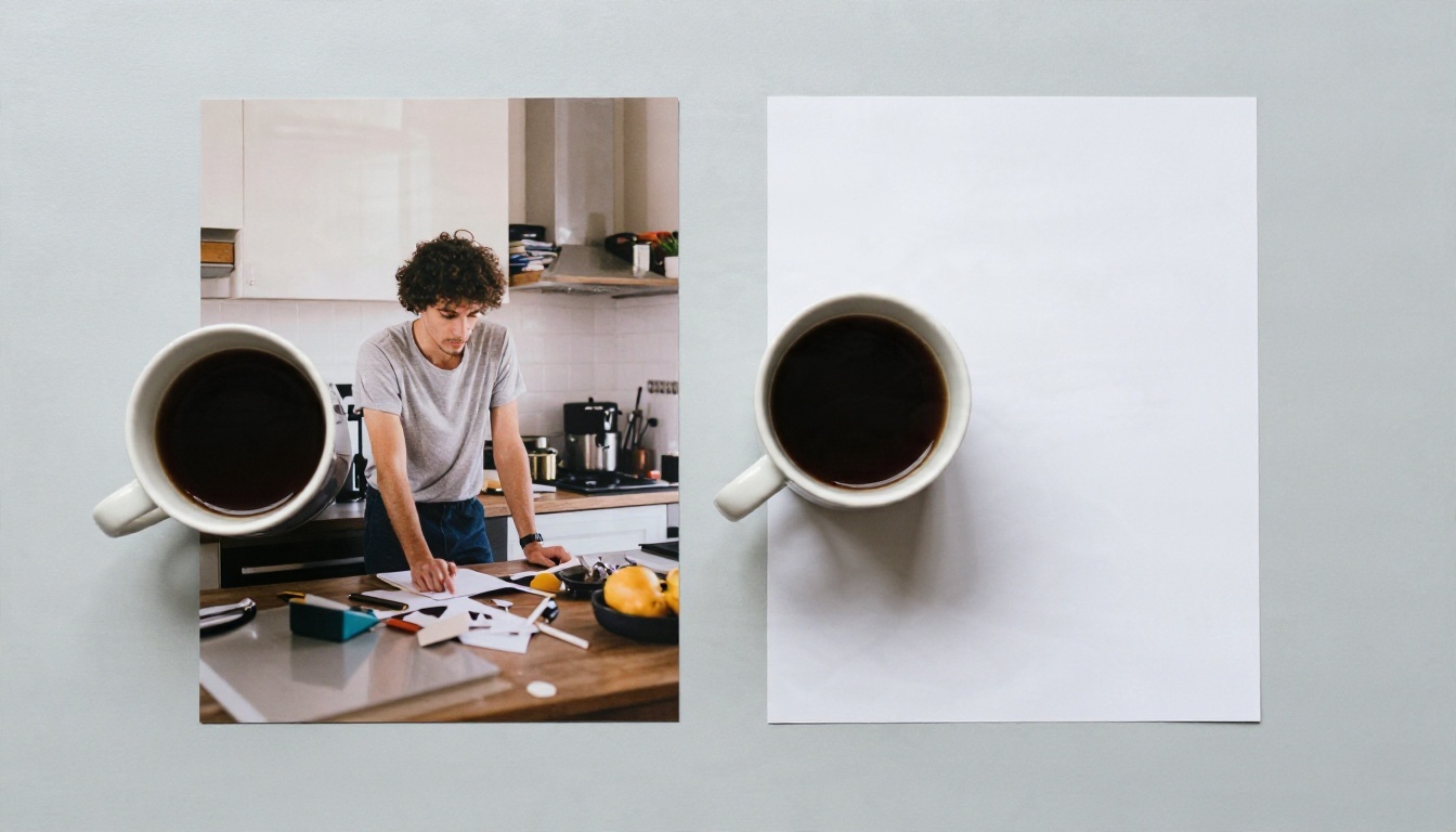
The man in the first print is standing in a kitchen, with a fridge, mugs and sunlight blasting through a window behind his head. Nothing about the photo is bad, but the eye keeps leaving his face. In the second print, the same face and the same shirt sit on a clean pale gray background. The expression reads as more confident simply because nothing is competing with it.
Three changes explain most of the difference:
- Clutter removed. The eye has one place to land.
- Contrast corrected. Without a bright window behind him, his face is no longer underexposed.
- Edges softened. The hair outline keeps a few natural flyaways instead of a hard cut.
How Recruiters See the Difference
On a hiring platform, profile photos appear in long lists. A consistent, tidy background makes you easier to recognize and remember.
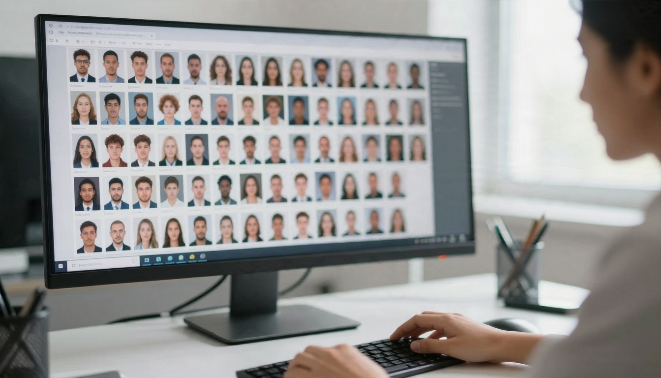
When dozens of small faces sit side by side, the ones with clean, even backgrounds look calmer and more intentional. Cluttered ones create visual noise, and noise is what people skip.
Mistakes That Make Photos Look Fake
AI makes the technical part easy, which means the remaining mistakes are about judgment. These are the ones that give an edited headshot away.
Edge Halos
A light outline around your hair or shoulders is the number one tell. It happens when the old background color leaks into the cutout. To fix it, zoom in at 200 percent and look at the boundary. If you see a glow, run the cutout again from a sharper original or soften the edge slightly by one or two pixels.
Lighting Mismatch
If the face is lit warmly from the right and the new background is cool and lit from the left, the brain notices even if the viewer cannot say why. Pick a backdrop whose color temperature and light direction agree with your photo.
Over-editing the Face
Background changes should not come with skin smoothing, jaw reshaping or teeth whitening on top. A profile photo that does not look like you in a video call creates an awkward first impression. Keep your texture, your freckles and your laugh lines.
Ignoring Clothing Contrast
Light clothing on a light wall and dark clothing on a dark wall both lose their outline. If you have already shot the photo, choose a background in the opposite tone from your clothing.
| Your clothing | Best background tone |
|---|
| Dark navy or black | Light gray, warm beige, sage |
| White or cream | Navy, deep teal, medium gray |
| Bright color | Neutral gray or soft white |
| Patterned shirt | Plain, low contrast neutral |
A Note on Honesty
Changing the background is a presentation choice, just like picking a good shirt. Keep the person real: same face, same age, same general look. If you would be surprised when a colleague meets you in person, the edit went too far.
Color Cheat Sheet by Industry
Use this table when you cannot decide. It reflects common expectations, not rigid rules.
| Industry | Best background | Why it works |
|---|
| Finance, law, consulting | Navy or medium gray | Reads as stable and formal |
| Tech and startups | Light gray, sage, soft blue | Clean and modern without being stiff |
| Design and marketing | Terracotta, beige, soft color | Shows personality |
| Healthcare and education | Soft green, light blue, warm neutral | Calm and approachable |
| Sales and real estate | Blurred office, warm beige | Friendly and reachable |
| Freelancers and founders | Any of the above matching your brand | Consistent with your website |
Match Your Banner
Your banner sits directly above the profile photo. If your banner is navy, a gray or warm backdrop gives pleasant contrast. If your banner is a bright pattern, keep the portrait background plain so the two do not fight.
Keep It Consistent Across Platforms
Use the same background style on your website, email signature and conference bio. Repeated visuals build recognition faster than any slogan.
Make Your Own Headshot Today
You do not need a studio, a ring light or a professional retoucher. You need one decent photo, a clean cutout and a background that fits your field. Start with light gray if you are unsure. Try navy if you want authority and sage if you want warmth.
Open the Remove Background model on PicassoIA, upload your best current photo, and save the transparent PNG. Then try three versions: one gray, one navy, one warm neutral. Test each one at thumbnail size on your phone and keep the one where your face reads first.
If you want to go further, use PicassoIA Image Editor Pro to change the background right inside the photo, or generate custom backdrops with Seedream 4.5. The more variations you test, the easier it gets to spot the one that feels like you. Browse every available tool at picassoia.com/en/all-models and build the profile photo you actually want people to see.


