You have a perfect product shot, a logo that needs to sit on three different banners, and a client who wants "just the mug, no background" in ten minutes. That is the exact moment the GPT Image layer workflow earns its place. Instead of fighting a magic wand tool for an hour, you ask the model for a subject on a transparent background, stack it over anything you like, and edit one element at a time while everything else stays put.
This article walks through what the term really means, how transparency works in GPT Image models, which prompts produce assets that are easy to separate, and which settings protect delicate edges like hair and glass. You will also get two tables you can keep open while you work and a short tutorial for running the whole process on PicassoIA.
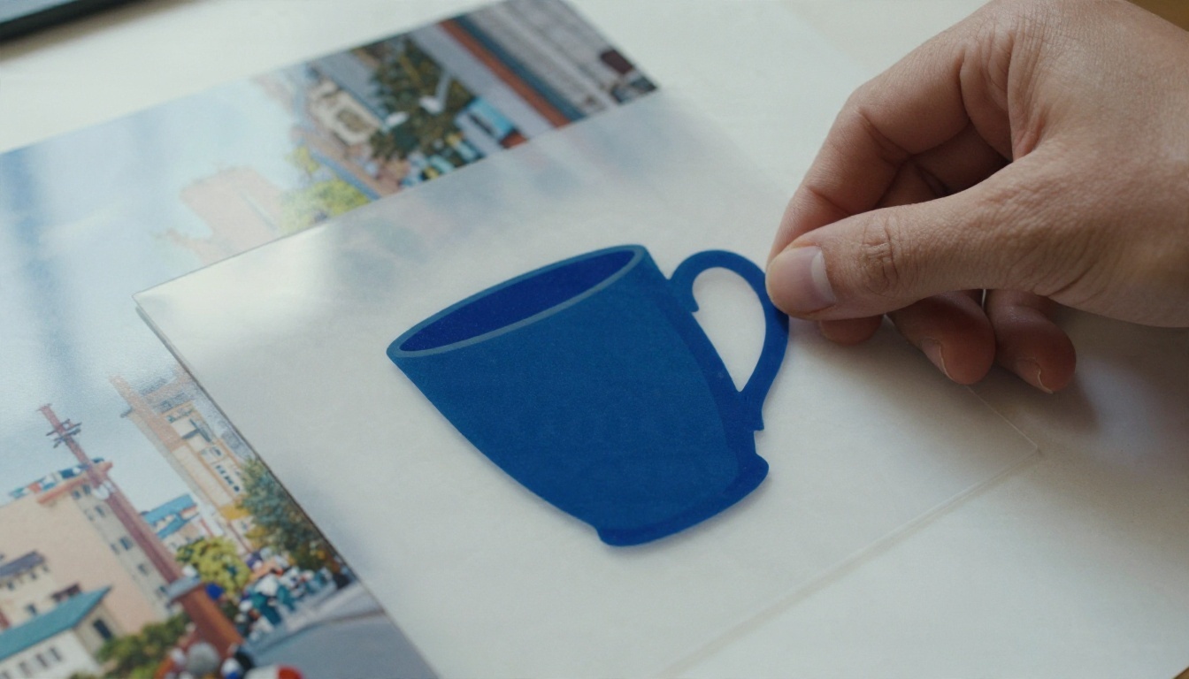
What GPT Image Layer Really Means
Not a Separate Model
Let's clear up the name first. In my research I found no standalone model called "GPT Image Layer". There is no special layer button hiding inside OpenAI's image lineup, and no export that hands you a ready-made multi-layer file. What people mean by the phrase is a workflow: you use GPT Image models to produce individual assets with transparent backgrounds, then treat each asset as its own layer in your design.
That distinction matters because it changes how you prompt. You are not asking one image to contain everything. You are asking for a series of clean, separable pieces: a subject, a prop, a shadow, a backdrop. Then you combine them in whatever editor you prefer.
💡 Quick reality check: if a tutorial promises a one-click layered file straight from a text prompt, treat it with caution. The reliable path today is one transparent asset per generation.
Layers vs. Transparency
These two ideas get mixed up constantly. Transparency is a property of a single image: the background pixels carry zero opacity. A layer is a role that image plays in a composition. A transparent PNG becomes a layer the moment you place it above something else.
| Concept | What it is | Where it lives | Typical use |
|---|
| Transparency | Alpha channel on one image | Inside the PNG or WebP file | Logos, stickers, product cutouts |
| Layer | An image placed above another | Your design editor | Mockups, banners, composites |
| Mask | A grayscale shape controlling visibility | Editor or edit workflow | Selective edits, soft blending |
| Flat image | Opaque pixels only | Any JPEG | Final export, social posts |
Once you think in those four buckets, the rest of the workflow gets simpler. You generate transparency, you use it as a layer, and you keep a flat export for the end.
How Transparent Backgrounds Work
The Background Setting
GPT Image models expose a background parameter with three values: auto, transparent and opaque. Auto lets the model decide, which usually means an opaque scene. Transparent asks for an alpha channel. Opaque forces a solid background. According to OpenAI documentation I reviewed, newer GPT Image 2.5 variants also support transparent and opaque backgrounds, and transparency for GPT Image 2 was reported as a preview feature in the API, so behavior can differ between versions.
GPT Image 1.5 on PicassoIA lists this setting directly, along with the other inputs you need for asset work. If you want a transparent result, set it explicitly instead of hoping the prompt does the job.
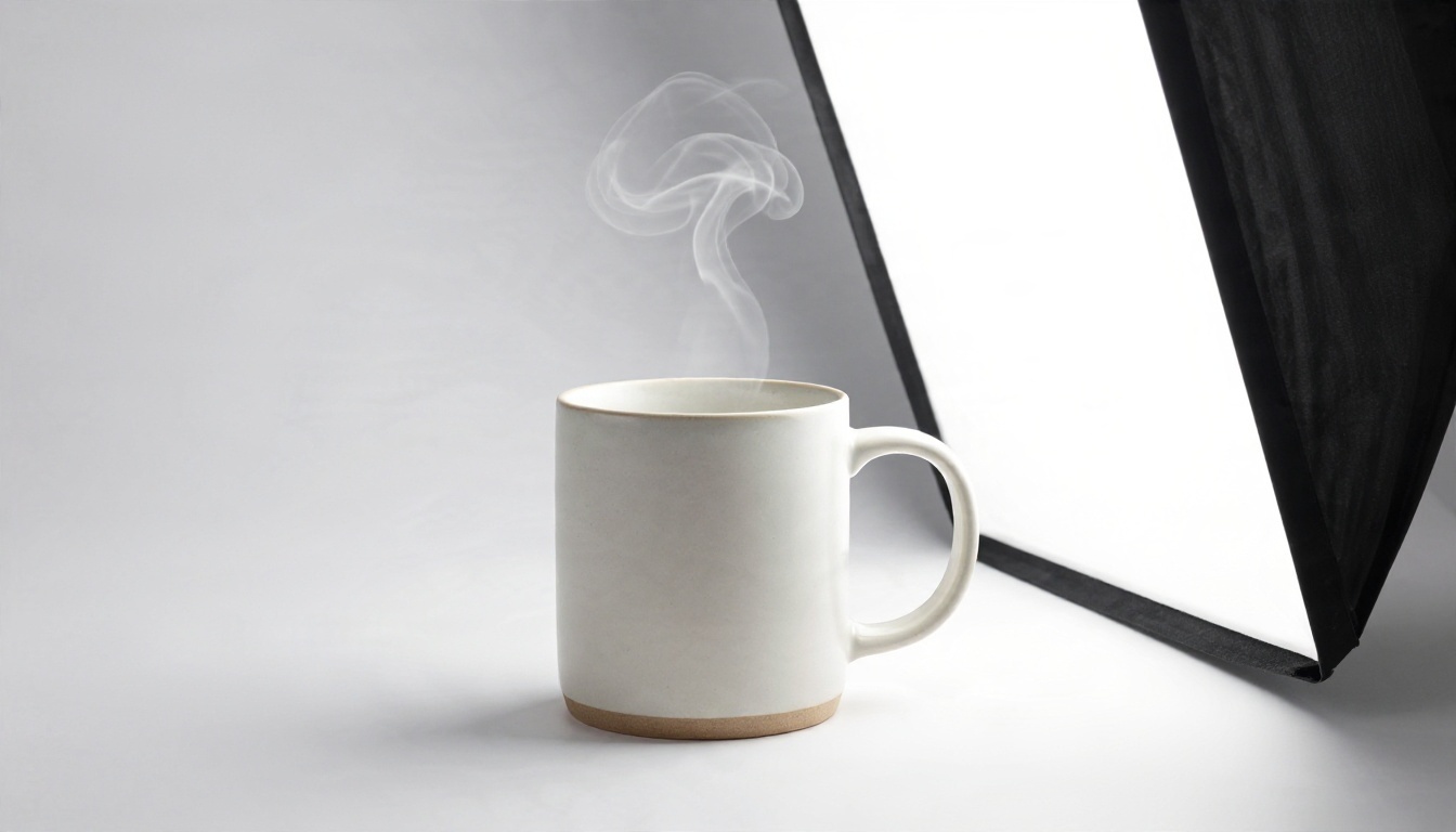
Pick PNG or WebP
A transparent background only survives in formats that support an alpha channel. PNG is the safe choice: lossless, universal, and accepted by every editor. WebP also keeps transparency and produces much smaller files, which helps for web projects. JPEG cannot hold transparency at all, so choosing it with a transparent request defeats the purpose.
On PicassoIA the output format defaults to WebP, so if your editor is picky, switch it to PNG before you generate.
| Format | Keeps transparency | File size | Best for |
|---|
| PNG | Yes | Large | Print, editing, archiving |
| WebP | Yes | Small | Websites, apps, previews |
| JPEG | No | Smallest | Flat photos only |
When Glass and Hair Fight Back
Transparent backgrounds are easy for a matte mug and difficult for anything semi-see-through. Glass, smoke, water droplets and flyaway hair all blend with whatever is behind them, so the model has to guess how much opacity each edge pixel should carry.
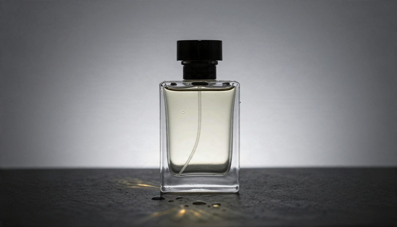
Three habits help:
- Simplify the subject. Ask for a bottle with a plain frosted label instead of a bottle full of refractions.
- Describe the edge. Words like "crisp defined outline" or "soft fine hair strands" push the model toward the finish you actually want.
- Test on both light and dark. Drop the result over white, then over near-black. Halos and fringes show up immediately.
Prompts That Build Clean Layers
The Layer Prompt Formula
A layer-friendly prompt has five parts, in this order:
Subject + material + viewpoint + edge quality + background instruction
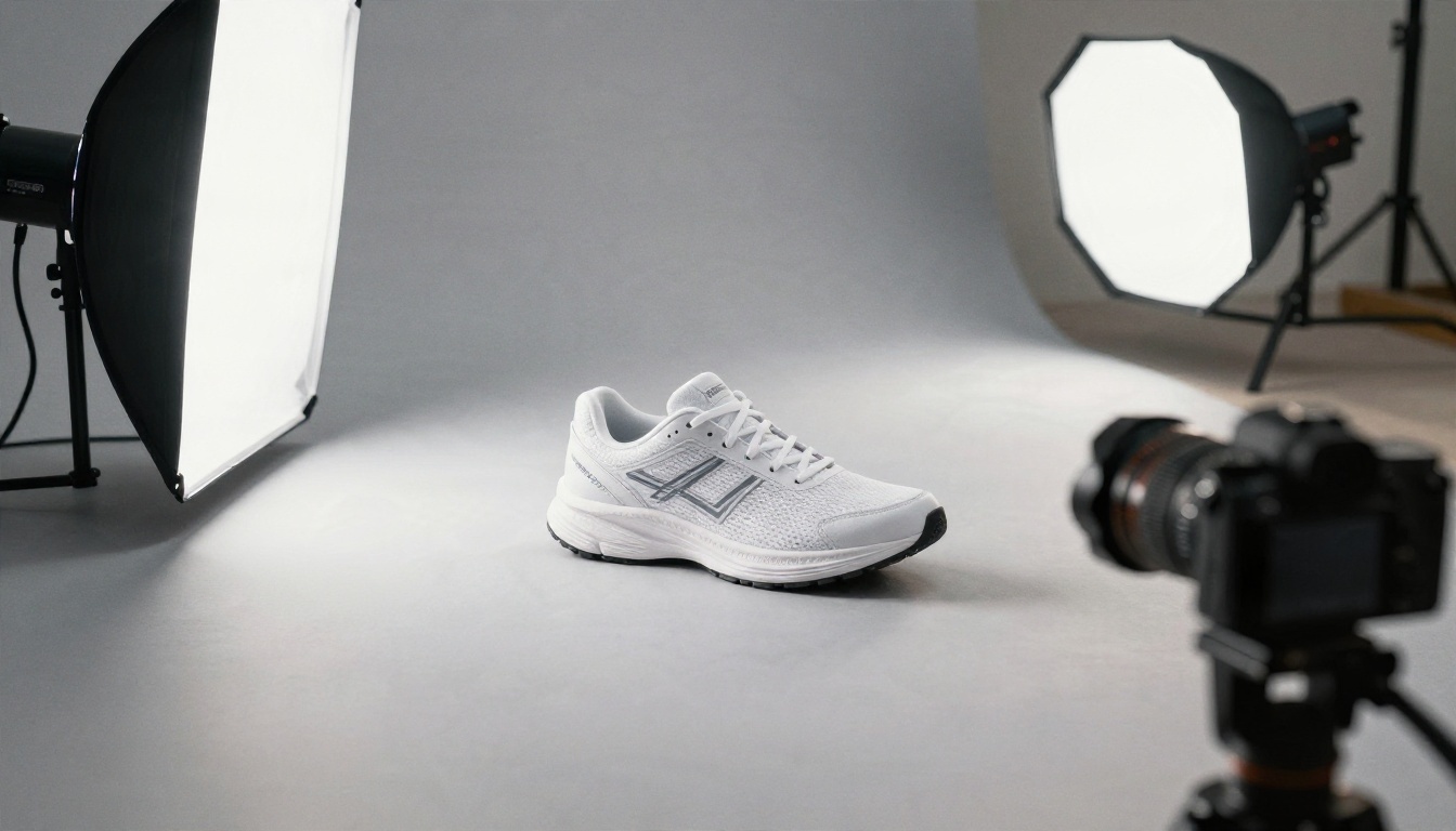
For example: "A white running sneaker with mesh upper and visible stitching, three-quarter view, crisp clean outline, isolated on a transparent background, no floor, no shadow."
Notice what is missing: scene description, mood words, props you do not need. Every extra element becomes something you have to remove later. Keep the prompt focused on the one asset you want.
Five Prompts to Copy
Paste these, swap the subject, and adjust.
- Product cutout: "Matte ceramic coffee mug, straight-on view, soft studio light, crisp clean outline, transparent background, no shadow."
- Sticker asset: "Die-cut sticker of a simple mountain with a white border, flat vivid colors, transparent background."
- Apparel print: "Circular emblem of a leaf and a sun, single-color ink look, centered, transparent background, no mockup."
- Prop for compositing: "Potted cactus on a small terracotta pot, top-three-quarter angle, soft natural light, transparent background, no table."
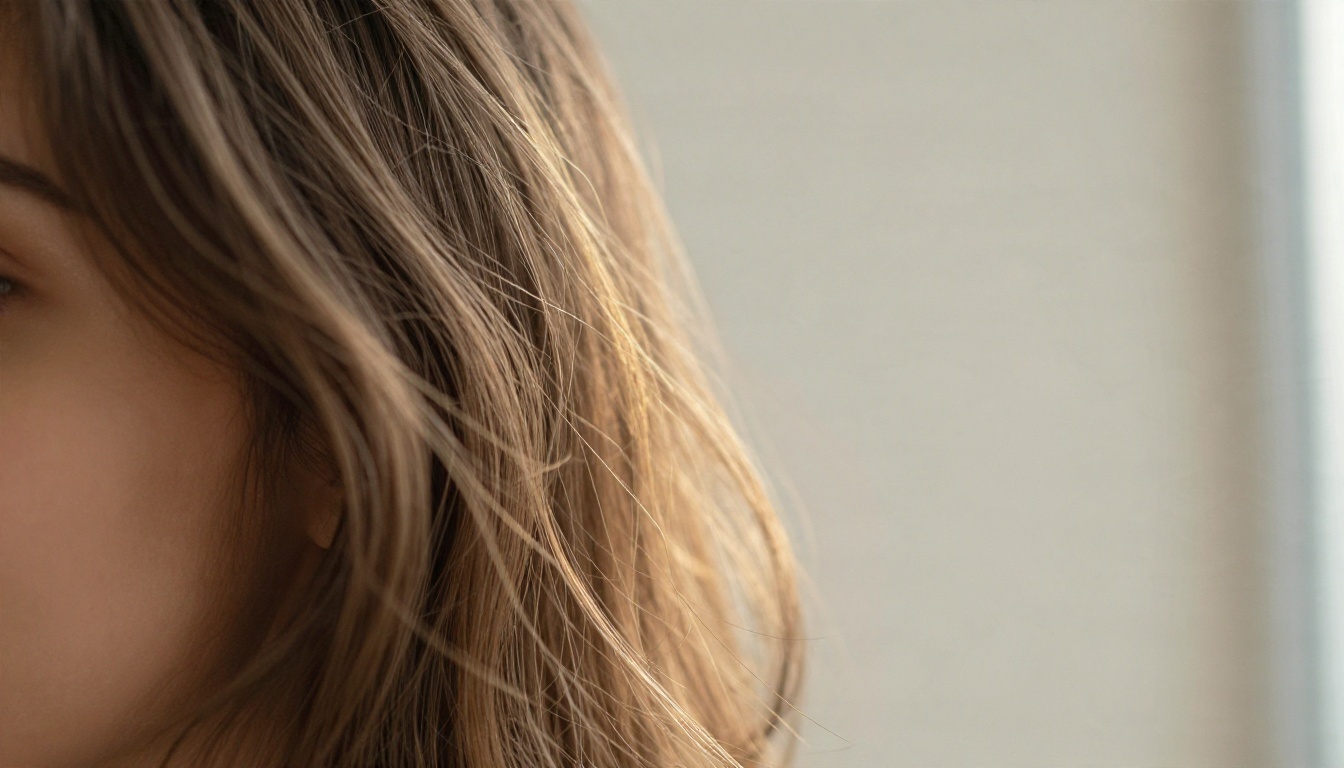
- Portrait element: "Woman with loose wavy hair, shoulders up, even soft light, fine individual hair strands, transparent background."
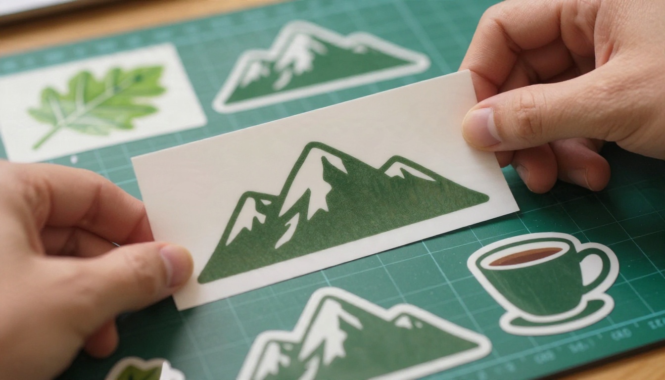
💡 Pro tip: end every layer prompt with the same sentence: "isolated, no floor, no shadow, no background elements." Reusing one line keeps your batch consistent.
Shadows Stay Separate
A baked-in shadow is the fastest way to ruin a cutout. When the shadow is painted into the subject, it looks wrong the moment you move the asset onto another surface. Ask for the subject without a shadow, then generate the shadow as its own asset if you need it: "soft elliptical contact shadow, gray, on a transparent background."
That is the layer mindset in one move. The subject is one layer, the shadow is another, and you can dial the shadow opacity in your editor until it matches the scene.
Editing With Reference Images
Input Fidelity
Editing means feeding one or more source images into the model along with a prompt. GPT Image 1.5 on PicassoIA accepts input images and an input fidelity setting with two values, low and high. Low gives the model freedom to restyle. High asks it to hold the source more tightly, especially faces and fine features.
For layer work, use high whenever the subject must stay recognizable: a person, a branded product, a specific garment. Use low when you only want the source as loose inspiration.
Swap One Object, Keep the Rest
The cleanest edit prompts name what changes and what stays. Compare:
| Weak prompt | Strong prompt |
|---|
| "Make it look better" | "Replace the blue mug with a matte black mug, keep the table, lighting and framing unchanged" |
| "Remove the background" | "Keep the sneaker exactly as shown, delete the floor and wall, output on a transparent background" |
| "Add a logo" | "Add a small circular emblem on the left chest, same fabric texture, no other changes" |
The strong versions give the model a boundary. Everything outside the sentence is protected, and that protection is what makes edits feel like clean layer changes rather than a full re-roll of the image.
Settings Cheat Sheet
These are the options you will touch most, based on the inputs GPT Image 1.5 exposes on PicassoIA.
| Setting | Options | Recommendation for layer work |
|---|
| Background | auto, transparent, opaque | Transparent for assets, opaque for final scenes |
| Output format | png, jpeg, webp | PNG for editing, WebP for web |
| Quality | low, medium, high, auto | Low for drafts, high for final assets |
| Aspect ratio | 1:1, 3:2, 2:3 | 1:1 for logos and stickers, 3:2 or 2:3 for scenes |
| Number of images | 1 to 10 | 4 to 6 variations per prompt |
| Input fidelity | low, high | High when identity or branding matters |
| Moderation | auto, low | Leave on auto unless a project requires otherwise |
| Output compression | 0 to 100 | Keep near the default for WebP, ignore for PNG |
Quality defaults to low on PicassoIA, which is great for testing a prompt cheaply. Once the composition and edges look right, rerun the winning prompt at high quality.
💡 Workflow rhythm: draft at low, pick the best of six, then re-render only that one at high. You spend less and finish faster.
Use GPT Image 1.5 on PicassoIA
GPT Image 1.5 is the model I would reach for first when the goal is transparent assets, because the background option sits right next to the prompt box. Here is the process from empty page to finished layer.
Step by Step
- Open the model page. Go to the GPT Image 1.5 page on PicassoIA and open the generation panel.
- Write a focused prompt. Use the layer formula: subject, material, viewpoint, edge quality, background instruction.
- Set background to transparent. Do not leave it on auto.
- Choose PNG. This keeps the alpha channel intact and works in any editor.
- Pick a ratio. Square is best for logos and stickers. Use 3:2 for wide objects.
- Set quality to low and generate 4 to 6 images. Compare edges, not just looks.
- Re-render the winner at high quality. Reuse the same prompt and seed-like wording.
- Drop it over white and dark backgrounds. If you see halos, add "crisp clean outline" and run again.
Cutouts With Remove Background
Sometimes you already have a photo and just need the subject lifted out. For that, PicassoIA has dedicated cutout tools:
A strong combined workflow looks like this: generate a hero image with GPT Image, run it through a cutout tool if edges need tightening, then bring it into your editor as a layer.
Which Model Fits Which Job
PicassoIA lists several GPT Image generations, and each one suits a different stage. Check each model's settings panel to confirm which options it exposes, since transparency support can differ between versions.
| Model | Best for | Link |
|---|
| GPT Image 1.5 | Transparent assets with a visible background option | Open |
| GPT Image 2 | Prompt-faithful scenes and detailed edits | Open |
| GPT Image 2.5 Sunburst | Generating and editing images in one place | Open |
| GPT Image 2.5 Flare | Fast drafts and quick iterations | Open |
| GPT Image 1 | Reliable baseline for general generation | Open |
| GPT Image 1 Mini | Budget-friendly experiments | Open |
If you want a different look for your hero shots, Qwen Image 3 and Qwen Image 3 Pro are worth testing for photorealistic output before you run the cutout step.
Common Mistakes
Asking for Too Much
Putting a person, a car, a dog and a skyline in one transparent request gives you a messy alpha channel. Generate each element separately and combine them later. Five clean layers beat one confusing image every time.
Trusting JPEG
It happens more than you would think. A transparent request exported as JPEG fills the empty area with white or black. If your "transparent" file shows a solid background, check the format first.
Skipping the Contrast Test
An asset can look perfect on white and fall apart on dark. Always test on both. Halos around hair and glass are the usual culprits, and a one-line prompt change ("crisp defined edge, no glow") usually fixes them.
Baking in the Shadow
If the subject carries its own floor shadow, you cannot place it on a new surface without a visible mismatch. Generate the shadow separately or add it in your editor.
💡 Rule of thumb: one prompt, one asset, one job. The moment a prompt has two jobs, split it.
Make Your Own Layers Today
You now have the full process: the transparent background setting, a prompt formula that keeps assets separable, edit prompts that protect what should not change, and a settings table you can reuse on every project. The fastest way to make it stick is to run one real test.
Open GPT Image 1.5 on Picasso IA, set the background to transparent, choose PNG, and generate six variations of one product or sticker idea at low quality. Pick the best one, rerun it at high quality, and drop it onto two different backgrounds. If the edges hold up, you have a working layer pipeline. If they do not, adjust the edge wording in your prompt and try again.
When you want to see what else is available, browse the full catalog at picassoia.com/en/all-models and mix in cutout tools, upscalers and other image models. Start with one asset today, and build your next composition layer by layer.


