Free AI image generators have a reputation problem. Most people type a short phrase, get a flat plastic-looking result, and conclude that "free" means "bad." That conclusion is wrong. The models behind those free tools are genuinely capable of photographic realism. The problem is almost always the prompt, the settings, or the post-processing step. Fix those three things and you can produce images that are indistinguishable from professional photography — without spending a cent.
This is a practical breakdown of every tip that actually moves the needle. No filler, no generic "use more descriptive prompts" advice. Just the specific things that work.
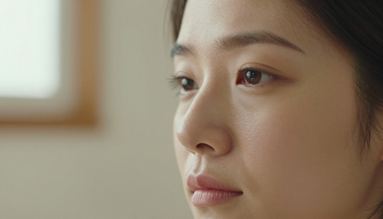
Why Most Free AI Art Looks Fake
Before fixing the problem, it helps to understand exactly what causes the plastic, artificial look that most people associate with AI-generated images.
The Flat Lighting Problem
Real photographs have complex, directional light. A face illuminated by afternoon sun coming from the upper left looks completely different from the same face under fluorescent ceiling lighting. AI models learn from millions of images, and when you give them a vague prompt, they average everything out into a kind of "neutral" lighting that does not exist in nature. The result looks like a product render or a wax figure.
The fix is specificity. Tell the model exactly where the light is coming from, what quality it has (hard, diffused, golden, cool), and what it hits first. Once you start doing this, the flat plastic look disappears almost immediately.
Vague Prompts Kill Realism
"A portrait of a woman" generates a generic composite of every portrait the model has ever seen. It picks an average nose, average hair, average background. Average everything. Nothing specific, nothing real.
Real photographs are always specific. A particular person, in a particular place, at a particular time of day, with a particular lens. The more specific your prompt, the more the model has to commit to actual choices rather than averaging across possibilities. That commitment is what creates the feeling of a real moment captured.
💡 A good rule of thumb: If your prompt could describe a stock photo from any decade, it is not specific enough.
How to Write Prompts That Actually Work
The Anatomy of a Realistic Prompt
A strong photorealistic prompt has five layers. Leave any one out and the image quality drops noticeably:
| Layer | What It Controls | Example |
|---|
| Subject + action | Who or what is in the image | "A 35-year-old man with salt-and-pepper stubble, looking slightly left" |
| Environment | Where the subject is | "seated inside a warmly lit independent coffee shop, worn wooden tables in background" |
| Lighting | Direction, quality, color temperature | "warm tungsten light from the right at 45 degrees, soft fill from a window on the left" |
| Camera specs | Lens, aperture, depth of field | "shot on an 85mm f/1.4 lens, razor-thin depth of field, background fully blurred" |
| Film/texture | Grain, color grading, sensor feel | "Kodak Portra 400 film emulation, slight grain, natural warm tones" |
Every single element of that table should be in your prompt. It sounds like a lot of information, but free models like Flux Schnell and P Image handle long, detailed prompts exceptionally well. In fact, longer prompts tend to produce more consistent results with these models because they have more constraints to anchor the output.
Camera and Lens Specifications
This is the single most underused technique for getting realistic results. Real photographers know that a 35mm wide lens makes spaces feel bigger and faces slightly distorted at close range. An 85mm portrait lens flatters faces and creates beautiful background separation. A 100mm macro lens shows skin texture at a level of detail that no smartphone camera can match.
When you include lens specifications in your prompt, the AI model draws on its training data from actual photographic work shot with those lenses. The output inherits the visual characteristics of that lens: the compression, the bokeh shape, the characteristic way light falls off from the subject.
Lens combinations that reliably produce realistic results:
- 85mm f/1.4 — portraits with natural face proportions and creamy bokeh
- 50mm f/1.8 — street and documentary feel, close to natural human vision
- 35mm f/2 — environmental portraits, slightly wide, feels immediate
- 100mm f/2.8 macro — extreme close-ups, visible texture, clinical sharpness
Lighting Descriptions That Matter
Generic lighting terms ("soft lighting", "good lighting") produce generic results. The model needs to know the geometry of the light, not just its character. Here are the specific terms that trigger genuinely photorealistic lighting behaviour:
- "Volumetric morning light from the upper left" — produces that hazy, atmospheric golden-hour quality
- "Hard directional sun at 2 o'clock position" — strong shadows, high contrast, midday feel
- "North-facing window diffused light" — the classic photography studio look, even, no harsh shadows
- "Tungsten overhead practicals" — warm, slightly underexposed interior feel like a hotel room or restaurant
- "Bounced flash from a white ceiling" — documentary, slightly flat but natural
Pair one of these with a specific film stock name and you have a lighting system that is almost impossible to distinguish from a real photograph.
Film stocks worth knowing:
- Kodak Portra 400 — warm, natural skin, slightly faded shadows
- Kodak Ektar 100 — vivid, punchy colours, sharp outdoor landscapes
- Fujifilm Velvia 50 — saturated greens and blues, high contrast landscapes
- Kodak Tri-X 400 — black and white, pushed grain, street documentary feel
Choosing the Right Free Model
Not all free text-to-image models produce the same quality of realism. The architecture, the training data, and the inference steps all affect the final output. Two models are worth knowing for consistently photorealistic results.
P Image for Sub-Second Results
P Image by PrunaAI is one of the fastest generation models available, producing finished images in under one second. What makes it interesting for realism is its ability to handle extremely detailed, long prompts without breaking down. You can write 150 words of specific environmental, lighting, and texture detail and it holds the whole description together coherently.
On PicassoIA, P Image runs with no credit limits and no usage quotas. That means you can iterate 30 or 40 prompt variations in a session to find the exact result you want, which is exactly how professional photographers work with traditional cameras. Volume of attempts, with refinement between each one, is what produces a great final shot.
💡 Tip: Enable "Prompt Upsampling" in P Image's settings. This tells the model to internally expand your prompt with additional visual detail before generating. It often catches specifics you forgot to include, especially around background and atmospheric elements.
Flux Schnell for Iteration Speed
Flux Schnell by Black Forest Labs takes four denoising steps to produce an image, which makes it among the fastest high-quality generators available. Its strength is consistency: prompt it with the same description and a fixed seed value and you will get the same image every time. That predictability makes it excellent for refining prompt language.
The workflow that works: generate 10 variations of a prompt with different random seeds, identify which one looks most realistic, then analyze what worked about that composition and write it back into the prompt explicitly. After three or four rounds of this you have a prompt that reliably generates realistic outputs every time.
How to Use P Image on PicassoIA
The model recommendation is clear: P Image is the best starting point for photorealistic AI art with no cost or setup friction. Here is how to use it effectively from the first session.
Step-by-Step Setup
Step 1 — Open the model page
Go to PicassoIA P Image and click the Generate button. No account is required to run your first generation.
Step 2 — Set your aspect ratio before writing the prompt
Choose 16:9 for landscape scenes, editorial images, or header images. Choose 9:16 for portrait-oriented content like social media posts. Choose 1:1 for headshots or square-format work. Getting this right before you start prevents you from needing to crop later, which always degrades realism in the borders.
Step 3 — Write the full five-layer prompt
Subject, environment, lighting, camera specs, film stock. All five layers. Do not skip the film stock — it is the element that most reliably adds that photographic texture that separates AI art from AI art.
Step 4 — Enable prompt upsampling for first runs
Toggle on prompt upsampling for your first few generations. Read what the model adds to your prompt to understand where your descriptions are thin. Then turn it off and add those details manually for tighter control.
Step 5 — Set a seed for your best result
When you get an image you like, copy the seed value. You can adjust a single element of the prompt and regenerate with the same seed, and the model will produce a very similar composition with only that element changed.
Prompt Parameters to Adjust
| Parameter | Default | Recommendation |
|---|
| Aspect Ratio | 1:1 | Match your target platform |
| Prompt Upsampling | Off | On for first iteration |
| Seed | Random | Set after first good result |
| Custom Dimensions | Off | Use for specific print sizes |
Upscaling: The Final Realism Boost
Even a well-crafted prompt from a fast model like P Image or Flux Schnell produces images at roughly 1 megapixel. That is adequate for web use but not for large-format printing, detailed cropping, or professional deliverables. Upscaling takes the generated image and enlarges it while adding the fine detail that was not present at smaller sizes.
This is where free AI art goes from "good enough" to genuinely indistinguishable from professional photography.
Clarity Pro Upscaler in Action
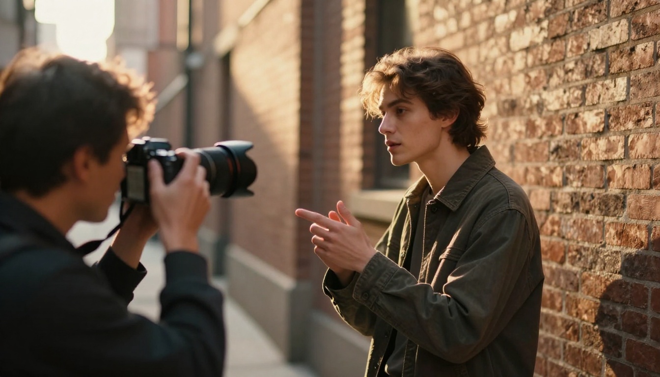
Clarity Pro Upscaler is the best option for portrait and close-up work. It handles the hardest part of upscaling: faces. Most generic upscalers either blur skin textures or introduce artificial, waxy surface detail. Clarity Pro Upscaler preserves facial structure, individual pores, hair strands, and the subtle asymmetry that makes faces look real. It does this while adding the resolution you need for large-format output.
The key parameter is the Creativity slider:
- Negative values (-1 to -3): Stay very close to the original image. Use this when the source image already looks great and you want more pixels without changing anything.
- Zero: Balanced approach. Good default for most portrait work.
- Positive values (1 to 4): The model adds realistic texture and depth interpretation. Use this when the source image lacks detail in specific areas like hair or background.
When to Use 2x vs 4x vs 16x
| Scale | Best For | Output Size |
|---|
| 2x | Web headers, social media | ~2 megapixels |
| 4x | Printed A4/letter documents | ~8 megapixels |
| 8x | Large format prints, posters | ~32 megapixels |
| 16x | Billboard, high-DPI editorial | ~128 megapixels |
For most use cases, 4x with a creativity setting of 0-2 hits the sweet spot. The Topaz Image Upscale model is also worth trying for landscape images, where the Clarity Pro model's portrait optimisation is less relevant. Real ESRGAN is the fastest option for bulk upscaling where you have 10+ images to process.
💡 Workflow tip: Generate at 1:1 at full megapixels, then upscale to 4x with Clarity Pro. The combined pipeline costs nothing, takes under 90 seconds total, and produces print-ready portrait images.
Common Mistakes That Destroy Realism
These are the patterns that consistently produce bad results, even when the prompt contains all the right elements.
Overloading with Style Keywords
There is a common belief in AI art communities that stacking quality keywords ("ultra HD, 8K, masterpiece, highly detailed, photorealistic, professional photography, award winning") improves output quality. It does not — at least not with current generation models like Flux Schnell or P Image.
These models respond to descriptive specificity, not quality superlatives. "Photographed with a 85mm f/1.4 lens, natural skin texture visible, morning light from the left" tells the model what to do. "Ultra HD masterpiece photorealistic" tells the model nothing it does not already know.
Strip the quality keywords entirely. Replace them with specific visual descriptions. The results will improve immediately.
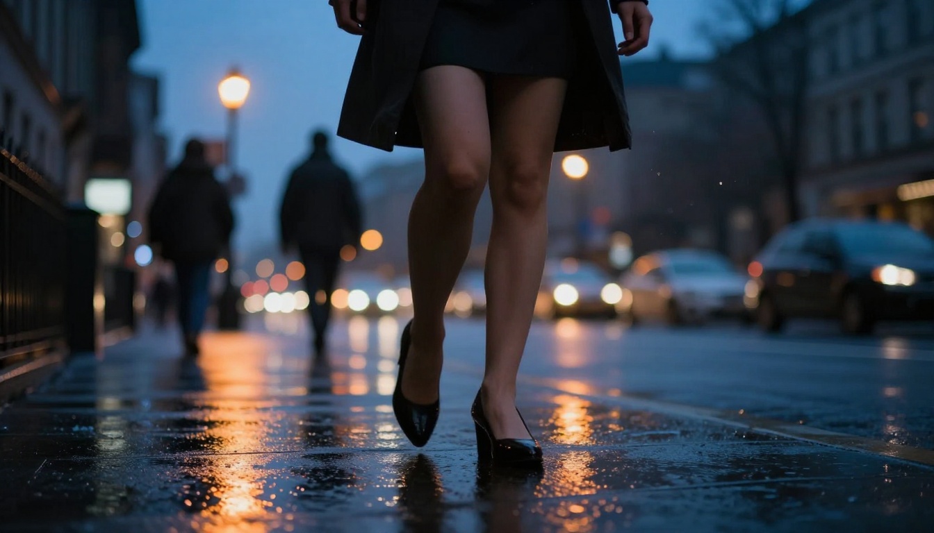
Skipping Aspect Ratio
Generating at 1:1 and then cropping to 16:9 is a mistake that most beginners make. When you crop an image, you lose pixels from the composition that was designed for the original ratio. The subject gets pushed off-center, the background becomes a wall instead of a scene, and depth of field behaves differently across the remaining image.
Always set your target aspect ratio before generating. P Image supports 1:1, 16:9, 9:16, 4:3, 3:4, 3:2, 2:3, and custom dimensions. Flux Schnell supports eleven ratio options including the cinematic 21:9. Pick your output canvas first.
Ignoring the Background
Most prompts focus entirely on the subject and leave the background undefined. The model fills undefined space with whatever it associates most commonly with the described subject, which is usually something generic and flat.
Describe the background explicitly. Not just "office" but "a warmly lit editorial office at 6pm, warm practicals visible in the background, slightly busy, out of focus at f/1.4." The background is what grounds the image in a real world. Without it, the subject floats in a void that the viewer immediately recognises as artificial.
Using the Wrong Seed Strategy
A random seed every time means a random composition every time. If you find a prompt that produces a composition you like — the angle, the pose, the way the light falls — write down the seed immediately. Locking the seed while you refine other elements of the prompt (lighting colour temperature, background detail, subject expression) lets you improve the image without losing the composition that worked.
Real Results: Before and After
The difference that proper prompt structure makes is not subtle. Here is a concrete comparison:
Bad prompt: "Portrait of a woman, realistic, high quality"
Good prompt: "A 28-year-old woman with natural auburn hair tied loosely at the neck, seated at a worn wooden café table, late afternoon north-facing window light illuminating her left cheek, expression thoughtful and slightly distracted, 85mm f/1.8 portrait lens, shallow depth of field, background café details softly blurred, Kodak Portra 400 film emulation, subtle grain, warm amber tones, no artificial retouching"
The first prompt produces a generic composite. The second produces something that looks like it was taken by a photographer who was actually there.
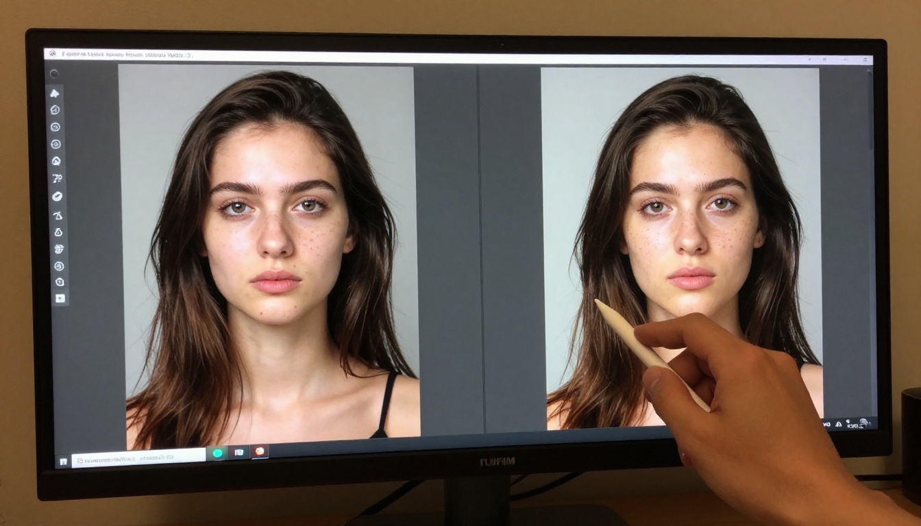
The same principle applies at every scale. A landscape with "mountains and trees" versus "the eastern face of a granite ridgeline at 7am, sparse spruce forest at the treeline, low morning mist in the valley below, hard directional light from the right, slight lens flare, 28mm f/8, Fujifilm Velvia 50" — the gap in output quality is enormous.
The Upscale Step in Practice
Even an excellent 1-megapixel generation benefits from upscaling before any professional use. The process on PicassoIA takes about 30 seconds and requires no technical knowledge.
The two-step workflow:
- Generate at full resolution using P Image or Flux Schnell with your detailed five-layer prompt
- Upload the result to Clarity Pro Upscaler, set 4x scale, creativity at 1, and download the PNG output
The output is print-ready. For portraits, the difference in skin texture, hair detail, and eye clarity at 4x is significant enough that the image will pass visual inspection even at A3 print size.
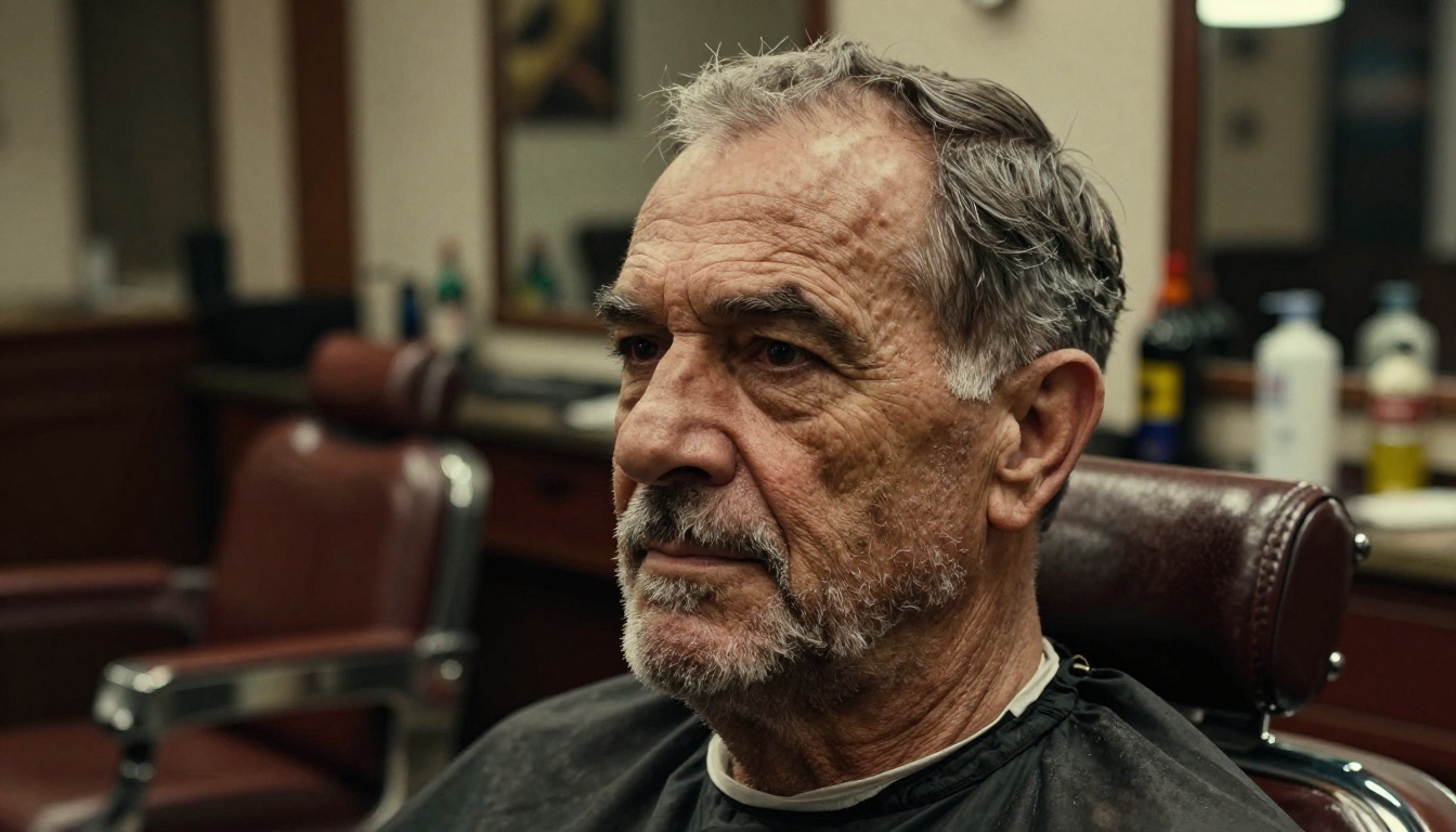
For landscape and architectural images, P Image Upscale offers the same speed advantage at the upscaling stage that P Image offers at generation. The Crystal Upscaler is worth testing on portrait close-ups for a different rendering style — some users prefer its handling of fine hair detail over Clarity Pro.
Texture Is Realism
One of the least-discussed aspects of photographic realism in AI art is surface texture. Real photographs capture material properties: the slight roughness of cotton, the grain of leather, the way wool catches diffuse light differently from silk. When you describe these properties explicitly in your prompt, the model adds them.
Texture phrases that consistently improve realism:
- "natural skin pores visible at this magnification"
- "cotton shirt fabric texture catching light"
- "worn leather surface with natural scuffs and patina"
- "paper texture visible under studio lighting"
- "slight subsurface light scattering in skin"
That last one — subsurface scattering — is particularly powerful. It describes the way light penetrates slightly into skin and scatters before exiting, which is why human skin looks warm and alive rather than like painted plastic. Mention it and models that understand photography will apply it.
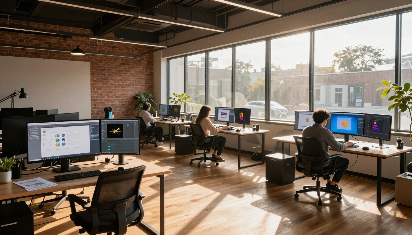
Depth of field — the zone of sharp focus in a photograph — is more responsible for the "photographic" feel of an image than almost any other element. Real cameras cannot keep everything sharp at once. The physics of optics means that if the subject is in focus, the background is out of focus, and vice versa. This is so fundamental to photography that we associate it with "real" images at a subconscious level.
Most AI-generated images default to everything being roughly in focus because the training data includes many images shot at small apertures. When you specify a wide aperture (f/1.4, f/1.8, f/2.0), the model applies the appropriate optical blur to everything outside the focus plane.
The technique: Specify both the focus subject and the aperture. "Sharp focus on her eyes, background café tables softly blurred at f/1.4" is better than just "f/1.4" because it tells the model what should be sharp, not just how much blur to add.
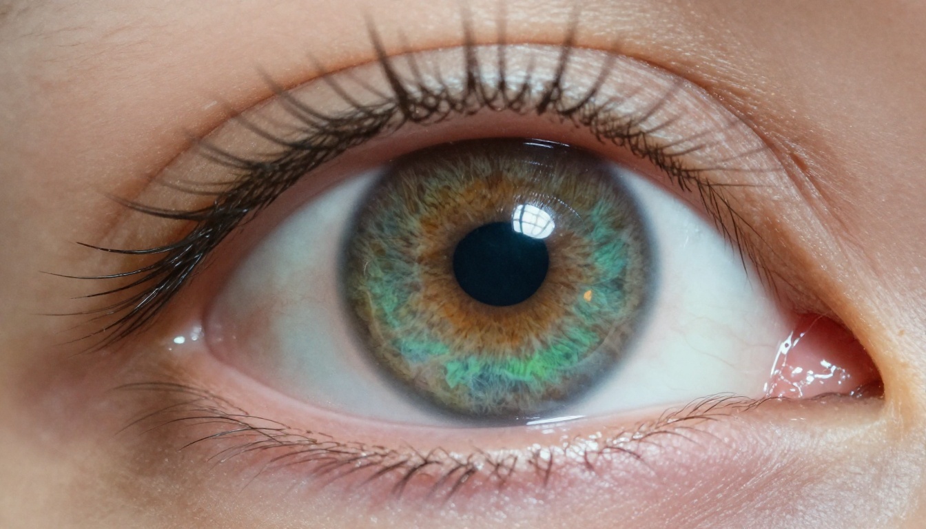
Create Your Own Photorealistic Images on PicassoIA
Everything covered in this article is available right now, at no cost, on PicassoIA. The generation models — P Image and Flux Schnell — run with unlimited generations and no credit caps. The upscaling tools — Clarity Pro Upscaler, Real ESRGAN, and Topaz Image Upscale — are available on the same platform.
The gap between "AI image" and "photograph" is almost entirely a prompt-craft problem. Take any tip from this article, apply it to your next generation, and the difference will be immediate and visible. Start with the five-layer prompt structure. Add a lens specification you have never tried before. Describe your lighting with geometry instead of adjectives.
The best way to get better at this is to generate more images, not fewer. With unlimited generations on PicassoIA, that is exactly what you can do. Run 20 variations of the same scene in one sitting, compare what changed, and write that learning back into your prompt structure.
The photorealistic results are already there, inside these free models. The prompts are the only thing standing between you and them.


