Most people type "cool mountain wallpaper" into an AI image generator, get something that looks fine as a thumbnail, and then watch it fall apart the moment it becomes a real background. The sky is cropped, the subject sits right behind the clock, and the icons land on top of the best part of the picture. A good AI wallpaper generator prompt fixes all of that before the image is even created, because it tells the model about shape, empty space and light, not only about the scene.
This article gives you a repeatable formula, then a stack of copy-ready examples for desktop, phone and anime wallpapers. Every example is written so you can paste it, change two or three words, and get something you would actually keep on your screen for a month.
💡 Quick answer: A wallpaper prompt needs five parts: the subject, the setting, the light, the camera or art style, and a composition note about empty space. Add the aspect ratio in the settings, not only in the text.
What Makes a Wallpaper Prompt Work
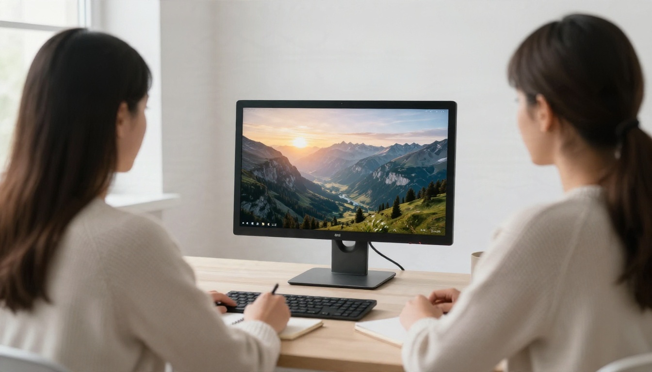
A wallpaper is not a poster. A poster is meant to be stared at. A wallpaper lives behind windows, icons, widgets and a clock, so the picture has to work when 30% of it is covered. That single fact changes how you write.
Pick the Aspect Ratio First
Before you write a single adjective, decide where the image will live. Desktop monitors are almost always 16:9, ultrawide screens are 21:9, and phones are close to 9:16 or 9:19.5. If you generate a square image and crop it, you throw away a big part of what you paid for.
| Screen | Ratio | Typical use |
|---|
| Laptop and monitor | 16:9 | Landscapes, workspaces, city scenes |
| Ultrawide monitor | 21:9 | Panoramas, horizons, skylines |
| Phone lock screen | 9:16 | Single subject, tall composition |
| Tablet | 4:3 or 3:2 | Balanced scenes, illustrations |
| Dual monitor spread | 32:9 | Long horizons, seascapes |
Most modern models let you choose the ratio in a setting. Use it. Then repeat the shape in the prompt with words like "wide panoramic composition" or "tall vertical composition", which nudges the model to place things correctly.
Leave Room for Icons and Clocks
The most useful phrase in wallpaper prompting is a plain description of negative space. Write things like "large clean area of open sky in the upper third" or "subject placed on the right, empty calm space on the left". On desktops, icons live on the left and the taskbar sits at the bottom. On phones, the clock sits at the top and the dock at the bottom.
💡 Tip: If your results keep putting the subject dead center, add "rule of thirds, subject off center" and name the side you want to keep empty.
After a lot of trial and error, the same structure keeps working across models. It is short enough to remember and flexible enough to bend to any style.
Subject, Setting, Light, Lens
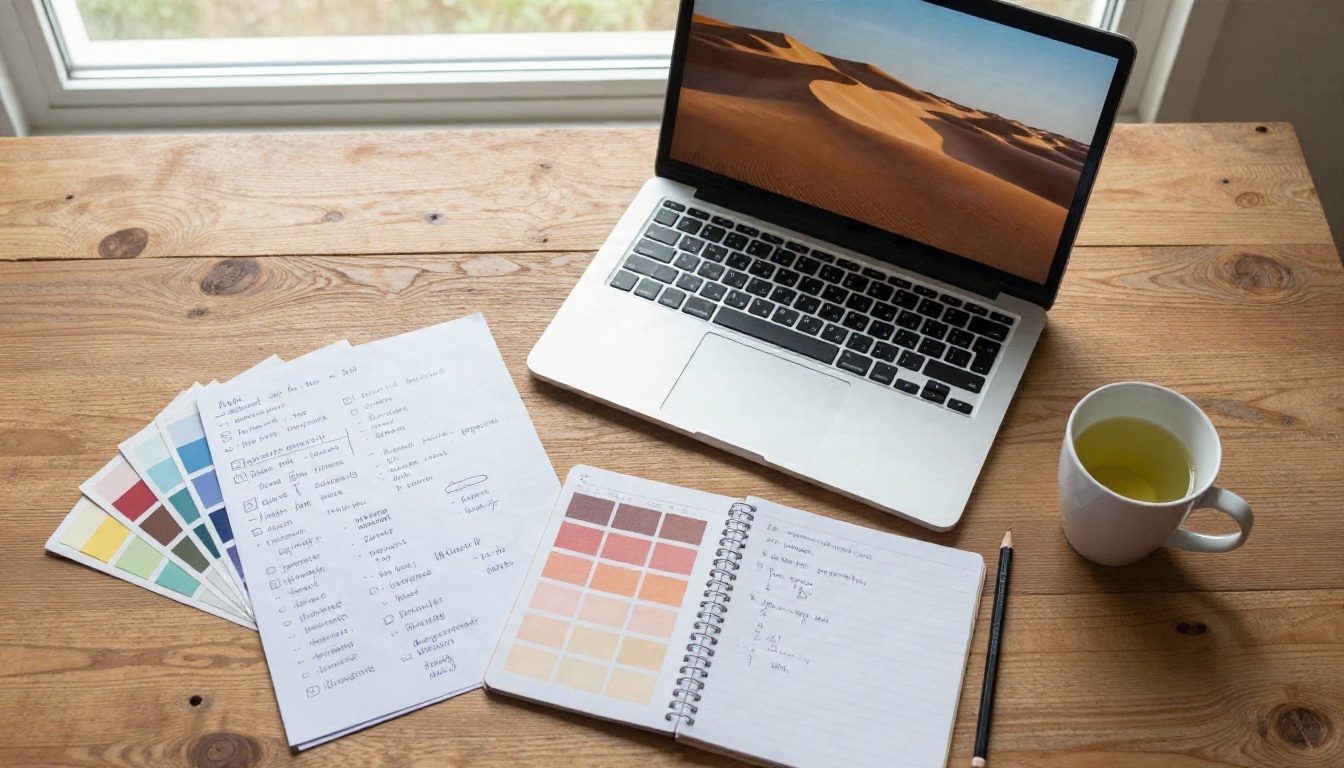
Write the prompt in this order:
- Subject: what the eye should land on (a lone cabin, a fox, a train station).
- Setting: where it sits (frozen lake, rooftop, rainy street).
- Light: the time of day and direction (low golden sun from the left, overcast soft light, blue hour).
- Camera or style: a lens for photos ("35mm lens, shallow depth of field") or a named look for illustration ("hand-painted anime background, soft watercolor clouds").
- Composition note: the empty space and the ratio.
A filled-in example: "A lone wooden cabin beside a frozen lake, pine forest behind it, low golden sun from the left, long soft shadows on the snow, 35mm lens, wide panoramic composition, large calm area of sky in the upper third, photorealistic, fine film grain."
Words That Make the Image Calmer
Wallpapers are viewed for hours. Busy, high-contrast images tire the eye and make icons hard to read. Add calming cues such as "soft light", "muted palette", "low contrast", "quiet mood", "gentle haze". If you want a dark mode friendly image, write "deep shadows, dark tones, minimal highlights" so white text stays readable.
💡 Tip: Keep the prompt under 80 words for wallpapers. Long lists of adjectives usually fight each other and flatten the picture.
Desktop Wallpaper Prompt Examples
Desktop wallpapers reward wide, layered scenes where depth does the work. Foreground, midground and background layers give the image a sense of space even when windows cover half of it.
Landscapes That Hold Up
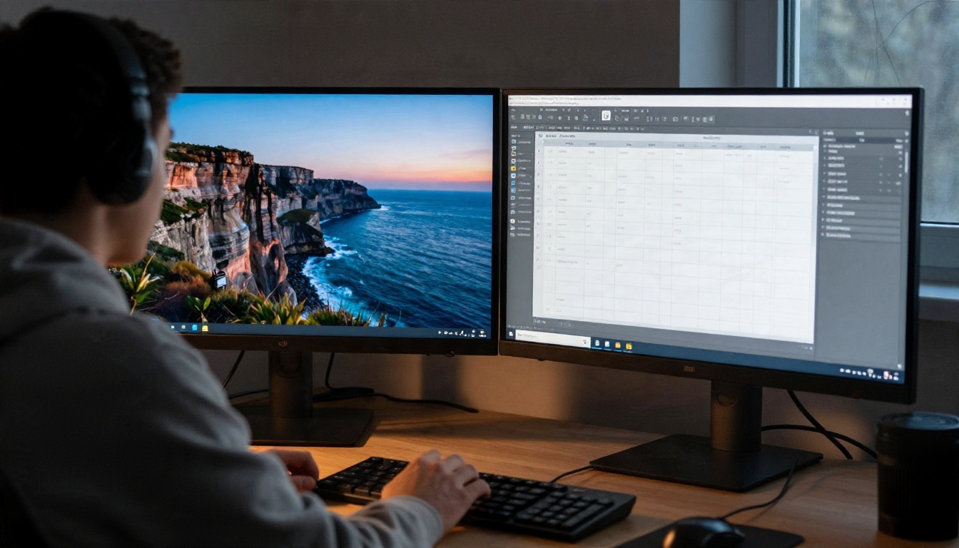
These prompts work well at 16:9 and survive icon clutter:
- Alpine sunrise: "Alpine valley at sunrise, layered mist between pine ridges, still turquoise lake in the foreground, soft pink and orange clouds, 24mm lens, wide composition, clean open sky on the left, photorealistic, fine grain."
- Desert calm: "Rolling sand dunes at late afternoon, sharp ripple textures in the sand, long shadows, a single faint footpath, muted warm palette, wide panoramic photo, large empty sky."
- Autumn forest: "Quiet forest path in October, fallen leaves in amber and rust, soft overcast light, shallow depth of field, mist in the distance, calm mood, photorealistic."
- Ocean cliff at twilight: "Rocky coastal cliff at blue hour, slow waves as soft white lines, deep blue sky fading to peach near the horizon, wide composition, minimal highlights."
Ultrawide and Dual Monitors
For 21:9 and 32:9, lean on horizons. A long line of coast, a skyline, a mountain range or a desert road gives the model an easy reason to spread the scene sideways. Write "ultra wide panoramic view, horizon in the lower third, the subject spread across the whole frame" and avoid single vertical subjects, which tend to get duplicated or stretched.
If your tool cannot output 32:9 natively, generate the widest ratio available, then extend the sides with outpainting. It is easier than asking a model for an extreme ratio from scratch.
Minimal Workspace Backgrounds
Not every desktop needs a landscape. A calm, almost empty image can be the best background for people who keep many windows open. Try:
- "Smooth gradient of dusty blue to soft peach, subtle paper grain, very low contrast, no objects, wide format."
- "Close-up of white sand with soft wind ripples, side light from the left, minimal, quiet, wide crop."
- "Matte concrete wall with a soft shadow of a plant leaf, diffused daylight, muted grey tones."
These produce images with almost no focal point, so icons stay readable and the screen feels clean.
Phone Wallpaper Prompt Examples
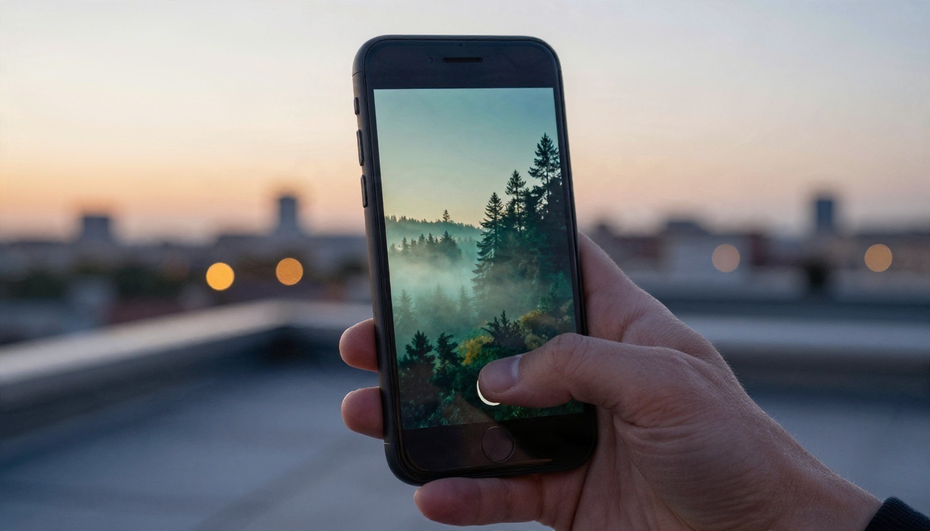
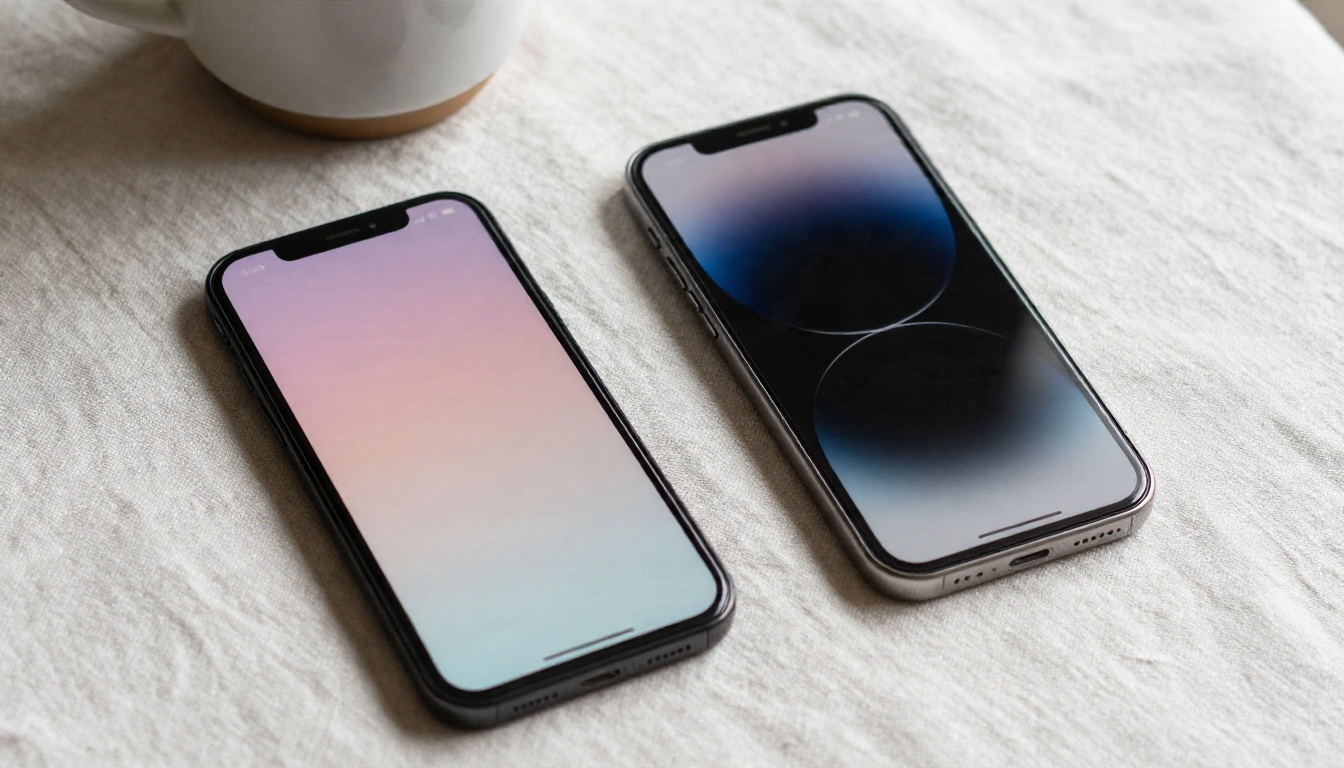
Phone wallpapers are a different problem. The screen is tall, the clock covers the top third on a lock screen, and the home screen is covered in app icons in a grid. The best images have a clear subject in the middle band and gentle texture everywhere else.
Lock Screen vs Home Screen
A lock screen can carry a strong subject. A home screen needs to be quieter. Use two different prompts for the same theme:
| Screen | Prompt focus | Example wording |
|---|
| Lock screen | Clear subject, space at top | "tall vertical composition, lone lighthouse on the lower right, open misty sky at the top for the clock" |
| Home screen | Soft pattern, low contrast | "tall vertical composition, soft out of focus waves, muted blue tones, no strong focal point" |
Vertical Compositions That Work
Here are phone prompts I would copy first:
- Misty forest: "Tall vertical photo of a misty pine forest at dawn, soft blue green tones, tree trunks leading up, empty hazy sky at the top, 9:16, photorealistic."
- Sunset beach: "Vertical photo of a quiet beach at sunset, smooth gradient sky from orange to violet, gentle foam at the bottom, large calm area at the top third."
- Dark mountain: "Vertical silhouette of a mountain ridge under a deep navy sky, a few faint stars, minimal highlights, very dark tones, quiet."
- Pastel gradient: "Soft pastel gradient of cream, peach and lilac, fine film grain, no objects, vertical."
💡 Tip: AMOLED phones show true black. Prompts with "deep black shadows, minimal highlights" look striking and save a little battery.
Anime Wallpaper Prompt Examples
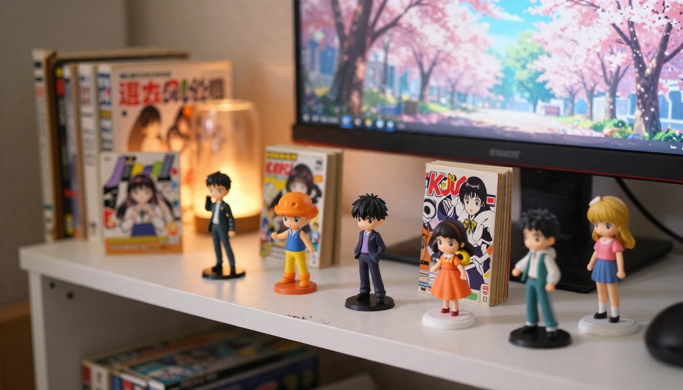
Anime wallpapers are the biggest search group after landscapes, and they are also where prompts go wrong most often. People write a character name and a mood, and the model returns a generic face. Strong anime prompts describe the scene and the style of the background, because that is what makes a wallpaper feel like a film frame.
Anime Film Backgrounds
Think about the painted backgrounds in feature animation: soft clouds, careful light, detailed small objects. These prompts aim at that look:
- Cherry blossom street: "Anime film style background, quiet suburban street in spring, cherry blossom petals drifting, warm afternoon light through the branches, detailed power lines and a small shrine, soft painted clouds, wide 16:9, no characters."
- Rainy city alley: "Anime film style, narrow Tokyo alley after rain, wet asphalt reflecting warm shop windows, vending machine, umbrellas, soft blue evening light, hand-painted texture, vertical 9:16."
- Summer train platform: "Anime film style, empty countryside train platform in July, towering white clouds, green rice fields, cicada-season haze, bright clean light, wide composition."
Character Scenes Without the Mess
If you want a character, keep the description simple and put the effort into the scene. Name one outfit, one pose, one place and one light source. For instance: "A girl with short dark hair in a school uniform standing at a train crossing, back partly turned, golden hour light, anime film style, soft painted sky, character on the right third, empty space on the left, wide 16:9."
Avoid piling on five characters, three props and a dramatic action. The more you add, the more hands and faces the model has to get right, and the more likely it is that something looks off.
Style Words That Change the Look
Small style words change the result a lot:
| Add this | What you get |
|---|
| "anime film style, painted background" | Soft clouds, detailed scenery |
| "90s anime, soft grain, muted colors" | Retro, slightly faded look |
| "watercolor anime, pastel palette" | Gentle, airy images |
| "high contrast, bold shadows, dramatic angle" | Action poster feel |
| "chibi, simple shapes, flat colors" | Cute, playful phone wallpapers |
Pick one style direction per prompt. Mixing three of them usually produces a muddy middle ground that matches none of them.
Best Models for Wallpapers
Different models are good at different things, so it helps to pick on purpose. The table below summarizes what I would reach for on PicassoIA.
| Model | Best for | Why |
|---|
| Seedream 4.5 | 4K desktop and phone wallpapers | Sharp detail at high resolution and strong prompt following |
| Nano Banana Pro | Clean compositions and editing | Handles layout instructions and follows revisions well |
| Imagen 4 | Photorealistic landscapes | Natural light and believable textures |
| Qwen Image 3 | Detailed scenes and anime backgrounds | Good with complex descriptions |
| Z Image Turbo | Fast batches of ideas | Quick results for testing prompts |
| Flux 2 Klein 9B Base LoRA | Styled looks | Useful when you want a consistent visual style |
A workflow that saves time: test a prompt on Z Image Turbo first because it is fast, then run the version you like on Seedream 4.5 for the final high resolution result.
How to Use Seedream 4.5 on PicassoIA
Seedream 4.5 is a solid first choice for wallpapers because it outputs large, sharp images and follows composition notes well.
- Open the model page. Go to the Seedream 4.5 page on PicassoIA.
- Paste your prompt. Use the formula: subject, setting, light, style, composition note.
- Set the aspect ratio. Choose 16:9 for desktop, 9:16 for phone, or 21:9 for ultrawide.
- Choose the resolution. Pick the highest option your screen needs. A 1440p monitor wants at least 2560 pixels on the long edge.
- Generate and compare. Create two or three variations and keep the one where the empty space sits in the right place.
- Download and apply. Save the file and set it as your wallpaper. Check it with icons visible before you decide.
💡 Tip: Change only one thing between runs, such as the light or the empty space note. It is the quickest way to see what each word actually does.
Fix Blurry or Cropped Results
Even good prompts sometimes give you a wallpaper that looks soft on a big screen, or a subject that sits in the wrong spot. Most problems have simple fixes.
Upscale Without Losing Detail
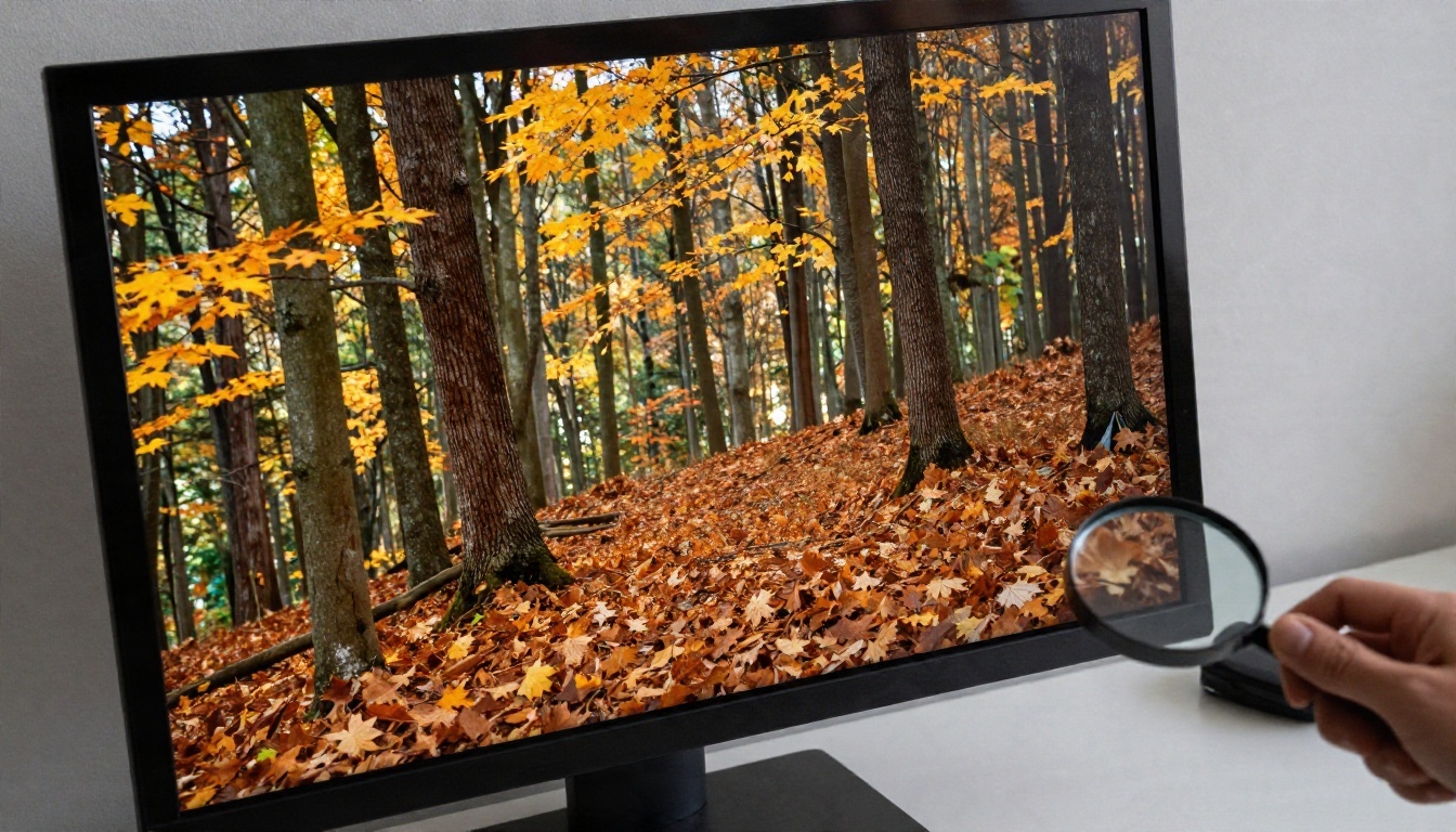
If your image is 1920 pixels wide and your screen is 4K, the system stretches it and everything goes soft. Run it through an upscaler instead. Real ESRGAN is a quick option for 4x enlargement, Clarity Pro Upscaler is useful when you want fine photographic texture restored, and Image Upscale goes up to 6x for very large displays.
A good habit is to generate at the native model size, choose the best image, and only then upscale it. Upscaling every draft wastes time.
Common Mistakes to Skip

Here are the errors I see most often, and what to write instead:
- Square output used as a wallpaper. Set the ratio in the settings, not only in the text.
- Subject right under the clock. Add "subject in the lower half, open sky at the top".
- Too much going on. Remove half of the adjectives. If a detail does not help the mood, cut it.
- Harsh contrast. Add "soft light, muted palette, low contrast" for something you can live with.
- Text in the image. Do not ask for words. Models still garble lettering, and a wallpaper does not need it.
- Mixed styles. Choose either photorealistic or anime, not both.
💡 Tip: If a good image has one flaw, such as a stray object, fix that area with an editing model like Nano Banana rather than rerunning the whole prompt.
Make Your Own Wallpapers Today
You now have a formula, a set of examples for each screen type, and a short list of models that suit the job. The fastest way to get better at this is to run your own tests: pick one example from this article, change the place or the light, and see what happens.
Open PicassoIA, paste one of the prompts above into Seedream 4.5 or Imagen 4, set the aspect ratio for your screen, and generate a few versions. Try a desktop landscape, a vertical phone image and an anime street scene, and keep the ones you would not mind looking at every day. If you want to try more tools, browse the full list at picassoia.com/en/all-models.


